Bold Distinctive Branding vs Beautiful Generic Branding
What performs better: a brave, specific, memorable brand identity or a beautiful but generic trendy one? Let's take a look.


What performs better: a brave, specific, memorable brand identity or a beautiful but generic trendy one? Let's take a look.
This is one of the most uncomfortable questions in branding.
What performs better?
A brave, very specific, maybe even rough-edged brand identity that nobody confuses with anyone else?
Or a beautiful, polished, trendy identity that looks premium, safe, and familiar, but also looks a little like twenty other brands in the same category?
The honest answer is not romantic. Beauty can help. Good craft matters. Trust matters. Readability matters. But in a crowded market, beauty without memory is weak.
The brand has to be found, remembered, attributed, and chosen. If the visuals are pretty but generic, they may win a design mood board and still lose the shelf, the feed, or the buying moment.
This article sits naturally beside Branding Codes That Stick, Graphic Design Trends: Why Design Styles Always Come Back, and Stay Normal: Why Consistency Beats Trends in Graphic Design.
“A brand does not need to be loved by every designer. It needs to be remembered by the right buyer.”

Designers often evaluate branding through taste first.
They ask:
Those are useful questions, but they are not enough.
A brand identity has to work under worse conditions than a portfolio image. It has to work when the customer is tired, scrolling fast, standing in a supermarket aisle, seeing a tiny social ad, comparing five tabs, or half-remembering something they saw last week.
In that reality, the more important questions are:
That is why a slightly raw but specific identity can outperform a gorgeous generic one. It gives memory something to hold.
The Ehrenberg-Bass language around distinctive brand assets is useful here.
A strong asset should be:
That can be a logo, color, mascot, package shape, sonic cue, slogan, character, illustration style, layout system, or product ritual.
This is different from normal beauty. A distinctive asset can be awkward, loud, unfashionable, or visually unfriendly by traditional design standards. If it is strongly linked to the brand, it can still be extremely valuable.
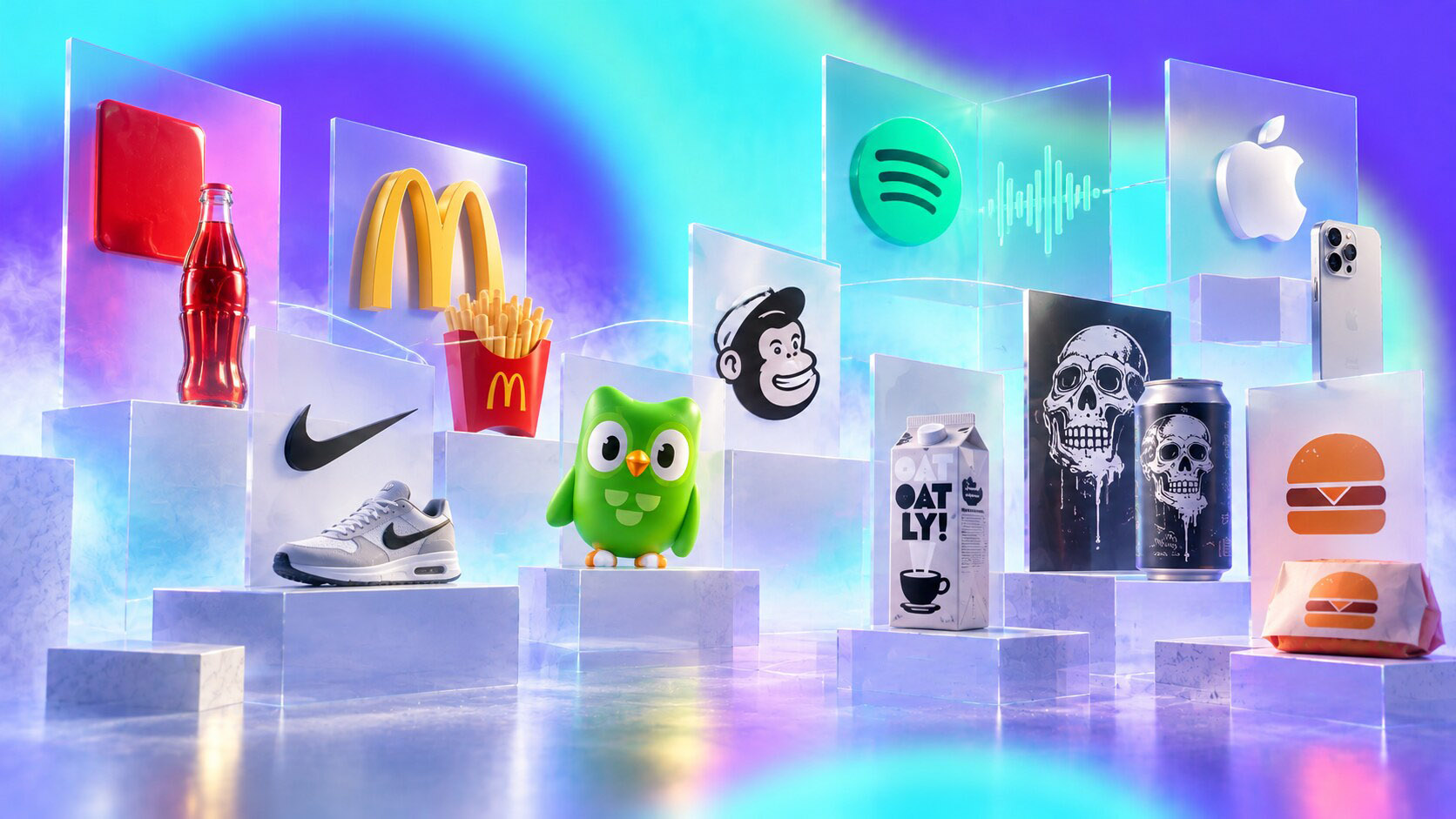
Kantar’s Brand Imprint research makes the same direction practical. In one large study across eight markets, more than 200 brands, 10,500 interviews, and over 1,300 brand cues, the strongest assets worked through clarity, consistency, and communication. Kantar also points to Disney, Coca-Cola, and McDonald’s as brands with very strong imprint because their cues are simple and repeated across many touchpoints.
That does not mean every brand should copy them. It means every brand should ask what it can own.
One hidden branding truth is that distinctive assets often look too simple to justify a large invoice. But that simplicity is exactly why people remember them.
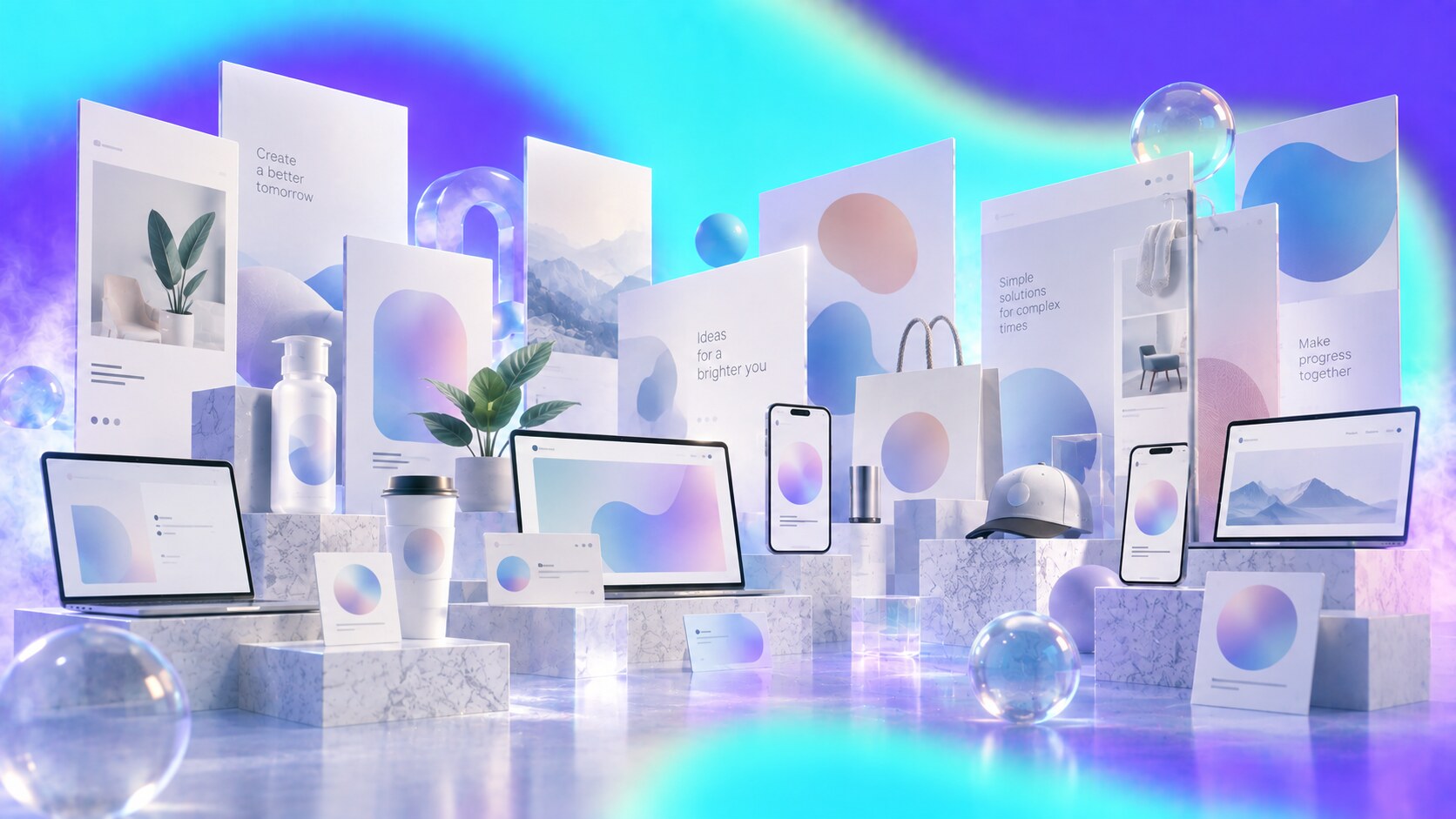
Trendy branding often starts with good intentions.
The client wants to look modern. The designer wants to avoid visual noise. The team wants something clean, flexible, and safe across digital channels.
That can be reasonable.
But too much safety creates a problem: many brands start sharing the same visual grammar.
You know the pattern:
None of these elements are wrong alone. The problem is accumulation. When everyone uses the same solutions, the category becomes visually smooth and mentally weak.
This is why “beautiful” can become dangerous. Beauty often removes friction. But some friction is exactly what makes a brand memorable.
The most dangerous generic branding is not bad. Bad branding is easy to reject. Generic good branding is harder because everyone in the meeting can approve it and nobody outside the meeting remembers it.
Unconventional design is not automatically good.
Random roughness is usually just weak design. But controlled roughness can work when it creates a clear signal.
It works when the visual choice is:
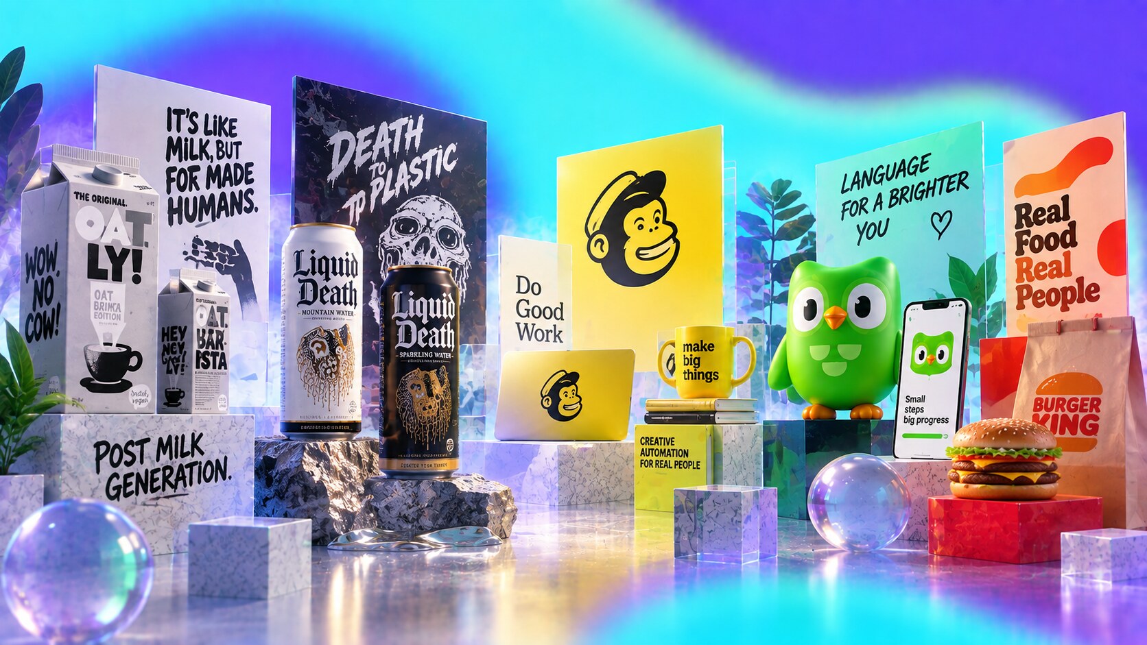
Oatly is a strong example. With Forsman & Bodenfors, the brand treated packaging as media, not just container design. The packaging was text-heavy, awkwardly conversational, and intentionally unlike normal milk packaging. Forsman & Bodenfors reports a 700% increase in demand and a 21% yearly growth rate during the transformation.
Liquid Death is another case. Water is usually clean, pure, light blue, mountain-fresh, and quiet. Liquid Death used tallboy cans, a skull, metal-band energy, and comedy. Founder Mike Cessario has repeatedly explained that the point was to make water entertaining enough to talk about. BeverageDaily reported the brand reached $263 million in retail scanned sales in 2023 and a $1.4 billion valuation in 2024.
These brands are not strange by accident. They are specific by design.
Liquid Death launched attention before product scale. The first viral proof came from people reacting to the idea and the can, which helped the brand earn retailer interest before it behaved like a normal beverage company.
The point is not that rough always beats beautiful.
That would be lazy thinking.
Beauty works very well when it gives the brand clarity, confidence, desire, and trust while preserving ownable codes.
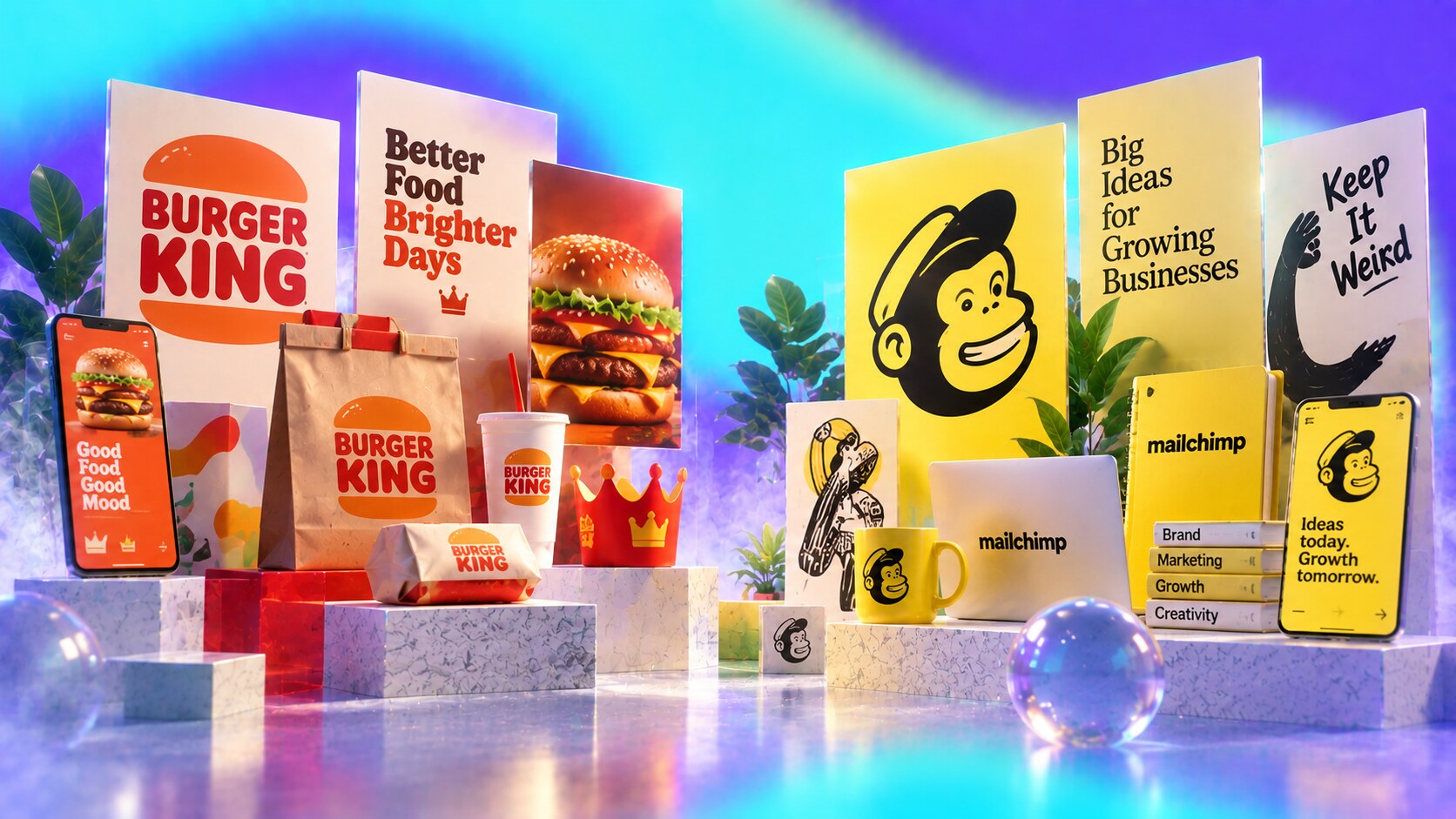
Burger King’s 2021 rebrand by JKR is a good case. It was beautiful, but not generic. It pulled from the brand’s heritage, warmer food cues, rounded typography, flame energy, and an appetite-led system. JKR reports that the rebrand made people want to buy Burger King over McDonald’s by 66% and that Restaurant Brands International stock rose 7.8% around the launch.
Mailchimp’s 2018 identity with COLLINS also shows beauty with strange DNA. The brand kept the weirdness, Freddie, humor, yellow, and expressive illustration while making the system more professional. Mailchimp’s own announcement said the goal was to keep the weird, lovable elements while giving the brand more room to grow.
So the better question is not rough or beautiful.
The better question is: does the beauty make the brand easier to remember, or only easier to approve?

The research direction is fairly consistent.
Ipsos analyzed more than 2,000 pieces of video creative and found that distinctive brand assets are strongly linked to positive branded-attention effects. The key phrase is branded attention. Attention alone is not enough if the audience remembers the joke, image, or influencer but not the brand.
System1’s work on fluent devices is useful too. Their insurance-category analysis says campaigns with fluent devices are 23% more likely to generate very large share gain and 22% more likely to generate very large profit gain effects than average. Their broader consistency work also argues that creative consistency improves long-term brand effects.
Kantar’s BrandZ work adds another useful angle: Difference can be a predictor of share growth. In a study of 1,313 brands over three to four years, Kantar found that brands growing share tended to start with stronger Difference compared with Meaningful and Salient scores.
The simple version:
| What you optimize for | What it can improve | Main risk |
|---|---|---|
| Beauty | trust, desire, premium feel | category sameness |
| Distinctiveness | memory, recognition, attribution | rejection if too random |
| Consistency | fluency, familiarity, compounding effect | boredom if never refreshed |
| Risk | attention, talk value, category disruption | confusion or backlash |
That table explains why the best brands rarely choose only one side. They build distinctive systems with enough craft to be usable.
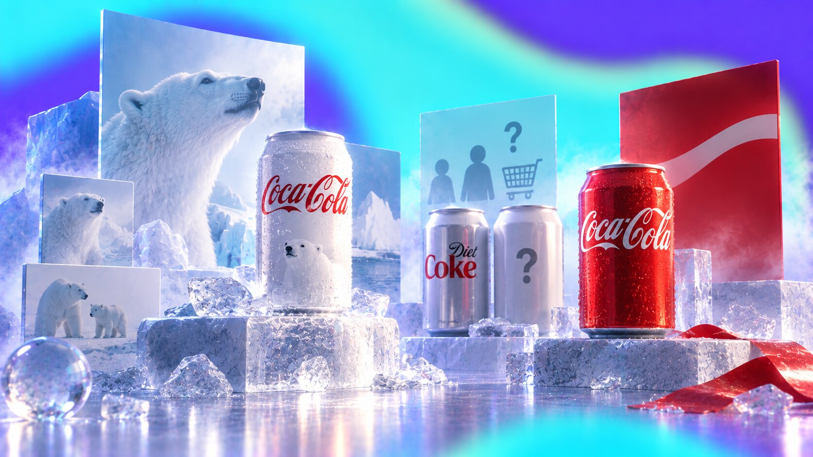
The better warning story is Coca-Cola’s 2011 Arctic Home can.
This was not a lazy redesign. It had a good reason behind it. Coca-Cola partnered with WWF to support polar bear habitat conservation and announced that more than 1.4 billion white cans would replace the familiar red background for the campaign.
Visually, the idea made sense on paper:
But the package collided with a stronger asset: the red Coke can.
Customers started confusing the white regular Coca-Cola can with Diet Coke’s silver-white world. ABC News reported complaints from buyers who thought they had bought Diet Coke, and the Smithsonian notes that consumer complaints pushed Coca-Cola to switch back to the iconic red after about one month.
That is the more interesting lesson. The design was not visually bad. The campaign was not meaningless. The problem was that the new look asked shoppers to ignore one of the strongest beverage packaging shortcuts in the world.
The designer may see red as just a background color. The customer may see it as the product itself.
Modernization becomes dangerous when it treats recognition as clutter.

The original path should not start with the sentence “let’s be crazy.”
It should start with a category audit.
Look at what everyone else is doing:
Then search for the opening.
The best original path often comes from one specific contradiction:
After that, test the idea in real formats before falling in love with it. Put it on a shelf mockup, a social thumbnail, a business card, a homepage, an email header, a delivery box, a tiny app icon, and a bad PowerPoint slide. Strong brand codes survive rough conditions.
One hidden test is the intern test: if a junior person can apply the system badly and it still looks recognizably like the brand, the code is probably strong.
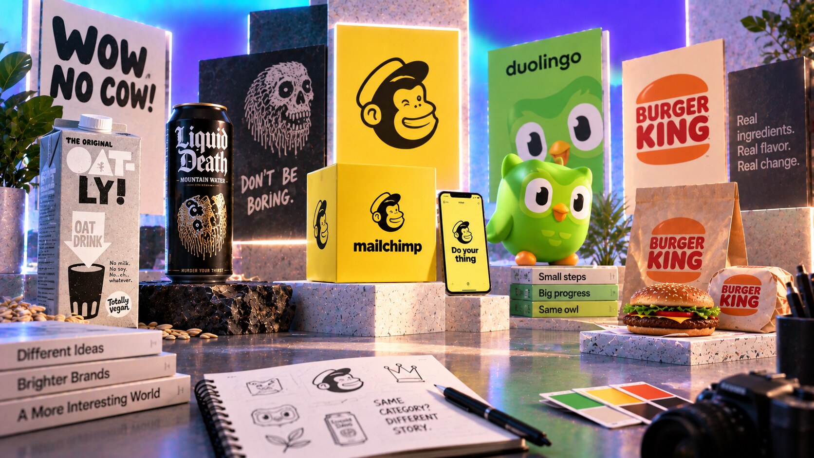
Several brands show how different this can look in practice.
Duolingo uses Duo as a flexible character system. Its own design writing says quirk is key and that all roads lead to Duo. The brand guidelines make the character very specific: helpful, motivating, persistent, emotive, and slightly awkward. That specificity is why the character can travel from app UX into social culture.
Mailchimp kept weirdness when many SaaS brands were becoming clean and blue. COLLINS and the internal team made the brand more systematic without sanding off all personality.
Oatly used packaging copy as advertising. It looked less like perfect FMCG design and more like a brand talking directly from the carton.
Liquid Death made a healthy beverage look like something from a metal show, which gave people a reason to photograph water.
Burger King showed that beauty can still be distinctive when it comes from real brand heritage and appetite, not a generic premium template.
The common thread is not roughness. The common thread is specificity.
These brands chose a memory path instead of only a taste path.
“The opposite of generic is not rough. The opposite of generic is specific.”
Beautiful generic branding can feel safe, modern, and professional.
Bold distinctive branding can feel risky, raw, and uncomfortable.
But performance usually asks a colder question: will people remember this brand and know it was us?
That is where distinctiveness matters.
The best identity systems usually combine:
So do not chase roughness for its own sake. Do not chase beauty for approval either.
Find the strange, clear, useful thing the brand can own. Then repeat it until the market learns it.
News, insights, case studies, and more from the rausr team — straight to your inbox.
Send us your brief, your wildest idea, or just a hello. We’ll season it with curiosity and serve back something fresh, cooked with care.