Branding and Logo Design of 8 Famous Sunglasses Brands
How eight iconic sunglasses brands built their logos, visual identities, and reputations, from heritage aviation marks to sport-performance systems and fashion-led eyewear worlds.

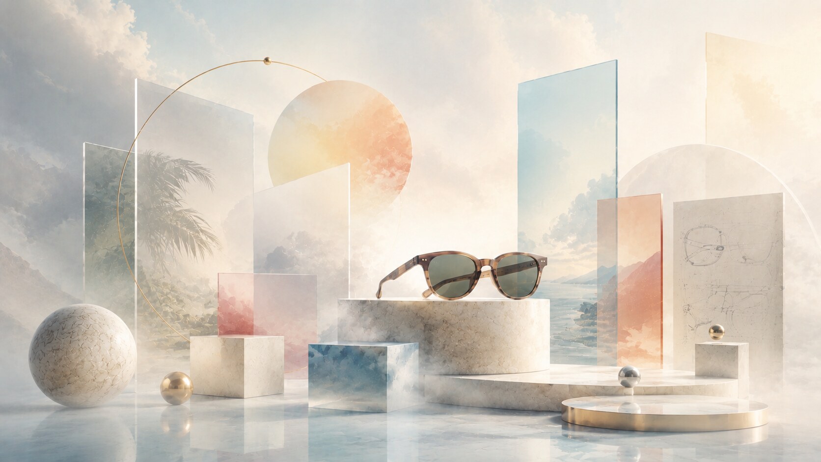
How eight iconic sunglasses brands built their logos, visual identities, and reputations, from heritage aviation marks to sport-performance systems and fashion-led eyewear worlds.
In eyewear, branding has to carry an unusual amount of meaning.
A sunglass brand is not only selling protection from light. It is selling identity, confidence, status, subculture, performance, memory, and often a whole way of seeing the world. That is why the best brands in the field are remembered long before people study the technical differences between their frames.
Some built their power through heritage. Some through sport technology. Some through retail theater. Some through direct-to-consumer simplicity.
What connects them is that their logos and visual systems learned how to support a very specific promise.
This article sits naturally beside How Sunglasses Are Designed: From First Sketch to 3D Model, The Evolution of Adobe Design, and Trend Cycles in Graphic Design.
“A strong sunglasses logo does not only mark a frame. It tells people what kind of personality the frame wants to borrow them.”
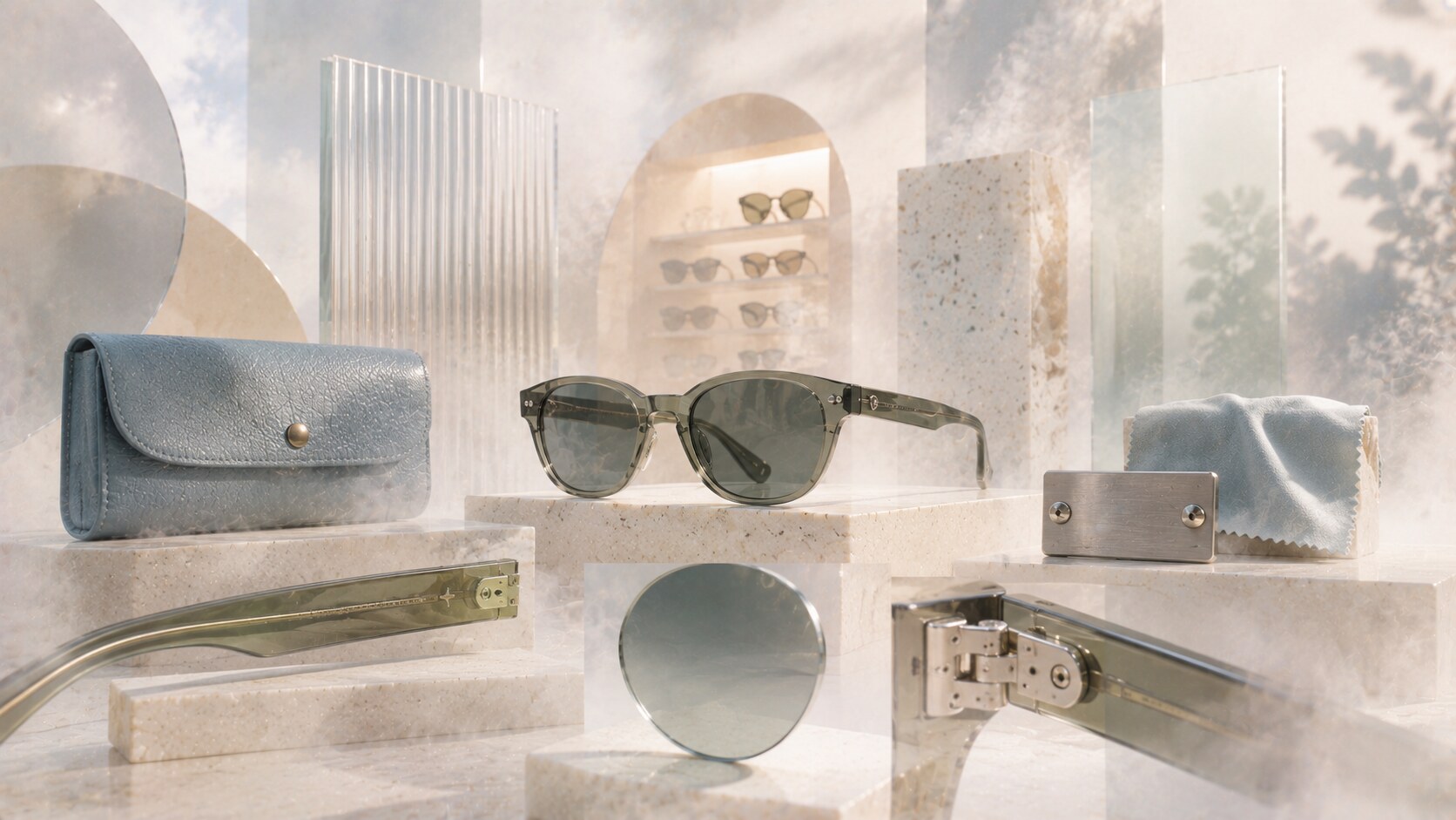
Eyewear identity is small-scale branding under pressure.
Unlike a big beverage can or billboard, sunglasses often carry the brand in miniature:
That means clarity and repetition matter a lot. It also means weak branding gets exposed fast. If the brand cannot survive shrinkage or premium materials, it starts feeling generic.
One hidden truth in this field is that many famous eyewear brands were shaped less by one celebrated outside agency and more by long internal stewardship, product culture, and retail discipline.
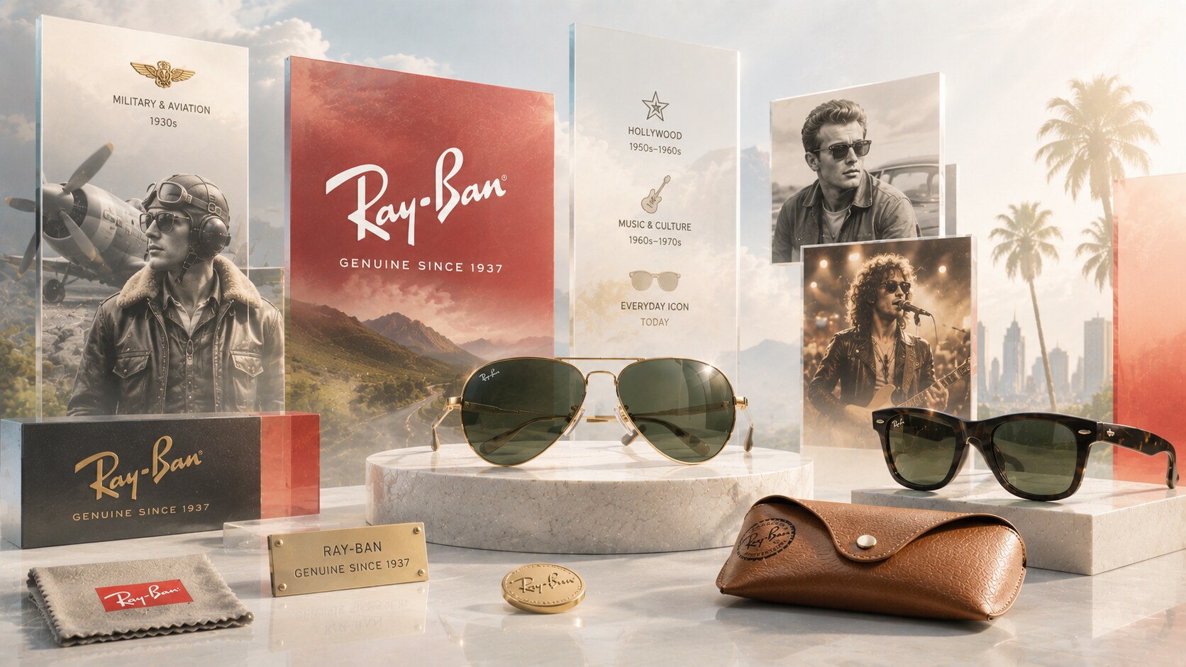
Ray-Ban is still the benchmark for sunglasses branding because its identity is tied to some of the strongest frame archetypes ever made: Aviator, Wayfarer, and Clubmaster.
The logo itself is not complicated. It is a confident script mark with enough movement to feel personal and enough consistency to behave like a stamp of authenticity.
The real brilliance is how the brand built a stable triangle:
EssilorLuxottica’s own brand framing still leans into freedom, culture, and wearables, but the older logic remains visible underneath. Ray-Ban works because the logo never had to perform alone. The frames already did half the work.
Because the brand stayed attached to universally readable shapes.
The name literally means “ray-blocking,” which sounds technical, but the brand’s cultural life ended up far larger than that literal meaning.
Its biggest risk is overexposure. A brand this famous can start to feel obvious rather than special.
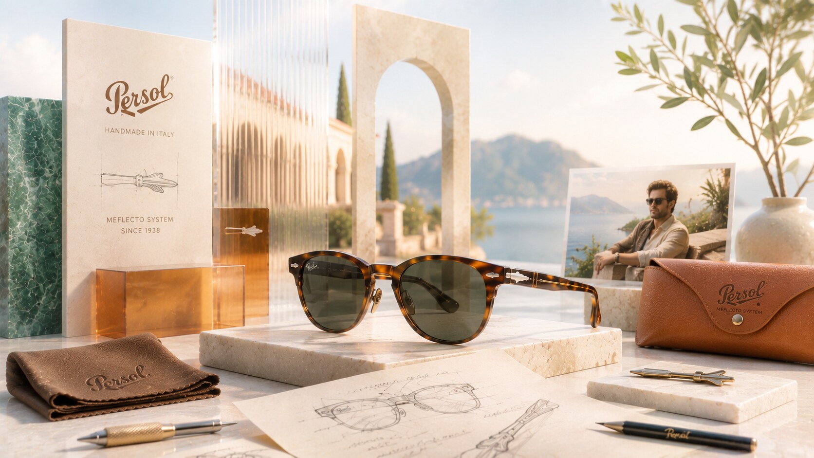
Persol is a very different branding story from Ray-Ban.
Its heritage page makes the central logic clear: hand-built identity, Italian craft, patience, and the smallest details. The logo is restrained, but the silver arrow and Meflecto system became much more emotionally important than loud graphic gestures.
This is why Persol feels premium in a more discreet way. It does not shout performance or youth culture. It signals connoisseurship.
That strategy worked because the brand built meaning through:
Because the brand understood that one signature detail can be stronger than a louder logo.
Too much heritage emphasis can make a brand feel timeless, but also slightly frozen.
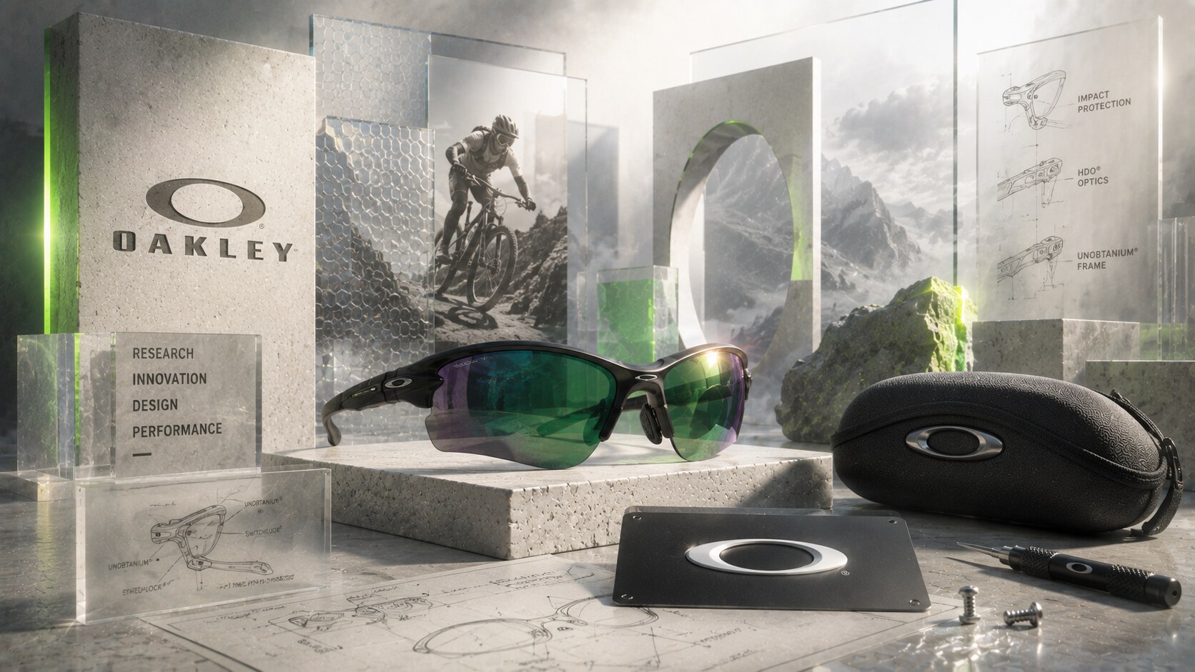
Oakley built one of the most successful performance-brand identities in eyewear.
The company’s own brand material still talks about invention, patents, and a creator-scientist culture. That tone matches the visual system. The O mark behaves less like fashion typography and more like a piece of equipment branding.
This was a smart move because founder Jim Jannard came from a product-obsessed culture, not from classical luxury fashion. Oakley’s early rise through sport and motocross created a different visual promise:
Oakley holds more than 800 patents, which helps explain why the brand identity often feels closer to engineering culture than to ordinary accessory branding.
At times the same performance language can become too aggressive or too locked into a specific era of macho futurism.
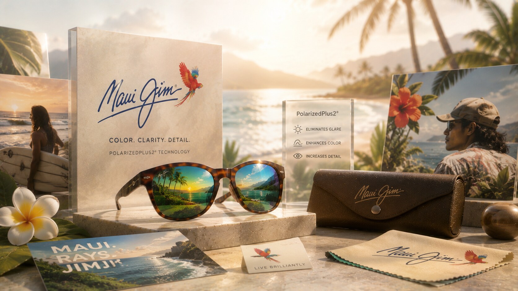
Maui Jim followed a rarer path. Instead of leading with celebrity or fashion mythology, it built the brand around what the lenses do to the world.
Its official story keeps returning to the same promise: brilliant color, glare protection, island light, and the PolarizedPlus2 technology born from conditions in Maui.
That gave the branding a different emotional center:
The logo and color world are not the most radical in eyewear, but they are coherent. The brand knows that the real product hero is the visual experience itself.
Because it turned optical benefit into emotional identity.
Compared with fashion-forward brands, it can look safer and less culturally sharp.
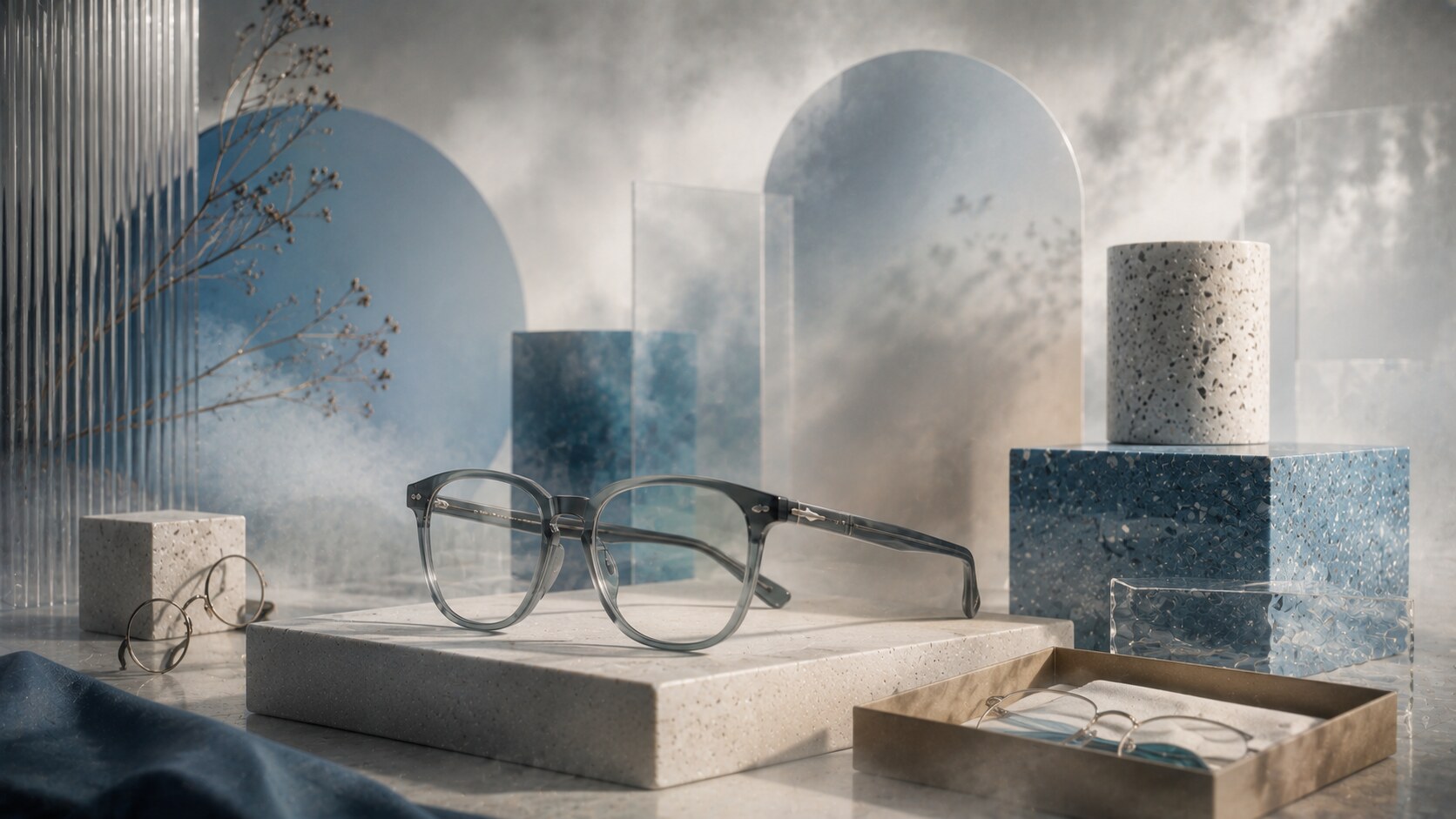
Warby Parker changed the eyewear conversation by rebranding the purchase process itself.
Its history page still frames the founding insight simply: glasses were too expensive. That gave the company a powerful brand position from the beginning. It was not only selling frames. It was selling relief from industry frustration.
The visual identity supported that with:
This was one of the smarter branding moves in modern eyewear because it made affordability feel stylish rather than cheap.
| Signal | Figure | Why it matters |
|---|---|---|
| Team members in 2025 | 4,036 | the brand is now much larger than startup mythology |
| New stores in 2025 | 47 | retail became a major part of identity, not only ecommerce |
| Glasses donated to date | 25 million | the social mission remains part of brand memory |
As the company scales, the brand risks feeling more corporate and less insurgent than it did in the early direct-to-consumer years.
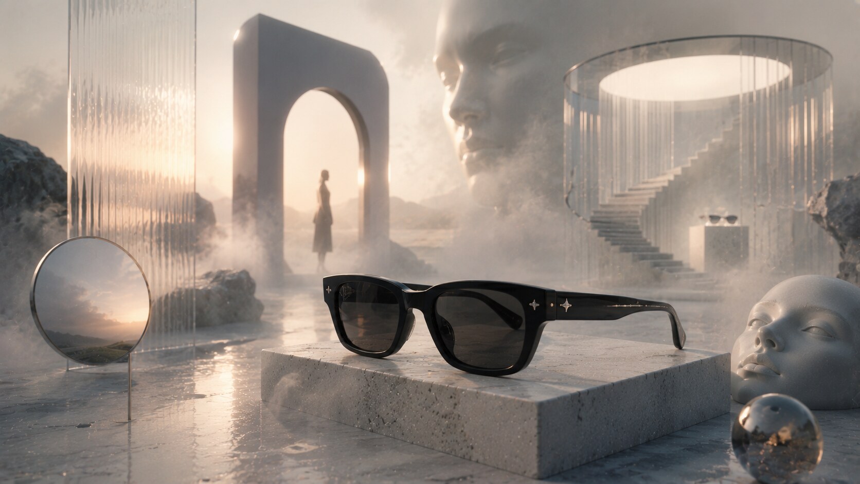
Gentle Monster built one of the most visually distinctive eyewear brands of the last decade by refusing to act like a normal optical company.
Its identity is not driven mainly by a classic logo evolution story. It is driven by atmosphere:
The official stories section makes this obvious. The brand behaves like a cultural platform as much as a product label. The BOLD story is a good example of how collections are given conceptual narratives rather than simple seasonal naming.
Because it made store experience and campaign direction part of the brand itself.
Gentle Monster’s parent is IICOMBINED, which helps explain why the company often feels more like a creative universe builder than a standard frame manufacturer.
When atmosphere becomes too dominant, some customers may remember the world more than the actual frame distinctions.
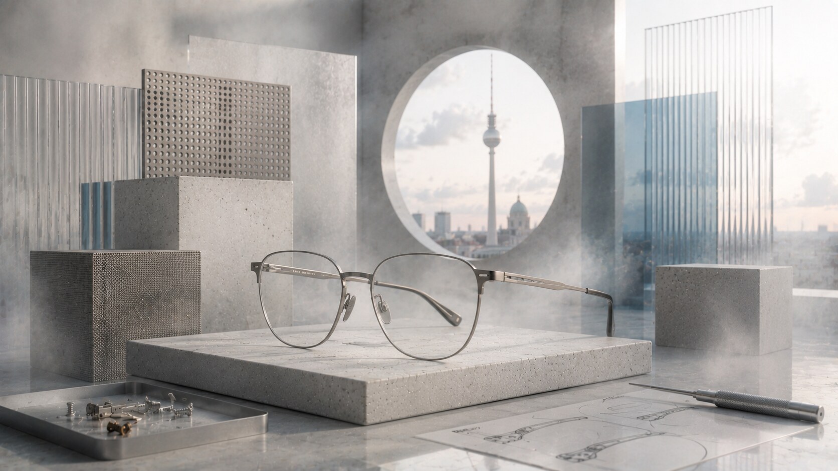
MYKITA represents a design-led eyewear model where understatement is the strategy.
The brand’s identity works because it aligns perfectly with the product story:
This is why MYKITA feels different from Italian heritage brands and from fashion-world spectacle brands. Its logo and visual language do not try to romanticize. They try to signal intelligence and refinement through restraint.
That has been one of its strongest branding decisions. The quieter the presentation, the more the construction details can speak.
This level of restraint can also make the brand feel colder or less emotionally immediate to broader audiences.
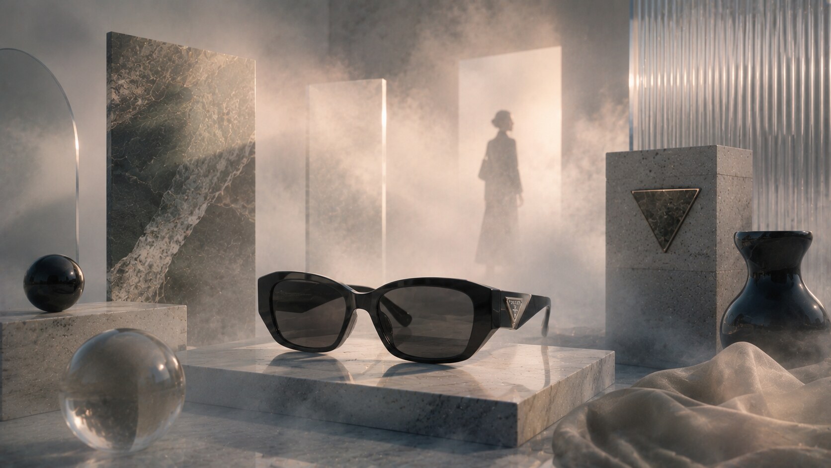
Prada Eyewear is a useful contrast case.
Unlike Maui Jim or Oakley, it does not need to build its full meaning from optical performance or sport heritage. It inherits a strong conceptual fashion identity from the larger Prada brand, whose group language is built around experimentation, structure, and image.
That means the eyewear branding works differently:
This is one reason Prada’s eyewear line has remained influential even when individual frame trends change. The eyewear is not selling itself alone. It is selling access to a much larger cultural code.
When the parent fashion universe is doing most of the work, the eyewear line can sometimes feel less individually authored than standalone eyewear-first brands.
| Brand | Core branding strength | Main risk |
|---|---|---|
| Ray-Ban | archetypal recognition | overexposure |
| Persol | crafted heritage subtlety | feeling too frozen in legacy |
| Oakley | performance identity | dated aggression |
| Maui Jim | color-and-lens promise | safer cultural profile |
| Warby Parker | accessible smartness | loss of insurgent feel |
| Gentle Monster | world-building and theater | product detail overshadowed |
| MYKITA | intelligent restraint | emotional coldness |
| Prada Eyewear | parent-brand authority | less independent eyewear identity |
The comparison makes the central lesson clear. Great eyewear branding is not one formula. It is a tight fit between product logic and cultural promise.
One future clue is already visible across the field: the brands gaining momentum are not only selling frames anymore. They are selling ecosystems of retail experience, digital try-on, collaborations, lens technology, and in some cases wearable tech.
Eyewear branding is moving in several directions at once.
Some brands are becoming more technological through smart glasses and optics partnerships. Some are becoming more theatrical through retail and collaboration culture. Some are becoming more systemized as global portfolios grow.
But the winners will probably keep one old rule alive: people still need to understand the promise quickly.
Ray-Ban still has shapes. Oakley still has performance. Persol still has craft. Gentle Monster still has atmosphere. Warby Parker still has accessibility.
That is why these brands matter. Their logos and brand systems did not become famous by accident. They became famous because each one found a different way to make a frame mean something larger than a frame.
News, insights, case studies, and more from the rausr team — straight to your inbox.
Send us your brief, your wildest idea, or just a hello. We’ll season it with curiosity and serve back something fresh, cooked with care.