Branding for Older vs Younger Generations
How graphic design and branding should change when speaking to Baby Boomers, Gen X, Millennials, Gen Z, and younger audiences without losing the same clear brand core.


How graphic design and branding should change when speaking to Baby Boomers, Gen X, Millennials, Gen Z, and younger audiences without losing the same clear brand core.
Designing for different generations is dangerous when it becomes stereotype.
Older people do not all want beige, calm brochures. Young people do not all want chaotic TikTok energy. Millennials are not one single taste group either.
But age still matters because people grow up inside different media systems, economic pressures, technology habits, and cultural references. Those things shape how they read brands.
The main graphic story is often the same:
The difference is how quickly the audience expects that story to move, how much proof they need, which visual codes feel natural, and which codes feel fake.
This article sits naturally beside Branding Codes That Stick, How Graphic Design Boosts Ecommerce Sales, and Beginner vs Professional Graphic Designer.
“Generational design is not about changing the truth of the brand. It is about changing the door through which people enter that truth.”

Generational language is helpful only when it stays modest.
Pew Research Center treats generations as broad cultural groupings, not perfect scientific boxes. Baby Boomers are commonly placed around 1946 to 1964, Gen X around 1965 to 1980, and Millennials after 1980 in Pew’s older demographic framework. Gen Z is usually described by research firms as people born from the late 1990s into the early 2010s, though exact borders vary.
That already tells us something important: the border is blurry.
A 58-year-old executive and a 72-year-old retiree may both be called “older audience” in a campaign, but they may not behave the same. A 17-year-old student and a 29-year-old parent may both sit under Gen Z in some reports, but their design needs can be very different.
So the smart designer uses generation as a starting lens, then checks:
Many weak campaigns fail because the team designs for an imagined generation, not for a real situation.

For older audiences, the design should not become childish or dull.
That is a common mistake.
The stronger approach is respectful clarity. Older adults often respond well when the design feels organized, readable, stable, and honest. Nielsen Norman Group’s older-adult usability research keeps returning to practical issues: small type, low contrast, tiny tap targets, unforgiving forms, and confusing error messages create real barriers.
Those problems do not only affect seniors. Younger users dislike them too. But for older users, the cost is higher.
In graphic design, this usually means:
The emotional layer matters too. Older generations often carry stronger memory of brands through TV, print, retail experience, and personal recommendation. GWI’s 2026 brand discovery data says Baby Boomers are especially likely to discover brands through TV and word of mouth.
That means visual trust signals still matter deeply: history, testimonials, visible service, guarantees, and a tone that does not feel like it is chasing youth culture too hard.
The biggest mistake is confusing “older” with “outdated.” A mature audience still recognizes bad design. They just have less patience for design that makes the job harder.
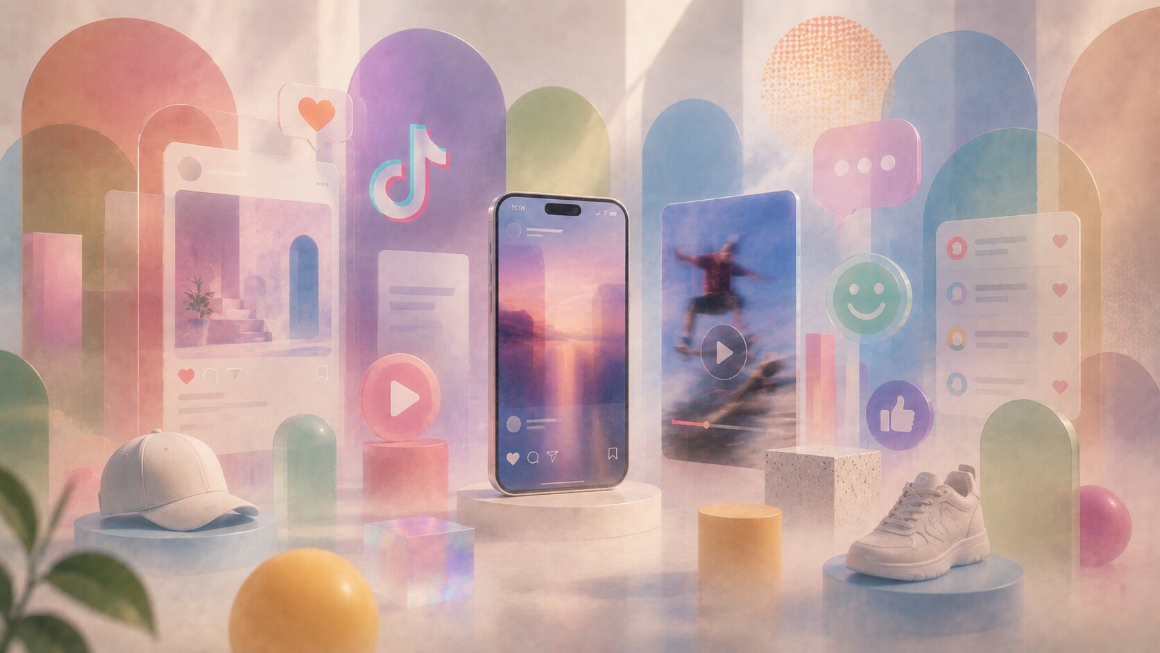
Gen Z and younger audiences grew up with branding everywhere.
They see brand behavior in feeds, comments, creator sponsorships, screenshots, memes, reviews, resale platforms, and AI summaries. They are not only seeing the official campaign. They are seeing the campaign plus the public reaction to it.
That changes the design task.
Younger audiences often read brands through:
GWI’s Gen Z reporting describes this group as mobile, creator-aware, and active in social product research. YouGov’s 2025 data also points to something useful: Gen Z says honesty, trustworthiness, and consistency are more important than brands simply being funny.
That is a good warning for designers. Youth branding is not just weird typography and loud color. If the substance is weak, the style can make the brand look even more fake.
Many young audiences can read design references faster than a brand team expects. A “Gen Z style” that was fresh six months ago can already feel like a template by the time a slow corporate campaign launches.

Millennials are interesting because many of them remember an analogue childhood and live a digital adult life.
They can understand:
That makes them flexible, but also harder to impress.
They have seen many branding cycles already: skeuomorphic interfaces, hipster craft branding, flat startup design, wellness minimalism, brutalist web references, Y2K returns, and AI-polished sameness.
For Millennials, performance often comes from balance. They usually do not need the design to explain the internet, but they also may not want the brand to behave like a teenager in a comment section.
The stronger direction is often:
One hidden Millennial detail is that nostalgia works strongly here, but only when it feels specific. A vague “retro mood” is weaker than a precise memory: early web buttons, old packaging codes, school-era typography, game menus, or local cultural references.

The best way to think about this is not “old design” versus “young design.”
Think in layers.
The first layer is the same for everyone: what the brand offers and why it matters.
The second and third layers change by audience:
| Audience | Secondary proof | Tertiary signals |
|---|---|---|
| Older generations | reliability, service, guarantees, expertise | phone support, readable details, testimonials |
| Gen X | practical value, competence, time saving | search visibility, comparison logic, direct offers |
| Millennials | lifestyle fit, quality, purpose, convenience | reviews, origin story, transparent pricing |
| Gen Z and younger | identity, authenticity, creator proof, social meaning | comments, short video, shareability, ethical consistency |
This table is simplified, but useful.
The mistake is changing the entire brand for every age group. That creates fragmentation. The better move is to keep the core stable and change the supporting evidence.
The main headline may be almost identical across generations. The difference is often what sits below it, beside it, after it, and behind it.

Typography is where generational targeting becomes visible very fast.
Older audiences usually need better reading comfort:
Younger audiences may accept more expressive type, compressed layouts, variable fonts, animated lettering, and rougher visual texture. But even there, the main buying or action path must remain clear.
This is one of the cleanest professional rules: expressive typography belongs where expression helps the message. Functional typography belongs where decisions are made.
For example, a Gen Z fashion campaign can use unstable display type in a hero visual. But the product size, price, delivery date, and return rule should not become a decoding game.
Designers sometimes use accessibility only when targeting seniors. That is weak thinking. Accessibility is a base quality layer. Style comes after that.

A young designer can absolutely design well for older audiences.
But not by guessing.
The trap is designing from personal normality. If the designer lives inside short video, dark-mode apps, fast gestures, and trend language, they may accidentally make older-audience design feel like a locked room.
The practical fix is direct research:
Older people often do not complain in the language of design. They say things like “I do not know where to click,” “I cannot read this,” or “I do not trust this page.” Those sentences are design feedback.
The designer’s job is to translate them into hierarchy, contrast, copy, spacing, and proof.

Older designers can also design excellently for younger audiences.
Their risk is different.
They may understand strategy, hierarchy, and craft very well, but misunderstand the speed of cultural reading. They may see a visual trend as a style pack, while the younger audience reads it as a social signal with context, irony, and timing.
Youth design fails when it only borrows surface:
The solution is not to pretend to be young. The solution is to build the work with people close to the culture, study the platform behavior honestly, and respect the audience’s ability to detect theatre.
McKinsey’s consumer research is useful here because it keeps showing nuance: Gen Z is gaining spending power, but also carrying financial pressure. Deloitte’s 2025 survey says many Gen Zs and Millennials are focused on money, meaning, and well-being at the same time. That is not a cartoon youth audience. That is a serious audience with fast media habits.
Sometimes the oldest person in the room protects youth branding from looking childish, because they can separate a strong idea from temporary style noise. The problem is not age. The problem is distance from the audience.

The highest-performing generational branding is rarely a total redesign for each group.
It is more often one stable system with controlled variation.
The shared core should include:
The variable parts can include channel rhythm, imagery style, caption density, proof order, motion, format, and how much cultural reference is allowed.
Pew’s 2025 social media data shows why this matters. In the U.S., YouTube reaches broadly across age groups, while Instagram, TikTok, Reddit, and Snapchat skew much younger. Facebook still reaches older adults strongly. So the same brand story may need a calmer Facebook post, a proof-heavy landing page, a faster TikTok edit, a searchable FAQ, and a printable local flyer.
That does not mean the brand has five personalities. It means the brand has one personality with different manners.
“Good age targeting does not ask: how do we make this look old or young? It asks: what does this audience need to believe next?”
Older audiences often need more readability, more trust, and more direct proof.
Younger audiences often need faster rhythm, stronger authenticity, and design that can survive public social reading.
Millennials often sit between both worlds, carrying nostalgia, digital fluency, and strong sensitivity to generic branding.
But the deepest rule is the same for all of them:
The best generational design does not talk down to anyone. It simply meets people where their eyes, habits, memories, and doubts already are.
News, insights, case studies, and more from the rausr team — straight to your inbox.
Send us your brief, your wildest idea, or just a hello. We’ll season it with curiosity and serve back something fresh, cooked with care.