Choosing the Optimal Monitor Setup for Graphic Design
What size actually works best, when one display is enough, why EIZO still matters, and where ergonomics and color trust start to change the setup.

What size actually works best, when one display is enough, why EIZO still matters, and where ergonomics and color trust start to change the setup.
Graphic designers often ask the monitor question in a very hardware-shaped way.
They ask:
Those are good questions, but the best answer depends less on abstract specs and more on the kind of work you do all day.
A monitor setup for graphic design has to solve several problems at once. It has to give enough room for tools and documents, enough clarity for type and image work, enough color trust for serious decisions, and enough ergonomic comfort that your neck, eyes, and shoulders do not start paying for the setup a few months later.
That is why there is no single perfect answer. There is only a setup that matches your workflow honestly.
This article continues naturally from Monitor Resolution in Graphic Design, The Role of Display Quality in Graphic Design, and How to Choose an Optimal Computer for Graphic Design.
“The best monitor setup is not the one with the most screen area. It is the one that lets you work and think longer with less visual and physical resistance.”
One strong display is still a completely serious setup for many designers.
If your work is mostly:
then one good monitor can often feel better than two mediocre ones.
A single display reduces head turning, keeps your main canvas central, and simplifies color consistency. It also removes one of the quiet problems of dual-monitor setups: one screen often becomes the “real” screen while the other becomes a slightly wrong companion with different brightness, contrast, or color behavior.
This is why many designers are happiest with one well-calibrated 27-inch or 32-inch monitor plus virtual desktops, app switching, and disciplined workspace organization.
That said, one monitor stops being enough when your workflow constantly requires multiple full-size references at once. Long editorial layouts, design-plus-browser testing, Figma plus documentation, After Effects plus assets, or 3D plus texture tools can all make a second display feel less like luxury and more like relief.
Unknown but useful truth: a lot of people buy a second monitor to solve a space problem that is really a window-management problem. If your first screen is too small or too soft, adding another weak screen may only spread the discomfort wider.

Two monitors are most useful when the screens have clearly different roles.
The healthiest dual setup for many designers is:
That is much better than trying to make two mismatched displays behave like one seamless canvas.
Dual monitors often help most in:
But there is a tradeoff. The more time you spend turning your head sideways, the more your setup becomes a physical system, not just a visual one. A second display that sits too high, too far away, or at the wrong angle can quietly damage comfort even while improving “productivity.”
This is why a vertical side display, or a smaller side monitor used only for supporting tasks, often works better than two equally dominant screens.
“The best second monitor is often the one that makes the first monitor easier to trust.”
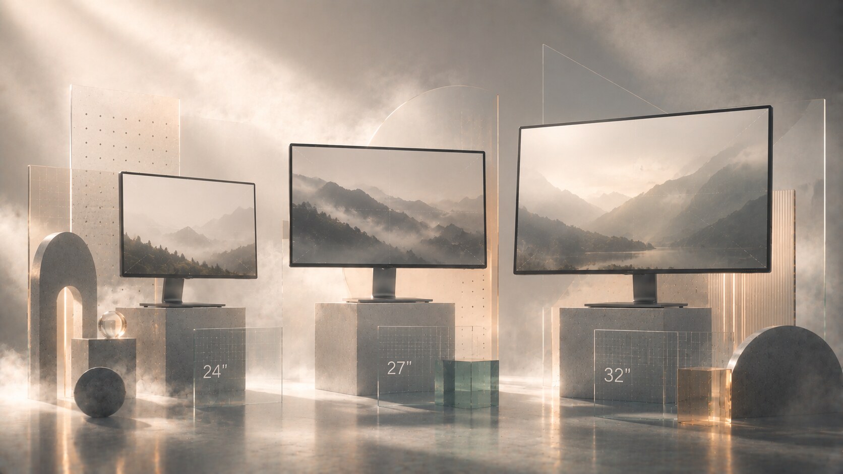
The most common sweet spots today are still very predictable:
For many graphic designers, 27 inches remains the safest answer. It is large enough to feel generous, small enough to keep the full screen inside a comfortable field of view, and available in many strong 1440p, 4K, and 5K-class options.
32 inches can be excellent too, especially for one-monitor users who want more space (eveything can be larger). But it changes the posture of the setup. If the desk is shallow or the monitor is too close, the screen starts feeling less like one surface and more like a wall you scan.
24-inch class displays are still valid, especially in color-critical or budget-conscious setups, but they feel tighter for modern multi-app work.
The real answer depends on distance:
This is one of those areas where “bigger” is often overrated. A better-sized monitor usually beats an oversized one.
Virtual desktops are underrated by many designers because they solve clutter without creating more hardware.
They work especially well when your day moves in stages:
In that kind of workflow, virtual desktops can feel cleaner than dual monitors because they preserve focus. Instead of everything being visible at once, only the relevant environment stays in front of you.
They are less ideal when your process depends on constant side-by-side comparison. If you are repeatedly dragging visual decisions against live code, live browser previews, or multiple long-form documents, physical screens can still be more efficient.
So the real dividing line is simple:
That is why some of the cleanest designer desks now use one excellent monitor and strong workspace habits instead of building a small control room.
Useful hidden point: virtual desktops also preserve color consistency. One accurate display is easier to calibrate, easier to light properly, and easier to trust than two or three different panels.
EIZO became a serious name in graphic design for reasons that are still relevant, not nostalgic.
What the brand sells is not just “a nice display.” It sells a display system built around:
That matters a lot in print design, photography, retouching, prepress, and any workflow where color trust is expensive to lose.
This is why EIZO still carries weight even when other brands may offer sharper-looking screens, flashier industrial design, or better value for general digital work.
But EIZO is not automatically the right choice for everyone.
If your work is mostly:
then a strong BenQ DesignVue, ASUS ProArt, Dell UltraSharp, or Apple Studio Display-class screen may already be enough.
The premium starts making sense when the monitor is acting less like a nice window and more like a measuring instrument.
“EIZO is worth it when color error costs more than the monitor premium.”
The big change does not happen at one magical price. It happens when the display stops being a general-purpose office monitor and starts becoming a monitor made for color-managed work.
That jump usually includes some combination of:
This is why many designers feel a real difference not between cheap and expensive in the abstract, but between:
That middle zone is where many modern designers should look first. It is often the best value layer in the market because it brings most of the meaningful improvement without immediately jumping to full reference-grade pricing.
The premium end changes the logic again. At that level, you are paying less for “nicer screen” and more for trust, calibration workflow, uniformity, warranty confidence, and reduced doubt.
So yes, there is a threshold where things change, but it is really a feature threshold, not a mystical price threshold.
A designer can buy a beautiful monitor and still build a bad setup around it.
The physical basics still matter:
The same goes for long-session comfort. Many monitor brands now talk about low blue light, flicker-free design, or eye-care certification. Those features can be useful, especially when they reduce harshness in long reading sessions, but they should not be treated like magic health solutions.
The more practical question is:
That last point is underrated. A good monitor in a bad lighting environment becomes a worse tool very quickly.
One of the least glamorous but most valuable monitor upgrades is often not the panel itself, but a proper arm, better desk depth, and controlled ambient light behind or around the display.
The student, the freelance brand designer, and the color-critical retoucher usually do not need the same setup.
Three realistic paths look like this:
That is another reason these conversations go wrong. People talk as if every designer is shopping for the same outcome, but the category is really several workflows hiding under one job title.
For many graphic designers, the safest answer is still one very good monitor before two average ones.
The rest depends on the work:
The smartest setup is usually not the most dramatic one. It is the one that makes your design decisions clearer, your posture calmer, and your day less interrupted.
That is where monitor setup stops being gear obsession and starts becoming part of design practice.
“A good design display does not only show the work. It quietly removes excuses, second-guessing, and fatigue from the process around the work.”
News, insights, case studies, and more from the rausr team — straight to your inbox.
Send us your brief, your wildest idea, or just a hello. We’ll season it with curiosity and serve back something fresh, cooked with care.