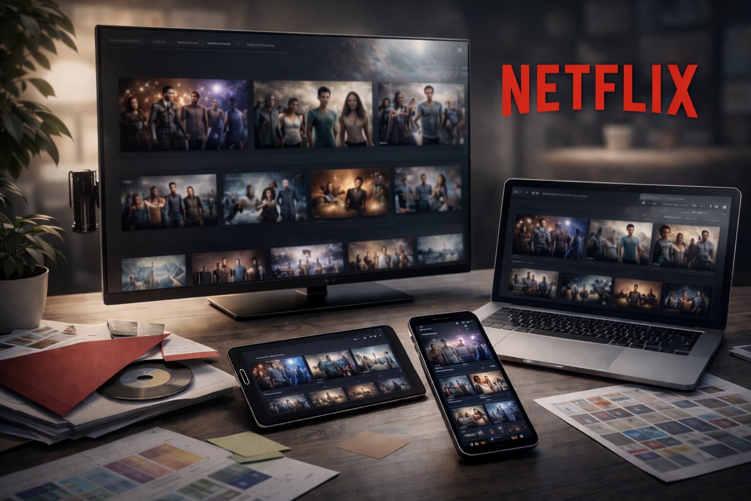
Netflix didn’t “design an app” — it designed a decision engine
Most companies treat UI as a frame around the product.
Netflix treats UI as part of the product.
Because the real Netflix problem isn’t video delivery anymore. It’s choice.
On TV, the distance is long and the input is slow. On mobile, the session is short and the context is chaotic. On the web, the viewer is multitasking. In every case, the job is the same: help a human decide what to watch before they leave.
That’s why Netflix’s design evolution is unusual. The brand (red, black, “N”) is only the skin. The deeper shift is this:
Netflix turned artwork, layout, and language into testable, changeable components of recommendation.
“Artwork is the first instance of personalizing not just what we recommend but also how we recommend.”
This article tracks that evolution: how it began, who shaped the identity, how Netflix tests UX/UI, where it failed and where it succeeded, how “covers” are produced and localized, and what path seems next.
If you’re into research-style UX articles: browse ux ui.
The beginning
The DVD era trained Netflix to solve discovery, not delivery
Netflix began as a DVD-by-mail service, but its hardest problem was never packaging or shipping. It was helping people pick. A catalog is only valuable if it can be navigated without fatigue, and the DVD era forced Netflix to build habits around search, browsing, trust, and commitment.
That early phase matters because it reveals a constant Netflix truth: the “experience” is not the player. The experience is the set of decisions that gets you to play.
Streaming didn’t invent that problem. It amplified it. When “availability” becomes instant, friction moves from delivery to decision.
“Streaming removed the waiting. Design had to remove the hesitation.”

Netflix optimized for remote control and weak attention
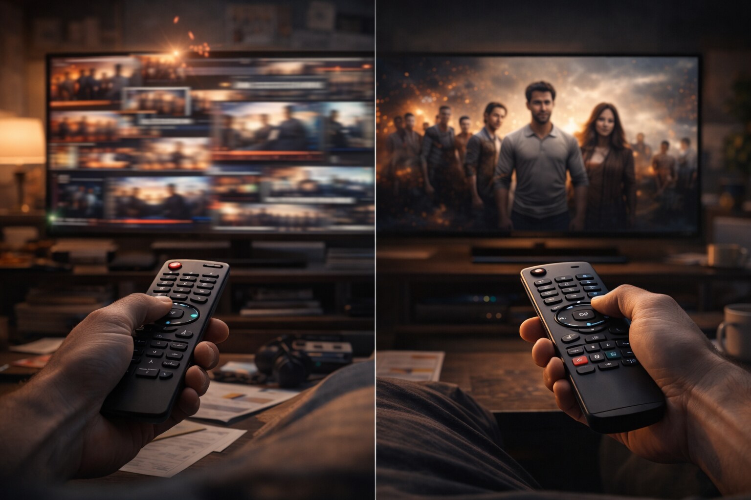
When streaming became mainstream, Netflix’s UI was shaped by one dominant surface: the television. TV UX has brutal constraints: limited input, long viewing distance, and an environment where people are already tired.
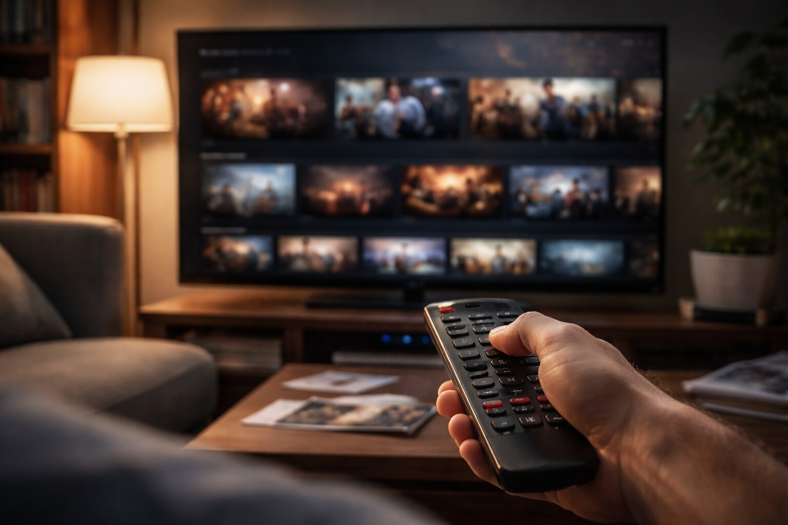
Netflix’s answer was not a complicated navigation tree. It was a continuous storefront built from rows: continuation, editorial curation, genre clusters, and personalized selections living side by side. Rows look simple, but they do a lot of work. They let Netflix adjust the “front door” without restructuring the entire product. They also make discovery feel endless without forcing the user to understand an information architecture.
Here’s a useful way to read the design: Netflix doesn’t try to show you the catalog. It tries to show you enough of the catalog to keep you moving.
| Constraint | What Netflix design tends to do |
|---|
| Slow input (TV remote) | reduce decisions per step, keep actions predictable |
| Long distance viewing | prioritize big shapes and scanning, avoid fragile detail |
| Decision fatigue | repeat safe patterns and familiar labels |
| Endless library | present “slices” instead of full category trees |
This is where Netflix quietly influenced an entire industry. Streaming interfaces became less like libraries and more like adaptive storefronts.
Design takeaway: the “row” is not a layout choice — it’s a navigation strategy that hides complexity.
Brand becomes infrastructure
A global identity system designed for constant change
As Netflix expanded globally, brand consistency had to survive an impossible situation: thousands of titles, countless devices, continuous product iteration, and an interface that is never “final.”
Gretel, a Brooklyn-based design studio known for bold visual systems and cultural storytelling, led the rebrand. Their work on Netflix’s global brand system describes “The Stack” — a system built from uniformly sized, stack-like cards that represent the living catalog and curated selections. What’s notable is the output: not only a look, but a toolkit meant to be executed by many teams at speed. This era also introduced Netflix’s first tagline: “See What’s Next.”
The famous “N” matters here because it behaves like a functional UI component. It’s legible at tiny sizes, it works as an app icon, and it acts as a consistent stamp across product and marketing.
This is a Netflix pattern: design decisions are made to survive scaling. Brand is not decoration. Brand is a stability layer in a product that changes constantly.
“If an identity can’t be shipped by hundreds of people, it isn’t an identity — it’s a poster.”
Typography as a systems decision
One typeface, many devices, many languages
Netflix Sans is often described as a branding move, but it’s better understood as an operational move. Dalton Maag’s portfolio frames it as a custom type family designed to unify typography across marketing and product. The language detail is easy to miss but revealing: Netflix Sans was designed with broad coverage (including Latin and Vietnamese extension, plus Greek and Cyrillic) and support for 120+ languages.
This matters for UX more than for aesthetics. Typography is where layout and language collide. A predictable type system reduces edge cases, improves legibility, and gives teams a common foundation for UI labels, title treatments, promotional text, and localized metadata.

The “cover” becomes a product surface
Artwork is evidence, not decoration
Netflix’s artwork is not only marketing, it is the first decision point in the product. The thumbnail is a promise about tone, genre, and emotional payoff. If that promise is repeatedly broken, members don’t just dislike one title — they distrust the interface.
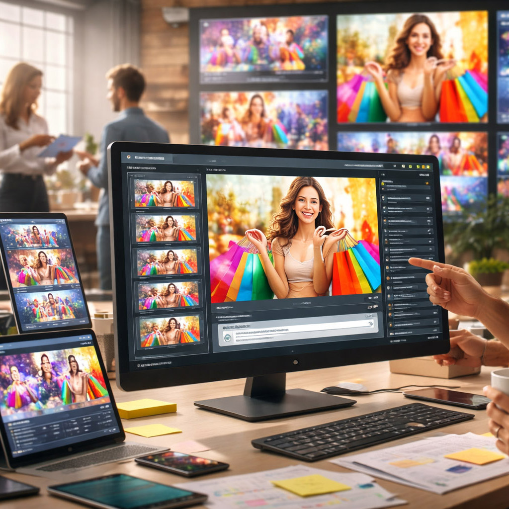
Netflix’s partner artwork guidelines make the philosophy explicit: artwork must be authentic to the title, because trust is part of retention. At the same time, those guidelines also acknowledge the practical reality of discovery: teams create multiple artwork versions to express different facets of a title so different audiences can connect for the right reasons.
The less obvious part is how much logistics goes into it. Netflix engineers talk about giving each piece of artwork a stable ID because the images keep changing: new crops, fresh title treatments, higher-resolution files, and different aspect ratios for phones, TVs, and browsers. Public technical posts explain that those related versions are grouped into a family or lineage so experiments and insights stay valid even when creatives swap one asset for another.
That detail is a good example of Netflix’s design maturity: it treats creative output as dynamic, and it builds infrastructure to manage it.
If you’ve ever felt “thumbnails are just marketing”, Netflix is the counterexample: artwork is part of the recommendation interface.
Who makes the images, the text, and the UI?
In-house direction, external production, regional execution
People often ask if Netflix’s covers are made by internal designers, interns, or remote teams. The real answer is less dramatic and more scalable: Netflix operates a distributed pipeline.
Internally, teams define what “good” means in product terms (reduce indecision, increase satisfaction, avoid regret), plus the constraints that protect consistency (formats, safe areas, typography rules, localization requirements, and review checks). Externally, specialized agencies and production partners can generate large suites of assets at the pace Netflix requires. Regionally, localization and market knowledge shape how titles, metadata, and presentation behave in culture and language.
This structure is not a compromise. It’s the only viable model at Netflix scale. And it changes what design leadership looks like: leadership becomes toolkits, specs, review loops, and decision rules — not one person controlling everything.
“At global scale, “design consistency” is less about taste and more about tooling.”

UX/UI testing
The product ships as a series of controlled hypotheses
Netflix is famous for experimentation, but the less-known part is how productized it is. Netflix engineering describes an internal experimentation platform referred to publicly as XP, and an experimentation UI used to configure and analyze tests often referred to publicly as ABlaze.
That changes how design decisions are made. Netflix can test outcomes of choices that other companies treat as “taste.” The question is rarely “does it look better?” and more often “does it reduce drop-off, decrease searching loops, or improve satisfaction over time?”
The strongest Netflix-style experiments tend to focus on tensions that can damage trust if you optimize too aggressively:
| Tension | Typical design risk | What Netflix tries to protect |
|---|
| engagement vs control | pushy features that feel manipulative | autonomy and confidence |
| personalization vs transparency | “why am I seeing this?” discomfort | explainability and trust |
| click vs satisfaction | bait-like packaging | expectation matching |
The point is not a specific metric. The point is the philosophy: design is not a debate club. It’s a measurement culture with guardrails.
“In an experimentation culture, design ships as a hypothesis — not a hero asset.”
Localization at scale
Subtitles, dubbing, and reading rules shape the experience
Once Netflix became global, design stopped being “English-first.” Localization isn’t only UI strings. It is timed text (subtitles and SDH), dubbing workflows, delivery specifications, and a lot of rules that affect comprehension.
Netflix publishes detailed timed text style guides and delivery specs for partners. The existence of those documents is itself a design signal. It means Netflix treats reading speed, line breaks, punctuation rules, and accessibility behavior as product quality. A beautiful interface is irrelevant if the story is hard to follow in your language.
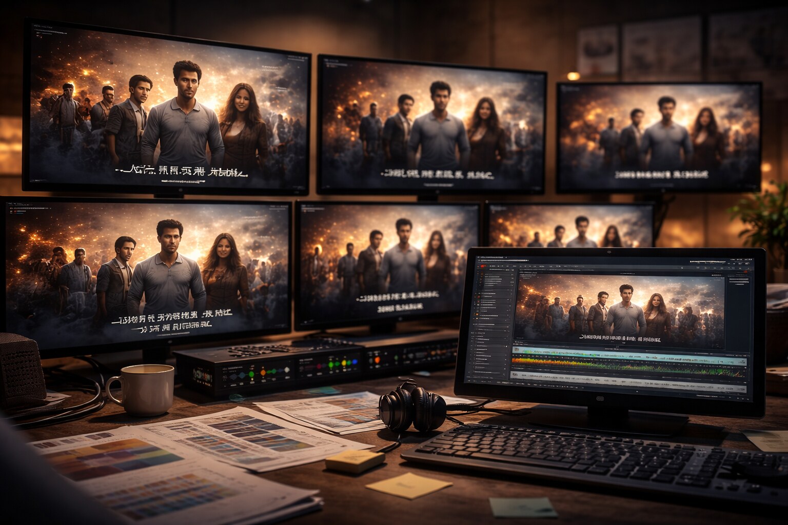
And the moment you localize, “covers” localize too. Title treatments change, typography constraints shift, and what fits in one language may not fit in another. The practical result is that a title is no longer a single image. It’s a controlled family of localized assets.
Underrated UX truth: subtitles are interface. If reading feels hard, the whole product feels hard.
Failures and course corrections
Netflix’s hardest mistakes are usually trust mistakes
Netflix’s design history includes missteps that are instructive because they weren’t “bad UI.” They were moments where optimization fought trust.
Autoplay previews are a classic example of that tension: they can increase short-term engagement, yet make the experience feel noisy and less controllable. Another failure pattern is expectation mismatch: if artwork is optimized purely for clicks, the platform begins to feel like bait. Netflix’s own partner guidelines repeatedly point back to authenticity for a reason.
And then there are structural mistakes where UI can’t help. The Qwikster era remains a reminder that product structure and naming decisions can break trust faster than any interface detail can repair it.
Netflix’s best corrections tend to return to the same center: clarity, control, and confidence.
“A thumbnail is a promise. Break it often enough, and the UI loses authority.”
The new path
The future Netflix UI may be quieter, not louder
If Netflix keeps following its own logic, the next phase won’t be a single redesign. It will be deeper integration between presentation, explanation, and control.
One direction is contextual packaging. Artwork can already vary, the next step is presentation that adapts to the situation (device, session, time) while staying honest about tone. The “trust line” will matter more than the click line.
Another direction is explanation as a first-class design layer. “Because you watched…” is a hint, not a reason. A clearer visual language for why something is recommended — and why this specific image represents it — could reduce discomfort and increase confidence.
And localization will keep pushing design into systems thinking. More scripts, more nuance, higher accessibility expectations, and more cultural sensitivity all demand tighter coordination between product UI, metadata, timed text, and artwork pipelines.
Netflix’s design evolution suggests a long-term philosophy:
don’t treat design as a layer on top of content.
Treat design as the operating system of choice.
The next frontier isn’t “more personalization”. It’s more legible personalization: clearer reasons, calmer choices, and fewer trust taxes.