Why macOS is still recognizable after 40 years
Most operating systems redesign by replacement: new patterns, new visuals, new rules, then a slow battle to get apps to comply.
macOS is different.
It evolves constantly but maintains a remarkably stable “personality” across decades — from the original Macintosh System Software, through classic Mac OS, the OS X era, and into modern macOS releases.
This article explores the ups and downs of macOS design:
- what its core signature really is (beyond “nice icons”)
- which releases were the most beautiful versus most revolutionary
- what made macOS successful (and sticky)
- where the biggest design challenges still lie
- who shaped the system (and some lesser-known stories behind the UI)
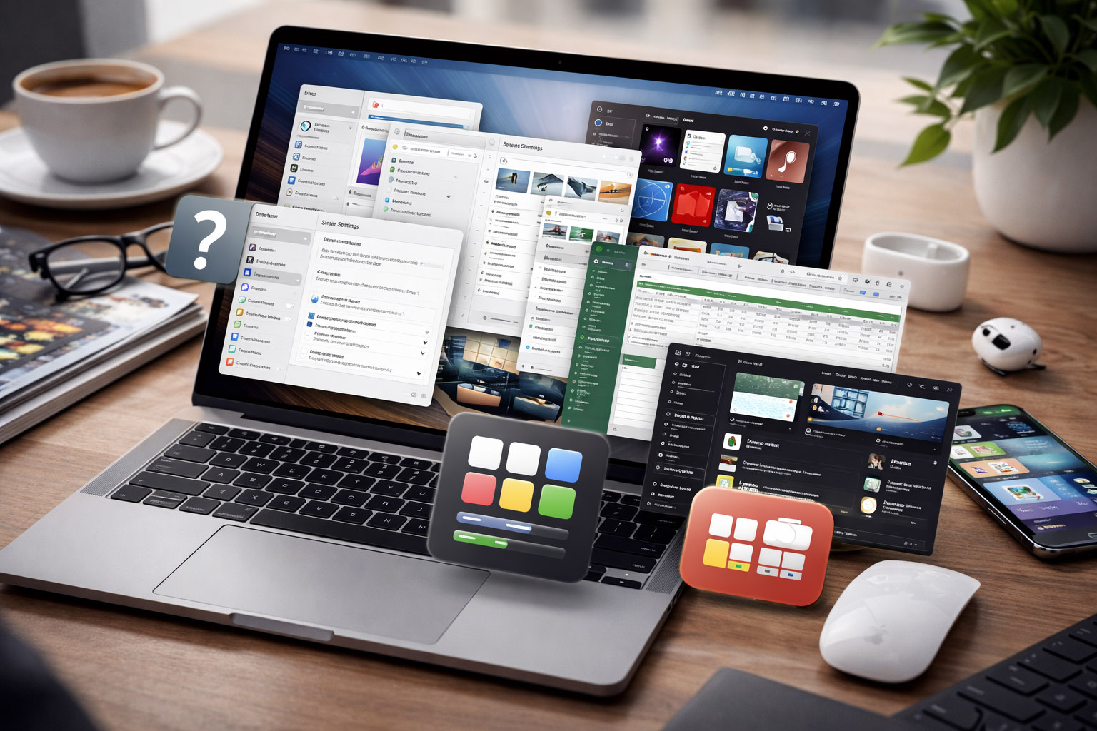
The Prime Signature of macOS (Across All Versions)
When people say “macOS feels premium,” they usually mean its aesthetics.
But the signature runs deeper than gradients, translucency, or icon style.
1) Direct manipulation as the default mental model
The Mac taught users that you can grab things:
- files as objects
- windows as movable, resizable surfaces
- the desktop as a place, not just a list
Even as macOS modernized, that object-based model remained intact.
2) A system-wide obsession with legibility
macOS design is typography-driven:
- long reading sessions matter
- spacing and rhythm are treated as first-class design elements
- the UI strives to stay readable at a glance and under glare
That’s why macOS’s visual style often feels calmer than systems optimized primarily for density.
3) Strong, opinionated consistency (with controlled exceptions)
macOS historically sets clear rules:
- menu bar patterns
- standard dialogs
- keyboard shortcuts consistent across apps
- a predictable window hierarchy
It’s not perfect, but the goal is consistent: teach users once, then reuse that learning everywhere.
Early Mac used clear metaphors (folders, trash, desktop).
OS X (Aqua) introduced “digital material”: shiny, glassy, liquid UI that signaled interactivity.
Modern macOS employs subtle depth, blur, and motion to convey hierarchy without heavy skeuomorphism.
“The macOS signature is not a single aesthetic. It’s a design culture: legibility, predictability, and a bias toward objects you can manipulate.”
The Most Revolutionary macOS Releases
Design-Wise
Revolutionary doesn’t mean “prettiest.” It means the release that changed:
- how people understand the system
- what developers build
- what users expect from interaction
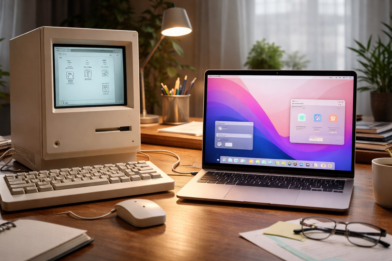
1) The original Macintosh System Software (1984 era)
The Mac’s early UI wasn’t just a new look — it was a new contract.
For many, it was the first time computing felt like:
- icons and windows
- readable menus
- actions that didn’t require memorizing commands
It laid the foundation for everything that followed.
2) Mac OS X 10.0 “Aqua” (2001): the “lickable” era
Aqua was bold — a design statement.
It featured:
- translucency
- glossy controls
- depth cues
- playful color
It also established a modern foundation: Quartz graphics, protected memory, and a UI scalable with hardware.
Unknown insight: early Aqua aimed to make controls look so tangible users would know what’s clickable without manuals. Internally, this sparked an “affordance arms race” — if everything looks clickable, communicating hierarchy becomes harder.
3) OS X 10.4 “Tiger” (2005): Spotlight and the search mindset
Spotlight wasn’t a visual redesign; it was a workflow shift.
It moved the Mac from “navigate folders” to “find instantly.”
Once users embrace system search, the OS becomes less about structure and more about speed.
That’s a psychological design shift, not just a feature.
4) OS X 10.7 “Lion” (2011): the iOS influence arrives
Lion introduced patterns that initially upset some users but later became standard:
- full-screen apps as a default mode
- gesture-first navigation
- Launchpad as an app-centric layer
It marked a pivot toward the laptop trackpad as a primary interface.
5) OS X 10.10 “Yosemite” (2014): the flattening of Mac identity
Yosemite modernized macOS’s visual language with:
- simplified icons
- cleaner surfaces
- a move away from heavy skeuomorphism
For some, it was the moment macOS became “modern.”
For others, it was when it felt “generic.”
Both reactions are valid — it was a real turning point.
6) macOS 11 “Big Sur” (2020): the new shape language
Big Sur redefined:
- icon geometry (more uniform shapes)
- spacing and padding (iOS-like breathing room)
- translucency and layering
- control styling and sidebar-heavy layouts
It also coincided with Apple silicon momentum — a rare moment when software design and platform direction aligned.
The Prettiest macOS Version
And Why This Question Is Hard
“Pretty” in OS design can mean different things:
- beautiful surfaces
- elegant motion
- refined typography
- or subtle restraint
Candidates designers often mention
- Aqua-era OS X (early 10.x): bold, charismatic, unmistakably “Mac”
- Snow Leopard (10.6): quiet polish; design felt stable and confident
- El Capitan / Sierra era: mature OS X visuals before the next big reshaping
- Big Sur / Monterey era: clean, airy, modern depth without heavy decoration
My take: the prettiest versions are usually those where visual language matches system behavior.
When the UI looks calm but the system feels chaotic, it feels dishonest.
When the UI is expressive but interactions are coherent, it feels iconic.
“The prettiest release is often the one where nothing “shouts” — yet everything feels intentional.”
The Success Behind macOS
Design Reasons, Not Just Apple Brand Power
macOS succeeds because it reduces friction in ways users only notice when it’s gone.
1) The menu bar and consistent shortcuts
The menu bar is an underrated design achievement:
- always in the same place
- reduces window chrome complexity
- makes shortcuts system-wide habits
Once learned, that consistency compounds productivity.
2) Finder as a “relationship manager” for files
Finder isn’t just a file browser; it’s a context system:
- previews
- quick actions
- metadata awareness
- search and smart folders
Even when users complain about Finder, they still rely on it as a daily command center.
3) The “hardware-aware UI” effect
macOS benefits from Apple controlling hardware constraints:
- trackpad gestures become primary patterns
- typography tuned to display characteristics
- animations designed with predictable performance budgets
That tight integration makes the UI feel intentional — and intentional feels premium.
Unknown insight: the biggest “design feature” of macOS might be performance consistency. A UI that animates smoothly feels more trustworthy — even if it performs the same tasks as a slower system.
The Biggest Design Issues in macOS
macOS isn’t a flawless design story. Some problems recur across eras.
1) Inconsistent settings and discoverability
Many users struggle to predict where something lives:
- System Settings / Preferences
- app-specific preferences
- hidden menus and “advanced” toggles
Recent redesigns improved some areas but also introduced confusion by changing familiar layouts.
2) UI density vs clarity (and who macOS is for)
Modern macOS often favors spacing and calmness over density.
That helps new users.
But power users sometimes feel the OS “wastes space” — especially on large monitors.
The design tension is real:
- clarity reduces cognitive load
- density reduces mouse travel and scrolling
3) Window management identity crisis
macOS still carries historical assumptions about windows, which sometimes clash with modern multitasking:
- split view limitations
- full-screen behavior versus multi-window workflows
- mission control as a powerful concept not everyone learns
This remains one of the most noticeable friction points for new switchers.
4) Visual consistency across Apple apps vs third-party apps
Apple redesigns its own apps quickly.
Third-party ecosystems move slower.
This creates moments where the OS feels split between two eras at once.
Designers Behind macOS
And the Culture That Shaped It
It’s tempting to credit a single person. In reality, macOS is a team-built artifact shaped by multiple generations.
Early Macintosh era: the original interface builders
Key figures tied to early Mac interface thinking include:
- Andy Hertzfeld (software engineering and early Mac experience)
- Bill Atkinson (graphics and interaction foundations)
- Susan Kare (iconography and early visual personality)
- Larry Tesler (interaction ideas; user-centered thinking)
They helped define the Mac’s human-first approach: friendly, legible, and learnable.
NeXTSTEP influence: the hidden DNA of OS X
OS X didn’t come out of nowhere.
Much of its architecture and UI logic traces to NeXTSTEP — a system built for serious work, with disciplined interface patterns that later merged into Apple’s mainstream.
Modern era: refined minimalism and system unification
The macOS visual system in recent years has been strongly influenced by Apple’s broader software design direction — emphasizing:
- coherent patterns across devices
- shared component styling
- clearer hierarchy through depth and motion instead of decoration
Unknown insight: many “macOS design debates” are really debates about audience. Is the Mac primarily for creators and power users, or for mainstream computing with pro options? Each redesign signals a different answer.
🤯 Unknown Insights & Less-Talked-About Details
- The Mac’s friendliness was engineered. Early iconography and language aimed to reduce intimidation in an era when computers felt hostile to non-technical users.
- Aqua solved one problem and created another. It improved learnability through strong affordances but also increased visual noise — later releases spent years “quieting” Aqua without sacrificing clarity.
- The Dock is more than a launcher. It’s an attention-management tool: it tries to keep users in the app mindset rather than the file mindset.
- Transitions matter more than features. Some of the best macOS releases are remembered not for new UI, but for invisible stability and performance polish — because trust is a design outcome.
- The Finder is a philosophical compromise. It serves both the “desktop as place” metaphor and the modern “search-first” reality, and that tension explains many of its quirks.
Conclusion
macOS has redesigned itself many times — glossy, flat, airy, layered — yet it remains recognizable because its core signature hasn’t changed:
- object-based interaction
- legibility as a priority
- consistency as a learning strategy
- and a careful balance between metaphor and modern abstraction
The “ups” of macOS happen when visual language aligns with behavior and performance.
The “downs” occur when discoverability, density, or window workflows stray from what users actually need.
If you want a system that feels designed — not just assembled — macOS remains one of the most instructive case studies in software history.
“Great OS design is not about being pretty once. It’s about staying coherent while the world changes underneath you.”