Designing a Powerful Exhibition Stand on a Very Low Budget
How to make a small, low-budget exhibition stand visible, memorable, and welcoming even when giant neighbors dominate the hall.

How to make a small, low-budget exhibition stand visible, memorable, and welcoming even when giant neighbors dominate the hall.
Many companies enter exhibitions with the same fear: our stand will disappear.
The hall will be full of giant towers, ceiling rigs, LED walls, glossy hospitality zones, and brands whose build budget is larger than the whole marketing budget of a small exhibitor. So the smaller company starts thinking defensively. Maybe we can at least survive. Maybe we can at least be present.
That is the wrong mental position.
A low-budget stand should not try to imitate a huge stand in miniature. That almost always ends badly. The better move is different: use the limits to become sharper, cleaner, easier to read, easier to approach, and easier to remember.
In practice, a compact stand with strong graphic discipline, open entry, clean materials, and one smart human detail can outperform a larger neighbor that is overbuilt, cold, or hard to decode.
This article continues naturally from The Best Exhibition Stand Is the One That Stops People and Exhibition Stand Design in 2025.
“When the budget is small, clarity becomes your luxury material.”
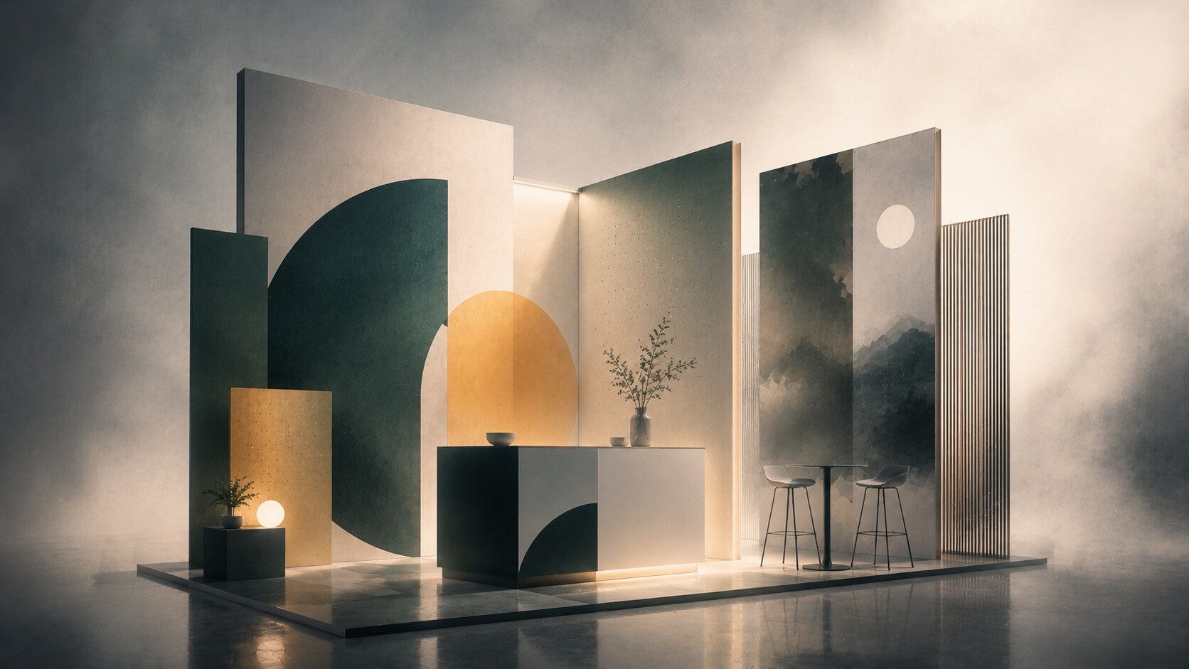
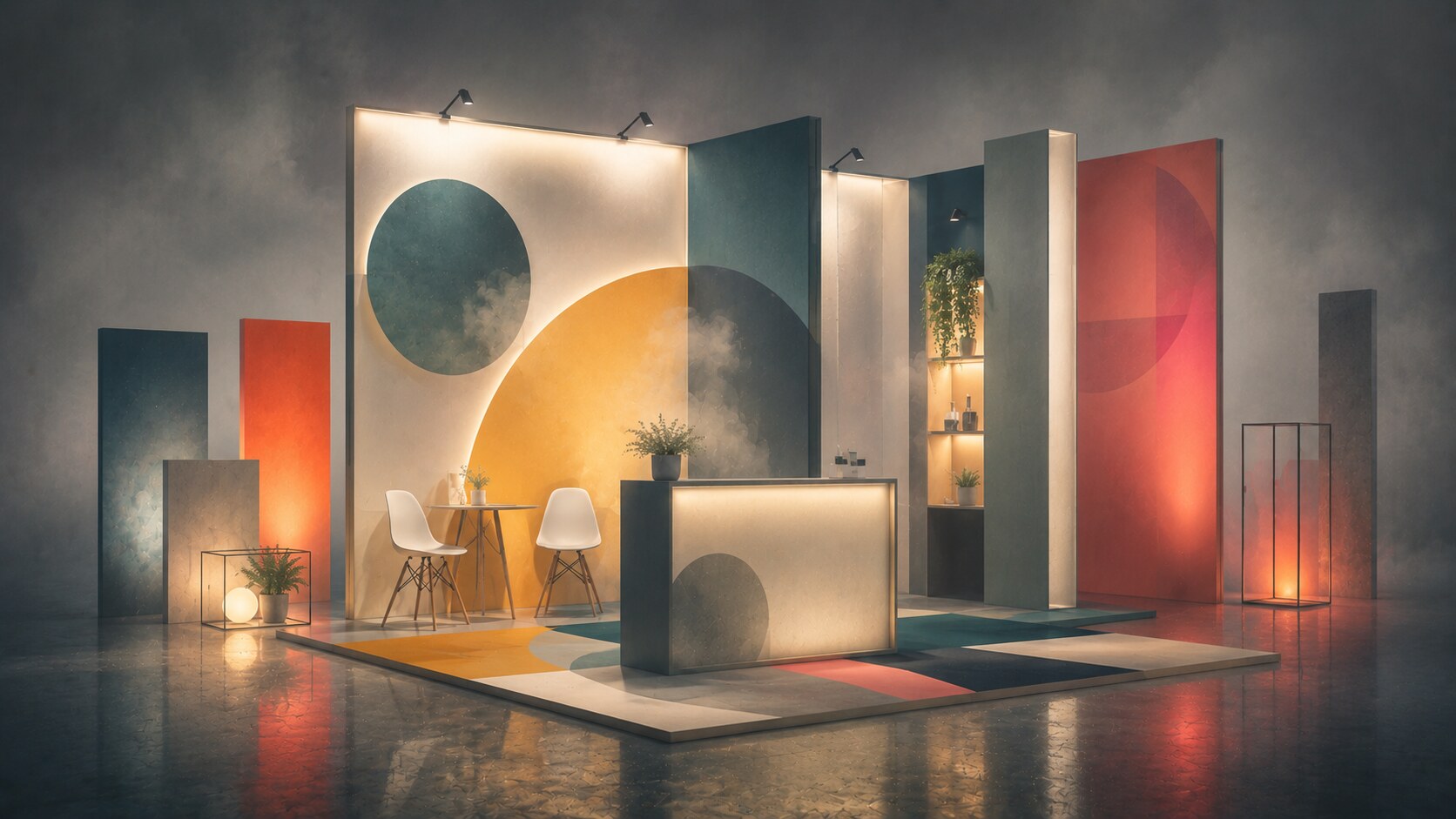
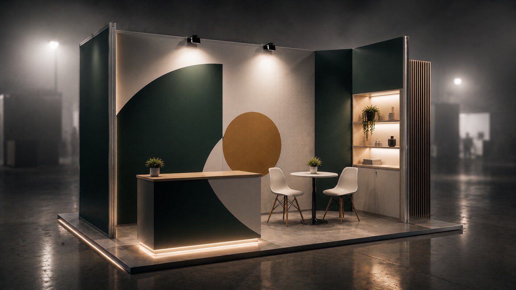
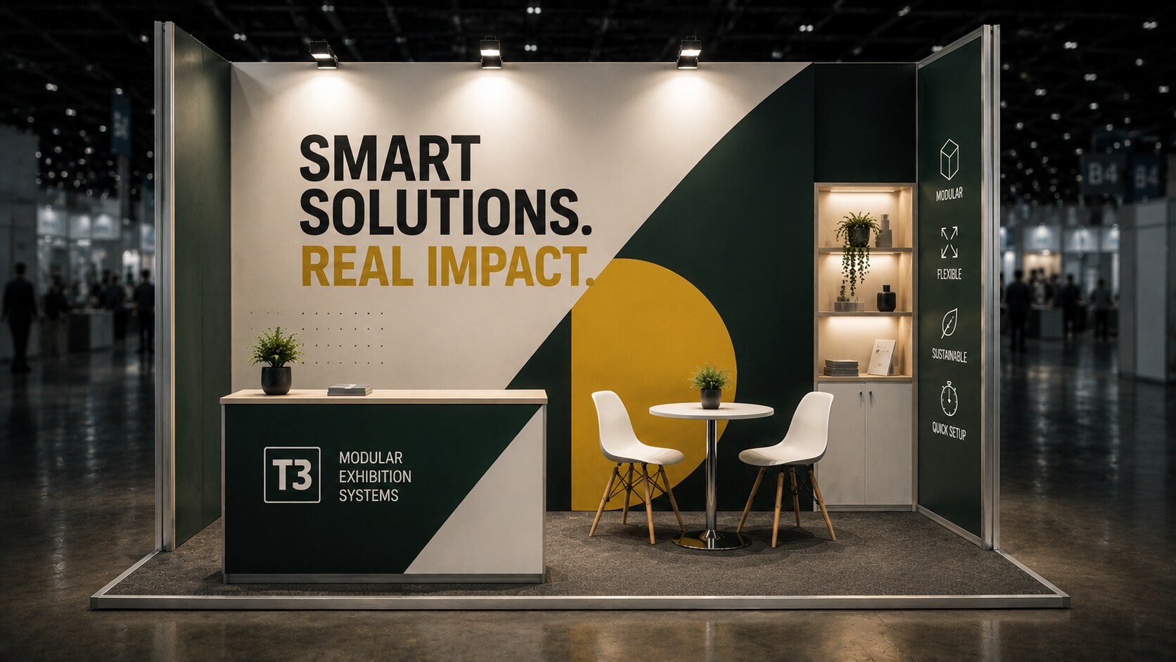
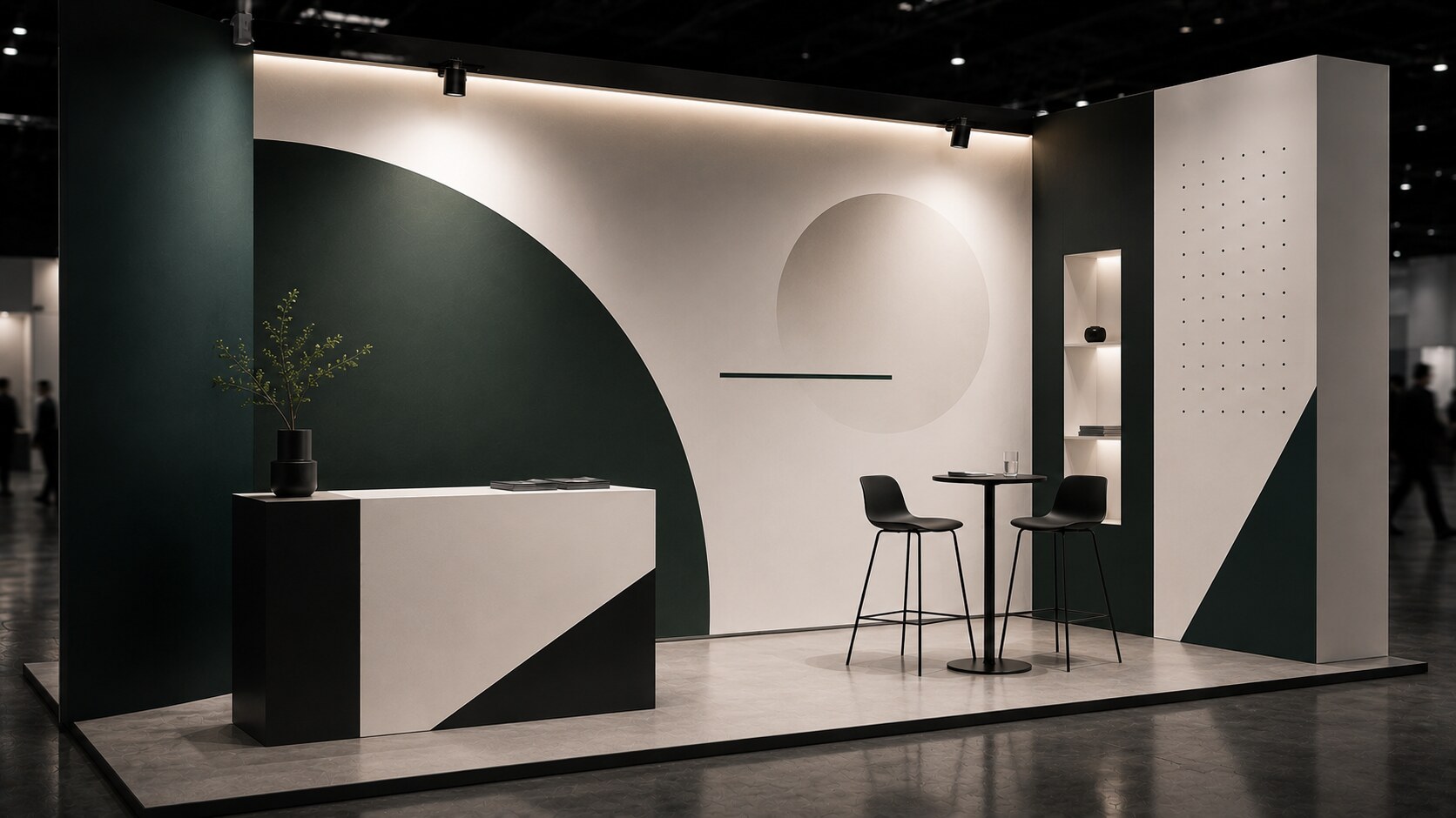
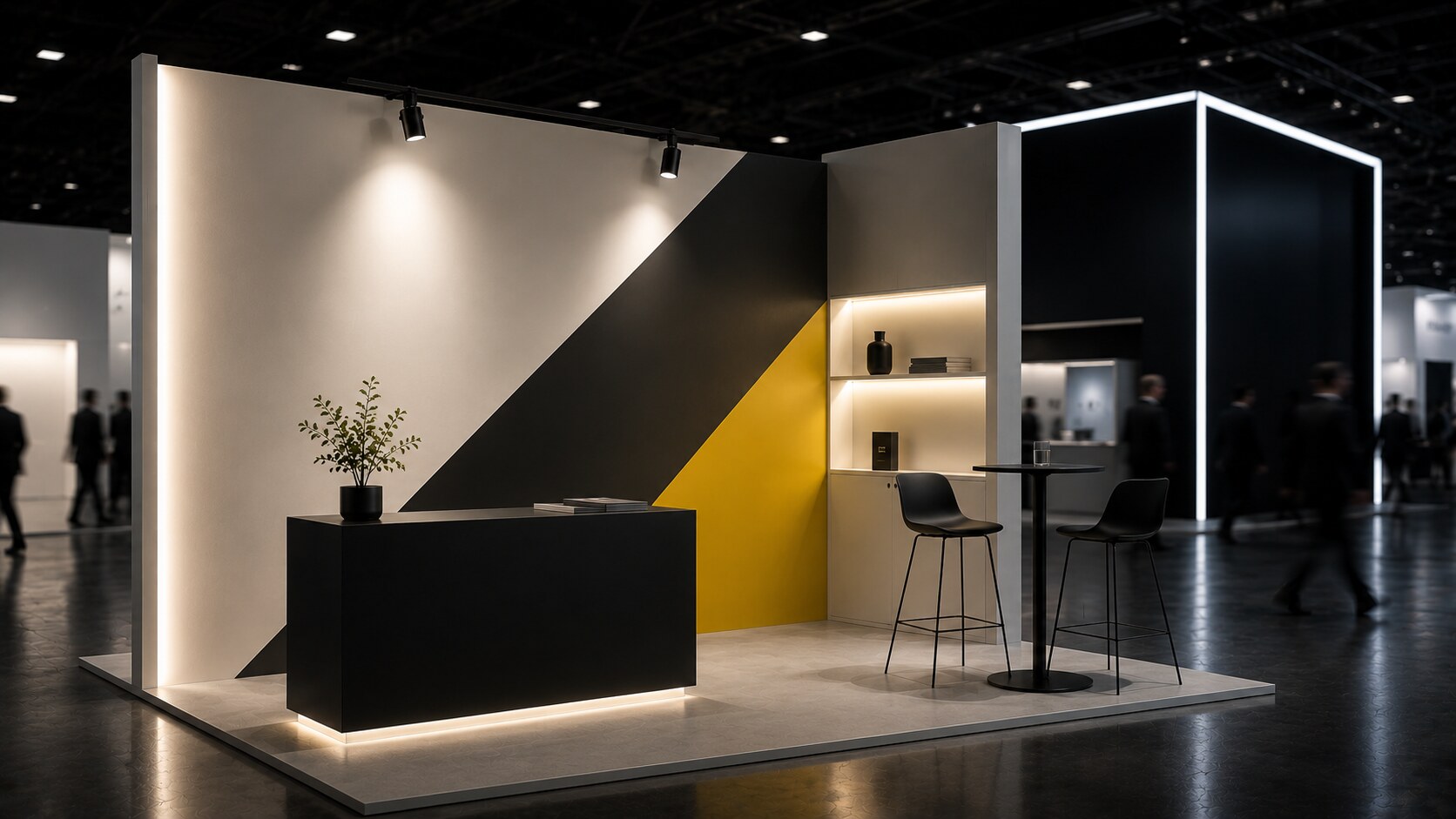
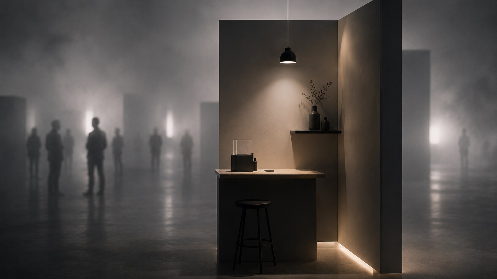
If the rent area is small, treat that as a format, not a handicap. A modest inline footprint can still work very well if the structure is honest about what it is.
For many low-budget stands, a very sensible starting point is:
That 2.5 m zone is often a smart middle ground. It gives presence without forcing expensive rigging, heavy engineering, or awkward proportions. It is high enough to frame the brand clearly and low enough to remain practical in transport, rental, and assembly.
This is also where many stands go wrong. They try to create spectacle with shape. But shape is expensive. Complexity eats money through cutting, joining, finishing, transport, labor time, and errors during setup. If the budget is tight, the geometry should become calmer while the communication becomes stronger.
Small stands work best when people can understand them in one quick look. The visitor should immediately see what kind of company it is and where they can step in or stop to talk. GES company makes this point well in its advice for small booths around 3 x 3 m (10x10 ft) and 3 x 6 m (10x20 ft): a small stand succeeds when it feels open, easy to read, and easy to enter.
When money is limited, material choice matters more than visual ambition.
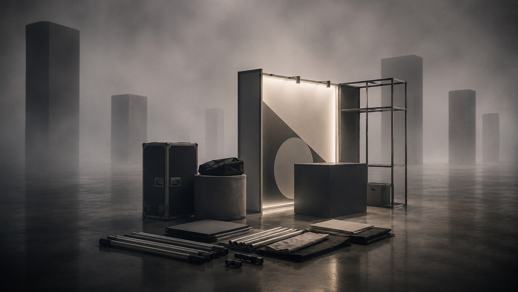
The safest route is usually a modular system with textile graphics and a restrained number of built-in elements. Systems such as T3 or OCTANORM exist for a reason: they reduce fabrication complexity, allow reuse, and make it easier to repair or reconfigure the stand later.
What works well in this category:
What usually wastes budget:
Textile is especially useful in low-budget work because it gives a large clean surface, hides minor frame irregularities well, packs very (insted of UV technology roll prints) efficiently, and photographs better than many cheap hard-panel solutions.
T3works for example its system as tool-free and endlessly reconfigurable. That matters for smaller exhibitors because labor cost is often where “cheap” stands stop being cheap. A system that can be assembled by your own team, or at least with minimal installer time, changes the economics immediately.
Unknown but important detail: on crowded show floors, visitors often remember the cleanest large surface, not the most expensive material. Cheap but tidy usually beats premium but noisy.
This is the part many exhibitors underestimate.
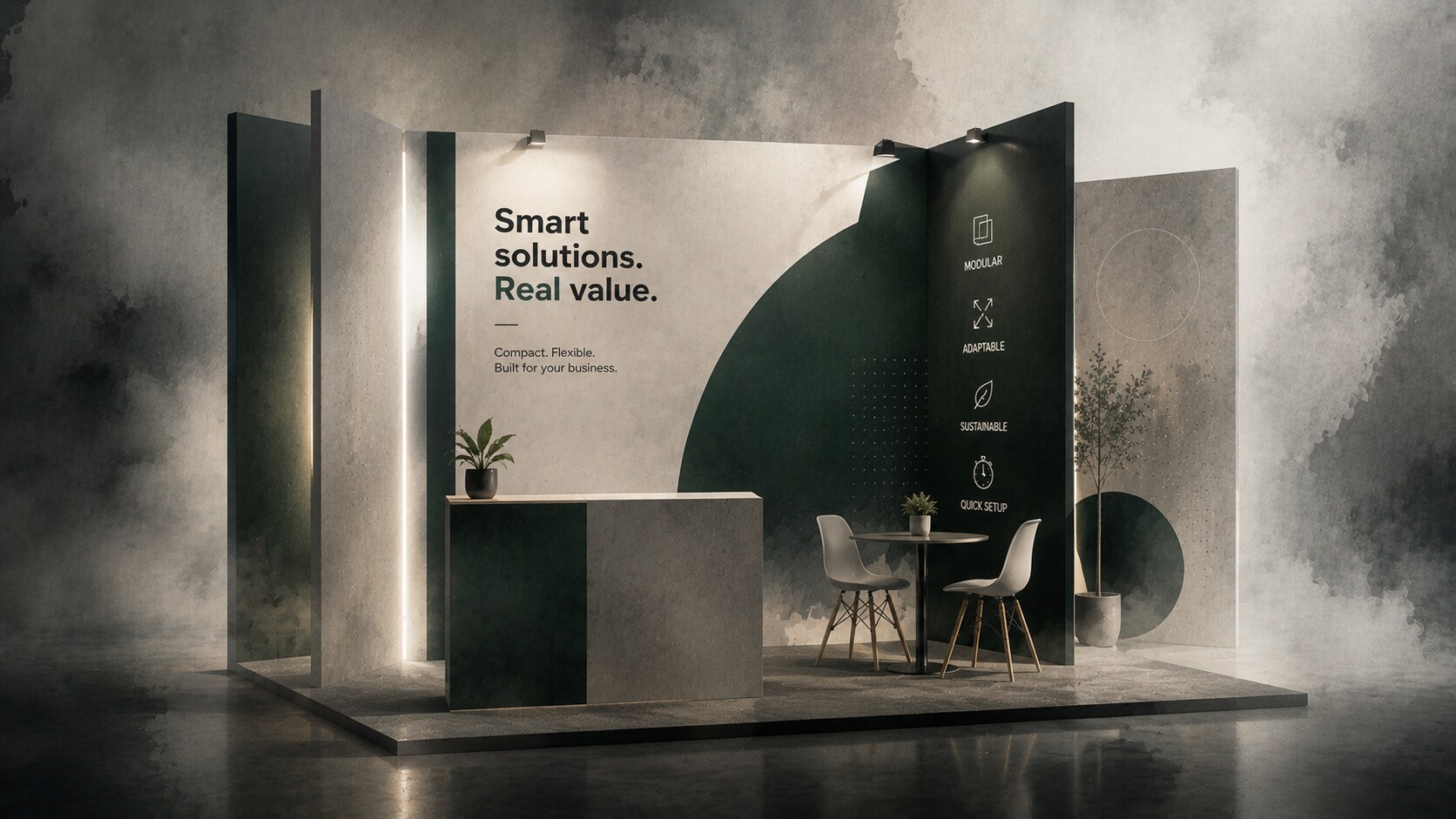
If the stand is physically simple, the graphic system becomes the thing that creates power. It has to do the job that expensive architecture would otherwise try to do.
The stand should communicate in layers:
That means:
The IAEE eye-tracking study is useful here because it found that graphics generally attracted stronger gaze attention than textual elements. That does not mean text is unimportant. It means text has to behave like a headline, not like a brochure pasted on the wall.
One of Freeman’s better practical points is simple but true: what people see first determines whether they stop at all. On a low-budget stand, every square meter has to work at first glance.
This sits well next to Branding Codes That Stick and When Being Trendy Backfires.
Large stands often dominate by mass, height, and production budget. Smaller stands need a different weapon set.
The most effective ones usually win with:
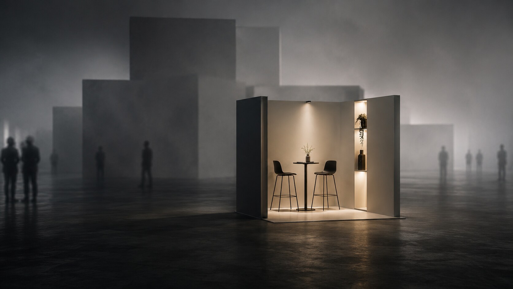
A giant stand can be visually impressive but socially distant. Some feel like corporate fortresses. Visitors admire them, then keep walking. A smaller stand with one open counter, one friendly staff member, one moving demo, and one clear reason to stop can feel more human and easier to enter.
Lighting matters a lot here. Not expensive theatrical lighting, just intentional lighting. Even a modest spotlight or illuminated product shelf can create direction. Freeman’s small-booth guidance repeatedly emphasizes lighting because visibility is not only about size; it is about where the eye lands first.
Counters are another underrated tool. GES company points out that counters often remain visible even when the booth gets crowded and the back wall is partially blocked. In a small booth, the front of a counter can do more branding work than people expect.
“Big stands often own more space. Small stands can still own the decision to step closer.”
This part is rarely said loudly enough in the exhibition industry: larger does not always mean more comfortable.
Some oversized stands create distance instead of attraction. They can feel too polished, too guarded, too busy, or too formal. Visitors hesitate because they do not know where to enter, whether they are “important enough,” or whom to approach.
A smaller stand can be better for:
If the staff positioning is right, the whole stand feels like an invitation instead of a performance stage.
This is one reason low-budget exhibitors should not copy luxury-stand behavior. A compact booth should behave like a conversation space first. Even one small table with two stools can work if it does not block the entry and if it is used for actual discussion rather than storage overflow.
One hidden advantage of small stands: your team cannot hide. That often improves the quality of greeting, because people naturally stay closer to the aisle and closer to the visitor.
Visitors do not stay because a stand shouts. They stay because something gives them a reason to remain for another twenty seconds.
In many sectors, the strongest low-cost retention tools are:
And yes, a small funny or secret moment can help, if it fits the brand.
For example:
This kind of detail works because it rewards attention without turning the stand into a carnival. It gives people a smile and a memory. That is very different from cheap gimmickry.
The Competitive Edge exhibitor guide makes a useful point here: attendees want a booth to feel like a destination worth their time. Interactive demos are often the preferred way to engage. The low-budget version of that insight is simple: one meaningful interaction beats five decorative distractions.
If the stand is for one show or occasional use, rental is often the most rational first move.
Why rental can make sense:
Derse’s bioMérieux case is a useful reference here. Their modular rental approach used inventory that could be swapped depending on footprint and messaging, while avoiding ownership costs such as storage, insurance, and recurring maintenance. That is a very practical lesson for smaller exhibitors.
If the company exhibits regularly, then ownership starts becoming more attractive, but only if the system is truly reusable and transport-efficient. That is where modular frames, fabric graphics, and self-assembly logic become powerful.
Self-assembly is not always realistic, but it can be a real saving when:
The dry run matters more than people think. A stand that looks “easy” in renders can still burn hours on site if parts are mislabeled, counters are overpacked, or cables were never tested before arrival.
The good examples are usually boring in the best way.
A small exhibitor takes a 3x3 m or 3x4 m booth. They use:
It does not look rich. It looks clear. Visitors understand it quickly, approach easily, and stay because the explanation continues smoothly.
Even though it was on a much larger scale, the modular logic in the Okuma and bioMérieux case studies points to the same truth: reconfigurable assets, lighter structures, and fewer one-off scenic pieces improve flexibility and cost control. Small exhibitors can apply that thinking even more aggressively.
A company spends most of its money on:
Then the back wall becomes unreadable, the entry becomes narrow, the team sits behind a table like a customs office, and visitors walk past because nothing explains itself in three seconds.
The stand tries to be funny with gimmicks unrelated to the business. People may smile, but the memory attaches to the trick, not to the company.
The lesson is not “do less” in an empty way. It is:
Booth-attractiveness research suggests that attractiveness is not just about pretty form. It works because it affects behavior. In other words: the stand is successful only when the visitor reacts.
It is absolutely possible for a low-budget exhibition stand to be visible in the shadow of huge builds.
But only if it stops trying to compete on the wrong axis.
It should not compete on monumentality. It should compete on:
If the stand stays around 2.5 m, uses a clean modular system, prefers textile over fussy construction, controls the message, lights one focal point well, and gives visitors a comfortable reason to pause, it can perform far above its price class.
Sometimes the megalomaniac stand really is too much. Sometimes the small stand with the better manners wins.

News, insights, case studies, and more from the rausr team — straight to your inbox.
Send us your brief, your wildest idea, or just a hello. We’ll season it with curiosity and serve back something fresh, cooked with care.