Multilingual Design: Building for Different Scripts and Cultures
How to design a brand or interface that works across Cyrillic, Arabic, Hebrew, Japanese and Chinese, from typography and translation data to team size and cost.


How to design a brand or interface that works across Cyrillic, Arabic, Hebrew, Japanese and Chinese, from typography and translation data to team size and cost.
A design made for one language is rarely finished when its text is translated. The Russian headline might need another line, the Arabic checkout might need a different reading direction, and a Japanese font may display a Chinese character in a form that looks wrong to a Japanese reader. Meanwhile, the same photograph or joke may carry a very different meaning in another place.
Good multilingual design is not one supposedly neutral layout exported many times. It is a shared system with room for local decisions: suitable type, flexible components, structured translation data, and people in each market who can say when the result feels unnatural. The design should remain recognizably one brand without insisting that every language occupy the same shape.
This is the international edge of a design system and a digital content system: the rules need to survive real words, not just tidy English placeholders.

The first project decision is not which flag goes on the language selector. It is which locales the product will serve. A locale combines language with the conventions needed for a particular audience. Spanish for Spain and Spanish for Mexico may share most words while differing in address, currency, legal copy, examples and campaign tone. Chinese written with simplified characters and Chinese written with traditional characters are not interchangeable image exports.
Ask what must stay global: the promise, core mark, product names, accessibility standards and essential interaction patterns. Then ask what may change locally: copy, photography, examples, support details, date and number formats, payment methods or a campaign’s humor. Avoid the lazy shortcut of assigning one color or one visual stereotype to an entire culture. A local reviewer can tell you more than a mood board of national symbols.
This is also where the brief becomes honest. “Available worldwide” may mean a few translated pages, or it may mean a purchase flow, customer support, packaging, legal approval and search visibility in each market. Those are very different design jobs.
“A global identity needs a consistent idea, not identical pixels in every language.”
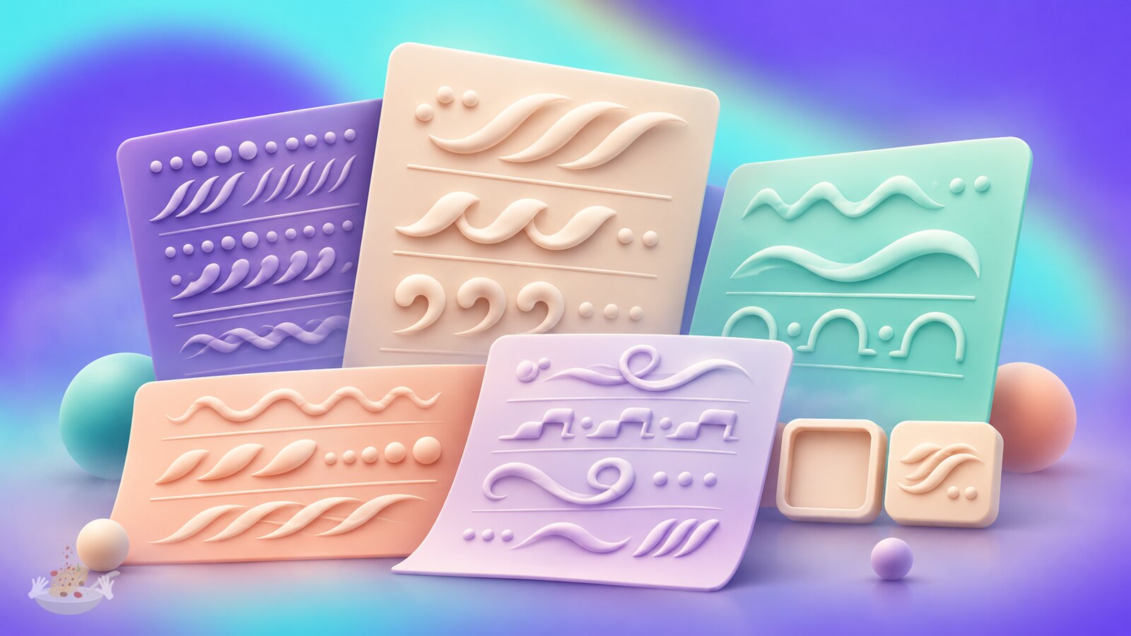
“Cyrillic” is a script, not a language. Russian, Ukrainian, Bulgarian and Serbian do not all use identical letterforms or conventions. A font may contain Cyrillic glyphs yet still look like Latin characters with unfamiliar shapes pasted on. The designer needs to inspect the actual language, in the intended weight and size, with someone who reads it fluently.
Arabic adds contextual letter shaping, a different calligraphic rhythm and important marks above and below the baseline. Hebrew has its own proportions and punctuation behavior. Japanese mixes kanji, hiragana and katakana; Chinese uses Han characters, but preferred forms can differ between regions. The Noto CJK project is a useful example: even a unified family accounts for regional expectations rather than pretending one glyph form is always right.
Typography therefore needs a family strategy, not necessarily one font file. Choose script-specific companions that agree in tone, hierarchy and apparent size, then test them in real paragraphs, navigation, small labels and print output. Check font licensing and webfont payloads as well as appearance. A display face that supports only Latin may be fine for a campaign mark, but it cannot quietly become the only voice of a multilingual product.
A name with a problem inside it: Google says Noto means “No more tofu”. “Tofu” is the blank box shown when a font cannot display a character. The project began as a practical need for Android and Chrome OS, and Google’s 2016 account describes years of work with script specialists, Monotype, Adobe and volunteer reviewers. The tiny missing-glyph box was not a cosmetic bug; it could make a message unreadable.
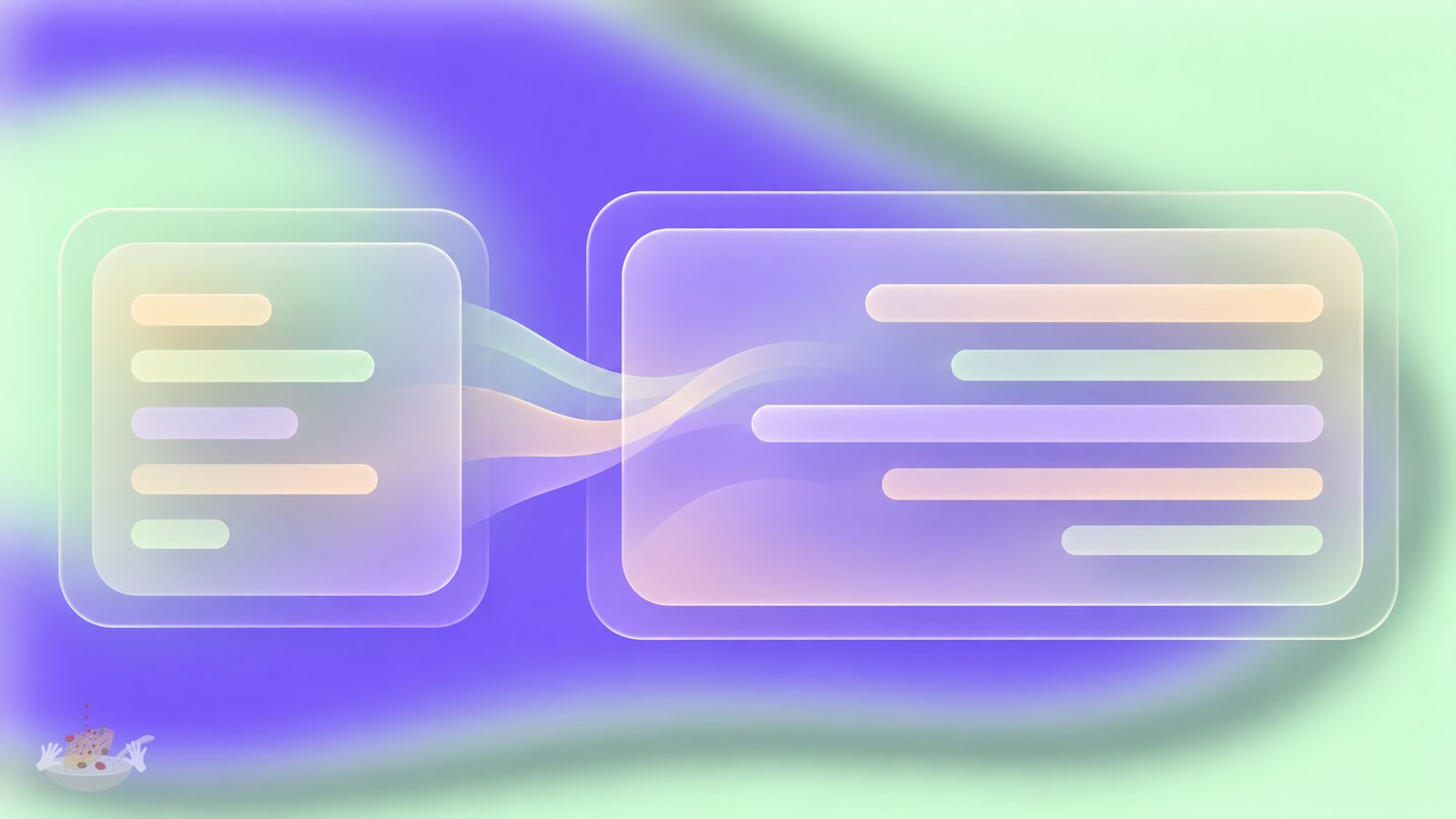
There is no safe universal rule that translated copy will be a fixed percentage longer. A two-word button can grow dramatically while a paragraph in another language becomes shorter. Design a component for a range of content: let labels wrap where possible, avoid fixed-height text boxes, define sensible maximum widths and allow a local editor to shorten copy without changing its meaning. In print, make the translation proof part of the layout stage, not a last-minute text replacement on a locked dieline.
Right-to-left work is more than right-aligning text. Arabic and Hebrew interfaces often place navigation and progress in a mirrored reading flow, while a logo, photograph, number, chart axis or video control may need individual judgment. The W3C recommends using HTML direction markup and CSS logical properties such as start and end instead of hard-coding left and right everywhere. A mixed Arabic-and-English product name also needs correct bidirectional handling; reversing the characters by hand is not a solution.
Japanese and Chinese are commonly set horizontally in digital interfaces, although vertical composition remains a meaningful option in some editorial and cultural contexts. Their line-break rules differ from English, and punctuation should not be stranded in awkward places. The W3C’s line-breaking guide shows why a generic “break anywhere” rule can damage reading even when it prevents overflow.
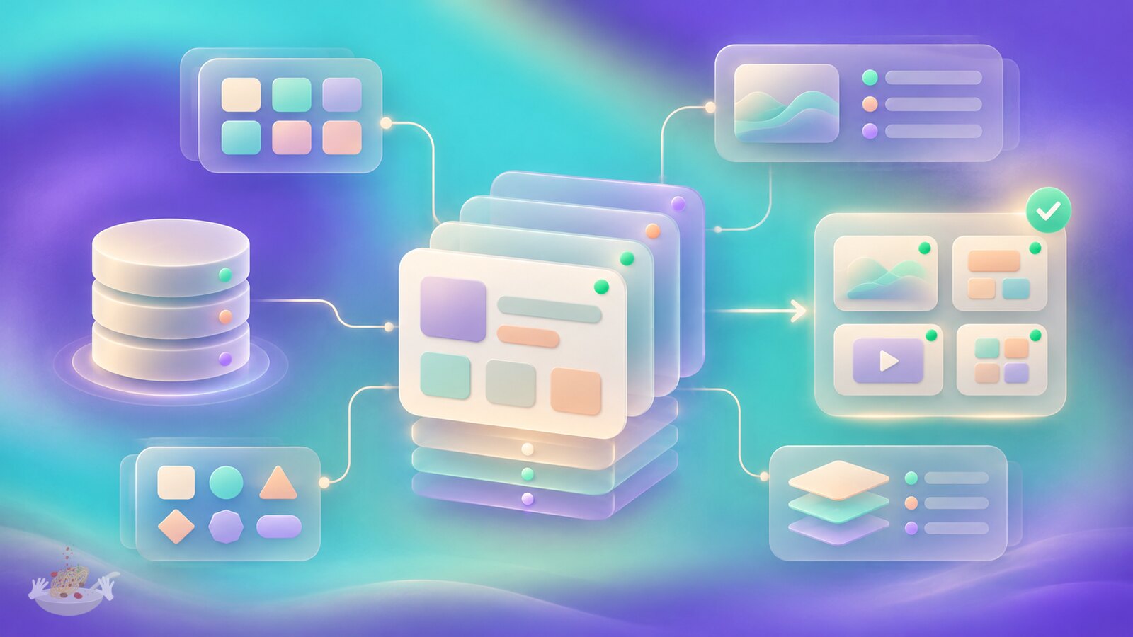
In a digital product, translated text should not live only inside Figma frames or a developer’s copied strings. A content management system (CMS) usually owns pages and product copy, while application messages may live in resource files or a localization platform. Each piece needs a stable key or content ID, source text, context, locale-specific versions and review status. Screenshots and character limits help translators understand where a phrase appears. The published interface then requests the correct approved value for the active locale.
For example, checkout.pay is a stable message key, not the English words on the button. Its record can contain “Pay now”, a note that the action charges the customer, and approved versions for de-DE and ar-SA. The application reads the locale variant; the component decides how to render it. W3C guidance on strings also stresses that natural-language values need language and direction metadata, especially when content is exchanged as plain data rather than HTML.
Do not assemble a sentence from fragments such as "You have " + count + " items". Word order and plural forms change. Unicode CLDR plural rules show why the English singular/plural pair is not a universal model. Use locale-aware message formatting for numbers, dates, currency and plural text; keep editorial control over the resulting sentence. Put translatable text in content, not baked into an image, unless the image has a deliberate local version.
One hidden failure is the fallback that works too well. If an untranslated field quietly displays English, the page can look complete to a project team while local customers see a half-translated checkout. Track missing keys and approval state as quality signals, not just technical exceptions. For public multilingual sites, give localized pages distinct URLs and connect the correct versions using Google’s hreflang guidance; a language switcher alone does not solve discovery.

A sensible sequence starts with market and task research, then a locale inventory and content model. Next come type and component prototypes using real sample translations. Engineering connects those components to content and localization data. Translation, local cultural review and visual quality assurance follow in parallel loops, not one final approval meeting. Launch with a plan for updates, because a new feature or campaign creates new strings immediately.
The team can be small but it cannot be one English-speaking designer acting as every market’s judge. A defined website might use one lead designer, one engineer, a content or localization lead, translators, part-time in-market reviewers and a QA tester. A larger platform adds product teams, accessibility specialists, type expertise, legal reviewers and release coordination. The number of people on a worldwide project is driven less by the number of flags than by how many distinct customer journeys and approvals must work.
Before paying for finished translations, use pseudolocalization: automatically stretch the source text, add conspicuous characters and test a right-to-left mode. Microsoft’s guidance describes it as a way to expose clipped labels, hard-coded strings and layout assumptions early. It is a test, not a substitute for real translators or native-speaker review. Then test actual Arabic, Hebrew, Cyrillic and CJK copy on the devices and print formats people will use.
The same principle appears in email design systems: a reusable component is only robust when it survives real content, production constraints and the tools that deliver it.

Public budgets for complete global design programs are rarely comparable: one may cover only translated copy, another includes a new identity, software, packaging and years of maintenance. The following is illustrative arithmetic, not a market quote or a real client’s budget. Imagine a small marketing site with 2,000 source words, six target locales, existing brand assets and no new product engineering:
That example totals $18,960 before tools, licensing, taxes, legal review, new photography or rework. It might fit a six-to-ten-week plan if source content, decisions and reviewers are available on time; that is a planning scenario, not an industry average. A multilingual checkout, regulated packaging or a large app can cost much more because each localized journey must be tested and maintained. Equally, a short brochure using an established system can cost far less. Ask for a scoped estimate rather than a universal “price per language”.
The expensive wrong turn is usually not the translator’s word rate. It is discovering after design approval that the font, component, CMS or approval chain cannot carry the new language. Good global design makes those constraints visible at the beginning. The result may look effortless to a reader in Tokyo, Sofia or Cairo, but that ease comes from deliberate flexibility and local judgment, not from one perfect master file.
Send us your brief, your wildest idea, or just a hello. We’ll season it with curiosity and serve back something fresh, cooked with care.