From CRT to OLED: Choosing the Right Display for Graphic Design
Is IPS still the king? A look into monitor technology for designers—from CRT nostalgia to modern-day panels and their impact on your work and your eyes.

Is IPS still the king? A look into monitor technology for designers—from CRT nostalgia to modern-day panels and their impact on your work and your eyes.
In the era of ultra-slim LED and OLED screens, it’s tempting to say: “Any screen works.” But if you’re a graphic designer, illustrator, or color-sensitive creative — panel type matters. A lot.
Why? Because design accuracy directly affects your output in very real ways. Whether it’s print, where colors must match inks exactly; brand consistency, where every logo and palette must be spot-on across media; or video production, where color grading defines mood and storytelling — your display is the gatekeeper. An inaccurate monitor can cause misjudgments that lead to costly reprints, client headaches, or videos that look washed out on other devices.
The screen is where your entire creative world lives. And not all screens are built for that world.
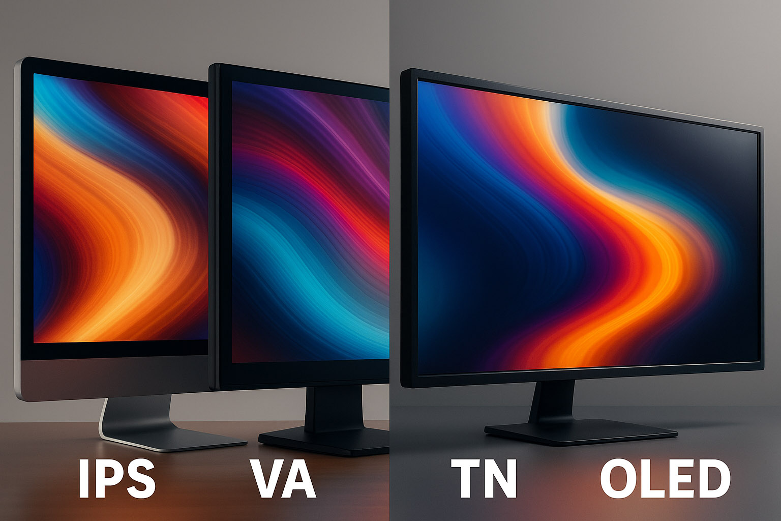
IPS (In-Plane Switching): This is still the gold standard for creatives. Great color reproduction, wide viewing angles, and decent response time. Most color-accurate displays (Eizo, BenQ PD series, Apple displays) use IPS panels. They excel in photo editing, 3D rendering, and any work where color precision and consistency matter. IPS panels maintain color accuracy even when viewed off-center, which is great for collaborative environments or multi-monitor setups.
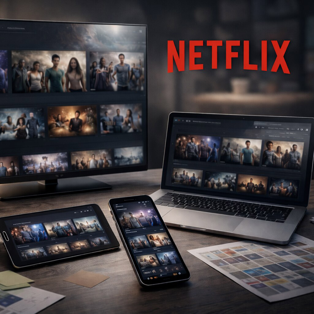
VA (Vertical Alignment): Good for contrast (hello, Netflix) but not for color work. Narrow viewing angles, color shift. Cheap? Yes. Precise? No. VA panels are better suited for entertainment or casual use rather than professional design.
TN (Twisted Nematic): Great for gamers who need fast refresh rates. But designers? Nope. Washed-out colors and poor vertical viewing angles. TN panels can be useful for budget builds or fast-paced tasks but are generally avoided in color-critical workflows.
OLED: The new king in town — infinite contrast, vibrant colors, deep blacks. Perfect for video editors and digital artists wanting punchy visuals with true blacks. However, burn-in risks and high cost make it less common in pro design setups (for now). OLED’s ability to display HDR content with incredible dynamic range is a game-changer for multimedia professionals.
Mini-LED: An emerging option bridging the gap between LCD and OLED. Mini-LED backlighting offers improved local dimming zones, resulting in better contrast and brightness control without the burn-in concerns of OLED. This tech is gaining traction for high-end monitors aiming to deliver HDR performance with color accuracy.
“Yes — you can design on an LED panel, but make sure it’s powered by the right panel tech underneath.”
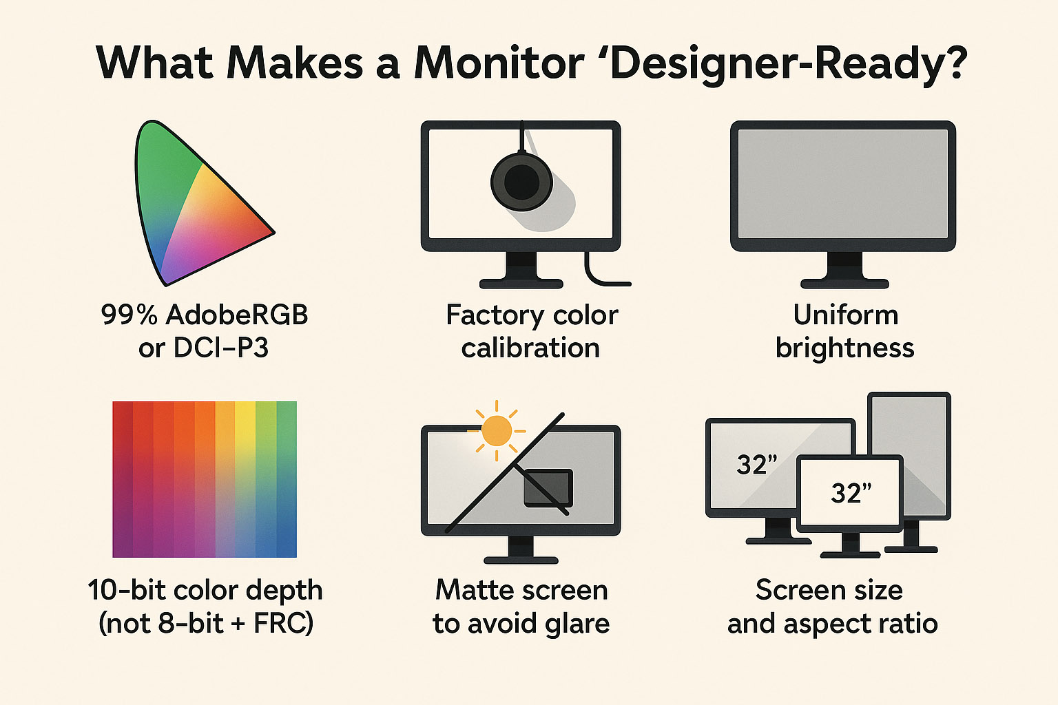
99% AdobeRGB or DCI-P3 color coverage: These wider color gamuts ensure your colors are vibrant and true to life, especially important for print and digital cinema standards.
Factory color calibration: The monitor arrives with color profiles tuned to exacting standards, saving you hours of manual calibration and ensuring consistent results out of the box.
Uniform brightness: No annoying patches or hotspots, so gradients and shadows look smooth and natural.
10-bit color depth (not 8-bit + FRC): True 10-bit panels can display over 1 billion colors directly, avoiding the dithering tricks of 8-bit + Frame Rate Control (FRC) which can introduce banding artifacts. This means smoother gradients and more subtle color transitions.
Matte screen to avoid glare: Glossy screens may look punchy but cause distracting reflections that can throw off your color perception and cause eye fatigue.
Hardware LUT (lookup table) for pro-grade calibration: LUTs allow precise color mapping and adjustments at the hardware level, enabling accurate color reproduction across different devices and workflows. This is essential for color grading and print proofing.
Screen size and aspect ratio: While 27” to 32” is a sweet spot for most designers, those working with large layouts or multiple windows may prefer ultrawide monitors (21:9 or 32:9) for extended horizontal workspace. Portrait mode can be handy for editorial or web design work.
“If you’ve never worked on a high-end calibrated IPS monitor — you’ll cry happy tears the first time your print matches your screen.”
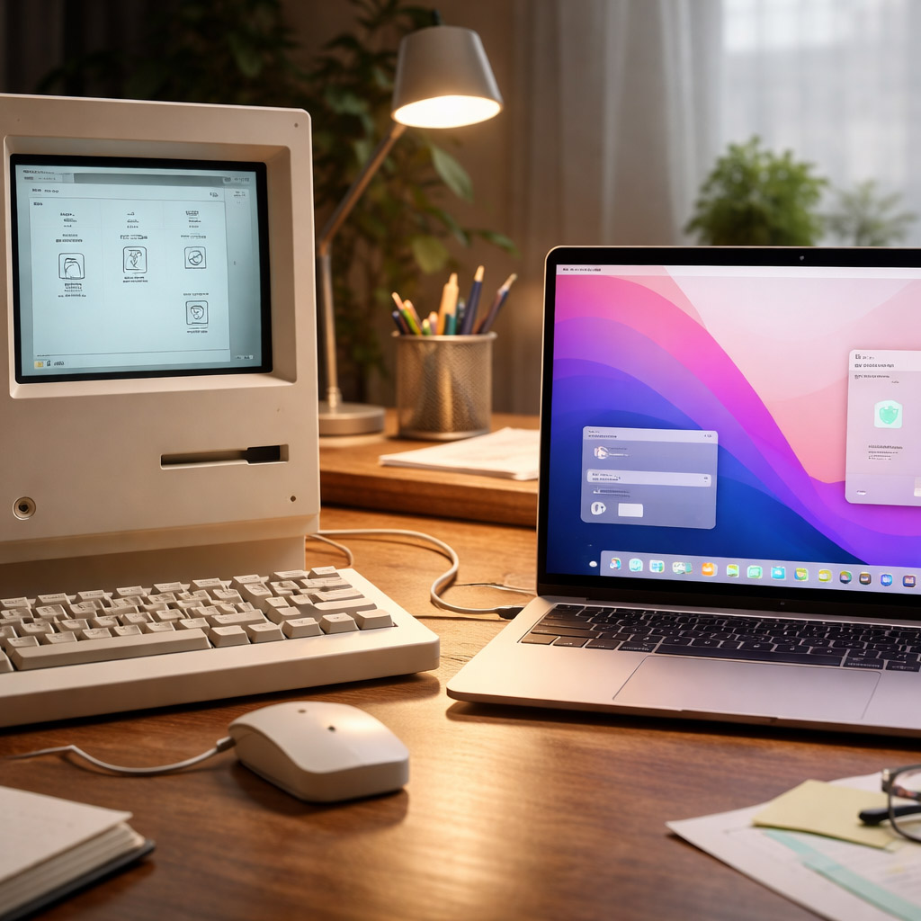
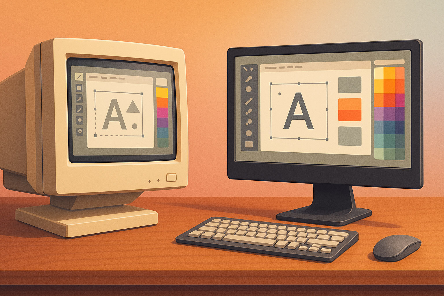
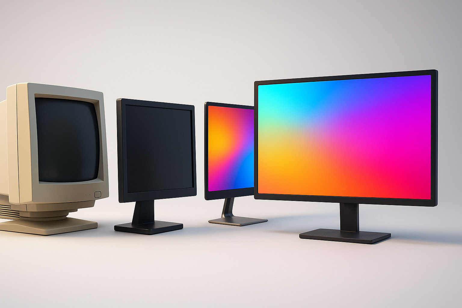
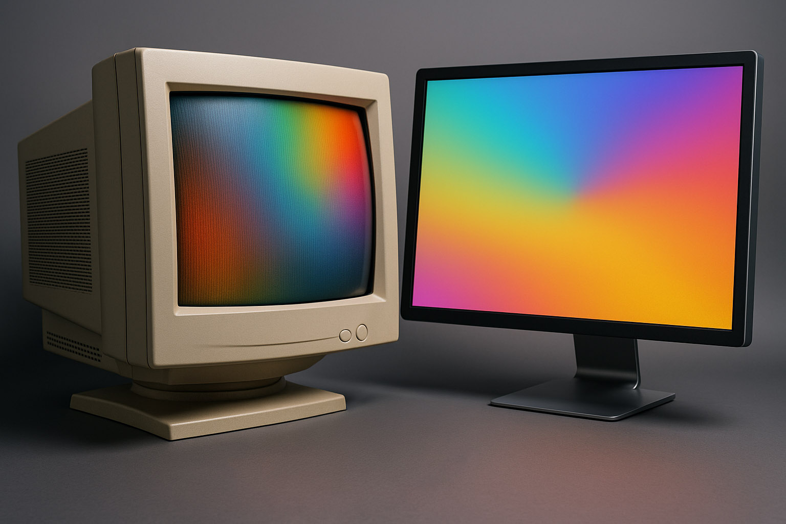
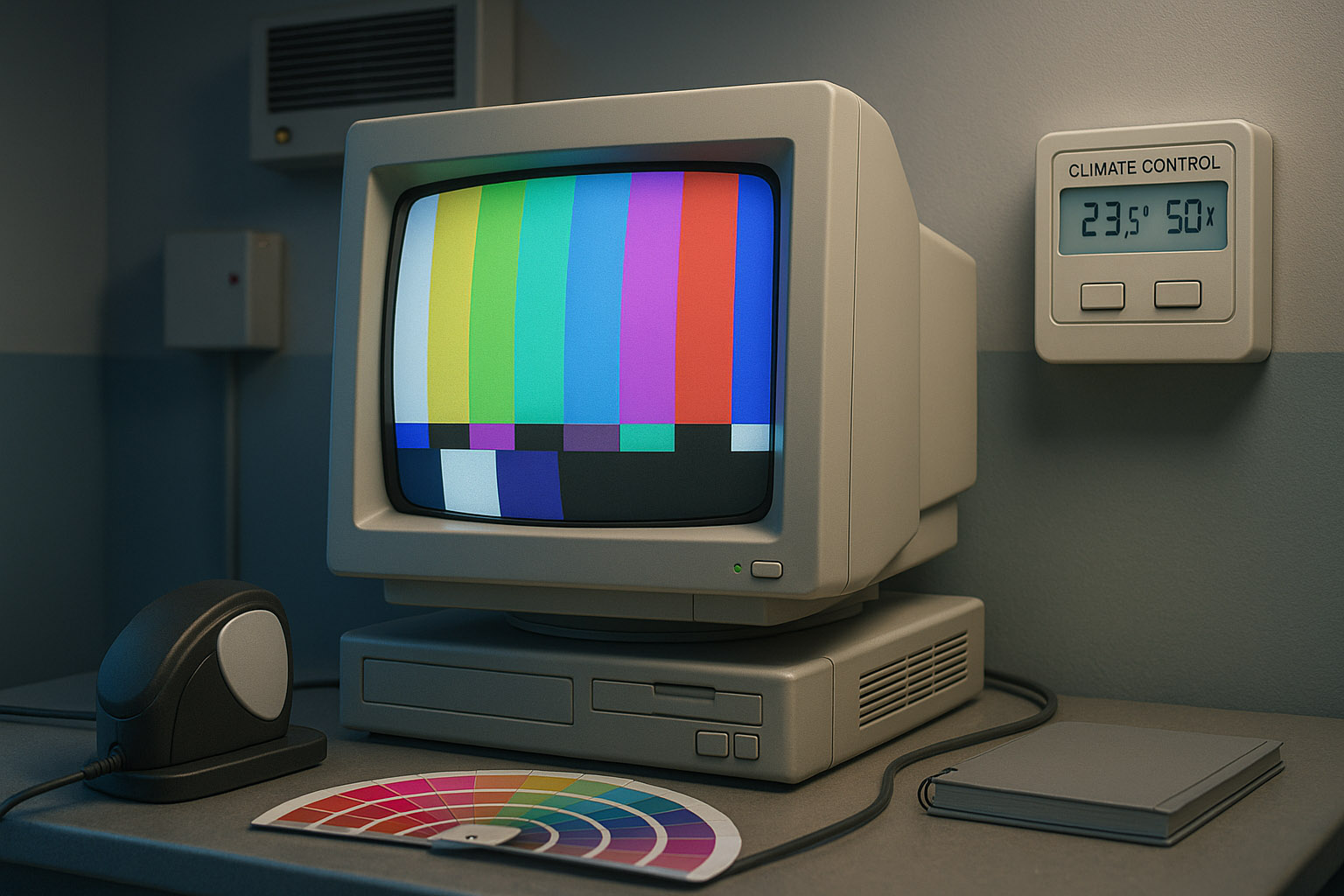
Once upon a time, design was done on heavy, flickering CRTs (Cathode Ray Tube displays). These beasts could weigh 30kg and needed deep desks. But they had real advantages:
Of course, they also gave you a minor headache after 6 hours.
Fun fact: Some high-end Sony Trinitron CRTs are still used in color grading studios for video mastering — they have unmatched shadow detail.
Also worth mentioning: early Apple Cinema Displays helped bridge the gap from CRT to LCD, offering color accuracy and screen real estate that finally made LCDs viable for pros, changing the game forever.
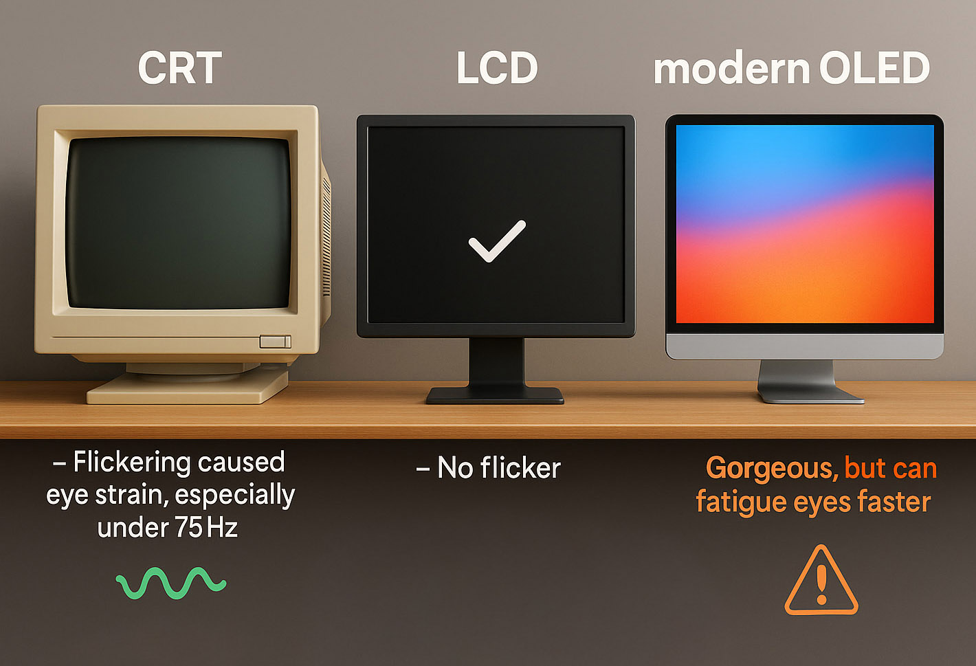
CRT: Flickering caused eye strain, especially under 75Hz. But good ones at 100Hz+ were smooth.
LCD: No flicker — unless there’s aggressive PWM dimming (common in cheaper panels). PWM (Pulse Width Modulation) dims the backlight by rapidly turning it on and off, which can cause subtle flickering invisible to the eye but tiring to the brain over long sessions.
Modern OLEDs: Gorgeous, but can fatigue eyes faster due to sharp contrast and brightness shifts.
Want to save your eyes?
In the early 2000s, some print studios refused to upgrade to LCDs because their color calibration workflows were built entirely around high-end CRTs. They’d spend thousands on spectrometers, calibration rigs, and custom software just to avoid “flat-screen lies.”
One legendary Berlin prepress house even had climate-controlled rooms to stabilize CRT color temperature during critical packaging reviews. Temperature and humidity affected CRT phosphor behavior, so keeping the environment rock-solid was essential to maintain color fidelity.
Today, while CRTs are mostly retired, many high-end monitor manufacturers and color-critical workflows still test and calibrate displays in controlled environments to ensure consistent results, proving that some old-school rigor never goes out of style.
Your display isn’t just a window — it’s the canvas.
“If you’re serious about design, investing in the right monitor matters more than the fanciest mouse or keyboard. Choose wisely. Calibrate often. And maybe say a quiet thank you next time your display doesn’t buzz or weigh 45 pounds.”
News, insights, case studies, and more from the rausr team — straight to your inbox.
Send us your brief, your wildest idea, or just a hello. We’ll season it with curiosity and serve back something fresh, cooked with care.