Email Design Systems and Marketing Email Campaigns
How to design effective marketing emails, build a practical email design system, choose the right tools, and work around the strange technical limits of HTML email.


How to design effective marketing emails, build a practical email design system, choose the right tools, and work around the strange technical limits of HTML email.
Many designers underestimate email because it feels old.
That is exactly why it is still interesting.
Email marketing remains effective because it reaches people in a direct, personal, and measurable space. But from a design point of view it is a strange battlefield. The channel still matters commercially, yet the medium itself is full of technical compromises, outdated rendering behavior, inconsistent client support, and strange HTML habits that would look absurd anywhere else on the web.
That is what makes email design systems useful. Without a system, every campaign becomes a small technical panic. With a system, a team can move faster, stay visually consistent, and avoid breaking layouts every second week.
This article sits naturally beside Workflow for Complex Branding Design: Print and Digital, The Evolution of Yahoo Design, and Reddit Design and Branding Evolution.
“Email design is not web design with fewer ambitions. It is a separate craft shaped by ugly constraints, careful hierarchy, and ruthless testing.”

Email is still useful because it can combine reach, automation, segmentation, and ownership. A brand does not fully own social algorithms, but it does have more direct control over its email list and messaging cadence.
From a design and marketing perspective, email remains strong for:
The hidden truth is that email often performs best not when it tries to be dazzling, but when it is easy to scan, clear about value, and visually stable enough to build trust over time.

Normal web designers often hit email and immediately ask the same question: why is this still built with tables, inline styles, and defensive hacks?
The answer is simple. The medium is fragmented.
Support for HTML and CSS in email clients is inconsistent enough that dedicated resources like Can I email… still matter every day. Some clients are generous. Others are hostile. MJML itself explains the problem bluntly: email HTML is different from normal web HTML, clients render things in different ways, and what works in one inbox can fail in another.
That is why email code still leans on older habits:
One of the strangest facts in the field is that some modern design teams still produce email markup that would look almost prehistoric in any normal front-end project. And they are right to do it.
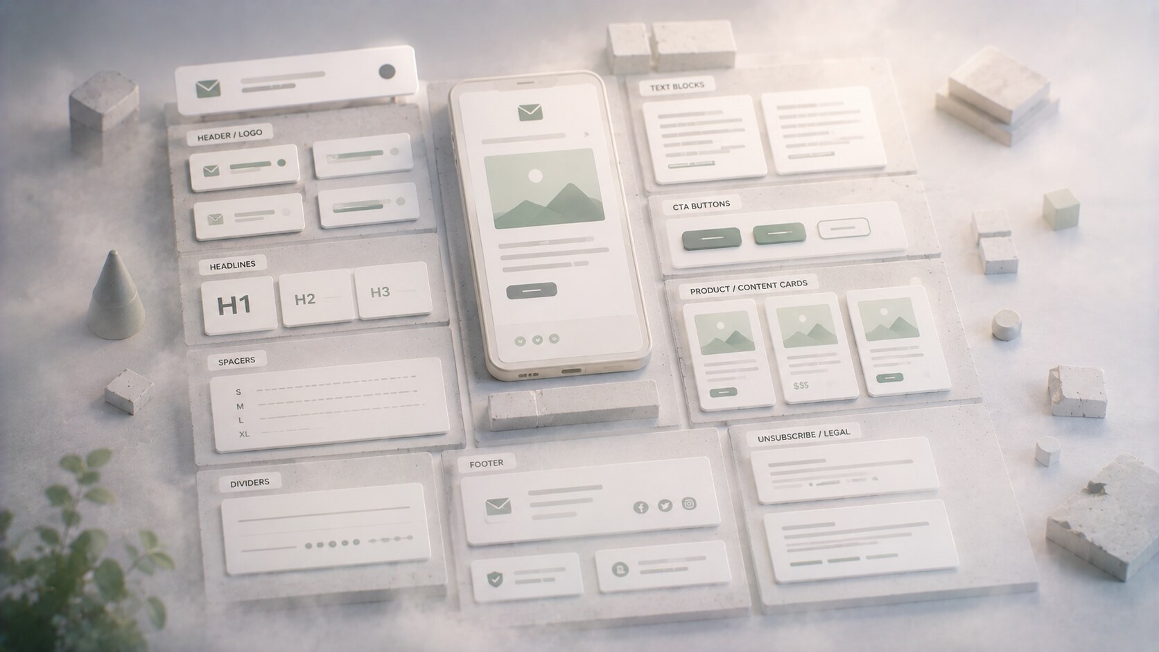
An email design system should be smaller and stricter than a full web design system.
That is because every extra variation increases testing burden. A practical email system usually includes:
It should also define what is not allowed. That part is often missing.
For example:
The strongest email systems are not the most visually adventurous ones. They are the ones that make repetition look polished instead of lazy.
Most marketing emails fail through confusion, not through lack of decoration.
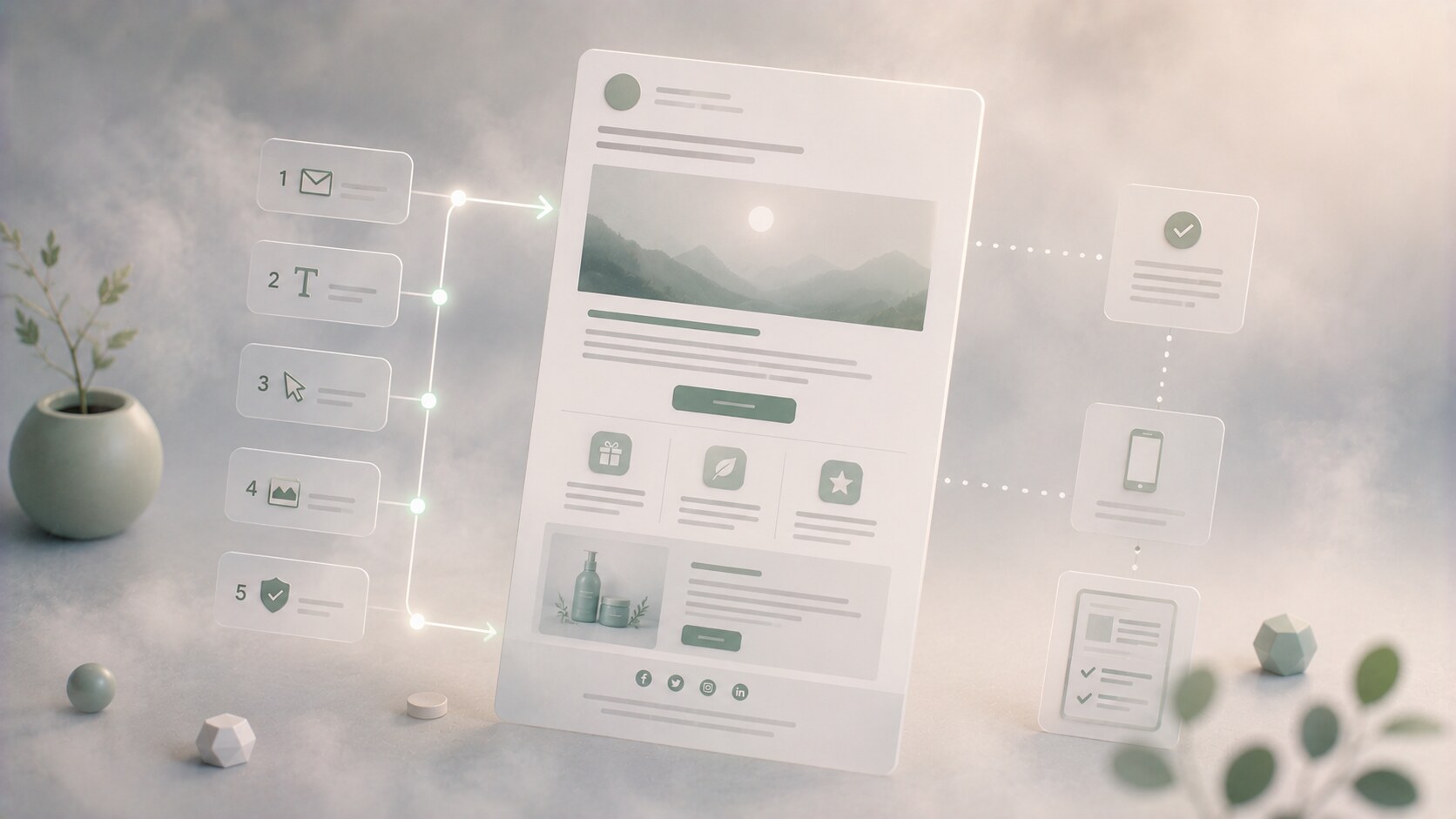
The campaign structure usually needs a very clear order:
That sounds basic, but many emails still bury the core message under visual clutter, too many products, or competing buttons.
A reliable flow often looks like this:
The best graphic choice in email is often subtraction. White space, spacing rhythm, and fewer competing blocks usually outperform ambitious collage behavior.

No single tool covers the whole job well.
Design usually starts in Figma, sometimes in Photoshop for image-heavy campaigns, and occasionally in Illustrator for isolated assets. But final production often moves elsewhere because email HTML has its own logic.
For teams that code, MJML remains one of the most useful tools because it turns a higher-level component syntax into responsive email HTML. For teams that do not want to code from scratch, platforms like Mailchimp, Klaviyo, and Braze offer template builders, automations, segmentation, and sending infrastructure.
Testing is a separate discipline again. Litmus and Email on Acid are still relevant because previewing a campaign across many clients and catching rendering issues before send is worth real money.
| Tool type | Typical tools | Main use |
|---|---|---|
| Visual design | Figma, Photoshop | layout, assets, template planning |
| Email code layer | MJML, hand-coded HTML | responsive structure and reusable modules |
| Campaign platforms | Mailchimp, Klaviyo, Braze | sending, segmentation, automation |
| QA and testing | Litmus, Email on Acid | previews, checks, rendering confidence |
The important insight here is that email design is rarely one software problem. It is a workflow problem.
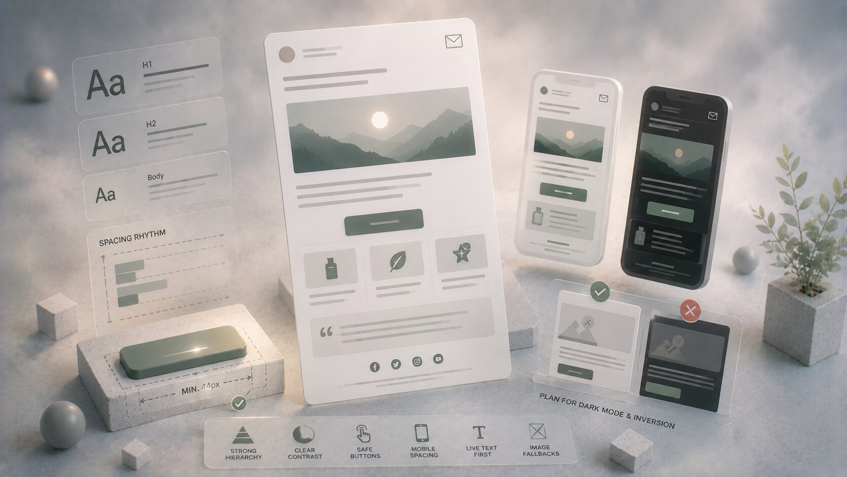
Email graphic design has a few brutally practical rules.
Readable type matters more than expressive type. Large tappable buttons matter more than subtle ones. Shorter sections matter more than long continuous text walls.
The core graphic priorities usually are:
One unknown but important detail: image-heavy emails can still look beautiful, but if the real selling message only exists inside the image, the campaign becomes fragile. Accessibility suffers, inbox clipping can hurt, and blocked-image states become ugly fast.
Dark mode is one of the most annoying hidden layers in email design because some clients invert colors more aggressively than others. A campaign that looks elegant in one inbox can become muddy or broken in another.
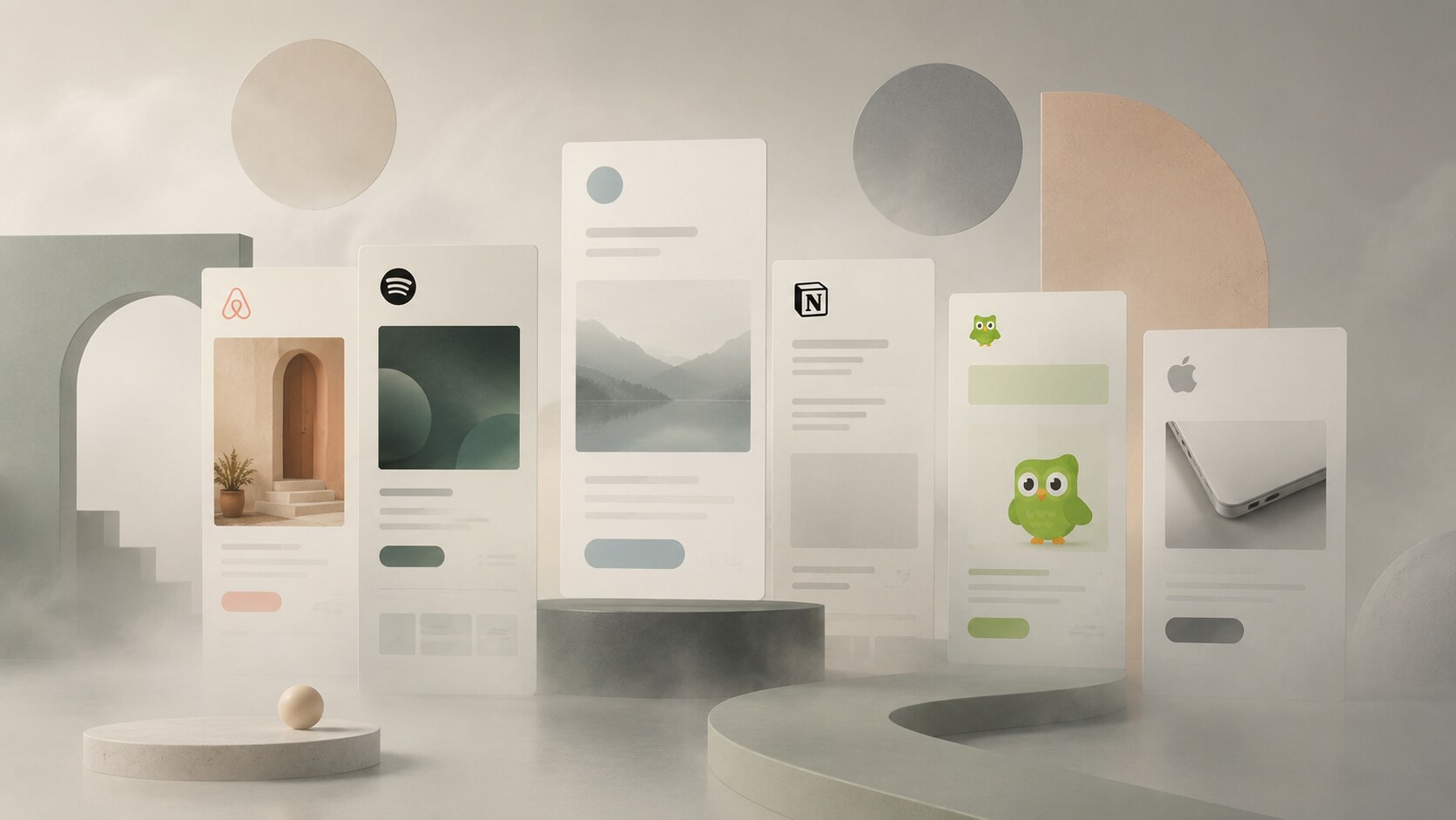
Some of the best-known brands in email do not necessarily produce the most visually dramatic messages. They produce some of the most disciplined ones.
Brands often cited positively by designers and marketers include:
What these examples tend to share is not one common style. It is a shared discipline:
“The best brand emails rarely try to prove how creative the designer is. They try to make the next click feel inevitable.”
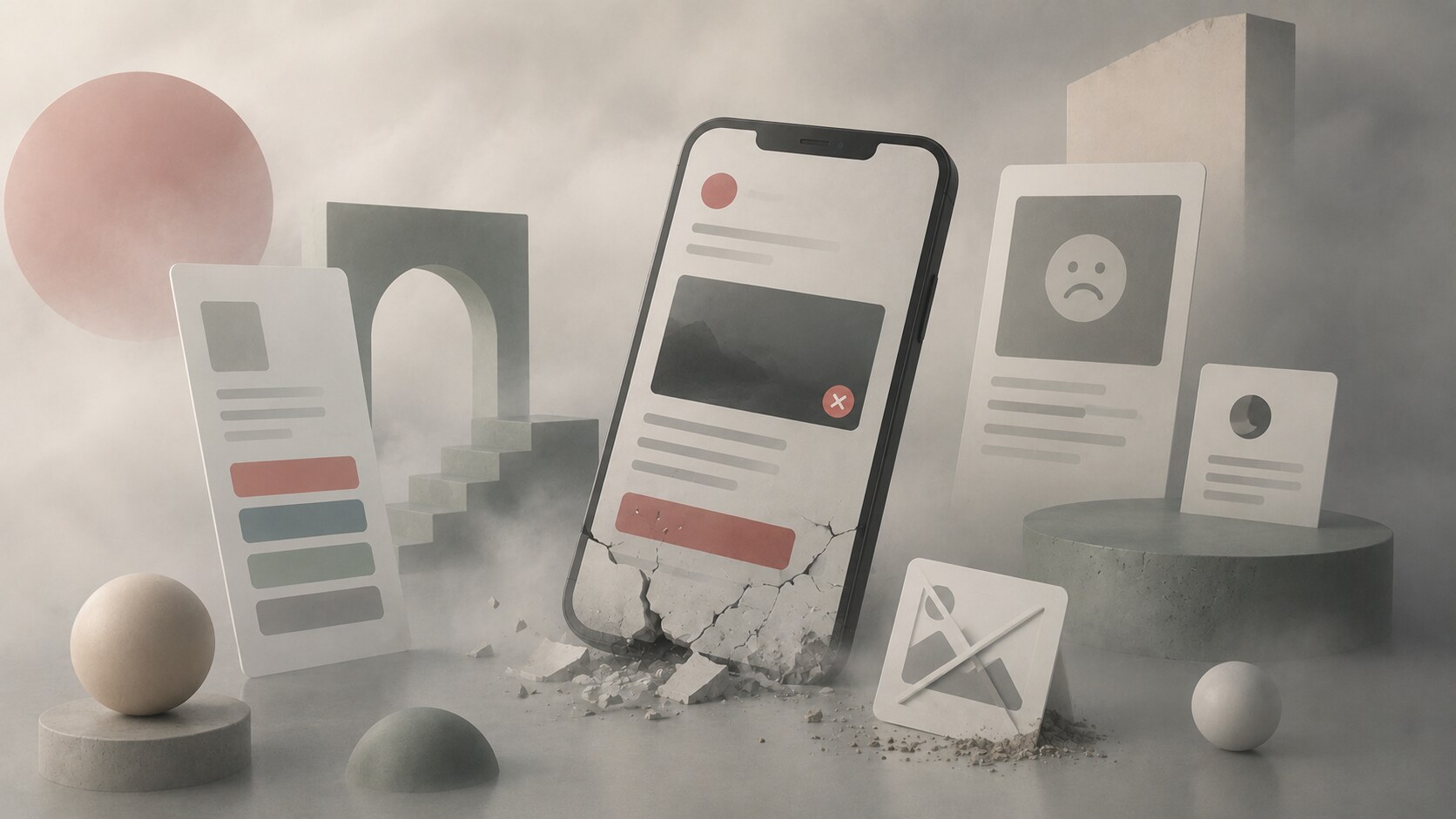
Some email mistakes repeat constantly:
That last one matters more now than many teams admit. Privacy changes, especially Apple Mail Privacy Protection, made open-rate interpretation far less reliable than it used to be. This changed how smart teams evaluate success. Clicks, conversions, downstream action, and list quality matter more than vanity optimism around opens.

Email design is partly visual, but partly operational trust design.
The U.S. CAN-SPAM rules are one basic example: clear sender identity, non-deceptive subject lines, a visible opt-out mechanism, and a valid physical postal address all matter. Beyond law, sender trust also depends on consistency, list hygiene, and not surprising subscribers with irrelevant volume.
This is where design and operations meet:
A hidden professional truth: some teams spend weeks polishing the hero banner and almost no time on the footer, preference center, or sending reputation. That is backwards.

Email is not becoming a normal web canvas. It is becoming a more systemized one.
The direction is clear:
In other words, email design is becoming less about building one beautiful campaign and more about maintaining a high-performing branded communication system.
One useful future fact: the more teams personalize email at scale, the more valuable rigid design systems become. Personalization increases complexity, so the visual framework has to become stricter, not looser.
Marketing email still works, but only when the design respects the medium instead of fighting it.
The channel rewards clarity, consistency, testing, and system thinking far more than decorative ambition. That is why a real email design system matters. It helps brands stay recognizable, helps teams move faster, and reduces the technical chaos that still defines HTML email.
Email may be old, but from a design point of view it is not dead at all. It is simply one of the few places where technical ugliness and commercial effectiveness still have to cooperate every day.
News, insights, case studies, and more from the rausr team — straight to your inbox.
Send us your brief, your wildest idea, or just a hello. We’ll season it with curiosity and serve back something fresh, cooked with care.