2026 is louder than ever, so graphics must speak faster
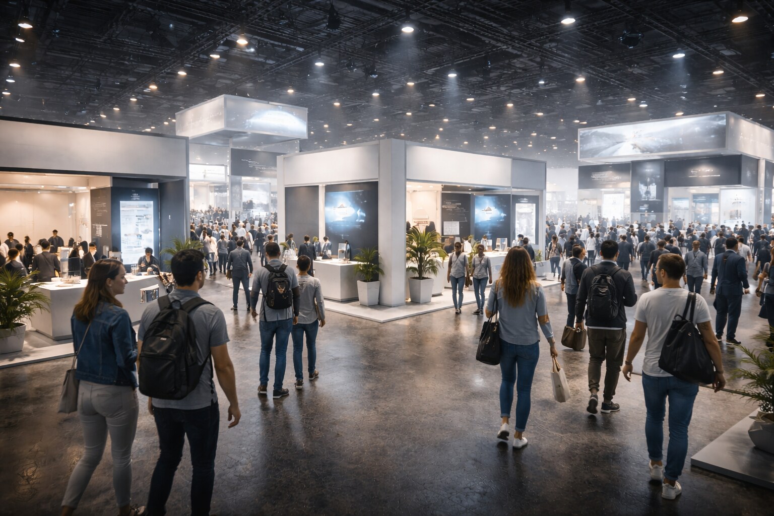
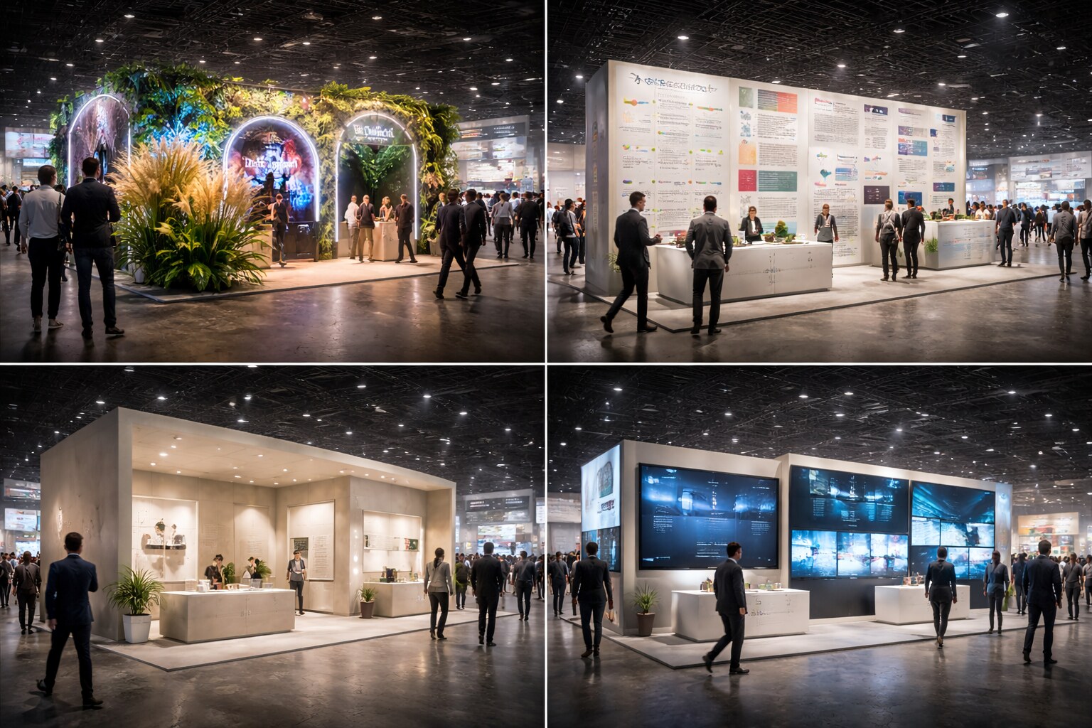
If you walk into an exhibition hall in 2026, one thing is obvious in the first 20 seconds:
there is more light, more motion, more screens, more “brand wallpaper”, and less patience.
Visitors don’t arrive in a calm reading mode. They arrive in survival mode: scanning, filtering, moving.
Your graphics are not competing with one competitor.
They’re competing with the entire room.
“On events the visual smog is extreme, so quick delivery of information for the visitor is the key to success.”
This article breaks down how exhibition and event graphics look in 2026, what changed in the last 5–10 years, what succeeds (and why), what fails (and why it keeps happening), and a practical set of rules you can use on real booths.
The core change
In 2016, many booths still relied on presence:
big photos, big logos, big walls. The winners rely on comprehension: fast message, clear categories, strong brand codes, repeatable system.
Not because “minimalism is trendy”.
Because the room is chaotic.
How It Looks in 2026
The dominant visual language of the show floor
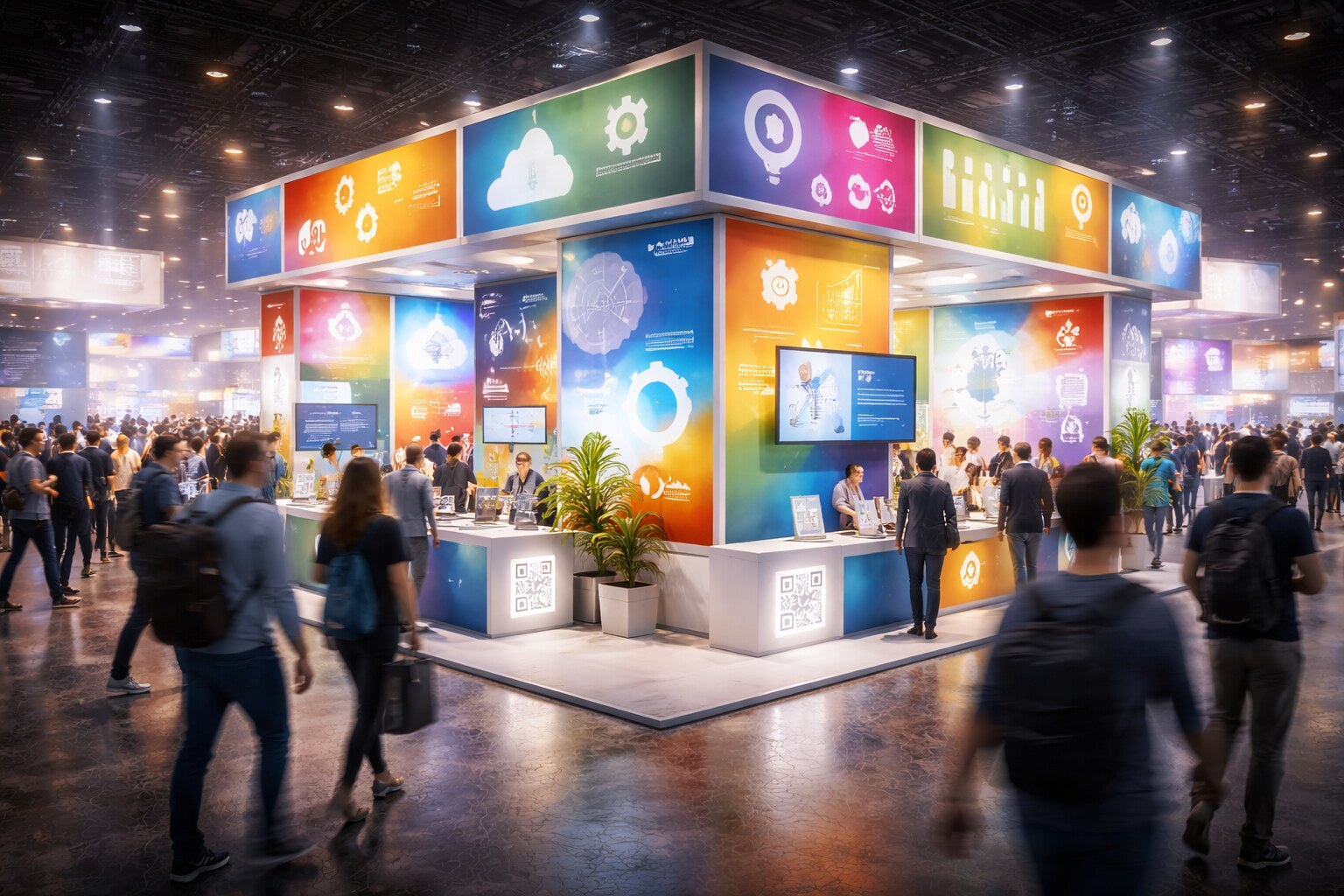
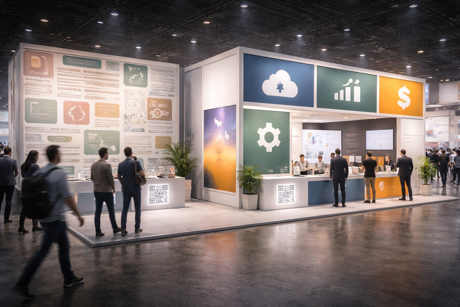
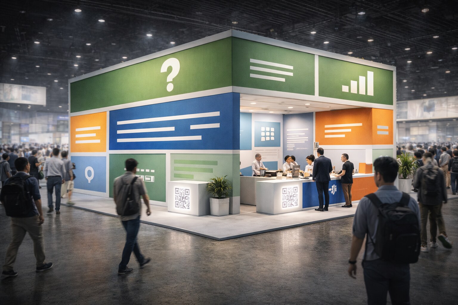
Exhibition and event graphics in 2026 typically combine giant typography (brand voice as architecture), lightboxes (fabric systems replacing heavy print builds), motion surfaces (LED walls, projections, interactive screens), dense iconography (features, standards, “quick proof” symbols), and QR codes as exits (download, demo, catalog, booking).
The best booths don’t use all of it.
They choose a primary signal and let everything else support it.
2026 “materials look”
Backlit fabric and matte textiles became the default because they look premium, install fast, and travel well. Recycled boards and modular frames push reuse and logistics efficiency, while glossy prints quietly disappear because glare kills readability in LED-lit halls.
2026 “typography look”
Instead of “one-off” display fonts, you see more system typography: one headline style, one body style, and one numeric style that works across every surface. Weights are heavier, contrast is higher, and “thin + trendy” gets replaced by “bold + legible” because distance reading matters more than refinement.

What Changed Since 2016–2021
Five shifts that quietly rewired event graphics
1. Light became a competitor
Ten years ago, your print was lit by hall lights.
Now your print competes with LED walls, dynamic signage, and brightly lit neighbors.
Result: low contrast, subtle gradients, and tiny type die first.
2. Booths became modular systems
Graphics are no longer “a one-off wall print”.
They’re modules that must work in different footprints, countries, and seasons.
Result: the identity must be a system, not a poster, and the message architecture must survive resizing.
3. Phones changed “how people read”
People trained themselves on short content.
In a hall, that behavior becomes extreme: they read headlines, labels, and numbers.
Result: your booth needs headline-level clarity, and your details must be scannable (not paragraph-based).
4. The camera became the second audience
Your booth is read by humans and by cameras:
phone photos, event photographers, social posts, recap videos.
Result: you need “photo-safe” contrast and compositions, with clean focal points instead of chaos.
5. Buyers want proof, not adjectives
“Premium”, “innovative”, “quality” are now background noise.
People want specific proof:
certifications, measurable benefits, demo cues, use cases.
Result: graphics shifted from “brand mood” to “brand + evidence”.

The Biggest Mistake in 2026
Mistaking noise for impact
Noise feels like effort. It feels like “we did a lot”.
But on the show floor, noise becomes invisibility.
The common 2026 failure pattern is simple: too many messages, too many symbols, too many visuals, and no clear reason to stop.
If visitors can’t answer this in 2 seconds, you’re losing:
- What is it?
- Who is it for?
- Why should I care?
What Not To Do
1. Don’t design a “poster booth”
Posters are read standing still.
Exhibitions are read while moving.
Typical symptoms are long paragraphs, thin type, and clever headlines that require context. Fix it by writing headlines like signage (direct, literal) and replacing long copy with short labels and scannable fragments.
2. Don’t chase trends as your main strategy
Trends are short.
Booths need recognition across time.
“Do not follow design trends in the main way. Trends are a small time horizon.
Instead build your branding, work with brand codes, stay consistent. People must quickly recognize: it’s you.”
Fix:
Decide your brand codes (color, type, grid, photo style, shape language) and repeat them harder than feels comfortable.
3. Don’t rely on “beautiful but vague”
“Beautiful” gets you a glance.
Clarity gets you a conversation.
Fix:
Include one proof line (numbers, category, outcome) and one “who it’s for” line (industry, segment, use case).
4. Don’t destroy contrast with trendy palettes
Muted palettes look premium on a clean website.
In a bright hall they often turn into mush.
Fix:
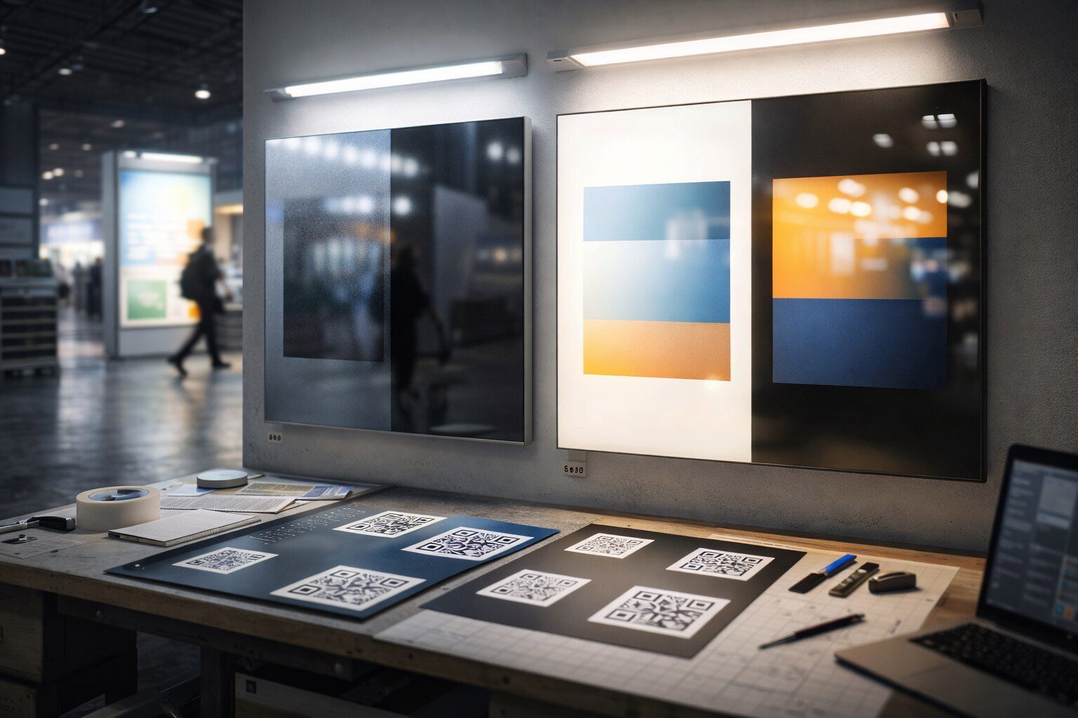
Test contrast under harsh light and keep at least one “hard” color pairing for headlines.
5. Don’t place critical text where people won’t stand
If your key message is on a side wall behind a demo table, it’s invisible.
Fix:
Treat the booth like a compass: put front-facing messages first, and place proof where conversations happen (counter / demo zone).

What To Do Instead
A practical system for booth graphics that work in 2026
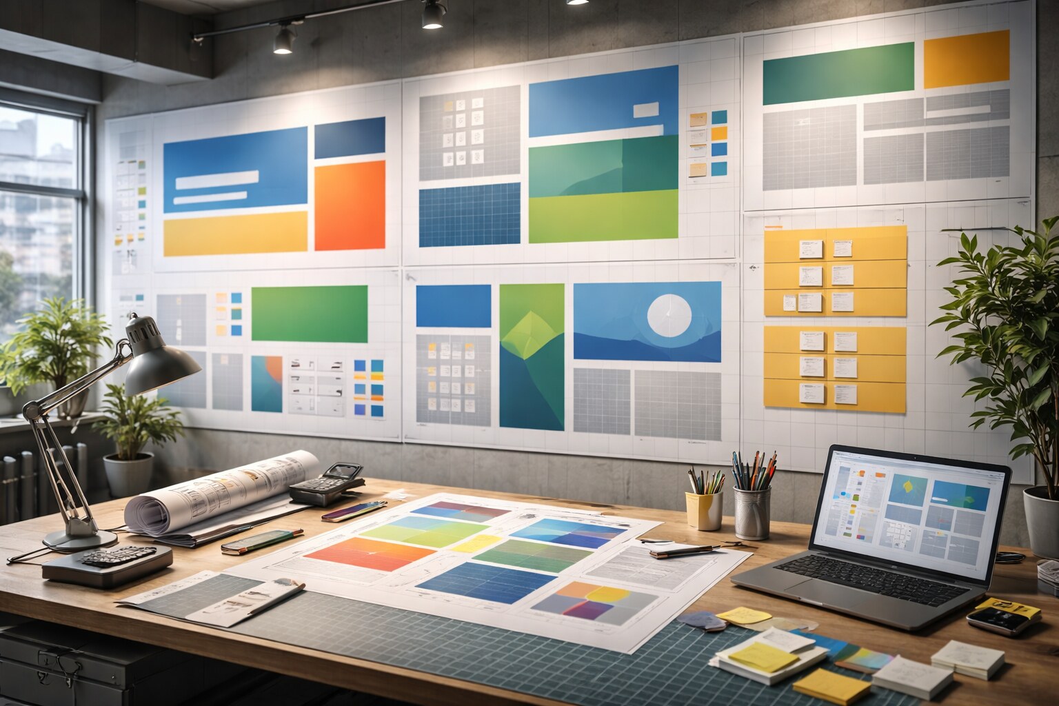
1. Build a message hierarchy (not a layout)
Your booth needs a stack:
- Stop line: the 2-second headline (what you are)
- Category line: who it’s for (industry / use case)
- Proof line: why it’s true (numbers / standards / results)
- Action line: what to do next (demo, scan, talk)
If you can’t write these four lines, don’t open Illustrator yet.
2. Use big type as wayfinding
Think like environmental graphics:
type is not decoration, it’s navigation.
Rule of thumb: visitors should read your primary headline from across the corridor, and they should read your proof line from conversation distance.
3. Repeat brand codes on purpose
At exhibitions, repetition is not boring.
Repetition is recognition.
Brand codes to lock:
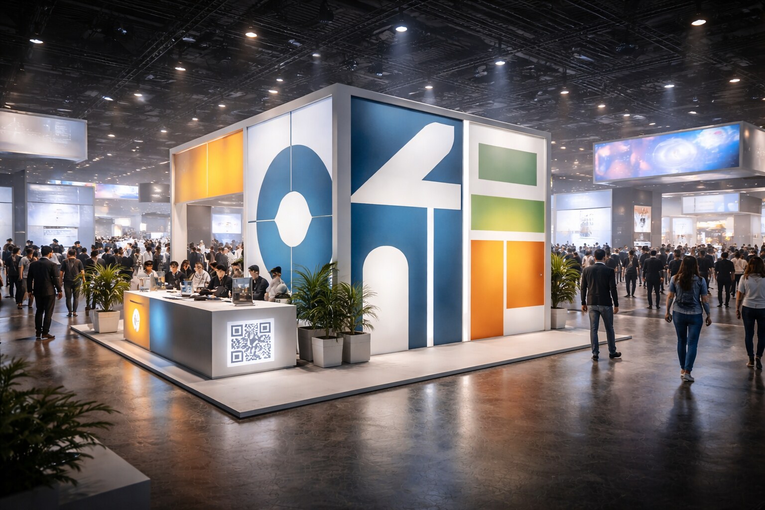
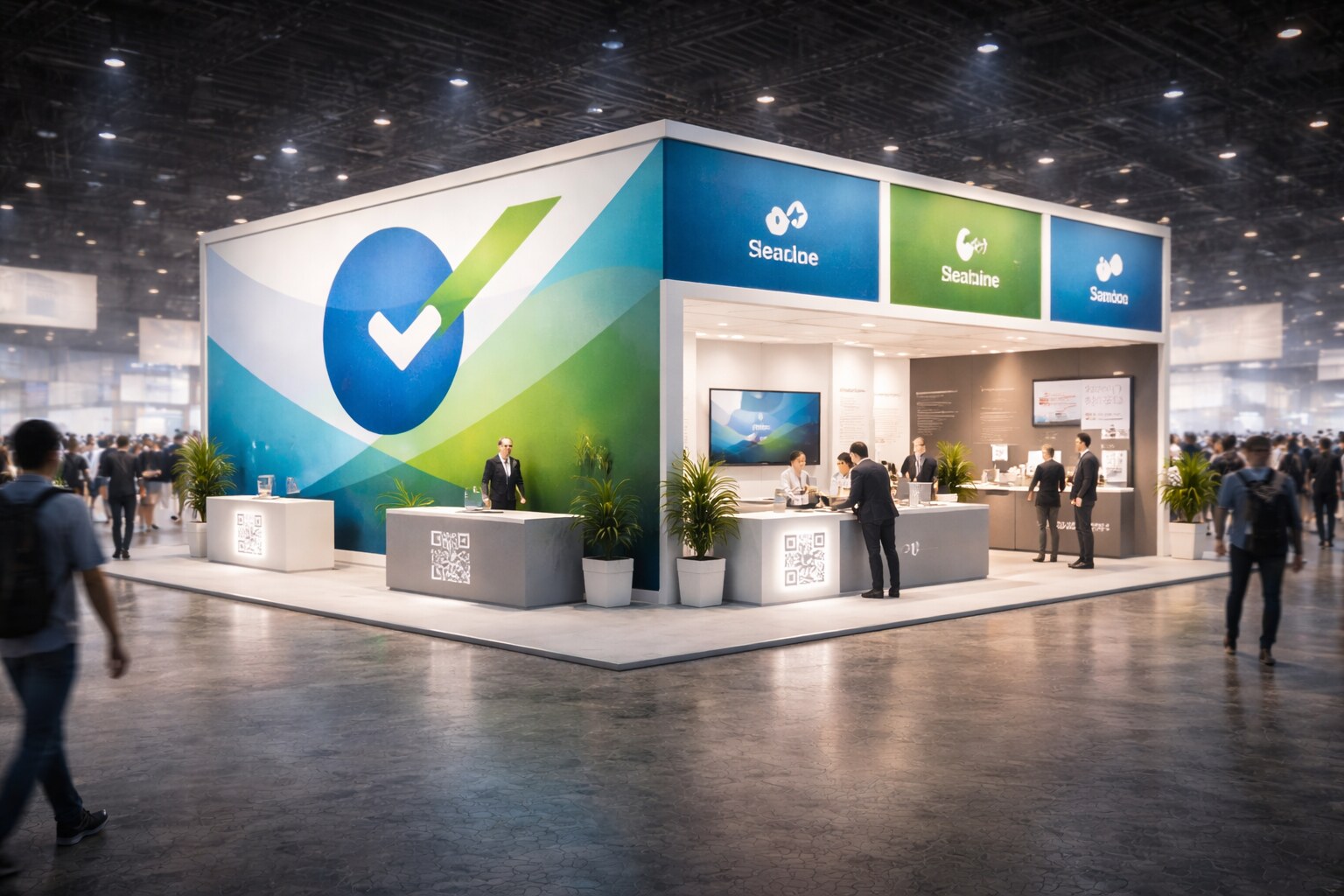
Pick 1–2 main colors (plus a neutral), one headline font and one body font, one grid logic (margins and spacing), one photo style (angle, lighting, subject), and one shape language (circles, stripes, frames, cut corners).
4. Design for speed: labels beat sentences
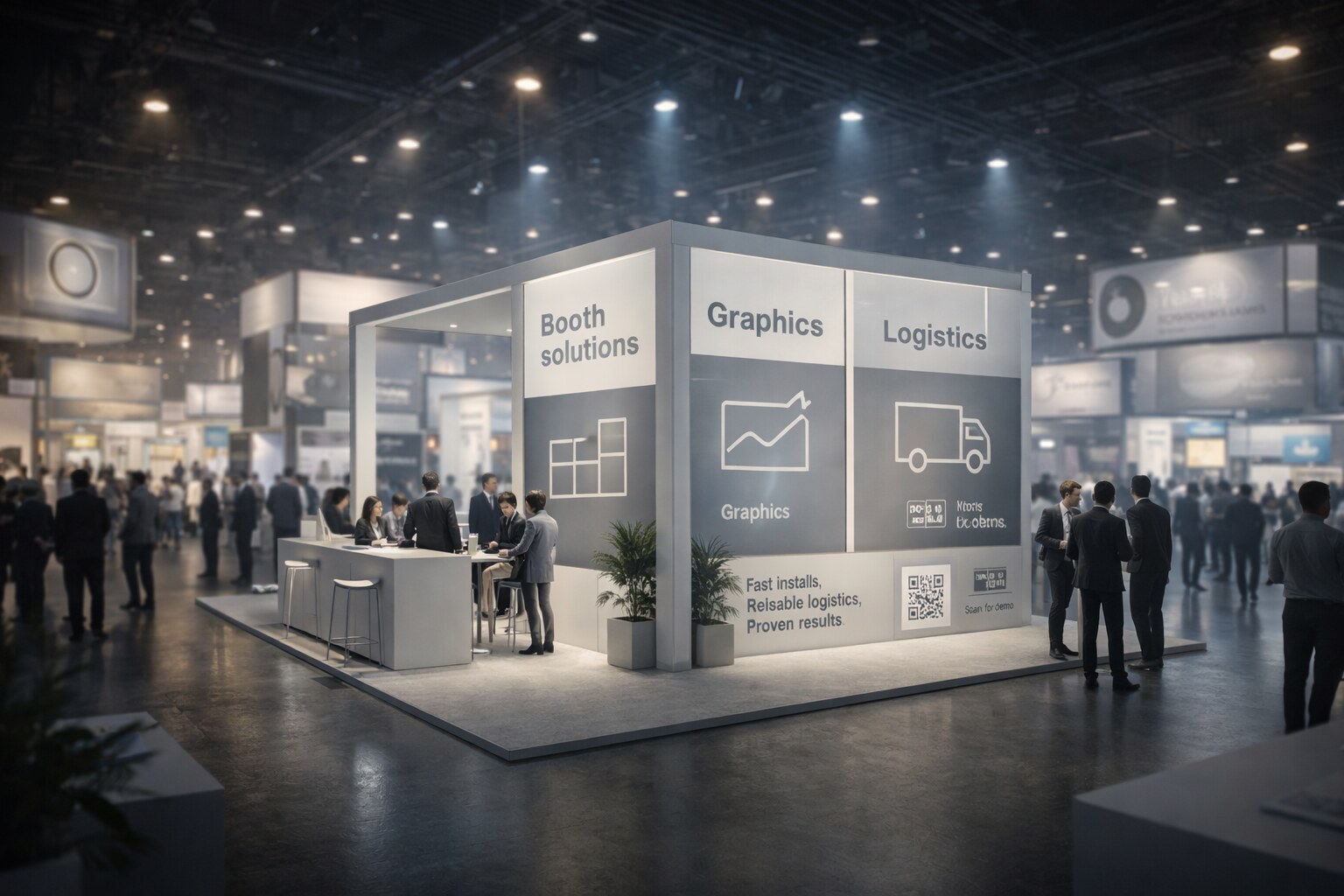
Replace vague sentences like “We provide end-to-end solutions for…” with concrete nouns and categories such as “Booth build”, “Graphics”, “Installation”, “Logistics”.
People scan nouns.
They don’t parse marketing grammar in a crowded hall.
5. Make the booth readable in fragments
Most visitors will not see your booth from the “perfect front view”.
They’ll see fragments: corner, edge, top, a cropped photo.
Design for fragments:
Put the headline on more than one face, ensure the logo reads from multiple angles, and avoid one single “hero wall” carrying everything.

Backlit graphics behave differently than prints
Lightboxes are popular because they’re clean, modular, and premium.
But backlit visuals can wash out subtle tones, expose banding in gradients, and reveal low-res imagery fast.
Practical fix: avoid delicate gradients in key areas, proof a backlit sample early (even a small one), and keep a high-contrast version of critical labels.
Gloss is not “premium” when the hall is full of LEDs
Glossy laminations can turn your message into a mirror.
Matte finishes often win, even if the print feels less “luxury” in hand.
Your most important copy should survive 3 seconds of walking
If your booth is only understandable when someone stops, you lose most of the room.
Practical exercise:
walk past your booth concept in your head; if the headline isn’t obvious instantly, rewrite it.
QR codes are not magic
People scan only when the reward is clear and the scan is frictionless.
Bad QR usage is “Scan to learn more” (no reason) or multiple QR codes with no labeling. Good QR usage is specific and transactional: “Scan for price list”, “Scan for demo booking”, “Scan for spec sheet”.
Successful Designs
1. The “one claim, one proof” booth
It doesn’t try to say everything.
It says one thing and proves it.
Example structure: “Fast install. Clean result.” or “Setup in 45 minutes. Reusable system.”
2. The wayfinding-first system
Instead of “branding everywhere”, it creates navigation through clear zones (demo / meeting / samples), big labels, and a consistent icon system.
This increases conversations because people feel oriented, not overwhelmed.
3. The brand-code booth
No trendy gimmicks.
Just a consistent, recognizable identity applied ruthlessly:
the same grid on every surface, the same type hierarchy, the same spacing rules, and the same photo language.
It looks “expensive” because it looks intentional.
Unsuccessful Designs
What looks cool in a render and dies in the hall
1. The “Instagram booth” with no message
It photographs well but says nothing.
People walk by because they don’t understand the offer.
2. The “feature explosion”
Every wall becomes a list.
The booth turns into a spec sheet.
Visitors don’t know what to focus on.
3. The “quiet luxury” booth that becomes invisible
Everything is low contrast, minimal, beige.
In the hall it becomes background architecture.
4. The “screen addiction”
If your booth is 70% screens, you’re competing with your neighbors’ screens.
And screens are often ignored because everyone assumes “it’s just a video loop”.
Designers Worth Knowing
Not “trendy names”, but people who shaped clarity and systems
If you want strong references for exhibition and event graphic design, study Paula Scher (Pentagram) for environmental typography, Lance Wyman for wayfinding systems, Otl Aicher for pictograms and information discipline, and Massimo Vignelli for hierarchy, grids, and legibility.
There are a lot of others, but these chefs were mentioned a few times before in previous articles.
You don’t need to copy their style.
You need to copy their obsession: clarity under real constraints.
A Practical Checklist for 2026 Booth Graphics
Run this before production, not after installation
- Can someone understand the booth in 2 seconds, and read the main message from across the corridor?
- Is there exactly one primary headline per viewing angle?
- Do you have a proof line (numbers, standard, result) at conversation distance?
- Do your brand codes repeat across all surfaces, even when the booth shrinks?
- Are QR codes labeled with a real reward, and will your visuals survive harsh light and glare?

Conclusion
In 2026, the hall is not a gallery. It’s a storm.
The winning exhibition graphics are not the noisiest.
They’re the clearest.
“If you build a consistent identity, repeat your brand codes, and keep your message simple, you don’t need to chase trends to look modern. You’ll look like a brand that knows who it is.”
