FIFA World Cup Branding and Visual Evolution
How FIFA World Cup visual identity evolved from early posters and simple emblems into full branding systems with logos, mascots, campaigns, and global event design.

How FIFA World Cup visual identity evolved from early posters and simple emblems into full branding systems with logos, mascots, campaigns, and global event design.
The FIFA World Cup is one of the strangest design objects in global culture.
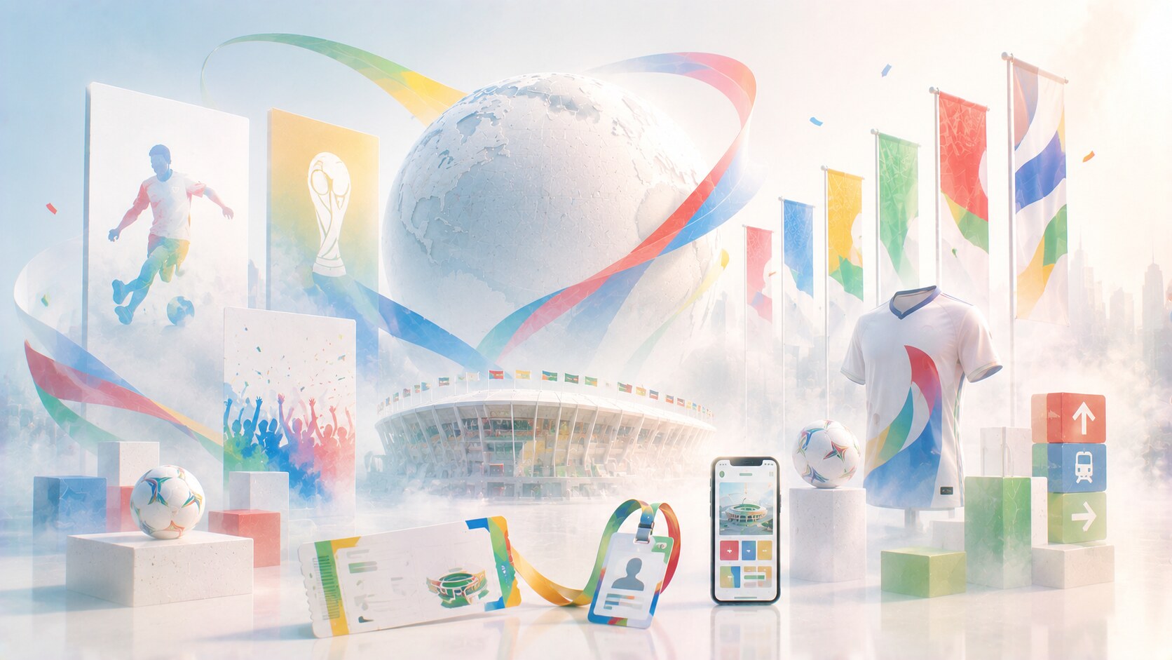
It is huge, expensive, politically loaded, visually everywhere for a short period, and then suddenly gone as a live event. But the identity itself never really disappears. Posters, mascots, logos, tickets, wayfinding, broadcast graphics, city dressing, merchandise, volunteer uniforms, and sponsor systems keep each tournament alive much longer than the month of matches.
That is why World Cup branding is so worth studying. It shows how event design changed from poster-led promotion into a full visual system stretched across architecture, television, apps, transport, retail, and digital culture.
This article sits naturally beside Graphic Design as the Key to Visual Orientation at Festivals and Events, Trend Cycles in Graphic Design, and Reddit Design and Branding Evolution.
“World Cup branding is not only a logo project. It is a temporary country-scale design system built for one of the most watched events on earth.”
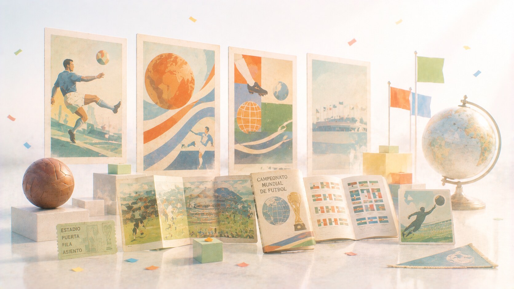
In the early decades, the World Cup did not yet behave like a full identity machine.
The tournament still had memorable graphics, but these were usually centered on posters, printed announcements, and national-host symbolism rather than on a tightly unified cross-platform brand system. The visual task was simpler because the media environment was simpler.
What mattered most then was:
These early identities were important, but they were not yet operating at the scale of modern mega-event branding. In practical terms, the World Cup had not yet become a total design environment.
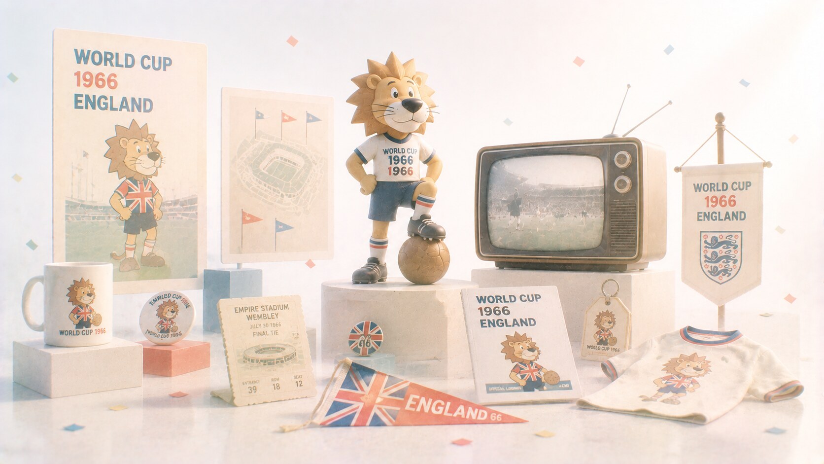
One of the biggest early turning points came in 1966 with World Cup Willie, the tournament’s first official mascot.
FIFA’s own mascot history makes clear how important that was. Willie was not just a side character. He helped establish the idea that a tournament identity could extend into merchandising, media friendliness, and broader public recognition.
This is why 1966 matters so much. It marks the point where World Cup design started becoming more expandable. A mascot could travel further than a poster. It could enter children’s culture, souvenirs, television, and later licensing logic.
Because the tournament identity was no longer only something you looked at. It became something you could buy, repeat, and remember in a more emotional way.
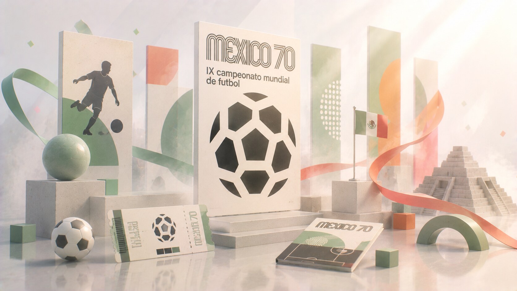
The 1970 tournament in Mexico remains one of the clearest graphic-design highlights in World Cup history because the official poster was designed by Lance Wyman.
That matters for two reasons.
First, Wyman was already deeply associated with the visual power of Mexico 1968 (olympic games). Second, his World Cup work showed how a football tournament could borrow from a more modern design language without losing clarity.
The 1970 poster is memorable because it is:
This was not the beginning of all good World Cup branding, but it was a serious signal that the tournament could produce design work respected beyond football itself.
One hidden reason 1970 still feels important is that it sits close to the Mexico 1968 design universe, one of the most celebrated event-identity systems of the twentieth century. That atmosphere raised the visual bar.
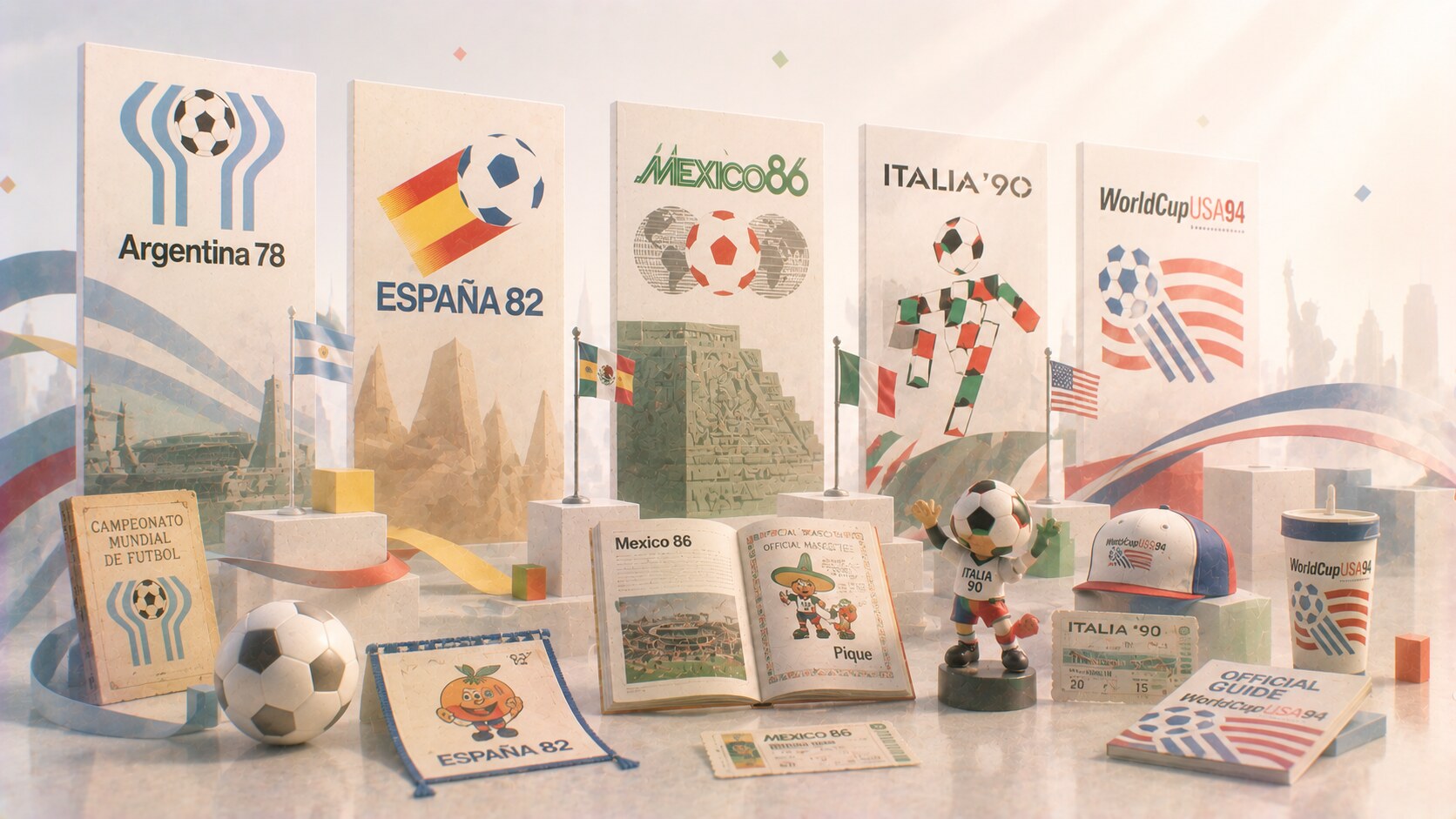
As the World Cup moved through Argentina 1978, Spain 1982, Mexico 1986, Italy 1990, and USA 1994, the visual identities became more recognizable and more tied to host narratives.
This period is interesting because the World Cup identity was no longer innocent. It was often carrying politics, tourism, national image-making, and growing commercial pressure at the same time.
The 1978 Argentina mark is one of the most discussed examples. Later design writing has shown how the logo’s meaning became politically charged in ways that far exceeded a normal sports emblem.
By the 1990s, the tournament was clearly becoming a more serious design commission. It had to contain more than a logo:
This is the stage where the World Cup became harder to design because it became harder to control.
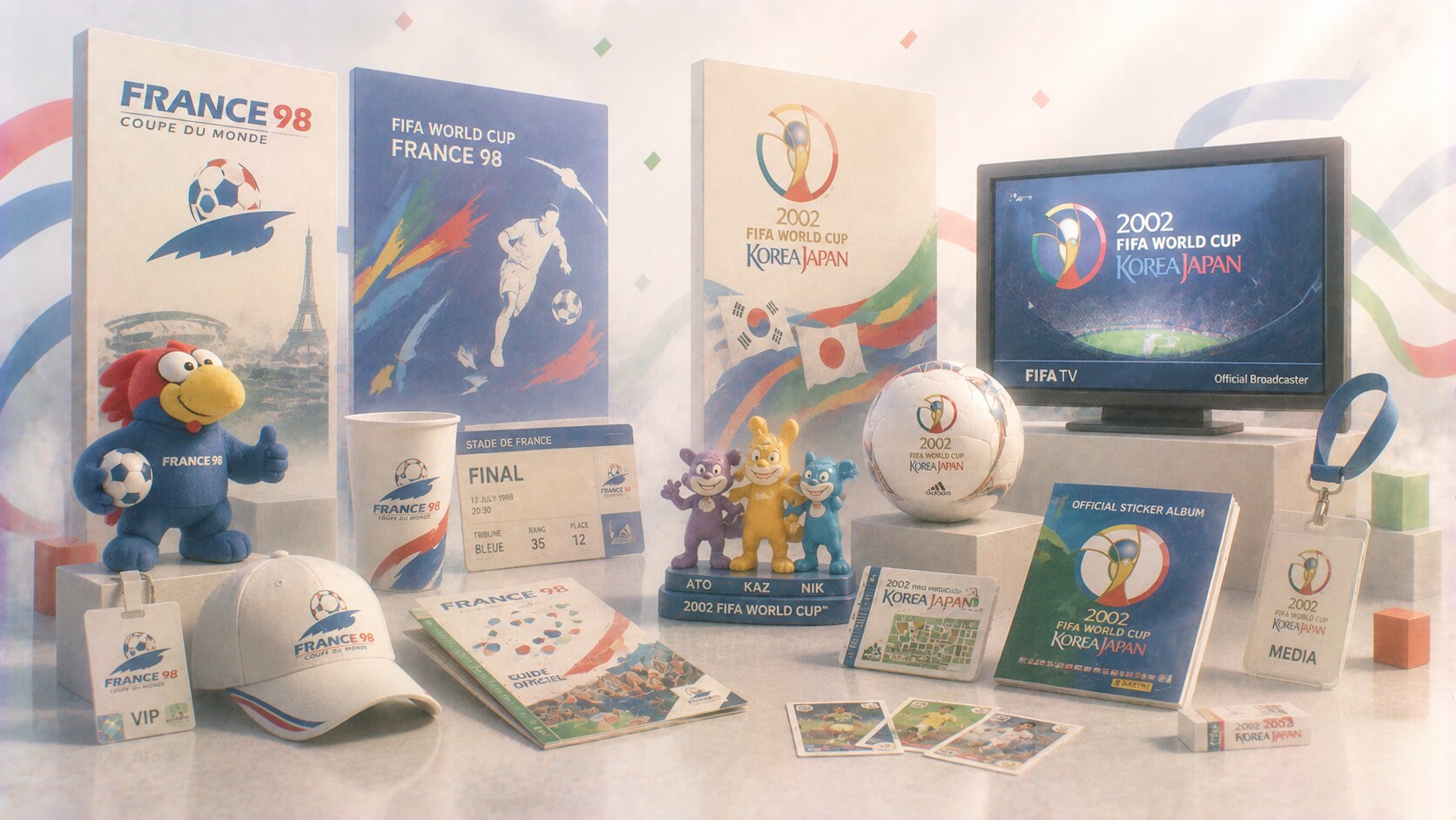
By France 1998 and Korea/Japan 2002, the World Cup had fully entered the era of larger global event branding.
This did not mean every graphic solution was perfect. But the expectation changed. The identity now had to work across broadcast graphics, physical host environments, sponsors, digital materials, fan products, and a truly worldwide media cycle.
In other words, the World Cup stopped being only a tournament image and became a multi-touchpoint visual program.
That shift also brought new risks:
As FIFA grew commercially, visual identities gained more consistency but sometimes lost some of the raw local unpredictability that made older tournaments visually distinct.
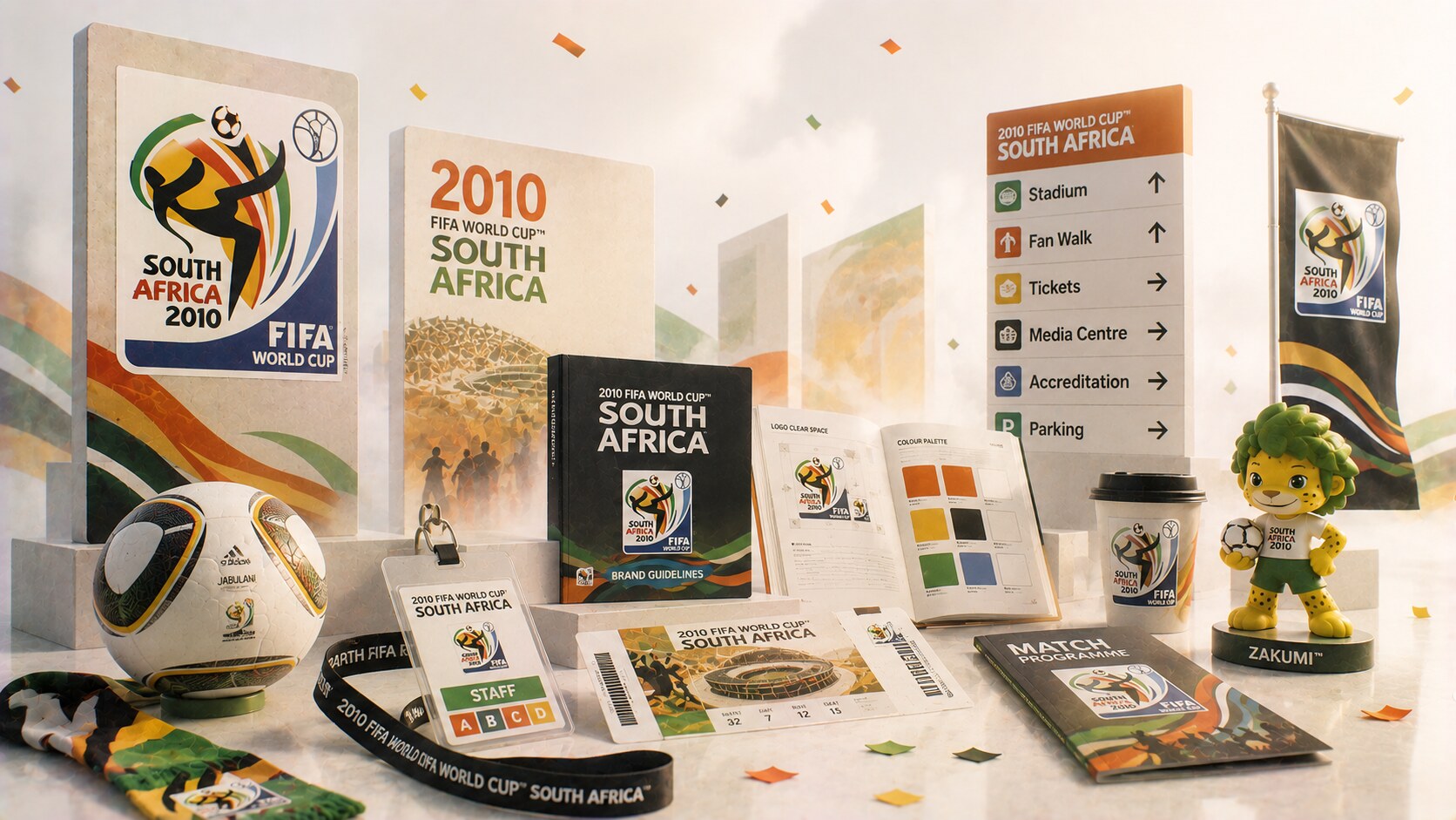
The 2010 FIFA World Cup in South Africa is important not only for its look, but for what the design process revealed.
Design Week reported that the branding was developed by Johannesburg consultancy Switch after a structured FIFA pitch process that began roughly five years before the event. That timing alone says a lot. By this stage, World Cup branding was no longer a late-stage logo task. It was a long-range strategic commission.
This phase shows the new reality clearly:
Because it proves how large the World Cup branding machine had become. Even though the live tournament lasts around a month, the visual preparation can take many years.
Exact identity-design budgets are rarely public in a clean way. But the process is clearly expensive, long, and highly managed, because it feeds signage, publications, broadcast, digital assets, uniforms, licensing, and sponsor integration across a global event.
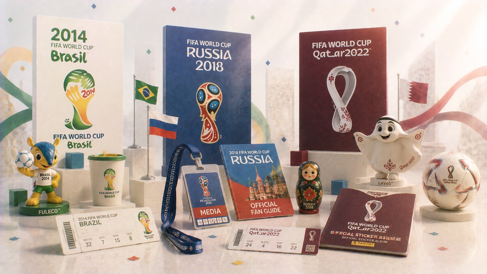
The 2010s made the pattern obvious. FIFA and host organizers were now delivering visual systems that had to feel globally deployable and locally meaningful at the same time.
The 2022 Qatar emblem is a useful example because FIFA’s own explanation is unusually explicit. The official emblem connected:
This is one of the strengths of recent World Cup branding. The emblem is expected to perform as compressed storytelling.
But it also reveals a weakness. When every emblem has to explain many meanings at once, some identities can start feeling over-justified after the fact rather than naturally iconic.
“Modern World Cup branding often has to do two jobs at once: satisfy a global corporate system and still look like it belongs to one host culture.”
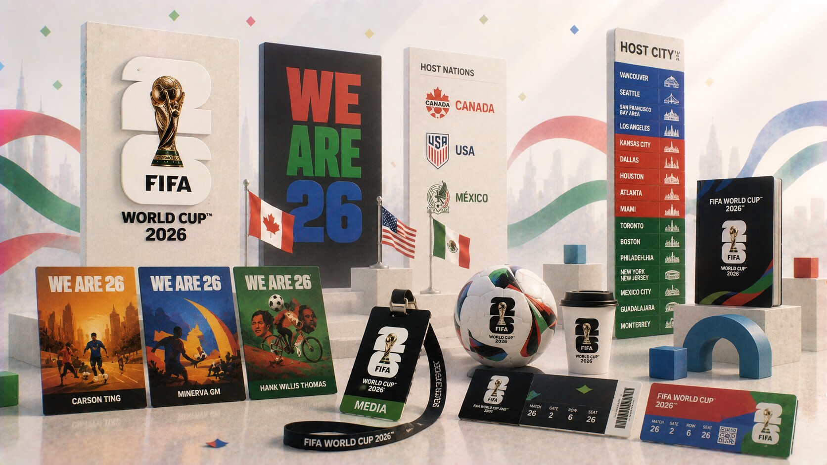
The FIFA World Cup 2026 identity made one thing very clear: FIFA now wants a system that can scale almost infinitely.
FIFA’s official brand launch described the emblem as a combination of the actual trophy image and the year “26.” It was presented as a timeless structure that could be customized across hosts and cities. This is a major shift in logic.
Instead of designing one singular host-specific mark in the older sense, FIFA moved toward a framework:
The 2026 official poster approach also broke a new boundary. For the first time in World Cup history, three artists collaborated on the official tournament poster: Carson Ting, Minerva GM, and Hank Willis Thomas.
Because FIFA is trying to solve scale through modularity rather than through one ultra-specific host symbol alone.
Some designers and fans felt the 2026 emblem was too generic compared with older, more distinctive host-era marks. That criticism is important. Scalability can improve system behavior while reducing emotional singularity.
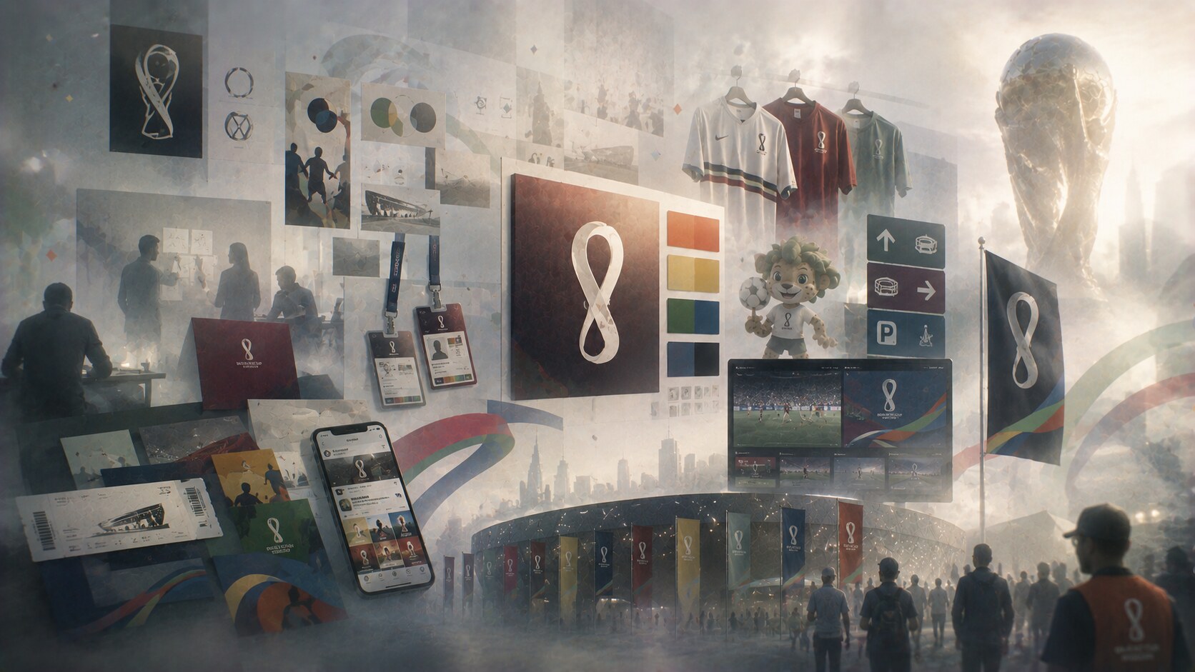
If a studio, internal team, or organizing committee is building a World Cup identity today, the brief is enormous.
It usually has to cover:
That is why the project takes years and why exact authorship can become blurry. There may be named designers for posters or mascots, but the total identity is often the result of committees, consultants, FIFA rules, local organizers, and commercial constraints all working at once.
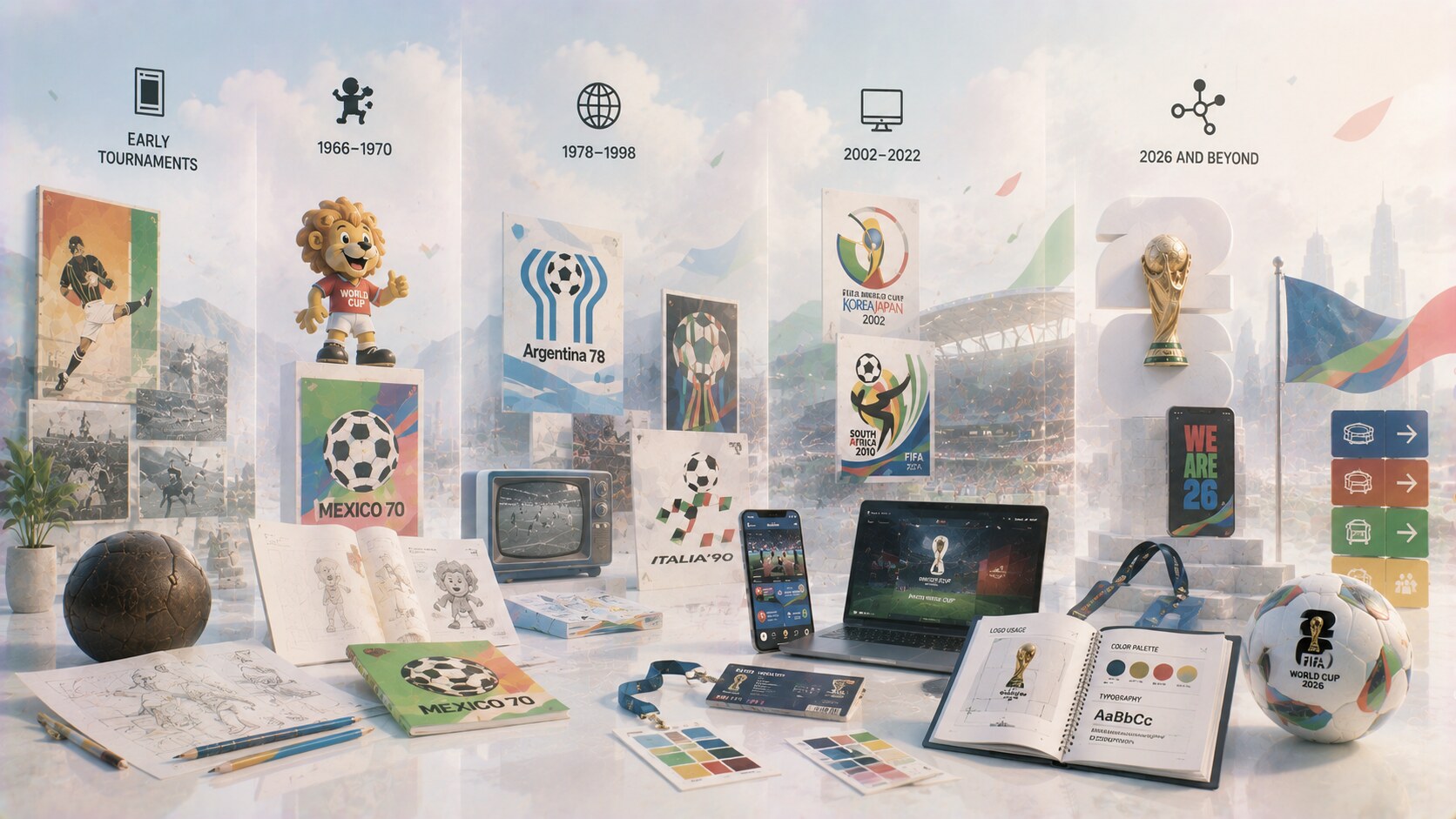
| Era | Main visual logic | Main challenge |
|---|---|---|
| Early tournaments | posters and simple emblems | visibility more than system coherence |
| 1966-1970 | mascots and stronger modern graphic authorship | expanding memory beyond the match |
| 1978-1998 | host symbolism and broader event identity | politics, commercialization, and scale |
| 2002-2022 | polished multi-platform systems | balancing global consistency with local culture |
| 2026 onward | modular brand frameworks | scaling across many hosts without losing distinctiveness |
The comparison shows the deeper story clearly. As the tournament grew, the design problem stopped being “How do we announce it?” and became “How do we control it everywhere?”
The earliest World Cups could still live mostly through posters and symbols.
Modern World Cups cannot.
Now the identity has to function in stadiums, on phones, on tickets, in merchandise, on television, across social media, and through sponsor ecosystems before, during, and after the tournament. That is why the work starts years in advance even though the matches themselves last only a short time.
The most successful World Cup identities usually do three things well:
That is the real design story here. The World Cup did not only get bigger. It forced graphic design to become bigger with it.


News, insights, case studies, and more from the rausr team — straight to your inbox.
Send us your brief, your wildest idea, or just a hello. We’ll season it with curiosity and serve back something fresh, cooked with care.