From Cursor to Touchscreen: How Touch Interface Design Was Born
How interface design moved from cursors and styluses to finger-first touchscreens, from E. A. Johnson and PLATO IV to the iPhone, modern accessibility and spatial input.


How interface design moved from cursors and styluses to finger-first touchscreens, from E. A. Johnson and PLATO IV to the iPhone, modern accessibility and spatial input.
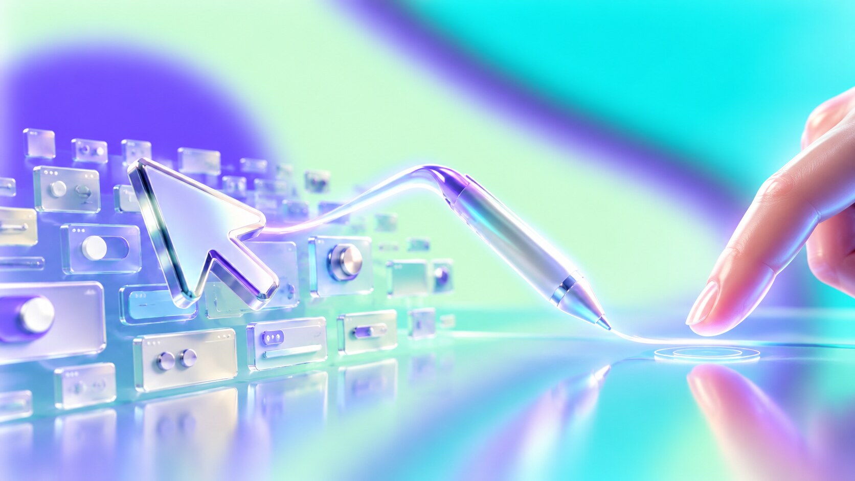
For decades, a computer interface assumed that the user’s hand was somewhere else. A mouse moved a cursor across the screen. A stylus touched the display more directly, but still supplied a narrow, precise tip. Then the finger became the pointer, and many familiar rules stopped working.
A finger has no hover state, hides the object it touches and lands much less precisely than a cursor. It also creates something more powerful: the feeling that the content itself is being moved. A photograph follows the hand. A page keeps scrolling after a flick. Two fingers stretch a map. The interface no longer feels like a control panel beside the object; it feels like the object.
Apple did not invent the touchscreen, the touch phone or multi-touch research. Its achievement was combining mature sensing technology, fluid animation, a large capacitive display and a consistent operating system into the first globally successful finger-first pocket computer.
This story continues the interface timeline from UX and UI in the Early Days and connects with Skeuomorphism: When Interfaces Felt Like Home, because early touchscreens needed familiar visual objects before gestures became familiar.
“Touch succeeded when designers stopped treating the finger as an inaccurate mouse and started designing an interface for the hand.”
The graphical desktop was designed around indirect control. A mouse could cross a large screen with a small wrist movement and select a target only a few pixels wide. Hover revealed help. Right-click opened a second layer of commands. Menus could be dense because the pointer did not cover them.
This system rewarded precision and information density. It was excellent for spreadsheets, illustration, page layout and complex software, but it required a desk, a flat surface and learned coordination between hand and cursor.
The stylus shortened that distance. Writing and drawing felt natural, and a sharp tip could select small controls inherited from desktop software. Yet most pen computers still treated the display as a portable mouse pad. The user touched tiny menus, window borders and scrollbars designed for another input method.
Direct finger input required a more radical question: what if the interface were not a desktop made smaller, but a physical surface with its own scale, movement and behavior?
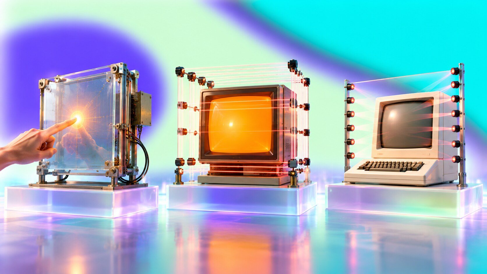
British engineer E. A. Johnson described a capacitive touch display in a 1965 paper while working at the Royal Radar Establishment. His design was intended for demanding control environments such as air-traffic systems. It recognized a finger on the screen, but it was not a pocket computer and did not contain the visual grammar we now associate with touch.
In 1972, the University of Illinois introduced PLATO IV terminals with an orange plasma display and an infrared touch grid. Students could answer questions by touching locations on educational screens. The system demonstrated an important principle: touch becomes understandable when the software presents a limited set of clear choices.
The HP-150 brought touch to a commercial personal computer in 1983. Infrared emitters and detectors surrounded the screen, so dust could interrupt the grid and create false input. More importantly, much of the software still belonged to the DOS and keyboard world. The machine had touch hardware without a complete touch-first operating system.
| Year | Device or system | What it proved |
|---|---|---|
| 1965 | Johnson touch display | a finger could select a position electronically |
| 1972 | PLATO IV | touch could support real users and visual lessons |
| 1983 | HP-150 | touch could ship on a personal computer |
| 1989 | GRiDPad | a stylus tablet could succeed in specialist work |
| 1994 | IBM Simon | a touchscreen could organize phone and PDA functions |
| 2007 | iPhone | fingers could control a complete mass-market mobile OS |
The answer to “what was first?” therefore depends on the category. Johnson produced the earliest widely credited finger-operated capacitive design. PLATO IV was an early deployed touchscreen computer system. The HP-150 was an early commercial touchscreen PC. None was the first modern touch interface in the form we use today.
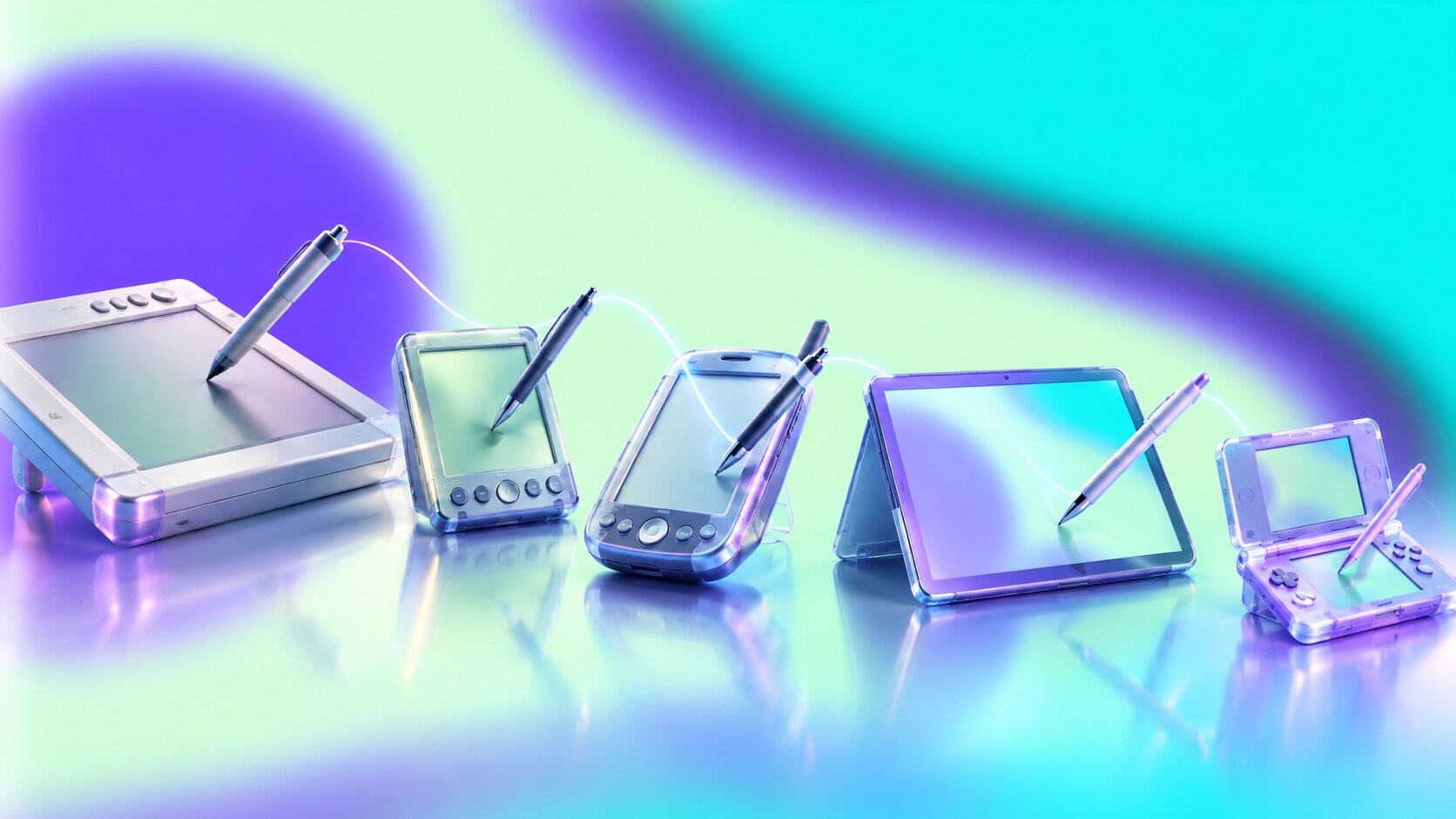
Jeff Hawkins designed the GRiDPad, introduced in 1989. The Computer History Museum describes it as the first commercially successful tablet computer. Its handwriting work later informed Graffiti on the PalmPilot. These products accepted an obvious fact: when screens and controls are small, a pen is more accurate than a fingertip.
IBM’s Simon Personal Communicator went on sale in 1994. Led conceptually by Frank Canova, it combined a mobile phone, calendar, notes, email and fax behind a resistive touchscreen. It is widely recognized as the first smartphone, but its interface was easier with the supplied stylus and its weight, battery life, price and network context prevented mass adoption.
Microsoft’s Windows XP Tablet PC Edition arrived in 2002 with digital ink and pen input added to full desktop Windows. This was useful for notes and specialist work, but compatibility was also a trap: preserving every existing Windows application preserved controls designed for a cursor.
The Nintendo DS offered a smarter compromise in 2004. It kept buttons for fast game actions and used a stylus touchscreen where pointing, drawing or dragging felt better. Nintendo reports lifetime DS family sales of 154.02 million units. Touch did not have to replace every control to become mainstream.
Hidden lesson: The stylus did not lose because pens were unnatural. It lost the role of mandatory navigator. Pens remain excellent for drawing, handwriting and precise selection; the problem was requiring one for ordinary actions such as opening a message.
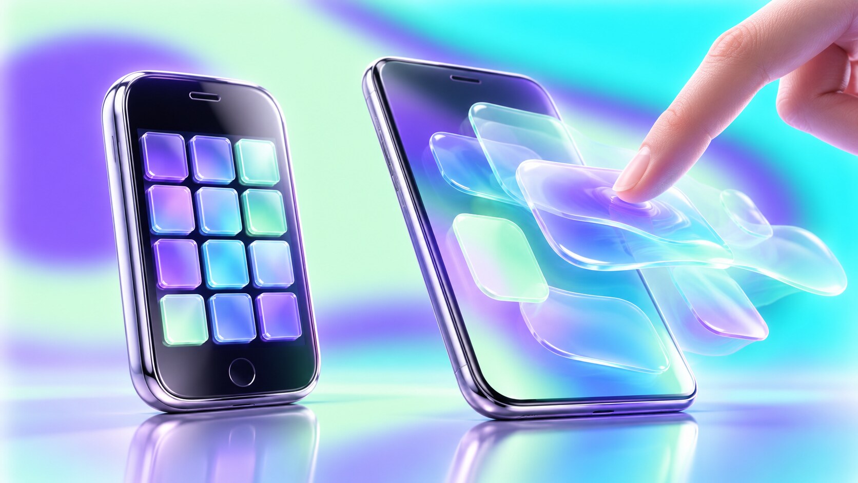
The LG Prada was announced before the iPhone and reached the market with a capacitive all-touch display. Earlier phones such as the Neonode N1 had already explored finger gestures and swipe-to-unlock behavior. Apple entered a field with many existing inventions.
Apple had also acquired FingerWorks in 2005. Founded by researchers Wayne Westerman and John Elias, the company had developed multi-touch gesture surfaces before the iPhone. Multi-touch itself had a much longer research history, documented extensively by interaction designer Bill Buxton.
The breakthrough came from integration. Steve Jobs pushed the product direction, Jony Ive led industrial design, and Scott Forstall led the software effort. The human-interface team included Greg Christie, Bas Ording and Imran Chaudhri, among others. No single person designed “touch.” A concentrated team turned separate technologies into one behavior system.
Several decisions made the difference:
This consistency made the first iPhone feel simpler than many devices with fewer capabilities. The glass was blank until software gave it the correct controls for the current task.
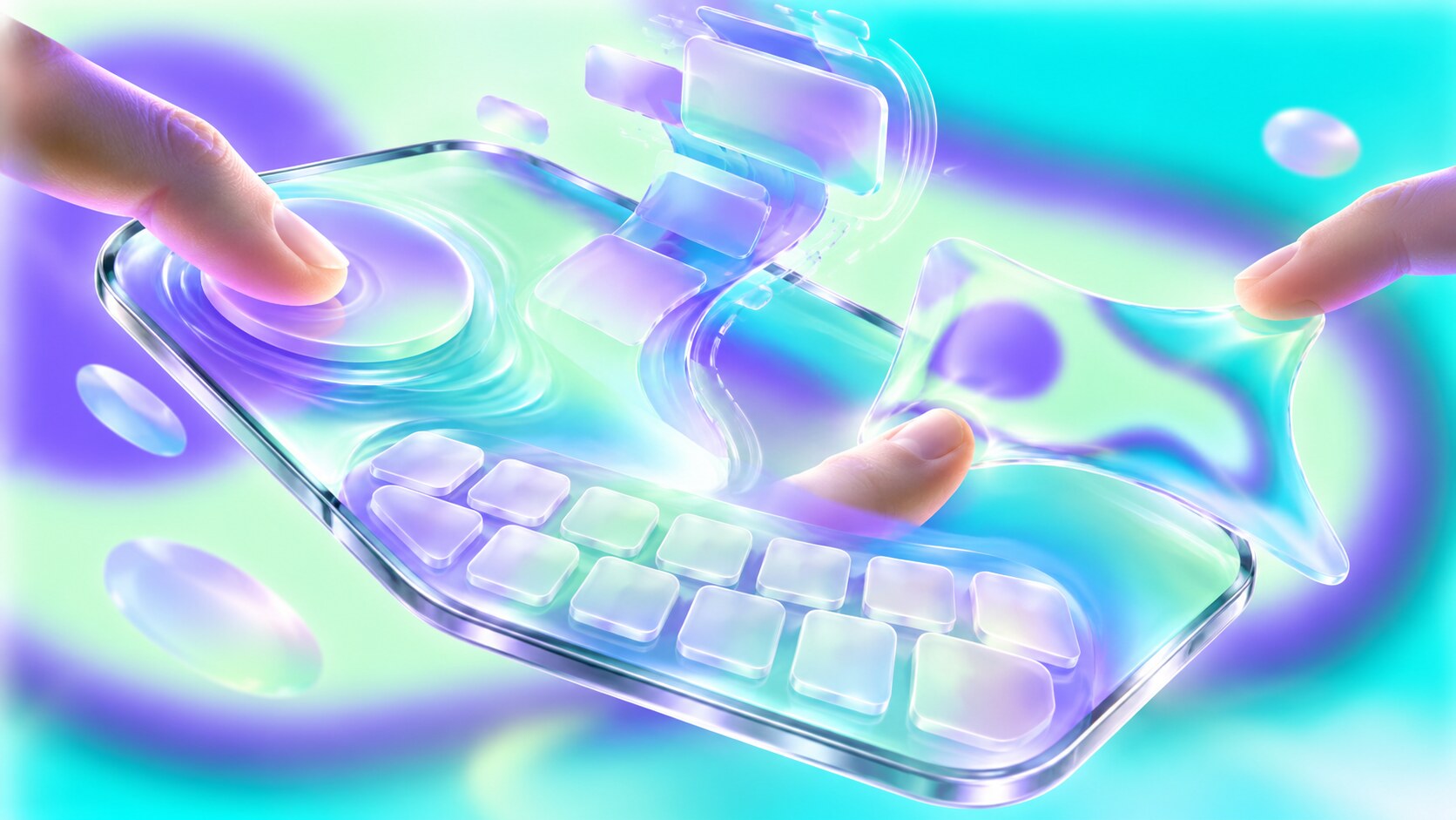
Earlier teams were not simply less imaginative. They worked with dim displays, slow processors, poor batteries, expensive sensors and networks built mainly for calls. Resistive screens often needed pressure and were easier with a stylus. Software animation could lag behind the hand, immediately breaking the illusion of direct manipulation.
By 2007, Apple could combine a responsive capacitive panel, a capable mobile processor, desktop-class web rendering, useful maps, media synchronization and a battery that could support the experience. It also controlled the hardware and operating system together. A gesture did not have to survive several manufacturers, screen technologies and incompatible interface layers.
Apple sold the millionth iPhone only 74 days after launch. LG later reported more than one million sales for the first Prada phone, a real achievement but not the start of a comparable software platform. The difference was not only screen technology. The iPhone connected touch to a browser, media ecosystem, recognizable interaction rules and, one year later, the App Store.
“The winning invention was not the touchscreen alone. It was the agreement between the screen, animation, gestures, applications and hardware.”
The first iPhone still had blind spots. It launched without native third-party apps, copy and paste, or a physical keyboard. Its glossy visual realism sometimes used more decoration than necessary. Success did not mean the system was complete; it meant the central interaction model was convincing enough to improve quickly.
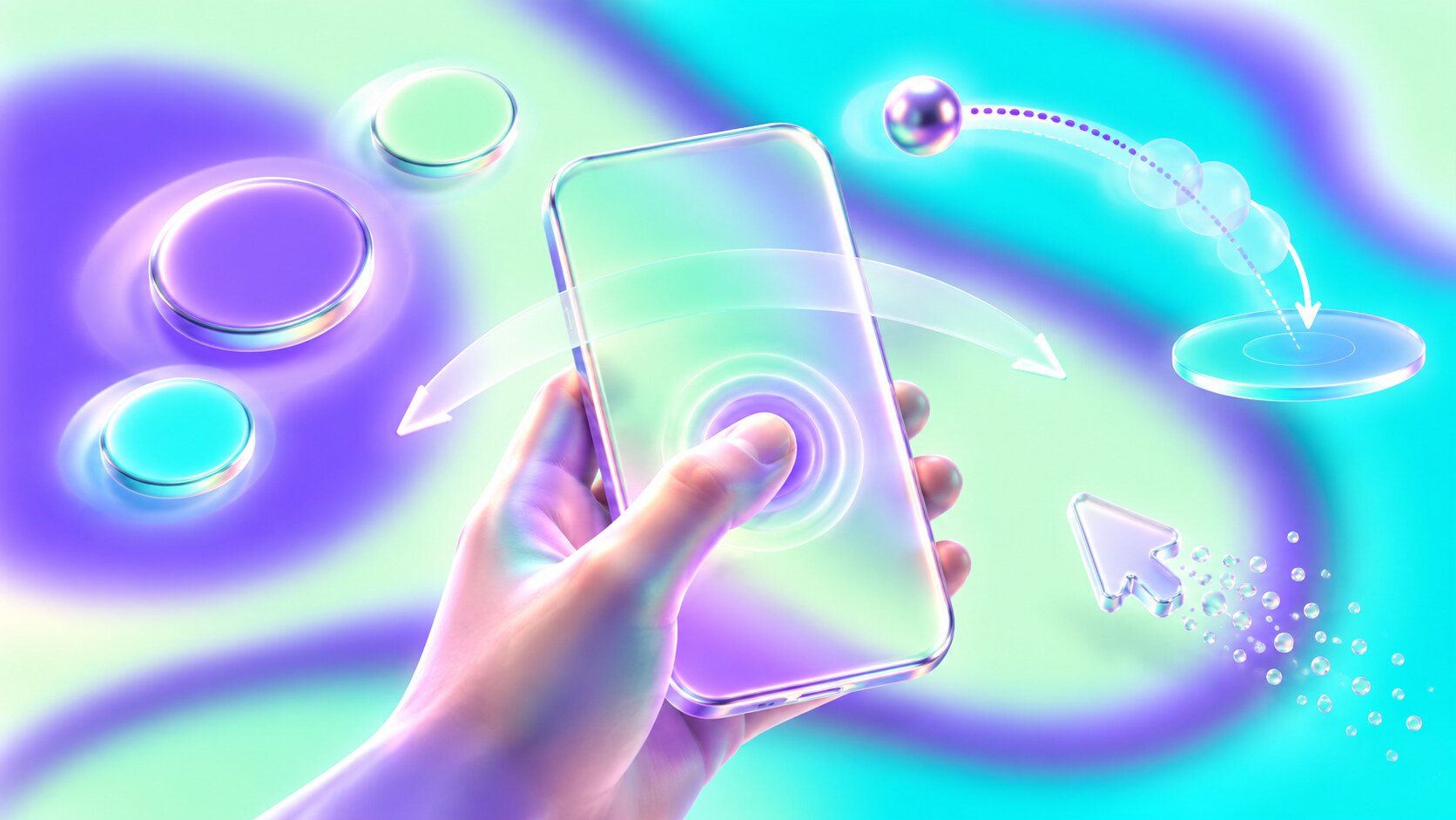
A mouse points without hiding the target. A finger covers several millimetres of screen. Touch interfaces therefore need generous targets, spacing and immediate feedback. Apple recommends hit areas of at least 44 by 44 points. WCAG 2.2 sets a 24 by 24 CSS-pixel minimum at Level AA, with spacing exceptions, and recommends 44 by 44 at the enhanced level.
Touch also removed hover. Important information could no longer wait behind a pointer state. Designers had to make actions visible, reveal them through context or teach them carefully. The most successful gestures borrowed physical expectations: drag an object, flick a list, pinch a surface, pull beyond an edge and watch it return.
Four rules became especially important:
Early skeuomorphism helped communicate these rules. Buttons looked pressable, switches looked movable and bookshelves made content categories familiar. Once users learned the gestures, interfaces became flatter. Some later systems removed so many cues that discoverability suffered. Visual simplicity is not useful when nobody can identify what is interactive.
The difference between an elegant interface and one that only looks elegant becomes visible in testing. Our article How UX and UI Are Tested explains how observation, task performance and interaction data expose those gaps.
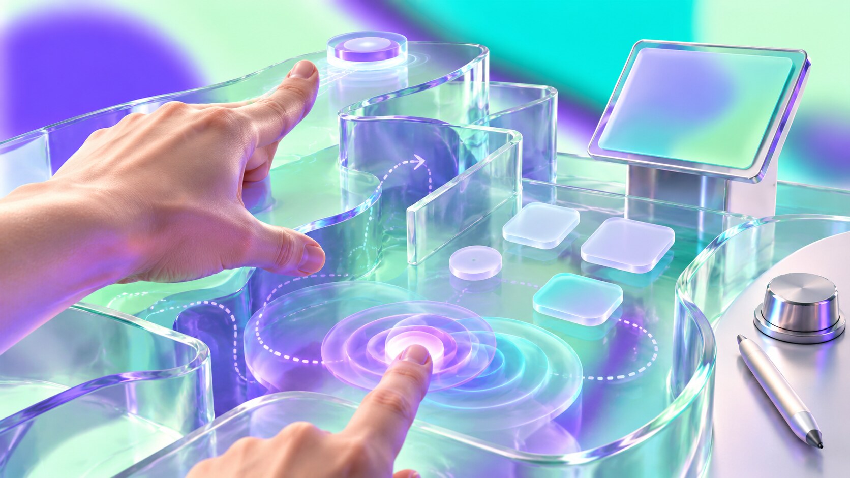
Touch is often called natural, but most gestures are learned conventions. A child may try tapping a screen, yet nobody can see that a three-finger swipe changes applications or that holding an icon opens another menu. Gesture-only navigation saves visual space by spending discoverability.
The keyboard is another compromise. Software keys adapt to language and context, but they offer no fixed edges under the fingers. Autocorrection became part of interface design because the screen had removed physical feedback. Haptics can suggest contact, but they cannot recreate the location of separate keys.
Accessibility can expose the deepest blind path. A touch-only kiosk with flat glass may offer no tactile reference for a blind user. Small controls punish tremor or limited dexterity. Motion gestures can exclude users who cannot perform them. Every essential action needs a clear, reachable and preferably alternative route.
The strongest modern systems are therefore hybrid. They accept touch, keyboard, mouse, stylus, voice and assistive technologies without making one input feel like an afterthought. Apple Pencil, Samsung S Pen and Microsoft Surface Pen show that precision input returned after touch became dominant. The stylus was not erased; it was reassigned to the work it does best.
Fun fact: The 2004 Neonode N1 used an optical touch system related in principle to PLATO’s infrared grid, and its swipe gesture later became important prior art in disputes around slide-to-unlock patents. A futuristic phone was using a sensing idea more than thirty years old.
Touch size, alternative input and clear interaction states are also accessibility requirements, not optional polish. See The European Accessibility Act and Inclusive Design for the wider design context.
Touch is no longer a special feature. ITU estimated that 82% of people aged ten or older owned a mobile phone in 2025. StatCounter recorded mobile browsers at 49.36% of worldwide web usage in August 2026, almost level with desktop at 49.11%, while tablets represented 1.54%. Those figures measure page views rather than every computer interaction, but they show why interfaces can no longer assume a cursor.
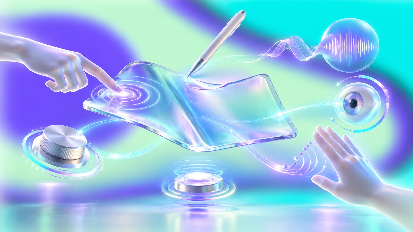
At the same time, touch is losing its monopoly. Foldable screens change size while an app is running. Cars combine touch with physical controls and voice. Watches depend on short taps and crowns. Spatial systems mix eye targeting, hand gestures and speech. Apple recommends a larger 60 by 60 point hit region in visionOS because the selection conditions are different from a phone.
The next stage will likely combine several signals:
The design challenge is no longer choosing one perfect input. It is preserving a clear mental model while the input changes. A command should remain recognizable whether it is tapped, spoken, selected with a pointer or reached through assistive technology.
Apple was decisive in this history, but not because it created touch from nothing. Johnson, PLATO, HP, GRiD, IBM, Palm, Microsoft, Nintendo, FingerWorks, LG and many research teams built essential parts first. Apple’s contribution was to remove the cursor as the default assumption and make software respond as though the screen itself were alive.
That remains the lasting shift. The best touch design does not ask users to operate a computer through glass. It makes the glass disappear.
News, insights, case studies, and more from the rausr team — straight to your inbox.
Send us your brief, your wildest idea, or just a hello. We’ll season it with curiosity and serve back something fresh, cooked with care.