Does Geography Shape Graphic Design? From Scandinavia to the Sahara
Can a country’s location influence how it designs? How climate, culture, and context shape graphic aesthetics — with surprising examples.

Can a country’s location influence how it designs? How climate, culture, and context shape graphic aesthetics — with surprising examples.
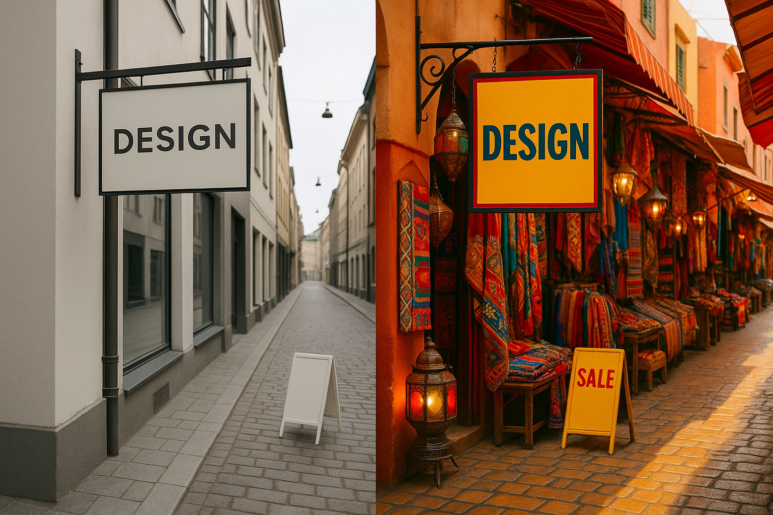
There’s a curious design phenomenon: walk through the streets of Stockholm, then through a market in Marrakech and you’ll feel it instantly.
“Coincidence? Not entirely.”
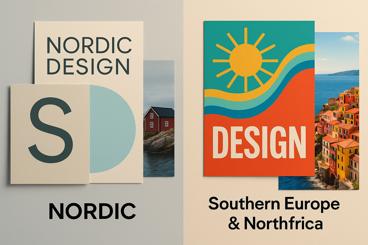
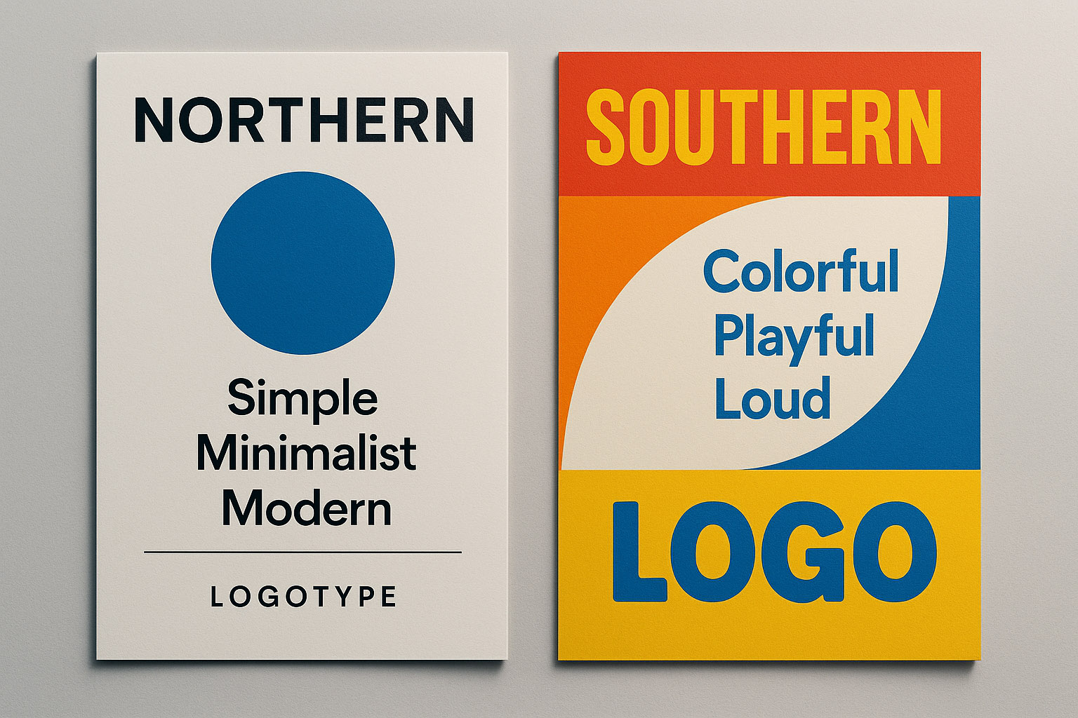
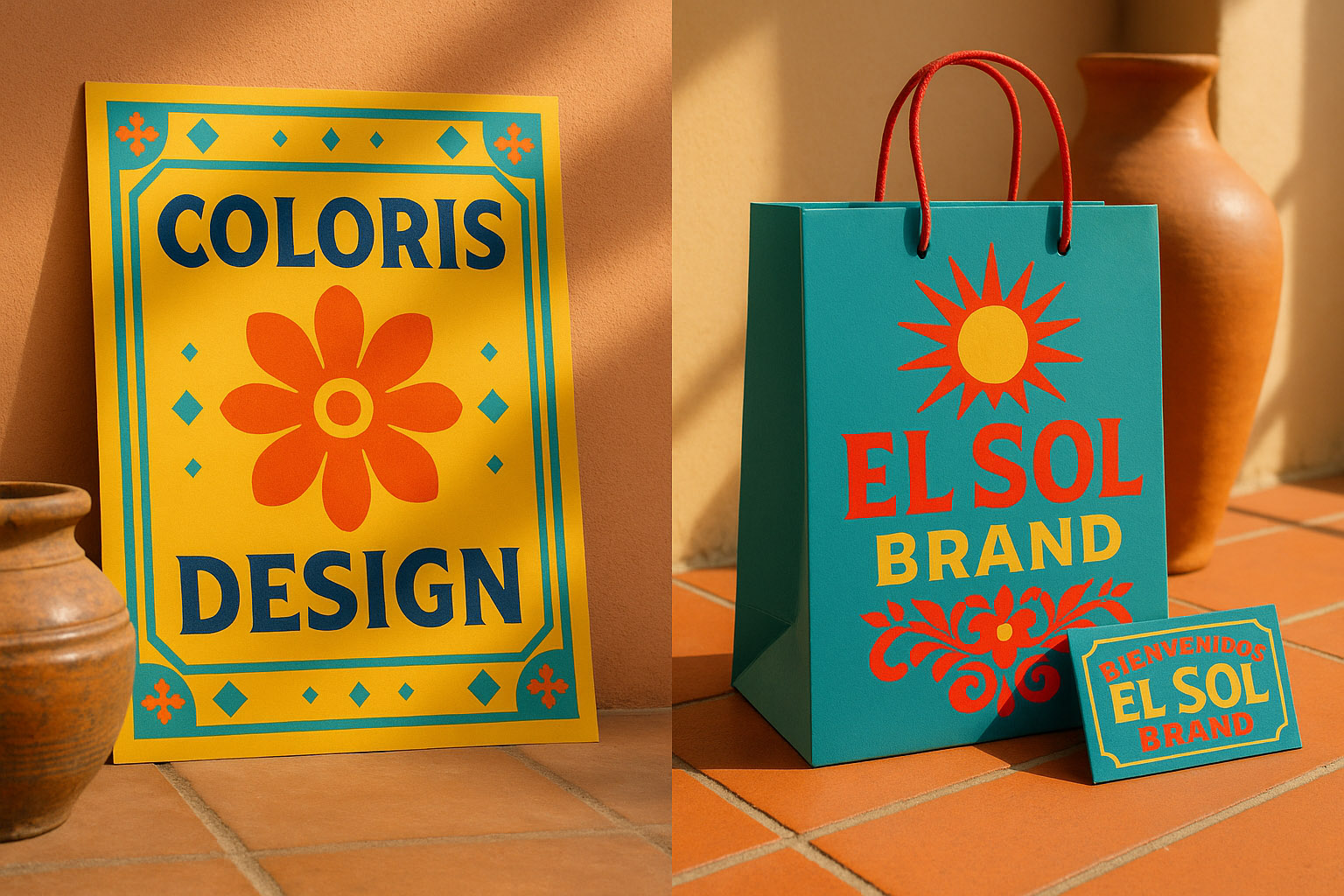
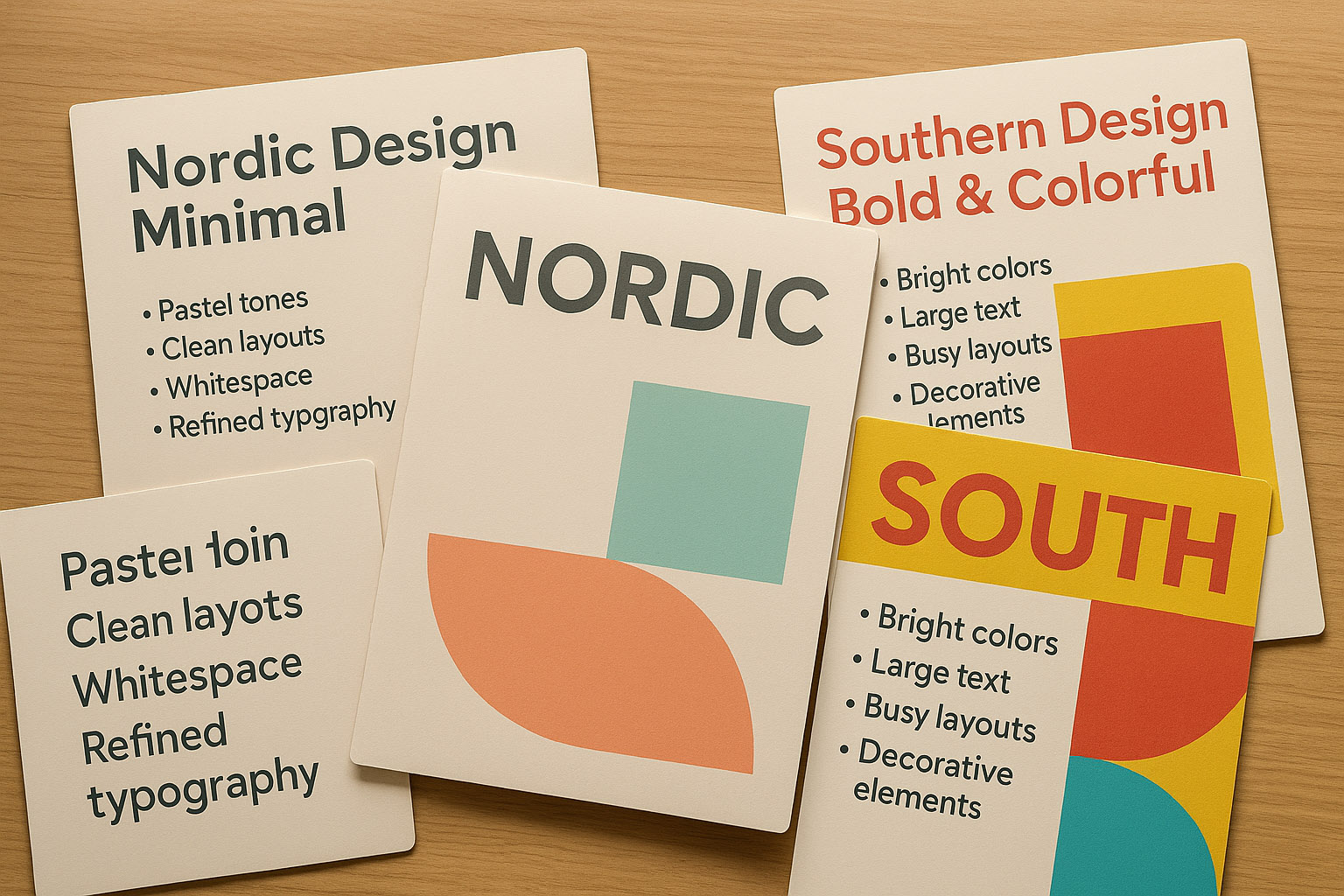
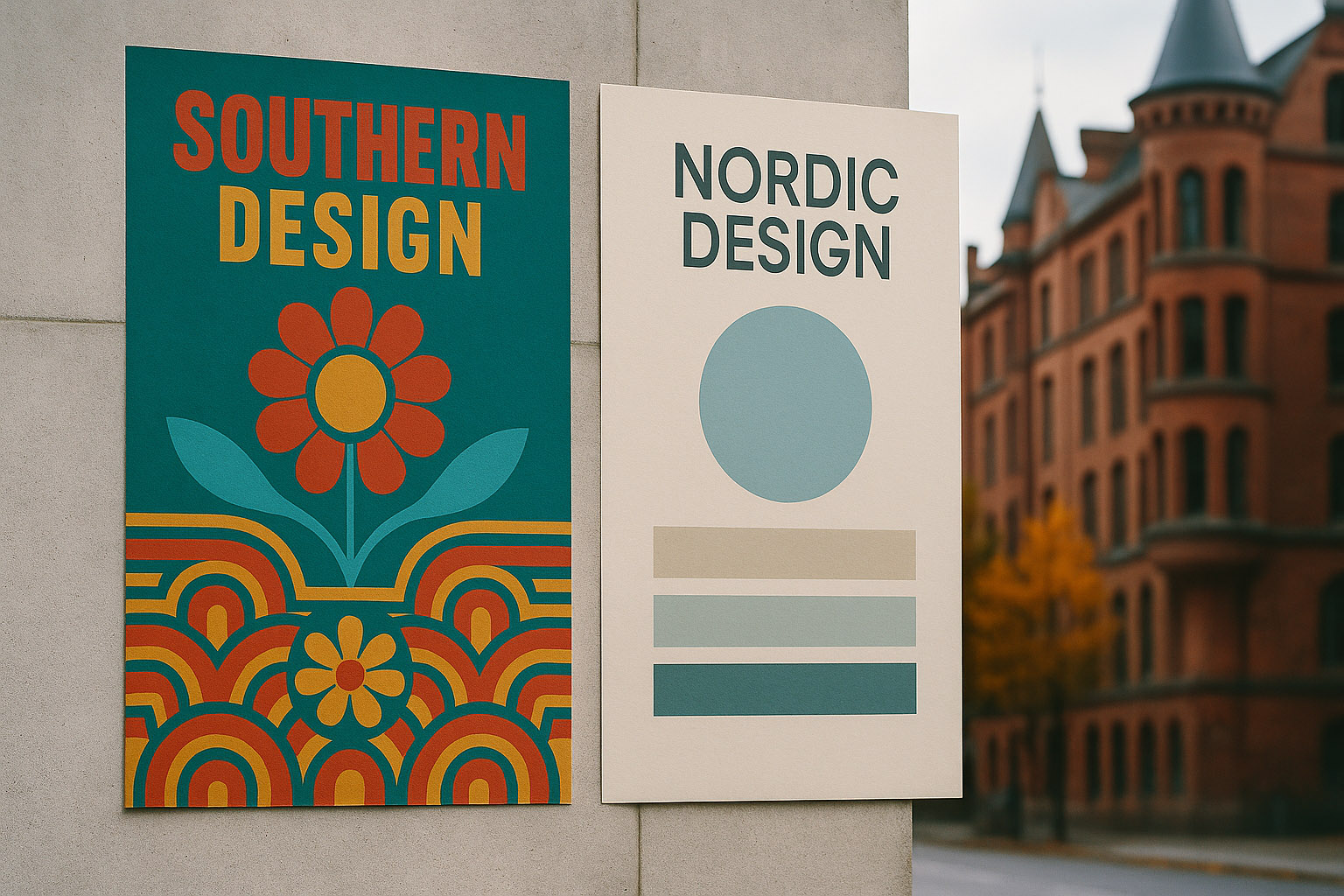
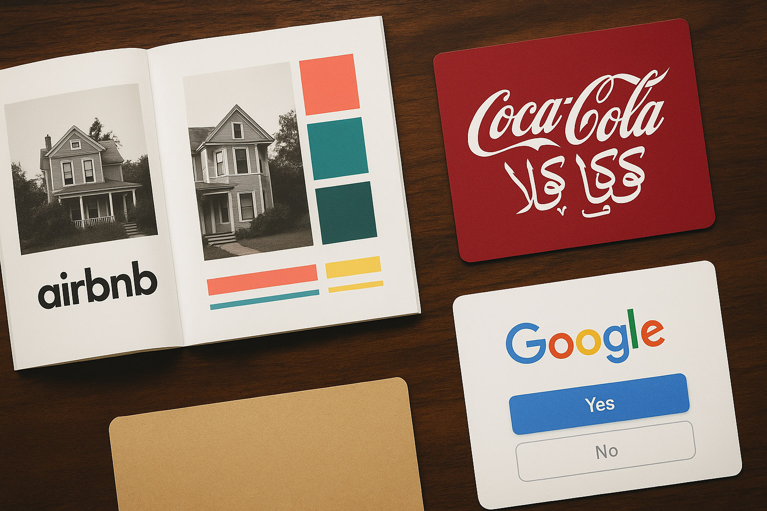
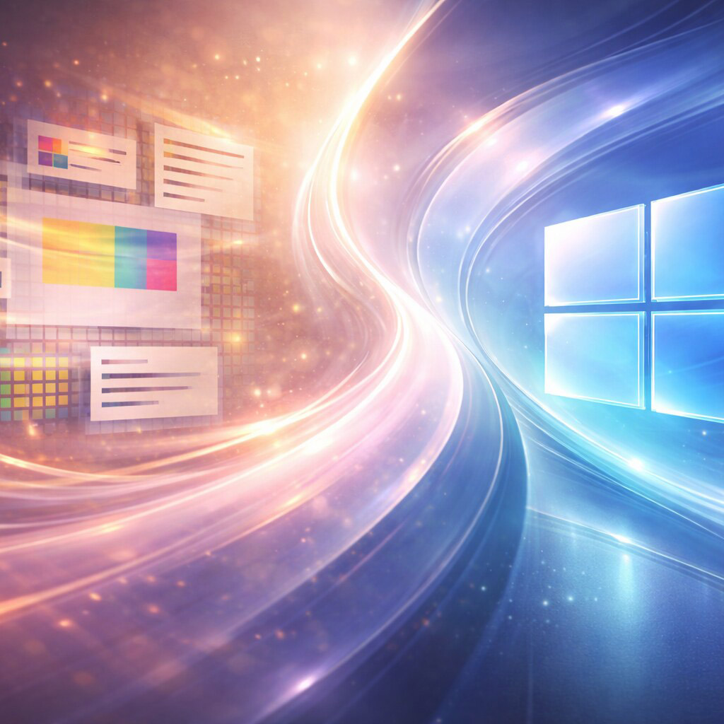
In countries like Italy, Greece, Morocco, Brazil, or Spain, we often see:
Why?
Tourism industries in these southern countries have also heavily influenced local design languages. Vibrant, eye-catching visuals cater to the influx of visitors, encouraging lively street art, colorful signage, and dynamic branding that reflects both heritage and hospitality.
In urban spaces like Naples or São Paulo, the density of advertising is intense, creating a highly competitive visual environment. This competition drives designers to push for more striking, saturated color schemes and larger, more decorative elements to capture attention amidst the clutter.
“One Greek street designer once said: “If you put Swedish gray on a bus stop in Athens, nobody will even notice it’s an ad.””
In Sweden, Norway, Finland, Denmark, we often find:
Why?
Fun fact: IKEA’s in-store color palette is bold (blue/yellow), but its catalog and UX/UI design is ultra-minimal to balance the sensory load.
Additionally, the long indoor time during the extended winters has led Nordic cultures to emphasize calm interior design and soft UI experiences. This focus on creating soothing, cozy environments translates directly into digital products, where soft colors, gentle animations, and quiet interfaces reduce cognitive load and promote comfort.
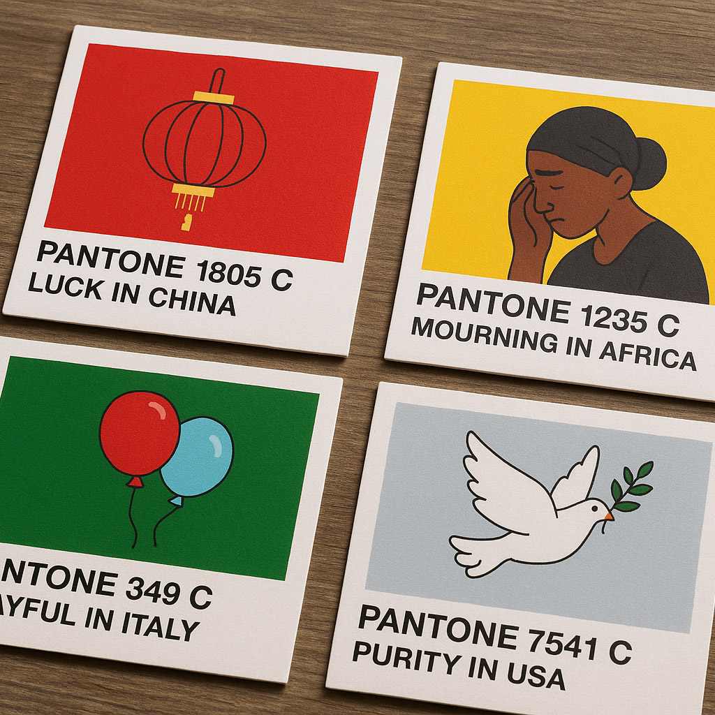
Color psychology is not universal — it’s geographically and culturally conditioned.
For example:
Typography choices also vary widely across cultures. In MENA regions, Arabic calligraphy heavily influences branding, with flowing, intricate letterforms used to convey luxury, tradition, and identity. In contrast, Western typography often prioritizes readability and simplicity, reflecting different cultural priorities.
Today’s brands are global. Designers everywhere use Figma. And trends spread faster than ever.
But even with global access, local taste still matters. For example:
Multilingual typography plays a critical role in global brand systems, requiring careful consideration of script, reading direction, and character complexity to maintain consistency while respecting local languages.
Moreover, global remote teams now hold regular “design culture syncs” to align on regional preferences and avoid costly design misfires. These syncs help teams share insights about local user expectations and cultural nuances, fostering better global-local design collaboration.
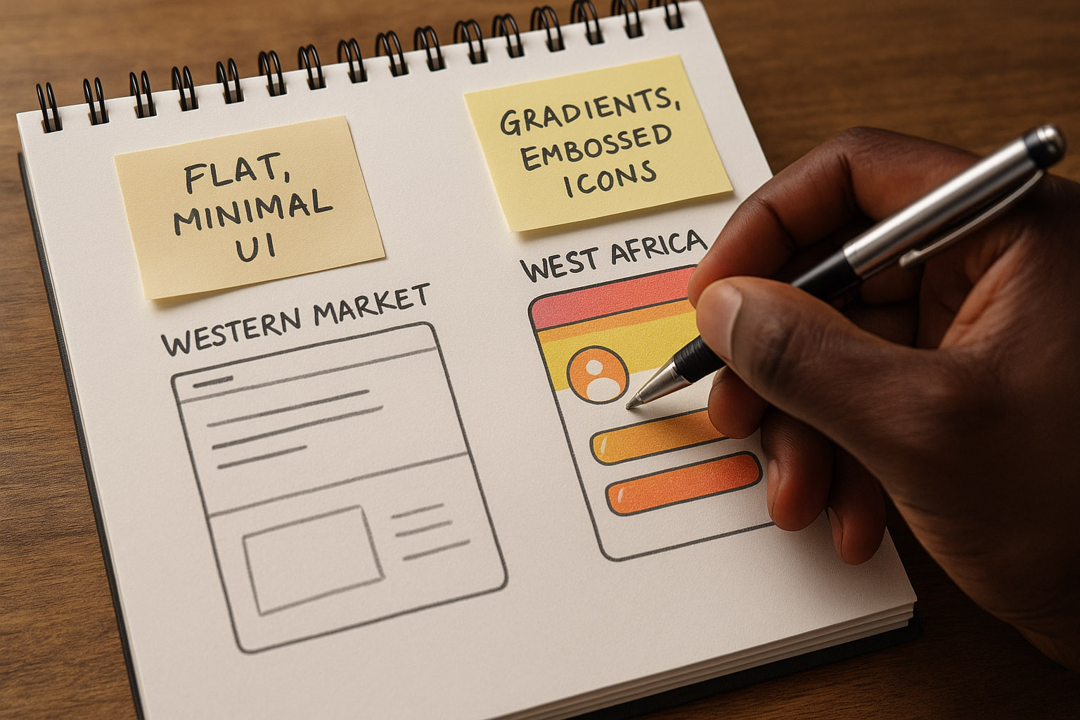
During a 2018 branding project, a German agency working with a West African telecom learned that:
“Locals associate thin lines and minimal UI with low-budget brands.”
So they reintroduced gradients and embossed icons — styles long considered outdated in Europe — because they tested as premium in the local market.
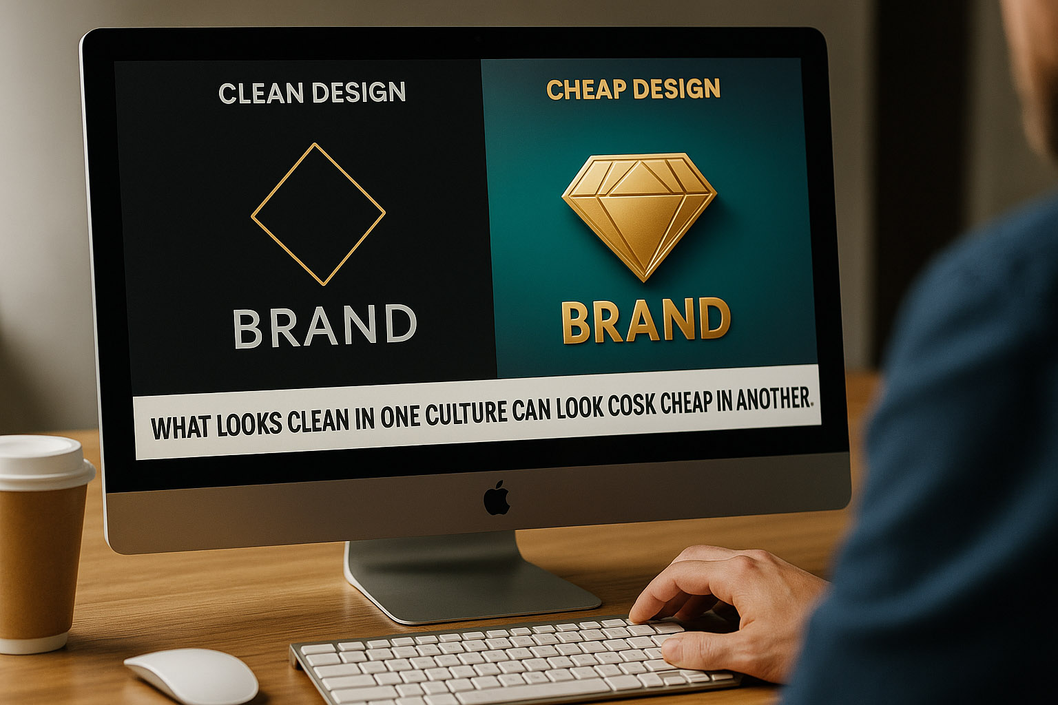
“Moral? What looks clean in one culture can look cheap in another.”
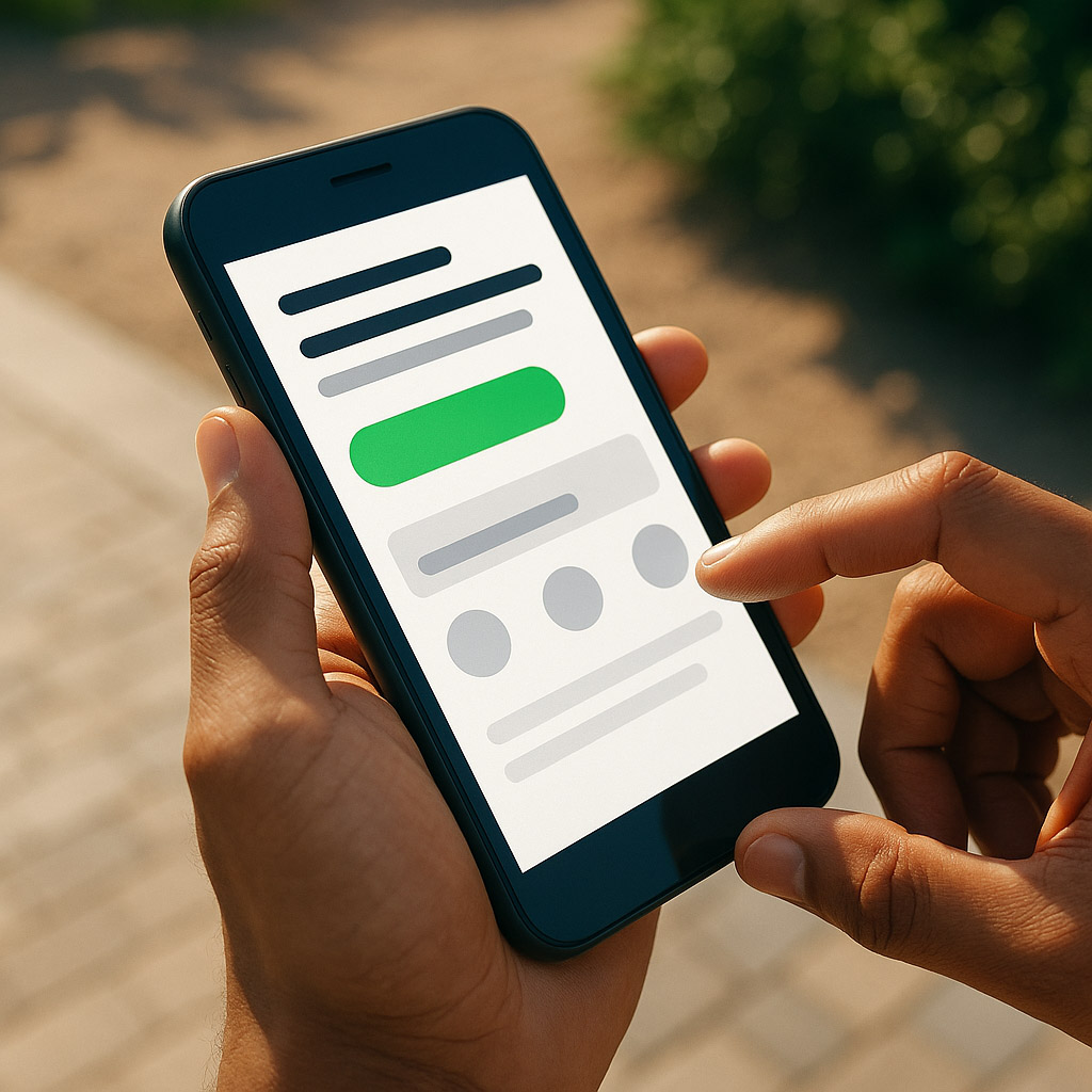
In a cross-cultural UX study from 2020, researchers found users in hot climates spent less time scanning dense interfaces. Their eyes fatigued quicker, especially in outdoor conditions.
As a result, some mobile UI teams began optimizing apps for sunlight conditions — high contrast modes, larger buttons, simplified navbars — even in otherwise minimalist apps.
Surprising takeaway? Some brands saw increased conversion in southern markets after reducing elegance and increasing impact in layout.
“Sometimes, it’s not just culture — it’s the weather.”
“Design isn’t just about grids and color wheels. It’s also about sunlight, culture, seasons, and symbols. Geography isn’t just where your users are — it might be why they like what they like.”
News, insights, case studies, and more from the rausr team — straight to your inbox.
Send us your brief, your wildest idea, or just a hello. We’ll season it with curiosity and serve back something fresh, cooked with care.