Graphic Design and Navigation in Airport Halls
How airport wayfinding systems are designed for speed, stress, multilingual movement, and passenger confidence. Research, hierarchy, timelines, and future of airport navigation.


How airport wayfinding systems are designed for speed, stress, multilingual movement, and passenger confidence. Research, hierarchy, timelines, and future of airport navigation.
An airport hall is one of the most demanding public navigation environments in the world.
People arrive:
That means airport wayfinding is not just a signage problem. It is a time-pressure problem, an architecture problem, an accessibility problem, and a trust problem all at once.
When the system works, the airport feels calm even when it is busy. When the system fails, the whole terminal feels more stressful than it needs to be.
This article sits naturally beside Metro Orientation Design, Hospital Navigation and Wayfinding Design, and Graphic Design as the Key to Visual Orientation at Festivals and Events.
“The best airport wayfinding system does not make passengers admire the signs. It makes them miss the feeling of being lost.”
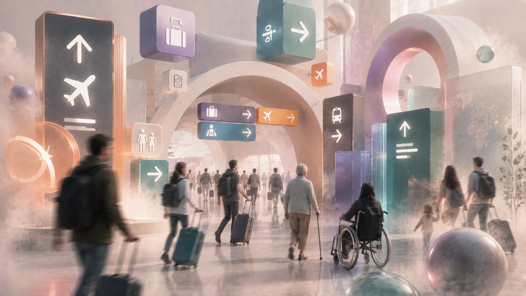
Airports are harder than many other wayfinding environments because mistakes are expensive.
In a museum, a wrong turn wastes time. In an airport, a wrong turn can mean:
This is why airport navigation has to work for very different minds at once:
Entro’s airport-wayfinding explanation captures this well. Unfamiliarity is universal, and time pressure is constant. That is why airports need design that works “from curb to gate,” not only around one terminal corridor.

A serious airport wayfinding system usually includes all of these layers:
This is where many people underestimate the job. Airport navigation is not just an interior graphics assignment. It is a continuous guidance system that starts before the traveler enters the building and often ends only after baggage claim or train connection.
Good airport wayfinding is really about sequencing information. People must see the right message at the right moment, not all messages at once.

Airport wayfinding is normally built by a mixed team.
That can include:
Two of the most important specialist names in this field are Mijksenaar and Entro.
Mijksenaar’s Schiphol project page explains that it has worked with Amsterdam Airport Schiphol for more than 35 years and developed what it calls a Total Airport Concept. That tells you immediately how large the job really is. This is not an isolated sign package. It is a long-term operational design system.
Entro’s airport portfolio shows a similar pattern across large North American terminals. The firm talks openly about research, passenger movement, accessibility testing, and VR validation before systems are built.
So the short answer is: yes, architects matter, but the best airport systems usually need specialist wayfinding expertise as a discipline of its own.

The process is usually long because the environment is always moving:
The rough project sequence often looks like this:
Entro’s Minneapolis–Saint Paul project is a useful example. Its public project write-up says the program included journey mapping, surveys, on-site observation, and more than 1,500 signs in a redesigned system.
That gives a realistic scale clue: even one airport terminal upgrade can become a very large information program.
A limited terminal refresh may take several months. A major airport-wide program can easily stretch across 1 to 3 years or more, especially when tied to broader renovation or capital works.

Airport wayfinding has several unusually difficult pressure points:
The hardest of all may be the transition between landside and airside. People feel a psychological shift there. They want reassurance, not only data.
This is one reason many strong airports rely on:
One less-discussed airport fact is that many wayfinding failures happen before the passenger ever reaches the gate. Parking, drop-off, terminal approach, and check-in uncertainty often create the stress that makes later navigation harder.
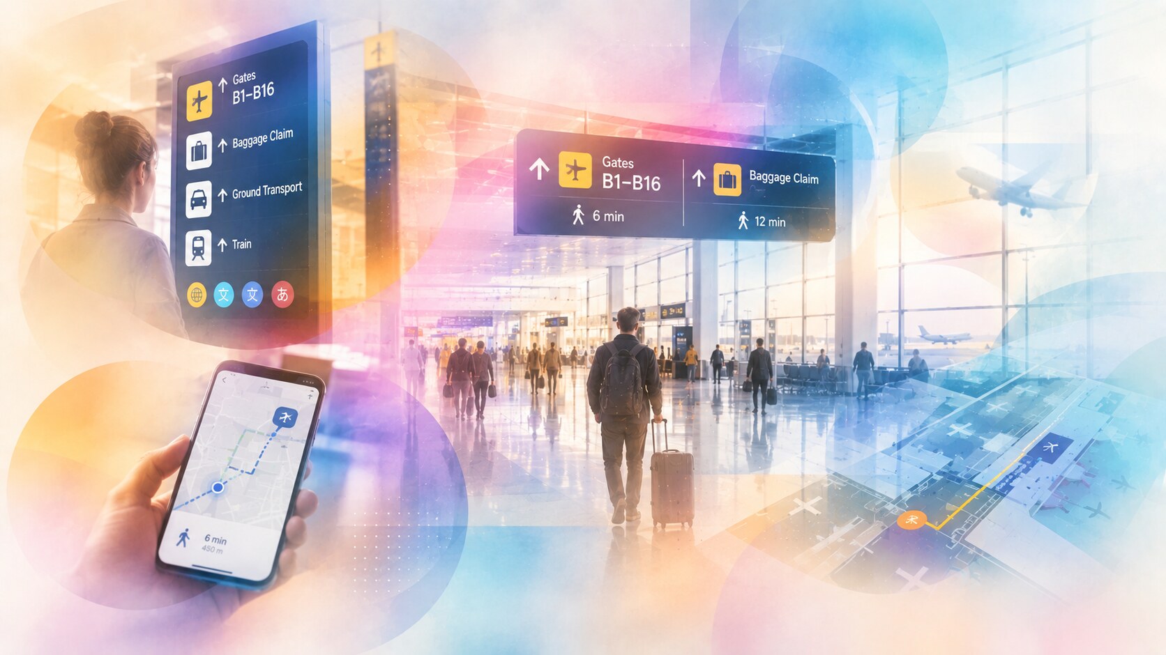
Several patterns keep appearing in strong airport work:
Mijksenaar’s Schiphol page is especially useful because it explains the system as orientation, navigation, and experience combined. That sounds abstract, but it is correct. Airports need all three:
At San Francisco International Airport, the SEGD project description frames the redesign as Wayfinding as a Service, which is one of the better phrases in the field. It suggests that wayfinding is not only physical output but an operating layer inside the airport.
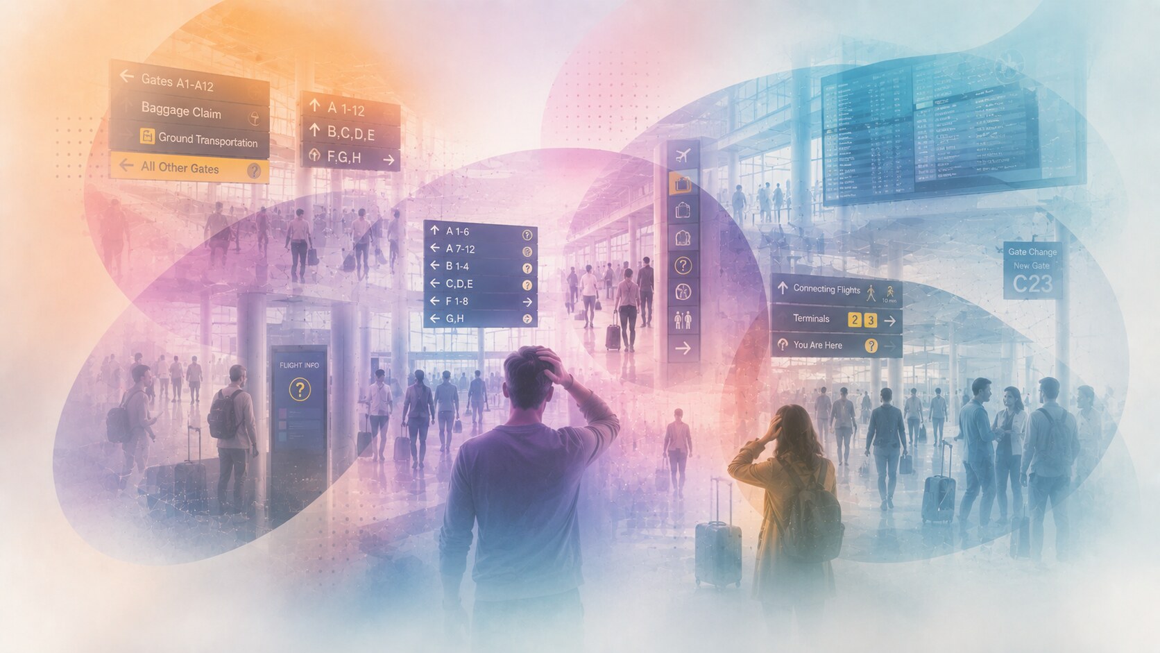
Bad airport systems usually fail in predictable ways:
One especially damaging mistake is assuming frequent flyers can teach everyone else how to read the building. Good airport design cannot depend on local familiarity.
This is where some terminals feel unintentionally elitist. They work well for staff and repeat travelers, but not for ordinary people under stress.
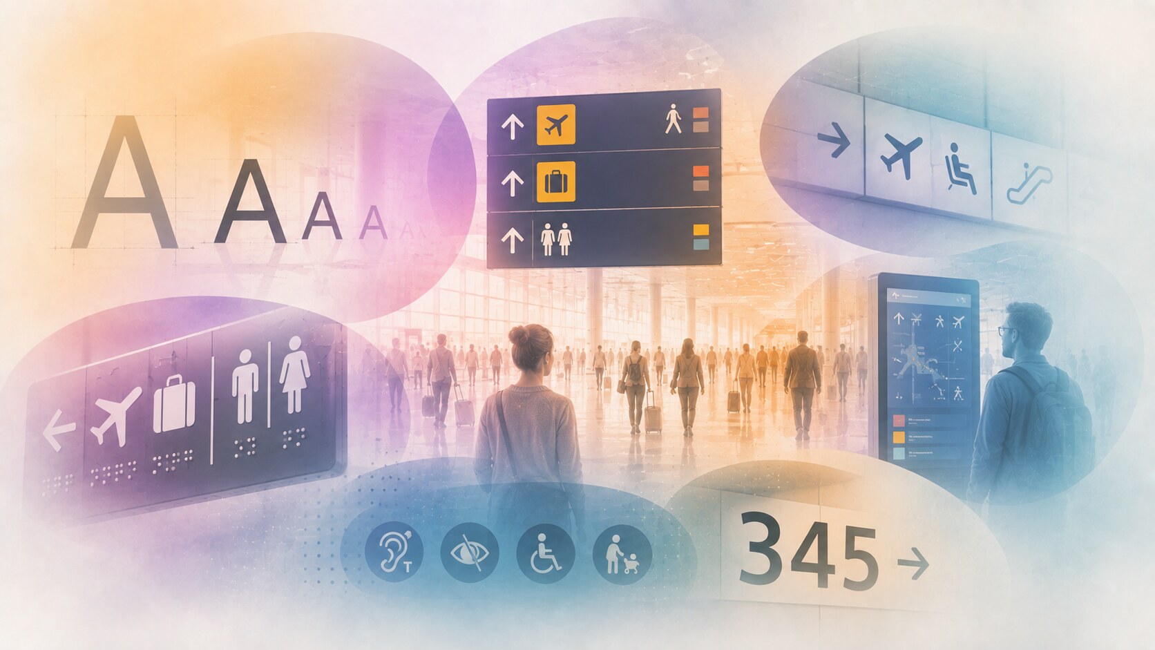
One of the most interesting hidden facts in airport design is how persistent certain type traditions are.
The SEGD project about the Moniteurs airport-wayfinding book points out that Frutiger, followed by Helvetica, became a global standard in many airports. That matters because it shows how practical legibility sometimes beats local visual expression.
Another hidden layer is accessibility research. The ACRP report on aging travelers and passengers with disabilities shows how much airport navigation has to account for sensory, cognitive, and mobility differences. This is not a niche concern. It changes the whole design brief.
Even research around airport wayfinding can be substantial. The ACRP accessibility wayfinding project highlighted by SEGD carried a budget of $390,000 (approx), and that was for research and guidance, not a whole airport implementation.
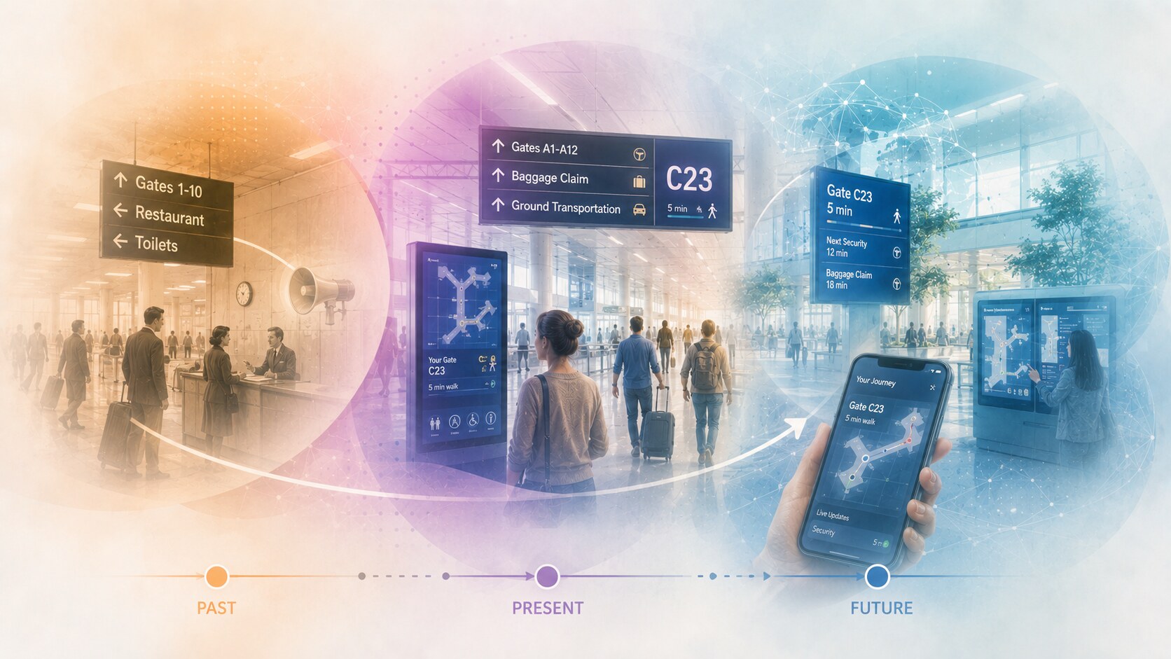
In the past, airport orientation relied more heavily on fixed signs, desk staff, and repeated public announcements.
Now the stronger systems combine:
The future will likely push further toward hybrid systems, but static signage will remain essential. A traveler cannot depend only on an app, battery, or airport Wi-Fi in a stressful moment.
So the direction is not “replace signs with screens.” It is “connect signs, screens, architecture, and operations more intelligently.”
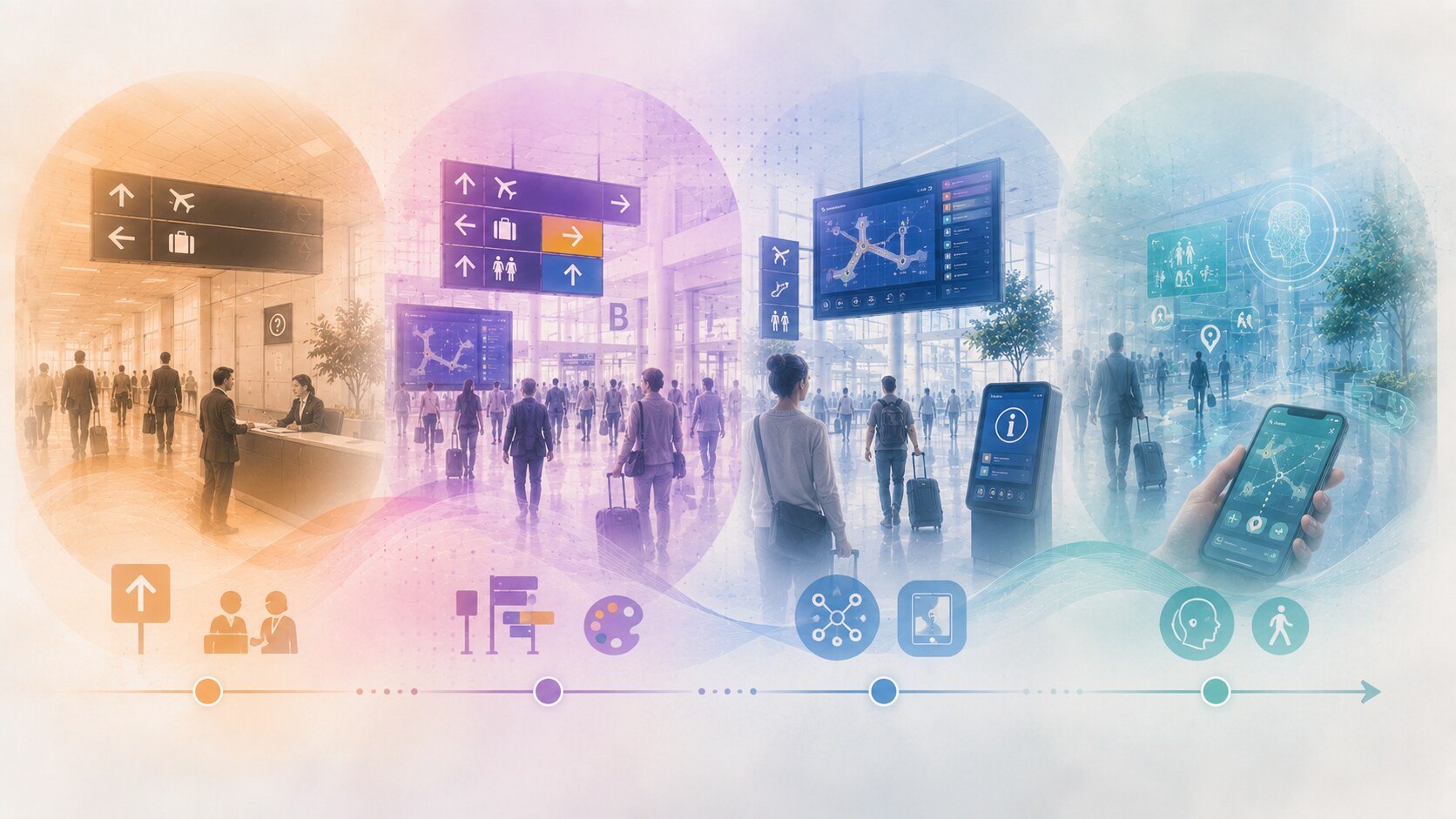
| Era | Main navigation logic | Main weakness |
|---|---|---|
| Older airports | static signs plus staff help | too dependent on local knowledge |
| Transitional systems | more signs and color coding | often cluttered and fragmented |
| Current strong systems | integrated physical and digital hierarchy | complex and expensive to coordinate |
| Near future | hybrid service-oriented guidance | risk of digital overcomplication |
The comparison shows the shift clearly. Airport wayfinding improved when it stopped being treated as sign installation and started being treated as a passenger-experience service.
That is what makes it so demanding and so valuable.
The best systems are not memorable because they are flashy. They are memorable because they quietly make a difficult journey feel manageable.
They help people trust the building. They help staff answer fewer repeated questions. They help operations flow more smoothly.
And most importantly, they respect the fact that the airport passenger is rarely calm, rarely reading deeply, and almost always carrying more stress than the sign designer can see.

News, insights, case studies, and more from the rausr team — straight to your inbox.
Send us your brief, your wildest idea, or just a hello. We’ll season it with curiosity and serve back something fresh, cooked with care.