Graphic Design as a Main Sales Power: When Visuals Become the Sales Unit
How graphic design can sell by itself through posters, packaging, websites, social media, and brand systems, with famous success stories and wrong turns.


How graphic design can sell by itself through posters, packaging, websites, social media, and brand systems, with famous success stories and wrong turns.
Graphic design is often treated as the finishing layer: the poster after the campaign idea, the packaging after the product, the website after the business model, the social post after the strategy.
That is a small view of design.
In many strong commercial stories, graphic design is not a wrapper around sales. It is one of the things doing the selling. A poster can make people cross the street. A package can make someone choose a product they never tasted. A checkout interface can rescue a purchase that was almost abandoned. A social image can spread faster than the official campaign plan. A label, button, cover, symbol, or grid can become a salesperson that works without a human being standing beside it.
This does not mean every design should scream “buy now”. The best sales-driven design usually does something quieter and more useful: it removes doubt, creates memory, tells the product truth faster, and makes a decision feel easy.
This article sits close to Successful Branding Codes, Branding Codes That Stick, and The Process Behind Iconic Logo Design.
“Graphic design sells best when it does not feel like pressure. It feels like clarity arriving at the exact moment someone is deciding.”

Graphic design rarely sells completely alone. A bad product with beautiful graphics is still a bad product. A weak offer with a perfect poster is still weak. But design can become the visible part of the sales machine: the part people notice, understand, trust, remember, and act on.
McKinsey’s design research is useful here because it does not treat design as taste. Its study connected strong design practices with stronger revenue growth and shareholder returns. The point is not that a better color automatically creates profit. The point is that companies that treat design seriously often create better customer experiences, clearer products, and more coherent decisions.
Design becomes sales power when it handles four jobs:
That is why graphic design can be a sales unit. It can perform part of the work that a salesperson, shelf assistant, or product demo would normally do.
The danger begins when design is asked to sell without truth. Then it becomes manipulation, decoration, or noise. Sales design works best when the product has something worth revealing.
One hidden reason design is commercially powerful: it works at the moment before language. People often feel “cheap”, “premium”, “safe”, “fast”, “fresh”, or “for me” before they read a single line.
Before social feeds, landing pages, and paid search dashboards, the city wall was already a commercial interface. Posters had to stop people walking, communicate fast, and make them remember a show, shop, cigarette, soap, cabaret, or political idea.
In the late 19th century, lithographic posters changed public advertising. Artists like Jules Cheret, Alphonse Mucha, and Henri de Toulouse-Lautrec made the street visually competitive. This was not only art history. It was sales history.
Toulouse-Lautrec’s 1891 poster Moulin Rouge, La Goulue is a clean example. It advertised the Moulin Rouge and its performers, but it did more than give information. It created a public image of nightlife. The Art Institute of Chicago notes that thousands of copies were pasted around Paris and that the poster helped push Toulouse-Lautrec into the artistic limelight.
That is graphic design as sales power: the poster sold a place, a mood, a performer, and a social promise.
The hidden lesson is still modern:
This is the same problem now, just on different surfaces. A street poster, TikTok thumbnail, app banner, product card, and exhibition wall all fight the same enemy: being ignored.

Some graphic ideas sell by becoming culture. They stop functioning like normal ads and start functioning like symbols.
Apple’s 1984 commercial is not graphic design in the narrow poster sense, but it is one of the strongest examples of visual selling. The Macintosh itself barely appears. The product is sold through an idea: rebellion against conformity. According to Campaign’s history of the ad, Apple’s board disliked the commercial, and Jay Chiat’s agency did not simply follow the instruction to sell off all the Super Bowl airtime. The commercial aired nationally during the 1984 Super Bowl and helped make the launch feel like a cultural event, not just a computer release.
There is a similar pattern in Shepard Fairey’s Obama Hope poster. It did not sell a product in the supermarket sense, but it sold belief, identity, optimism, and participation. The Art Institute of Chicago describes it as a grassroots activist image that was later widely circulated online and adopted by the campaign.
These examples matter because they show design’s ability to compress emotion into a reusable signal.
“The most powerful sales graphic is not always the one with the clearest product photo. Sometimes it is the one that gives people a role to play.”
The wrong turn is obvious too. When a campaign graphic promises more than the product or organization can deliver, the image becomes fragile. It can create desire, but it cannot repair reality forever.
Packaging is the most obvious place where graphic design becomes a sales unit. In a store, the package often has no salesperson, no video, no long argument, and no second chance. It has to be found, understood, trusted, and chosen in seconds.
This is why strong packaging design is not just about looking good in a portfolio. It has to work in a messy shelf environment.
For the wider packaging branch, continue with The Story of Meal Packaging Design and Iconic Water and Lemonade Packaging.
The RXBAR redesign is a practical modern case. The founders’ early packaging was homemade and unclear. The redesign led by Scott & Victor moved the ingredient list to the front and made the offer brutally simple: egg whites, nuts, dates, and no nonsense. Packaging World reported that the redesign helped RXBAR move to number three in its category at natural-food retailers.
That is not decoration. That is sales argument turned into layout.
What made it work:
The product still had to be good enough. But the packaging finally made the product legible.

Absolut Vodka is one of the cleanest stories of graphic design selling through repetition. The product was not explained again and again. The bottle shape became the platform.
The early campaign by TBWA centered the bottle and used the same simple construction: the bottle, a visual twist, and a short phrase beginning with “Absolut”. The first ad, Absolut Perfection, appeared in 1980. Absolut’s own history describes how the brand later moved into art collaborations, including Andy Warhol painting the bottle in the 1980s and a large art collection connected to the brand.
The sales genius was not only the bottle drawing. It was the repeatable system.
A good sales system has rules:
Absolut did not need every ad to reinvent vodka. The campaign sold by making the bottle familiar, then surprising people inside that familiarity.
Absolut is a reminder that a strict design rule can create more creativity, not less. The bottle was the cage, but also the engine.
The internet made graphic design measurable in a harsh way. A beautiful interface that does not help people buy, register, donate, book, or understand is not commercially strong. It may be visually impressive, but it fails the sales moment.
Baymard’s checkout research is useful because it shows how much money can be lost after the buyer already decided to buy. Its research tracks high cart abandonment and describes checkout design and flow as frequent causes of users leaving. Baymard also estimates that many large e-commerce sites could improve conversion significantly through better checkout UX.
That means the sales unit is not only the hero image. It can be:
Interface design sells by making the purchase feel safe and finishable.
For a deeper UX-testing angle, continue with How UX/UI Is Tested and How Smart UX Boosts Nonprofit Donations.
The unknown detail many non-designers miss: checkout is not just “technical”. It is graphic design, information design, microcopy, spacing, hierarchy, and trust design working together.

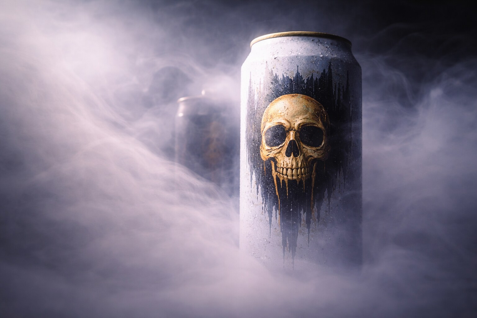
Water is one of the hardest categories to differentiate. It is transparent, basic, and widely available. Liquid Death made that boring truth into an advantage by packaging water like a punk or metal beverage.
The cans, the skull, the heavy typography, and the phrase “Murder Your Thirst” did not describe water. They described an attitude. CNBC reported in 2019 that founder Mike Cessario had a background as a creative director for Netflix campaigns. Axios later reported that Liquid Death reached a $700 million valuation in 2022, with the company reporting a strong revenue run-rate.
This is a strong example of design selling the social meaning around a product.
It works because the design creates:
But there is risk. Shock positioning needs renewal. If the visual joke becomes expected, the brand must keep earning attention without becoming only a costume.
“Design can make a simple product feel chosen, not just consumed.”
Graphic design in physical space has a special sales role. It has to stop a moving person. A website visitor is already looking at a screen. A trade-show visitor, street pedestrian, mall shopper, or festival audience is physically moving past you.
So the first sale is not the product. The first sale is attention.
This is exactly the logic behind The Best Exhibition Stand Is the One That Stops People.
Good public-space design works differently than a brand book page:
This is why a poster, booth wall, window display, or event graphic can act like a salesperson. It filters who should stop, gives them a first idea, and makes the human conversation easier.
The wrong turn is over-information. Many stands and posters fail because teams are afraid to choose. They put everything on the wall, so nothing becomes memorable.
Sales-driven design can fail badly when teams confuse newness with improvement.
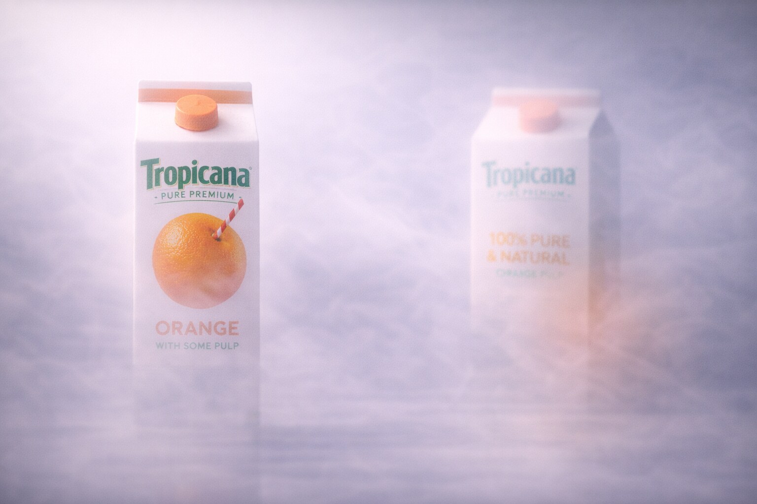
Tropicana’s 2009 packaging redesign is the classic warning. The product did not become worse. The packaging became less recognizable. The familiar orange-with-a-straw image disappeared, the wordmark changed, and the shelf code was disrupted. A research paper hosted by AgEcon Search reports that sales of Tropicana Pure Premium dropped around 20% in the period studied and estimates the cost at about $27 million.
That is the dark side of design as sales power: if packaging can sell, packaging can also unsell.
The failure was not simply that people hated modern design. The deeper problem was that the redesign removed the visual shortcuts customers used to find and trust the product.
Design can break sales when it:
For the broader risk of over-modernizing a visual identity, continue with Why Companies Sterilize Their Logos and When Being Trendy Backfires.
The product can stay exactly the same and still sell worse if the design removes the customer’s mental map.
Some sales-powered design is intentionally built that way. RXBAR wanted clarity. Absolut built a repeatable campaign system. Liquid Death chose category rebellion. Checkout UX is measured directly against completion.
But some design becomes sales power through culture. Toulouse-Lautrec’s poster was commercial, but it became art history. The Obama Hope poster began as grassroots visual activism and then became a widely circulated campaign symbol. Apple’s 1984 commercial nearly did not run as planned, then became the story people told about the product.
So is it planned or coincidence?
Usually both.
Strong sales design needs intention:
But it also needs room for cultural life. If a design is too engineered, it can feel dead. If it is too accidental, it may not serve the business. The best work often has a clear commercial structure and enough emotional oxygen to travel.
If you are thinking about design as a business role, this connects with Hiring a Graphic Designer or Visual Designer.
Designing with sales in mind is not a bad idea. It becomes bad when sales means shouting, tricking, exaggerating, or turning every surface into a discount sticker.
Good sales design is more disciplined than that. It asks: what is the person trying to decide, and what can visual communication make clearer?
The practical checklist is simple:
This is why design can be one of the main sales powers in a company. It does not only create beauty. It creates the conditions in which people can choose.
The best approach is not “make design that sells at any cost”. It is: make design that tells the product truth so clearly that selling becomes easier.
“Great sales design is not louder than the product. It makes the product easier to believe.”
In the future, this will matter even more. AI can generate endless visual noise. Templates can make every brand look competent. Social media can reward tricks for a week and punish them the next. The advantage will belong to teams that understand design as a commercial language with ethics, memory, and usefulness.
Graphic design can absolutely sell. But its best sales power is not manipulation. It is recognition, clarity, trust, and timing.

News, insights, case studies, and more from the rausr team — straight to your inbox.
Send us your brief, your wildest idea, or just a hello. We’ll season it with curiosity and serve back something fresh, cooked with care.