Graphic Design as the Key to Visual Orientation at Festivals and Events
How strong graphic design turns festivals and events into more organized places. Better signage, better paths it means less confusion, and a stronger brand experience.

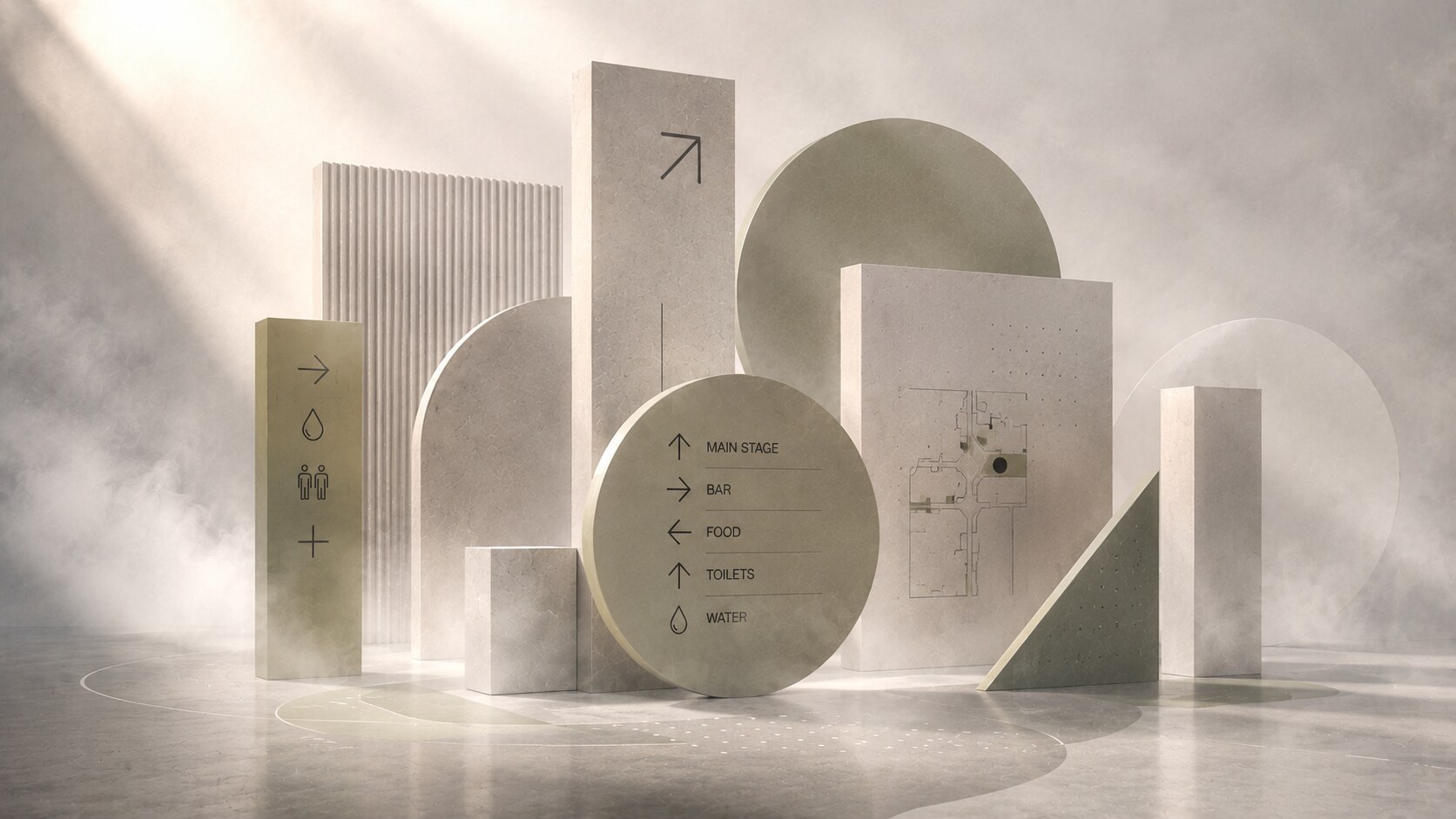
How strong graphic design turns festivals and events into more organized places. Better signage, better paths it means less confusion, and a stronger brand experience.
A festival can have a beautiful stage, a strong lineup, and expensive branding, yet still feel stressful the moment people begin moving through it.
They ask:
That is where graphic design stops being decoration and becomes infrastructure.
At festivals and event actions, orientation is not a secondary layer added at the end. It is one of the things that decides whether the experience feels calm, premium, chaotic, cheap, memorable, or exhausting. A well-designed navigation system does more than prevent people from getting lost. It reduces friction, shortens decisions, keeps queues cleaner, and lets the brand feel intelligent instead of loud.
This article continues naturally from Exhibition & Event Graphic Design in 2026, The Best Exhibition Stand Is the One That Stops People, and Metro Orientation Design.
“When people can orient themselves without effort, the event feels better before they can explain why.”
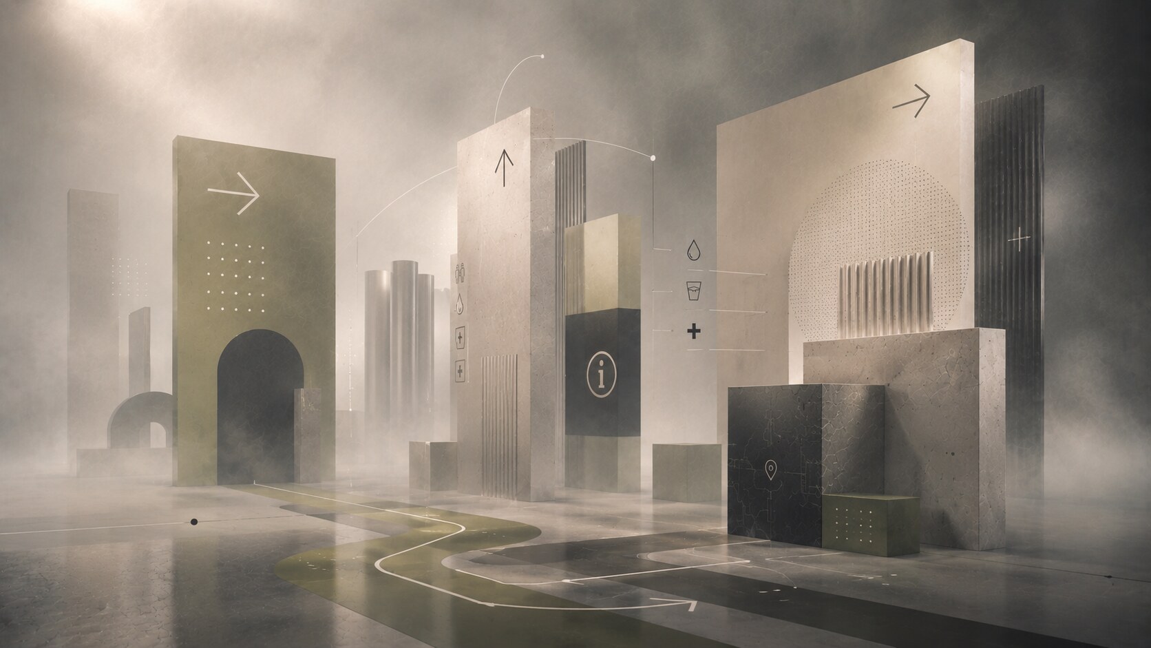
A festival or event site is a messy spatial interface.
People move through it:
They are not standing in front of a screen calmly comparing options. They are making fast physical decisions in heat, darkness, noise, mud, crowds, and visual overload.
This is why event orientation belongs to graphic design as much as to production planning. The sign family, the type rules, the pictograms, the zone names, the color hierarchy, the contrast levels, and the placement logic all shape how quickly people understand space. Entro’s event-wayfinding framing is useful here: event navigation works best as a layered system of directionals, modular signage, and digital information adapted to each programme and audience.
The mistake many organizers make is assuming navigation is mostly a mapping problem. It is not. It is a perception problem. If a sign is technically correct but visually late, it has still failed.
Unknown but useful fact: advanced wayfinding studios now use methods such as pedestrian-flow modeling, eye-tracking, space syntax analysis, and virtual testing. The old “just put more signs there” instinct is being replaced by actual behavioral research.
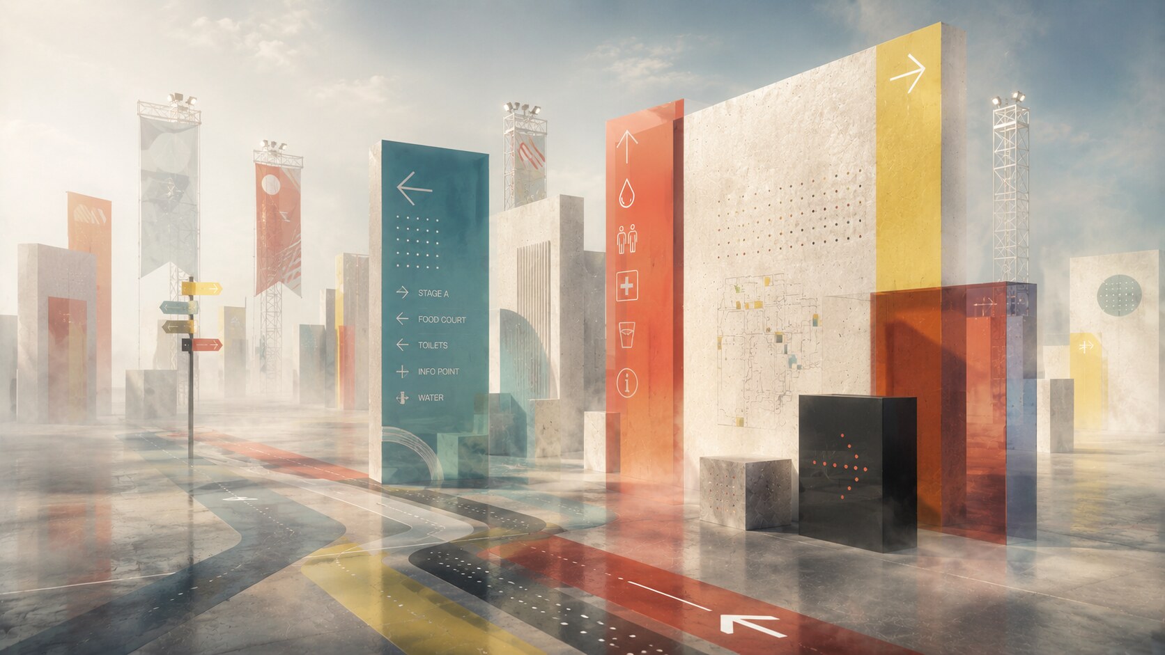
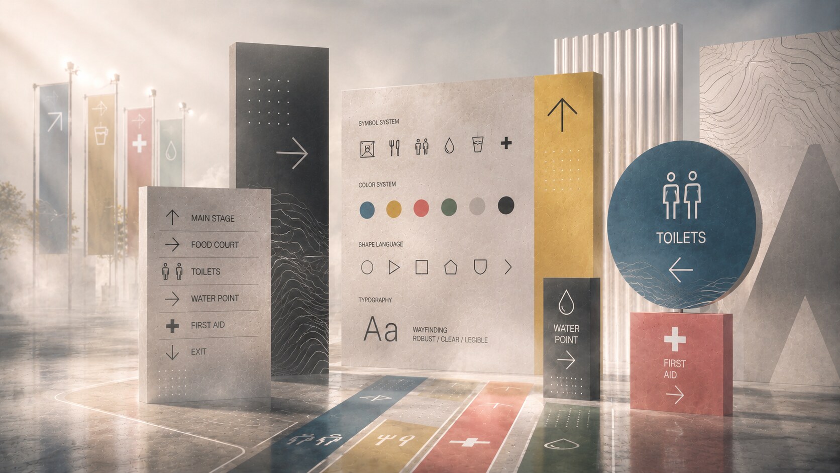
The best event wayfinding systems are built like a language, not like a pile of temporary boards.
At minimum, they need:
This sounds obvious, yet many event systems still fall apart because the organizer commissions a logo, social graphics, stage graphics, and sponsor boards first, then treats orientation as leftover production.
A strong system should answer different questions at different scales. From far away, people need to know the general zone. From medium distance, they need a direction and a destination name. Up close, they need confirmation that this really is the entrance, the water point, the ambulance post, the cashless top-up point, or the correct stage.
The system also needs consistency across:
If each of those speaks a slightly different visual language, people waste cognitive energy translating instead of moving.
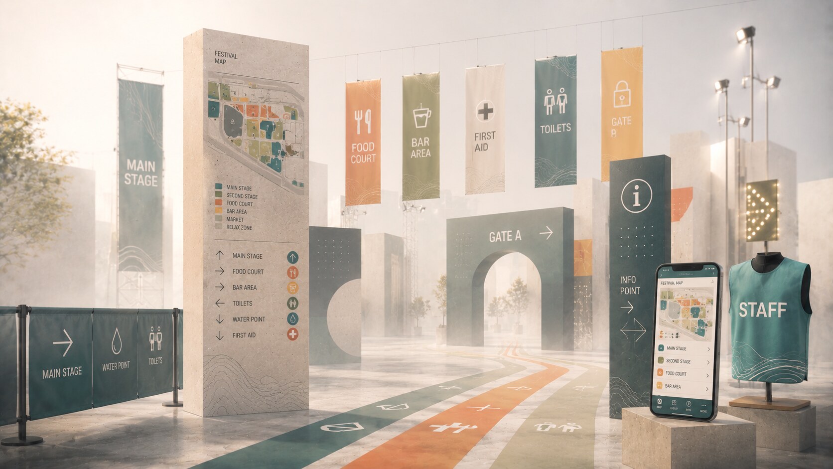
Color is powerful, but color alone is weak.
A lot of event graphics are built as if one color per zone is enough. In reality, lighting changes color perception, mud and weather reduce contrast, nighttime conditions distort hierarchy, and color-blind users lose part of the code immediately.
So color should support the system, not carry it alone. A stronger approach combines:
That is why the most robust navigation systems feel almost redundant. A toilet is not only “the blue zone.” It is also labeled with a clear word, a visible symbol, a predictable arrow style, and a repeated placement logic.
Typography matters just as much. Event signage often fails because designers borrow the brand’s decorative display type and force it into a navigation task. But wayfinding type is not there to be fashionable. It has to hold up at speed, at distance, under mixed light, in condensed spaces, and next to sponsor clutter.
Consistency is what makes an event wayfinding system feel truly premium. If stage names, arrows, maps, and emergency signs all follow different visual rules, people stop reading them as one system and start experiencing them as a set of unrelated decisions.
“In event navigation, consistency feels more luxurious than visual experimentation.”
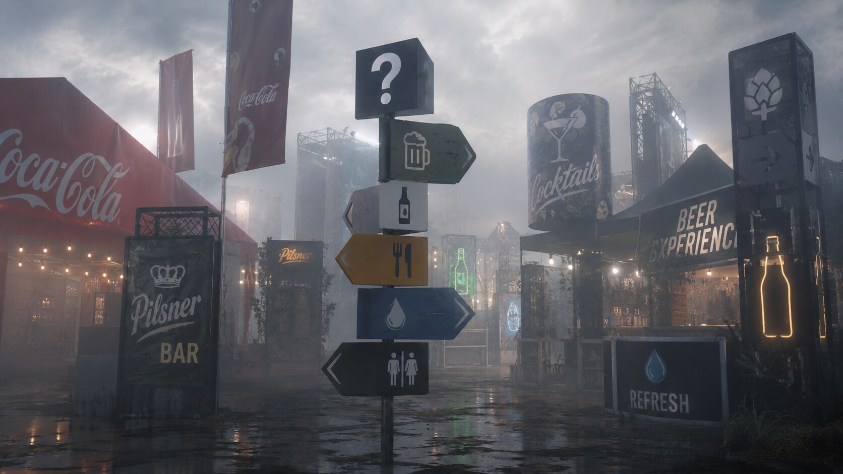
One of the most common real-world failures appears around food and drink points.
You arrive hungry or thirsty and see:
But what you actually need to know is much simpler:
This is where brand marketing logic and wayfinding logic collide.
For a sponsor, the ideal result is visibility. For a visitor, the ideal result is instant understanding.
Those are not the same thing.
The better solution is almost always service-first and sponsor-second. Mark every relevant drink point clearly as BAR. If one serves a special distributor offer, list that inside the bar zone, on the menu board, or on secondary signage. Do not force the visitor to decode the commercial structure of the event just to find a beer or a cola.
The same applies to other functions:
FIFA’s stadium-guideline logic is useful here even outside football because it follows a simple rule: the whole venue should speak one clear navigation language, and temporary event branding should sit on top of that system without disrupting it. In other words, people must understand where to go before they notice who sponsors it.
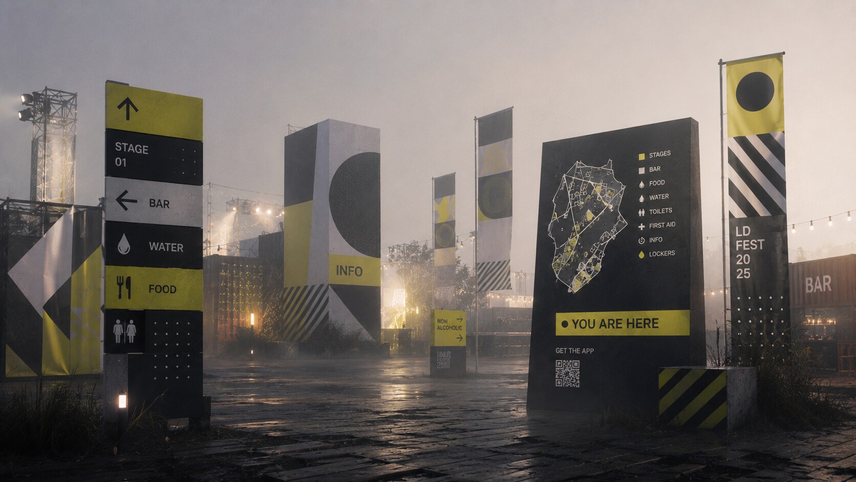
Not every event publishes its full signage system publicly, but several examples show the right instincts.
Cercle Festival is one of the better current examples from electronic music. The festival, staged near Paris at Le Bourget, is built around atmosphere, scenography, and a highly curated visual world, but even there the operational layer still matters: contact points, bars, food trucks, prevention stands, shuttle logic, and map-based location cues all need to stay understandable. That makes Cercle useful as a lesson. A visually intense music festival can still feel calm if the orientation language remains plain, consistent, and easy to trust.
London Design Festival, shaped for years by Pentagram under Domenic Lippa’s direction, is a useful benchmark for consistency. It is not a field festival, but it demonstrates something event designers often forget: identity only becomes real when it can carry wayfinding, advertising, venue graphics, and a city-wide information layer without collapsing.
LA Design Festival, with work by Weekday Studio, is another strong example of a campaign system extended into original signage and wayfinding rather than treated as separate jobs. The important lesson there is that navigation and branding should share one design grammar.
Terraforma, through Vectorealism, is another strong music-festival example, but with a very different tone. Instead of leaning on visual spectacle, it uses quieter materials and low-noise wayfinding. That is valuable because many outdoor festivals believe visibility requires shouting. Terraforma shows the opposite: clarity can stay restrained and still work.
Design Junction, with a wayfinding strategy by Maynard Design, demonstrates how orientation can organize a dense event without flattening the atmosphere into bureaucracy.
These are not all the same stylistically, which is exactly the point. There is no single festival look. There is only the shared discipline of making the event legible.
One less-discussed sign of a mature event system is not how photogenic the wayfinding is, but whether visitors stop asking staff the same directional question every ten minutes.
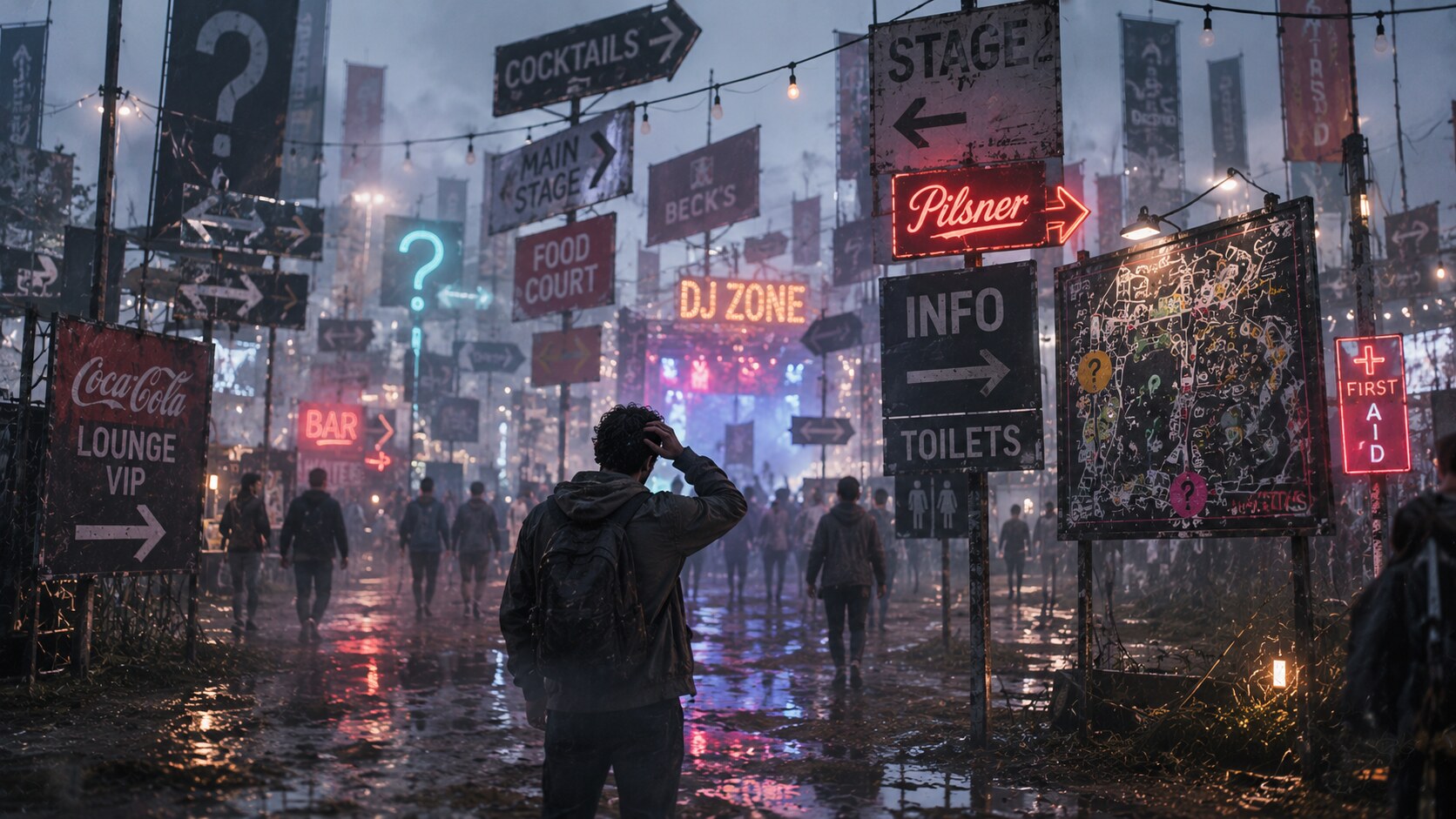
Bad event wayfinding is rarely mysterious. It usually comes from the same habits:
The ugliest failures are often not stylistic but structural.
For example, a sign may say the correct thing but still fail because it is mounted too high to read quickly, it appears only after the path split, its arrow points ambiguously in a diagonal layout, or the same destination has two names in two parts of the site.
This is where many organizers waste money. They commission more objects instead of designing a better system. Ten mediocre signs do not equal one coherent orientation logic.
Several studios and disciplines stand out repeatedly in this field.
Pentagram remains important because of how often it proves that event identity and event orientation can be part of the same visual system instead of parallel tracks.
Entro is one of the clearest current references for wayfinding as a research-driven discipline, especially in how it talks publicly about behavioral testing and multi-layer systems.
Mijksenaar remains a classic benchmark in orientation design because it helped establish a way of thinking that treats movement, information, and stress as one design problem.
Maynard Design, Weekday Studio, Vectorealism, and other environmental-graphic and event-focused practices show how festival and event systems can work at different scales, from boutique design events to large public experiences.
What separates the stronger studios from the weaker ones is not only taste. It is process. The good ones ask:
That distinction alone already saves many events from confusion.
“The best event graphics do not simply decorate movement. They organize it.”
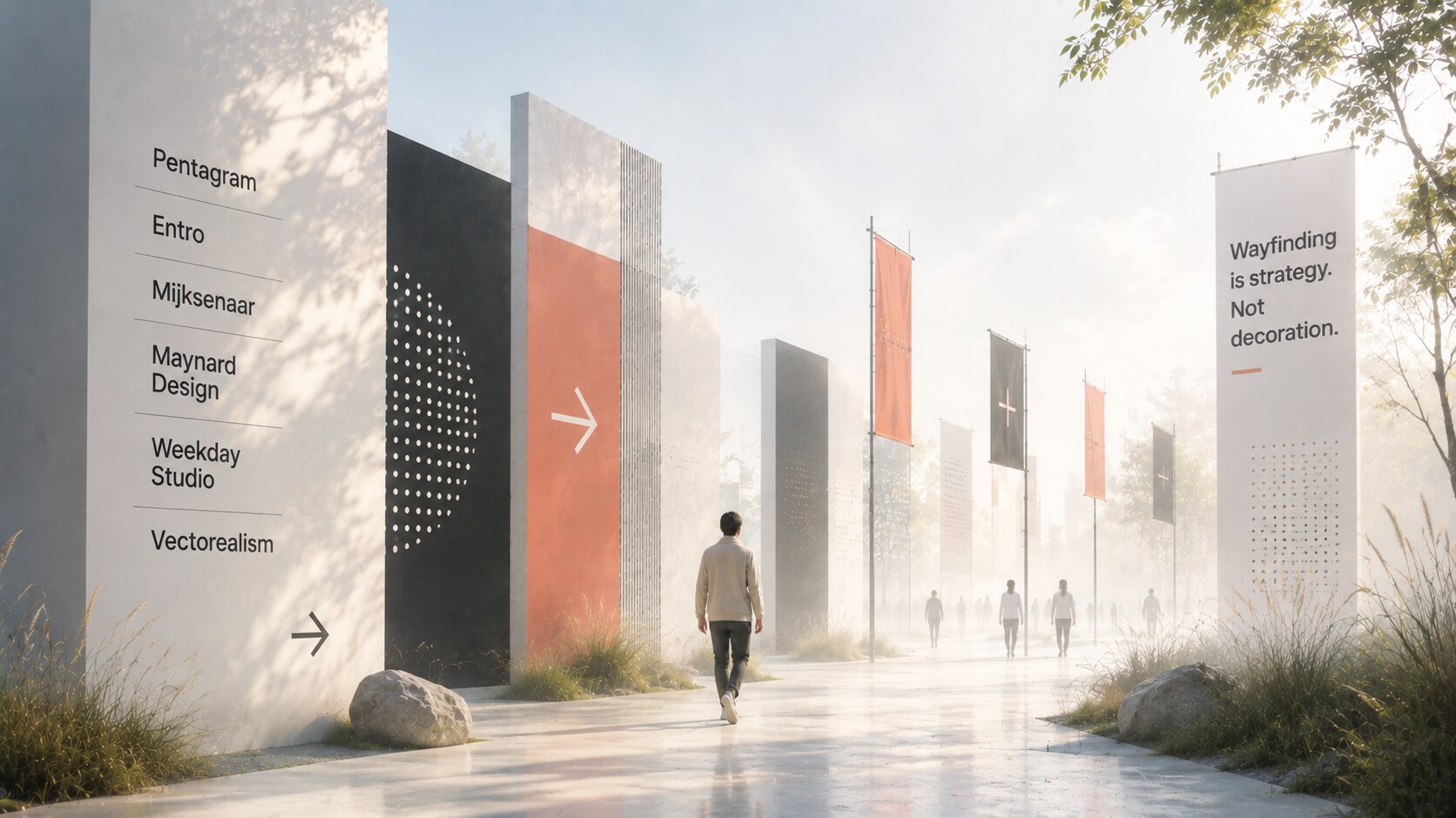
When a festival or event is easy to navigate, people rarely praise the signage first. They say it felt well organized, it was easy to find everything, it felt premium, or it was surprisingly calm despite the crowd.
That is exactly the point.
Graphic design becomes the key to visual orientation when it helps people move through the event with less doubt and less wasted effort. Great marks, good symbols, restrained color logic, typography that survives distance, and a clean separation between service signs and sponsor noise all contribute to that feeling.
The stronger the event identity becomes, the more disciplined the navigation layer must be. Otherwise the brand starts competing with the visitor’s needs.
And the final rule is simple:
News, insights, case studies, and more from the rausr team — straight to your inbox.
Send us your brief, your wildest idea, or just a hello. We’ll season it with curiosity and serve back something fresh, cooked with care.