Graphic Design in the 19th Century

How it was made before “design” existed. Graphic design—printing methods, poster culture, typography trends, and the real production workflow behind Victorian-era visuals.

01.01.2026 BY Emily Portrait of Emily
Graphic Design in the 19th Century header image

Introduction

🏭 The Century That Turned Printing Into Mass Media

The 19th century is where “graphic design” (as we think of it today) quietly takes shape—without the title, without software, and often without a single person owning the whole composition.

It was a world of compositors, engravers, lithographers, type founders, and printers—all contributing to what we’d now call layout, typography, branding, and visual communication.

If the 20th century invented modern design studios, the 19th century invented the industrial pipeline that made design scalable.

19th-century printing workshop and production tools

What Counted as “Graphic Design” Back Then?

In the 1800s, the job title graphic designer didn’t exist (the term becomes common much later). But the work absolutely did:

  • Posters for theatres, concerts, political movements, and consumer products
  • Packaging labels, trade cards, catalog pages, and newspaper ads
  • Illustrated journals, broadsides, timetables, signage, and certificates
  • Type specimens and ornamental borders meant to sell printing services

The big difference: the “designer” was often a craft specialist inside the print ecosystem, not a single author controlling everything end-to-end.

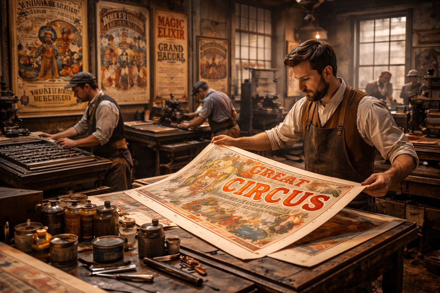
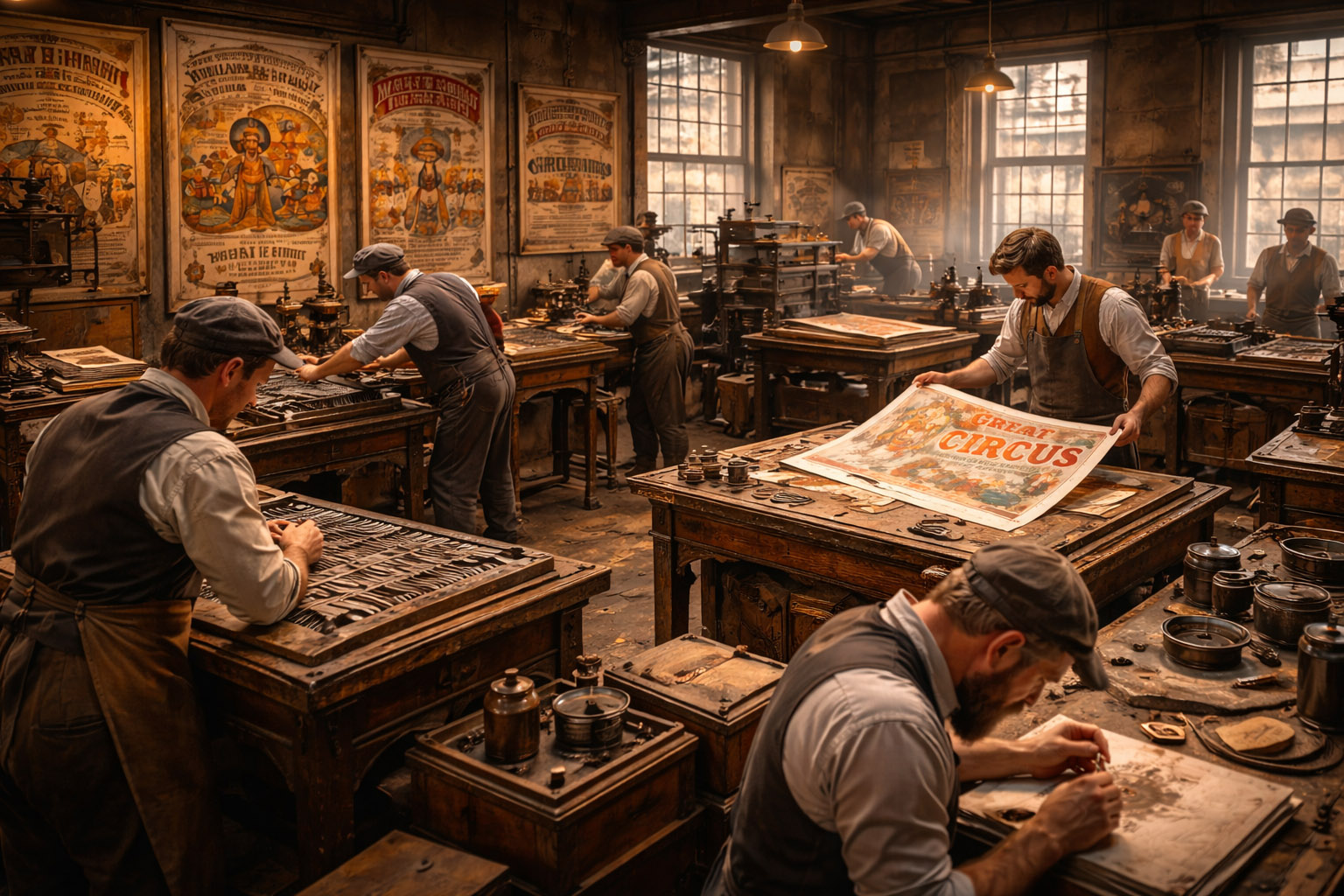
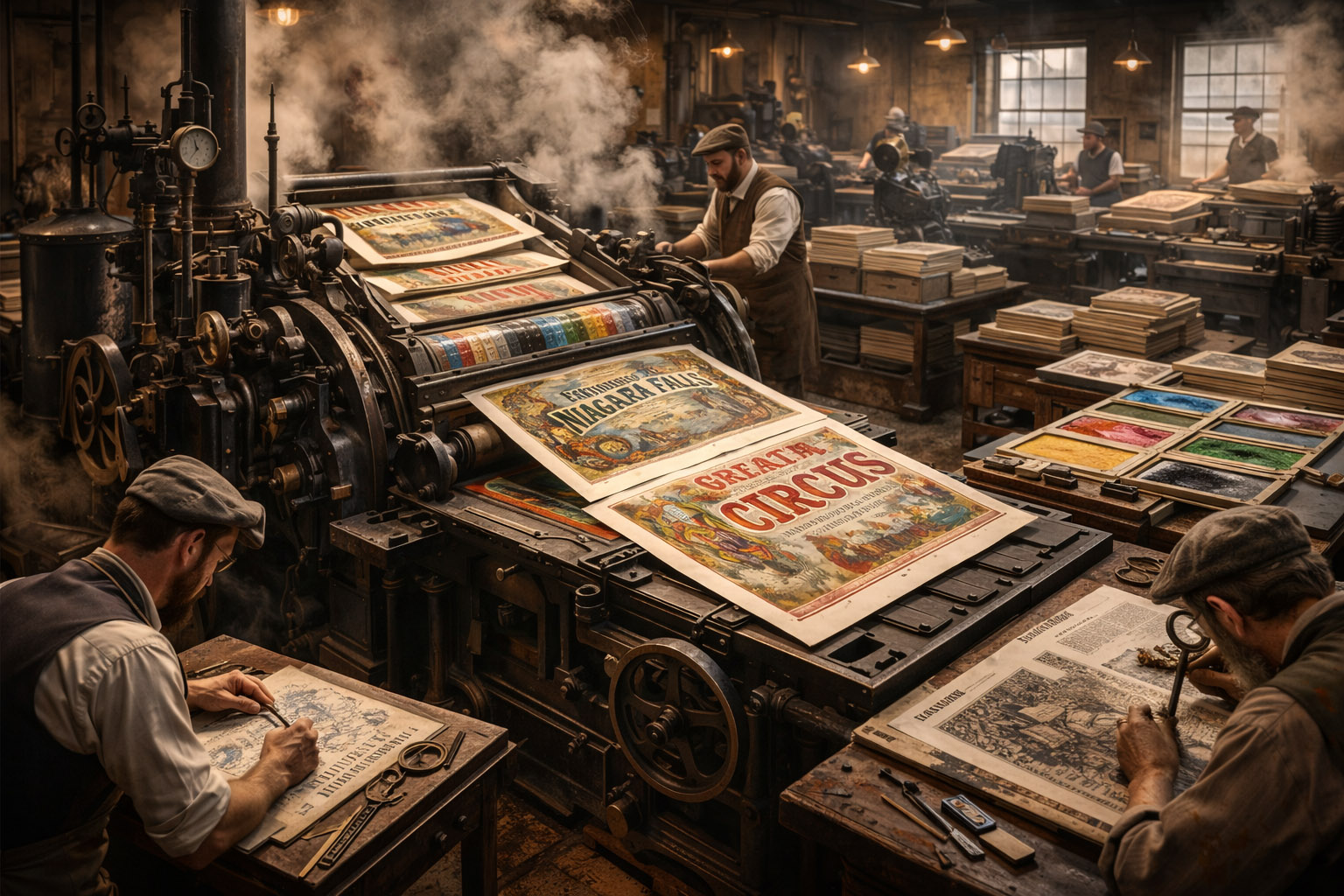
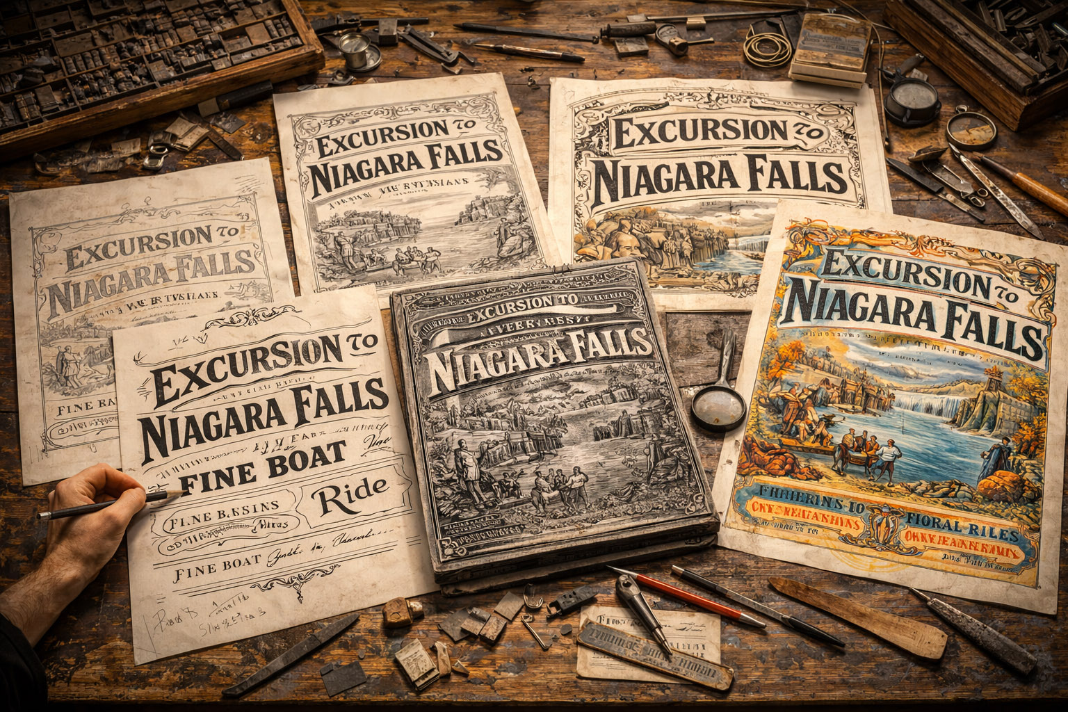
Reality check: a single poster could pass through multiple hands—one person drawing, another letterforming, another making plates/stones, another printing, another finishing. What we call “design” was distributed labor.

Victorian-era printed ephemera: posters, ads, and ornamental layouts

The Technologies That Changed Everything

1) Steam Power + Mechanized Presses

As presses became faster (and paper production scaled up), print stopped being a luxury object and became a mass communication channel. That shift created demand for:

  • Bigger headlines and higher contrast typography
  • Faster turnaround and repeatable layouts
  • Visual systems that could be reused across many documents

2) Lithography: Drawing Directly for Print

Lithography (printed from a flat surface—traditionally stone) was a turning point because it let artists create:

  • Fluid illustration
  • Hand lettering
  • Large posters
  • Multiple colors (eventually) at scale

Unlike metal type, lithography could reproduce expressive strokes and painterly textures with fewer compromises.

3) Chromolithography: Color Becomes a Selling Tool

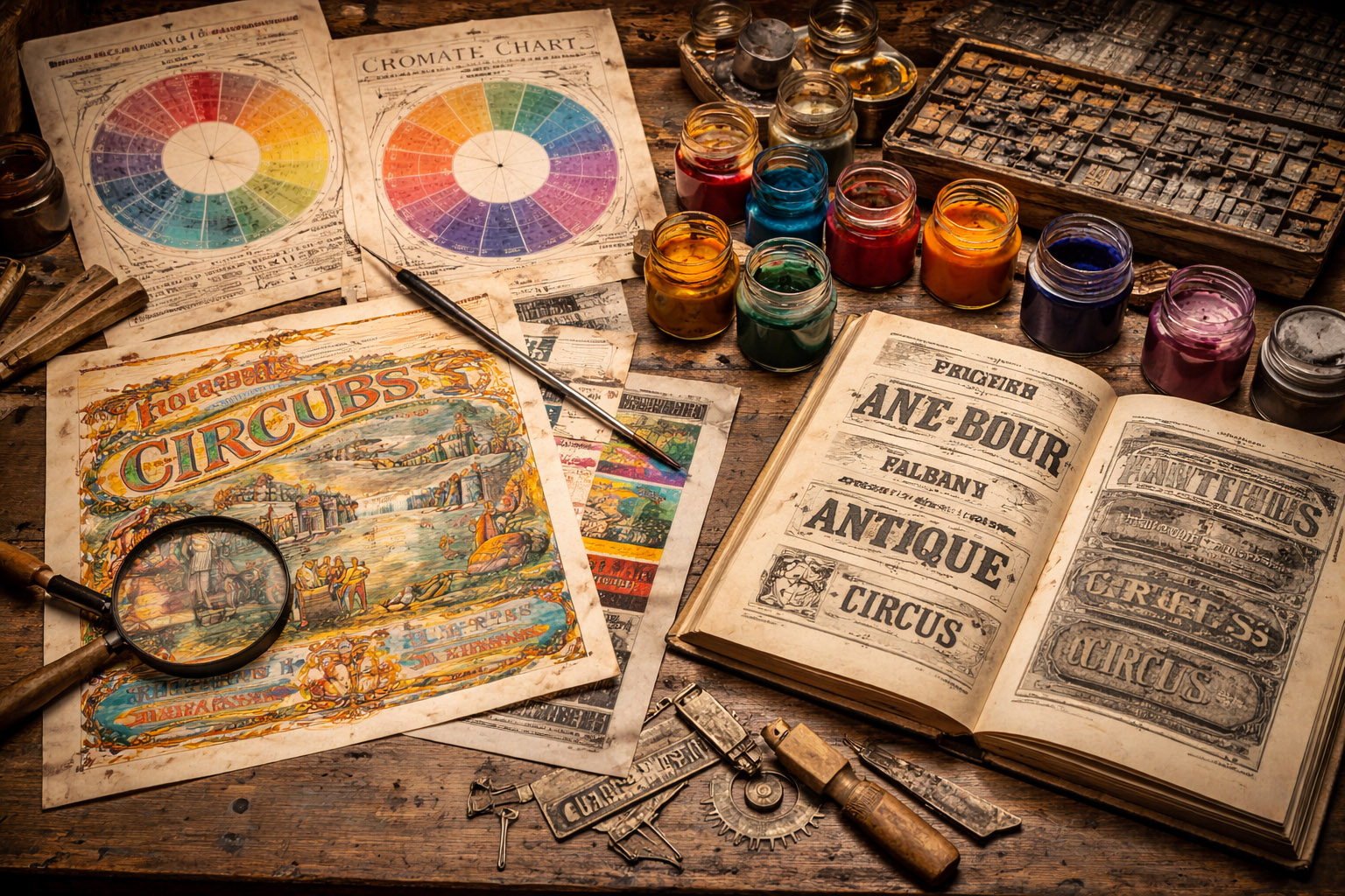
Color printing grew into a competitive advantage. Chromolithography required separate stones/plates per color, carefully registered so every layer landed in the right place.

This pushed print toward what we’d now call production design:

  • Planning color layers
  • Managing contrast so text stays legible
  • Using key lines and outlines to hide misregistration

Less-known production trick: many color prints used a strong dark “key” layer to anchor details. If colors drifted slightly, the image still looked sharp because the key line held it together.

4) Wood Engraving and Illustrated Newspapers

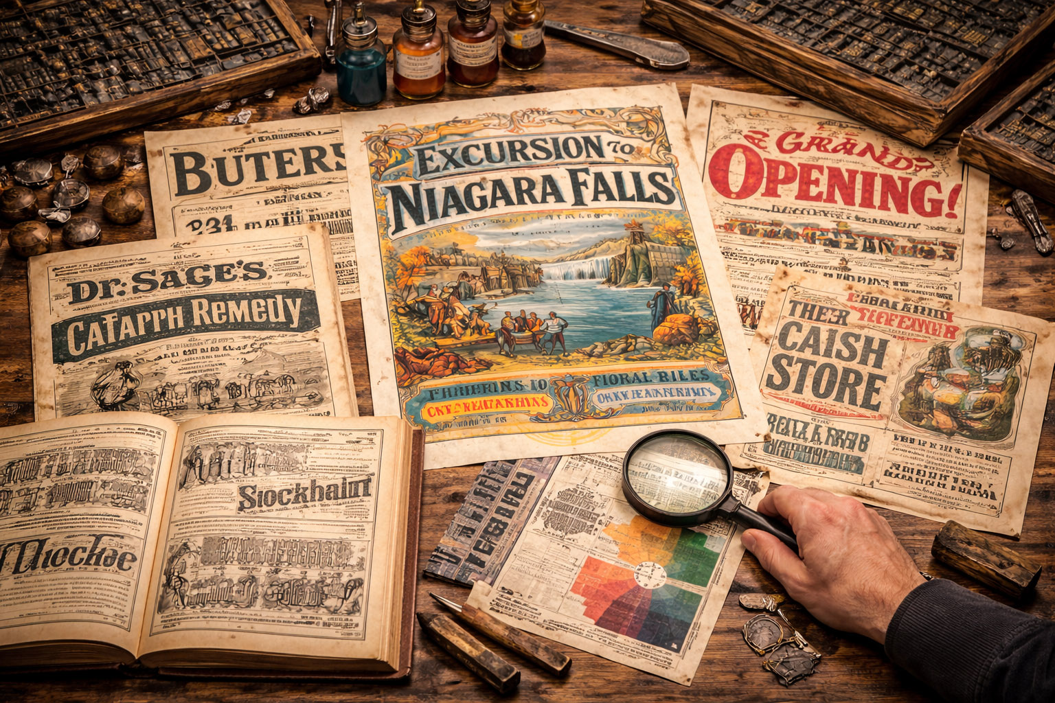
Before photo reproduction became easy, newspapers often relied on wood engravings to translate events into images. Sometimes these were made from photographs—but the photo couldn’t be printed directly, so an engraver converted it into a printable pattern.

5) Halftone + the Arrival of Printable Photography

In the late 1800s, halftone screens (printing images as dot patterns) helped unlock mass photo reproduction. That change slowly reshaped editorial design:

  • Layouts could include real photos, not only drawings
  • The balance of text/image shifted
  • Visual credibility became part of news and advertising

6) Linotype: Speeding Up Text

Hot-metal typesetting (Linotype and later systems) compressed the time between writing and printing—pushing periodicals, ads, and catalogs into a faster cycle. More pages, more ads, more competition—so visual hierarchy mattered more than ever.

19th-century print technology and reproduction methods

Victorian Typography

Loud, Ornamental, Competitive

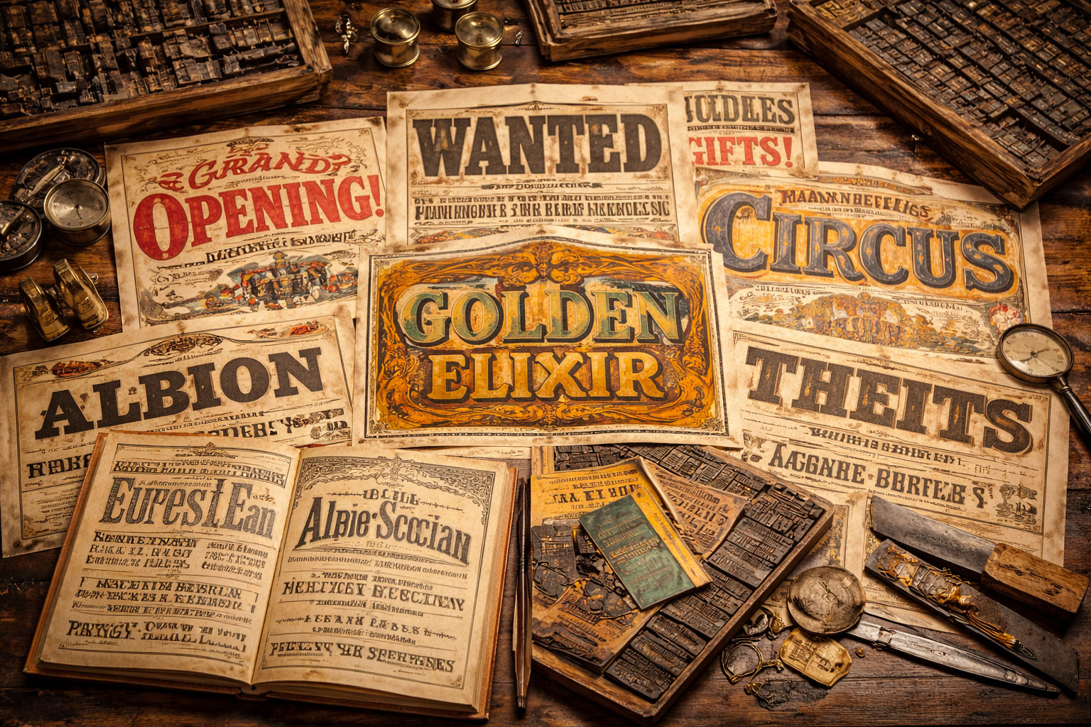
When advertising explodes, typography becomes a battleground. The 19th century is famous for:

  • Didone contrast (thick/thin strokes) used for elegance and authority
  • Slab serifs (“Egyptians”) built for impact and poster readability
  • Grotesques (early sans) used for utilitarian signage and ads
  • Tuscan and ornamental styles designed to perform on the street
  • Wood type for large-scale posters—cheaper and faster than metal for big sizes

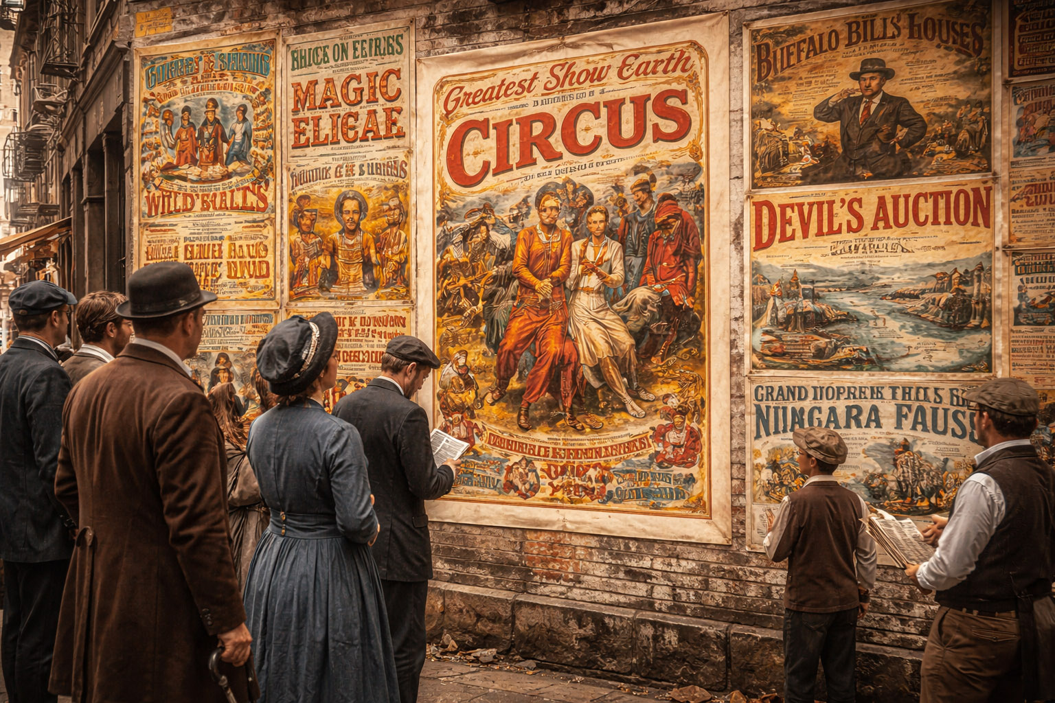
This is why Victorian prints often look “busy”: they were competing for attention in a dense visual market—shop windows, streets, newspapers, handbills.

Victorian typography with decorative and display styles

Posters: The Street Becomes the Feed

If social media today is a scroll of competing visuals, the 19th-century city wall worked similarly:

  • Layers of posters fighting for attention
  • Constant turnover
  • A visual language optimized for distance and speed

Lithographic poster artists helped define what “modern” looked like before modernism:

  • Bold silhouettes and simplified composition for instant readability
  • Expressive hand-lettering integrated into imagery
  • Strategic color to guide the eye and create brand memory

Unknown-but-important shift: posters weren’t only “art”—they were an early laboratory for conversion design. The question wasn’t “is it beautiful?” but “will it stop someone walking past?”

19th-century poster design: bold layouts competing for attention

How a 19th-Century Job Got Made

A Realistic Workflow

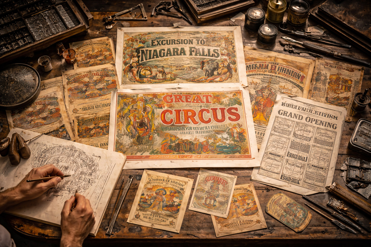
Here’s what the pipeline often looked like for a poster, label, or certificate:

  1. Client request (often vague: “make it look premium” existed even then)
  2. Rough sketch and copy decisions (headline, pricing, address, claims)
  3. Lettering plan (hand lettered, composed from type, or mixed)
  4. Production choice (letterpress vs lithography vs engraving; budget decides a lot)
  5. Prepress craft
    • Type set by compositors (manual composition from cases)
    • Images engraved (wood/metal) or drawn on stone for litho
  6. Proofing
    • Printed proofs checked for spacing, spelling, alignment
    • Corrections cost real time and real money
  7. Printing + finishing
    • Folding, trimming, mounting, sometimes varnish or embossing

The “design system” wasn’t a Figma file. It was repeatable print components: borders, ornaments, type combinations, and standard page structures.

Manual layout and prepress workflow before digital tools

Behind the Scenes

Things Most People Don’t Hear About

  • Color science mattered: theories of simultaneous contrast (19th-century color research) influenced how printers and artists paired hues for impact.
  • New dyes changed the palette: vivid synthetic dyes in the 1800s made brighter inks and printed ephemera more attractive (and more disposable).
  • Registration was a daily fight: even small shifts between color layers could ruin a run—so designers adapted with outlines, traps, and simplified shapes.
  • Type was expensive infrastructure: print shops invested in type the way teams invest in software today. Specimen books were both catalog and marketing.
  • Credit was rare: much of the most influential “design” work of the century is anonymous—embedded in print culture rather than signed like fine art.
Print production details: registration, type, and color planning

What We Can Learn From 19th-Century Design Today

  • Constraints create clarity: fewer options forced stronger decisions.
  • Production literacy is power: the best work came from people who understood printing limitations.
  • Consistency beats decoration: the most effective pieces used ornament with hierarchy, not instead of it.
19th-century design aesthetics: ornament, hierarchy, and readability

Summary

19th-century graphic design was the birth of design-as-industry: mass print, mass advertising, and the rise of visual competition. It wasn’t clean or minimal—but it was highly strategic, deeply crafted, and surprisingly modern in its intent.

“Before “graphic design” had a name, it already had a job: make information readable, persuasive, and repeatable—at scale.”

Thanks for reading ✌️
Take a look at graphic recipes from our chefs 🥑
Sections in this article
← Newer article Older article →

Let’s Dish It Out

Send us your brief, your wildest idea, or just a hello. We’ll season it with curiosity and serve back something fresh, cooked with care.