Graphic Design in the 2010s: The Second Decade of the 21st Century
How graphic design changed between 2010 and 2019 through responsive websites, flat UI, flexible identities, cloud tools, social media and collaborative design systems.


How graphic design changed between 2010 and 2019 through responsive websites, flat UI, flexible identities, cloud tools, social media and collaborative design systems.
Graphic design between 2010 and 2019 cannot be explained by one font, one color palette or one fashionable effect. Its main change was deeper: a design was no longer expected to live in one final size.
A logo had to work as an app icon, profile picture, animation, sign and tiny browser mark. A publication might begin on a phone and end as a printed book. A campaign needed to survive square posts, vertical stories, responsive websites, digital screens and physical spaces. The designer was increasingly building rules for a changing environment rather than polishing one permanent composition.
The decade began by removing the gloss, reflections and fake materials of the 2000s. It ended with design systems, cloud collaboration, custom typefaces, motion identities and brand languages that could generate thousands of variations. That made graphic design faster, broader and more strategic, but also more standardized.
This article continues Graphic Design in the First Decade of the 21st Century. The earlier story explains the glossy Web 2.0 surfaces and desktop logic that the 2010s inherited, then deliberately edited away.
“The defining object of 2010s design was not the poster or the logo. It was the system that could keep both recognizable while everything around them changed size.”
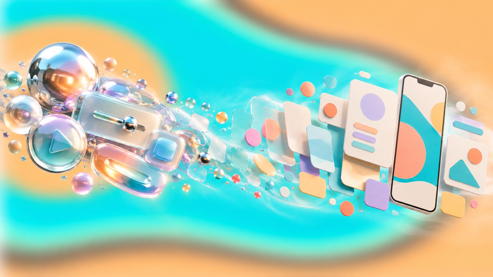
The 1990s had made graphic design expressive, layered and frequently anti-grid. The 2000s translated that digital excitement into chrome, bevels, glass, reflections, Flash animation and realistic icons. By 2010, those effects had become heavy baggage.
Smartphones changed the conditions. Screens were smaller, connections could be slower, touch needed larger targets and the same service had to behave across many devices. Decorative realism consumed space and attention. Designers began replacing it with simple geometry, large color fields, clean typography and icon systems that could scale.
Microsoft’s Metro language was one of the clearest early signals. It borrowed the directness of transport signage and made type, motion and content more important than simulated materials. Apple’s iOS 7 pushed a similar change into the mainstream in 2013 by removing much of the leather, felt, gloss and dimensional ornament associated with earlier iPhone interfaces.
The transition was not simply from “bad decoration” to “good minimalism.” Skeuomorphic details had taught new users what a button, shelf or notebook could do. Once touch behavior became familiar, those explanations could be reduced. The 2010s were possible partly because the previous decade had already trained the audience.

The decade moved quickly, but a few dates show how its design logic was assembled.
| Year | Milestone | Why it mattered |
|---|---|---|
| 2010 | Responsive Web Design | One layout could adapt to different screens instead of requiring separate fixed sites. |
| 2010 | Metro, Sketch and Google Fonts | Interface minimalism, UI-specific tools and web typography all gained momentum. |
| 2012 | Adobe Creative Cloud | Professional software began moving from boxed releases to subscriptions and connected services. |
| 2013 | iOS 7 and Canva | Flat mobile UI reached a mass audience while template design reached non-designers. |
| 2014 | Material Design and HTML5 | Systems, motion and native browser capabilities replaced many improvised interface conventions. |
| 2016 | Figma and variable fonts | Real-time browser collaboration and adjustable font files changed production possibilities. |
| 2016 | Mobile passed desktop | Worldwide web use confirmed that the smallest screen could no longer be treated as secondary. |
Ethan Marcotte’s 2010 article did more than name responsive web design. It connected fluid grids, flexible images and media queries into one practical method. Six years later, StatCounter measured mobile and tablet devices at 51.3% of worldwide internet usage, against 48.7% for desktop. The mobile-first argument was no longer a prediction.
A revealing number: In late 2010, only months after its launch, Google reported that its web-font service was handling 17 million requests per day across about 400,000 websites. Typography on the web was escaping the short list of fonts installed on every computer.

Early 2010s work often looked lighter because it had to carry more complexity underneath. Flat surfaces loaded efficiently, adapted well and gave content more room. The dominant ingredients were easy to recognize: geometric sans serif type, simple line icons, cards, generous spacing, bright solid colors and grids assembled from reusable modules.
Google’s Material Design, launched in 2014, added order to this flatness. It treated interfaces as layered surfaces governed by light, elevation and motion. The visual result was cleaner than skeuomorphism, but not completely without physical logic. Shadows explained which layer sat above another, and animation showed where an object came from or went.
The Material team even used cut paper, lighting and filmed prototypes to study how digital surfaces should cast shadows and move. That is a useful hidden detail: one of the decade’s most influential digital systems was refined with physical materials.
By the middle of the decade, strict flatness softened. Gradients returned, but they no longer tried to imitate shiny plastic. Spotify’s duotone imagery, Instagram’s warm gradient identity and many campaign systems used intense color as atmosphere rather than fake depth. Illustration also expanded because it could explain abstract software without relying on generic stock photography.
The strongest visual features of the period were:
At the edges, designers resisted this smoothness. Brutalist websites, rough collage, risograph textures, eccentric serif type and deliberate anti-design brought friction back. The decade was never as uniformly minimal as its largest apps made it appear.

The best branding of the 2010s was designed as behavior. Color, type, photography, illustration, motion, sound, interface components and verbal tone became coordinated parts of one system. This was partly strategic and partly necessary: a static logo could not create enough continuity across dozens of channels.
DesignStudio built Airbnb’s 2014 identity around the Belo symbol and the idea of belonging. The mark was intentionally simple enough to draw, but its greater value came from connecting product, photography, community stories and global communication.
Pentagram simplified Mastercard without throwing away its strongest memory asset: the intersecting red and yellow circles. Research cited by Pentagram found 81% spontaneous recognition of the symbol without the company name. That made later wordless use feel like an earned reduction, not minimalism for its own sake.
Some identities went much further. E Roon Kang and Richard The developed a 2011 identity for the MIT Media Lab that could generate 40,000 logo variations. Each person could have an individual mark while the underlying grid kept the institution recognizable. It anticipated a decade in which identity could be produced by rules rather than supplied as one final drawing.
At the opposite end of polished corporate restraint, COLLINS and Dropbox’s internal brand team created a louder system of contrasting type, color, illustration and unexpected image pairings. It showed that a digital company did not have to communicate scale by becoming visually neutral.
“A responsive identity does not mean that everything changes. It means the right elements stay stable while the rest are allowed to move.”
Even controversial work could age well. Wolff Olins designed the London 2012 identity before the decade began, but its real public test came in 2012. The angular mark was widely criticized, yet its energetic shapes, bright colors and ability to hold imagery worked across venues, tickets, merchandise and broadcast graphics. It behaved more like an event language than a polite emblem.

In the 2000s, a web designer could still think mainly in finished pages. In the 2010s, that model became difficult to maintain. A button needed default, hover, focus, pressed, loading and disabled states. A card had to accept changing content. Navigation had to survive a phone, tablet and wide desktop. Design increasingly described relationships and rules.
This was the decade in which pattern libraries and design systems moved from specialist practice into normal product work. Google’s Material Design gave external teams a visible model, while companies such as IBM, Salesforce, Shopify and Atlassian published increasingly mature systems of their own. They did not merely standardize color and typography; they connected design decisions to reusable code.
Several conventions emerged because they solved real scaling problems:
The screen also changed from a destination to a continuous feed. Instagram, Pinterest and other image-led platforms made square crops, visual rhythm and immediate recognition part of everyday communication. Later, Stories shifted attention toward vertical frames and short-lived sequences. Brand designers were now composing inside platforms they did not control.
The physical consequences of this shift are explained in From Cursor to Touchscreen, where touch targets, missing hover states and direct manipulation show why desktop visual habits could not simply be reduced in size.
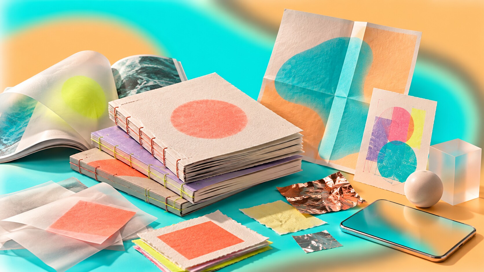
Print did not disappear in the 2010s. Its role changed. News, announcements and disposable information moved toward screens, while printed objects increasingly justified themselves through editing, material and permanence.
Independent magazines, cultural journals, art books and small publishers treated print as a slower premium experience. Uncoated stocks, exposed binding, fluorescent spot colors, risograph misregistration, foil and unusual formats made material qualities visible. The digital world favored perfect repetition; print often became interesting by showing texture and variation.
Editorial design also absorbed screen habits. Oversized type, modular blocks, short entries, strong image sequences and navigation-like contents pages moved between web and paper. Campaign identities were frequently developed for motion and social media first, then translated into posters, packaging and environments.
This created a productive reversal. In the 2000s, websites often imitated printed pages. In the 2010s, printed pages increasingly borrowed the pace, scale and modularity of screens.
The quiet print success: The decade’s most valuable printed object was often not the biggest campaign poster. It was the carefully made book, magazine or package that offered concentration away from a feed. Print became less universal, but more intentional.

Adobe introduced Creative Cloud in 2012 and shifted its professional tools toward subscription access. The move provided more frequent updates and connected services, but it also made designers dependent on continuing payments and vendor infrastructure. The business model of design software had changed as much as its interface.
Sketch, launched in 2010, concentrated on interface work instead of trying to reproduce the entire print-production history of older tools. Figma then made a more radical move. Founded by Dylan Field and Evan Wallace, it used browser technologies including WebGL and released multiplayer editing publicly in 2016. Designers, writers, developers and clients could enter the same file instead of exchanging versions named final, final-2 and final-really.
For a closer comparison of how that workflow change affected teams, see Figma vs Adobe XD.
Canva moved in the other direction by hiding much of professional software’s complexity. Founded by Melanie Perkins, Cliff Obrecht and Cameron Adams, it launched in 2013 and made template-based visual production available to far more people. This expanded participation, although it also increased the number of competent-looking designs assembled from the same ingredients.
Typography gained new technical freedom. In 2016, Apple, Microsoft, Adobe and Google jointly announced OpenType variable fonts. One font file could contain adjustable axes such as weight and width instead of requiring a separate file for every style. The idea was not entirely new: it revived concepts from Apple’s 1990s TrueType GX technology, now rebuilt for modern web and software environments.
HTML5, CSS, SVG, faster JavaScript and modern browser graphics also reduced dependence on proprietary plugins. Adobe announced in 2017 that Flash would reach end of life in 2020. Google reported that the share of desktop Chrome users visiting at least one Flash page each day had fallen from 80% in 2014 to 17% in 2017. An entire visual production culture was closing.
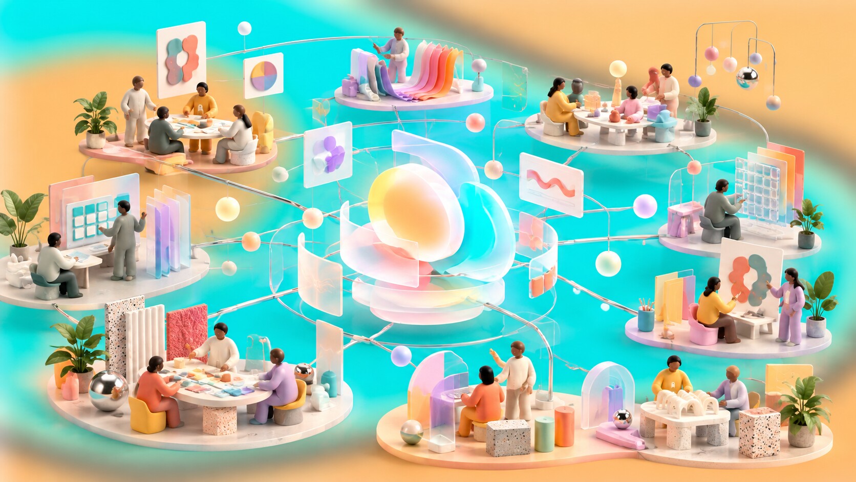
The 2010s still produced famous studio work, yet authorship became more distributed. A global identity might involve an agency, an internal brand group, product designers, type designers, illustrators, motion teams, developers and regional partners. Naming one heroic designer often hides how the system actually reached the public.
Pentagram, Wolff Olins, DesignStudio, COLLINS, Experimental Jetset, Studio Dumbar, Base Design and johnson banks were among the visible external practices shaping identity and cultural work. Type foundries and independent specialists became more prominent as custom fonts grew into a key brand asset.
The larger structural story happened inside technology companies. Apple, Google, Microsoft, Facebook, Airbnb, Dropbox, Spotify and many others developed substantial design organizations. Product behavior, data, support content and brand communication could no longer be separated cleanly, so design leadership moved closer to daily business decisions.
This changed the profession. Graphic designers increasingly worked beside researchers, engineers, strategists, writers and product managers. The advantage was influence and scale. The risk was that visual decisions became optimized for measurable short-term behavior, while cultural character and experimentation were harder to defend.
“The 2010s did not remove individual authorship. They made authorship harder to locate because the most important design was often the agreement between many teams.”

The decade’s main mistakes came from applying a correct idea without enough judgment. Removing unnecessary decoration was useful. Removing every sign that an object was clickable was not. Nielsen Norman Group’s eye-tracking research found that flat interfaces with weak signifiers attracted less attention and created more uncertainty than clearer controls. Minimalism had confused visual quiet with usability.
Other repeated problems included:
Gap’s 2010 logo is the decade’s fastest cautionary story. A familiar blue-box identity was replaced by a plain wordmark with a small gradient square. The company reversed the change after roughly one week of criticism. The problem was not that Helvetica was inherently wrong; the new mark did not offer a convincing reason to abandon accumulated recognition.
Uber’s 2016 redesign is more complicated and therefore more useful. Its internal team built an ambitious idea around “bits and atoms,” local color palettes and patterns. But the app symbol was difficult to recognize, and in 2018 the company replaced it with a much simpler wordmark-led identity. A concept can be intelligent in presentation and still fail at the small moment when a customer looks for an app.
Late in the decade, “blanding” became shorthand for another problem: direct-to-consumer companies and established fashion houses converging on clean sans serif identities, muted photography and nearly interchangeable layouts. These systems performed well on small screens and templated stores, but optimization gradually removed distinction.
That tension continues in Bold, Distinctive Branding vs Beautiful Generic Branding: polished beauty can support trust, but memory usually needs a feature that is not behaving like everyone else.
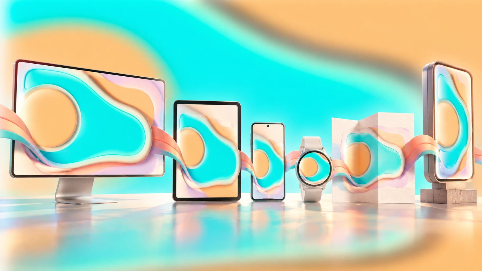
The decade’s surface trends have already cycled. Gradients returned. Serif type returned. Gloss and dimensional interfaces are returning in new forms. The deeper achievements have lasted because they solved structural problems.
The price of this progress was sameness. Tools became more capable, but defaults became more persuasive. Templates made visual communication accessible, while feeds trained brands to use the same crops, rhythms and calls to action. Systems reduced errors, but rigid systems could also remove surprise.
The best lesson from 2010 to 2019 is therefore not to imitate flat icons, duotones or geometric type. It is to separate a useful principle from its temporary costume. Responsive thinking is a principle; one particular card layout is a costume. Clear hierarchy is a principle; making everything pale gray is a costume. A flexible identity is a principle; endlessly changing a logo is only an effect.
Design history keeps recycling the costumes while preserving the strongest ideas. Trend Cycles in Graphic Design explains why yesterday's visual mistake can return as tomorrow's carefully edited reference.
The second decade of the 21st century made design less fixed, less solitary and more embedded in technology. Its greatest success was teaching visual systems to adapt. Its biggest failure was assuming that adaptation required everyone to look the same.


News, insights, case studies, and more from the rausr team — straight to your inbox.
Send us your brief, your wildest idea, or just a hello. We’ll season it with curiosity and serve back something fresh, cooked with care.