Graphic Design in the 2020s: The Third Decade of the 21st Century
How graphic design changed after 2020 through short-form media, AI, collaborative tools, accessibility and a renewed appetite for distinctive, human-made work.

How graphic design changed after 2020 through short-form media, AI, collaborative tools, accessibility and a renewed appetite for distinctive, human-made work.
The 2010s taught designers to build systems that could survive many screens. After 2020, the number of outputs grew faster than most teams could make them. A campaign might need a vertical video, a square post, a storefront, an email, a product page and several localized versions before anyone has finished approving the master artwork. Then generative AI made the first plausible image almost instantaneous.
This is not the end of graphic design. It is a change in what is difficult. Producing a polished surface became easier; choosing a clear idea, keeping it recognizable and proving that it works became more valuable. The 2020s also brought a counterreaction: more texture, imperfect marks and physical experiences in a world full of smooth, repeatable digital visuals.
We are writing in 2026, not at the end of the decade. The later years remain uncertain. But the first half already offers a story about tools, attention and the new demand for work that feels both useful and unmistakably made for someone.
This is the next chapter after graphic design in the 2000s and the system-building 2010s. The new question is what happens when those systems must produce more, faster, for more channels.
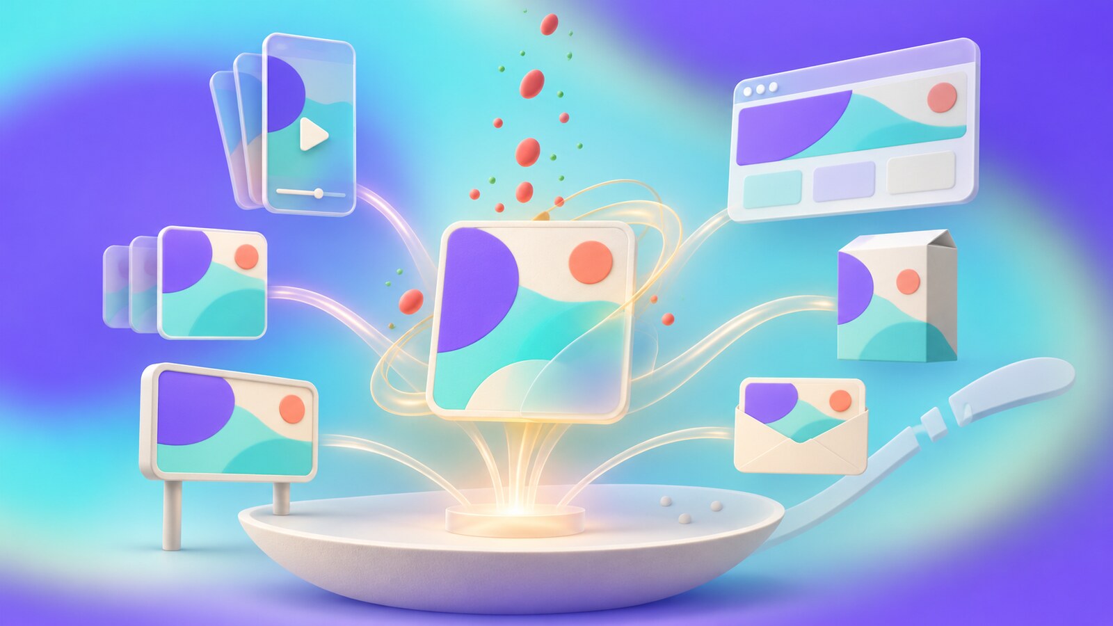
Remote collaboration, social publishing and online commerce became normal parts of everyday design work. The visual identity still needed rules, but those rules now had to survive constant cropping, motion, translation and reuse by people outside the original design team. A brand could no longer wait for one perfect campaign image before communicating.
Canva says its users made more than 12 billion designs in 2025. That figure counts activity on one platform, not the quality or total volume of graphic design worldwide. It does show the new scale of visual production: design is no longer performed only by people whose job title says designer. Marketers, teachers, founders and local teams are all making assets.
The professional response is not to handcraft every small variation. It is to create strong templates, distinctive assets and a review process that stops the system from becoming a machine for multiplying weak ideas.

Short-form platforms made designers think harder about the first second: is the brand visible, is the message legible, and is there a reason to keep watching? Research by System1 treats recognition within the first two seconds as a useful test of early branding. That is a measure of an ad in a particular viewing situation, not evidence that people can no longer concentrate for longer than two seconds.
The new skill is to make several speeds of communication work together. A moving logo, color, character or sound may help a fleeting impression register. A longer article, product experience or event can reward someone who chooses to stay. Compressing every story into a frantic opening frame would make many brands louder and less memorable.
We explored this tension in the two-second attention article: recognition in a feed and attention willingly given to a film or event are different design problems.
“The 2020s did not remove attention. They made designers earn it in more kinds of places.”
One direction continued the 2010s: restrained interfaces, modular grids, scalable type and carefully managed components. Another pushed toward bold type, collage, 3D surfaces, retro references, deliberate awkwardness and a sense of touch. These are not neat phases in a timeline. They coexist, often inside the same brand: calm checkout, wild campaign.
Canva’s 2026 trend report describes rising interest on its platform in tactile textures, scrapbook elements and pared-back editorial layouts. Those are searches and a creator survey, not proof that every audience wants an imperfect aesthetic. Still, the pattern is revealing. When smooth visuals are cheap to generate, visible choices and physical traces can become more distinctive.
There is also a trap here. A fake paper tear or simulated film grain can become a template as quickly as a glassy gradient. “Human” is not a filter. It is the specific story, material or voice behind the design.
A small sign of the loop: Canva reports that searches for DIY and scrapbook-style elements rose 90% year over year on its platform. A visual reaction against algorithmic polish is itself becoming measurable, searchable and easy to reproduce with a template.
The W3C published WCAG 2.2 in 2023 with nine new success criteria addressing needs including visible focus, touch-target size and accessible authentication. This did not suddenly invent inclusive design; it made more of its requirements concrete and testable for teams building digital products.
That shifts the brief. The designer must consider type and contrast, but also where focus goes, how controls behave when a hand is imprecise and whether a person can recover from an error. In print and environmental graphics, the parallel questions concern distance, lighting, language and fatigue. The broader lesson of the 2020s is that a design system should protect comprehension as carefully as it protects brand consistency.
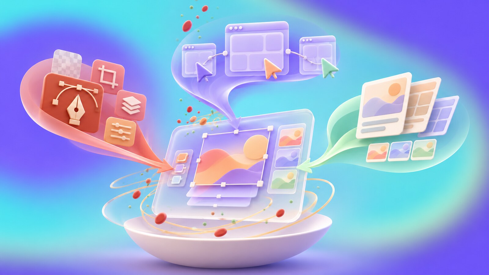
Adobe Creative Cloud remains deeply embedded in professional image, vector, layout and video production. Its 2026 announcements place AI assistants inside familiar applications and introduce Firefly Design as a shared canvas for raster, vector, motion, 3D and print. These are product announcements, not proof that every new feature has changed real-world practice. The strategic direction is clear: keep precise editing and generative speed in the same workflow.
Figma began this decade as a collaborative design canvas and moved toward working prototypes and agents. Figma Make, introduced in 2025, lets teams prompt and edit interactive concepts; by 2026 the company was letting agents operate on the design canvas. This can shorten the distance from mockup to tested behavior, but someone must still decide whether the behavior is useful.
Canva grew in another direction. It reported 260 million monthly users in 2025 and has been expanding beyond templates through AI, the Affinity suite and professional tools. Its 2026 ProSuite announcement even emphasizes craft alongside AI. The user’s concern is worth taking seriously: if a tool once valued for direct, simple editing becomes crowded with generation prompts, it risks frustrating the people who just want to finish a design. That is a product-design risk and a matter of user experience, not evidence that Canva is failing; its reported growth points the other way.
The surprising competition is not just Photoshop versus Canva. It is control versus convenience, and how much of each a team needs at different stages.
Generative tools are useful for rough imagery, variations, background extension and repetitive production. They also produce a flood of plausible work. The designer’s task shifts from making every option to deciding which options belong to the brief, can be licensed and reproduced appropriately, and remain coherent across a whole campaign.
The wrong path is easy to recognize: accept an impressive first image, wrap it in generic type, then discover it cannot survive a second format or a close look. The opposite mistake is rejecting every new tool because an early result looked generic. Better practice is to give AI a bounded role and keep original research, art direction, typography, accessibility and final production under human review.
This is the problem behind AI-generated websites that look alike: when the brief leaves visual choices open, defaults and familiar patterns quietly become the brand.

The likely next move is more automation of versions and routine edits, with more value placed on the decisions that automation cannot infer from an empty prompt. Expect teams to ask not only “Can we make this?” but “Is this distinct, understandable and worth putting into the world?” That is an inference from today’s tool direction, not a guaranteed prediction.
The decade may become less visually uniform than the 2010s, even as the tools become more standardized. Some brands will choose calm, accessible utility. Others will earn attention through unusual type, physical material, sound or a strong cultural point of view. The best will know when to use each. Graphic design after 2020 is not defined by one effect or one software company. It is defined by the growing distance between the ease of producing an image and the difficulty of giving it meaning.
Send us your brief, your wildest idea, or just a hello. We’ll season it with curiosity and serve back something fresh, cooked with care.