The 20th century is where graphic design stops feeling like a branch of printing and starts feeling like a discipline with its own language, heroes, systems, and arguments.
This was the century of posters, propaganda, corporate identity, magazine art direction, Swiss grids, phototype, record sleeves, packaging systems, and the first real shock of digital tools. It was also the century in which design became more public, more persuasive, more strategic, and more industrial all at once.
If the 19th century built the production pipeline, the 20th century taught that pipeline how to think visually.
If you want the prequel first, continue with Graphic Design in the 19th Century. If you want the logo-specific branch afterward, pair this with The Process Behind Iconic Logo Design.
“The 20th century did not give design one style. It gave design a permanent argument about what visual communication should be.”
When graphic design became modern
At the start of the century, many designers were still working close to the logic of the 19th century: ornament, decorative display type, illustrated posters, and print as the default medium. But as the century moved through industrial growth, political upheaval, modernism, mass media, and consumer culture, the field kept reorganizing itself.
The result was not one straight line from “old” to “new.” It was a sequence of major turns.

From ornament to modern visual systems
One of the biggest shifts was psychological.
In earlier print culture, decoration often proved value. Rich borders, expressive type, and visual abundance signaled effort, price, and theatricality. In the 20th century, especially once modernism matured, more and more designers began treating excess as noise.
That changed the goal of composition:
- decoration became secondary to hierarchy
- layout became a system rather than a collage
- type stopped being only expressive and became structural
- white space started carrying meaning instead of looking “empty”
This is one reason 20th-century work still feels so familiar. Much of what modern designers call clarity, restraint, rhythm, and grid logic became normal here.
The century’s real revolution was not “minimalism.” It was the growing belief that visual form should explain content, not just decorate it.
The big styles of the century
The 20th century was crowded with powerful visual movements. Some overlapped, some fought each other, and some aged better than others.
The most important style families included:
- Art Nouveau at the beginning of the century, with flowing line, ornament, and organic rhythm
- Constructivism and related avant-garde movements, where design became political, geometric, and urgent
- Bauhaus modernism, which pushed reduction, function, and visual logic
- Art Deco, with glamour, geometry, speed, and luxury
- Swiss / International Style, which elevated grids, sans-serif typography, and information clarity
- Mid-century corporate modernism, where identity systems became scalable business tools
- Psychedelic, counterculture, and punk design, which deliberately broke order
- Late-century postmodernism, which challenged the idea that design had to be neutral, rational, or restrained
That variety matters because it explains why the century still feeds so many current revivals. Contemporary branding, editorial design, posters, album art, and even web UI still borrow from these worlds constantly.

Graphic design in the 20th century was never only about style. It was deeply shaped by tools, production methods, and the cost of making mistakes.
That is easy to forget now because software hides so much friction.
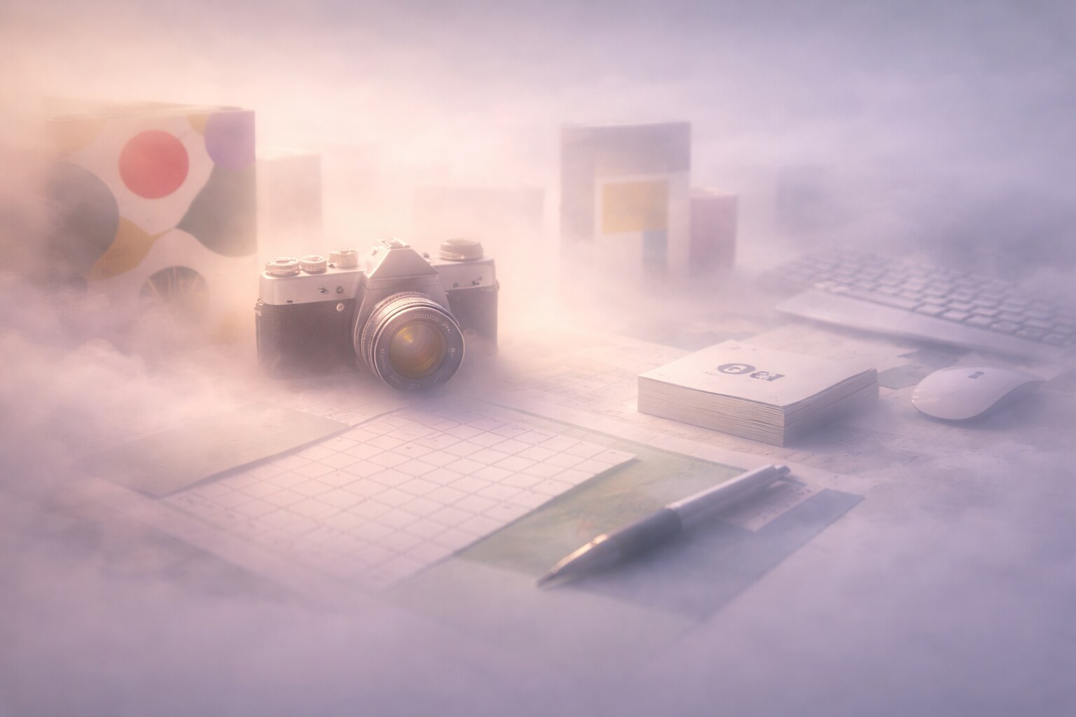
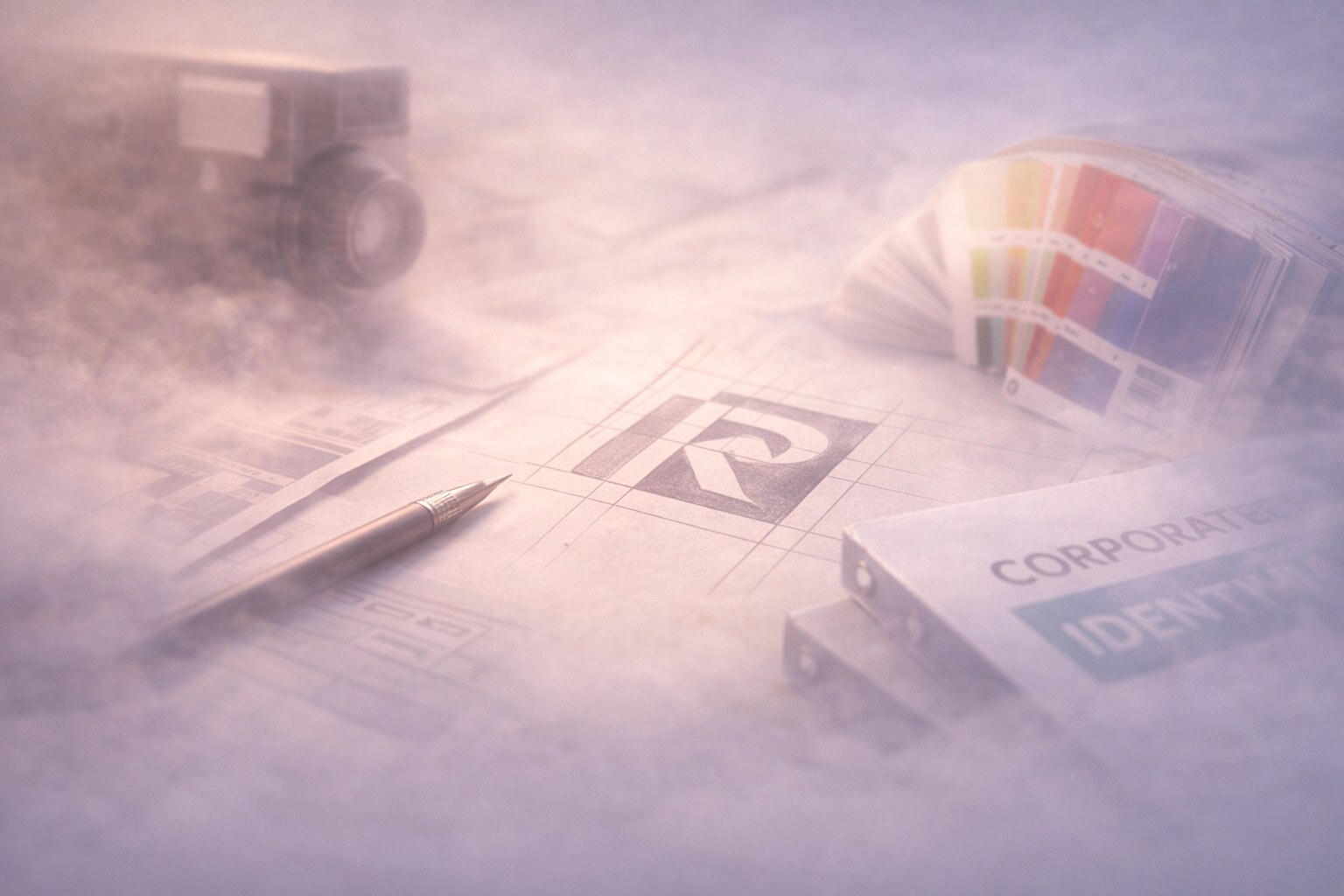
What designers physically used at the desk
For much of the century, a graphic designer’s desk looked more like a drafting station than a software workspace.
Common tools included:
- pencils, charcoal, brushes, and ink
- gouache and markers for comps and color studies
- ruling pens, technical pens, and French curves
- T-squares, triangles, pounce wheels, and scale rulers
- tracing paper and layout tissue
- scissors, knives, glue, wax, and mounting boards
Later in the century, especially in editorial and identity work, designers also relied on:
- Letraset and other dry-transfer lettering systems
- photostats and stat cameras for scaling and reproducing artwork
- rubylith and masking films for prepress separations
- airbrush techniques for illustration and retouching
Even when the final piece looked elegant, the process was often physical, messy, and slow.
The work demanded hand skill, visual judgment, and patience because revision was not cheap. Moving a headline or re-scaling an image was not a quick keyboard shortcut. It could mean rebuilding part of the board.

Print production, phototype, and paste-up
The century’s workflow changed several times, and each shift altered what design could look like.
Some of the biggest technical changes were:
- offset lithography, which helped scale print quality and color reproduction
- photography in print, which transformed editorial design, advertising, and realism
- photo-typesetting, which loosened design from hot metal composition
- paste-up methods, where layouts were assembled manually from printed and typeset pieces
- desktop publishing in the late century, which collapsed many specialist stages into software
This is where speed changed dramatically.
By the 1970s and 1980s, many designers were already living in a hybrid world: still thinking with analog discipline, but moving into digital layout tools. When Macintosh systems, PostScript, laser printers, PageMaker, and later QuarkXPress entered the field, the bottleneck shifted. Production became faster, but taste did not automatically get better.
“Desktop publishing was a technical liberation. It was not a quality guarantee.”
The people who changed the field
No single list can cover the century properly, but some designers and studios changed the conversation more than others.
Important designers, teachers, and studios
Some of the most important names are remembered not only because they made good work, but because they redefined what design was for.
- A.M. Cassandre made the poster feel cinematic, simplified, and modern.
- Jan Tschichold pushed radical typographic reform, then later became more critical of rigid dogma.
- László Moholy-Nagy linked design, photography, and experimentation in ways that still feel contemporary.
- Josef Muller-Brockmann helped define the Swiss approach to structure, grid, and visual clarity.
- Paul Rand made corporate identity intelligent, witty, and systematic.
- Saul Bass proved that identity, motion, and reduction could work together brilliantly.
- Herb Lubalin showed how typography itself could become voice, mood, and attitude.
- Massimo Vignelli turned systems thinking into one of design’s strongest modern business languages.
- Paula Scher brought historical fluency, scale, and typographic energy into late-century identity work.
- Neville Brody represented a later turn toward expressive, experimental, editorial type language.
An important thing younger designers sometimes miss: many of these people were not only “stylists.” They were editors of meaning. They connected business, culture, production, and visual choice in one line of thinking.

The big changers
Some moments in the 20th century matter more than others because they permanently changed what the field could do.
Milestones that rewired graphic design forever
If you had to reduce the century to a few truly disruptive changes, these would be near the top:
1. Modern poster culture
Posters stopped being merely loud announcements and became laboratories for modern composition, mass persuasion, and public style.
2. Photography becoming central
Once photography became deeply integrated into design, realism, mood, evidence, and editorial timing all changed.
3. The grid
The grid was not just a visual habit. It was a coordination device. It let large publications and identity systems become more scalable and internally coherent.
4. Corporate identity systems
The century taught companies that consistency across packaging, signage, stationery, vehicles, advertising, and later screens was a strategic advantage, not just a cosmetic preference.
5. Desktop publishing
Late in the century, software compressed production time so aggressively that the relationship between idea, layout, and output changed for good.
If you want to see one branch of that shift in a tighter form, continue with The Process Behind Iconic Logo Design and Why So Many Great Companies Sterilize Their Logos.
Why the work was difficult
Constraints, mistakes, and the jobs people forget
20th-century graphic design produced a lot of beauty, but the process itself could be punishing.
Many difficulties came from production reality:
- revisions were slower and more expensive
- color proofing was less forgiving
- typography depended on what could actually be typeset or transferred
- printing limitations constantly pushed back on visual ideas
- clients still wanted speed, novelty, and persuasion anyway
Then there was the invisible labor.
Designers spent time on mechanical corrections, spec preparation, coordination with printers, board assembly, image scaling, crop decisions, and endless proof adjustments. A lot of the job looked less like romantic creativity and more like controlled problem solving under technical pressure.
That is why so much 20th-century work has a certain hardness to it. Many decisions had to be thought through before execution because fixing things later was painful.
One underrated skill of 20th-century designers was production prediction. Good designers learned to imagine the print result before the press ever ran.
Wrong paths and dead ends
When the century overreached
The century was productive, but it also made mistakes.
Some wrong paths were ideological, some commercial, and some aesthetic.
The clearest ones include:
- propaganda design used at terrifying scale, proving that clarity and persuasion are not automatically ethical
- over-rigid modernism, where system became so dominant that warmth, nuance, and local character could disappear
- late postmodern excess, where expressive freedom sometimes tipped into unreadability
- early desktop chaos, where new software made it easy to produce weak typography faster than ever
This matters today because the same tensions still exist:
- system versus personality
- clarity versus spectacle
- speed versus craft
- persuasion versus ethics
The 20th century did not solve these conflicts. It exposed them.

Do designers still get inspiration from this time?
Why the 20th century still feeds contemporary taste
Very much so. In some areas, the 20th century is still the main visual archive designers return to when they want authority, rhythm, boldness, or conceptual clarity.
Designers still pull from this era because it offers unusually strong combinations of concept and form.
What keeps coming back:
- Swiss grids in editorial and UI structure
- Bauhaus reduction in branding and product thinking
- psychedelic typography in poster and music culture
- mid-century corporate restraint in premium identities
- punk roughness in fashion, youth culture, and anti-brand aesthetics
- late-century editorial experimentation in cultural publishing
It is also an era rich in real references, not just trends. The work often has visible intent behind it. That makes it useful.
If you want to follow two living descendants of this century, continue with The Art of the Album Cover and Calligraphy and Design: Is It Still Important for Modern Creatives?.
Unknown facts and fun details
& Hidden details most people miss
The 20th century is full of famous names, but some of its most interesting details sit in the margins.
- Jan Tschichold later softened his own earlier dogma. One of the century’s major typographic reformers eventually argued against treating modernist rules as universal law.
- Corporate identity manuals became enormous because complexity exploded. Once brands spread across global packaging, vehicles, architecture, and media, consistency had to be documented aggressively.
- Many iconic marks were refined through stat cameras and manual paste-up, not vectors. Their “clean geometry” often came from physical correction as much as conceptual purity.
- Phototype changed typography before digital software did. It loosened spacing, scale, and display experimentation in ways many people now attribute only to computers.
- The desktop publishing boom democratized layout, but also unleashed a flood of bad typographic decisions. Access widened faster than judgment.
- A lot of today’s “retro” design language is really selective memory. Designers often revive the highlights of the century, not the messy average.
“One reason the 20th century still fascinates designers is simple: it was modern enough to feel relevant, but physical enough that every decision still left a trace of the hand.”
Summary
Graphic design in the 20th century was not one clean style and not one clean ideology. It was a field under constant pressure from technology, politics, commerce, media, and taste.
That pressure is exactly what made it so rich.
It gave us posters that could stop crowds, grids that could organize complexity, identities that could scale across continents, and tools that slowly moved design from workshop craft toward digital production. It also gave us propaganda, rigidity, trend excess, and the permanent reminder that a stronger visual system is not automatically a wiser one.
For contemporary designers, that is why the century still matters. It does not only offer inspiration. It offers arguments, warnings, workflows, and proof that design gets interesting when form, technology, and culture all collide at once.