Graphic Design in the First Decade of the 21st Century
How graphic design looked between 2000 and 2009: the dominant visual elements and how print and digital split into two very different futures.


How graphic design looked between 2000 and 2009: the dominant visual elements and how print and digital split into two very different futures.
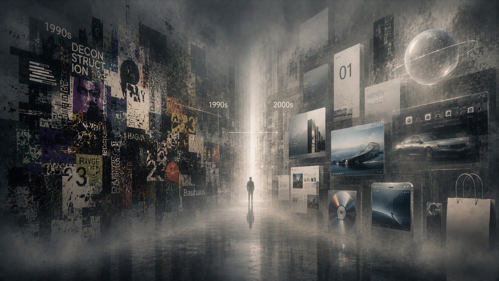
The first decade of the 21st century did not have one single graphic style. It had a tug of war.
On one side was the leftover energy of the late 90s: experimental type, techno-futurist surfaces, postmodern collage, noisy interfaces, Flash bravado, and a strong appetite for looking new at any cost.
On the other side was a new pressure for order:
That tension produced one of the most recognizable periods in recent design history. The decade loved gloss, gradients, reflections, translucent surfaces, shiny product renders, oversized sans serif headlines, and icons that tried very hard to look touchable. But it also pushed graphic design toward systems thinking, cleaner grids, and the first serious separation between print logic and interface logic.
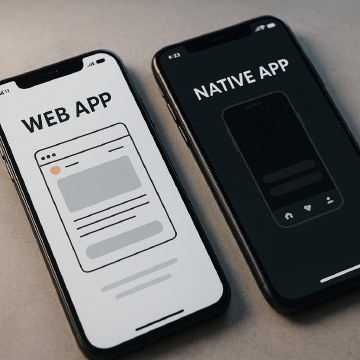
This article continues naturally from What Was Used Before Photoshop? and sits next to UX&UI After the Early Days if you want the web-specific side of the same era.
“The 2000s were the moment when graphic design stopped asking only “how should this look?” and started asking “how will this behave across everything?””

To understand the look of the 2000s, it helps to understand what the decade was trying to calm down.
The 1990s had already broken the modernist certainty of earlier corporate design. Designers had spent years testing deconstruction, layered typography, anti-grid editorial experiments, rave-flyer aesthetics, pixel graphics, DIY web imagery, and digital distortion. In print, magazines and music packaging often treated readability as negotiable. Online, novelty regularly outranked usability.
By around 2000, that energy had not disappeared, but it had to meet the reality of scale. Large companies needed repeatable identities. Media brands needed faster production. Websites needed to support real transactions, not just presence. The dot-com crash also removed some of the fantasy. Once money got tighter, decorative excess had to justify itself.
This is why the decade often looks contradictory. It inherited:
But it transformed those impulses into something more marketable, more modular, and more brand-safe.
One of the sharpest background tensions of the decade was ethical, not visual. “First Things First 2000” revived a public argument about whether design had become too obedient to branding, advertising, and consumer spectacle.
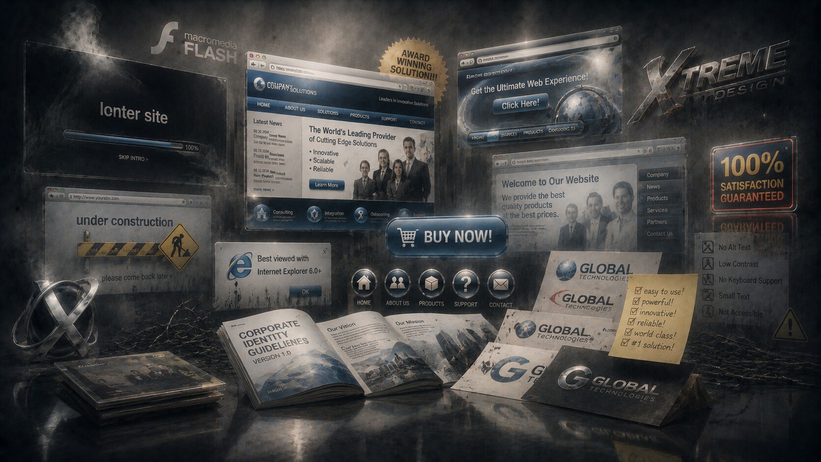
If you compress the decade into a toolkit, a few elements appear again and again.
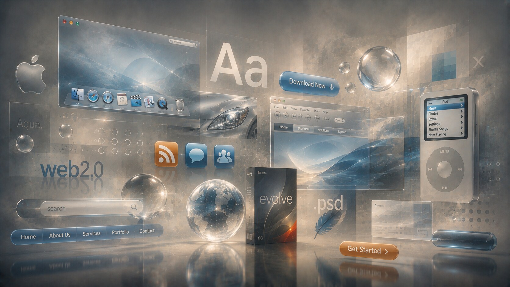
This was not random styling. It came from the era’s belief that digital products should look advanced, approachable, and expensive at the same time. Apple’s Aqua interface is a clean example of this logic. Apple described Aqua in 2000 as using luminous and semi-transparent elements with fluid animation, and that language spread far beyond Apple’s own products.
At the same time, by the middle of the decade, a parallel language gained force online: the Web 2.0 look. That meant glossy badges, rounded tabs, shiny logos, large search bars, cheerful blues, orange call-to-action buttons, RSS icons, and friendly interface chunks that made the web feel less technical and more mass-market.
If you want to see how trend-chasing later creates problems, this sits well beside When Being Trendy Backfires.
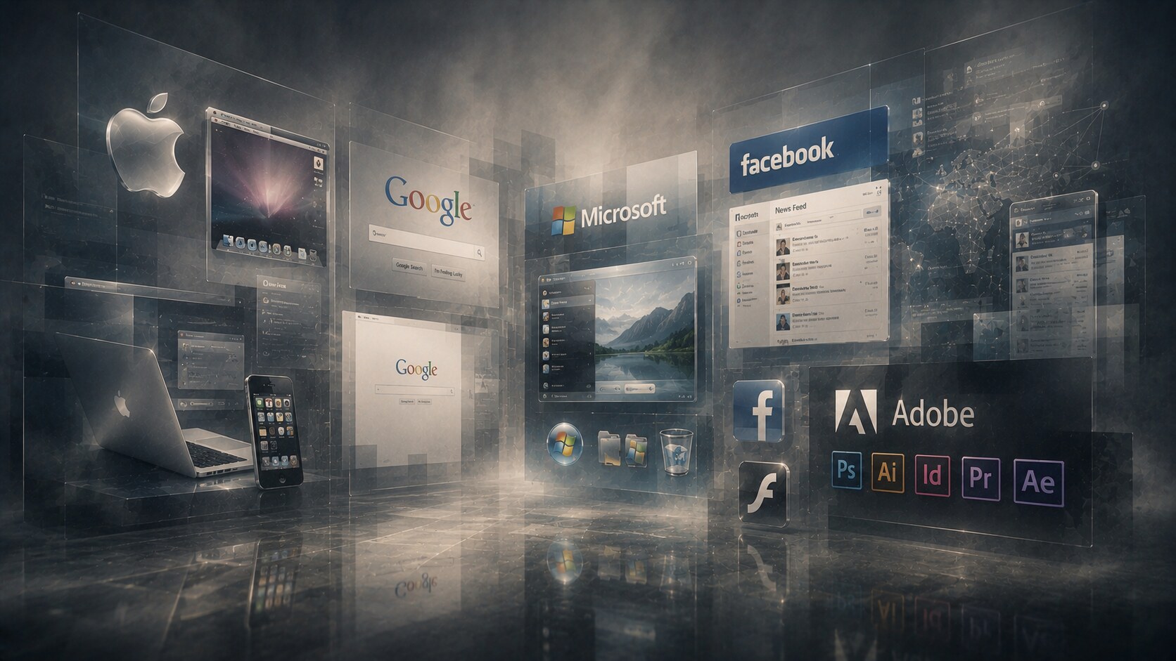
No company controlled the whole era, but several companies became visual reference points that others copied, diluted, or reacted against.
The result was a decade split between two dominant promises:
Those two promises often coexisted in the same product. A website might be structurally clean but still covered in shiny buttons and glass-like tabs.
“The decade did not fully trust flatness yet. It still wanted the screen to reassure users by pretending to be a physical object.”
The decade is easier to understand if you stop looking for one superstar and instead look for recurring influence across sectors.
There was also a widening split in design personality:
That split never fully disappeared. In many ways it still defines the field now.
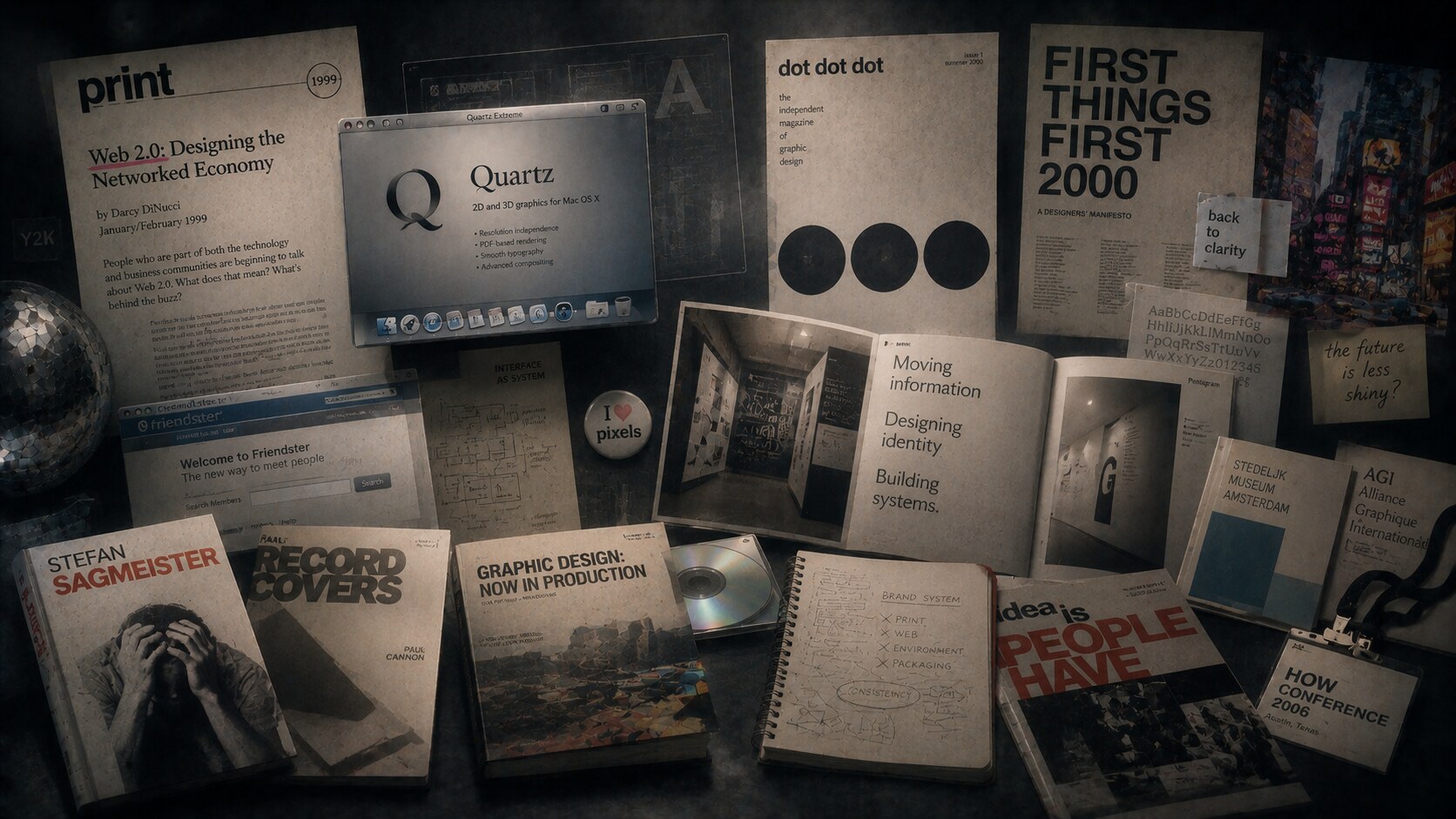
One under-discussed story of the 2000s is that “cool graphic design” was often being shaped as much by independent publishing and design criticism as by ad campaigns or software launches.
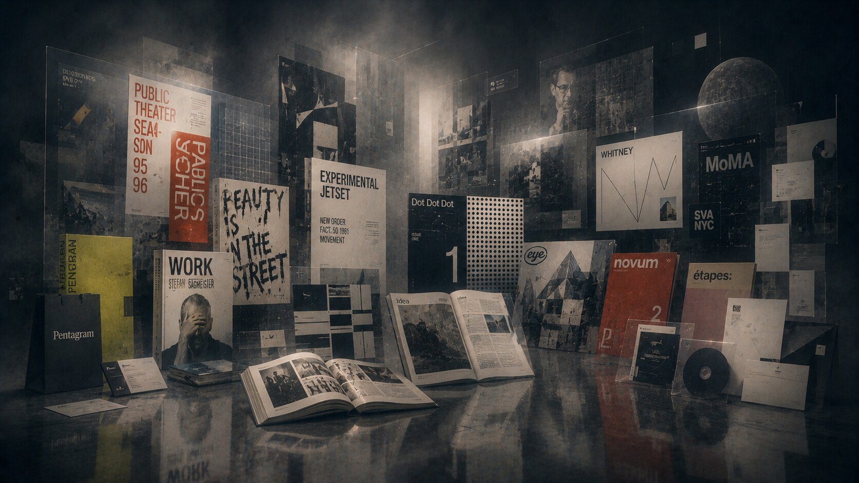
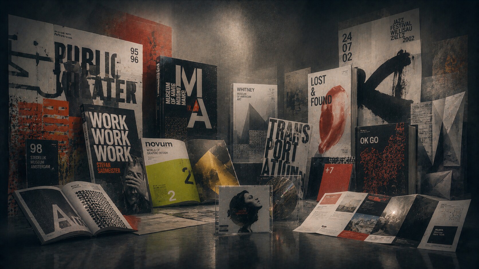
Print in the 2000s did not submit completely to the web’s usability logic. It stayed freer, more tactile, and more willing to treat the page as an event.
In editorial design, posters, books, album covers, and cultural branding, the decade often favored:
Music packaging and cultural print were especially open to experimentation. Sagmeister Inc.’s work is an obvious example, but the wider field also leaned into hand-made interventions, conceptual typography, and packaging as narrative space. Meanwhile, large identity systems became more ambitious in how they crossed signage, brochures, environmental graphics, and campaigns.
Print also preserved one thing the web could not yet match: material atmosphere. Paper stock, varnish, embossing, metallic inks, translucent sleeves, and unusual folds gave designers a place to stage richness without relying only on screen effects.
This article also pairs well with The Art of the Album Cover and The Process Behind Iconic Logo Design.
This is where the decade becomes especially interesting.
In structure, digital design improved. Navigation got clearer. Search became central. Content modules became more repeatable. Interfaces started behaving more like products and less like digital posters.
But visually, the decade often overcompensated with effects.
Common digital features included:
The Web 2.0 era wanted friendliness and trust. Rounded rectangles and blue gradients became a kind of universal accent. By the late 2000s, social feeds, dashboard patterns, and cleaner form structures pushed the web toward a more disciplined UI language, but most of the polish was still intact.
There was also a technical reason for the visuals. Designers were excited by what browsers, operating systems, and faster machines could finally render well. Good taste and technical possibility do not always move at the same speed, so the decade sometimes behaved like a child discovering every button on a synthesizer.
“The 2000s taught digital design how to be usable at scale, but they had not yet learned the discipline to stop decorating every success.”

Every strong design period creates habits that later become liabilities. The 2000s had several.
Some of the decade’s bad design was not caused by incompetence. It came from the collision of new software power, weak interface standards, and a market that wanted novelty to be visible. When tools suddenly make new effects easy, whole industries tend to use all of them at once.
One of the era’s recurring blind spots was confusing visibility with clarity. A shiny button could attract attention, but that did not automatically make a service more understandable. A decorative identity could look premium, but that did not ensure coherence once it had to scale across branches, websites, packaging, ads, and internal systems.
The decade’s failures are useful because they reveal an old design pattern: when a medium matures, its first instinct is often excess, and its second instinct is editing.
Some of the most revealing parts of the 2000s are not the obvious style markers, but the side stories around them.
That last point matters. Design history often gets told through the biggest companies, but many visual transitions actually happen in the smaller cultural layer first, then move upward into the mainstream.
Graphic design in the first decade of the 21st century matters because it trained the field to operate in two realities at once.
It still loved image, style, and spectacle. But it also had to become:
The decade’s signature look was not only gloss. It was transition.
It transformed late-90s experimentation into something brands could distribute at scale. It turned websites from novelty objects into service platforms. It let print remain expressive while digital moved toward modularity. And it exposed an argument that still has not gone away: should design impress first, or clarify first?
In the best work of the 2000s, it did both.


News, insights, case studies, and more from the rausr team — straight to your inbox.
Send us your brief, your wildest idea, or just a hello. We’ll season it with curiosity and serve back something fresh, cooked with care.