Hospital Navigation and Wayfinding Design System
How hospital navigation systems are designed for clarity, stress, panic moments, accessibility, and trust, from research and zoning to signage, digital layers, and future healthcare wayfinding.

How hospital navigation systems are designed for clarity, stress, panic moments, accessibility, and trust, from research and zoning to signage, digital layers, and future healthcare wayfinding.
People enter hospitals tired, anxious, distracted, in pain, under time pressure, or trying to help somebody else. In the most difficult moments, they may also be scared enough to stop reading carefully.
That is why hospital navigation is not a decorative signage layer. It is part of care.
A good healthcare wayfinding system reduces stress, protects time, supports staff, and helps patients move with more dignity. A bad one does the opposite. It creates extra panic in a place that already contains enough of it.
This makes hospital navigation one of the most demanding forms of graphic and environmental design. The system has to work for:
This article sits naturally beside Graphic Design as the Key to Visual Orientation at Festivals and Events, Metro Orientation Design, and FIFA World Cup Branding and Visual Evolution.
“In a hospital, a wayfinding system is successful when people notice it only because they are not getting lost.”
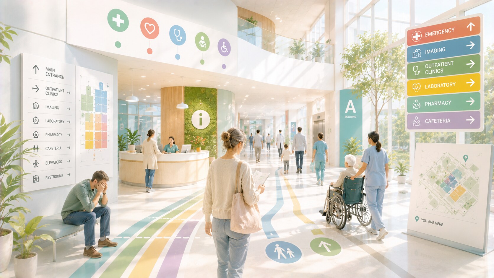
Hospitals are not like shopping centers and not like airports, even if they share some spatial complexity.
In a retail space, confusion is annoying. In a hospital, confusion can become emotionally destabilizing very quickly.
This is why healthcare navigation has to account for more than geometry. Entro’s healthcare framing is useful here because it treats wayfinding as a way to reduce anxiety and missed appointments, while letting staff focus more on care rather than repeated verbal directions.
The main problem is not only size. It is the condition of the user.
Hospital visitors often have reduced attention because they are:
That means the signage system must be clearer, earlier, calmer, and more forgiving than in many other environments.
Hospitals need at least two layers of navigation logic.
The first is everyday wayfinding: appointments, outpatient clinics, imaging, laboratories, wards, cafes, waiting areas.
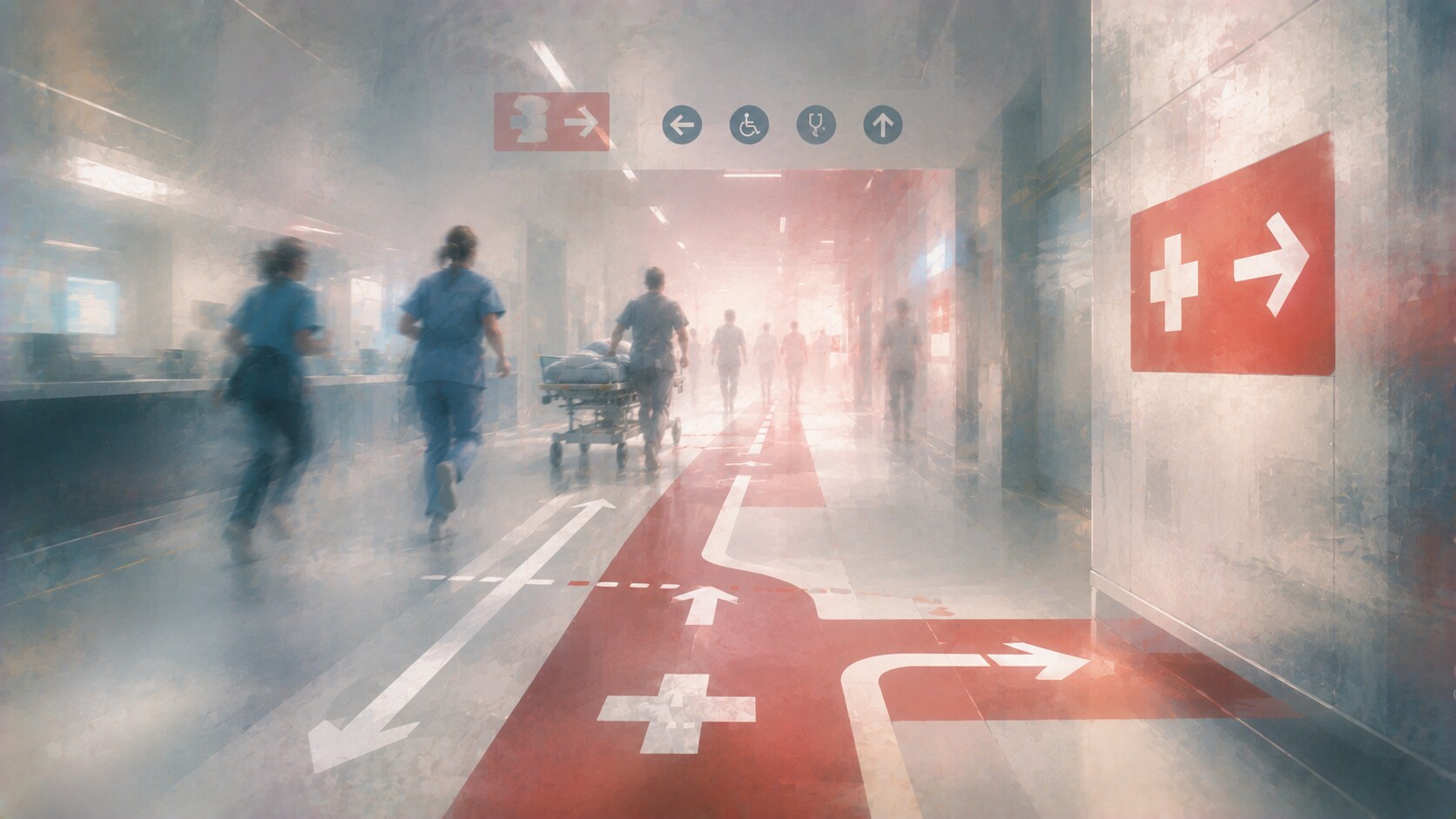
The second is high-stress wayfinding: Emergency, ICU, urgent admissions, maternity, surgery, ambulance arrival, or routes needed by relatives under shock.
This second layer must work with almost no cognitive friction.
That means:
One hidden professional truth is that hospital wayfinding is not only about showing the right route. It is about reducing the number of wrong micro-decisions a distressed person has to make on the way.
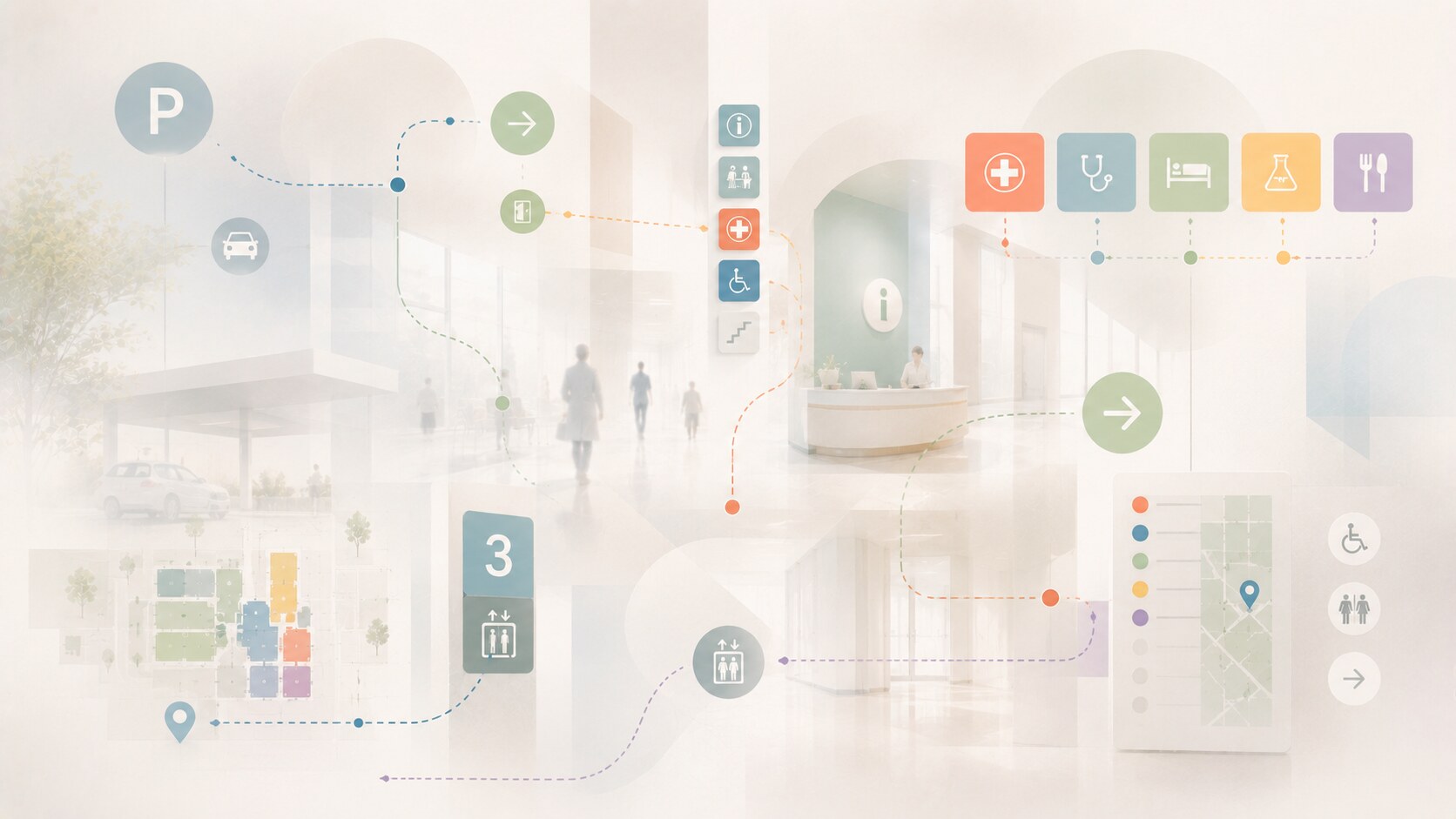
A proper hospital system usually includes far more than overhead arrows.
At minimum it needs:
Entro’s public explanation of healthcare signage breaks this down clearly into directional, room identification, informational, regulatory, map, and exterior signage. That is a useful reminder that the system has to function from the parking lot to the patient room, not only in one corridor.
The hidden challenge is naming. A sign can be visually excellent and still fail if the department names are inconsistent, overly clinical, or different from what reception staff and appointment letters actually say.
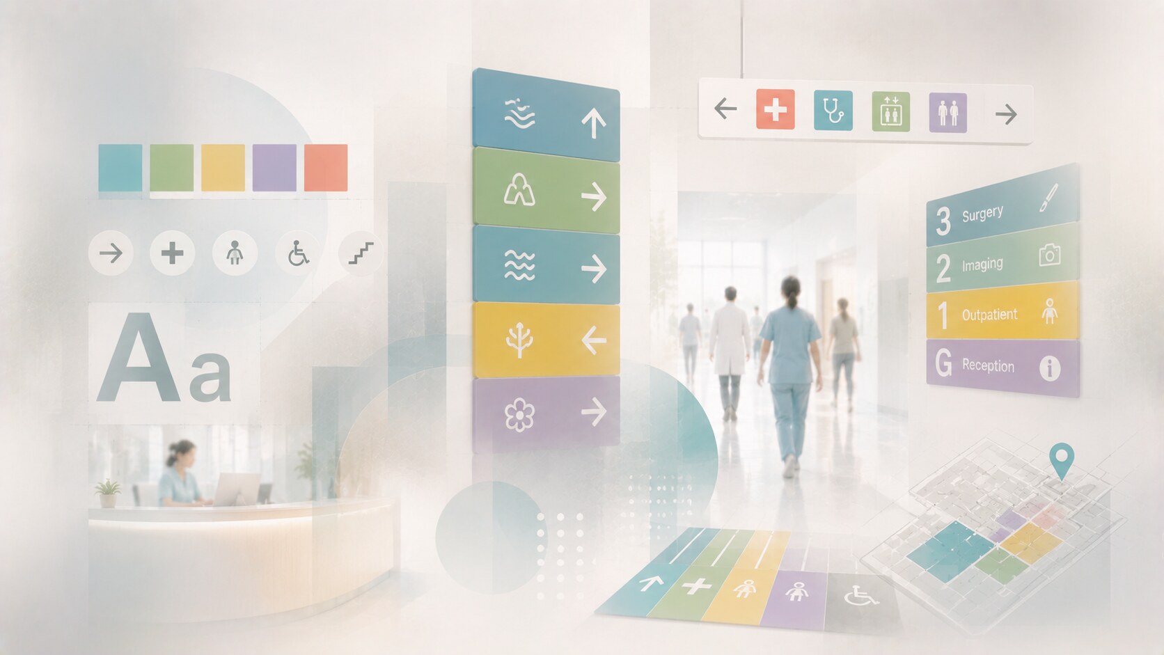
Color-coding is common in hospitals because it can simplify large campuses or buildings with many wings. But color alone is never enough.
A strong system combines:
Seattle Children’s Hospital is a good example of this thinking. Studio SC simplified a confusing six-zone structure into four named zones: Ocean, Mountain, River, and Forest. That move did more than make the building prettier. It made the navigation more memorable and more human.
Typography must be calm and readable. A hospital sign is not the place to prove a display font can be expressive. People may be reading at speed, from a wheelchair, through tears, or while following staff instructions. The type has to survive all of that.
Symbols matter too, but they are strongest when they reinforce simple words rather than replace them completely.
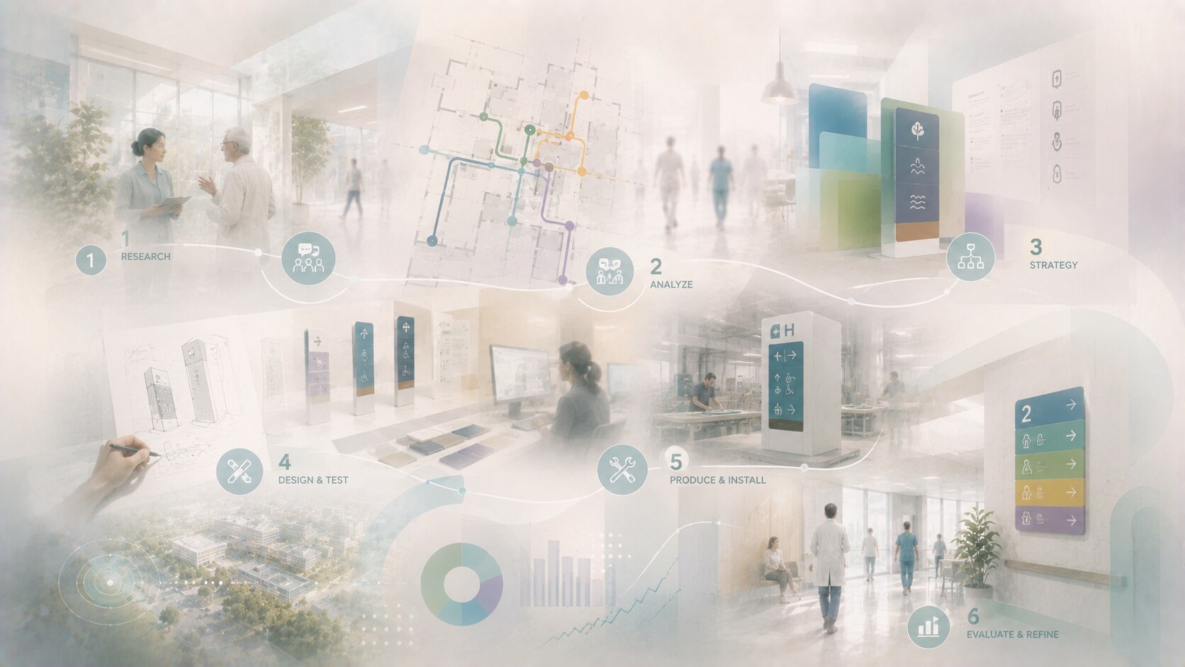
The process is rarely fast if the project is done properly.
Entro describes a five-step methodology built around research, concept development, design integration, testing, and implementation. That matches what many respected healthcare wayfinding projects show publicly.
A full hospital process often includes:
On a very large hospital campus, this can take many months and sometimes stretch across years, especially if construction, renovation, or phased opening is involved. The harder part is not drawing the signs. The harder part is aligning architecture, operations, medical departments, accessibility rules, and public understanding.
Public project budgets are often not published cleanly, but the market ranges are still possible to estimate with reasonable confidence.
For a smaller clinic or one limited hospital-zone refresh, the cost can sit roughly in the $25,000 to $100,000 range if the system is mostly static signage and modest planning.
For a serious full-building hospital wayfinding program, a more realistic bracket is usually around $150,000 to $500,000+ once strategy, naming, ADA-compliant fabrication, installation, and phased rollout are included.
For a large multi-building hospital campus, the investment can rise into the high six figures or even low seven figures, especially when the scope includes:
That sounds expensive, but it matches the operational scale. SEGD has cited healthcare research showing that confusing navigation can waste hundreds of thousands of dollars per year in lost staff time and missed appointments, so the real comparison is not only sign cost versus no sign cost. It is system cost versus ongoing confusion cost.
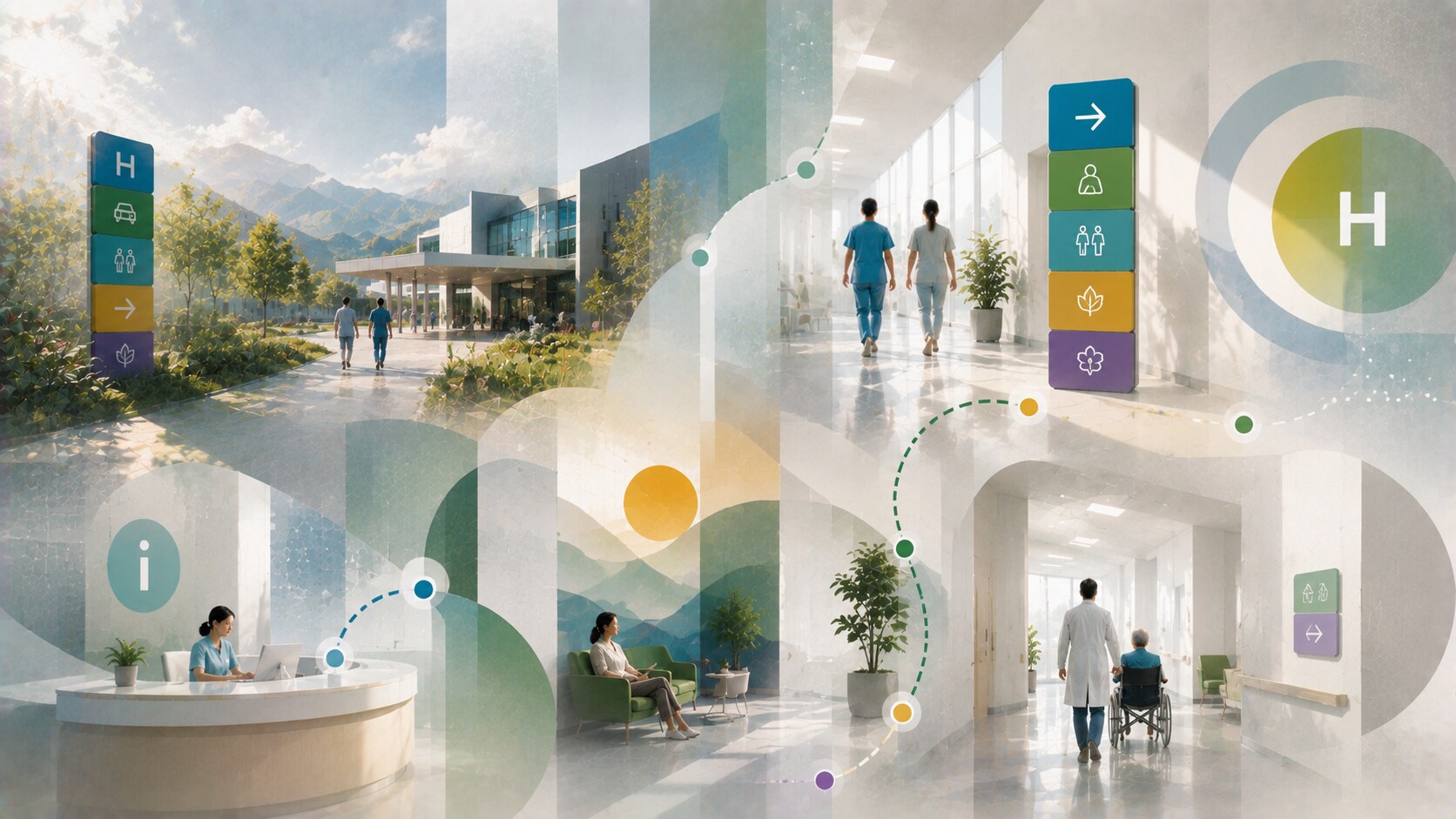
Several healthcare projects are useful reference points.
Lankenau Hospital, designed by AGS, ex;it, is a strong example because the project did not stop at signage objects. It included pre-arrival destination cards, guides, exterior and interior signage, and volunteer training. SEGD reports that follow-up studies showed wayfinding confidence rising from 66 out of 100 to 89 out of 100 after implementation. That is rare, concrete evidence that the system changed user experience.
Seattle Children’s Hospital, by Studio SC, is important because it showed how simplification can be more humane than adding layers. Moving from six unclear zones to four named zones helped unify old and new parts of the campus while making the whole place more readable.
Entro and Mijksenaar are also worth knowing because both present healthcare wayfinding as a balancing act between operational clarity and emotional care. That is the right framing. Hospitals do not need branding theater first. They need confidence-building navigation.
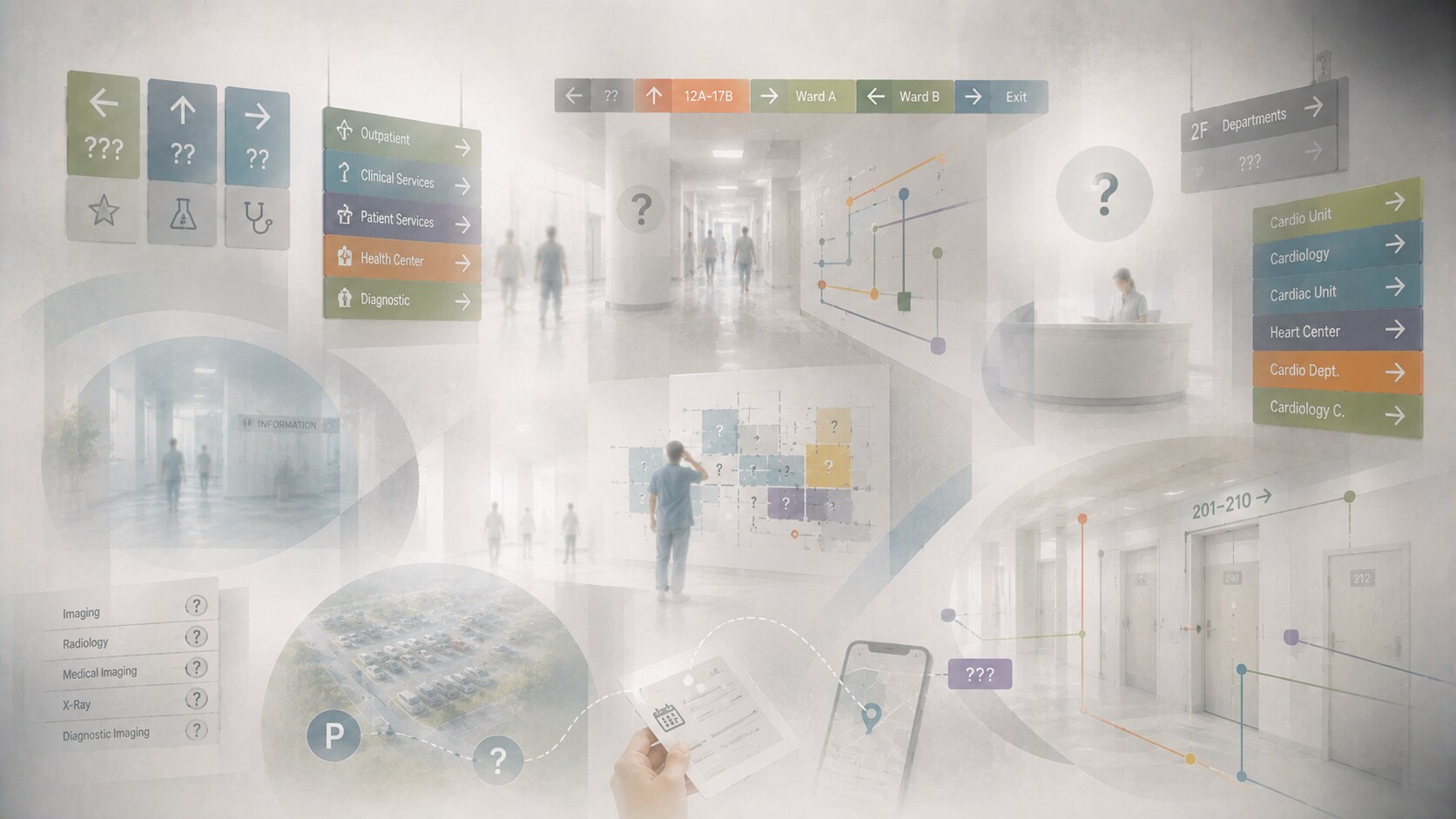
Hospital navigation fails in familiar ways.
Common problems include:
One especially bad pattern is when hospitals treat wayfinding as a late branding add-on after architecture is already fixed. Then the sign system has to repair a spatial problem it did not help shape.
That is expensive and usually less elegant.
One of the least discussed truths in healthcare wayfinding is that pre-arrival information is part of the navigation system.
If the appointment letter uses one department name, Google Maps shows another entrance, parking signage uses a third logic, and the hospital website shows an outdated map, the visitor is already lost before meeting the first wall sign.
That is why strong systems increasingly connect:
Lankenau’s use of pre-arrival destination cards is useful precisely because it acknowledges this. Hospital orientation does not begin at the corridor junction. It begins at home.

In the past, many hospitals relied on a simpler logic: department boards, long corridor signs, and verbal help from staff.
That worked poorly once campuses became larger, more specialized, and more public-facing.
Now the better systems are more integrated:
The future will likely add more flexible digital support, but static signage will remain essential. In a panic moment, nobody wants to depend only on a touch screen or phone battery.
So the future is probably hybrid rather than fully digital.
| Era | Main navigation logic | Main weakness |
|---|---|---|
| Older hospital systems | static directories and staff verbal help | too dependent on local knowledge |
| Transitional systems | more signs and color-coding | often fragmented and inconsistent |
| Current strong systems | research-driven zoning and integrated sign families | expensive and coordination-heavy |
| Near future | hybrid physical plus digital guidance | risk of overcomplicating simple tasks |
The comparison shows the real movement clearly. Hospital wayfinding improved when it stopped being thought of as “just signs” and started being treated as a patient-experience system.
The best hospital wayfinding systems are not impressive because they are loud or visually experimental.
They are impressive because they make a hard moment easier.
That is the real standard in this field. A hospital navigation system should reduce panic, lower confusion, save staff time, support accessibility, and let people focus on care instead of orientation.
When it does that well, graphic design becomes something more important than image. It becomes part of how the institution treats people.

Send us your brief, your wildest idea, or just a hello. We’ll season it with curiosity and serve back something fresh, cooked with care.