Typography: The Art, Science, and Soul Behind Every Letter
From metal type to variable fonts — exploring how typography shapes our visual language, the studios defining its future, and the untold stories behind the letters we see every day.
From metal type to variable fonts — exploring how typography shapes our visual language, the studios defining its future, and the untold stories behind the letters we see every day.
Typography is more than arranging letters — it’s architecture for language.
Each font carries its own personality, rhythm, and emotion. Behind every typeface you use — whether Helvetica, Futura, or a quirky indie font — lies a design process as detailed and deliberate as crafting a building.
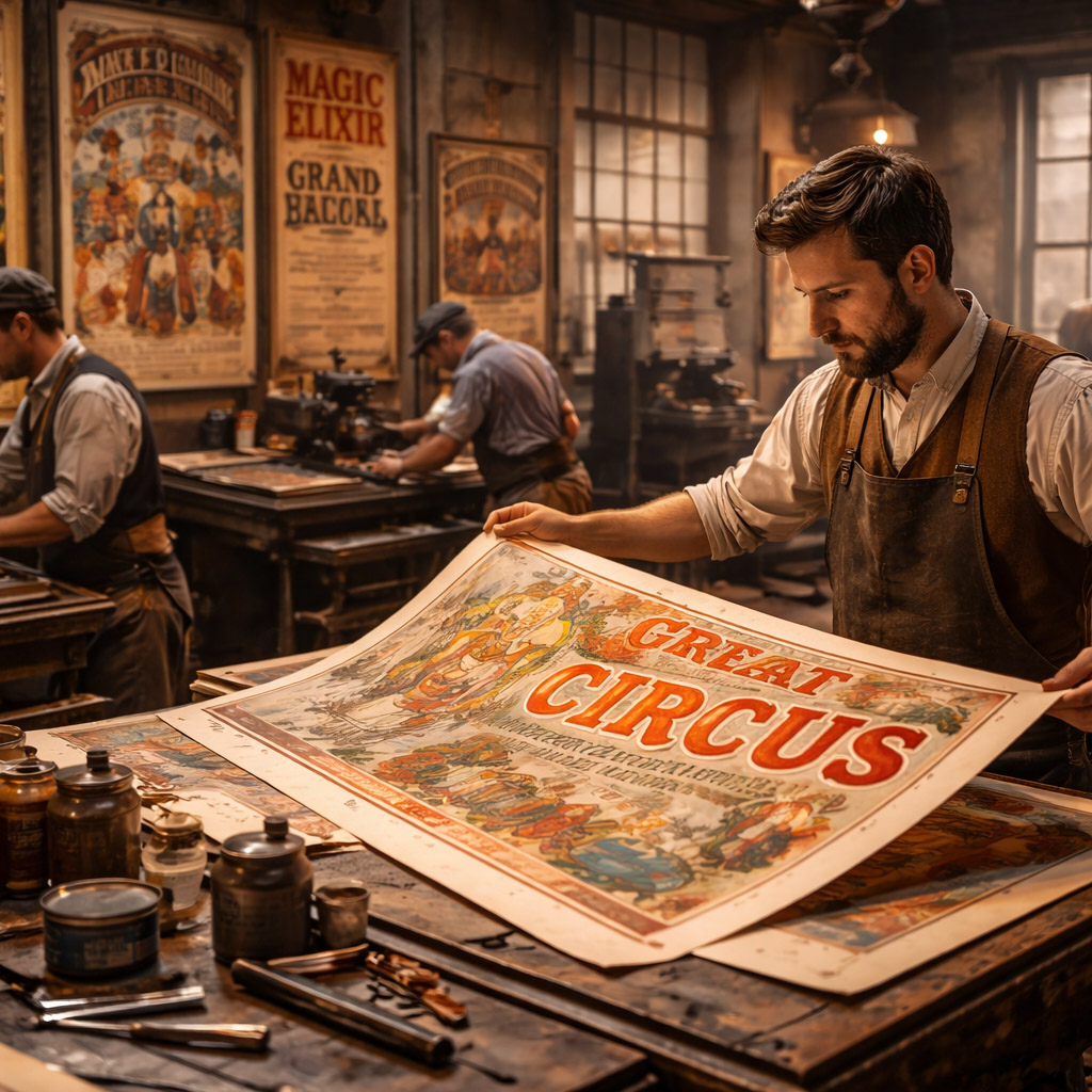
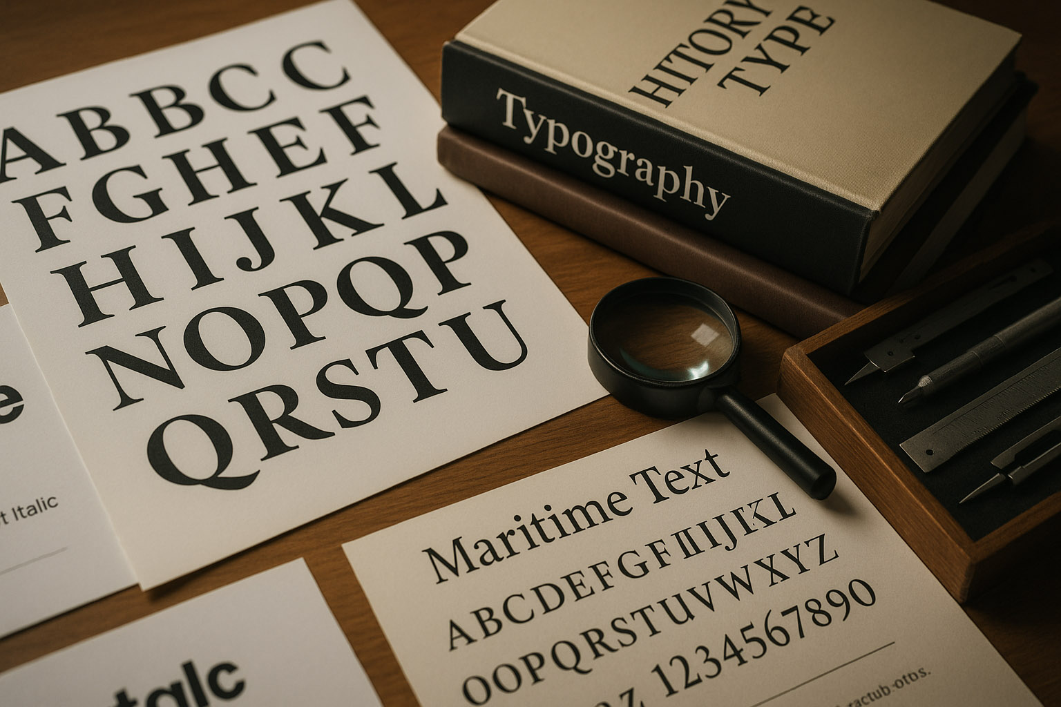
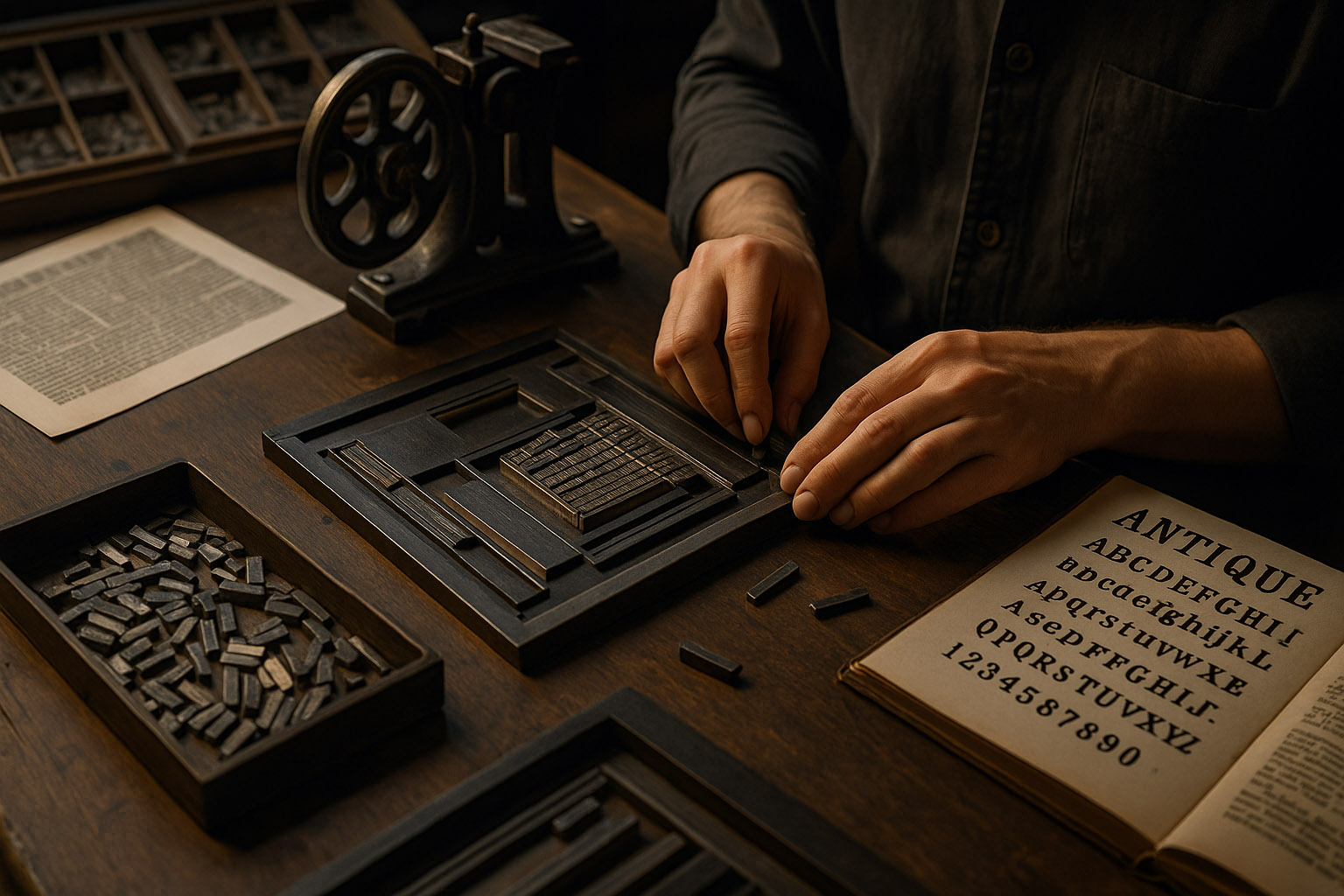
Typography began with Johannes Gutenberg’s movable type in the 15th century, a revolution that democratized reading. For centuries, typefaces were cast in metal — physically carved by punchcutters, then pressed into inked pages.
The 20th century brought giants like Bauhaus, Jan Tschichold, and Adrian Frutiger, who defined the modernist era with fonts like Univers and Helvetica — balancing geometry and legibility.
Unknown fact:
The original Helvetica was called Neue Haas Grotesk and was renamed for marketing purposes — “Helvetica” literally means Swiss in Latin.
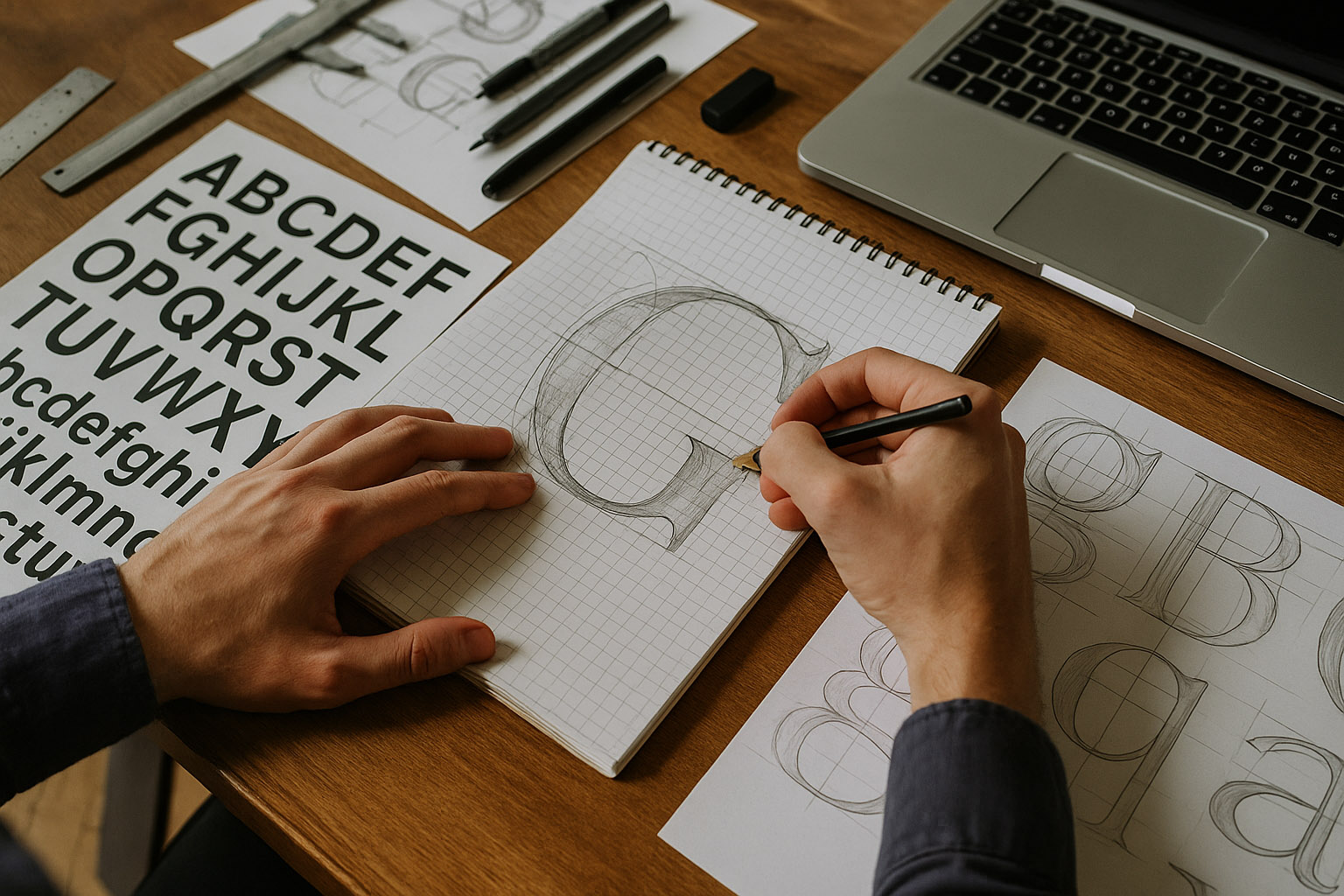
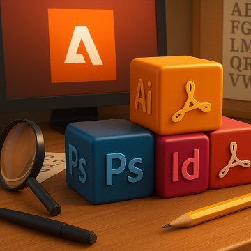
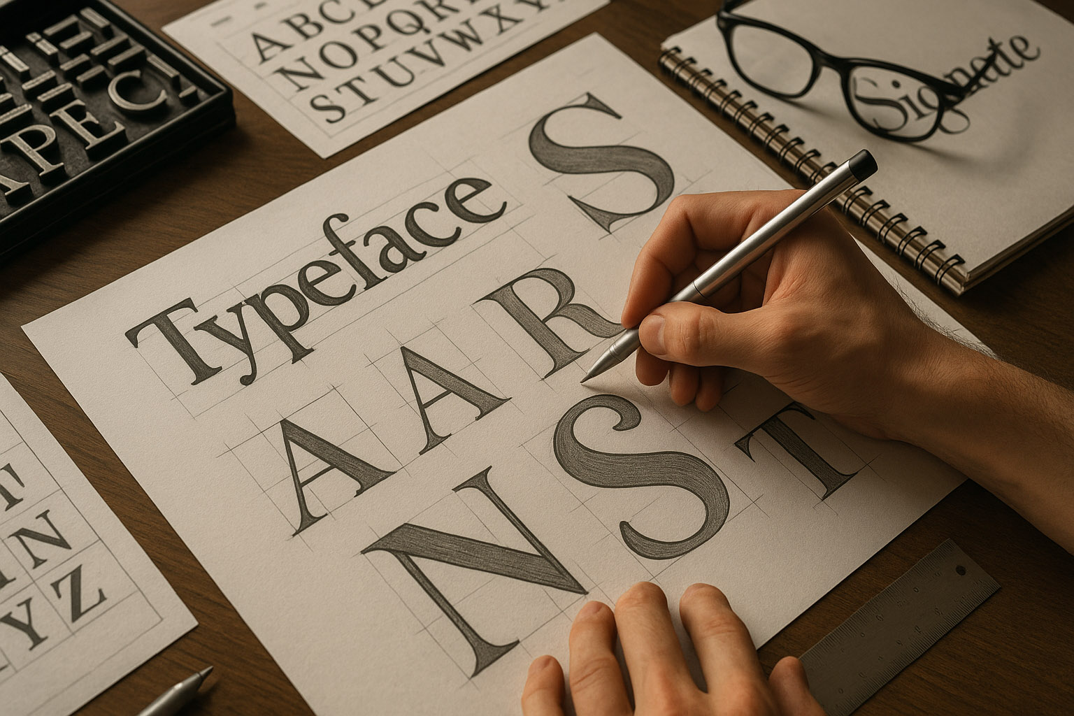
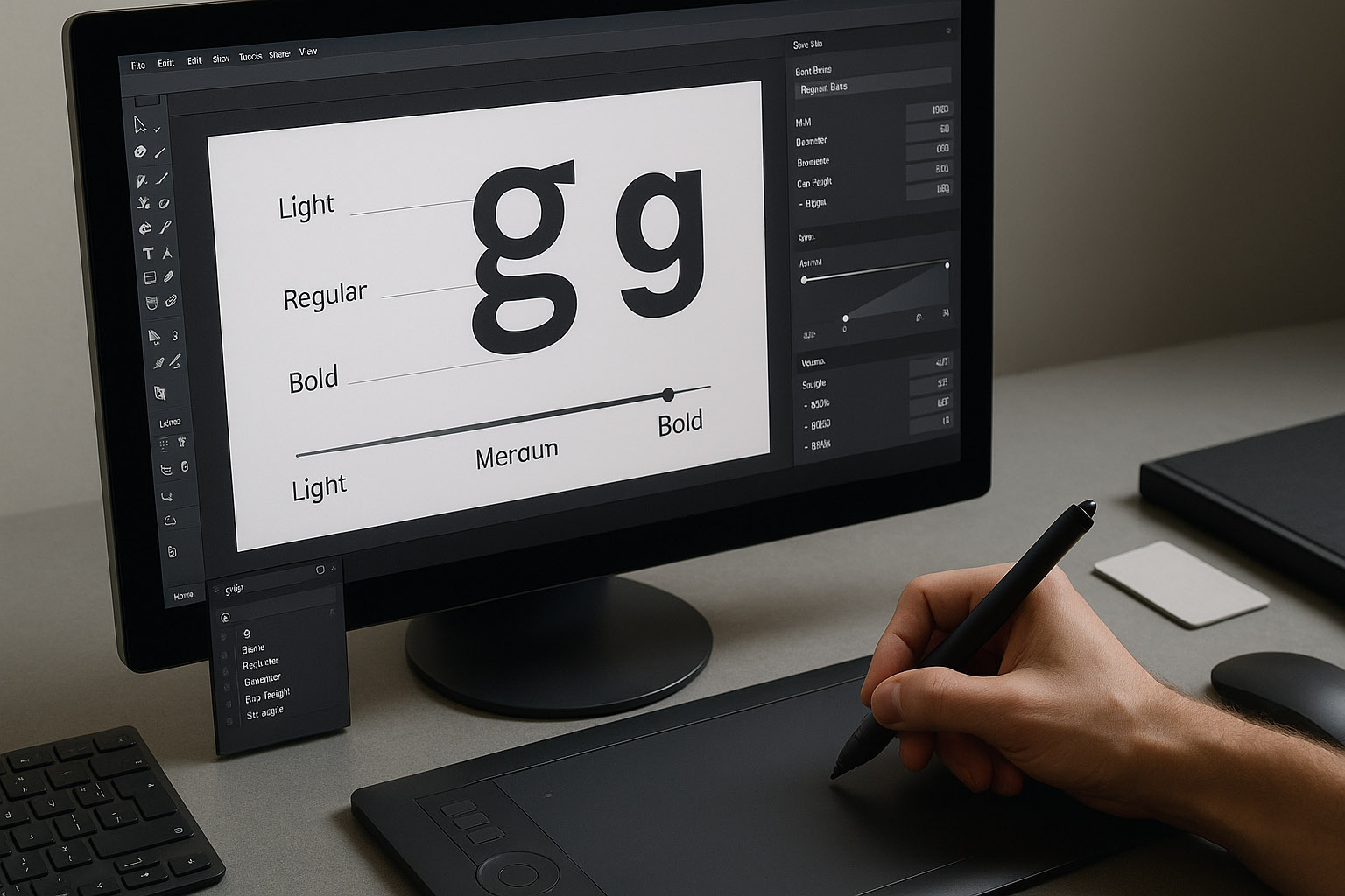
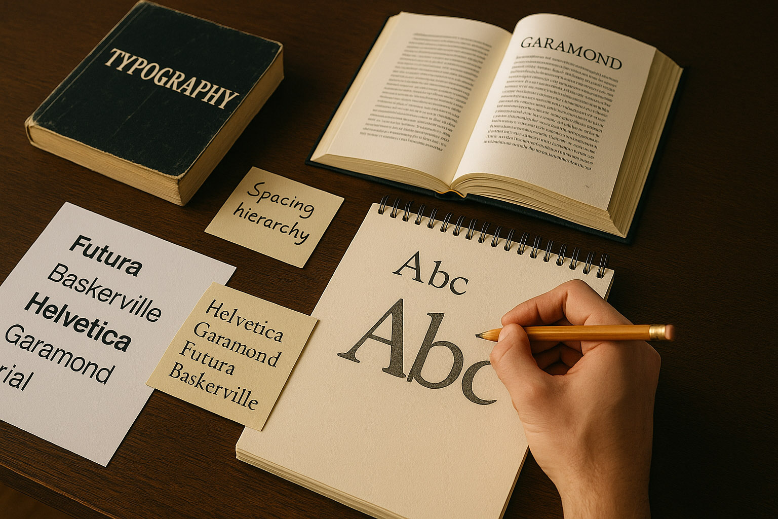
Creating a typeface starts not in Illustrator, but with research and sketching. Designers study letter proportions, weight distribution, and optical balance.
A single professional font family (with multiple weights and italics) can take 6 months to 2 years to complete.
Unknown insight:
Some type designers still print letters at 500% zoom and hand-correct their outlines with pencil before digitizing — an old-school trick to spot curve tension.
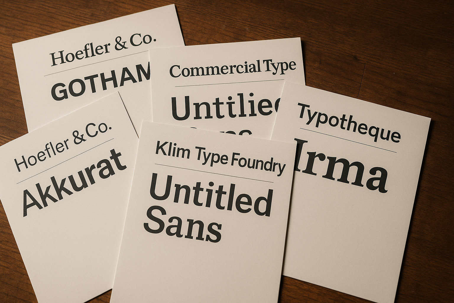
Known for Gotham — the Obama 2008 campaign font that redefined political design. Their work blends American modernism with typographic clarity. Gotham was used many, many times in political campaigns throughout the USA.
Founded by Paul Barnes and Christian Schwartz, creators of Guardian Egyptian and Graphik. Elegant, functional, and deeply researched.
Run by Kris Sowersby, Klim is behind Untitled Sans and Tiempos. His meticulous process has made him one of the most respected type craftsmen today.
Peter Bilak’s foundry explores multilingual and experimental typography — from Latin to Devanagari and Armenian scripts.
The home of Akkurat and Circular, defining the minimalist aesthetic of global design studios like Apple, Spotify, and Airbnb.
“Typography’s beauty has always carried fragility — a reminder that fonts are art forms as much as tools.”
The rise of variable fonts — single files that adapt seamlessly between weights and widths — marks a new era. Instead of loading 20 files, one font can now morph from light to bold, condensed to expanded — optimizing both web speed and creative flexibility.
AI is now stepping into typography:
Hidden fact:
In 2023, researchers at MIT trained an AI to recognize emotional tone in typefaces — fonts like Comic Sans scored “playful,” while Bodoni registered as “authoritative.”
Pro tip:
Follow foundries on Instagram (like @klimtypefoundry or @typotheque) — they often share process details and behind-the-scenes sketches.
Typography is the most invisible art in design.
When done well, it doesn’t shout — it speaks with quiet authority, guiding the reader’s eye and emotion.
Whether you draw letters by hand, tweak kerning in Figma, or explore variable font files, the essence remains: form follows meaning.
“Typography is not dying in the digital age — it’s evolving, one pixel-perfect curve at a time.”
News, insights, case studies, and more from the rausr team — straight to your inbox.
Send us your brief, your wildest idea, or just a hello. We’ll season it with curiosity and serve back something fresh, cooked with care.