How Graphic Design Boosts Ecommerce Sales
How graphic design helps ecommerce stores sell more through clarity, trust, hierarchy, speed, and conversion-focused decisions instead of decorative noise.

How graphic design helps ecommerce stores sell more through clarity, trust, hierarchy, speed, and conversion-focused decisions instead of decorative noise.
Graphic design in ecommerce is often misunderstood.
People talk about it as if it were mainly about taste:
Those things matter, but the real commercial role of ecommerce design is much more specific. Good design reduces doubt, guides attention, builds trust, and helps the shopper move toward a decision without feeling lost or manipulated.
That is why strong ecommerce design usually looks simpler than many young designers expect. Big sellers do not avoid extreme design because they are boring. They avoid it because high-volume commerce punishes unnecessary friction.
This article sits naturally beside Email Design Systems and Marketing Email Campaigns, Branding Codes That Stick, and Workflow for Complex Branding Design: Print and Digital.
“In ecommerce, design is not there to impress first. It is there to reduce uncertainty first.”

When a person lands on a store, the design immediately starts answering silent questions:
That is why design affects conversion directly.
It shapes:
Shopify’s 2026 UX coverage points in the same direction. Performance, clarity, and intentional reduction are no longer just aesthetic preferences. They are quality signals.
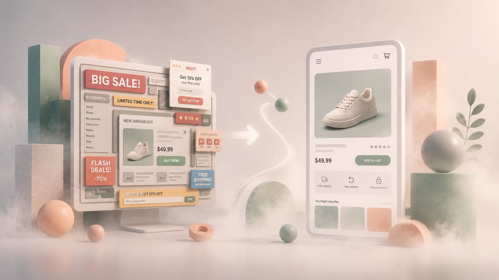
Early ecommerce often looked dense and nervous:
That made sense historically. Stores were trying to prove abundance, legitimacy, and promotional power all at once.
But the direction changed as mobile shopping grew and UX research matured.
Now the stronger stores tend to favor:
This is not only a style trend. It is an economic lesson. The more traffic a store handles, the more expensive confusion becomes.
One hidden reason ecommerce design became calmer is that mobile forced honesty. Small screens exposed weak hierarchy very quickly.

Large ecommerce brands usually do not use extreme visual behavior because their job is not to surprise the shopper. Their job is to keep the path to purchase stable.
Clean design helps with:
This is why many successful stores look almost conservative.
They know that dramatic visual experiments can create:
BigCommerce’s own messaging around conversion-focused storefronts reflects this well. The most profitable design is often not the loudest one. It is the one that helps checkout feel easy and expected.

Many conversion gains still come from the product page itself.
NIQ’s product-page guidance and broader Baymard research both point toward a similar truth: shoppers convert better when the page answers doubts quickly and visually.
The strongest product pages usually combine:
Baymard’s long-running findings are still useful here. Cart abandonment stays high in ecommerce overall, and one recurring reason is insufficient information or avoidable friction.
That means graphic design is not only making the page attractive. It is deciding how evidence is sequenced.
One of the biggest beginner mistakes in ecommerce is treating trust signals like small secondary widgets.
They are not secondary.
Reviews, delivery timing, guarantees, stock language, return policy, and payment confidence all shape conversion. Shopify’s 2026 landing-page guide even highlights trust signals and social proof as major conversion elements.
Good design makes trust visible without making the page feel desperate.
That balance matters.
If the design hides trust, people hesitate. If it over-sells trust with too many badges and exclamation marks, people also hesitate.
Professionally designed ecommerce pages usually place trust in ways that feel calm:

This is where the question becomes more interesting.
Could ecommerce standards change? Yes, absolutely.
Black backgrounds, stronger contrast, bolder art direction, and more dramatic retail storytelling can work, especially for:
But only under one condition: the experiment must still preserve clarity.
Dark or unusual systems tend to fail when they weaken:
So the answer is not “black backgrounds are bad.” The answer is “extreme styling must still obey conversion logic.”

The smartest design experiments in ecommerce usually leave some things untouched:
What they change is the atmosphere around those anchors.
That might mean:
Shopify’s 2026 design-trends coverage hints at this shift with ideas like slow browsing and more textured interfaces. The important part is not the trend itself. The important part is that the product and purchase path remain legible.
“The best ecommerce experiments do not break the checkout logic. They make the brand feel more distinct while leaving the buying path easier to trust.”
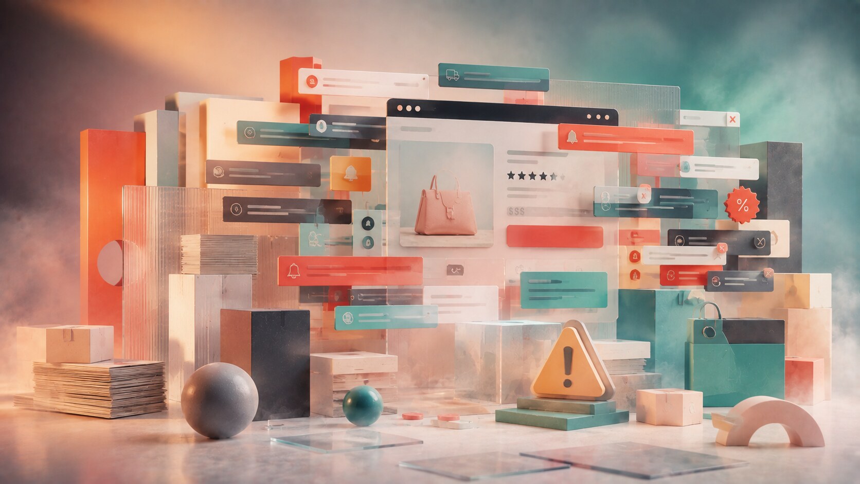
Some common problems repeat across weaker ecommerce stores:
One especially damaging mistake is treating every offer, message, and promotion as equally important.
That creates the same problem beginners have in design generally: everything shouts, so nothing leads.
| Design choice | Strong effect on conversion | Common failure |
|---|---|---|
| hierarchy | fast comprehension | too many equal priorities |
| product imagery | stronger confidence | beautiful but uninformative photos |
| trust placement | reduced hesitation | trust signals buried or overdone |
| checkout simplicity | lower abandonment | forms and steps create friction |
| bold experimentation | stronger distinctiveness when controlled | lower readability and weaker trust when overused |
The comparison makes the core lesson simple. Conversion-focused design does not reject visual ambition. It just refuses to let ambition damage clarity.

Ecommerce design is probably heading in two directions at once.
On one side:
On the other:
That may sound contradictory, but it is not. The base conversion logic is getting more disciplined. The expressive layer is getting smarter about where and when it appears.
One useful future clue is that “performance” is increasingly part of visual luxury. A store that feels smooth, clear, and effortless can signal premium quality more strongly than one with ten extra effects.
That is the real job.
Not decoration for its own sake. Not endless banners. Not louder novelty.
Just better visual decision-making in service of trust, clarity, and momentum.
That is also why the biggest sellers often look simpler than people expect. They learned that clean design is not the absence of creativity. It is the result of understanding which parts of creativity should help the purchase and which parts should stay out of the way.
News, insights, case studies, and more from the rausr team — straight to your inbox.
Send us your brief, your wildest idea, or just a hello. We’ll season it with curiosity and serve back something fresh, cooked with care.