How UX & UI Are Tested: The Full Process (From Lab Sensors to Cursor Data)
A practical walkthrough of modern UX/UI testing — planning, recruiting, moderated sessions, biometrics, eye tracking, and behavior analytics like cursor heatmaps.

A practical walkthrough of modern UX/UI testing — planning, recruiting, moderated sessions, biometrics, eye tracking, and behavior analytics like cursor heatmaps.
UX & UI testing isn’t a single method or a complicated science experiment. It’s simply a way to check whether people can actually use what you’ve designed.
Sometimes that means sitting in a room with a few users and watching them struggle. Other times it means looking at thousands of real sessions to see where people get stuck.
The most effective teams usually combine both approaches:
This guide walks through the full UX/UI testing process in plain terms — from moderated testing and eye tracking to analytics, heatmaps, and A/B experiments — without assuming you’re a researcher or data specialist.
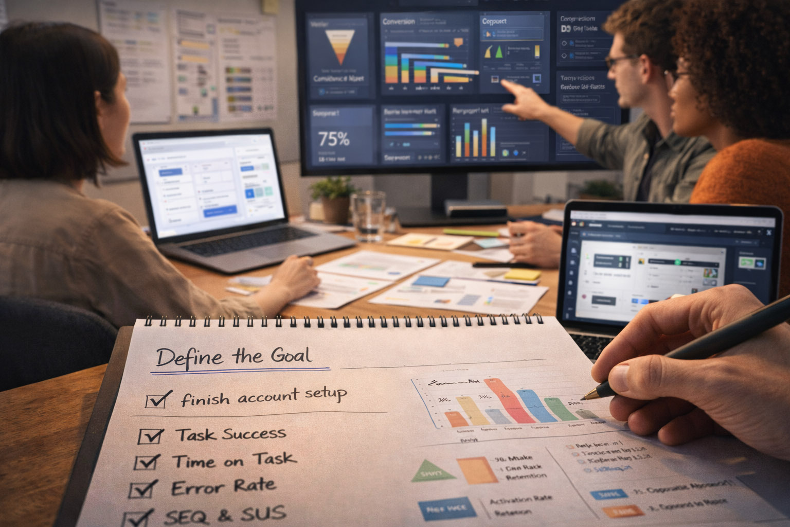
Testing “this new UI” doesn’t help much. Good testing starts with a simple, concrete question you want answered.
Examples:
The easiest way to waste time in UX testing is to collect lots of recordings without knowing what decision they should inform. Decide what you might change first — then test to support that decision.

You need one primary outcome and a few supporting signals.
Common usability metrics (session-level):
Common product metrics (behavior-level):
“If you don’t define “success”, you’ll end up debating opinions. If you define it too narrowly, you’ll ship a “winner” that harms trust.”
Most teams combine 2–4 methods, because each one answers different questions.
Best for: discovering friction, misunderstandings, missing expectations.
Best for: breadth, quick comparisons, and less “researcher influence”.
Best for: finding where to look and validating impact at scale.
Best for: proving causality (did the change cause the improvement?).
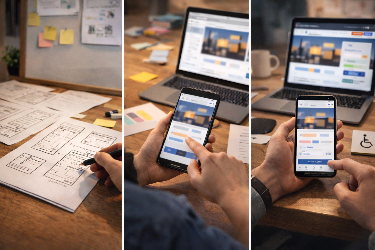
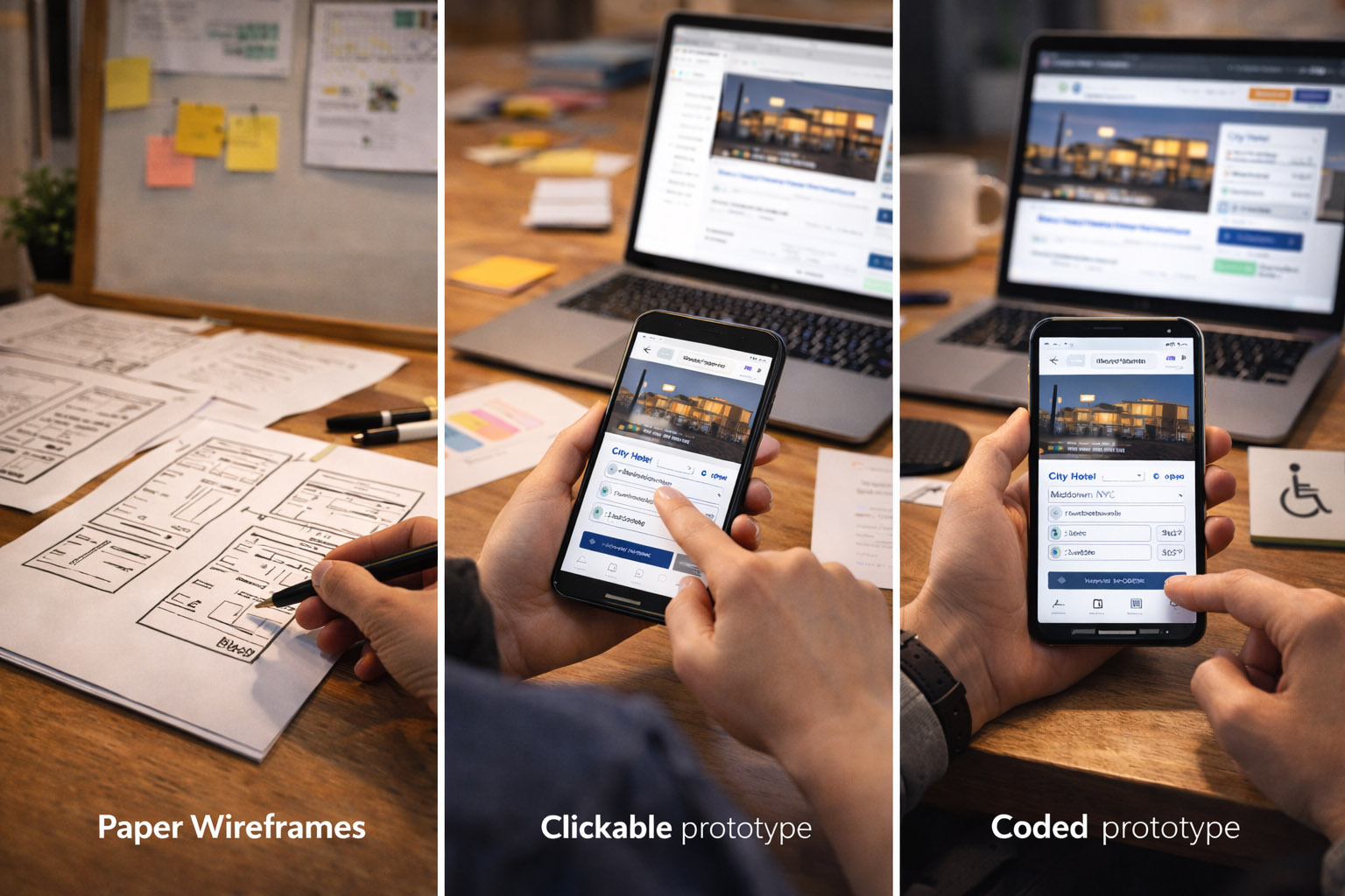
The prototype should match what you’re trying to learn.
“Wizard of Oz” testing is underrated: users interact with a realistic UI, while a human secretly powers the “AI” or complex logic behind the scenes. It lets you test value and trust before building heavy systems.
Recruit by behavior, not demographics. Examples:
Also decide:
Bad task: “Find the billing settings and change your plan.” Better: “You were charged for the wrong plan. What would you do?”
Good task design:
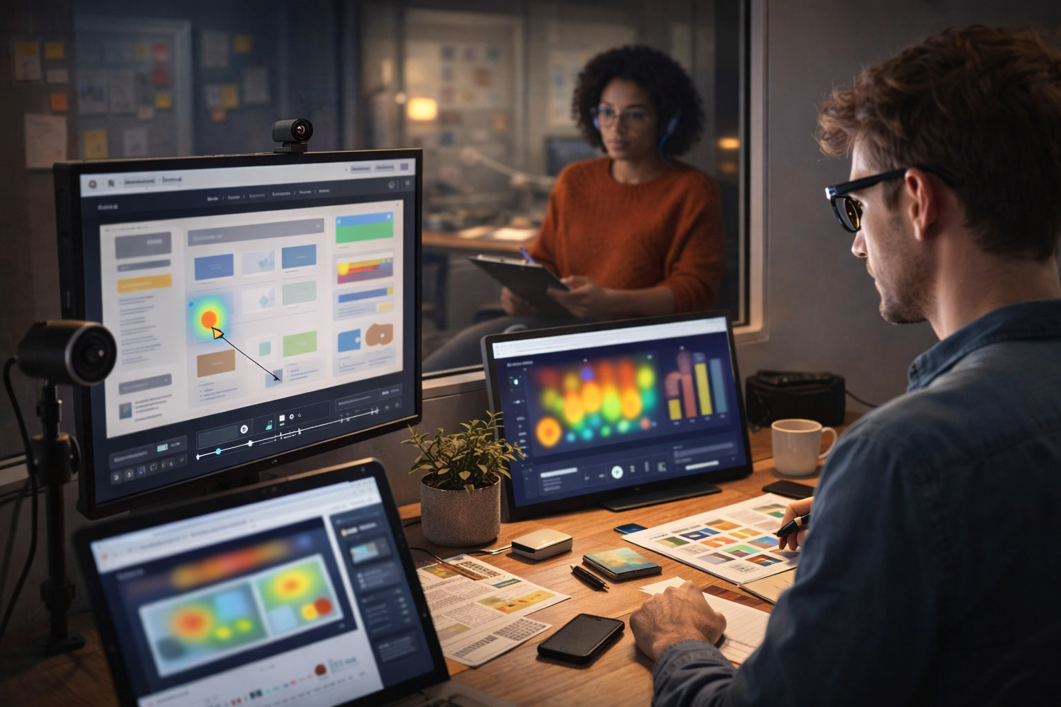
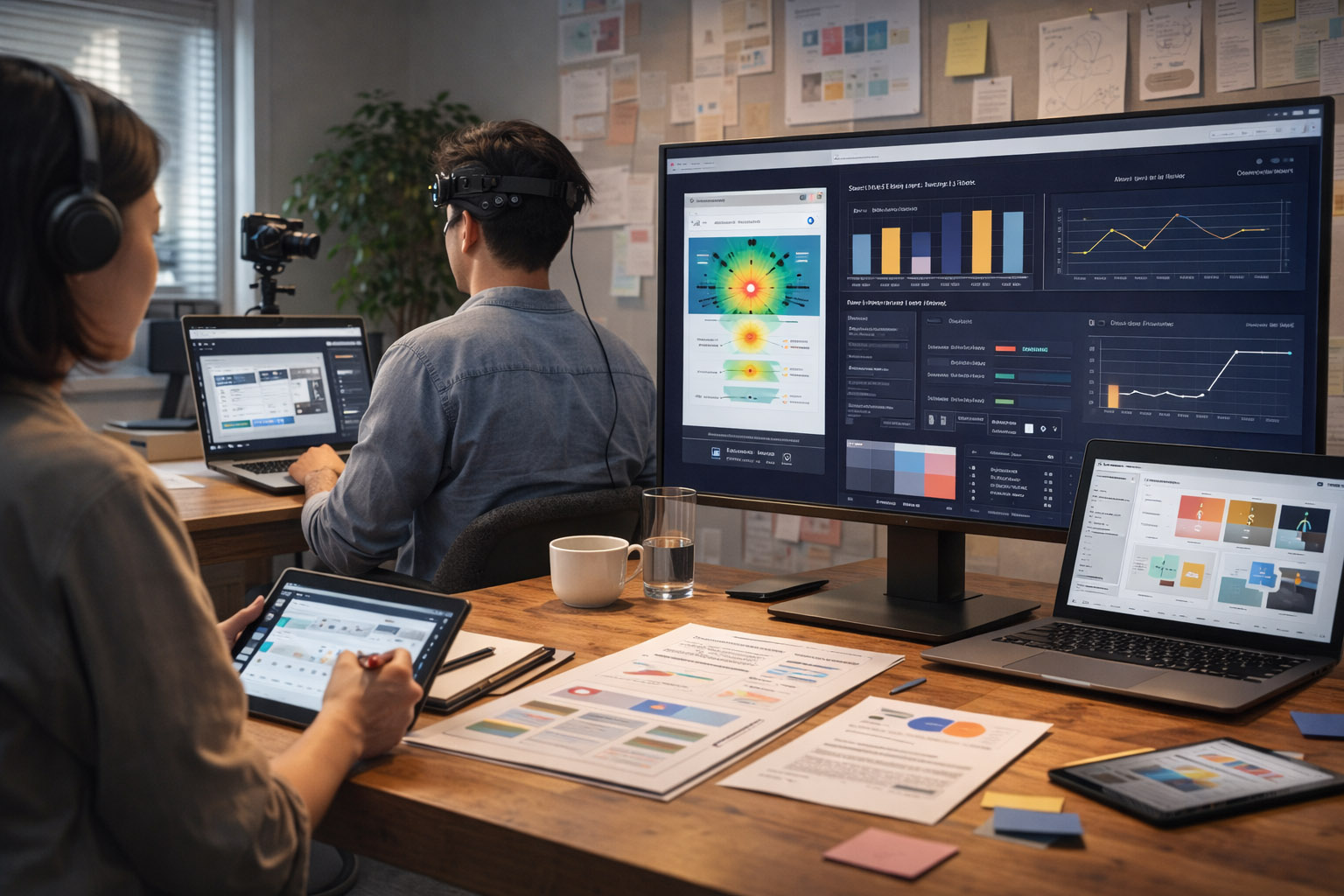
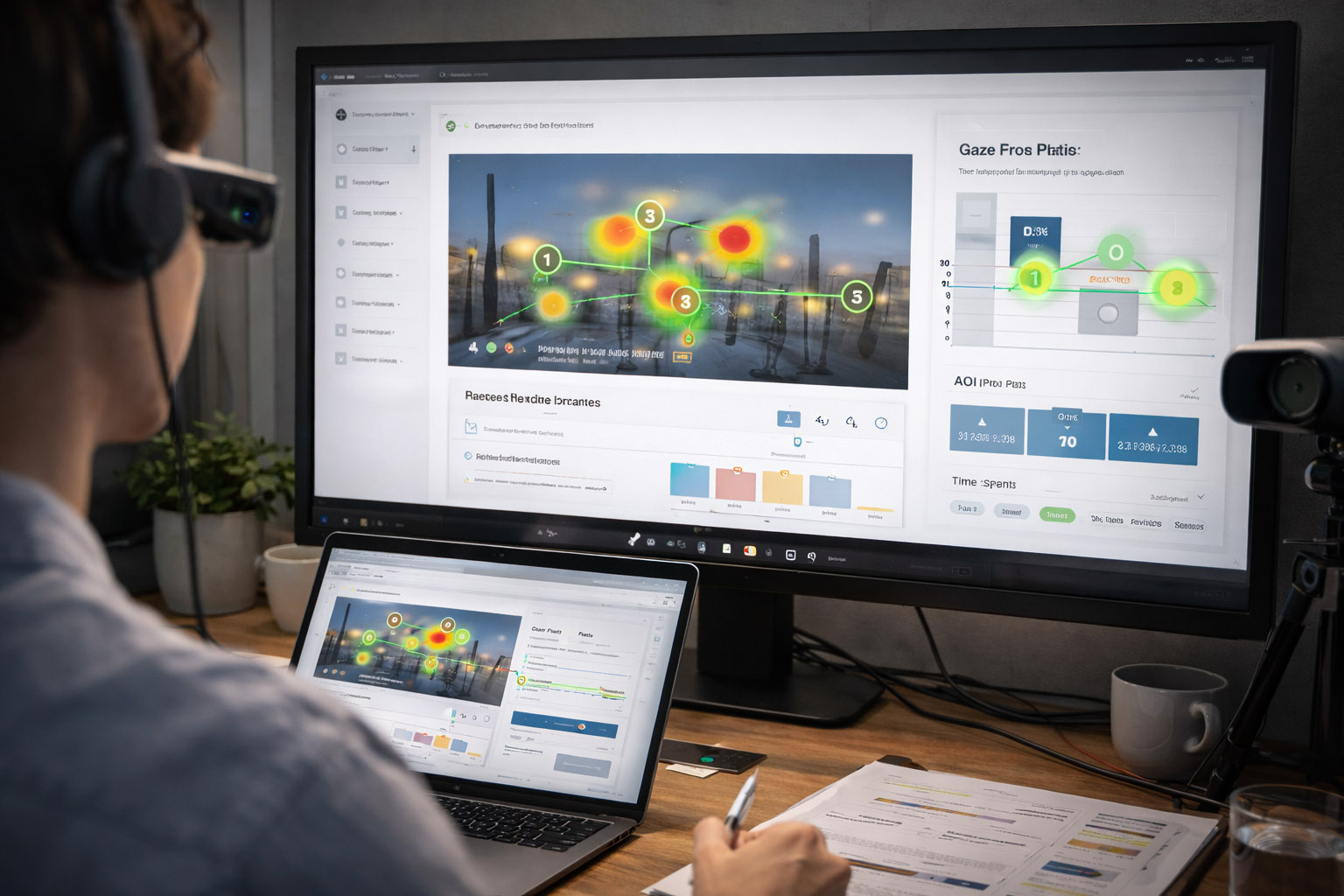
This is where UX research looks almost like sports science. It’s not always necessary — but it can reveal how people allocate attention, how hard a task is, and which moments create stress or confusion.
Then, optionally:
Unknown-but-important detail: eye tracking isn’t just “where they look”. Researchers often analyze time-to-first-fixation (how long it takes to notice a critical element) and revisits (how often people must re-check something they don’t trust).

Eye tracking is powerful when the problem is visual hierarchy, scanning, or attention. Examples:
Common eye tracking outputs:
Limitation: looking is not understanding. Always pair with tasks + outcomes.
Physiological signals can be useful for timing: they can flag “something happened here” even when the participant can’t articulate it.
But they’re rarely proof of a specific emotion. EDA spikes can mean: confusion, stress, excitement, surprise, or even a room temperature change.
Use biometrics to:
Avoid using biometrics to:
Not every team has a lab. But almost every product can measure real behavior at scale.
Cursor data is imperfect — but still useful. Modern tools can capture:
More “hidden” signals used in mature teams:
One of the most actionable metrics is “dead clicks per 100 sessions”. It’s a direct measure of UI misleading people — and it’s often easier to fix than “conversion”.
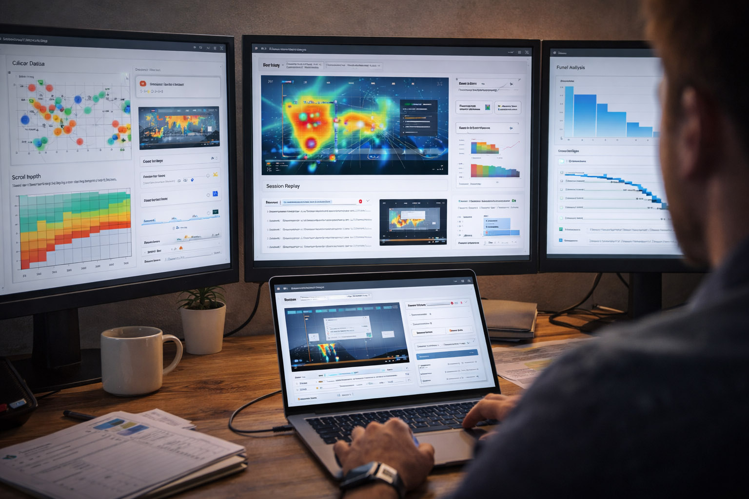
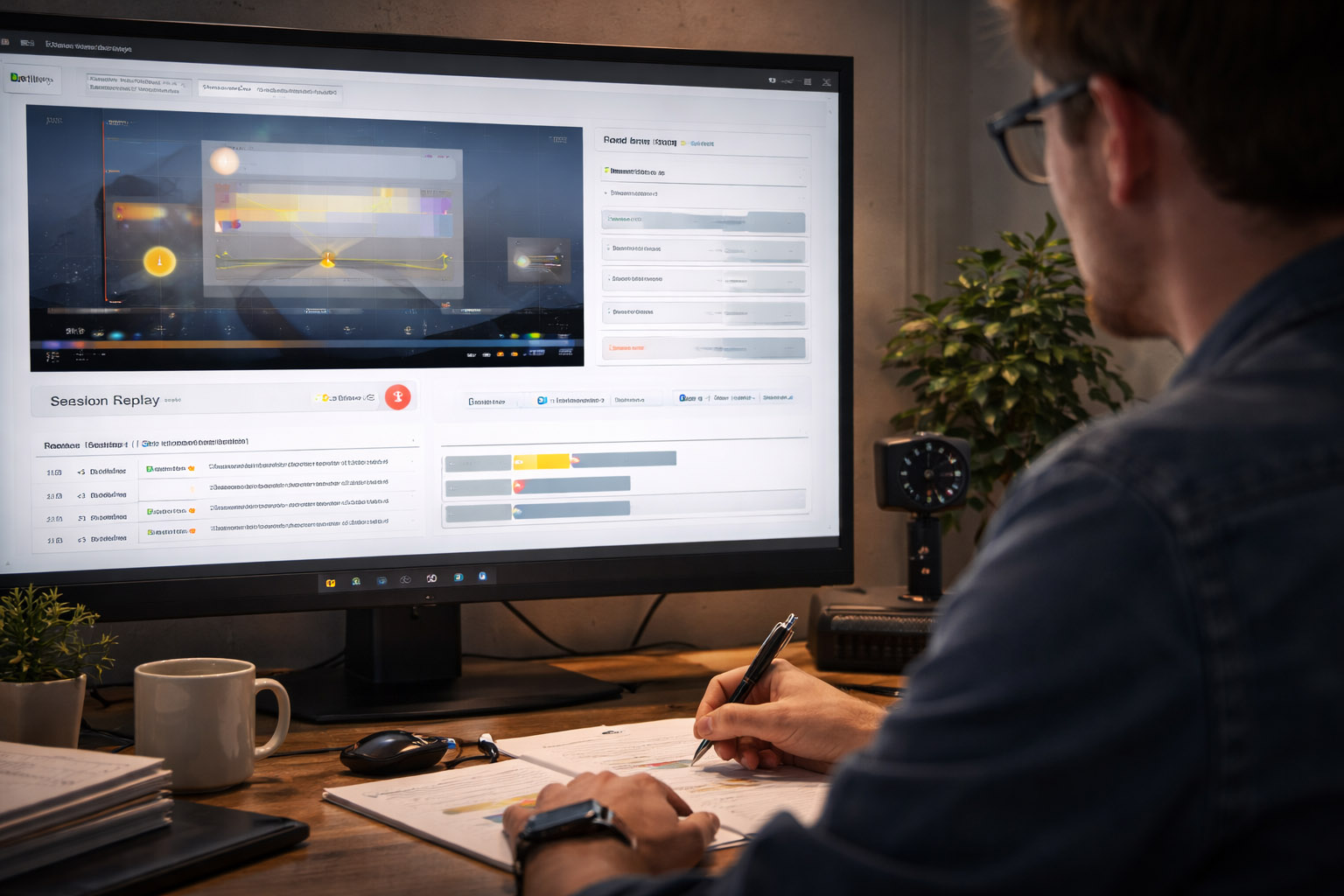
Session replay shows the full story: hesitations, loops, rage clicks, input errors, and device problems. It’s extremely effective for debugging UX — but it comes with privacy obligations.
If you use replay:
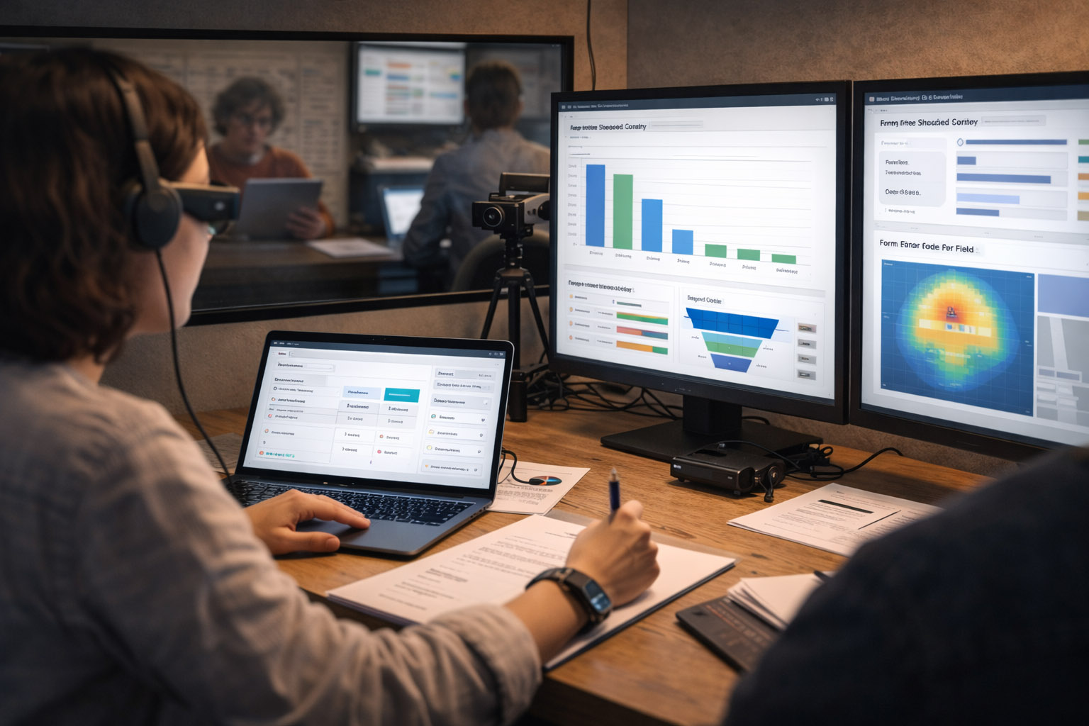
Funnels answer:
The best workflow is:
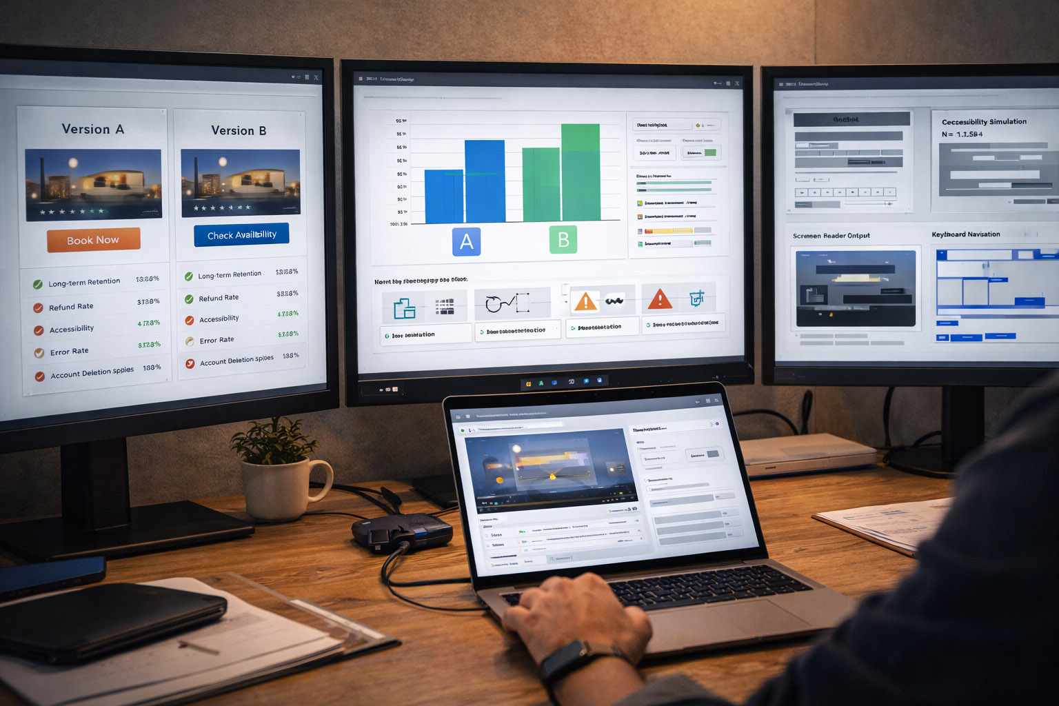
A/B tests are incredible for causality, but they can reward short-term behavior. Great teams pair A/B testing with “guardrails”:
“If an A/B test increases conversion but increases support tickets, you didn’t “win” — you just moved the cost.”
Accessibility testing isn’t a separate “compliance task” — it’s UX testing under real constraints.
Include sessions with:
Many “mysterious” usability problems disappear once a product is built to be robust and predictable.
Imagine you’re improving a checkout form.
In a moderated test (8 participants):
In analytics (thousands of sessions):
The overlap between these layers gives you confidence: you know what broke, why it broke, and how often it breaks.
Modern UX/UI testing is a loop: observe → measure → fix → validate.
The “physical” side (eye tracking, sensors, cameras) can reveal attention and workload. The “digital trail” side (cursor data, replays, funnels, experiments) shows what happens at scale.
When you combine them, you don’t just ship prettier interfaces — you ship interfaces that people can actually use, trust, and understand.

News, insights, case studies, and more from the rausr team — straight to your inbox.
Send us your brief, your wildest idea, or just a hello. We’ll season it with curiosity and serve back something fresh, cooked with care.