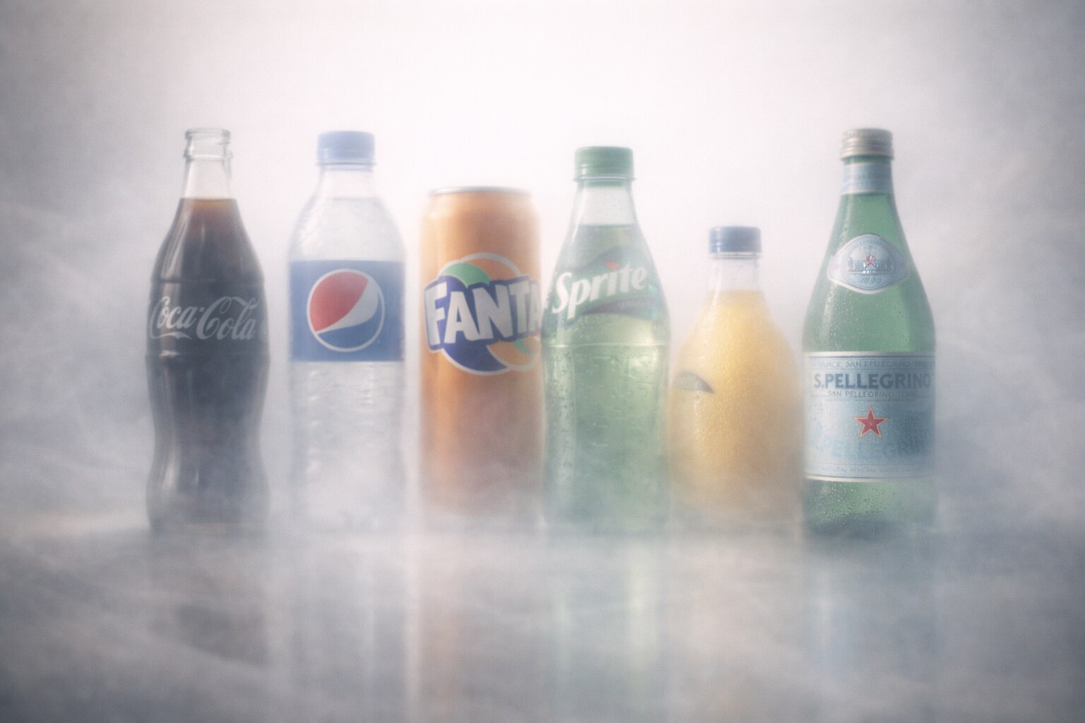
Iconic Water and Lemonade Packaging: Bottles, Cans, Labels, and Shelf Memory
Look at eight famous water and soft-drink packages, how their shapes, labels, bottles, and cans became recognizable, and where they went right or wrong.

Look at eight famous water and soft-drink packages, how their shapes, labels, bottles, and cans became recognizable, and where they went right or wrong.
Water and lemonade packaging is a strange design category. It looks simple from the outside: a bottle, a can, a label, a logo, some bubbles, maybe a fruit. But the most famous drink packages work like small pieces of architecture. They have a silhouette, a texture, a gesture, a label hierarchy, a color code, and a ritual attached to them.
That is why Coca-Cola can be recognized from the curve of glass, Perrier from green and bubbles, Orangina from a small orange-shaped bottle, and S.Pellegrino from a restaurant-table label that almost refuses to change.
The package has to solve several jobs at once:
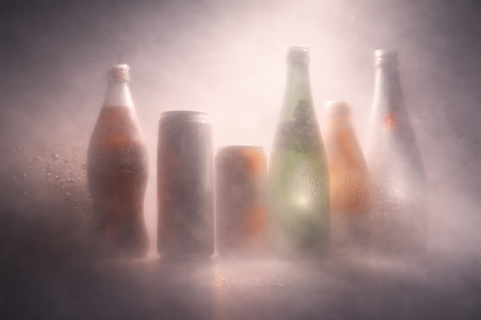
This article looks at eight famous drink brands and the packaging decisions behind them: Coca-Cola, Pepsi, Fanta, Sprite, Orangina, Perrier, evian, and S.Pellegrino. Some of these designs became almost untouchable. Others had to break their own visual codes to survive new markets, recycling rules, or changing taste.
For a wider packaging context, continue with The Story of Meal Packaging Design and From Sketch to Bathroom Shelves.
“An iconic drink package is not the one people admire the longest. It is the one people recognize fastest, even when they are tired, distracted, and standing in front of a cold shelf.”
Most drink packaging fails quietly. It is good enough to hold liquid, but not strong enough to hold meaning. Famous drink packages usually have one or two assets that survive redesigns: a shape, a color, a label position, a cap, a symbol, or even a way of opening and drinking.
The best packages are built around what shoppers can decode at speed:
This is where packaging overlaps with branding codes. A beautiful label is not enough if it disappears on shelf. A distinctive shape is not enough if it is expensive, heavy, difficult to stack, or environmentally weak.
The same logic appears in Successful Branding Codes and Branding Codes That Stick: recognition usually beats decoration.
The bottle-versus-can decision is practical before it is aesthetic. A can is excellent for fast chilling, events, vending, stadiums, nightlife, and multipacks. It gives designers a full 360-degree graphic surface and it travels efficiently. But it has no transparent product reveal and almost no silhouette difference.
A bottle can carry shape, clarity, premium weight, and table presence. It can become part of a restaurant ritual or a collector memory. But it is heavier, more fragile in glass, and more complex when sustainability pressure rises.
The hidden problem of iconic packaging is that the better it works, the harder it becomes to change. A brand can become trapped by the same shape, color, or label that made it famous.
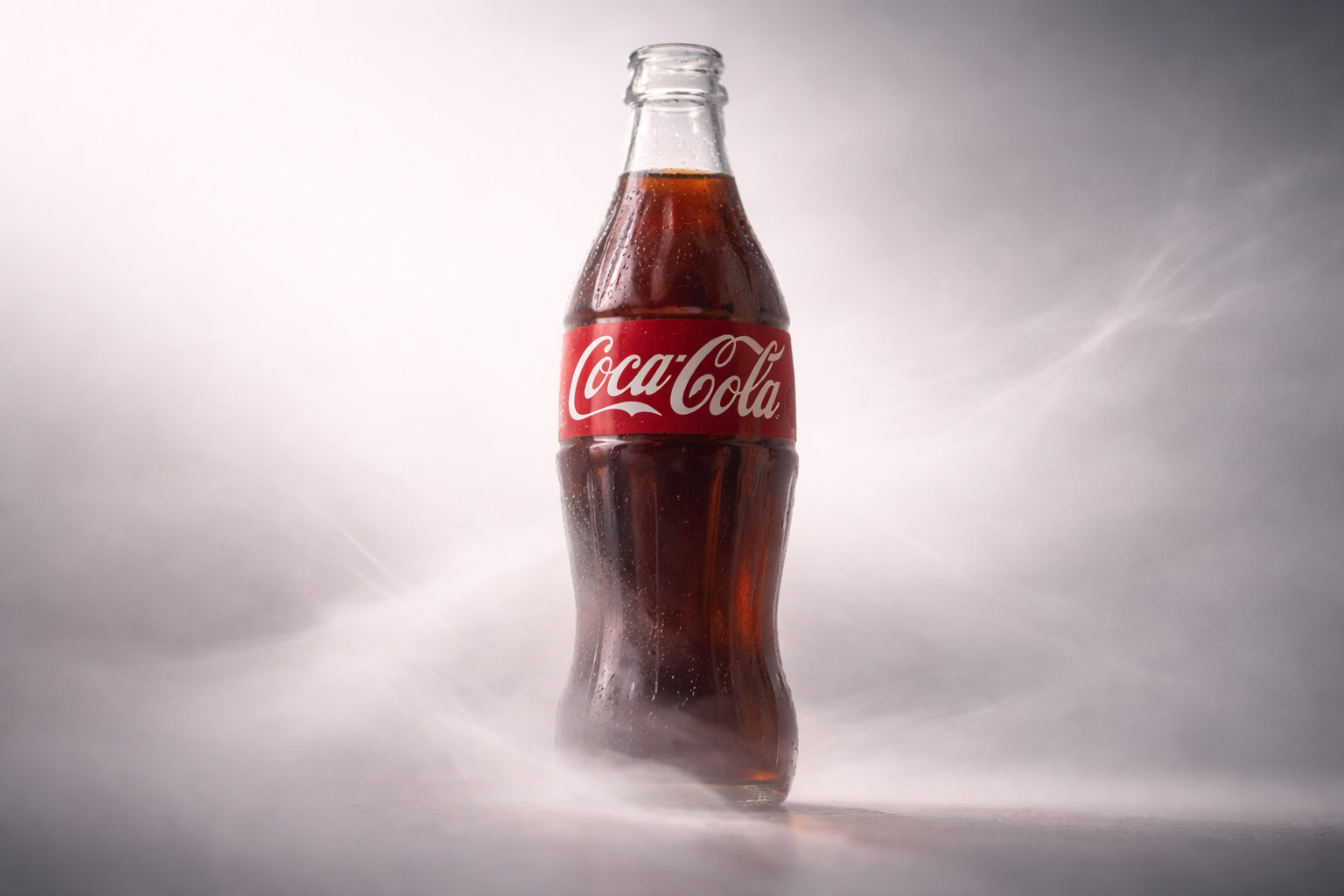
Coca-Cola is the classic case where packaging became bigger than packaging. The famous contour bottle was not created because somebody wanted a prettier soda bottle. It was created because the brand had a serious copycat problem.
In the early 1900s, Coca-Cola was sold in straight-sided bottles, while competitors used names and scripts close enough to create confusion. The company and bottlers needed a package that could protect the brand when the paper label was wet, damaged, or removed.
The design brief became legendary: create a bottle so distinctive it could be recognized by touch in the dark or when broken on the ground. Root Glass Company in Terre Haute, Indiana, worked on the winning idea. The design team included Alexander Samuelson, Earl Dean, Clyde Edwards, and the Root organization. The famous ribbed form was inspired by an illustration of the cocoa bean, which the team mistook as relevant to Coca-Cola’s ingredients.
That mistake became one of the most successful design accidents in packaging history.
The success story is clear:
The wrong turn is also useful. Coca-Cola’s 2011 white holiday cans created confusion with Diet Coke for many shoppers. The lesson was simple: even a giant brand can damage instant recognition when it changes a core color code too casually.
“Coca-Cola did not design a bottle only to look nice. It designed a bottle to fight imitation.”
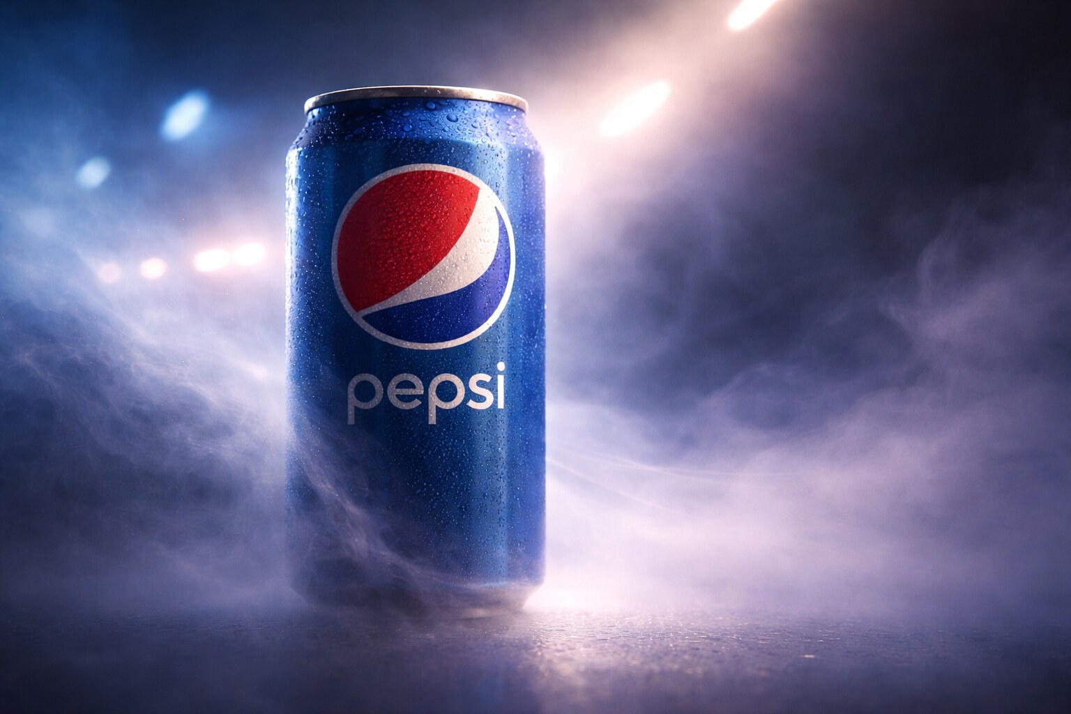
Pepsi’s packaging story is less about one eternal bottle and more about constant cultural motion. Coca-Cola built much of its memory around the glass silhouette. Pepsi built much of its identity around the globe, the can, music, sport, youth culture, and the feeling of being a challenger.
That difference matters. Pepsi packaging often needs to feel current. The risk is that “current” ages faster than “classic”.
The 2023 Pepsi identity, led through PepsiCo’s design system and publicly connected with Mauro Porcini and Todd Kaplan, was interesting because it pulled back toward heritage. The globe and wordmark were reunited. Black became more important, partly to strengthen the Pepsi Zero Sugar story. The can silhouette was treated as a major asset, not just a container.
That was a smart move because cans are where Pepsi behaves best:
Pepsi’s wrong paths usually come when the identity becomes too intellectual or too fashion-led. The 2008 globe redesign became a design-industry example of over-explaining a mark. Even if the package was visible, the strategy around it felt heavier than the shelf moment itself.
Pepsi shows a useful rule: if your brand is built on change, the package must keep one or two stable anchors. Without them, reinvention starts to look like uncertainty.
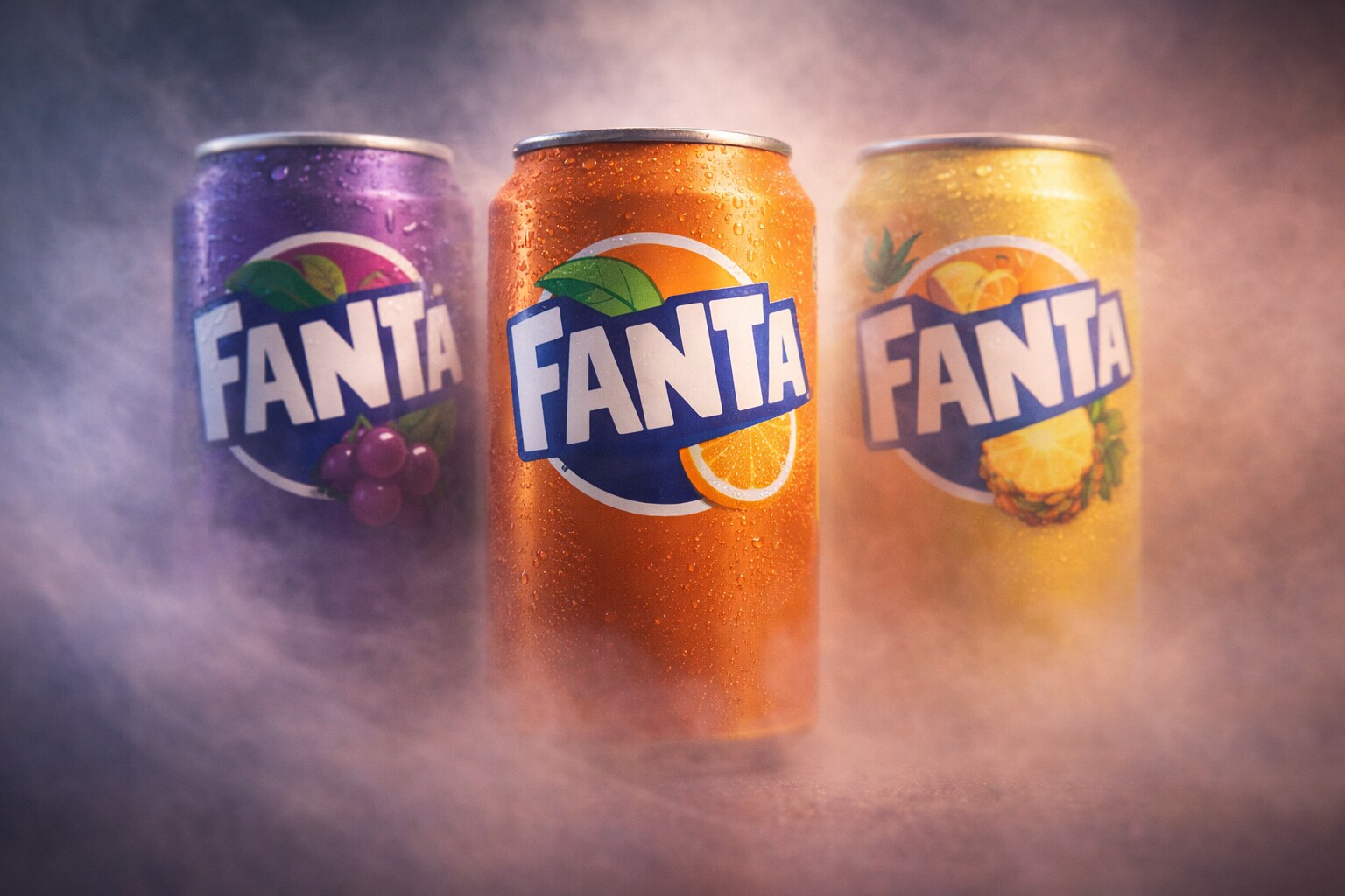
Fanta has one of the more unusual origin stories in soft drinks. It began in 1940 in wartime conditions, when the German Coca-Cola operation had to work with local ingredients because normal supply chains were disrupted. Later, Fanta became a global fruit-flavored system, with orange as the famous center but many local flavors around the world.
That global flavor spread created a design problem. If the package is too orange, it works for orange Fanta but becomes limiting for grape, pineapple, strawberry, lemon, or regional variants. If the identity is too generic, it loses the playful character people expect from Fanta.
The 2023 global identity work, developed by The Coca-Cola Company’s design team with Jones Knowles Ritchie, tried to solve exactly that. It simplified the logo, made the system more global, and gave the brand a stronger graphic structure for many flavors.
The visible move was brave: Fanta reduced some of the classic orange-and-leaf signals to make room for a broader flavor world.
What works:
The possible risk is that playful packaging can become noisy. When every flavor shouts, the system needs strong hierarchy. Fanta’s current challenge is not making packs louder. It is keeping them playful while making flavor choice easy.
This connects to the wider problem of simplifying without sterilizing a brand, which is explored in Why Companies Sterilize Their Logos.
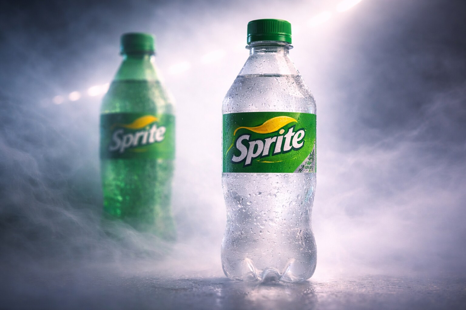
Sprite is a sharp example of packaging design where the correct environmental decision can hurt a famous visual code. For decades, green bottles made Sprite instantly recognizable. The green suggested lemon-lime refreshment, coldness, and a clean bite. It was one of the simplest shelf signals in soft drinks.
Then recycling logic changed the design conversation.
In 2022, Coca-Cola moved Sprite bottles in the U.S. and Canada from green plastic to clear plastic. The reason was practical: clear PET is generally more useful for bottle-to-bottle recycling than colored PET. Sprite kept green in the graphic system, but the material code changed.
That is a real packaging-design tradeoff. Green plastic did branding work. Clear plastic does sustainability and recycling work. The new identity has to carry more responsibility because the bottle material no longer carries the same instant color.
Sprite’s good move was not pretending that nothing changed. The brand leaned into clearer recycling communication and kept green through label, cap, and identity.
The lesson for designers:
“Sometimes the future of packaging is not a better-looking bottle. Sometimes it is giving up a famous bottle color because the material system changed.”
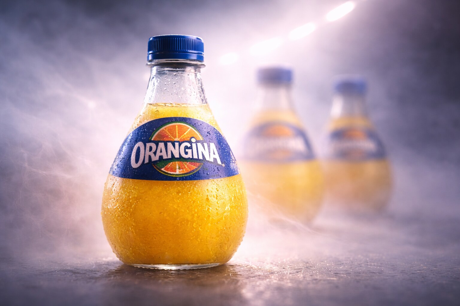
Orangina is one of the strongest examples of packaging as ritual. The brand is known for its pulpy orange drink and the instruction to shake before drinking. That behavior is not separate from the package. It is part of the package story.
According to Suntory Beverage & Food Europe, Orangina launched in 1936 and its iconic bottle was designed in 1951. The rounded, textured shape suggests an orange peel. It does not behave like a perfectly efficient cylinder. It is not the most rational warehouse object. But on shelf, it has memory.
That is why it works.
The bottle turns the product into a mini object:
The commercial story is connected with Jean-Claude Beton, who helped build Orangina’s French success after the formula moved from earlier origins into wider distribution. The packaging did what great beverage design often does: it made a flavor feel physical before the bottle was opened.
The wrong-way lesson is that distinctiveness can fight operations. A unique bottle may be harder to pack, stack, replicate, or modernize. But if the shape creates enough mental availability, the inefficiency can be worth it.
Orangina is almost the opposite of generic optimization. It proves that a slightly awkward package can become powerful when the awkwardness is meaningful.
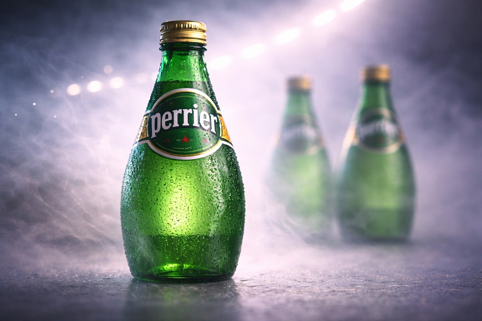
Perrier’s green bottle has a different mood from evian or S.Pellegrino. It is not quiet alpine purity and it is not formal restaurant elegance. It is sparkling, compact, French, slightly mischievous, and very graphic.
The classic bottle form is commonly linked to St John Harmsworth, who developed the brand in the early 20th century. One often-repeated design story says the bottle shape was inspired by Indian exercise clubs used by Harmsworth after an accident. Whether a shopper knows that or not, the result matters: Perrier’s bottle has a squat, energetic shape that looks ready to fizz.
The brand’s visual world was also helped by poster culture. Bernard Villemot and other French graphic voices gave Perrier a sense of wit and motion that pure product photography could not.
Perrier’s strongest assets:
Recent collaborations, including the 160th-anniversary work with Philippe Starck, show how carefully a brand has to handle an icon. Starck could redesign around the bottle, but not erase what made it Perrier.
The risk for Perrier is category drift. If sparkling water shelves become full of colorful cans, flavored variants, and wellness language, the old green bottle must keep feeling premium without becoming old-fashioned.
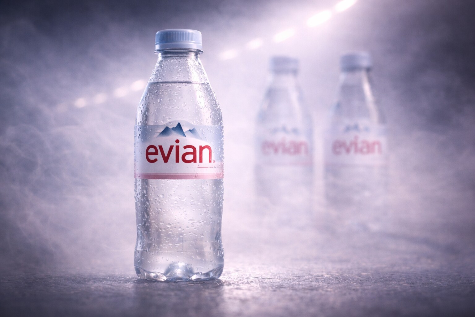
evian has a hard design task: it sells clear water. There is no cola color, no orange pulp, no visible bubbles, and no dramatic liquid identity. So the package must create value through origin, purity, lifestyle, and calm confidence.
The brand story begins with the discovery of the source in 1789 in Evian-les-Bains, with later bottling and thermal-water culture developing through the 19th century. The modern packaging relies on a few clear signals: transparent bottle, mountain reference, pale pink and blue tones, and a premium-but-soft mood.
evian’s most successful design move is that it made water feel like a lifestyle object, not only a commodity. The annual limited-edition glass bottles, which began in 2008, brought fashion designers and creative collaborators into mineral-water packaging. The list includes names such as Virgil Abloh, Christian Lacroix, Elie Saab, KENZO, Balmain, Coperni, and Pharrell Williams with Humanrace.
That changes the role of the bottle. It becomes table design, gift object, collector piece, and brand PR.
But evian also shows a modern tension:
The label-free bottle is a telling direction. It removes the classic printed label and asks shape, embossing, and material to do more work. That is elegant, but also risky: the less you print, the more the bottle form must carry recognition alone.
S.Pellegrino is one of the clearest examples of label etiquette. The package does not try to feel like a sports bottle or a convenience drink. It behaves like something that belongs on a table with food.
The brand dates to 1899, and its official packaging story describes the green glass bottle as the Vichy shape, named in relation to San Pellegrino Terme’s reputation as an Italian Vichy. The label structure carries Art Nouveau references, light blue filigree, a central red star, the origin building, and the Alps.
This is not accidental decoration. It is a social signal.
On a restaurant table, the label has to do different work than a supermarket soda label:
S.Pellegrino also uses limited editions carefully. Its “Journey of Water” labels brought in designers such as Neri&Hu, Steven Haulenbeek, and Philippe Nigro, coordinated by Giulio Cappellini. The important detail is that these editions worked around the icon, not against it.
The danger for a brand like S.Pellegrino is becoming too ceremonial for casual culture. That is why PET bottles and sleek cans exist. But the glass bottle remains the emotional center because it owns the table.
For more about how logos and symbols become visual shortcuts, continue with The Process Behind Iconic Logo Design.
Looking across the eight brands, one pattern appears again and again: iconic drink packaging is rarely only graphic design. It is industrial design, logistics, law, culture, sustainability, and habit.
Coca-Cola proves that shape can become a trademark-level asset. Pepsi proves that a can can be the strongest stage for a moving pop-culture brand. Fanta proves that global flavor systems need flexibility. Sprite proves that sustainability can force a brand to surrender a famous material code. Orangina proves that ritual and tactile personality can beat efficiency. Perrier proves that bubbles can become a whole visual world. evian proves that origin can turn clear water into a premium object. S.Pellegrino proves that label etiquette can build table authority.
The practical rules are simple but difficult:
“The winner on the shelf is not always the prettiest package. It is the package with the clearest memory.”
The future of water and lemonade packaging will probably move in two directions at once. Everyday packaging will become lighter, clearer, more recyclable, more refillable, and sometimes less printed. Premium packaging will become more tactile, collectible, limited, and table-aware.
That creates a difficult but interesting design question: how do you remove material and still keep identity?
The brands that answer that will not simply make better labels. They will create packages that people can find before they even start reading.

News, insights, case studies, and more from the rausr team — straight to your inbox.
Send us your brief, your wildest idea, or just a hello. We’ll season it with curiosity and serve back something fresh, cooked with care.