IKEA Design Evolution: From Flat-Pack Pragmatism to Global Democratic Design
How IKEA’s design evolved from Småland thrift and flat-pack invention to global democratic design and a more future-facing brand.

How IKEA’s design evolved from Småland thrift and flat-pack invention to global democratic design and a more future-facing brand.
Many large brands become famous through one strong symbol, one charismatic founder image, or one spectacular product.
IKEA is different.
Its design evolution is not really the story of one logo or one chair. It is the story of a whole worldview becoming visible across:

That is what makes IKEA so interesting. The brand did not become iconic by promising luxury or rarity. It became iconic by turning affordability, flat-pack logic, self-assembly, Scandinavian restraint, and what it calls democratic design into a full visual and product system.
This article sits naturally beside The Evolution of Apple Design, IKEA Design Evolution, and Most Popular Logo Fonts and Logotype Typefaces.
“IKEA did not make design feel elite. It made design feel expected.”
The roots of IKEA matter because they explain almost everything that came later.
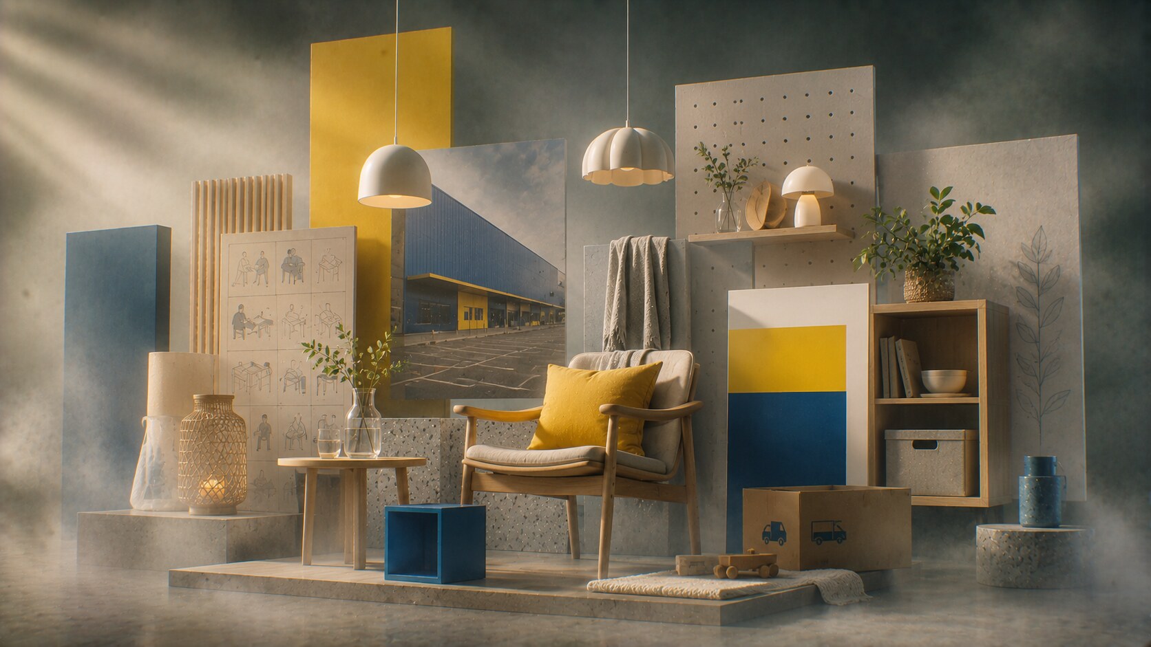
Founded by Ingvar Kamprad in 1943, the company emerged from Småland, a region of Sweden shaped by thrift, practicality, and making the most of limited resources. That context mattered visually as much as economically.

Early IKEA did not look like a “design icon” in the modern polished sense. It looked like a practical retail idea that was learning how to make usefulness attractive. The earliest catalogs and products carried that logic clearly:
That is one reason IKEA’s story feels different from many twentieth-century design legends. It was never only about form. It was always about logistics, price, distribution, and how ordinary people actually live.
Because the brand solved real domestic problems before it tried to build mythology around them.
IKEA’s later visual confidence makes it easy to forget that the company’s original strength was not polished Scandinavian cool. It was disciplined affordability.
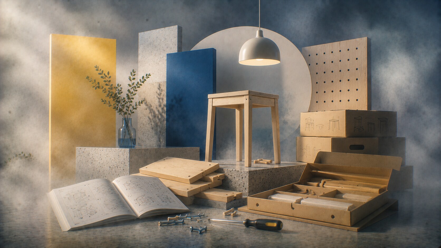
One of IKEA’s deepest design breakthroughs was not a color or a logo. It was flat-pack logic.
The famous story around Gillis Lundgren, one of IKEA’s earliest and most important designers, explains a lot here. To solve a transport problem, table legs were removed so products could be packed more efficiently. That practical move became a worldview.
Flat-pack changed everything:
This is where IKEA became truly modern in its own way. The brand stopped behaving like a furniture company that only sold finished objects. It became a system for producing, transporting, understanding, and assembling domestic life.
Because the efficiency was not invisible. Customers could feel the logic directly.
Lundgren is also associated with designing the BILLY bookcase, one of IKEA’s clearest proofs that industrial practicality can still become an emotional household constant.
Flat-pack brilliance also created one of IKEA’s lasting tensions: efficiency can easily become visual sameness or material disappointment when cost pressure goes too far.
One hidden IKEA lesson that many designers miss: some of the company’s most important design breakthroughs were really packaging, transport, and systems breakthroughs wearing the clothes of product design.
For decades, the IKEA catalogue was not just marketing. It was design media.
The numbers alone are strange enough to be memorable. At its peak, the catalogue was printed in enormous global quantities and became one of the most distributed publications on earth. That scale matters because it means IKEA was not only selling furniture. It was shaping what ordinary domestic aspiration looked like.

The catalogue taught a whole visual language:
This was one of IKEA’s great brand achievements. It made interiors feel legible to non-designers.
Because it sold scenes, not isolated objects.
The catalogue was so central that, for years, it consumed a huge part of IKEA’s marketing effort. In practical terms, the publication was one of the company’s strongest design instruments.
The catalogue’s power also made IKEA vulnerable to criticism whenever representation, cultural simplification, or visual editing choices felt too controlled or out of step.
Very few brands have turned the shopping trip itself into such a tightly designed sequence.
An IKEA store is not only a warehouse with nice signage. It is a deliberate environmental system:
This is where IKEA’s design evolution becomes almost theatrical. The brand learned that environment can teach customers how to think, what to notice, and how to behave.
The store tells a story about democratic design physically:
That is a very unusual retail proposition. It gives up some luxury and convenience in exchange for stronger scale, access, and identity.
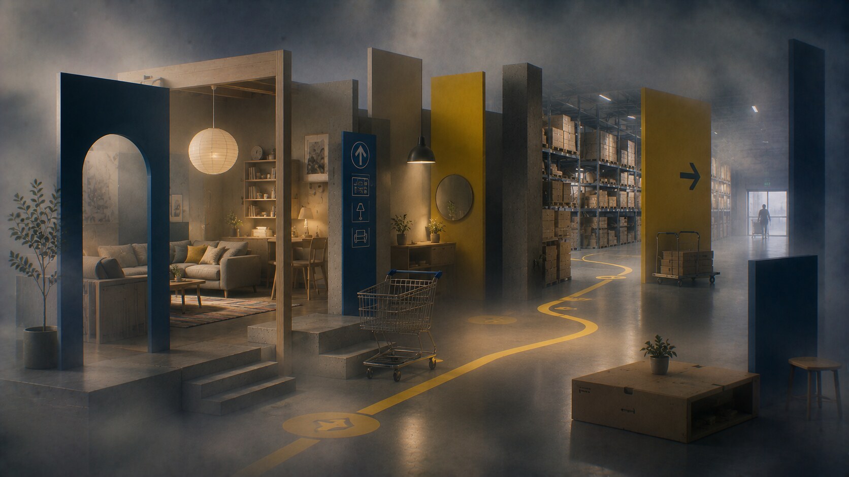
Because the store experience reinforces the product logic instead of hiding it.
IKEA’s path-like store experience is so culturally famous that “getting lost in IKEA” became part of the brand’s mythology rather than a pure failure.
The same immersive path can also create fatigue. What feels inspiring once can feel exhausting when the shopper wants speed, not experience.
“IKEA’s real logo may be the store route as much as the yellow wordmark.”
One of the most interesting things about IKEA is that the company never relied on one superstar identity the way some design-led brands did.
Instead, its evolution came through a network of designers and creative leaders.
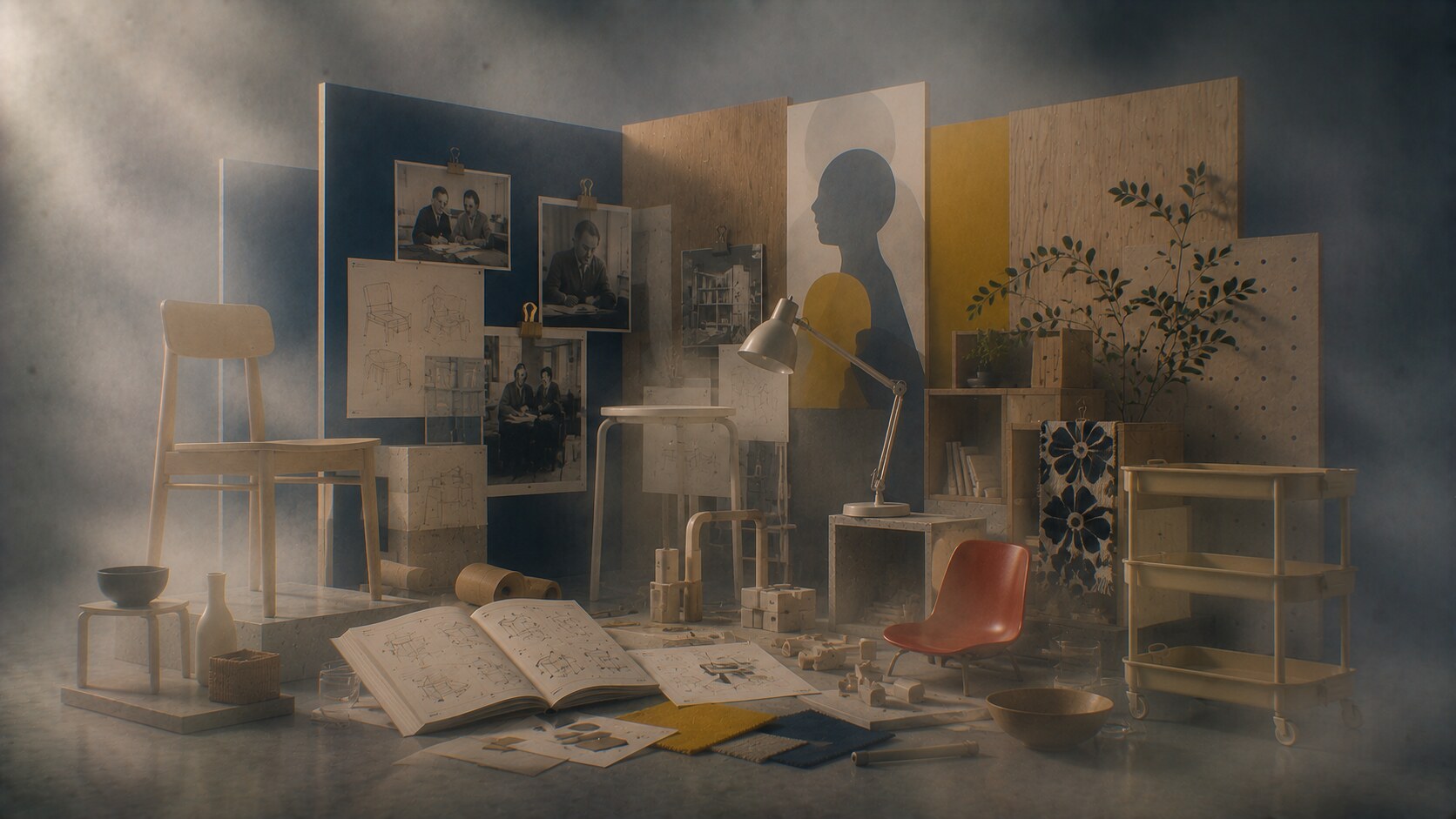
Some important names include:
This matters because IKEA’s identity is collective by nature. The brand does not work best when one object shouts louder than the system. It works when many objects share the same practical values.
Because the brand built a design culture, not only a design highlight reel.
IKEA’s strongest authorship is often organizational. Its real “designer” is partly the internal discipline that keeps cost, form, materials, logistics, and user behavior in the same conversation.
One thing people often miss is that IKEA also gave unusually large cultural space to textile and pattern designers, not only furniture designers. That widened the brand’s visual DNA beyond furniture silhouette alone.
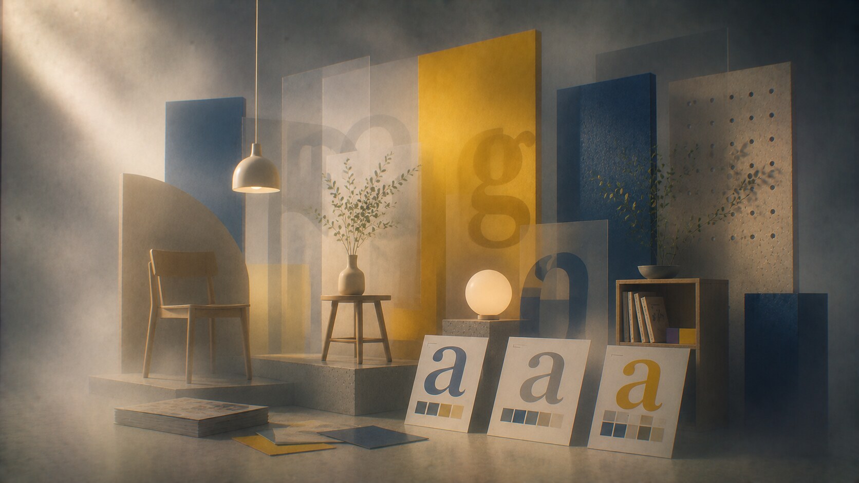
The famous Verdana switch in 2009 caused one of the strangest mainstream typography arguments of the era.
Why did it become such a story? Because IKEA moved away from Futura, a typeface with strong modernist and design-world associations, and chose Verdana, a screen-oriented font associated with web practicality rather than typographic romance.
Many designers hated the move. But the decision revealed something very IKEA: the company prioritized usability, global consistency, and web-era pragmatism over typographic nostalgia.
Then, in 2019, IKEA changed again, moving toward Noto IKEA, a customized version of Google’s Noto Sans. That shift made sense for a global company operating across many languages and digital environments.
This whole story is useful because it exposes the real IKEA logic. The brand does not usually optimize for typographic prestige first. It optimizes for scale, access, and operational clarity.
Because even when controversial, the changes reflected actual platform needs.
The “Verdanagate” reaction became a minor design-culture legend, proving that type people can treat a furniture company’s font choice like a national emergency.
Functional font choices can still become visually dull if they are not supported by a wider identity system with stronger character.
For a long time, IKEA’s strongest medium was physical experience.
Then digital expectations changed everything.
The company had to become better at:
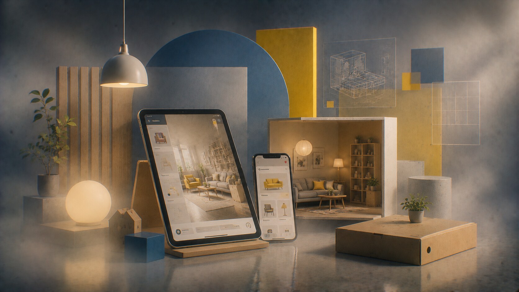
This is where partners like Work & Co became relevant in the digital-product layer, helping IKEA rethink parts of its customer experience beyond the classic warehouse trip.
That shift matters because the old IKEA strength was slowness with purpose. The digital world demanded something else: speed, clarity, and less friction before the customer ever visits a store.
Because IKEA gradually stopped treating digital as a side channel and started treating it as part of the design system.
The company’s biggest risk in digital was obvious: if the online experience became too generic, too frustrating, or too disconnected from the physical brand promise, the whole identity would weaken.
Today, IKEA is dealing with a very different world from the one that made its original megastore model feel revolutionary.
It now has to answer:
That means the future of IKEA design is not only about furniture form. It is about system adaptability.
We can already see the direction:

This does not erase IKEA’s past. It pushes the company to reinterpret its old logic for a different domestic reality.
The strongest version of IKEA in the next decade may be the one that behaves less like a furniture warehouse and more like a design-service ecosystem.
“IKEA’s future challenge is not proving that design can be affordable. It is proving that mass affordability can still feel responsible, relevant, and emotionally alive.”
IKEA’s evolution was never only about beautiful objects.
It was about turning:
into one of the most recognizable design systems in the world.
That is why the brand still matters. It did not only sell furniture. It taught millions of people a visual and behavioral model for living with design.
The successful part of the story is obvious: IKEA made usefulness emotionally legible.
The weaker parts are also clear: cost pressure, sameness, environmental criticism, and moments where efficiency risked draining warmth from the experience.
But as a design story, IKEA remains unusually important. It shows that global design power does not always come from exclusivity. Sometimes it comes from teaching ordinary life how to look coherent.
News, insights, case studies, and more from the rausr team — straight to your inbox.
Send us your brief, your wildest idea, or just a hello. We’ll season it with curiosity and serve back something fresh, cooked with care.