McDonald's Branding and Packaging Design Evolution
How McDonald's branding and packaging evolved from Speedee and roadside arches to global minimal packaging, modern brand systems and one of the most recognizable identities in the world.

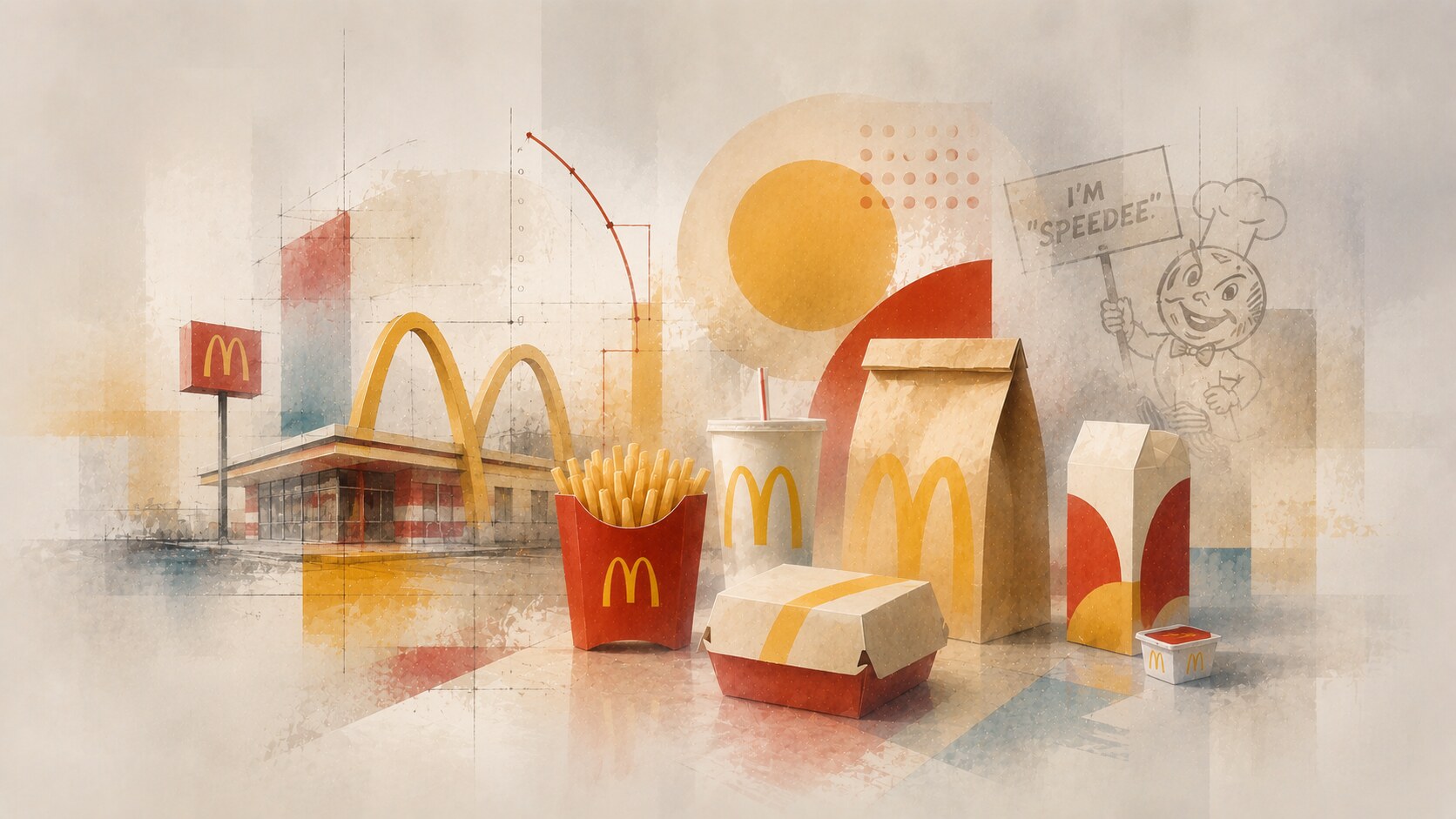
How McDonald's branding and packaging evolved from Speedee and roadside arches to global minimal packaging, modern brand systems and one of the most recognizable identities in the world.
McDonald’s looks simple from the street.
Red, yellow, arches, fries, cups, boxes, wrappers, bags, uniforms, drive-thru screens, app icons, Happy Meal graphics, window posters, delivery stickers, and small sauce lids all have to behave like one family.
That is the real design achievement.
The brand became a giant because it combined food, speed, architecture, franchising, repetition, and memory. Its packaging is part of that story, because the package is often the only piece of the restaurant that leaves the restaurant with the customer.
This article sits naturally beside Packaging Story of the Most Successful Snack Brands, IKEA Design Evolution, and The Evolution of Adobe Branding and App Design.
“McDonald’s became iconic because the brand learned to work at every scale: from a highway sign to a tiny fry box in your hand.”
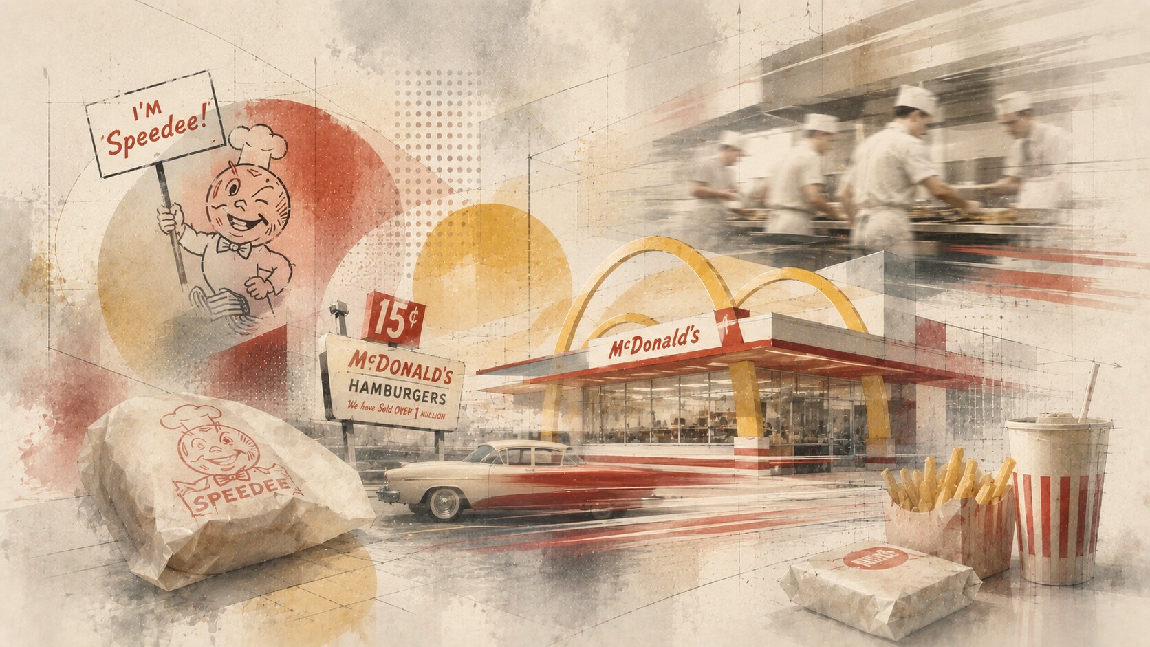
The important beginning is not the logo. It is the operating idea.
Richard and Maurice McDonald redesigned their San Bernardino restaurant around speed in 1948. Their Speedee Service System reduced the menu, simplified production, and made the restaurant behave almost like a small factory for hamburgers, fries, and shakes.
That shaped the visual language later. A business built on speed needs design that can be understood fast.
Early McDonald’s branding had:
When Ray Kroc entered the story in 1954 and opened his Des Plaines restaurant in 1955, the brand began moving from local efficiency to repeatable national identity.
McDonald’s did not first become famous because it had a perfect logo. It became famous because the business model was already graphic in its own way: visible, repeatable, fast, and easy to explain.
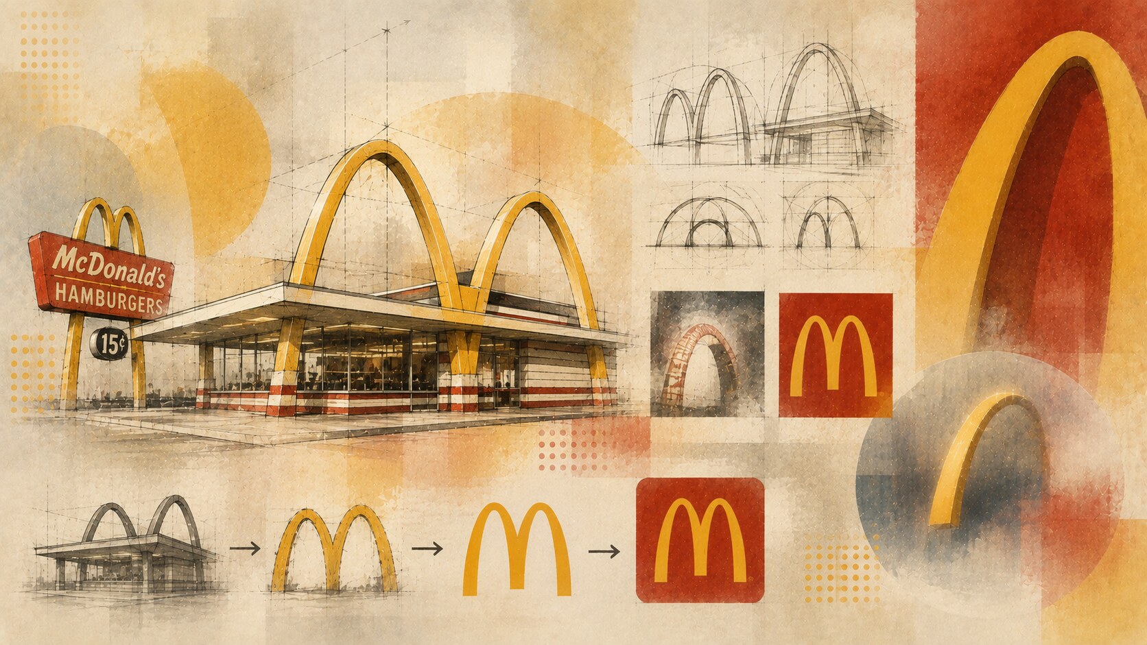
The Golden Arches are powerful because they were not born as decoration on paper.
They began as architectural forms.
The McDonald brothers wanted a restaurant that could be seen from the road, and architect Stanley Meston developed the red-and-white building language with dramatic yellow arches. Later, company designer Jim Schindler helped connect the two arches into the famous M form.
This origin still matters. The logo feels like signage, shelter, and commercial promise at the same time.
The best parts of the symbol are very simple:
That is why the arches can appear cropped, repeated, animated, embossed, simplified, or turned into a glow and still remain recognizable.
The Golden Arches are one of the rare brand marks where the public can recognize even a fragment. A partial yellow curve on red is often enough.
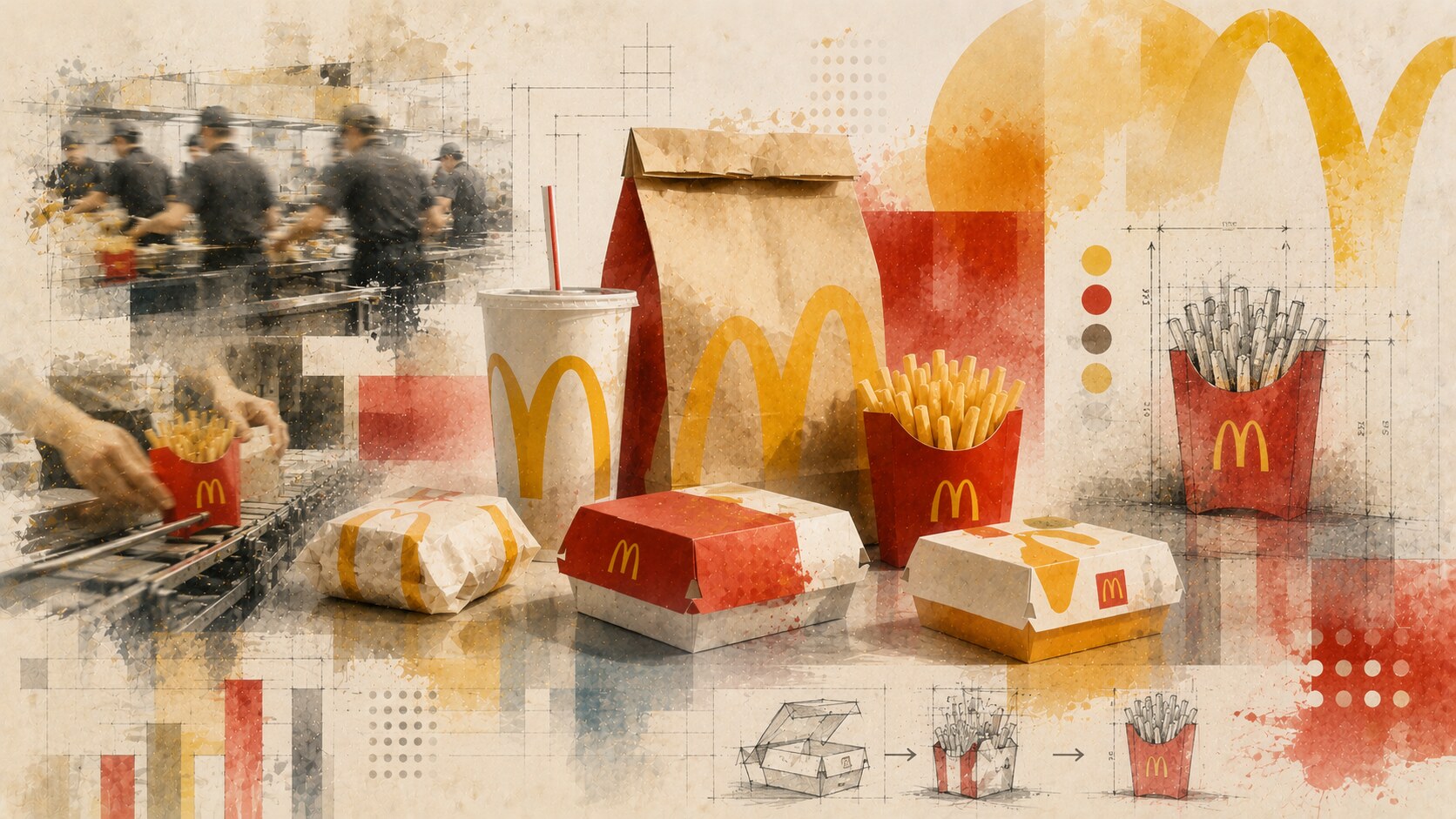
McDonald’s packaging has never been only a graphic design surface.
It has to help the restaurant work.
A wrapper, carton, fry box, or cup must:
The red fry box is one of the clearest examples. McDonald’s packaging history describes the 1970 fry box as a practical answer to speed and handling: it helped crew fill larger fry portions efficiently and helped customers keep fries upright.
That is good packaging design because the structure and the brand memory support each other. The box became functional, iconic, and emotional at the same time.
One overlooked McDonald’s lesson is that packaging can become famous without being luxurious. Sometimes the most remembered package is the one that solves a tiny operational problem millions of times per day.
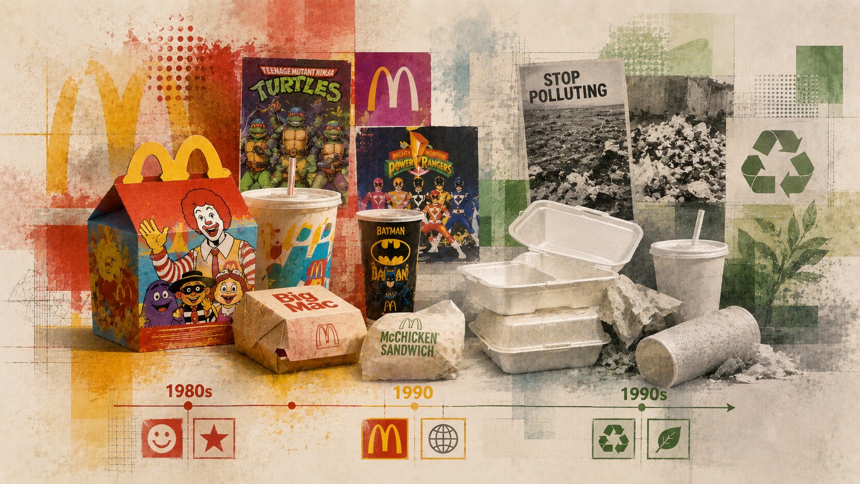
This period is one of the most interesting parts of the story because it contains both success and discomfort.
On one side, McDonald’s was excellent at making packaging feel playful. Happy Meal boxes, character graphics, promotional cups, and movie tie-ins turned the meal into a small event. The package was not only holding food. It was holding anticipation.
On the other side, packaging materials became a serious issue.
Foam clamshells and disposable waste became symbols of fast-food excess. McDonald’s began working with environmental organizations around 1990 and publicly credits that era with major reductions in packaging weight, recycling of corrugated boxes, and movement away from some foam materials.
This is the classic McDonald’s tension:
The brand’s visual language was strong, but the material story had to catch up.
The foam era is one of the clearest examples where convenience and efficiency later became a reputational problem. The package did its job technically, but the cultural meaning changed around it.
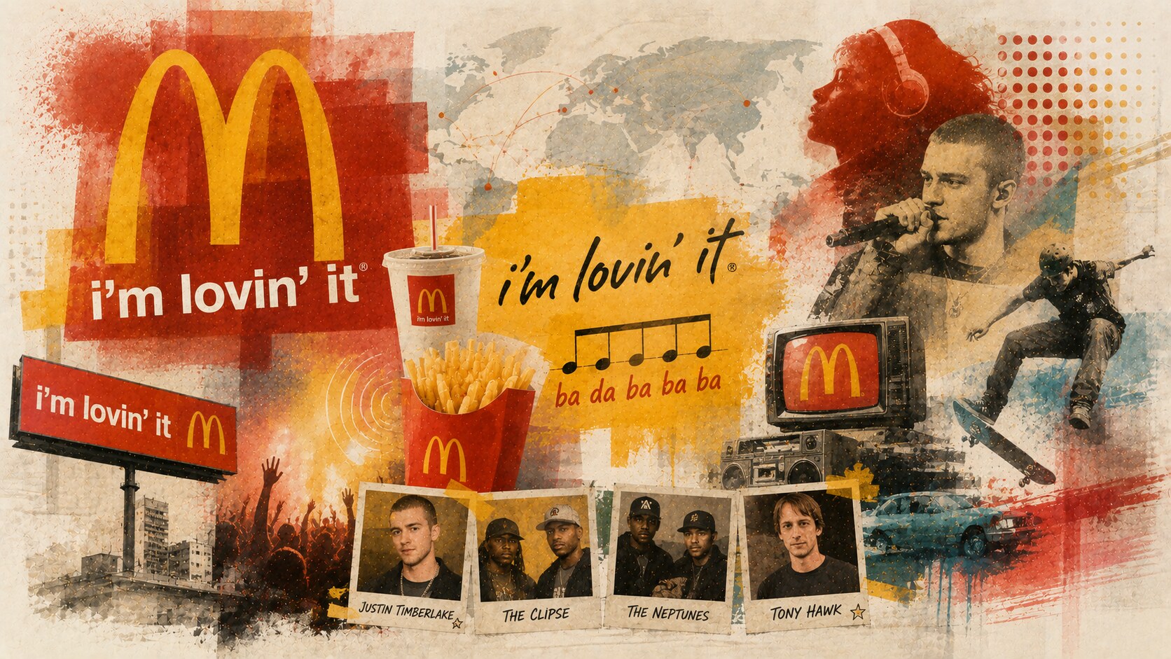
By the early 2000s, McDonald’s needed a more unified emotional language.
The company had grown enormously, but the brand also needed renewal. In 2003, i’m lovin’ it became McDonald’s first major global brand platform. The campaign was developed through a multi-agency process, with Heye & Partner in Germany playing the leading creative role.
The smartest part was not only the line. It was the sound.
The five-note ba da ba ba ba could travel across languages more easily than a sentence. That made it a branding asset that worked in TV, radio, restaurant audio, digital content, and ordinary memory.
Agencies including DDB, Leo Burnett, and other local partners helped execute the wider platform across markets. That is how giant brands often work: one global idea, many local hands.
The 2003 launch involved pop-culture names such as Justin Timberlake, The Clipse, The Neptunes, and Tony Hawk. It was not just fast-food advertising. It was an attempt to make McDonald’s feel connected to youth culture again.
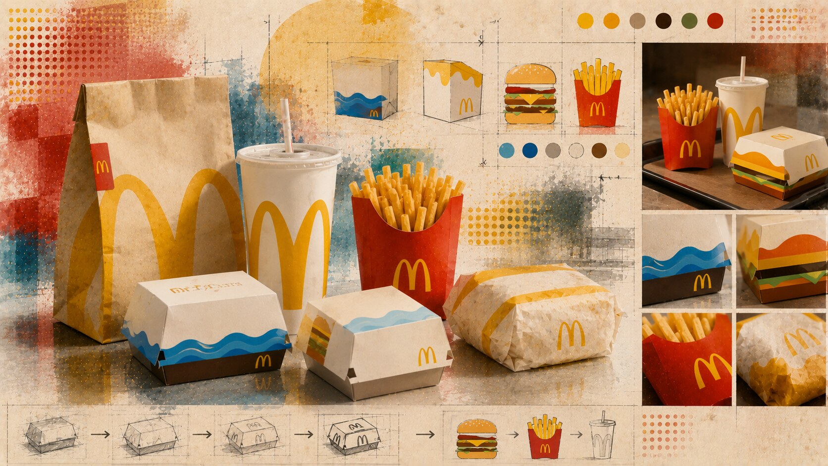
The 2021 global packaging redesign by Pearlfisher is one of the strongest recent examples of mass packaging simplification.
Instead of covering the packs with lots of messaging, the system moved toward bold, minimal illustrations inspired by menu items:
The key idea was not minimalism for fashion. It was recognition.
When packaging has to work across thousands of restaurants, many languages, delivery bags, counter moments, and digital photographs, overly textual design becomes heavy. Pearlfisher’s system made food cues behave like icons.
Important people named around the project include Hamish Campbell, Matt Sia, Priyanka Krishnamohan, and Alex Wagner, alongside McDonald’s internal teams and production partners.
Because it understood that a post-purchase package does not need to shout the brand name every second. It can create a small moment of joy while still being instantly McDonald’s.
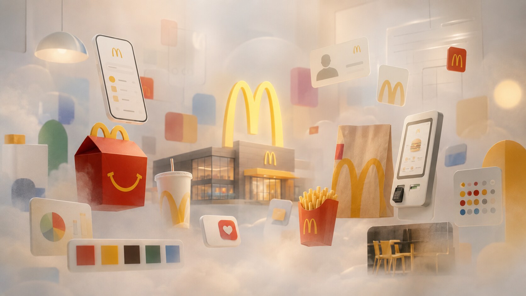
Modern McDonald’s branding is not only packaging.
Turner Duckworth describes a long strategic partnership beginning in 2017, where the Golden Arches influenced typography, glow, sub-brands, loyalty, conventions, retail touchpoints, and internal brand systems.
That is important because modern global brands need toolkits, not only logos.
McDonald’s has to design for:
The stronger the toolkit, the less each market has to improvise from zero.
Turner Duckworth’s work around Happy Meal is also a good case. The Happy Meal box is already a character-like object. Updating it means keeping the smile, play, and co-branding flexibility while still making the system cleaner.
At McDonald’s scale, one of the most valuable design jobs is not making the most beautiful single poster. It is making a system that thousands of teams can use without breaking the brand.
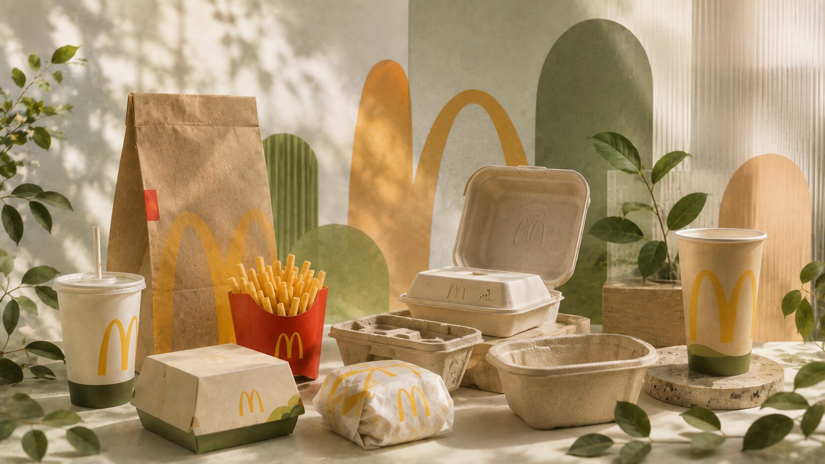
Packaging design is entering a less romantic era.
The graphic surface still matters, but material decisions now carry brand meaning. McDonald’s says most of its primary guest packaging is fiber-based and has been working toward sourcing all primary guest packaging from renewable, recycled, or certified sources by the end of 2025.
Its latest reporting for the end of 2024 listed:
| Goal area | Reported 2024 progress | Why it matters |
|---|---|---|
| Primary guest packaging | 90.93% from renewable, recycled, or certified sources | the core material challenge |
| Fiber-based guest packaging | 98.99% recycled or certified | paper and board are the strongest progress area |
| Fluorinated compounds | 99.82% of guest packaging items without intentionally added fluorinated compounds | food packaging safety and trust |
| Happy Meal toys | 80.26% reduction in virgin fossil fuel-based plastic vs. 2018 baseline | play is becoming a material issue too |
The difficult part is that food packaging must still resist heat, grease, moisture, transport, and contamination. A beautiful sustainable idea that fails in a busy restaurant is not a real solution.
That is why the future is likely to involve more local variation:
The danger is green-looking design that is materially weak or confusing. Customers can forgive a simple package. They forgive misleading sustainability much less easily.
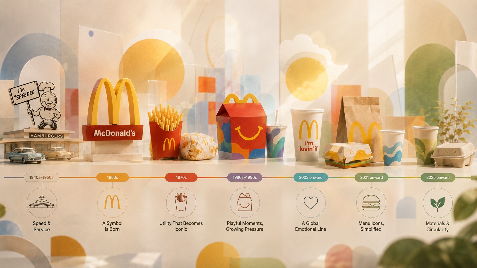
The strongest McDonald’s design moments share one pattern: they turn one simple idea into massive repetition.
| Era | Strong design move | Problem or tension |
|---|---|---|
| 1940s-1950s | speed made visible through architecture and service | early identity was still fragmented |
| 1960s | Golden Arches became the central symbol | architecture and logo had to separate |
| 1970s | red fry box turned utility into memory | disposability grew with scale |
| 1980s-1990s | Happy Meal and promotions made packaging playful | foam and waste became public pressure |
| 2003 onward | i’m lovin’ it gave the brand a global emotional line | pop-culture freshness needs constant renewal |
| 2021 onward | Pearlfisher packaging made menu items into icons | minimalism can become generic if the details weaken |
| 2025 onward | materials and circularity become brand proof | recycling infrastructure differs by market |
The future McDonald’s will probably be more restrained visually but more complex operationally.
The packaging must be:
That is a hard design problem, but also a very good one.
The strangest thing about McDonald’s design is that many of its most important decisions are invisible when they work. A fry box that fills faster, a wrapper that reads without language, or a cup that sorts more easily can matter more than a spectacular campaign image.
McDonald’s started with speed. Then it found a symbol. Then it turned packaging into memory. Then it had to face the environmental cost of massive convenience.
That is why the brand remains such an interesting design case.
It is not only about the Golden Arches. It is about how one visual idea survives across buildings, boxes, bags, cups, toys, apps, drive-thru screens, and local markets.
The best McDonald’s design work knows when to stay simple. The hardest future work will be making that simplicity more responsible.
News, insights, case studies, and more from the rausr team — straight to your inbox.
Send us your brief, your wildest idea, or just a hello. We’ll season it with curiosity and serve back something fresh, cooked with care.