Metro Orientation Design: How to Communicate Fast Under Pressure
Metro wayfinding design research: what great navigation must contain, how it works under stress, and which cities set the standard.

Metro wayfinding design research: what great navigation must contain, how it works under stress, and which cities set the standard.
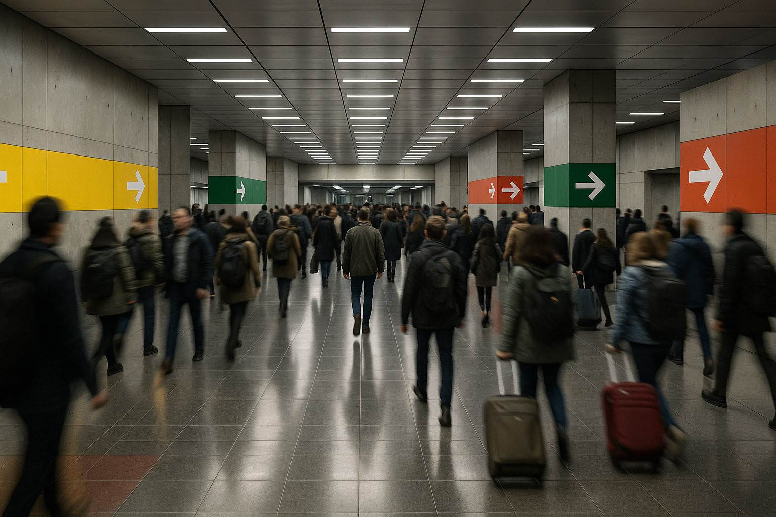
Metro navigation is one of the most unforgiving design environments on earth: low light, noise, time pressure, crowded platforms, many languages, tired bodies, and one simple requirement:
The message must land in seconds — even when the mind is overloaded.
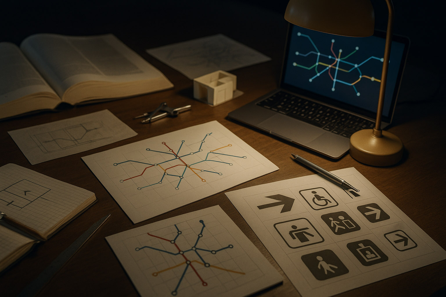
This is why metro wayfinding is not “just signage.” It is a full orientation system: maps, typography, color logic, symbols, architecture cues, announcements, and digital layers that help people move correctly through space with minimal thinking.
In the street, people can stop, look around, and recover. In the metro, the environment punishes hesitation:
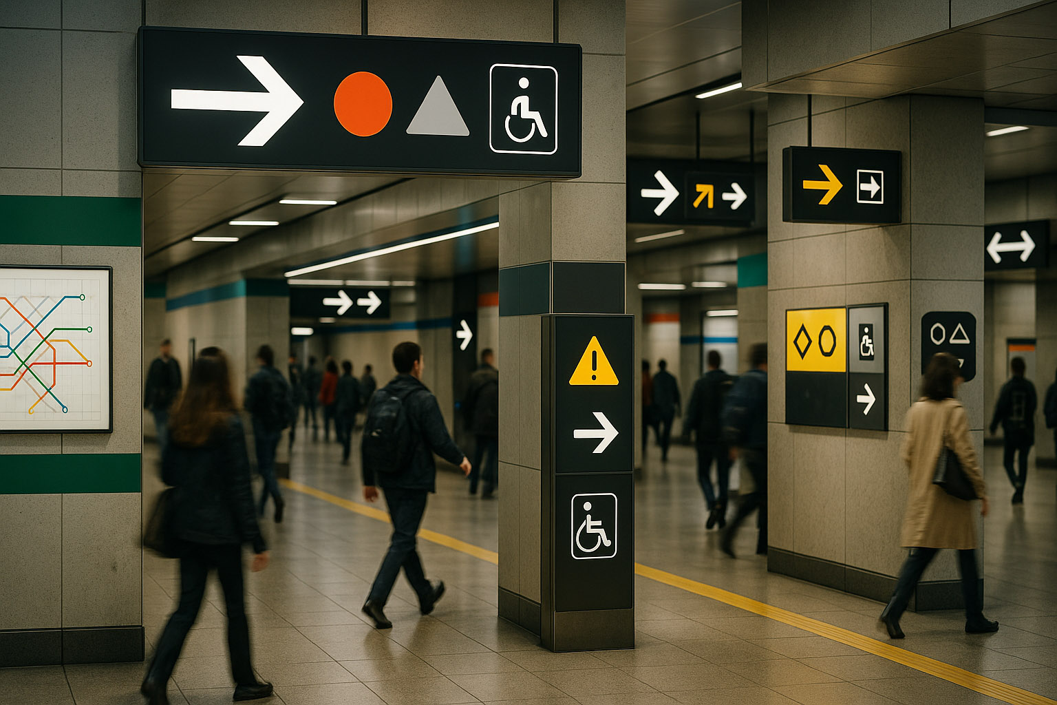
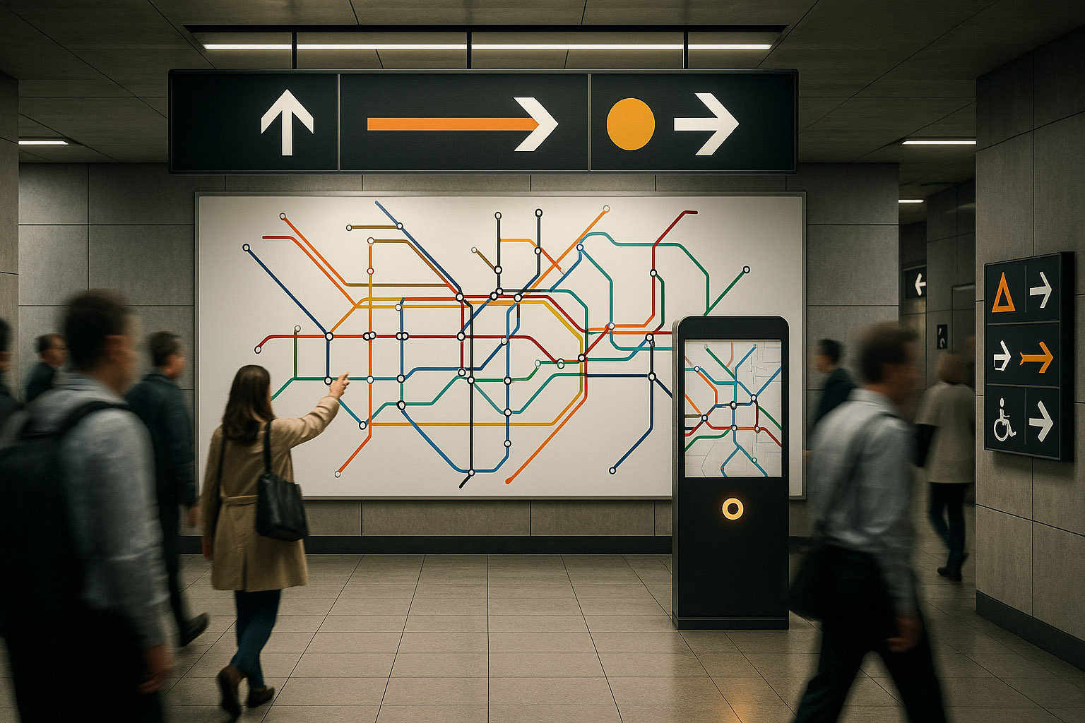
Design has to support fast perception, not careful reading. In practice, that means you design for:
Kevin Lynch described how people form “mental maps” of cities (paths, nodes, landmarks). Underground, you lose most of that — so the graphics must become the landmarks.
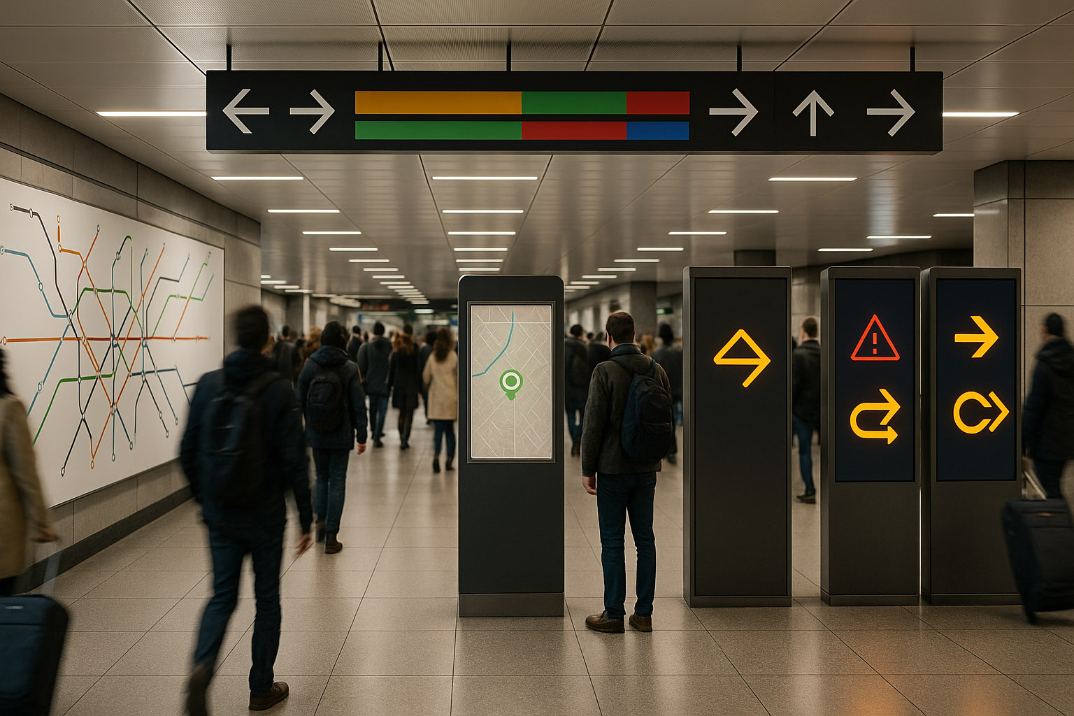
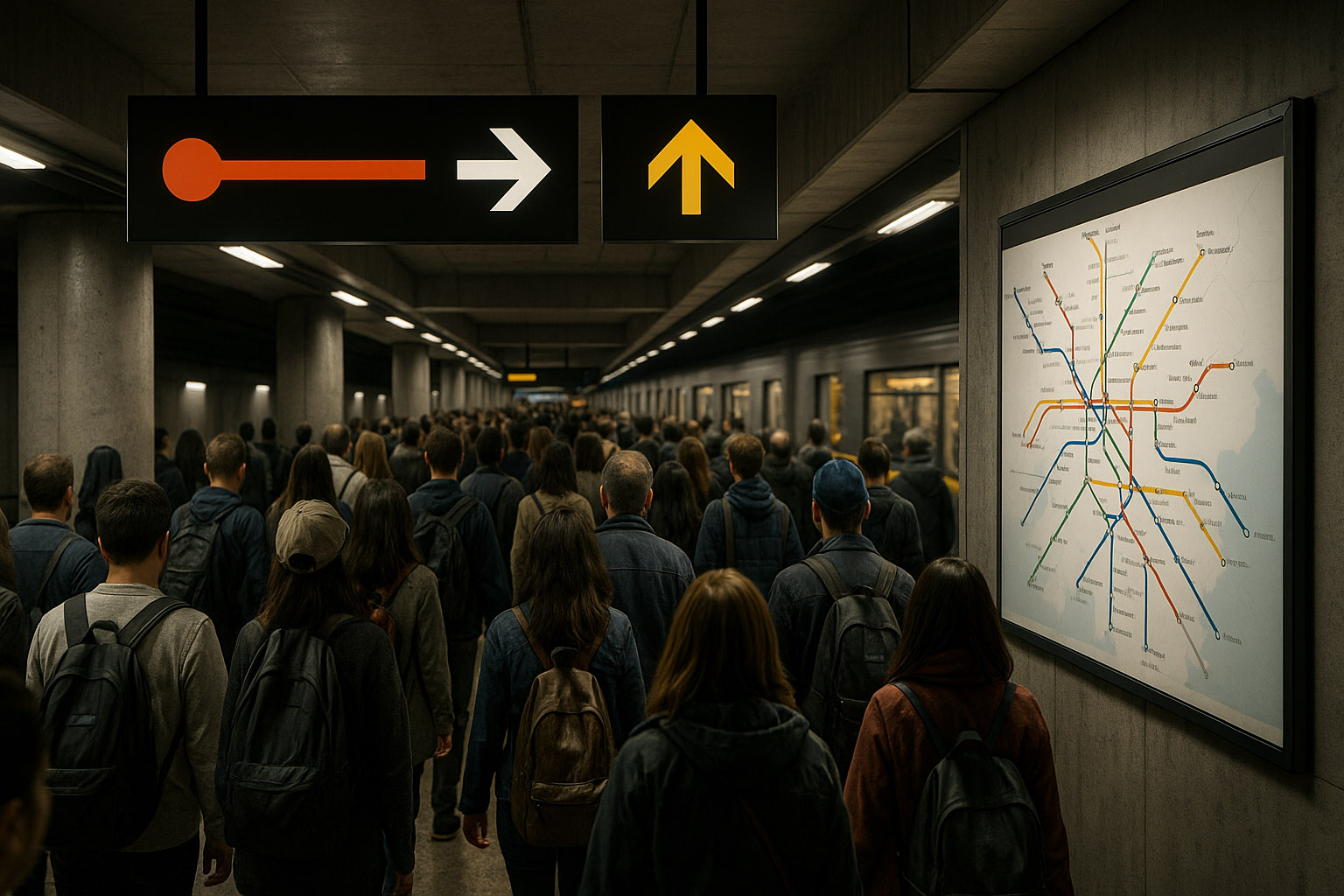
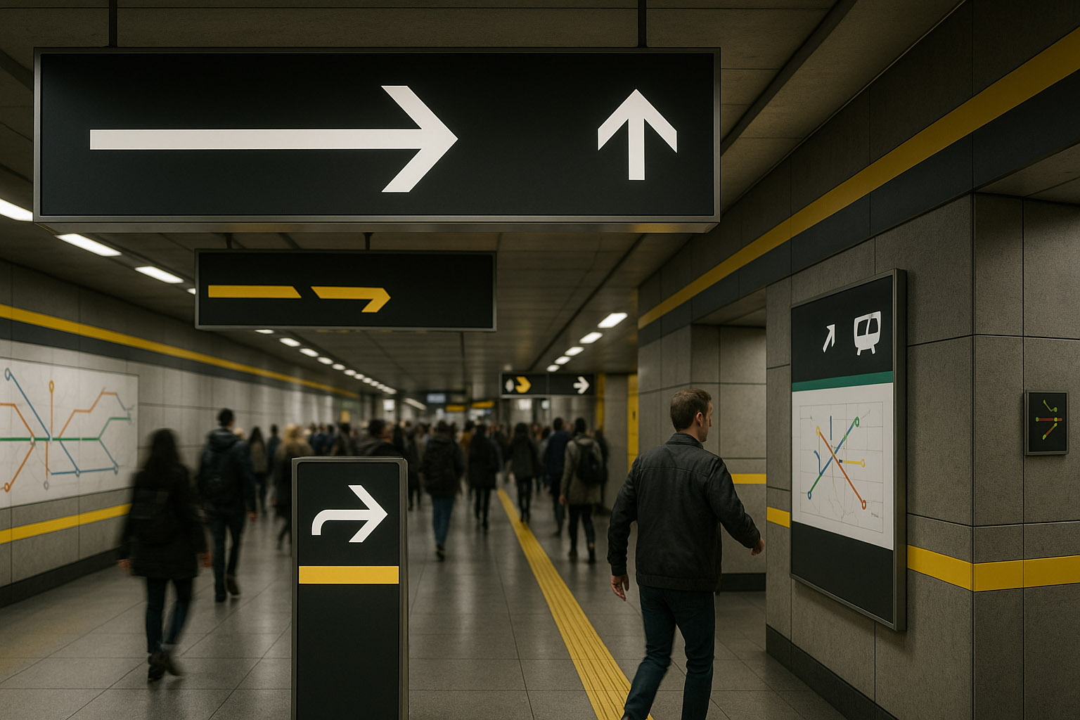
Think of a metro system as an information stack. If one layer fails, the next should still work.
Not one “pretty poster,” but a working tool:
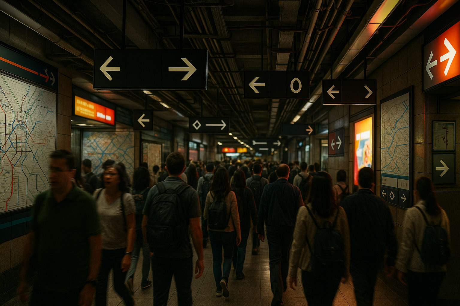
This is the real battlefield:
The “I found the station, now where is the street?” problem:
The best static systems still fail if disruption messaging is weak:
Metro messages should be designed to be recognized, not read.
Rule of thumb used by many wayfinding teams: if your system requires searching, it’s already late.
People learn the system by repetition:
Inconsistent rules force “new learning” under stress, which is the fastest path to wrong turns.
The best systems repeat the message in different forms:
But they avoid repeating everything everywhere. Redundancy is a safety net; clutter is a trap.
Some people think in color, some in numbers, some in shapes, some in language. Great metros allow multiple “routes to understanding”:
The system should assume users will miss information. A resilient metro:
“Good wayfinding doesn’t just tell you what to do — it calmly confirms you’re still doing it right.”
| Element | Why it matters under stress |
|---|---|
| Line identity (color + name/letter) | Color alone fails for color‑blind users and low light |
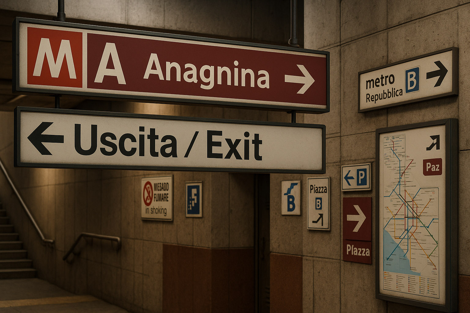
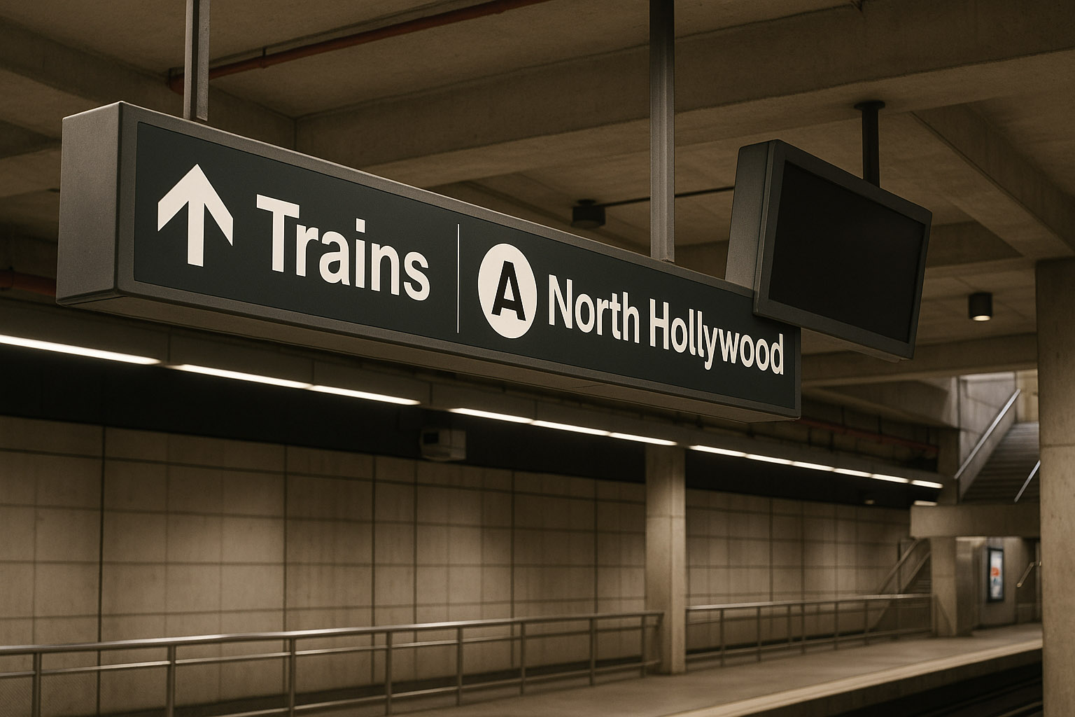
| Direction defined by terminus | “Uptown/Downtown” is unclear to visitors; end-stations are universal |
| Transfer info before decision points | People need time to prepare mentally and physically |
| Exit coding (numbers/letters) | Turns the “maze” into a simple selection problem |
| Station confirmation after turns | Prevents “did I go the right way?” anxiety |
| Accessibility markers (step-free, elevators) | Must be visible early, not discovered too late |
| Disruption messages with alternatives | “Closed” is not guidance; routes are guidance |
| Consistent typography + pictograms | Reduces cognitive load and multilingual friction |
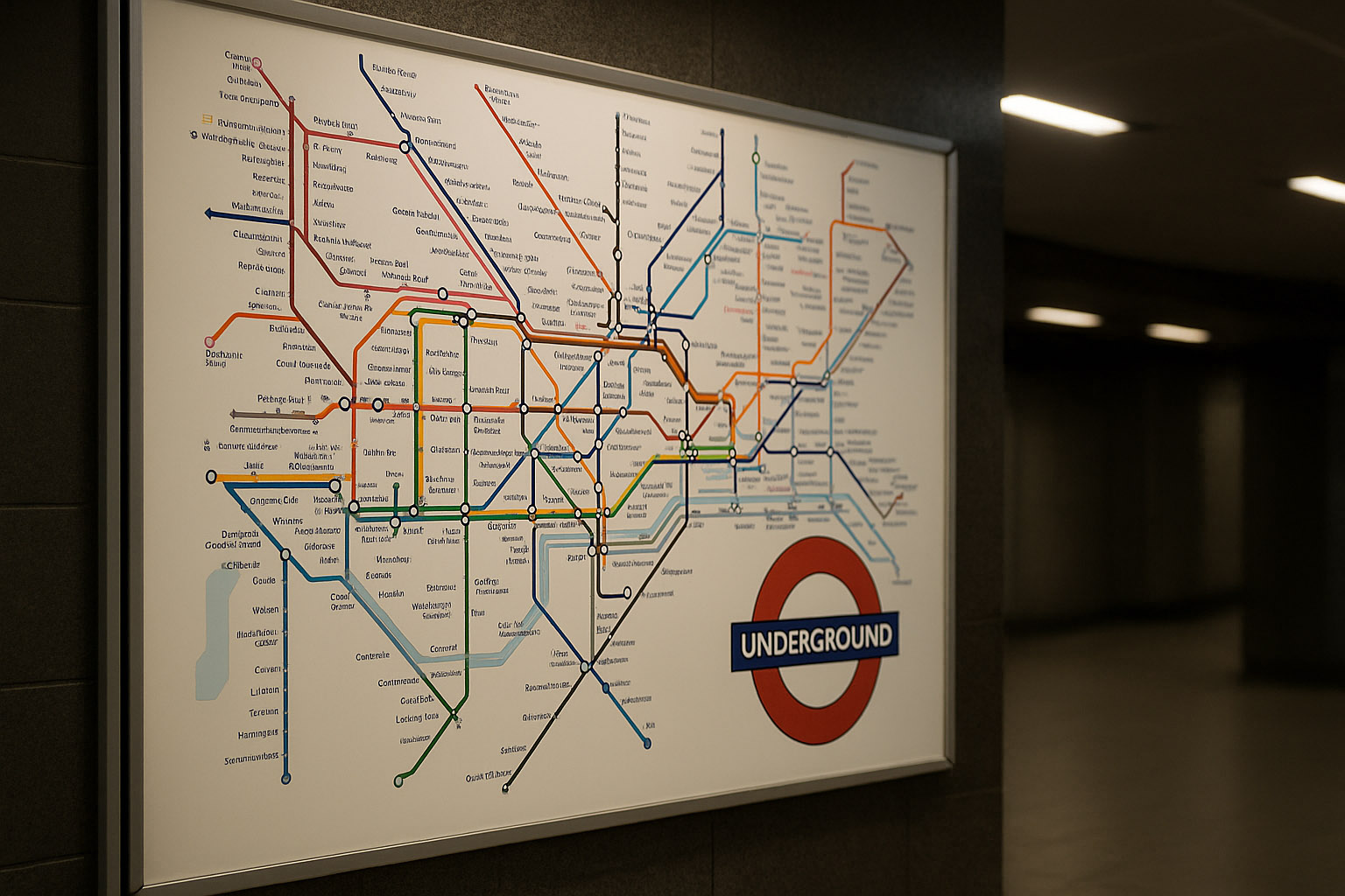
Author to know: Harry Beck (1930s), whose diagram treated the network like an electrical circuit: topology first, geography second.
What London got right:
Less-known detail: Beck’s map was initially not embraced as “accurate,” but its usability quickly proved itself — because metro users don’t need geographic truth, they need decision truth.
Author to know: Jean François Porchez, designer of the Parisine typeface family created for RATP to unify signage and printed information.
What Paris often gets right:
The hard part in Paris is complexity: deep interchange stations and mixed heritage signage can create “era collisions.” The best parts of the system are where the rules stay consistent despite the historic layers.
What makes it strong:
MTR is a good example of “calmness as a feature”: the system feels quieter than the crowd.
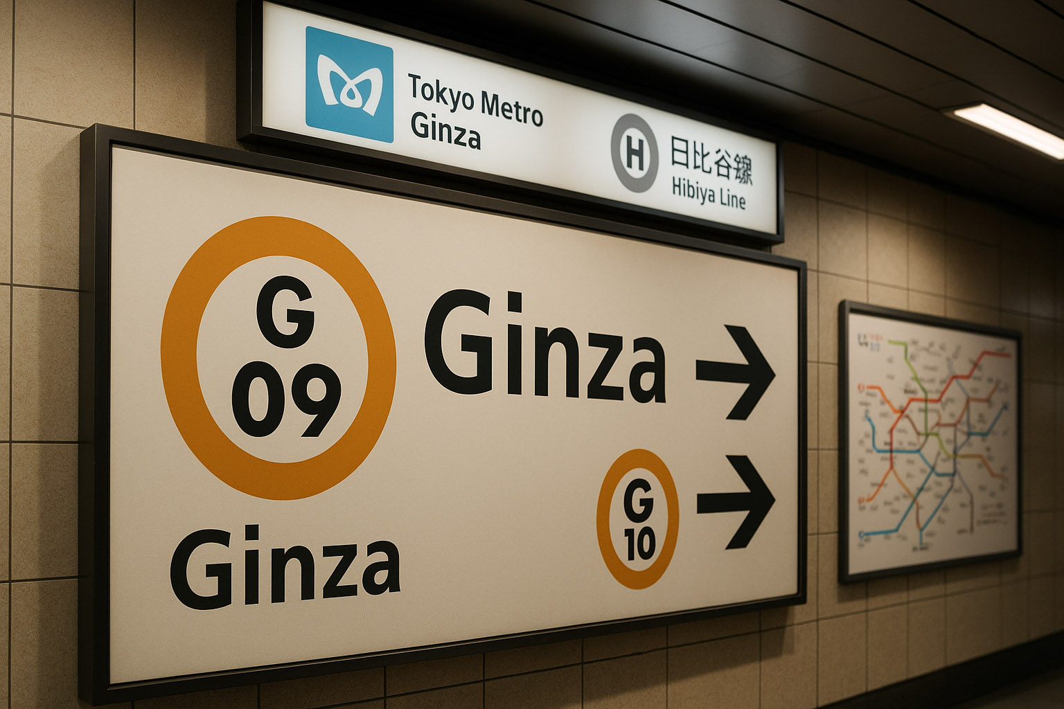
Tokyo is complex because it is many networks in one city. But one highly effective move is the use of line and station codes (letters + numbers), which help users who cannot read kanji recognize and confirm routes quickly.
This is a key insight: in high-density systems, codes reduce language dependency and improve error recovery (“I’m at G-09, next is G-10”).
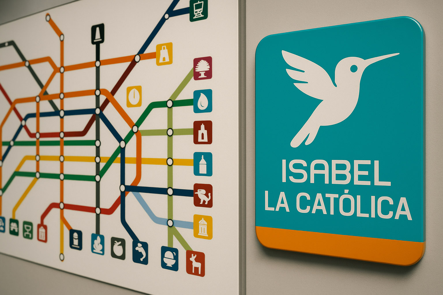
Author to know: Lance Wyman (with local collaborators), who helped develop a pictogram-based station identity system.
Why it works:
Less-known design insight: pictograms are not decoration here — they are a memory prosthesis.
Bad metro navigation is rarely “ugly.” It’s usually unclear under pressure. These are typical failure modes:
When a single map attempts to be:
…it becomes unreadable. Great systems often split the job: a diagram for decisions, and a local map for geography.
If line identity is only color, many users lose the system:
Better: color + name + code + icon pattern when necessary.
Switching between “Northbound,” “Platform 2,” “Direction City Center,” and “To Line X” without a stable rule forces interpretation every time. Under stress, interpretation fails.
When signs compete with:
…the environment becomes a visual noise field. Wayfinding needs visual priority in the space, not just in the graphic.
If the first time you learn about a transfer is at the split, you get crowd-blocking and panic decisions. The best systems pre-announce transfers early and repeatedly.
Not very known (but useful) wayfinding truths:
Modern metro navigation is a design test of empathy and discipline. The winners don’t win because they are stylish — they win because they reduce mental load:
If you want to judge a metro wayfinding system, don’t ask: “Is it pretty?”
Ask: “Can a tired visitor understand it in two seconds and still feel calm?”
“The best metro design is invisible: you don’t notice the system — you just keep moving.”
News, insights, case studies, and more from the rausr team — straight to your inbox.
Send us your brief, your wildest idea, or just a hello. We’ll season it with curiosity and serve back something fresh, cooked with care.