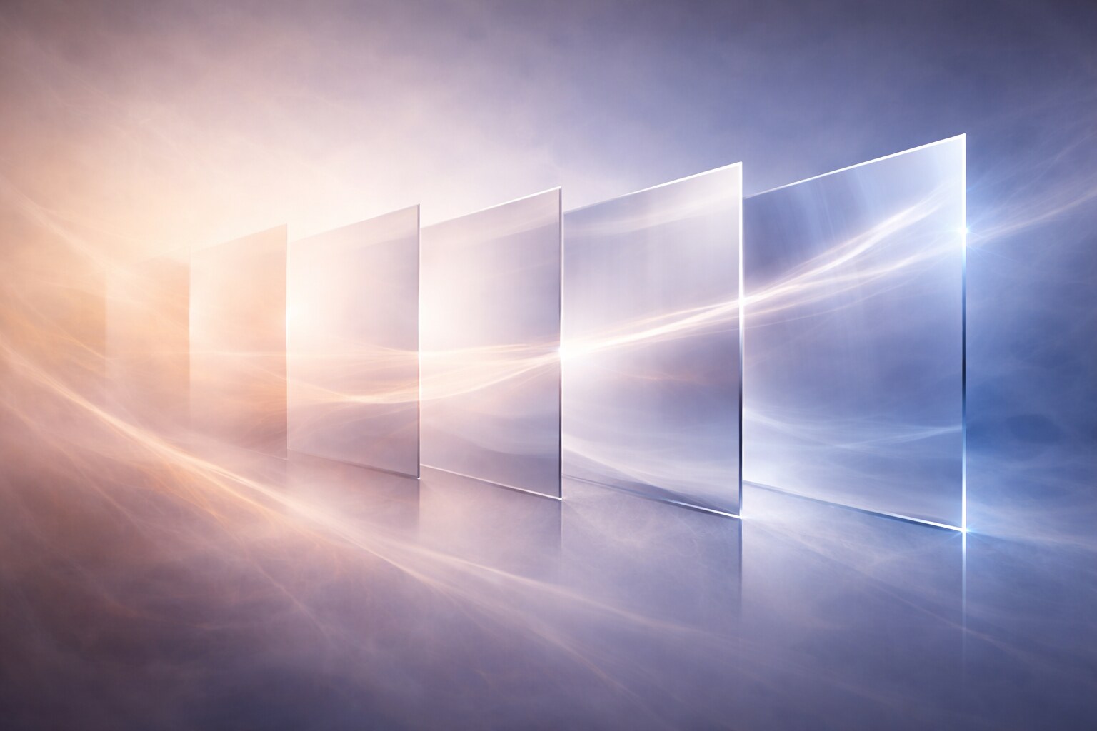
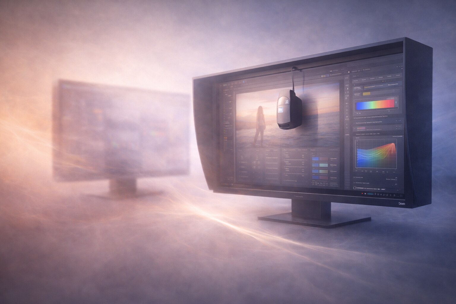
Resolution is one of those topics designers argue about in two equally misleading ways.
One camp says high resolution changes everything. The other says it barely matters and good design is good design on anything. Both views contain part of the truth, but neither is precise enough to help someone choose a monitor or understand what actually improves with each step from HD to 4K, 5K, or 6K.
The reality is more interesting. Resolution changes how clearly you inspect, how comfortably you work, how accurately you judge small details, and how much space you have at useful scaling levels. But it does not replace hierarchy, taste, contrast control, typography skill, or concept quality. A weak layout does not become smart on a 6K screen. It just becomes a weak layout in exquisite detail.
If you want the broader hardware context first, continue with Pixel-Perfect or Overrated? The Role of Display Quality in Graphic Design. If you want the panel-tech timeline around this topic, pair this with From CRT to OLED.
“Higher resolution does not invent better design principles. It mainly gives you a more honest microscope.”
Does resolution really change design quality?
Yes, but not in the mystical way people sometimes claim.
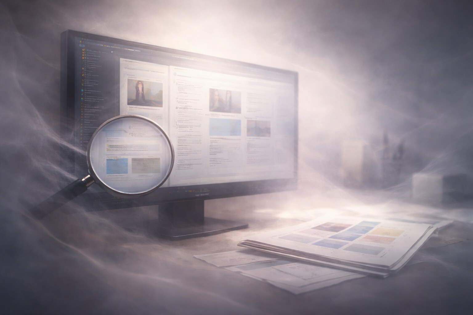
What resolution changes first is visual certainty. Fine text edges look cleaner. Thin strokes become easier to judge. Small interface elements stop shimmering. Retouching artifacts reveal themselves sooner. You spend less time wondering whether a line is actually misaligned or whether the screen is just soft.
That matters a lot in work where detail is the product:
- interface design with tiny spacing decisions
- typography-heavy layouts
- iconography and vector refinement
- photo retouching where halos, sharpening, and dust need to be seen early
But the underlying logic of design does not change with pixel density.
- A headline still needs hierarchy.
- A poster still needs composition.
- A brand system still needs consistency.
- A landing page still succeeds or fails on clarity, not on how expensive the monitor was.
So the right conclusion is not “resolution is overrated” and not “resolution is everything.” The better conclusion is that higher resolution reduces doubt and friction, especially during refinement.
Many designers confuse resolution with overall display quality. In practice, sharpness, coating, contrast behavior, color accuracy, scaling quality, and uniformity often shape the experience just as much as pixel count.
Can excellent work still happen on an old HD monitor?
Absolutely. It is still possible to make excellent design on an older HD or Full HD display. History alone proves that. Designers produced world-class branding, editorial systems, posters, and print work long before Retina-class screens became common.
What changes on an older monitor is not your ability to think. It is the amount of compensation your workflow must provide.
If you design on an older 1920 x 1080 or 1920 x 1200 screen, you usually have to be more disciplined about:
- zooming in and out instead of trusting one view too much
- checking typography at multiple sizes
- proofing on other devices before approval
- printing tests when print accuracy matters
- not mistaking softness for elegance
This is why skilled designers can still work surprisingly well on modest hardware. They learn not to trust the monitor blindly. They verify. They compare. They build a process around the limitation.
At the same time, there is no reason to romanticize old HD screens. They are more tiring for dense UI work, less convincing for micro-spacing, and often bundled with weaker panels overall. The design can still be excellent, but the experience is usually slower and less forgiving.
If you want the workflow side of that tradeoff, continue with One Monitor or Many?, where screen space, focus, and physical comfort become part of the same conversation.
“A talented designer can outwork a mediocre monitor. But a better monitor still removes avoidable friction from the day.”
HD, 2K, 4K, 5K, and 6K: what actually changes?
The jump from one resolution class to another is meaningful, but only when you combine it with screen size and scaling.
That is the part buyers often miss.
A 27-inch 1440p monitor and a 27-inch 5K monitor may look like a simple “more pixels” story, but the working feel is radically different. A 5K 27-inch display can keep interface elements at comfortable size while rendering them with much finer detail. That is why 5K became so attractive to designers: it does not just give more room, it gives cleaner room.
For context, this is why Apple’s 27-inch 5K and 32-inch 6K displays both land around 218 ppi, while the iPad Pro goes even denser at 264 ppi. The numbers alone do not decide the workflow, but they do explain why some screens feel dramatically calmer and cleaner than others at similar viewing distances.
Here is the practical ladder most designers feel:
| Display class | Typical example | How it feels in real work |
|---|
| Full HD / HD-era | 24" 1920 x 1080 or 1920 x 1200 | Usable, but tighter. More zooming and softer small text. |
| 1440p / “2K” in common monitor language | 27" 2560 x 1440 | A clear comfort upgrade with better space and clarity. |
| 4K | 27" or 32" 3840 x 2160 | Sharper and more detailed, but scaling matters a lot. |
| 5K | 27" 5120 x 2880 | A sweet spot where sharpness and comfortable UI scale meet. |
| 6K | 32" 6016 x 3384 | More room and refinement for large, detail-heavy work. |
There is also an important psychological shift here. Once you move to high-density displays, especially 5K-class screens, you stop evaluating only “space” and start evaluating surface quality. Type looks calmer. Curves look more finished. Long reading sessions feel cleaner. That changes how people judge the tool, even when the design principles underneath are still the same.
Unknown but important detail: the label 2K is used very loosely in the monitor market. Designers often use it as shorthand for 2560 x 1440, even though the term is not very precise outside everyday monitor talk. The useful question is not the label anyway. The useful question is always: how sharp is it at this size and this scaling?
Why Eizo still wins with lower-density panels
This is where the conversation gets more subtle than consumer tech marketing.
If pure density were the only truth, some lower-resolution Eizo ColorEdge monitors would make little sense. Yet they remain deeply respected in photography, prepress, retouching, and color-critical work.
Why? Because those workflows often reward predictability more than spectacle.
What Eizo is really selling is not only resolution. It is a controlled viewing instrument:
- stable panel behavior over time
- strong uniformity across the surface
- serious calibration workflows
- wide gamut support such as Adobe RGB coverage
- built-in or tightly integrated color management logic
- physical design decisions that reduce glare and ambient contamination
That matters because photo editors and print designers often care less about whether text looks jewel-like at absurd density and more about whether neutral grays stay neutral, whether skin tones remain believable, and whether the left side of the panel behaves like the right side.
Lower density can even be practical in some pro contexts. At 24.1 inches and 1920 x 1200, or at 27 inches and 2560 x 1440, interface elements can remain readable without aggressive scaling tricks. Menus, palettes, and proof views stay comfortably legible during long sessions. The screen can feel less like a showroom object and more like a dependable measuring device.
One reason Eizo retains loyalty is that many color-critical designers are not buying a display to be impressed. They are buying a display to distrust less.
This is also why a glamorous consumer panel can disappoint in a serious studio. If the screen is glossy, inconsistent, over-punchy, or unstable across brightness levels, it may look stunning and still be a weaker tool for hard production decisions.
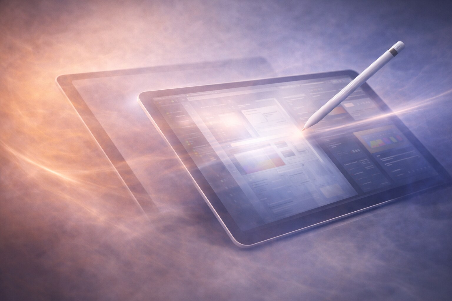
Designing on an iPad: brutal density, different reality
The iPad is the counterexample that keeps this topic honest.
Its display density is extremely high, and that sharpness feels wonderful. Lines look crisp. Pencil input feels immediate. Images appear polished and tactile. For sketching, illustration, markup, moodboarding, and concept exploration, the screen can feel almost luxurious.
But density alone does not turn the iPad into the perfect design monitor.
The tradeoffs are different:
- the screen is small relative to desktop work
- the interface is touch-first rather than pointer-first
- long production sessions can be less ergonomic
- glossy viewing conditions affect perception
- multi-window precision still behaves differently than a full desktop setup
This is why designers often love the iPad for certain phases and still return to larger monitors for final refinement, layout systems, prepress checks, or multi-app production work.
The interesting lesson is that the iPad proves how seductive density can be. Once you see 264 ppi-class sharpness in your hand, ordinary desktop displays can start looking coarse. But the iPad also proves that resolution is not the whole workstation. Workflow structure, size, posture, file handling, and app maturity still matter.
If you want the device-specific branch of this argument, continue with Designing on iPad: A New Era or Just a Portable Experiment?.
Unknown truths, fun facts, and the wrong conclusions
This topic is full of half-true assumptions, so it helps to separate signal from mythology.
Some useful facts and less obvious comparisons:
- A sharper display can make average typography look better than it really is. That is helpful for comfort, but dangerous if your audience mostly sees the work on ordinary laptops.
- A 27-inch 5K display and a 32-inch 6K display can land in a very similar density zone. The larger one does not just mean “sharper.” It means larger working area at similar refinement.
- Old CRT-era thinking about resolution was fundamentally different. Those displays did not behave like fixed-pixel LCDs, which is one reason older designers experienced “sharpness” differently from today’s designers.
- Many designers buy for resolution when the bigger upgrade would actually be panel quality or calibration.
- The wrong path is chasing density while ignoring brightness behavior, coating, uniformity, and viewing comfort.
There are also a few mildly funny truths:
- The phrase “I need 6K for design” is sometimes really code for “I want cleaner text and a more luxurious desktop.”
- Designers often notice bad anti-glare coating faster than they notice a spec-sheet victory.
- A lot of the internet talks about 4K as if it ends all arguments, but at 27 inches the scaling conversation starts immediately.
And one sad fact belongs here too:
- some teams spend thousands upgrading screens while still approving typography, spacing, and color decisions through unstructured feedback loops that no monitor can fix
“The big changer in this era is not that design principles were replaced. It is that modern displays let us inspect our work with far less blur, far less doubt, and far less excuse.”
Summary
Monitor resolution matters in graphic design, but it matters in a precise way.
It improves clarity, confidence, detail judgment, reading comfort, and in some setups the usable sense of space. It does not magically improve the concept, the hierarchy, the taste, or the strategy. Those remain human.
That is why excellent design is still possible on an older HD monitor, especially when the designer works with discipline and cross-checks output. It is also why higher-density screens still feel transformative once you spend long days refining type, icons, photos, or interfaces. They do not change the fundamentals of design. They change how honestly and comfortably you can inspect those fundamentals.
The healthiest conclusion is probably this:
- Buy more resolution when it removes real friction.
- Buy better panel quality when color trust matters more than spectacle.
- Do not confuse luxurious viewing with better decision-making.
For many designers, 4K or 5K is the practical sweet spot. For some color-critical specialists, a lower-density Eizo still makes perfect sense. And for iPad users, brutal pixel density proves a powerful truth of its own: sharpness is wonderful, but workflow still decides the final quality.