Most Famous Fashion Brands: The Story Behind Their Brand Design
From Chanel and Louis Vuitton to Prada and Versace. How famous fashion brands built their visual identity, which designers shaped them, where they succeeded, where they failed.


From Chanel and Louis Vuitton to Prada and Versace. How famous fashion brands built their visual identity, which designers shaped them, where they succeeded, where they failed.
Fashion brands do not become iconic only because the clothes are good.
They become iconic because they build a system people can recognize at a glance: a silhouette, a monogram, a serif wordmark, a pattern, a metal detail, a campaign tone, a packaging ritual, a type of confidence. In the strongest cases, the brand design becomes so consistent that people can identify the house before they even see the logo.
That is what makes fashion branding unusually fascinating. It sits between product design, graphic design, mythology, retail psychology, celebrity culture, and social status. A luxury house is not only selling garments or leather goods. It is selling a repeatable visual world.
If you want the broader branding framework first, continue with Branding Codes That Stick. If you want the more logo-focused branch too, pair this with The Process Behind Iconic Logo Design.
“The strongest fashion brands do not merely own a logo. They own a visual grammar.”
This article follows eight houses whose brand design shaped not just fashion, but global ideas of taste, aspiration, and status: Chanel, Louis Vuitton, Gucci, Burberry, Dior, Saint Laurent, Prada, and Versace.
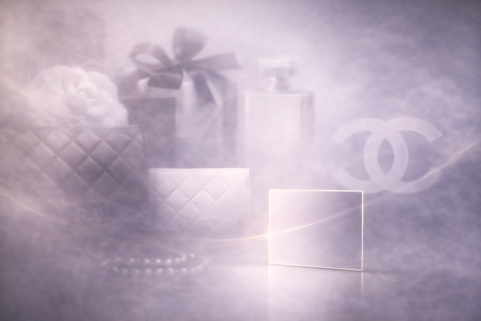
Chanel is one of the clearest examples of how a fashion brand can become larger than any single season.
Gabrielle “Coco” Chanel built the house around reduction long before modern minimalism became a broad commercial language. The visual system was never just the interlocking CC. It was black and white restraint, camellias, quilting, chains, high contrast, perfume geometry, and a kind of controlled luxury that felt modern without trying too hard.
The genius of Chanel’s brand design is that it does not rely on a loud mark. It relies on an atmosphere.
One overlooked truth about Chanel is that the house succeeded by turning strict limitations into a signature. Instead of endless novelty, it built value through recurrence. That is much harder than it looks.
Funny detail: Chanel packaging is so visually strict that many people can identify it from a ribbon, a box edge, or a bottle cap before seeing the wordmark clearly.
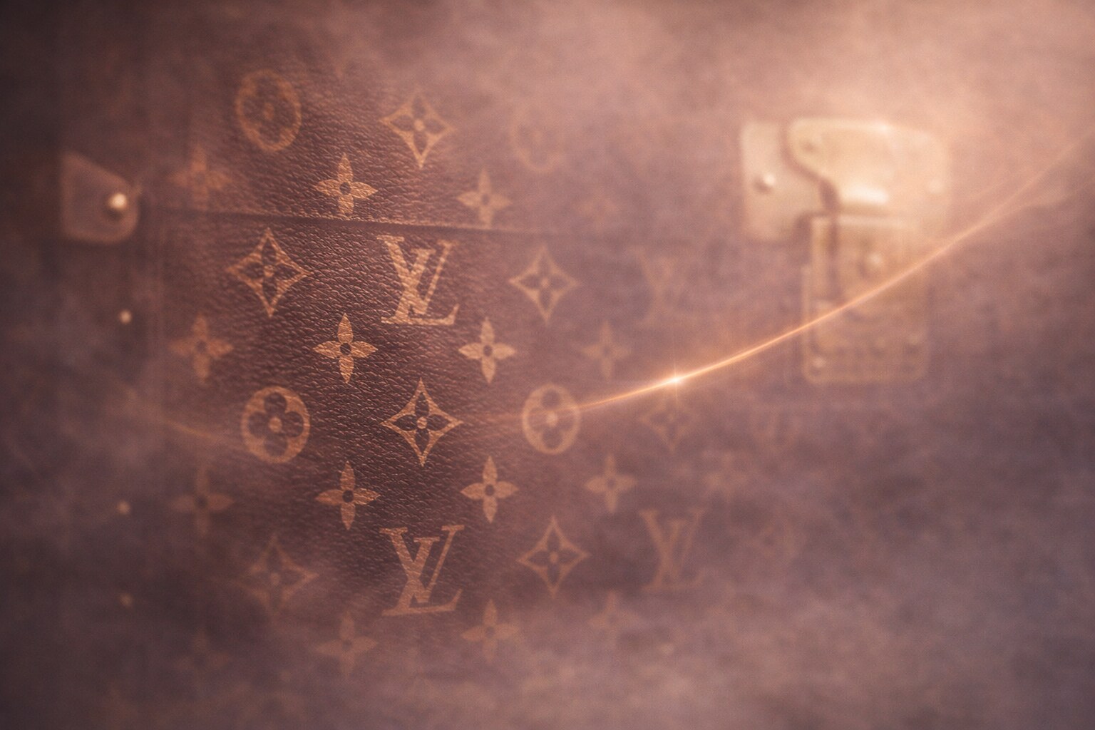
Louis Vuitton is one of the best historical reminders that a pattern can become more powerful than a logo.
The house’s monogram canvas was introduced in 1896 by Georges Vuitton, partly as a response to imitation. That origin matters because it explains why the mark feels both decorative and defensive. It was not only a branding flourish. It was also a strategic tool.
Over time, Louis Vuitton turned travel heritage into an endlessly expandable visual system:
This gave Vuitton a rare advantage. The house could remain deeply traditional and surprisingly elastic at the same time.
Its success came from understanding that monogram is not merely ornament. It is infrastructure.
Its biggest risk has always been overexposure. When the monogram is everywhere, exclusivity weakens and prestige can drift toward pure visibility. Vuitton has spent years managing that tension through craft stories, selective products, and higher-level collaborations.
Louis Vuitton is one of the clearest cases where brand design escaped the logo and became an all-over surface economy. The pattern itself became the product.
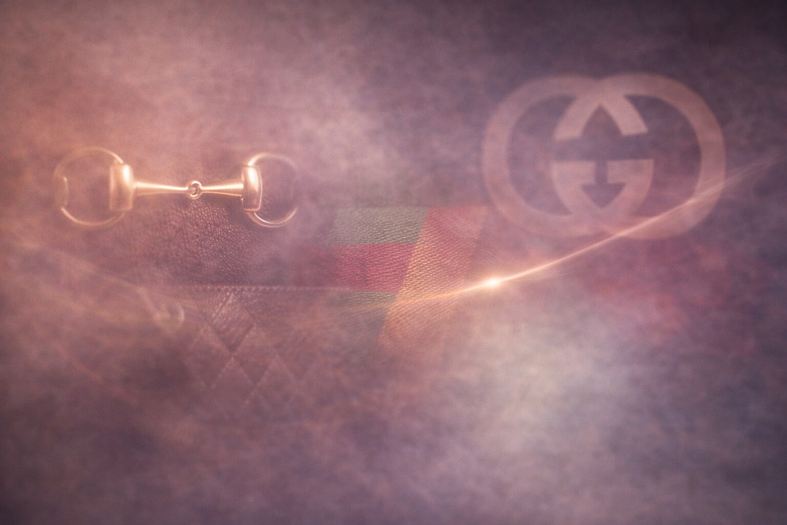
Gucci has survived because it never stayed psychologically fixed for too long.
Founded by Guccio Gucci in 1921, the house built its early codes from travel, equestrian references, leather goods, and Italian craft. Over time, details like the horsebit, green-red-green web striping, bamboo handles, and the double-G language turned Gucci into a house with unusually rich symbolic assets.
But Gucci’s real story is the story of reinterpretation.
Key creative figures changed how the brand felt:
That constant movement is both the success and the risk. Gucci can regenerate faster than many luxury houses, but it also risks confusing people when the pendulum swings too abruptly.
Unknown but useful point: Gucci often wins when it lets contradiction stay visible. Heritage plus provocation is not a flaw in this brand. It is usually the engine.
If you want the broader cautionary version of this problem, continue with Why Companies Sterilize Their Logos. Gucci is often strongest when it resists that sterile instinct.
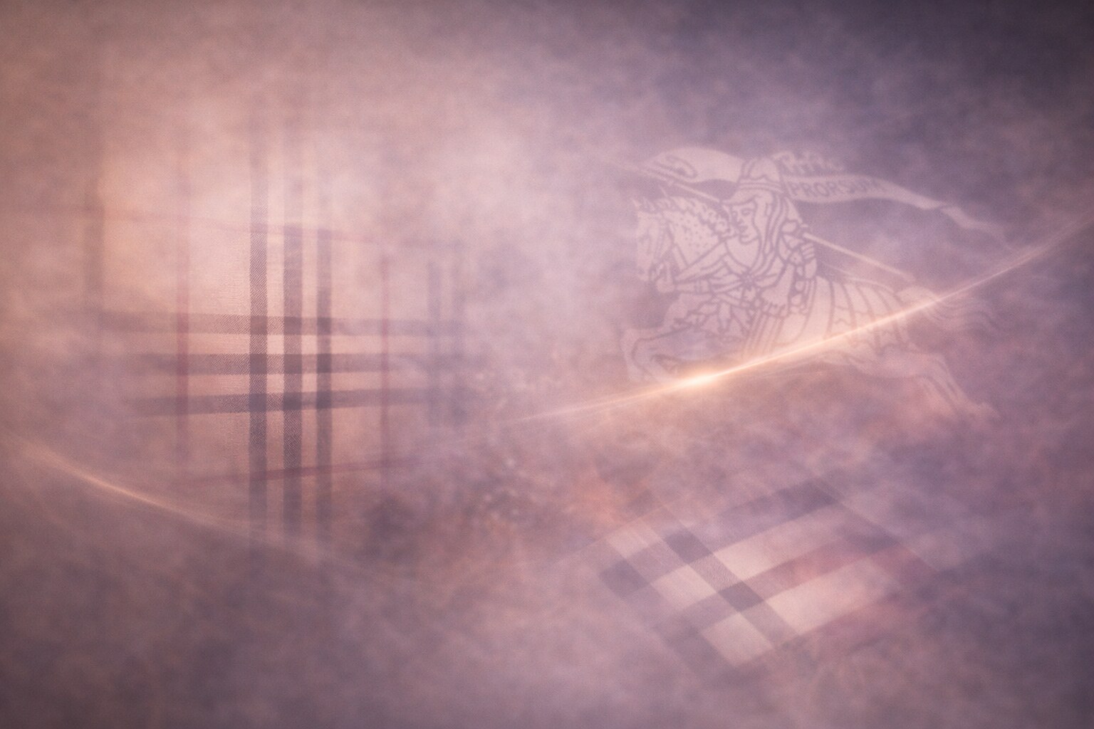
Burberry may be the cleanest lesson in how a legacy brand can over-correct and then recover.
The house began with Thomas Burberry, outerwear innovation, and British utility. Then the visual system expanded through the Burberry Check and later the Equestrian Knight Device, both of which carried a mix of practicality, class, and national identity.
For a while, Burberry’s challenge was not weak recognition. It was cultural drift. The check became so exposed and so widely interpreted that the house had to regain control of its own symbolism.
That led to one of fashion’s most discussed branding pivots:
This is why Burberry is such a useful case study. It shows that simplification is not always progress. Sometimes the unique thing you removed is the exact thing the brand needed.
Funny fact: Burberry’s check reportedly moved from lining to public icon status partly because customers liked the inside enough to turn it outward. That is an unusually literal example of identity escaping the product interior.
Dior’s branding strength comes from clarity with ceremony.
When Christian Dior founded the house in 1946, he was not only launching a couture brand. He was launching a worldview after war: beauty, structure, femininity, and controlled optimism. The famous New Look changed silhouette history, but it also set the emotional tone for the identity.
Visually, Dior has often worked through:
The success of Dior is that it can appear luxurious without screaming. Even when the house becomes more decorative in product or campaign expression, the core brand language usually returns to poise.
The failures tend to happen when product hype temporarily outruns house coherence. Dior can absorb bold moments, but it works best when those moments are framed by a stable couture center.
Unknown insight: Dior’s brand design often behaves more like interior design than logo design. The house sells spatial mood as much as it sells symbols.
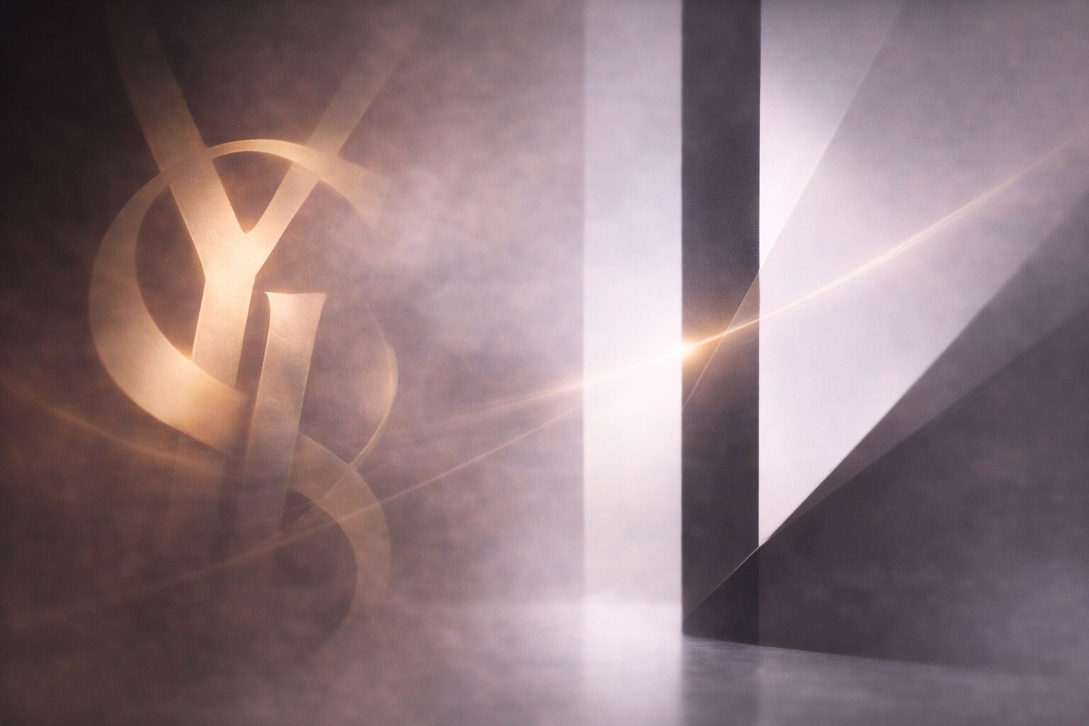
Saint Laurent is fascinating because it operates with two voices at once.
On one side there is the classic YSL monogram, designed in 1961 by A.M. Cassandre, one of the most important graphic designers of the 20th century. On the other side there is the cleaner Saint Laurent wordmark direction associated with the Hedi Slimane era.
That could have become a branding conflict. Instead, it became a system.
This is one of the smartest brand-design lessons in luxury: not every house needs one perfectly singular mark. Some need a hierarchy of marks with different emotional jobs.
Its main failure was not visual collapse, but audience shock. When Yves disappeared from the ready-to-wear name, some people experienced it as unnecessary rupture. Yet the house ultimately proved that a strong system can survive naming tension if the attitude remains coherent.
If you want the design-history branch behind this section, continue with Graphic Design in the 20th Century. Cassandre is one of the reasons fashion branding and graphic-design history overlap so beautifully.
Prada does not always sell warmth first. It sells intelligence.
That is what makes the brand so distinct. The Prada triangle, the cool typography, the industrial nylon story, and the controlled weirdness of many collections all contribute to a fashion identity that feels cerebral before it feels sentimental.
The foundational house came from Mario Prada, but Miuccia Prada is the figure who transformed the brand into a modern intellectual force. She made Prada feel like a place where ugly could become sophisticated, plain could become radical, and restraint could become provocative.
Brand-design strengths:
Brand-design risk:
Interesting detail: Prada is one of the brands where the smallest hardware application can do massive identity work. A tiny triangle can carry more authority than some full logos.

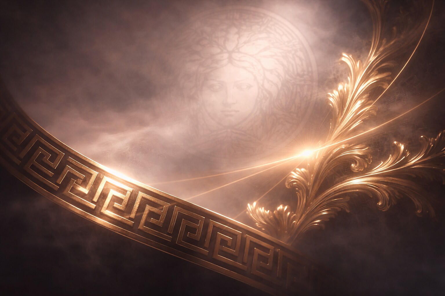
Versace is often described as loud, but the stronger truth is that it is precisely loud.
Gianni Versace built a house whose symbols were never shy: the Medusa, the Greca border, metallic sensuality, baroque confidence, black-and-gold force, and high-voltage celebrity energy. In weaker hands, that mix would collapse into chaos. In stronger hands, it becomes unmistakable.
That is the secret of Versace’s brand design. It shows that maximalism is not the opposite of discipline. It is a different kind of discipline.
Funny fact: the Medusa is so central that Versace can often make a product feel branded even when the wordmark is nearly absent. Few houses can rely on a symbol that hard without dilution.
Versace is a useful antidote to the idea that every premium brand must become flatter, quieter, and more neutral. Sometimes the real luxury move is to stay unmistakably yourself.
If you reduce the current direction of these houses to one short pattern, it looks like this:
This last part is an inference from recent house behavior, not a fixed rule. But the broader direction is clear enough: luxury fashion is becoming even more dependent on recognizable codes, not less.

The most famous fashion brands do not win only because they have money, famous models, or strong retail footprints.
They win because they know what must remain recognizable even while seasons, creative directors, campaigns, and market moods keep changing.
That is why these houses matter to designers outside fashion too. They are some of the clearest live examples of what brand design really is:
“Fashion branding often looks glamorous from the outside. In reality, it is one of the toughest identity disciplines there is. The house must evolve, stay sellable, stay culturally relevant, and still remain itself when seen from six meters away on a bag, a belt, a ribbon, a website, or a storefront.”

News, insights, case studies, and more from the rausr team — straight to your inbox.
Send us your brief, your wildest idea, or just a hello. We’ll season it with curiosity and serve back something fresh, cooked with care.