8 Famous Running Shoe Brands: Logo and Design Evolution
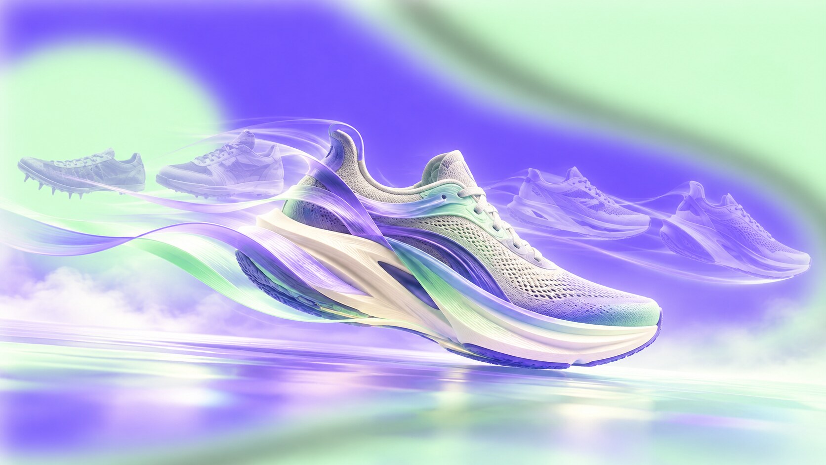
The branding and visual design stories of Nike, adidas, PUMA, ASICS, New Balance, Brooks, HOKA and On, including their designers, successes, wrong turns and future direction.

The branding and visual design stories of Nike, adidas, PUMA, ASICS, New Balance, Brooks, HOKA and On, including their designers, successes, wrong turns and future direction.
Running shoes are unusual branded objects. They have to protect the foot, survive repeated impact, satisfy sports regulations, look fast in a campaign and remain recognizable when the wearer passes at full speed. The graphic identity is not applied after the product is finished. It lives inside the shoe’s structure.
That is why the strongest running brands own more than a wordmark. Nike has the Swoosh, adidas has three stripes, PUMA has the Formstrip, ASICS has its crossed side stripes, New Balance has the N, Brooks has its motion mark, HOKA has an oversized sole and On has hollow CloudTec elements. Some of these details started as functional reinforcement before becoming commercial signatures.
This article examines eight influential and widely recognized brands. It is not a strict valuation ranking. Nike, adidas, PUMA, ASICS and On publish different financial measures; New Balance and Brooks are privately held; HOKA reports through Deckers. A clean league table would compare unlike numbers. The more useful question is how each brand became valuable through a distinctive mixture of product form, logo, typography, athlete proof and cultural meaning.
This story continues our footwear research from From Sketch to Sole: What Shoe Designers Use and connects it with Branding Codes That Stick, where recognizable shapes and behaviors matter more than a logo alone.
“The best running-shoe identities do not sit on the product. They help construct the product.”
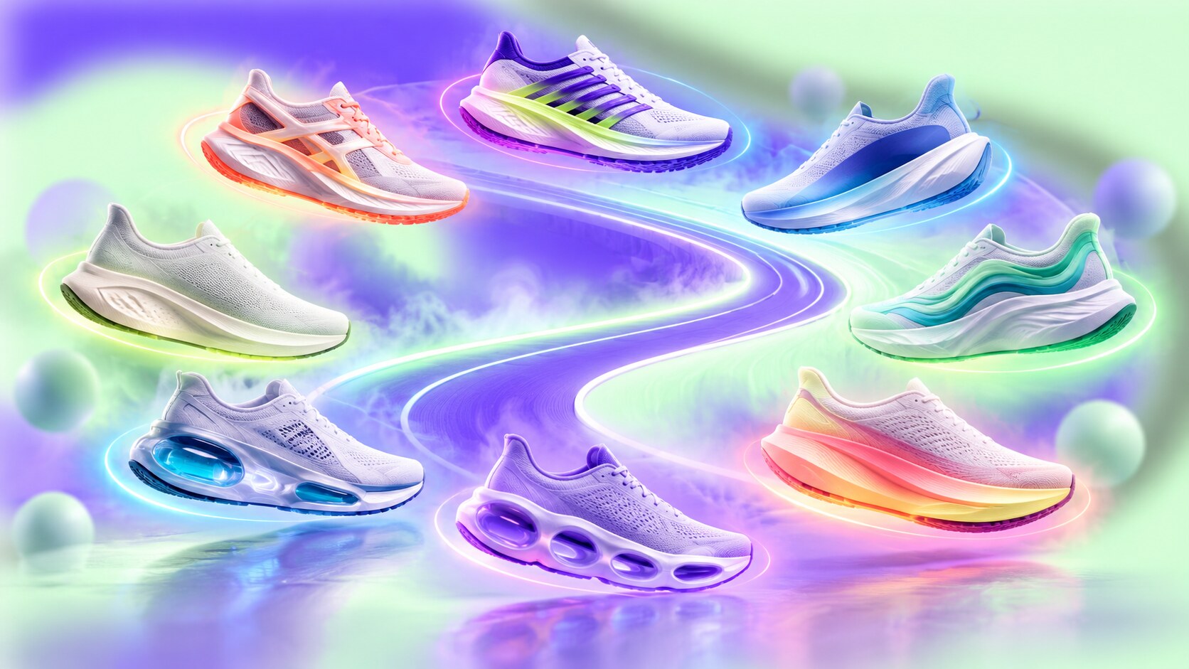
A shoe-box logo works under controlled conditions. A running identity has to work on a moving foot, in a dark race photograph, on a small timing-app thumbnail and across products with completely different technologies.
The side of the upper is therefore premium territory. A mark placed there can stabilize the material, organize overlays and identify the shoe in profile. The outsole and midsole have become equally important. Modern foam stacks are so large that their geometry, cavities and color blocking can communicate a brand before the upper becomes visible.
The most durable systems usually combine four layers:
The blind path begins when one layer is expected to do everything. A famous logo cannot rescue an ordinary product forever. Radical footwear without a clear name or story can become anonymous. An emotional campaign without retail fit and technical trust remains advertising.
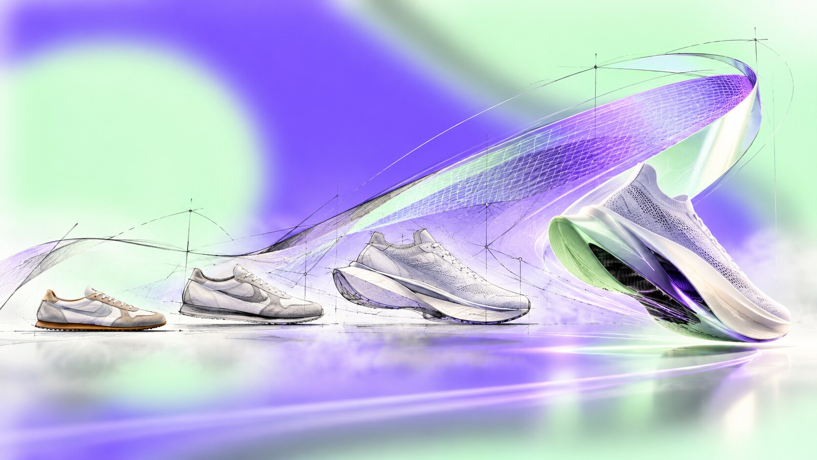
Nike began as Blue Ribbon Sports, the American distributor of Onitsuka Tiger shoes. When the company prepared its own footwear in 1971, Phil Knight needed a mark that would distinguish it from the Japanese products. He commissioned Portland State design student Carolyn Davidson, whom he had previously hired at $2 per hour for charts and graphics.
Davidson drew several shoe stripes. The group chose the curving check that suggested motion, although Knight admitted he did not love it and expected it to grow on him. Davidson invoiced $35. Early factories interpreted the shape inconsistently, and one version was compared to a dead fish, but the Swoosh was already visible on successful runners. By 1974 it could appear alone on apparel, without the Nike name.
Nike later added the verbal half of its identity. Dan Wieden and Wieden+Kennedy created “Just Do It” in 1988. The line moved beyond elite performance because it addressed the moment before action, a psychological space shared by Olympic athletes and first-time runners.
The most successful product decision was to keep making technology visible. Air windows, Flyknit uppers, ZoomX foam and the Vaporfly’s tall, curved stack all became communication devices. Vaporfly changed the visual language of distance racing so decisively that World Athletics introduced clearer limits for sole thickness and embedded plates. Design had become powerful enough to require regulation.
Nike’s recent blind path was not a bad logo. It was allowing famous lifestyle franchises and direct-to-consumer strategy to carry too much of the business while retailer relationships and sport-specific innovation weakened. Leadership later described reducing classic footwear supply, rebuilding wholesale partnerships and reorganizing around sport. The lesson is severe: even the Swoosh loses energy if the product pipeline underneath it becomes predictable.
Fun fact: Nike’s early “Pinwheel” mark was made by arranging several Swooshes in a circle because the asymmetric single mark initially felt awkward on bags and apparel. A temporary application problem created an archive symbol that Nike still revives.
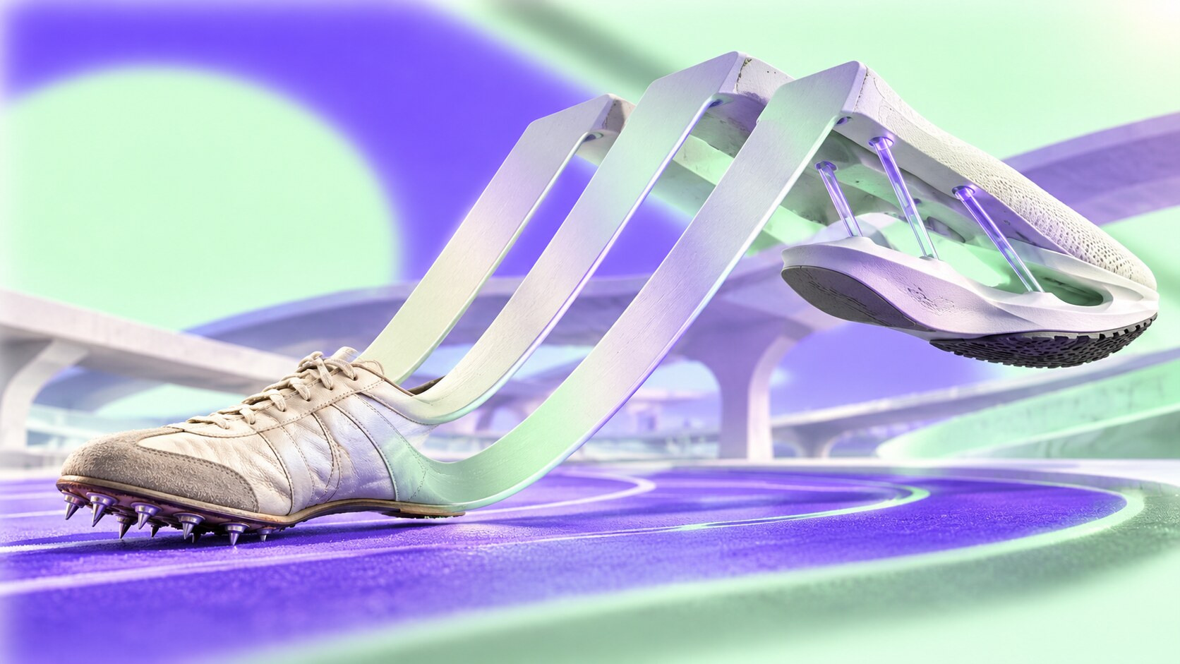
Adi Dassler registered adidas in Herzogenaurach in 1949 and used three contrasting side straps to make his shoes identifiable on athletes. The stripes behaved as reinforcement, decoration and trademark at once. They later moved from shoes onto the sleeves and legs of apparel, turning a local product device into a repeatable spatial pattern.
The Trefoil arrived in 1972 for a company expanding beyond footwear. Its three leaves crossed by stripes became a broad corporate and performance sign before shifting toward the Originals heritage line. In 1991, former Nike creative leader Peter Moore developed the angled three-bar Equipment mark with Rob Strasser. It combined the company’s strongest inherited asset with a harder performance reset.
Moore’s Equipment work is important because it was not only a logo redesign. The range used restricted colors, direct product language and the principle that equipment should meet real athletic needs without excess. adidas was struggling for direction in the late 1980s; a focused sub-brand helped reassert what the company was for.
Running later supplied some of adidas’s strongest visible technology. Boost foam created a pebbled white texture that looked different from conventional EVA, while Adizero racing models used exposed rods and cutaway geometries to signal efficiency. In 2025 adidas reported more than 30% currency-neutral growth in Running, driven by the Adizero family.
The brand’s visual strength is also a management problem. Trefoil, three bars, Badge of Sport, wordmark and three-stripe product graphics can create a rich hierarchy or a confusing shelf depending on how they are assigned. adidas works best when each symbol has a clear job: heritage for Originals, stripped-back bars for Performance and the stripes as the common product language.
Unknown detail: Karhu confirms that it sold its three-stripe trademark after the 1952 Helsinki Olympics. An often-repeated account values the deal at roughly EUR1,600 in today’s money and two bottles of whisky, although the colorful payment detail is not firmly documented. The story is a reminder that a simple product marking can become more valuable than anyone expects.
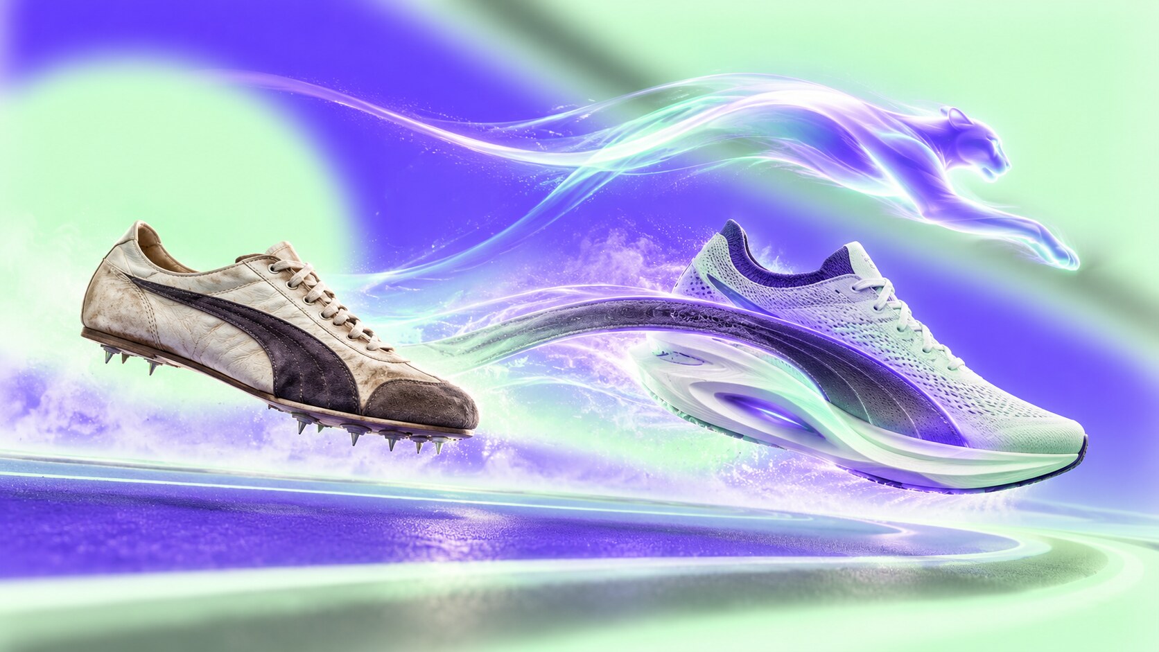
Rudolf Dassler founded PUMA in 1948 after separating from his brother Adi. The first emblem showed a cat passing through a capital D for Dassler. The more durable system arrived in two parts.
The Formstrip was patented in 1958. Its curved side panel originally helped stabilize the foot inside the shoe, making it another example of construction becoming identity. In 1967 German cartoonist Lutz Backes drew the leaping cat that evolved into PUMA’s No. 1 logo. The animal supplied speed, flexibility and attitude; the Formstrip made individual products recognizable from a distance.
PUMA’s history shows how quickly a famous identity can lose price power. By the early 1990s the company was in financial difficulty and had drifted toward a low-price position. Young CEO Jochen Zeitz rebuilt it around premium sport-lifestyle, later using collaborations such as Jil Sander to connect performance archives with fashion.
That recovery also created a tension. Football, motorsport and lifestyle gave PUMA enormous visibility, but running could become secondary inside the same brand. NITRO foam and the Fast-R family have rebuilt technical credibility with highly visible heel structures and aggressive geometry. PUMA reported running growth in 2025 even while group footwear sales fell.
The present challenge is therefore not recognition but focus. PUMA’s own 2025 reporting described low brand heat and poor sales quality as issues requiring a reset. The cat and Formstrip remain excellent assets; the product stories around them need enough consistency to make “Forever Faster” feel like a performance truth rather than only a slogan.
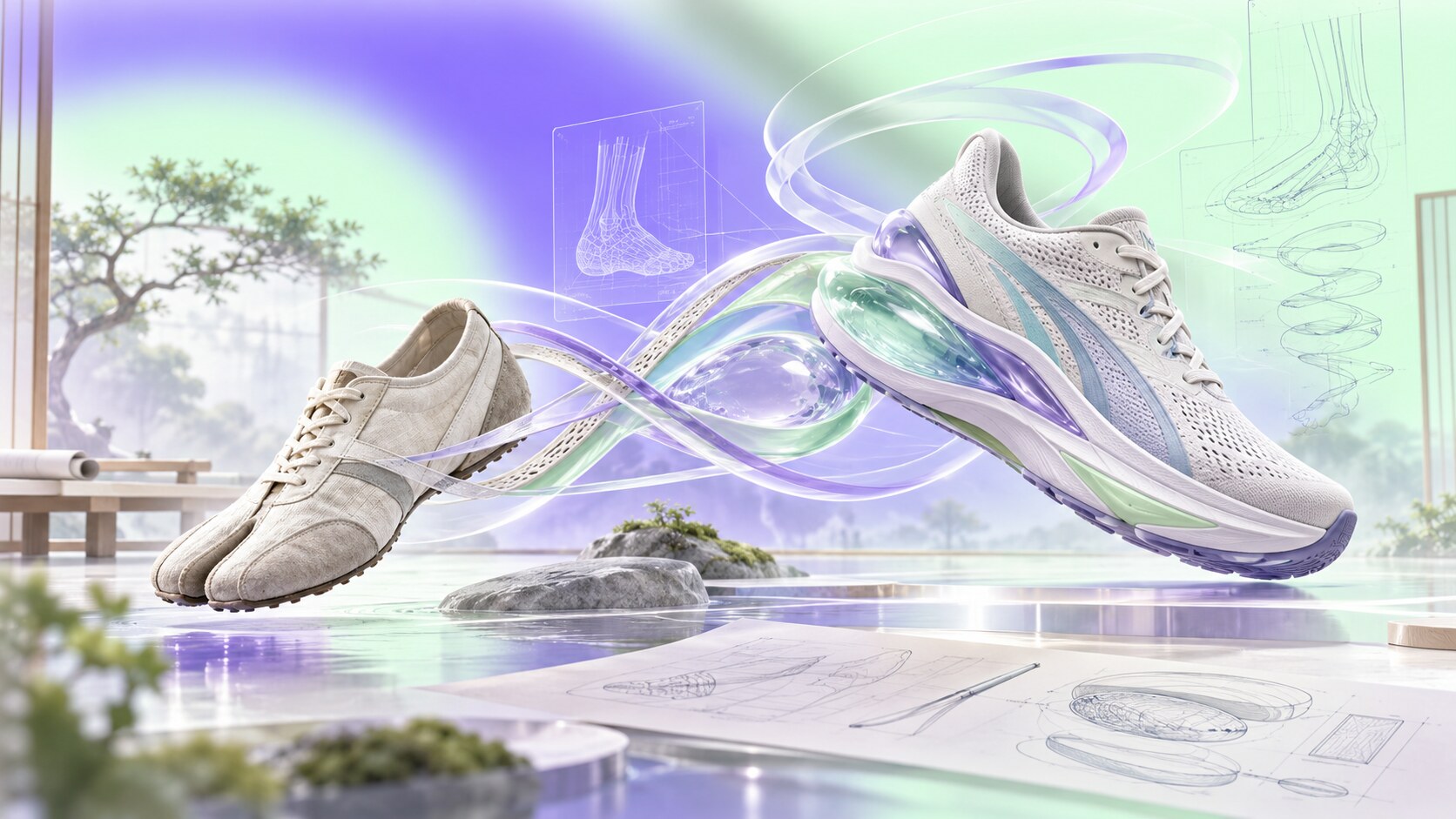
Kihachiro Onitsuka founded Onitsuka Co. in Kobe in 1949 with the goal of supporting young people through sport. Early product ideas came from observation: an octopus-inspired suction sole for basketball, tabi-shaped marathon shoes and a ventilated running shoe influenced by motorcycle cooling.
The crossed Tiger stripes first appeared in 1966. One of the company’s American products was called the Cortez before being renamed Tiger Corsair, a visible trace of the relationship and later split between Onitsuka and Blue Ribbon Sports, the company that became Nike.
ASICS was formed in 1977 through the merger of Onitsuka, GTO and JELENK. The name is built from Anima Sana In Corpore Sano, or “a sound mind in a sound body.” That philosophy gave a technical footwear company a broader human proposition decades before wellbeing became standard sports marketing language.
The modern spiral-a symbol arrived in 1992. JAGDA credits symbol design to Atsushi Takahashi under art director Masa Uehara. ASICS describes it as a stylized “a” expressing unlimited speed and the rotation of related businesses around a central competence. The shoe stripes remained the stronger product identifier, while the spiral worked as a compact corporate sign.
GEL cushioning, introduced in running shoes in 1986, and the GEL-KAYANO series gave ASICS a technical vocabulary customers could follow over decades. The first KAYANO was named after its designer and developer Toshikazu Kayano. This continuity built trust, but it also made the brand appear clinical and conservative during periods when running culture moved toward fashion and softer storytelling.
The successful correction was not abandoning performance. ASICS separated roles: mainline ASICS kept running authority, while the revived Onitsuka Tiger brand carried heritage and style. The blind path would be allowing those worlds to blur until consumers cannot tell whether a product is race equipment, everyday comfort or archive fashion.
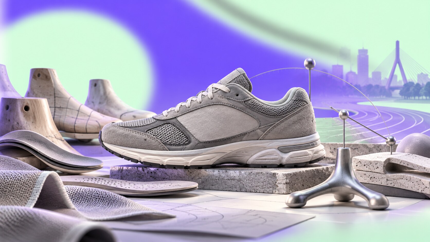
William J. Riley founded the New Balance Arch Support Company in Boston in 1906. Company history says he studied the three-pronged balance of a chicken foot when developing arch supports. The business moved into custom running shoes and launched the Trackster around 1960, notable for a ripple sole and availability in multiple widths.
Jim Davis acquired the small company on the day of the 1972 Boston Marathon. Soon afterward, designer Terry Heckler helped give it a coherent identity. Heckler recommended keeping the old name, created the large N for the side of the shoe and developed the numbering logic that kept attention on New Balance rather than a collection of unrelated model names.
The N was also a manufacturing solution. A detailed NB mark with speed lines was difficult to construct cleanly on the shoe, while one large letter occupied the side panel and replaced earlier support stripes. The 320 carried it into prominence in 1976, when the shoe received a top ranking from Runner’s World.
New Balance later turned practical restraint into a visual code: grey suede, mesh, model numbers and visible Made in USA or Made in UK production. The $100 New Balance 990 of 1982 was unusually expensive, but its price and quiet appearance communicated engineering rather than celebrity.
For years the same restraint could read as uncool or associated with older customers. The comeback came by resisting a total makeover. Collaborations, archive models and a return to visible sport made the existing codes desirable to younger buyers. New Balance reported $9.2 billion in global sales for 2025, according to its business update.
One wrong turn was reputational rather than graphic. Political comments by an executive in 2016 were interpreted as support for Donald Trump, followed by unwanted endorsement from a white-supremacist website. The company publicly rejected bigotry, but the episode showed that a brand can lose control of what its symbols mean when outside groups adopt them.
Fun fact: New Balance’s numbering system was partly a branding decision. Heckler wanted customers to remember the company name, not spend all their memory on poetic names for individual shoes.
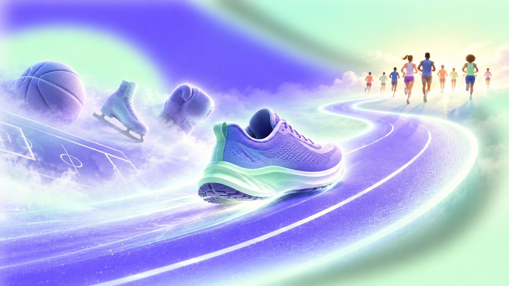
Brooks was founded in Philadelphia in 1914 and spent much of its life making different kinds of athletic footwear. By the turn of the century, that breadth had become a weakness. The company was close to bankruptcy and lacked a sharp reason to choose it over larger multisport brands.
When Jim Weber became CEO in 2001, Brooks committed to performance running and withdrew from less relevant categories. That decision appears limiting on paper. In practice it gave product teams, specialist retailers and communication one audience to understand deeply. Berkshire Hathaway acquired the company in 2006 without forcing it into a broader portfolio identity.
“Run Happy” gave the technical focus a human tone. Competitors often visualized running as discipline, pain or conquest; Brooks could show ordinary runners, humor and community without abandoning biomechanics. Its blue palette and flowing motion mark support that optimism, although the symbol is less instantly recognizable outside running than the Swoosh or N.
Much of today’s creative work is handled by Brooks’s internal Creative Lab. That arrangement fits a specialist brand: product, retail and communication teams can remain close to the running community instead of repeatedly teaching an outside agency the category. External partners still contribute, but no famous individual designer publicly owns the complete identity.
The successful path was radical category focus. The possible blind path is turning “running only” into visual sameness or failing to speak to runners outside specialist stores. Brooks passed $1 billion in revenue in 2021 and reported 16% global revenue growth in 2025, its ninth consecutive growth year, showing that specialization can still scale.
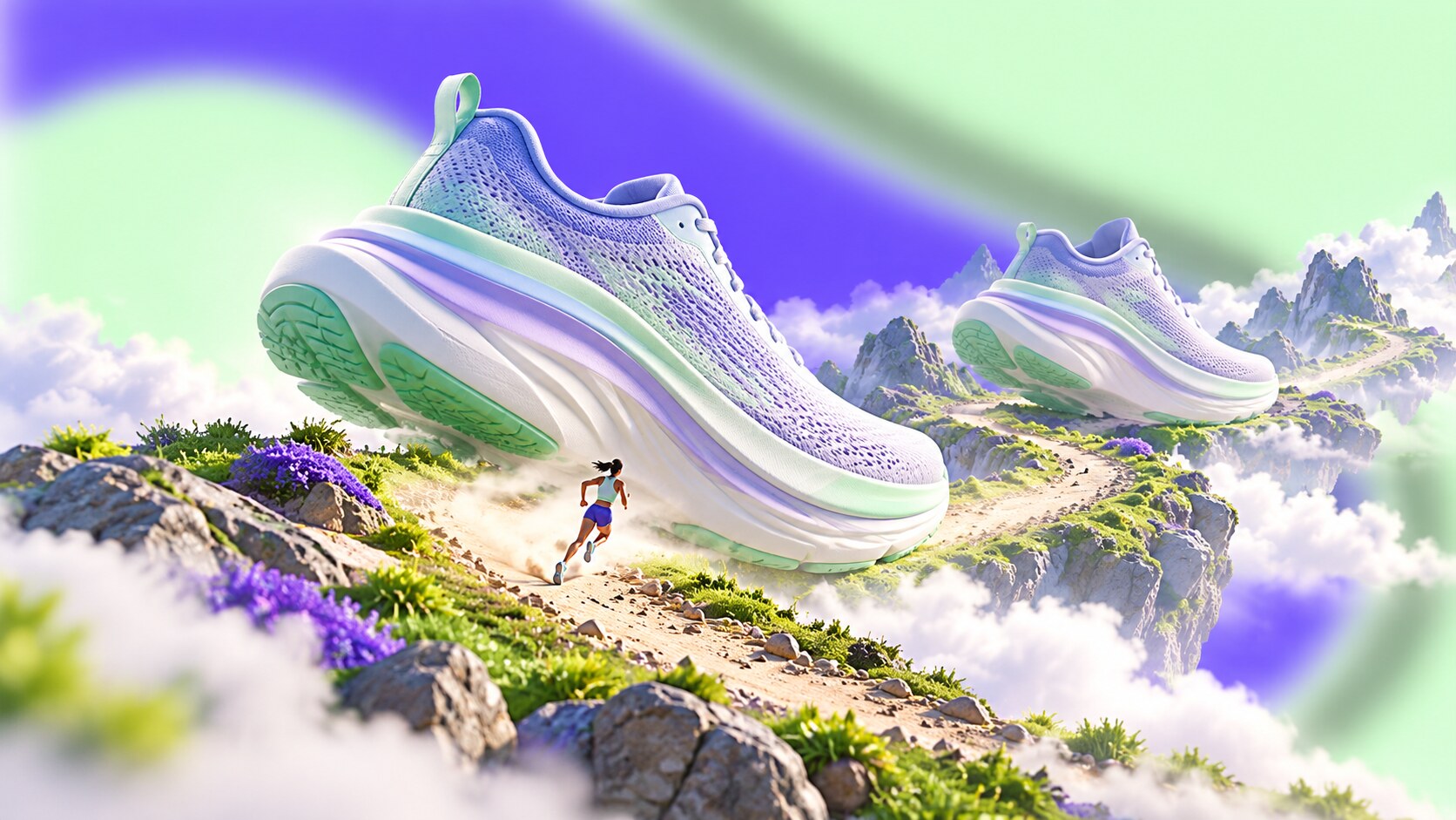
Former Salomon employees Nicolas Mermoud and Jean-Luc Diard founded HOKA in 2009 while trying to make downhill trail running faster and less punishing. Their answer used much more cushioning, a broad base and rocker geometry. At a time when minimalist barefoot shoes were culturally fashionable, HOKA looked almost absurdly large.
That visual contradiction was the opportunity. The oversized midsole could be recognized before the wordmark, and runners who experienced the ride supplied proof that the shape was functional rather than decorative. What critics saw as a clown shoe became the prototype for a wider maximal-cushioning movement.
Deckers acquired HOKA in 2013 and gave the specialist product global distribution and brand-building resources. The identity gradually became simpler, brighter and more optimistic. The first global “Fly Human Fly” platform and later visual relaunch by Anomaly LA used surreal scale, airborne bodies and saturated landscape imagery to turn cushioning into an emotional promise.
HOKA’s best decision was protecting the unusual silhouette long enough for culture to catch up. The danger now is success itself. As thick soles become normal and HOKA expands into walking, hiking and lifestyle use, competitors can imitate the category appearance. The brand must keep improving ride, fit and performance while developing visual codes beyond “large foam.”
The scale of the transformation is remarkable. HOKA generated $2.587 billion in net sales in Deckers’ fiscal 2026, up 15.9% from the previous year. A shape once considered too extreme has become a multibillion-dollar business.
“HOKA did not make an unusual shoe look normal. It made the market redefine what a normal running shoe could look like.”
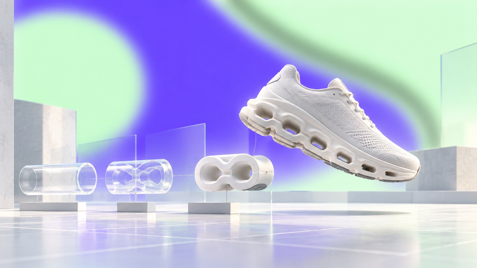
Retired athlete Olivier Bernhard experimented by attaching cut sections of garden hose to a shoe, searching for a softer landing followed by a firm takeoff. David Allemann and Caspar Coppetti joined him, and On launched in Switzerland in 2010.
The identity had unusual alignment from the start. The short name completed the phrase “running on clouds.” The hollow sole elements became CloudTec. Product photography made shoes appear to float. The geometric On mark stacked O and N into a compact figure that could sit quietly beside a mechanically loud sole.
The original corporate identity was developed at Raffinerie with creative direction and design contributors including Marcus Kraft; product design credit included Thilo Alex Brunner. More recently, Swiss type foundry Dinamo adapted Diatype into a rounder custom family whose softness supports the “cloud” proposition without becoming childish.
On’s visual world combines white space, technical diagrams, Swiss-engineering language and premium retail. That made performance shoes acceptable as office and travel footwear, especially before many traditional running brands understood quiet luxury. Roger Federer’s involvement from 2019 expanded the brand beyond running while preserving a credible Swiss connection.
The blind path is over-polish. A premium price, clean stores and restrained photography can make the brand feel remote from muddy, ordinary running. On’s campaigns have started using more humor, community and tactile mess. One internal campaign even addressed frequent misunderstanding of the small logo rather than pretending the mark was universally obvious.
On reached CHF3.014 billion in 2025 net sales, up 30% year over year. Its 2026 “Run On Clouds” identity reset returns running to the center while simplifying how technologies are explained. That is a sensible direction: the sole already creates curiosity, so communication should reduce rather than add complexity.
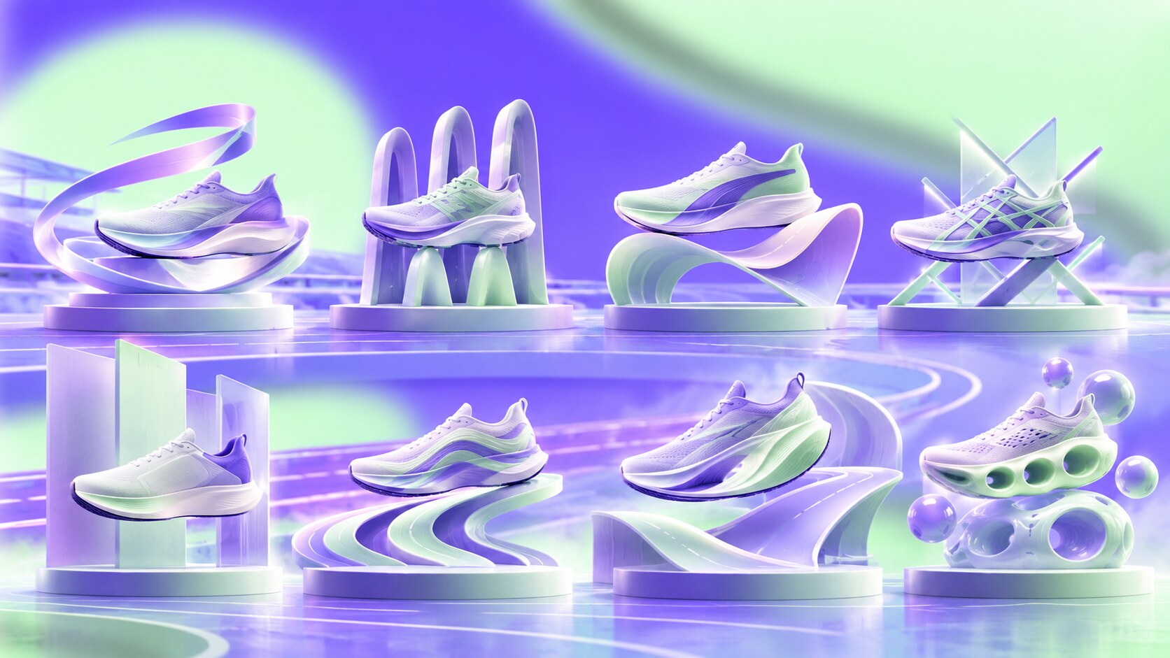
The figures below use each company’s latest clearly reported annual measure available while researching this article. They mix group revenue, footwear revenue, brand revenue and private-company growth because the businesses disclose different information. They are scale markers, not a direct financial comparison.
| Brand | Reported scale marker | Strongest owned code |
|---|---|---|
| Nike | $29.5bn FY2026 NIKE Brand footwear revenue | Swoosh and performance innovation |
| adidas | EUR24.8bn 2025 group sales | three stripes across product and culture |
| PUMA | EUR7.3bn 2025 group sales | Formstrip and leaping cat |
| ASICS | JPY810.9bn 2025 net sales | Tiger stripes, GEL and technical trust |
| New Balance | $9.2bn 2025 global sales | N, grey, widths and model numbers |
| Brooks | 16% revenue growth in 2025 | running-only focus and Run Happy |
| HOKA | $2.587bn FY2026 brand sales | oversized rocker silhouette |
| On | CHF3.014bn 2025 net sales | CloudTec sole and Swiss restraint |
Across these brands, the strongest decisions share a pattern. The visual code usually has a job before it becomes decoration. Adidas stripes and the PUMA Formstrip supported shoes. New Balance’s N occupied a structural side panel. HOKA’s sole changed the ride. On’s cavities explained the product idea.
The blind paths also repeat:
The difference between useful distinction and surface-level trend following is explored further in Bold Distinctive Branding vs Beautiful Generic Branding.
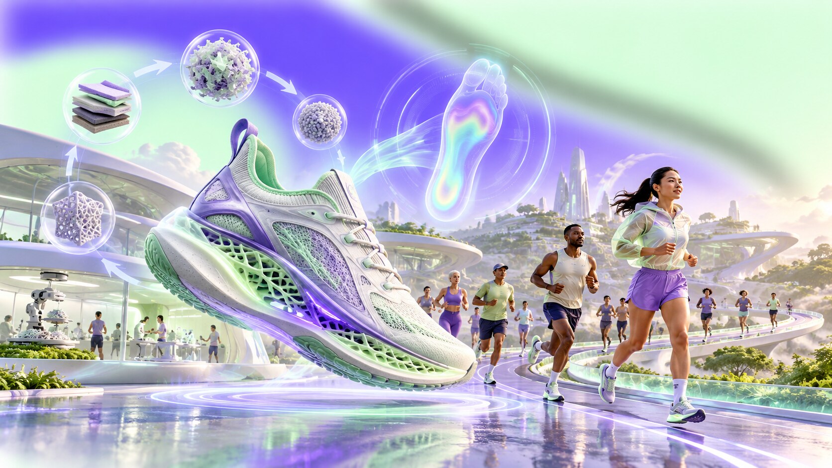
Running shoes are already moving toward larger sculpted surfaces, visible plates, holes, rods and digitally manufactured structures. Regulation will continue shaping elite products, especially around stack height, availability and rigid elements. This makes the rules part of the design brief rather than an obstacle applied afterward.
At the same time, master identities are becoming calmer. A simple wordmark and one side sign can organize increasingly complex products. The more visually active the midsole becomes, the less useful it is to surround it with noisy corporate graphics.
Three directions are likely to define the next chapter:
Personalized fit will also become more visible. Foot scans, pressure data and adaptable manufacturing can turn sizing from a hidden back-room process into part of retail identity. New Balance’s century-old width philosophy suddenly looks surprisingly modern in that context.
The largest brands will keep borrowing credibility from smaller specialists, while specialists will keep learning scale, storytelling and lifestyle design from global brands. The winners will not necessarily have the most radical logo. They will connect research, silhouette, language, retail and community so tightly that changing one element would weaken the whole system.
The eight stories show that running branding is rarely a clean march toward better taste. Nike’s Swoosh began as a reluctant choice. HOKA’s silhouette looked excessive. New Balance’s grey practicality became unfashionable before becoming fashionable again. Brooks became stronger by becoming smaller in scope.
That is the central lesson: a running brand becomes valuable when a recognizable design choice keeps proving itself in motion. The mark may begin the memory, but the miles give it meaning.

News, insights, case studies, and more from the rausr team — straight to your inbox.
Send us your brief, your wildest idea, or just a hello. We’ll season it with curiosity and serve back something fresh, cooked with care.