Most companies can update a logo after research, testing, and board approval.
A football club has a more difficult problem. Its mark may sit on a shirt, but it also lives on flags, tattoos, gravestones, pub walls, childhood photographs, stadium gates, video games, television scoreboards, and objects passed through families. Supporters do not experience the crest as a piece of corporate property. They experience it as inherited identity.
That makes football branding one of the most demanding areas of graphic design.
The designer must work between two very different scales. The mark needs to carry a century of local memory, yet remain clear as a tiny mobile icon. It must feel permanent, but work inside seasonal campaigns, international retail, women’s and academy teams, sponsor systems, stadium architecture, motion graphics, and social video.
In earlier football history, symbols often grew from municipal coats of arms, military industries, local myths, or informal club decisions. The author was frequently unrecorded. Today a major identity may involve an internal brand department, an international consultancy, type designers, kit suppliers, motion studios, licensing lawyers, historians, and supporter groups.
This article continues our design-history series alongside FIFA World Cup Branding and Visual Evolution, The Most Famous Sports Brand Logos, and Branding Codes That Stick.
“A corporate logo asks to be recognized. A football crest asks to be recognized, defended, worn, remembered, and handed to the next generation.”
The old crest identified a team; the modern identity must organize an international entertainment business

For much of the twentieth century, clubs did not manage identity with the consistency expected today. A crest could change between a programme, letterhead, blazer, match shirt, and souvenir. Colours varied with printing and embroidery. Some teams wore a civic coat of arms only for important matches, while ordinary kits carried no badge at all.
That flexibility was not necessarily poor design. Football institutions were local, production was manual, and the badge was not yet required to behave like a global trademark.
Now the commercial pressure is enormous. Deloitte reported that the twenty highest-revenue clubs generated a record EUR 12.4 billion in 2024/25. Commercial income reached EUR 5.3 billion, or 43 percent of their total revenue, making it the largest revenue source for a third consecutive year.
Brand design does not create those billions by itself, but it helps a club turn sporting attention into year-round recognition and products. The identity now has to work across:
- shirts, training wear, fashion collections, and licensed merchandise
- tickets, apps, streaming, match graphics, and tiny score bugs
- stadium signs, museums, restaurants, hotels, and international stores
- men’s, women’s, academy, esports, foundation, and community programmes
The visual system has become larger while the emotional permission to change it remains very small.
1. Real Madrid: the monogram that survived political change
Its strength comes from controlled evolution, not repeated reinvention

Real Madrid began with a decorative interlocking MCF monogram in 1902. A circle was added in 1908, giving the initials a stable container. In 1920, King Alfonso XIII granted the club the title “Real,” and the crown entered both its name and crest.
The mark then recorded Spanish political history. The crown and royal title disappeared during the Second Republic in 1931 and returned in 1941. The diagonal band, originally associated with Castile, remained. In 1997 its purple shifted to dark blue for marketing reasons, and the 2001 revision refined the proportions and brighter gold that define the current crest.
There is no famous consultancy attached to the original monogram. That is important. Early club identities were often accumulated cultural objects, not polished agency launches with a named creative director.
Real Madrid’s most successful design decision has been to protect the core structure:
- intertwined initials
- circular field
- diagonal band
- royal crown
- white as the dominant club colour
The crest is detailed, yet its silhouette is stable enough to survive embroidery, signage, trophies, broadcast graphics, and luxury collaborations. The white shirt adds another powerful brand asset because its restraint makes changing sponsors and seasonal trims easier without losing recognition.
According to Brand Finance’s 2026 estimate, Real Madrid became the first football club brand valued above EUR 2 billion, reaching EUR 2.4 billion. That figure is an external brand-valuation estimate, not cash on the balance sheet, but it shows the commercial scale now attached to a century-old monogram.
Hidden lesson
Real Madrid demonstrates that modernization does not always require visible redesign. Architecture, photography, retail, stadium experience, and motion can move forward while the central crest changes very little.
2. FC Barcelona: a player designed the crest, and members still guard it
The club’s identity is a rare combination of sport, city, Catalonia, and democratic ownership
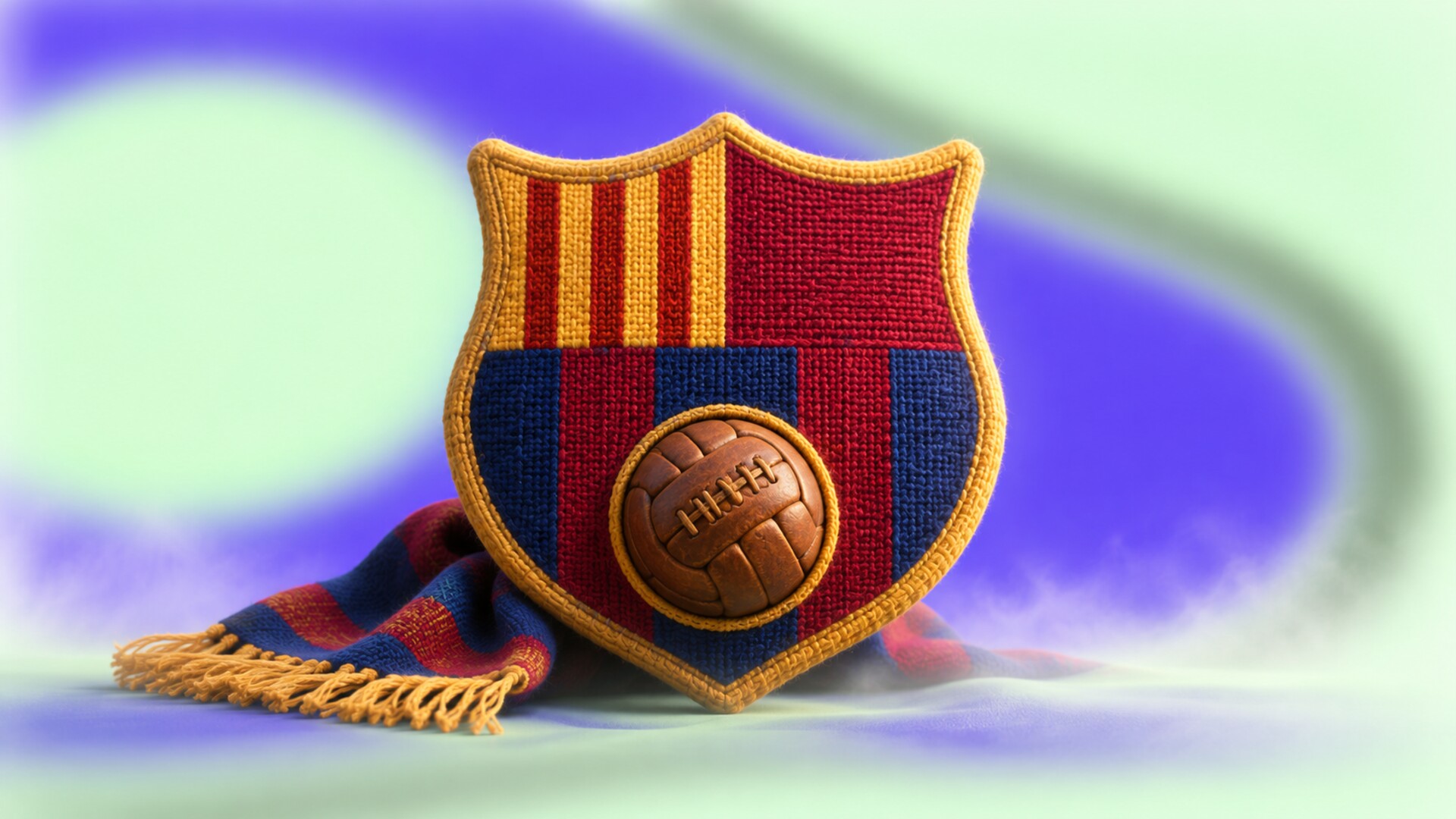
One of football design’s best facts is that Barça’s crest was designed by a footballer.
The club initially used Barcelona’s municipal coat of arms. In 1910 it held a public competition for a new emblem, won by striker, doctor, journalist, and club director Carles Comamala. His structure remains recognizable today: the Cross of Saint George, the Catalan flag, club initials, blaugrana colours, and a football.
This is a remarkably dense symbol, but every section carries meaning. Its complexity is not random decoration.
The modern identity system was developed by Summa with Barça’s in-house brand department. It expanded the club beyond the crest through stripes, textures, colour systems, and a large custom type family created with type designer Íñigo Jerez. The FC Barcelona Play variant turned ideas from Catalan modernism, the crest, and the club’s passing style into letterforms for kits and communication.
The wrong path came in 2018. A proposed crest adapted for small digital use reduced details, changed the stripe structure, and removed the FCB initials. From a conventional identity-design perspective, the logic was understandable. From a member-owned club perspective, permission was missing. The change was rejected and abandoned.
Barça’s own Innovation Hub later described the essential problem: members are not merely customers but part-owners, so a crest cannot be governed only by ordinary logo-design rules.
The hidden design asset is not only the crest. “Més que un club,” first spoken by president Narcís de Carreras in 1968, acts like a verbal logo. It connects visual identity to a political, social, and cultural idea that a cleaner badge alone could never express.
3. Liverpool: one club, two levels of emblem
The detailed official crest and the simple Liver Bird solve different design problems
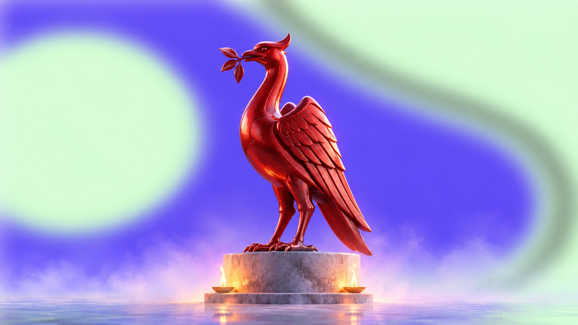
Liverpool’s central symbol did not begin as a modern football logo. The Liver Bird came from the city’s heraldry and appeared in club material long before it became a regular shirt badge.
The bird first appeared on a Liverpool kit for the 1950 FA Cup final. Later versions added LFC, a shield, the Shankly Gates, “You’ll Never Walk Alone,” and eternal flames commemorating the victims of the Hillsborough disaster. The 1999 crest remains the formal, detailed emblem used in important physical settings.
For the 2012/13 shirt, Liverpool returned to the standalone Liver Bird associated with the successful 1970s and 1980s. In 2024, the club extended that simpler symbol across digital and television platforms. The reason was practical and unusually transparent: more than 86 percent of website visits and 98 percent of social-channel use came from mobile devices.
This is a strong alternative to forcing one logo to do everything.
The detailed crest can carry memory at Anfield and in institutional contexts. The Liver Bird can remain clear on a phone, shirt, broadcast tile, or app icon. Neither version has to destroy the other.
There is also a scale-based fun fact. The crest installed on the expanded Anfield Road Stand weighs about 550 kilograms and measures 5 by 6.9 metres. That is almost the opposite design condition from a social avatar, yet both belong to the same identity.
Successful path
Liverpool treated simplification as a hierarchy of use, not as an excuse to erase meaningful elements from the official crest.
4. Arsenal: the cannon became stronger than the shield
Industrial origin, legal ownership, and modern typography all shaped the identity
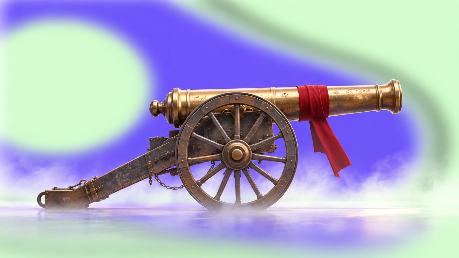
Arsenal’s visual identity begins with place and labour. The club was formed by workers connected to the Royal Arsenal in Woolwich, so cannons were not invented by a branding workshop. They were local reality.
Early crests used three cannons derived from Woolwich heraldry. Over time, one horizontal cannon became the clearer symbol. Under manager Herbert Chapman, Arsenal also developed one of football’s earliest coordinated modern identities: the geometric A-and-C monogram, art deco lettering, stadium details, and a stronger public image around “The Arsenal.”
The 2002 crest simplified the older heraldic badge into a cleaner, legally protectable design. This arrived when merchandising, counterfeiting, and trademark control mattered increasingly to clubs. The timing is notable: the European Court of Justice’s Arsenal v Reed case in the same year concerned unofficial merchandise sold near the stadium and became an important sports-trademark case.
The redesign solved reproduction and ownership problems, but many supporters felt the club had removed history without enough consultation. Its typography also carries a very specific early-2000s character that has not aged as quietly as the cannon itself.
Arsenal’s more recent visual direction has therefore elevated the standalone cannon. By 2024/25 it appeared across all three match kits without the full shield. The club has also mixed internal strategy with carefully chosen cultural collaborators, including artist Jeremy Deller, illustrator Reuben Dangoor, and graphic designer David Rudnick.
The lesson is sharp: a club may contain one symbol more powerful than its official badge. The difficult task is recognizing it.
5. Manchester City: consultation repaired a break with history
Supporters helped replace the eagle with a modern version of the older circular badge
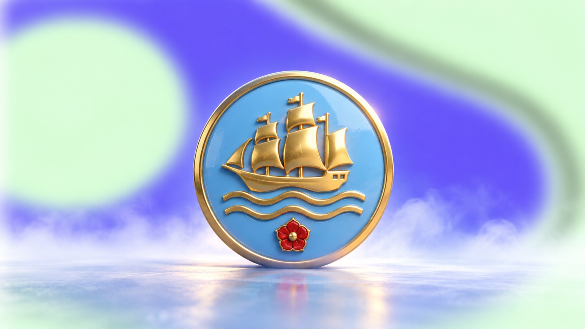
Manchester City’s 1997 eagle badge became attached to an extraordinary era of sporting growth, but it was a departure from the circular identities many supporters remembered.
When the club prepared another change, it did not begin by presenting a finished surprise. In 2015 it opened a 30-day consultation, offered talks by football historian Gary James, and asked supporters which shapes, colours, and symbols felt authentic. Only 34 percent wanted to keep the eagle-badge shape.
The 2016 result returned to a circle and combined the ship, three rivers, Lancashire rose, sky blue, and founding year. The club described it as a “modern original,” which is a useful phrase: the design was new, but its ingredients were retrieved rather than invented.
The rollout reveals how large football identity implementation has become. More than 100 people contributed, over 5,000 branded objects and signs were produced, and more than 1,500 stadium seatbacks were replaced. The badge was also applied to offices, stores, the training campus, digital products, and even a branded aircraft.
City’s later visual language has continued through collaboration between specialist sports agency TwelfthMan and the in-house City Studios team, including custom typography rooted in Manchester’s industrial character.
Hidden lesson
Fan consultation does not mean asking supporters to draw the final crest. It means identifying which memories and symbols the professional design team does not have permission to remove.
Interbrand replaced heraldry with a letter that could enter fashion, hospitality, and entertainment
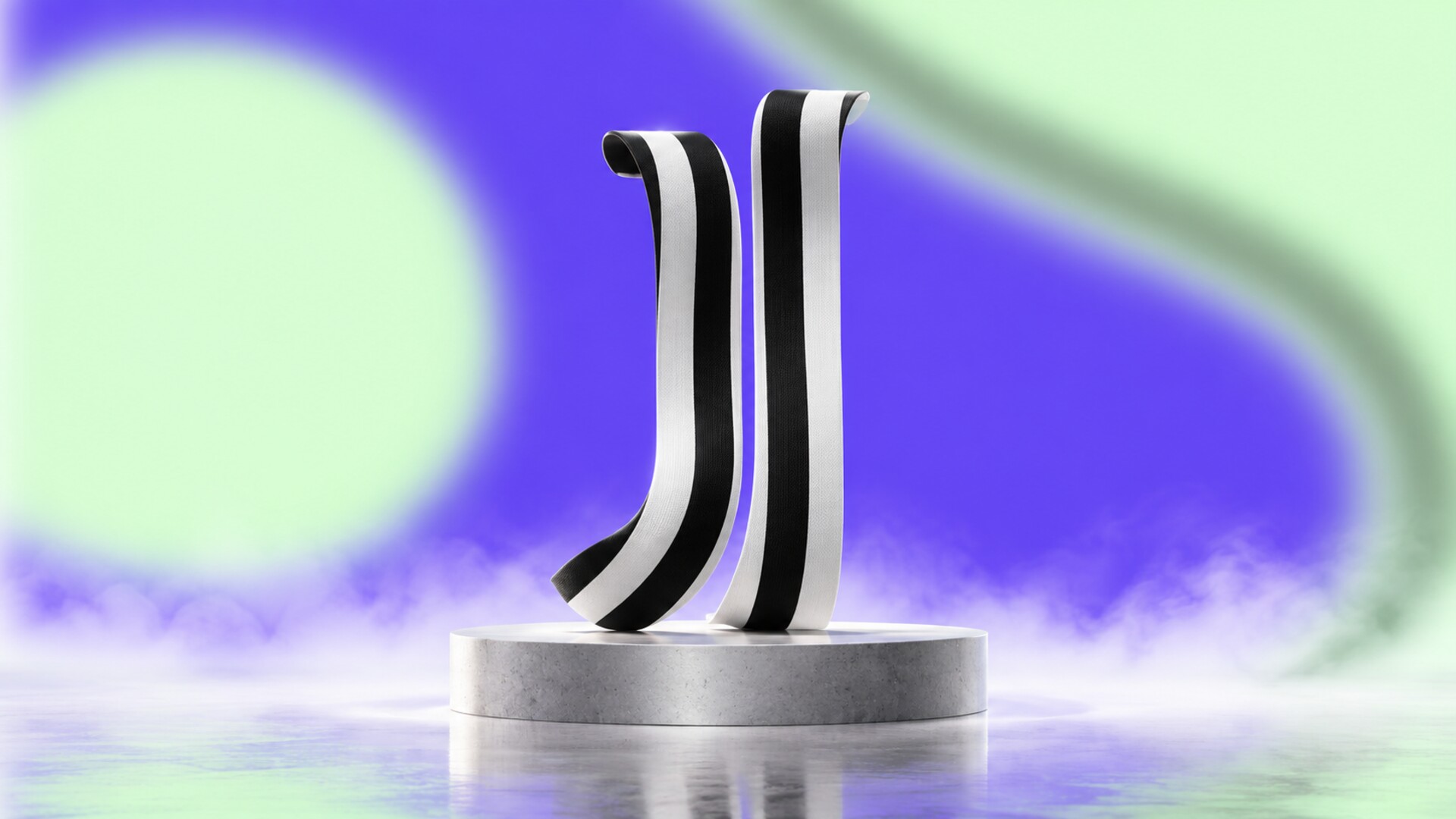
No major European club redesign created a cleaner break with football tradition than Juventus in 2017.
Working with Interbrand, the club moved away from its oval crest, zebra, crown, and layered heraldic structure. The replacement combined three ideas in an extremely reduced form: the black-and-white shirt stripes, the shape of the Scudetto shield, and the letter J.
Interbrand’s Manfredi Ricca framed the project around taking Juventus beyond sport. The new identity was built for the stadium, fashion collections, hospitality, cafes, products, and experiences as much as for the shirt.
The initial reaction included anger because many supporters saw a fashion mark where they expected a football crest. That criticism was reasonable: the new J gained flexibility by discarding visible history.
Yet the system also proved that radical simplification could create a genuinely ownable symbol rather than another generic circular badge. It won two D&AD awards, including recognition for the wider branding scheme and type work, and remained unusually clear across tiny and enormous applications.
The strongest part is not that the logo is minimal. Many minimal football redesigns are forgettable. The strongest part is that the J could only plausibly belong to Juventus.
The risk remains equally clear. A club can become more useful as a lifestyle brand while feeling less specific as a football institution. Juventus made that trade consciously; copying its surface without the same strategic reason would be a blind path.
7. Inter: a difficult monogram edited for a digital generation
Bureau Borsche kept the circular logic but reduced the name to I and M

Inter began with design authorship that is unusually clear. In 1908, painter and founding member Giorgio Muggiani created the circular FCIM monogram and selected the black-and-blue colours.
That original mark was elegant but visually complex. Across more than a century, the club repeatedly adjusted letters, stars, rings, gold, black, blue, and name structures while returning to Muggiani’s circular idea.
In 2021, Munich studio Bureau Borsche, founded by Mirko Borsche, redesigned the identity around the letters I and M. The club connected them to “Internazionale Milano” and the campaign phrase “I M.” Brighter blue and simplified geometry improved performance on screens and opened a more fashion-oriented visual language linked to Milan.
The successful part was continuity of structure. The circle and monogram still felt related to Inter, unlike a complete category change.
The weaker part was reduction of content. Removing F and C made the football-club name less literal, while the “I M” verbal idea worked more naturally in international campaign language than in every supporter context. As with Juventus, the design was trying to speak simultaneously to football, fashion, city culture, and global youth.
Fun fact
Inter’s black and blue were not simply fashionable colours chosen by a later agency. They were present at the founding, giving a contemporary studio an unusually strong century-old palette to work with.
8. Ajax: the rare club that moved from minimal back to detailed
After 34 years, supporter memory defeated the usual direction of logo modernization
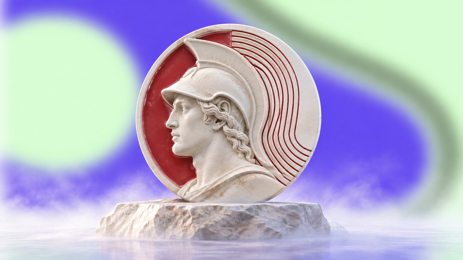
Ajax offers one of the most interesting reversals in contemporary identity design.
The Greek hero Ajax entered the club crest in 1928 as a detailed profile illustration. In 1991, it was replaced by a highly efficient abstract portrait made from eleven lines, one for each player on the pitch. The streamlined version is associated with designer André Toet, with fashion designer and former Ajax goalkeeper Rolf Leeser also credited with contributing to the redesign.
As a modern logo, the eleven-line head was intelligent. It simplified production, carried a hidden football idea, and remained visibly connected to the mythological figure.
Yet a large part of the fan base never accepted it as the emotional Ajax crest.
For the club’s 125th anniversary, Ajax announced that the detailed classic logo would return permanently from the 2025/26 season. The club described the move as staying true to its DNA and using the past as inspiration for the future.
This decision challenges the standard design story that progress always means fewer lines. Modern reproduction no longer imposes the same limits it did in 1991. High-resolution screens, improved embroidery, flexible identity systems, and separate small-use marks can support more detail.
Ajax therefore represents a new possibility: heritage is not only material to simplify. Sometimes the historic version is the differentiation.
“The future of football identity may not be universally flatter. It may be more flexible, allowing detailed heritage and simple functional symbols to coexist.”
The crest may be one drawing, but the working team resembles a small cultural institution
There is no single standard football-brand designer.
The visible work is often distributed among several groups:
- In-house brand teams protect daily consistency and understand internal politics.
- Brand consultancies handle strategy, architecture, research, and major identity changes.
- Specialist sports studios understand kits, broadcast, sponsorship, stadiums, and supporter culture.
- Type and motion designers build assets that can move and remain ownable without showing the crest constantly.
- Kit suppliers translate club history into seasonal products, sometimes creating their own lettering and secondary graphics.
- Historians and supporter groups provide cultural knowledge and legitimacy that a visual audit cannot replace.
- Trademark lawyers and licensing teams determine what can be owned, protected, sold, and reproduced internationally.
The most effective model is usually mixed. An external studio can question habits and bring specialist craft. An internal team knows which ideas can survive after the launch film disappears. Supporters know which apparently minor detail carries fifty years of memory.
This is also why public agency credits can be incomplete. A famous consultancy may receive the case study, while the final identity also contains years of work by unnamed club employees, manufacturers, sign makers, digital teams, and local experts.
What the eight stories reveal
The strongest identity is not always the newest or the simplest
| Club | Strongest visual asset | Main design lesson |
|---|
| Real Madrid | crowned MCF monogram | evolve the system around a stable core |
| Barcelona | culturally layered crest | ownership changes who must approve change |
| Liverpool | Liver Bird | one identity can use detailed and simple levels |
| Arsenal | cannon | a single inherited symbol can outgrow the shield |
| Manchester City | city symbols in a circle | consultation can restore authenticity |
| Juventus | double-J mark | radical reduction works when the result is ownable |
| Inter | circular monogram | edit heritage rather than pretending it never existed |
| Ajax | classic hero portrait | more detail can create stronger differentiation |
The successful paths share one quality: the designers identified what supporters already recognized before deciding what should change.
The wrong paths usually began when a club treated heritage as visual clutter, assumed commercial audiences mattered more than core supporters, or presented a finished answer before building cultural permission. Another failure is cosmetic modernization: smoothing lines, removing words, and choosing a geometric sans serif without creating a stronger idea.
There is also a less obvious danger in nostalgia. Returning to an old badge cannot repair poor communication, weak products, or distrust in club leadership. Heritage works when the institution behaves consistently with the story it is placing on the shirt.

Football identity is moving away from the idea that one crest must carry every message.
Clubs increasingly need a family of recognizable assets:
- a formal crest for institutional and ceremonial use
- a reduced emblem for shirts, apps, broadcasts, and social profiles
- custom typography that can communicate without repeating the badge
- motion behaviour for goals, lineups, highlights, and streaming
- patterns and colour combinations that organize many teams and programmes
- heritage editions that create emotion without permanently freezing the brand
Women’s football, global academies, esports, documentaries, gaming, and direct media channels will keep widening the system. The designer’s job will be less about drawing one perfect badge and more about defining relationships: what remains sacred, what may change each season, and what can be shared across the whole club.
AI will make polished campaign graphics and speculative crests easier to produce, but it will not make cultural permission easier. In fact, an abundance of smooth, generic alternatives may increase the value of real local material: a city symbol, an old chant, a stadium letterform, a supporter banner, or a strange historic drawing that no prompt would naturally invent.
The most iconic football identities were not made iconic by geometry alone. They accumulated victories, defeats, players, songs, arguments, places, and repeated use. Design can clarify that memory, strengthen it, and prepare it for new media. It cannot manufacture a century of belonging in one presentation deck.
“That is the central rule of football branding: make the system ready for tomorrow without making supporters feel that yesterday has been deleted.”