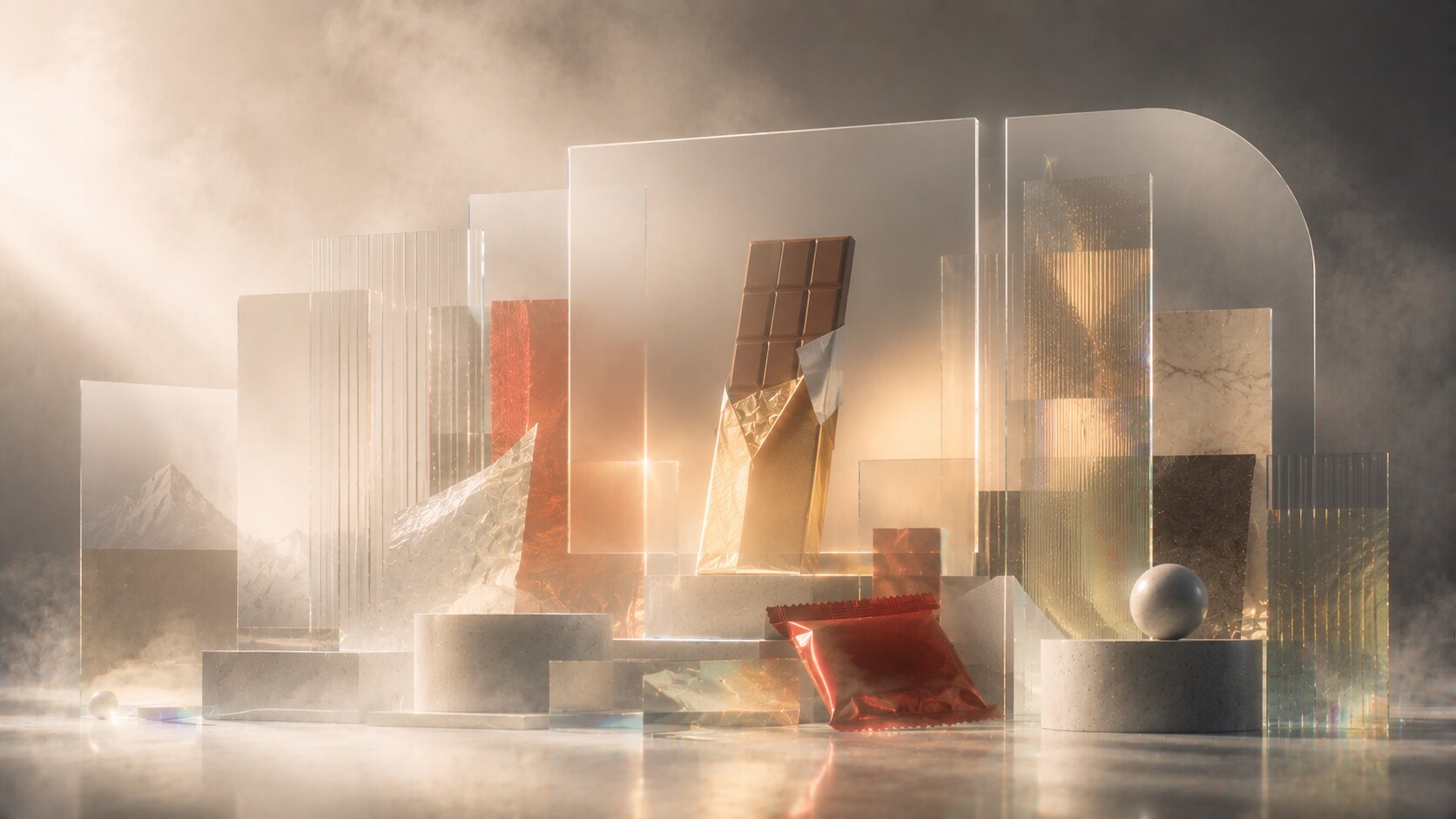
Most Successful Chocobars Packaging Design
Eight iconic chocolate bars, their wrappers, shapes, typography, visual codes, and the packaging stories that made them unforgettable.

Eight iconic chocolate bars, their wrappers, shapes, typography, visual codes, and the packaging stories that made them unforgettable.
Chocolate-bar packaging looks simple until you compare the winners with the forgettable ones.
At first glance, the category seems limited:

But the strongest bars prove that the wrapper is doing much more than covering sugar and cocoa. It has to create instant appetite, survive impulse buying, stay recognizable in clutter, travel through vending machines and supermarket aisles, and carry nostalgia for years without becoming invisible.
That is why some chocolate bars become packaging icons. People remember the red of KitKat, the triangle of Toblerone, the orange of Reese’s, the purple of Dairy Milk, or the black-and-gold hierarchy of Mars bars long before they consciously remember the design logic behind them.
This article sits naturally beside Iconic Water and Lemonade Packaging, Packaging of the Most Successful Alcohol Brands, and Package Design Story of Popular Cosmetic Products.
“The best chocobar wrapper does not only say what the product is. It says what kind of moment the product belongs to.”

KitKat is one of the cleanest demonstrations of packaging consistency in confectionery.
The basic structure is still extremely efficient:
Historically, KitKat’s identity is tied less to one celebrity package designer and more to long-term brand discipline under Nestlé and its predecessors. That matters. This is not a bar that relies on complex illustration or novelty graphics. It relies on memory pressure through repetition.
The red is a huge part of that. It is immediate, warm, energetic, and hunger-friendly. It also gives the bar a kind of break-time directness. KitKat never tried to look too elegant. It tried to look dependable, familiar, and ready.
The old silver foil era in the UK also matters historically. It gave the product a ritual quality. But the shift to flow-wrap plastic made the package more practical for global mass distribution, even if a little romance was lost on the way.
Because the wrapper behaves like a visual shortcut. It is almost impossible to confuse from a distance.
The famous four-finger shape became legally controversial in trademark disputes, which says something important: sometimes the package identity is so strong that the product form itself starts fighting for its own legal status.
A system this strong can become too dependent on extension culture. Too many flavors and sub-lines can weaken the clarity that made the main pack so powerful.

Toblerone is one of the clearest examples in all packaging design of structure becoming memory.
Its success comes from a rare combination:
Most chocolate bars are remembered through wrapper color first. Toblerone is different. It is remembered through architecture.
That is why the package has always carried unusual strength in travel retail and gifting. The long prism format instantly separates it from flat-bar competition. It is harder to pocket, but easier to notice. In other words, it sacrifices everyday neutrality for shelf theatre.
The package tells a very clear story: Swiss, mountainous, distinctive, slightly celebratory. That is also why the 2023 removal of the Matterhorn imagery after production changes became such a big deal. The packaging was not losing a small detail. It was losing part of the origin myth.
Because almost every visible part of the product and package says the same thing.
The shape is so dominant that Toblerone often feels closer to a souvenir object than a normal bar.
That same gift-like identity can make the bar feel less everyday and less spontaneous than flatter, cheaper, more portable competitors.
Interesting fact: very few mainstream chocobars have a package shape so strong that changing the mountain graphic becomes international news.
Snickers packaging does not pretend to be refined.
Its visual code is designed around appetite and force:
That makes sense because Snickers was never trying to behave like a light chocolate break. It is a dense bar with peanuts, caramel, and nougat. The package had to communicate weight, energy, and fullness.
The graphic design is direct in the best possible way. The logo is huge, legible, and structurally plain. That is part of its genius. Snickers does not waste time trying to become atmospheric.
The wrapper also supports the product’s long-running hunger-positioning beautifully. It feels substantial even before the bar is opened.
Because the package matches the product promise almost perfectly.
The old Marathon naming in the UK shows how even extremely strong package systems can be reshaped by local language and culture before later returning to global alignment.
The risk of a package like this is heaviness. If every extension, protein version, or health-adjacent line still looks like pure sugar aggression, it may become harder to recruit more cautious buyers.
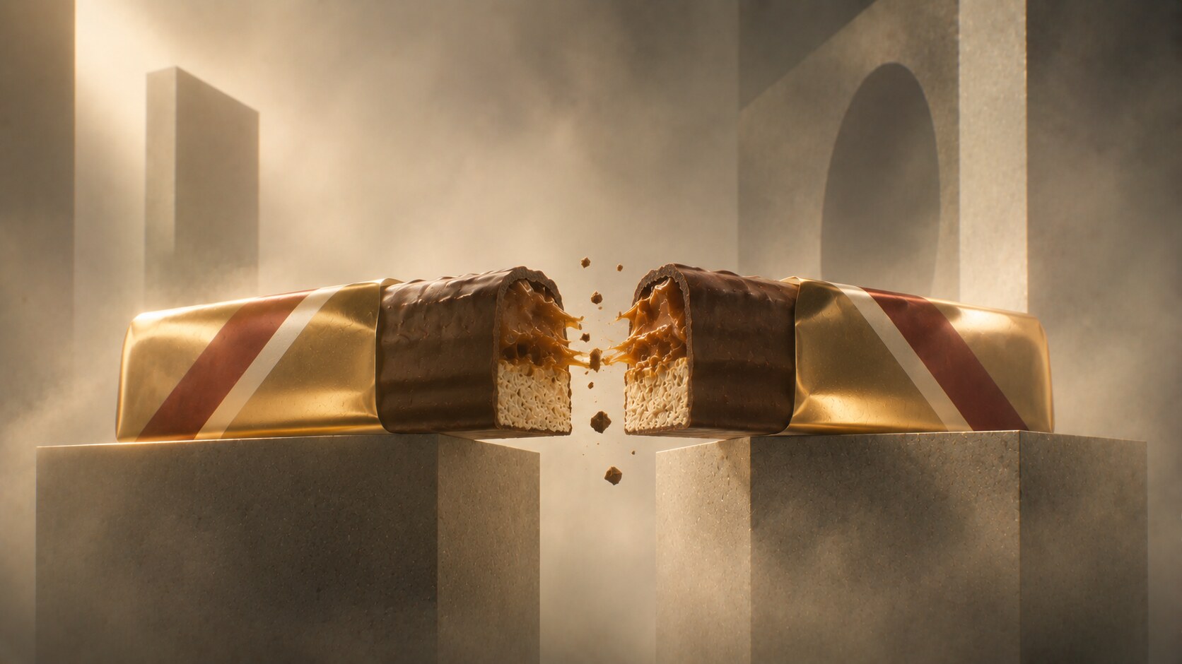
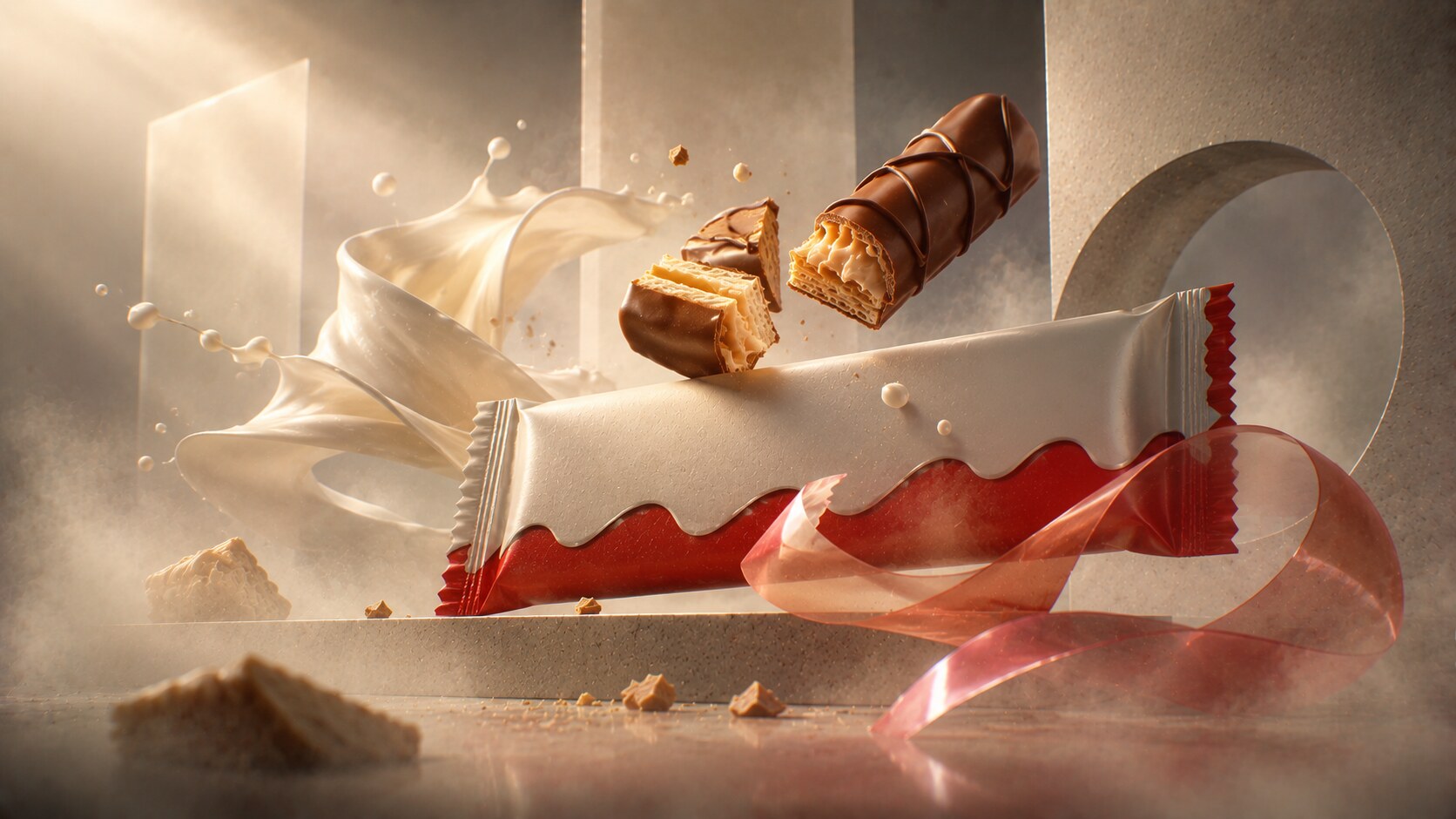
Twix packaging is interesting because the product proposition is more structural than many people realize.
The package has to sell:
That is one reason the gold wrapper has worked so well. Gold gives sweetness and richness, while the red logo holds enough contrast to stop the pack becoming too soft or generic. The package feels indulgent, but still energetic.
Twix also has one of the category’s smarter packaging stories in its Left Twix / Right Twix campaign era. The physical product did not change much, but the wrapper became part of the joke, the narrative, and the rivalry. That is a useful reminder that in chocobars, packaging is often the first surface available for playful storytelling.
Because it gave a very ordinary shelf format a stronger internal idea.
The older Raider naming in parts of Europe proves again how much confectionery brands depend on wrapper memory. When the name changes, the package has to carry continuity alone for a while.
The danger with humor-driven packaging is that the joke can outlive its freshness. If the bar identity becomes too campaign-dependent, the base pack can start feeling like it is missing something when the campaign fades.
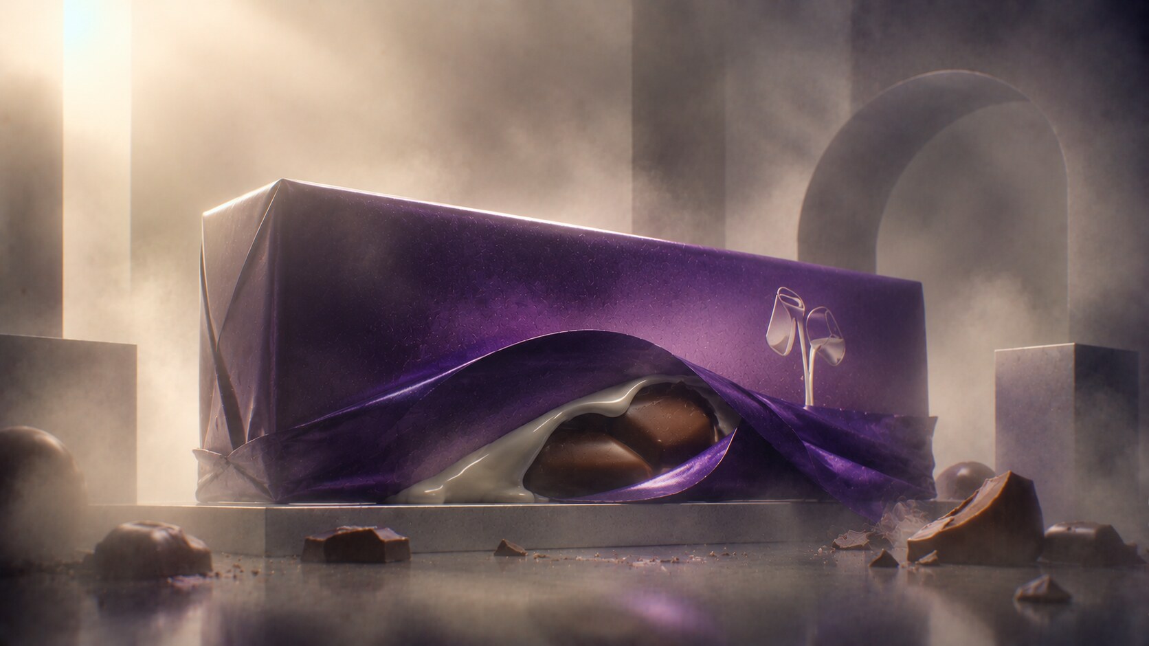
Cadbury Dairy Milk is one of the greatest color-ownership stories in consumer packaging.
The wrapper’s power comes from a few disciplined signals:
This is packaging built around emotional comfort. Dairy Milk does not shout like Snickers, and it does not architect itself like Toblerone. It feels more domestic, more familiar, more giftable in an everyday way.
Historically, the purple wrapper matters enormously. It gave the bar a distinct visual territory, and that territory became valuable enough to trigger major trademark conflict. That alone says a lot about the wrapper’s business power.
The package also tells a material story without overcomplicating it. Dairy, softness, milkiness, and rounded sweetness are all implied visually before the bar is eaten.
Because it built comfort into color and never let go of that ownership.
Cadbury’s use of retro anniversary packs is a smart reminder that packaging heritage can be activated without redesigning the core identity out of existence.
The biggest risk for a pack like this is over-smoothing. If texture, chunk shape, recipe, or wrapper cues drift too far toward generic corporate confectionery, trust erodes even if recognition remains.
“Some wrappers sell excitement. Dairy Milk sells reassurance.”
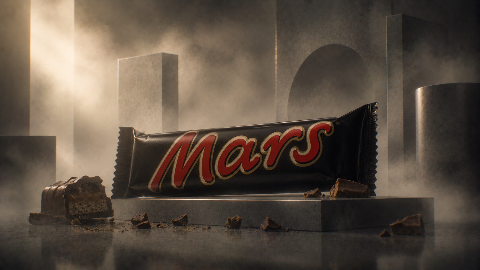
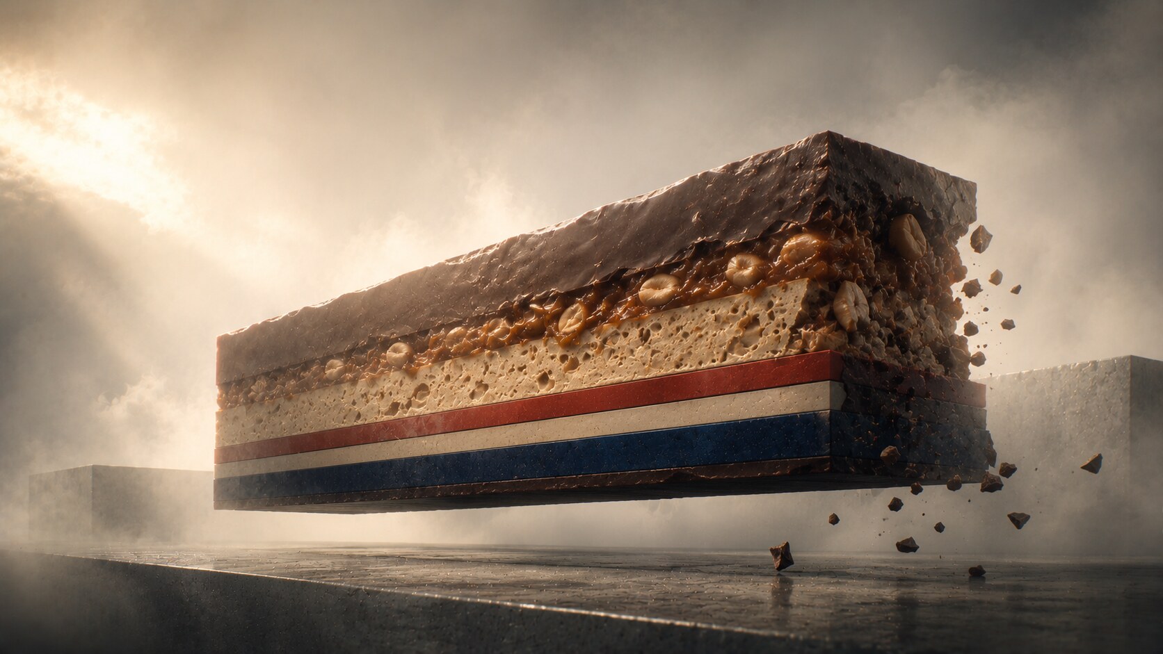
The Mars bar package is one of the simplest in the category, which is exactly why it lasts.
The visual language is brutally efficient:
It feels rich, immediate, and old-school without becoming antique. That is hard to do well.
The package tells a very straightforward story: this is dense, sweet, filling chocolate. There is no false sophistication. In some ways, Mars sits between Snickers and Dairy Milk. It has the hunger logic of one and the wrapped familiarity of the other, but with a more stripped-down graphic attitude.
Historically, the black wrapper gave the bar a stronger shelf anchor than lighter competitors. It reads as serious and rich in a category full of brighter noise.
Because the wrapper wastes no attention.
The pack is so compact visually that even temporary variations and promotional editions have less room to damage the core system.
Its very simplicity can also become a limitation. In a newer wellness-coded snack world, dark-heavy classic confectionery can start reading more “old treat” than “current choice.”
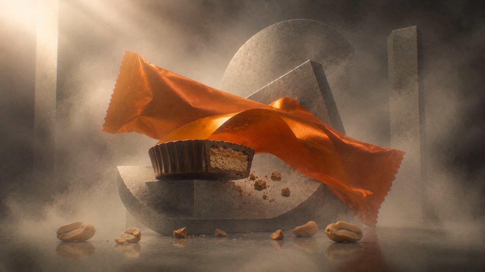
Reese’s is one of the strongest examples of a package making the flavor feel inevitable.
The orange wrapper is doing enormous work:
This is one reason Reese’s has such strong recognition power. The package does not behave like a standard chocolate bar wrapper. It behaves like a peanut-butter event.
The graphic design is equally blunt and effective. The name is oversized, the color system is loud, and the hierarchy leaves very little doubt about what matters.
Because the wrapper owns a flavor territory as much as a visual one.
Recent recipe and ingredient criticism around some Hershey portfolio items shows how fragile packaging trust can become. A wrapper may still look beloved even while loyal customers start questioning whether the inside still deserves the outside.
The biggest risk for Reese’s is not invisibility. It is over-extension. If every product form, seasonal novelty, and offshoot continues to stretch the orange language too far, the brand can begin to feel more like a candy empire than a clear product idea.
One useful packaging lesson from Reese’s: if a color is strong enough, it can start functioning almost like a taste memory.
Kinder Bueno is one of the most contemporary success stories in the category because it balances indulgence with a lighter visual feel.
Its packaging logic is very different from the older mass classics:
This matters because Bueno does not want to feel like a heavy bar. It wants to feel thin, clever, creamy, and easy to justify.
That is one reason it has traveled so well across markets. The package looks sweeter and softer than protein bars, but cleaner and more modern than many old-school chocolate wrappers.
Because it created a more “permissible” visual language for indulgence.
Kinder Bueno benefited from arriving into a market that had already seen decades of wrapper noise. Its lighter package language looked contemporary partly because so many legacy bars still looked dense and heavy.
The risk with lighter-looking indulgence is credibility drift. If the package starts implying wellness more than treat, disappointment can enter very quickly once the consumer remembers what the category actually is.
This is where the story becomes more current.
The classic chocolate-bar category is no longer competing only with other chocolate bars. It is now fighting against:
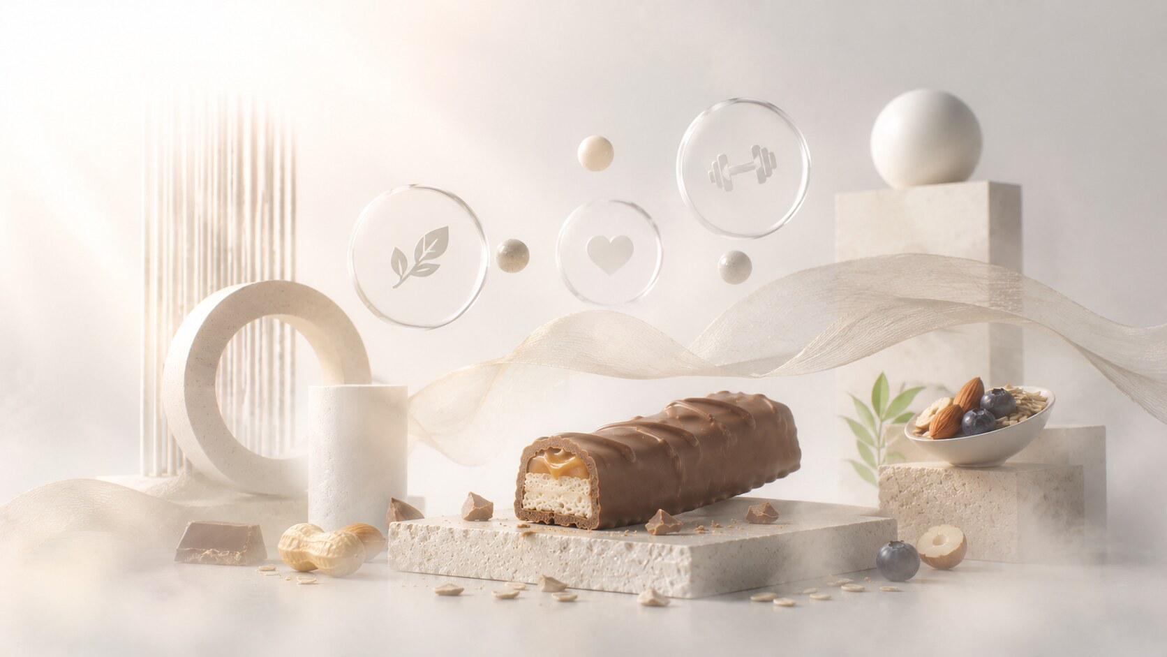
Recent Kantar, Circana, and broader snack-market reporting suggests people in some markets are buying fewer chocolate bars while shifting more attention toward healthier or more functional snacking. At the same time, cocoa cost pressure has made the category more nervous, more promotional, and in some cases more tempted by shrinkage, recipe drift, or packaging tricks.
That changes packaging strategy fast.
Now the wrapper has to do more than trigger craving. It often has to negotiate guilt, price sensitivity, nostalgia, and changing ideas of what “treating yourself” still means.
This is why today’s category trends are moving in several directions at once:
That does not mean classic chocobars will disappear. It means they now have to fight harder for relevance.
“In the next phase of chocobar packaging, winning may depend less on being the sweetest-looking bar and more on being the easiest indulgence to justify.”
The best chocobar packages each found one clear thing to own.
KitKat owned the break. Toblerone owned the shape. Snickers owned fullness. Twix owned duality. Dairy Milk owned reassurance. Mars owned direct richness. Reese’s owned peanut-butter color. Kinder Bueno owned lighter indulgence.
That is why these packages lasted. They did not only look good. They made the product easier to choose, easier to remember, and easier to want again.
And now, in a market shaped by healthier lifestyles, tighter budgets, and more skeptical snack behavior, that job becomes even harder.
The wrapper still matters. If anything, it matters more.
News, insights, case studies, and more from the rausr team — straight to your inbox.
Send us your brief, your wildest idea, or just a hello. We’ll season it with curiosity and serve back something fresh, cooked with care.