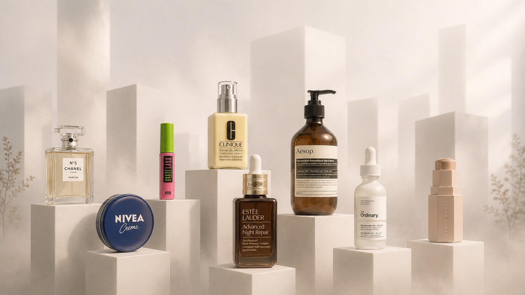
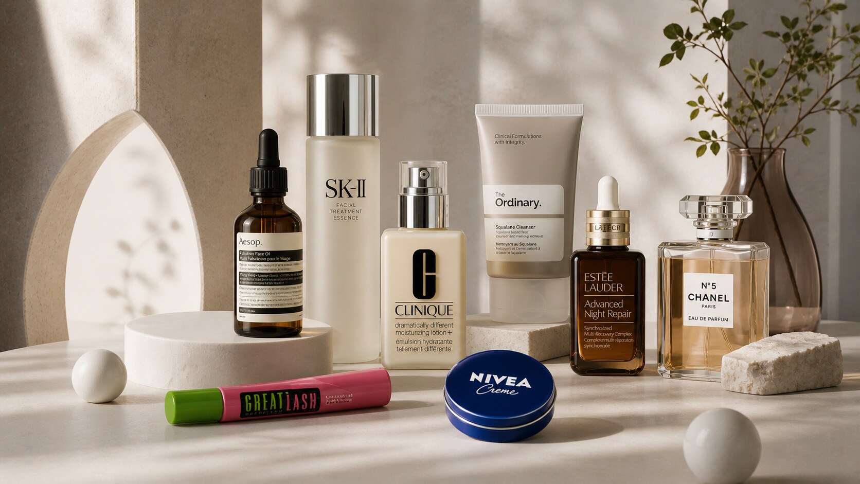
Package Design Story of Popular Cosmetic Products
8 Beauty Icons That Built Their Own Shelf Language. Who shaped them, why they look the way they do, which materials they use, and more.

8 Beauty Icons That Built Their Own Shelf Language. Who shaped them, why they look the way they do, which materials they use, and more.
Cosmetic packaging has to do more jobs than many other product categories at once.
It must:
And unlike food or hardware, beauty packaging is judged emotionally almost immediately. People do not only ask whether it works. They ask whether it feels clinical, luxurious, playful, serious, safe, modern, or worth the price.
That is why some cosmetic products become much bigger than their formulas. Their containers turn into memory objects. A blue tin, a brown bottle, a pink-and-green tube, an amber pump, a black-and-white label. Long after people forget the campaign, they still recognize the package.
If you like packaging history more broadly, this article sits naturally beside The Story of Meal Packaging Design and Iconic Water and Lemonade Packaging.
“In cosmetics, the package is often the first proof that the product knows what it wants to be.”
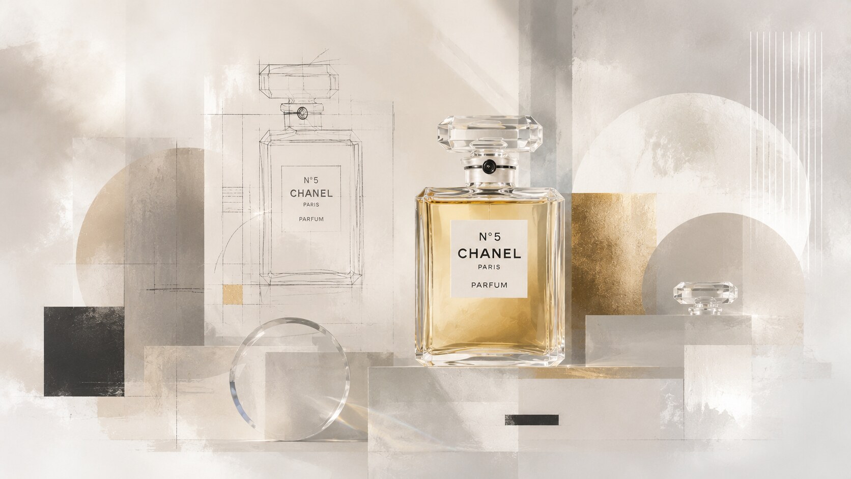
If there is one cosmetic package that crossed fully into design-icon territory, it is CHANEL N°5.
According to CHANEL’s own history, the bottle’s visual code is built around:
Why does it look like that? Because it was designed as the opposite of the heavily ornamented perfume world around it. Instead of flowers, scrolls, and romantic illustration, it offered a universal vessel: cool, abstract, and controlled.
The authorship here is mostly attributed to Gabrielle Chanel’s direction rather than to a widely promoted outside packaging studio. That matters. This was founder-led taste turned into industrial form.
Materially, the logic is simple and powerful:
Graphic design on N°5 is almost anti-graphic. That is exactly the point. The label behaves like a luxury signal through restraint.
Because it used subtraction as luxury. It looked expensive without performing “expensive” in the usual way.
Its modernity became so durable that the bottle entered museum-level design conversations, which is rare for commercial beauty packaging.
If Chanel had followed the decorative perfume logic of its era, the fragrance might still have become famous, but the bottle would probably not have become timeless.
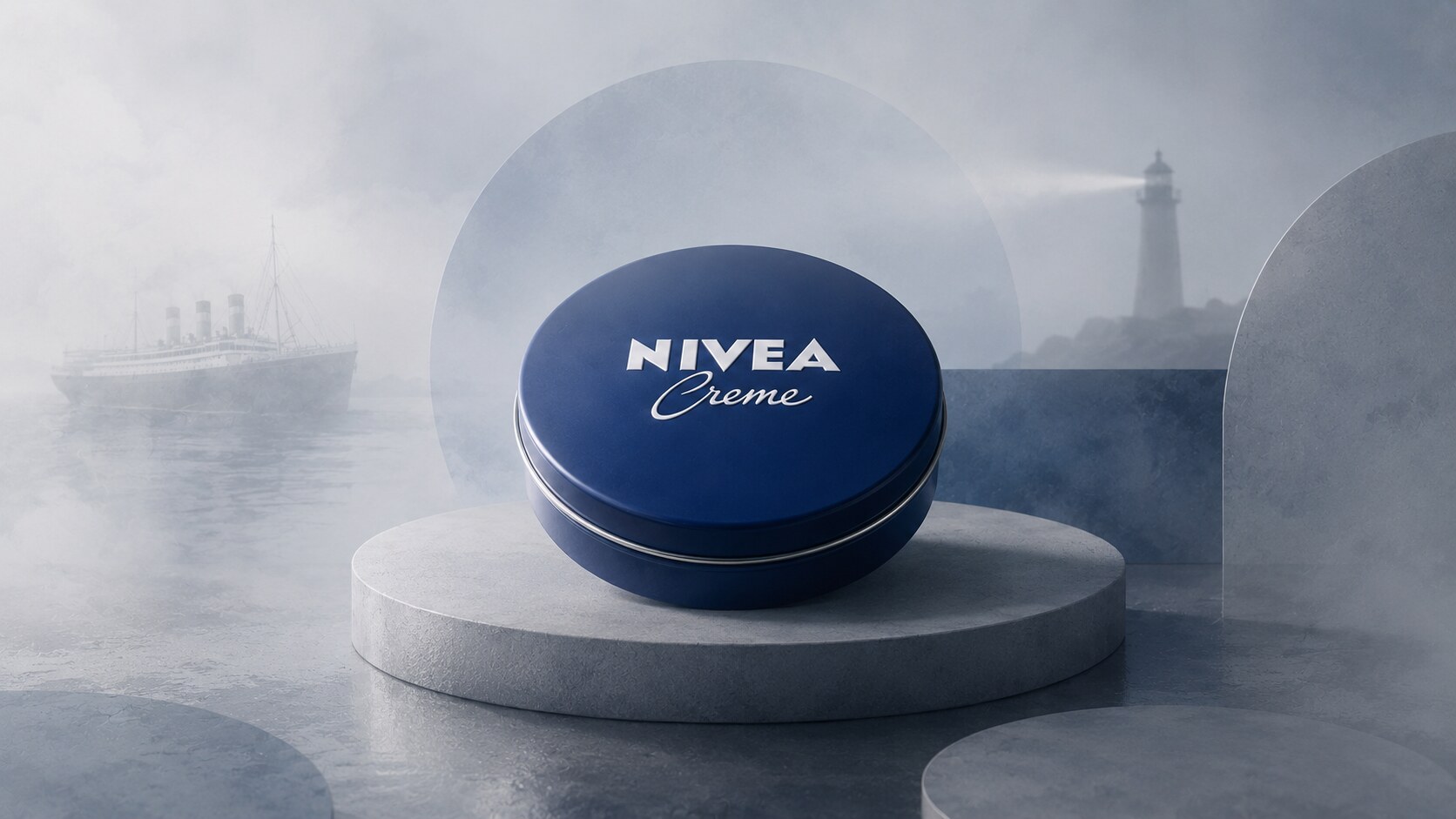
NIVEA Creme is one of the clearest examples of packaging doing the long-term brand work.
Beiersdorf’s own history is unusually specific here. In 1925, Juan Gregorio Clausen, then head of advertising at Beiersdorf, led the shift from the older ornate yellow Art Nouveau tin to the now-famous deep blue tin with white lettering.
That change was radical because it removed:
And replaced them with:
Material is central to the product story:
The graphic design is almost childishly simple, but strategically exact. The round format and blue-white palette became more than packaging; they became identity shorthand across generations.
Beiersdorf said in 2025 that more than four blue NIVEA tins were being sold every second worldwide. Very few cosmetic packages can claim that kind of continuity.
Because it created emotional durability through consistency. The package stayed recognizable while the market changed around it.
The danger for a package like this is not chaos. It is over-protection. Once a pack becomes sacred, brand teams can become too afraid to evolve anything around it.
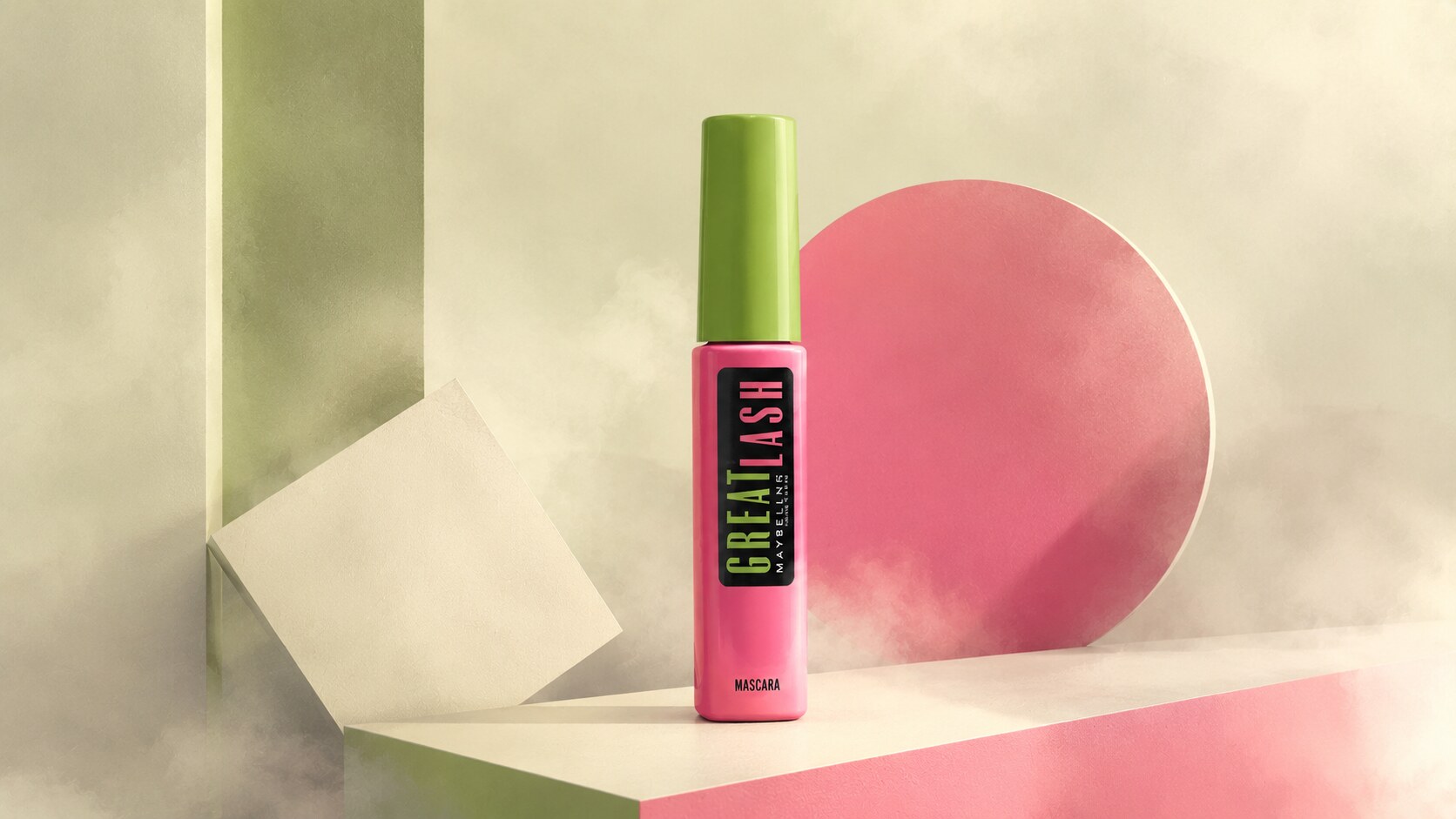
Great Lash is one of the strongest examples of color doing nearly all the shelf work.
The most repeated public credit for its original packaging points to Lilly Pulitzer, whose influence helped shape the now-famous pink and green tube introduced in 1971. The Los Angeles Times described the packaging as originally created by Pulitzer and noted that the tube had already become instantly familiar across generations.
Why does it look like that? Because mascara is often bought quickly, repurchased habitually, and stored in clutter. Great Lash solved that by becoming impossible to lose visually.
Packaging logic:
Graphic logic:
Because it chose memorability over elegance. In beauty, that is sometimes the smarter decision.
Its packaging became so iconic that later fashion-designer editions could sit on the same object without destroying recognizability.
This kind of design can age into “cheap-looking” territory if the rest of the brand drifts upscale. Great Lash survived because it never pretended to be a luxury artifact.
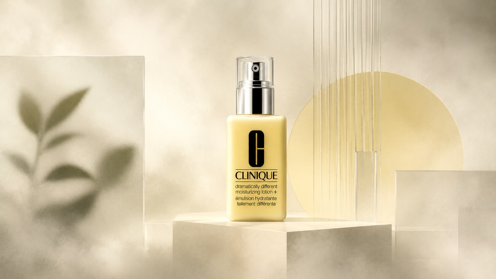
Clinique’s packaging story is one of the most important “anti-glamour” moves in beauty history.
The brand was launched in 1968 as the first dermatologist-created prestige cosmetics line under The Estée Lauder Companies. Public authorship is tied to the brand’s founding mix of Estée Lauder, Carol Phillips, and dermatologist Norman Orentreich, rather than to one famous external package designer.
The yellow lotion became iconic because it visualized the whole Clinique proposition:
Materially, the product sits in the familiar skincare logic of:
The package looks the way it does because it refuses perfume-style seduction. Its power comes from looking controlled, clean, and almost medical.
Graphic design choices:
Because it made “safe” feel premium. That is harder than it sounds.
Clinique says one Dramatically Different product is sold every 3.6 seconds. That kind of scale usually belongs to louder branding systems, not quiet clinical ones.
The same clinical language that built trust can also make the brand feel emotionally cold or dated if not refreshed carefully.
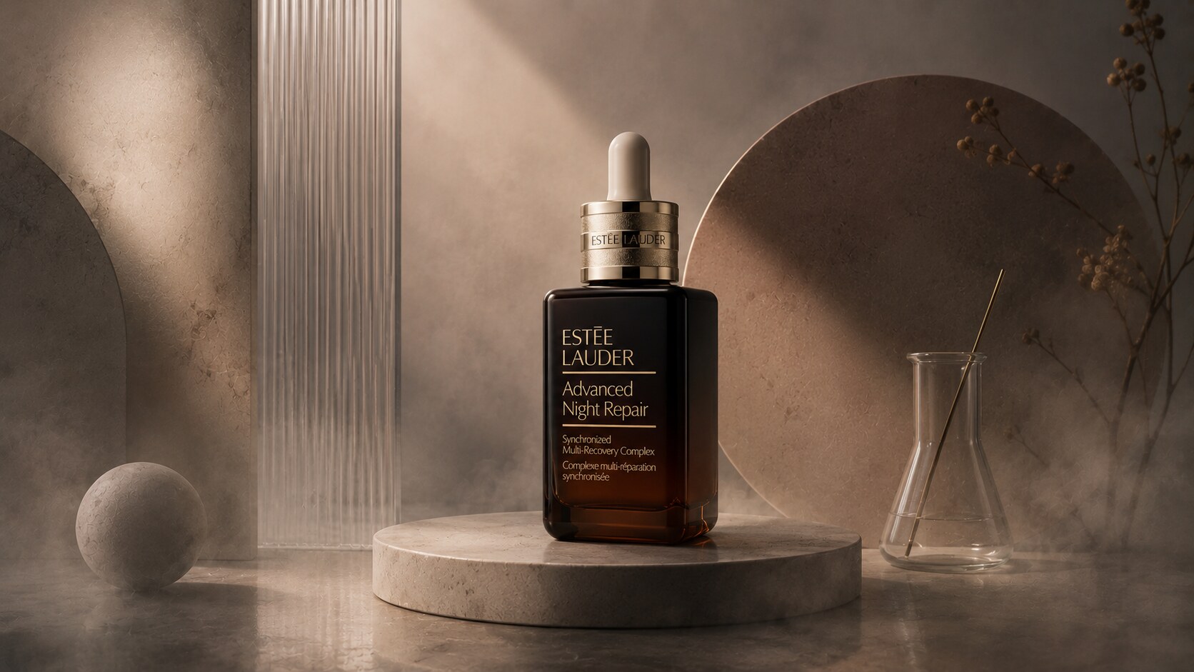
Advanced Night Repair is one of those products whose packaging nickname became part of the brand itself.
Estée Lauder’s own product page openly calls it “Our Little Brown Bottle™ serum.” British Vogue’s 2020 coverage of the reformulation shows how deeply the object had already entered beauty culture before the newest update.
Public authorship here appears largely in-house, driven by Estée Lauder’s product-development and brand teams rather than by a celebrated named outside studio.
Why does it look like that? Because the pack borrows from apothecary language:
Material story:
Graphic design stays secondary:
Because it translated science into an object ordinary consumers could trust visually.
Science-coded packaging can quickly become generic if too many brands copy the same brown-bottle, white-label formula without having a strong product reason behind it.
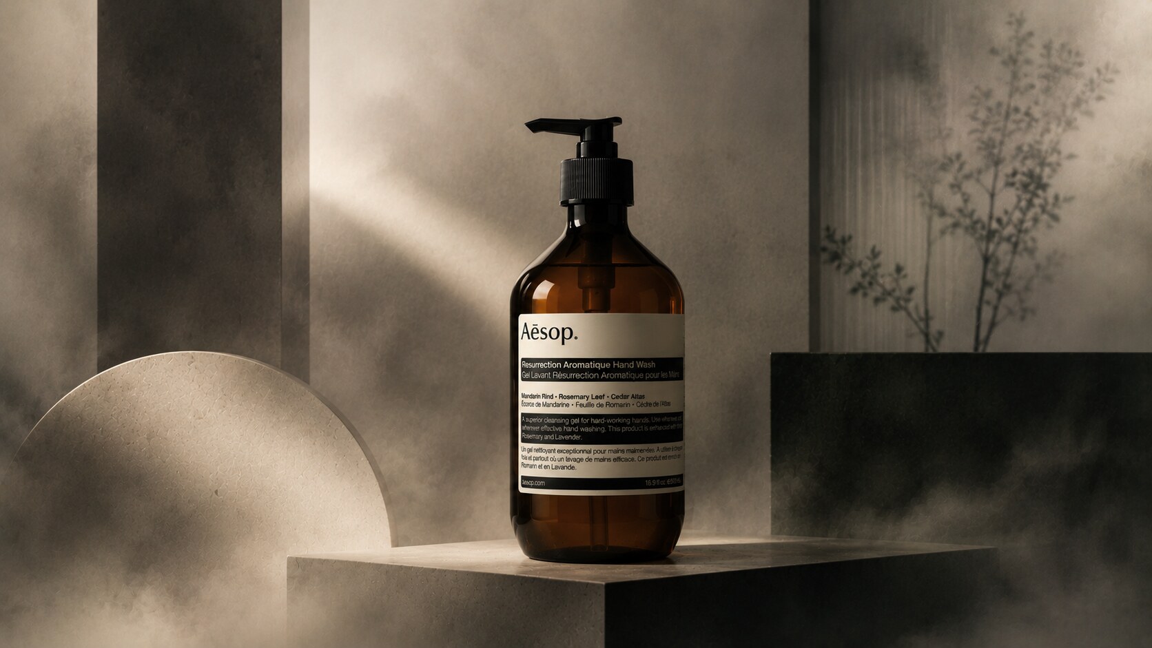
Aesop is one of the most copied packaging languages in modern beauty.
The packaging authorship is strongly tied to founder Dennis Paphitis and Aesop’s internal design philosophy. Aesop’s own brand history emphasizes its long-standing commitment to “intelligent and sustainable design,” and the company explicitly explains that many products are housed in pharmaceutical-grade amber glass because some formulations contain high concentrations of active botanical extracts that are more stable there than in plastic.
Why does it look like that? Because Aesop uses pharmacy cues to communicate:
Material logic:
Graphic logic:
Because it made restraint aspirational. Aesop turned a quasi-pharmaceutical label into a global taste signal.
One of Aesop’s smartest moves is that its packaging works at product scale and at interior scale. A single bottle looks good, but ten bottles in a bathroom, salon, or hotel also create a recognizable visual environment.
The downside of such a strong code is imitation fatigue. Once the market fills with “Aesop-like” amber bottles, the original risks becoming a genre rather than a signature.
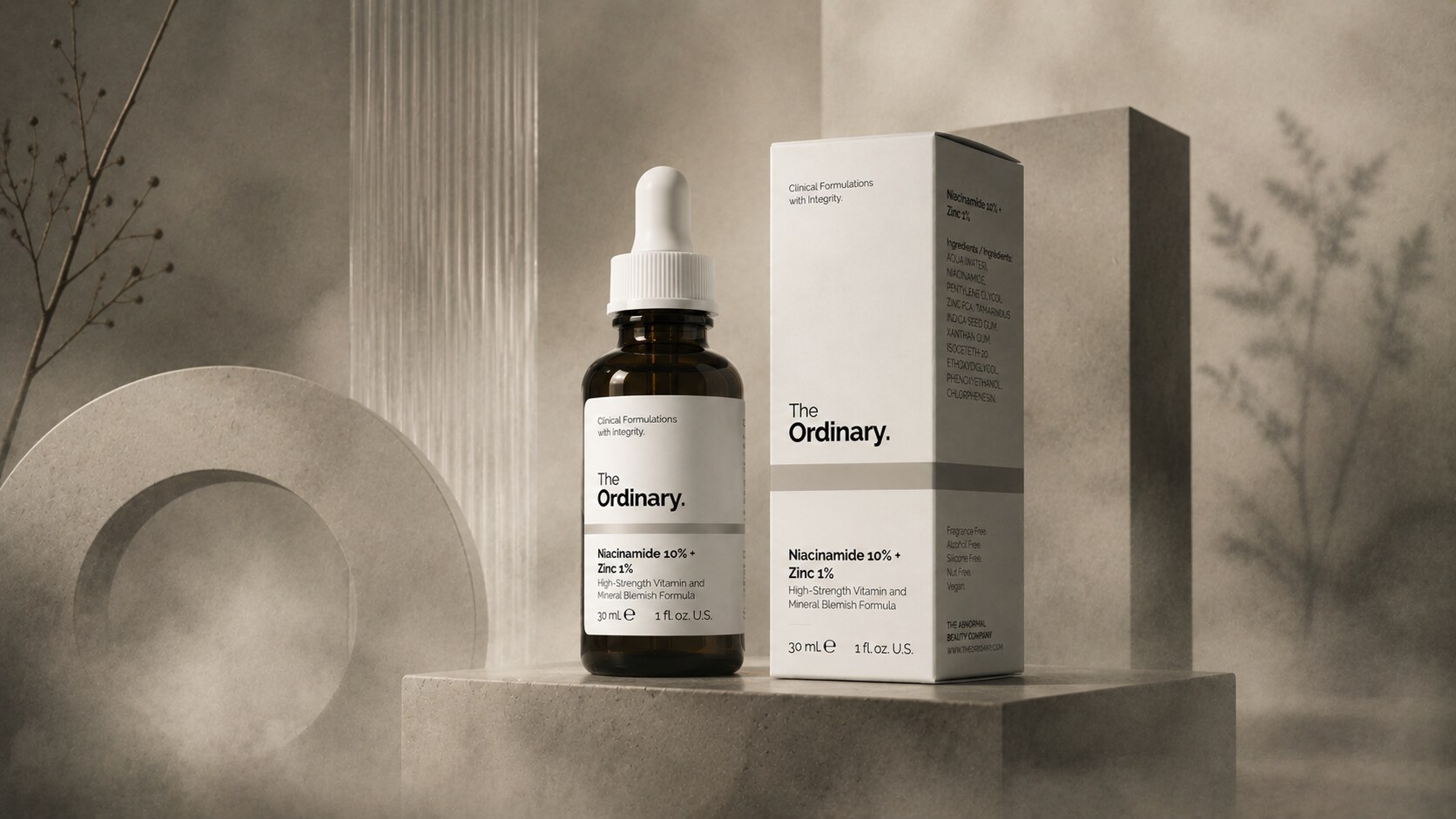
The Ordinary did something unusual: it made package plainness part of the sales argument.
Its own brand guide states the proposition directly. The brand strips away unnecessary scent, packaging, and fancy-sounding but unproven ingredients. The visual system is built to communicate honesty and simplicity.
Public authorship here is mostly DECIEM / The Ordinary’s internal brand system, rather than a famous external package designer being used as a marketing symbol.
Why does it look like that? Because it wants to reverse the normal prestige equation.
Instead of:
It gives you:
Material logic:
Graphic design is the main story here. The label behaves almost like a lab printout, but cleaned up enough for retail.
Because it made transparency feel rebellious. It offered a visual answer to beauty inflation.
The minimal pack also created a counterfeit problem. When a brand’s pack is simple, fakes can imitate the look more easily unless printing quality, retailers, and authentication systems stay tight.
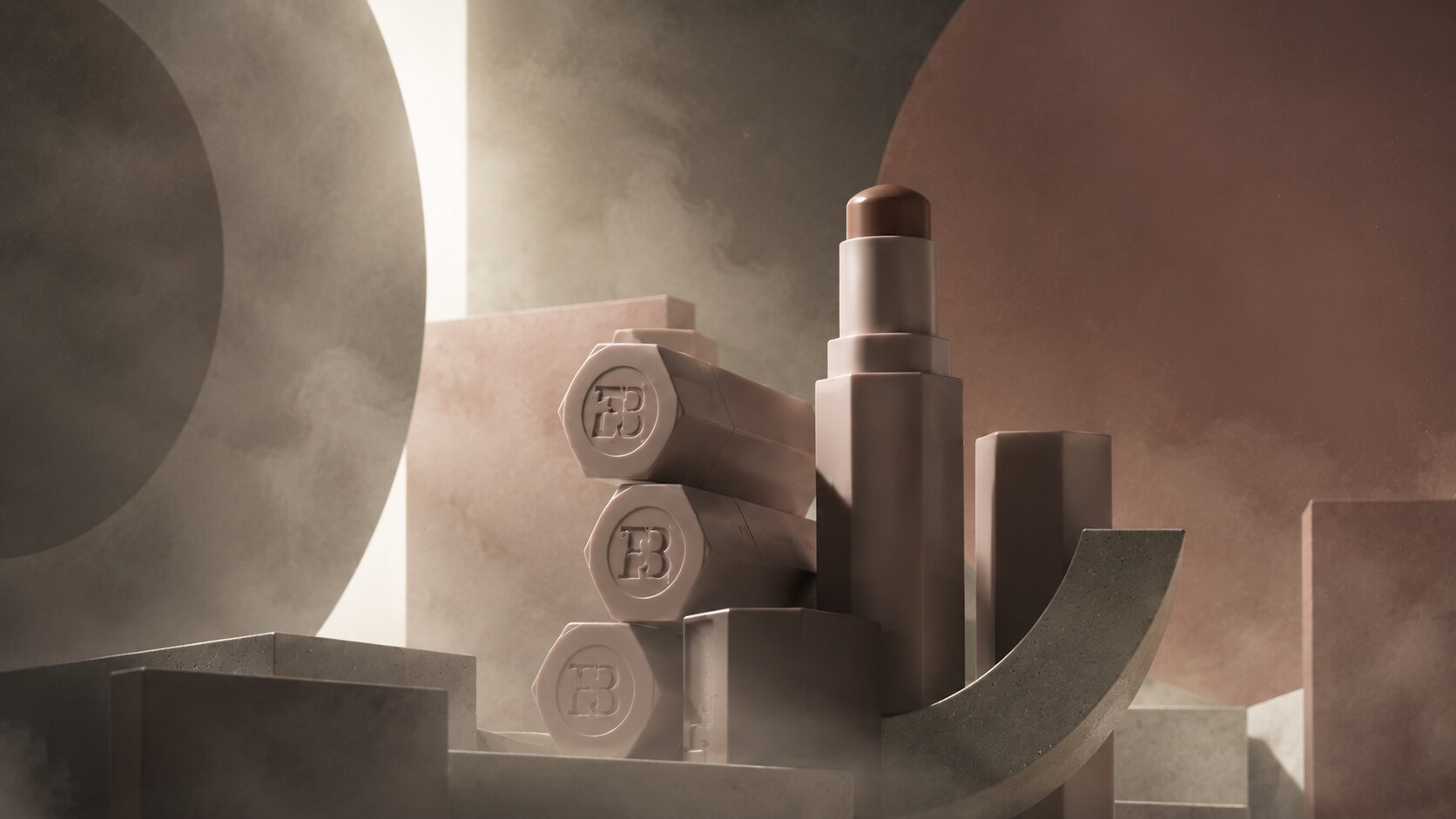
Fenty Beauty entered the market with formula inclusivity, but its packaging also did serious strategic work.
Rihanna told TIME she had “100 percent involvement” and creative freedom “from products to packaging,” so the public creative authorship is clearly founder-led, even if the detailed industrial-design credits are not foregrounded in the same way a design-studio case study might be.
Fenty’s own packaging-improvement note later confirmed two important things about Match Stix:
Why does it look like that? Because the product is trying to be:
Materially, the format leaned on molded componentry and initially used magnets, later removed for environmental reasons while keeping the shape.
Graphic design here is lighter than industrial design. The pack’s recognition comes more from silhouette than from label work.
Because it understood that in beauty, shape can become branding. You do not always need heavy graphics if the object itself is memorable.
Magnetic cleverness is appealing, but it can become a sustainability problem, a cost problem, or both. Fenty’s later change is a useful reminder that seductive packaging features often get reconsidered once scale grows.
These eight products do not look alike, but they win in very similar ways.
The common lesson is simple: cosmetic packaging becomes iconic when it chooses one dominant logic and follows it hard.
The wrong paths are also clear:
For the branding side of this logic, continue with Branding Codes That Stick and The Icons Who Refused to Chase Trends.
“The best cosmetic packages do not merely contain the formula. They teach you how to think about the formula before you even use it.”

News, insights, case studies, and more from the rausr team — straight to your inbox.
Send us your brief, your wildest idea, or just a hello. We’ll season it with curiosity and serve back something fresh, cooked with care.