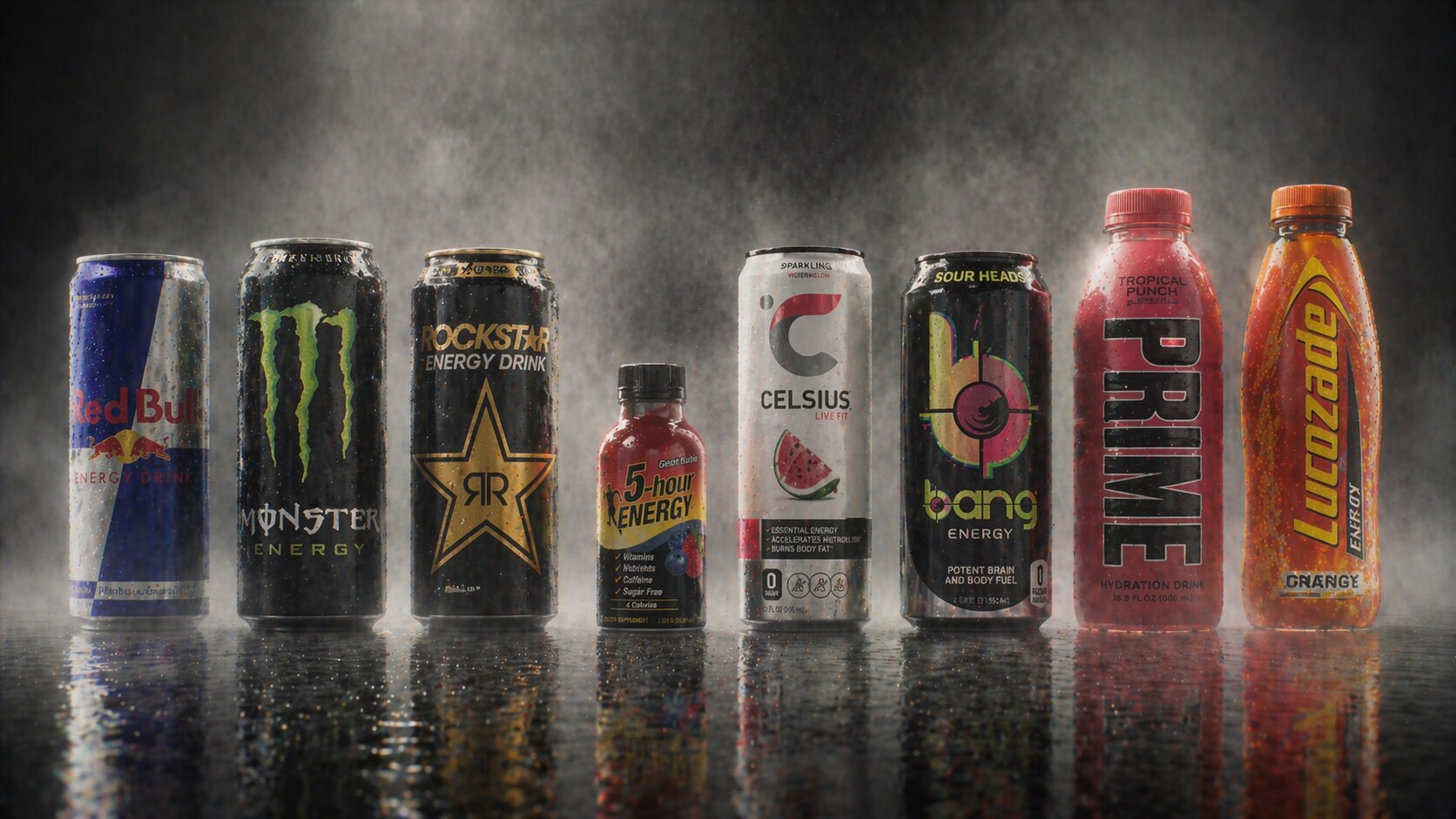
Packaging Design of Successful Energy Drinks: Cans, Shots, Bottles, and Brand Voltage
How eight iconic energy drink brands used packaging, graphic design, shape, color, and positioning to create shelf impact.

How eight iconic energy drink brands used packaging, graphic design, shape, color, and positioning to create shelf impact.
Energy drinks are one of the loudest shelves in retail. The category sells alertness, speed, focus, stamina, gym identity, gaming identity, nightlife, motorsport, creator culture, and sometimes pure chaos. That is why the packaging rarely behaves like a quiet soft drink.
The most successful energy drink packages do more than hold liquid. They create a feeling before the can is opened. A slim silver-blue Red Bull can feels like a premium functional tool. A black Monster can feels like a badge. A Rockstar can behaves like a stage light. 5-hour Energy made the tiny bottle into a new format. Celsius made energy feel cleaner and more fitness-driven. Bang turned performance claims and neon flavors into a shelf spectacle. Prime converted influencer reach into colored bottles and cans. Lucozade shows how an older recovery drink had to redesign itself for a modern energy shelf.
This article looks at eight iconic energy drink brands through packaging design: Red Bull, Monster, Rockstar, 5-hour Energy, Celsius, Bang, Prime, and Lucozade.
For the broader beverage-packaging branch, continue with Iconic Water and Lemonade Packaging and The Story of Meal Packaging Design.
“Energy drink packaging sells a promise before it sells a flavor: this will make you feel more awake, more active, more intense, or more like the person you want to be.”
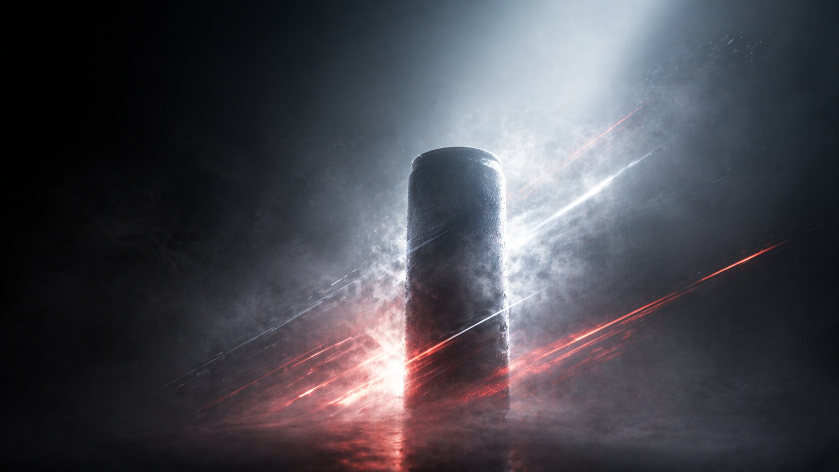
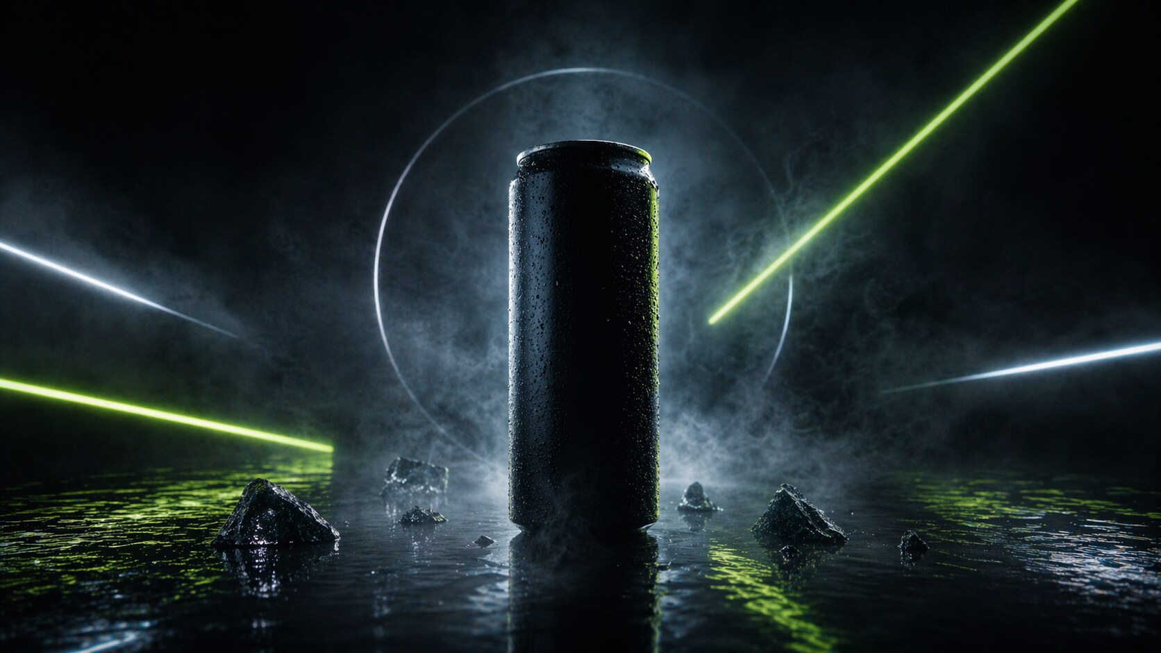
Most beverage packaging sells refreshment. Energy drink packaging sells transformation. That is why the design language is more aggressive, compressed, and symbolic than in many other drink categories.
The can has to answer fast questions:
This is where energy packaging becomes very different from water packaging. Water often sells purity and origin. Energy drinks sell a charged version of the self.
The most common design tools are easy to see:
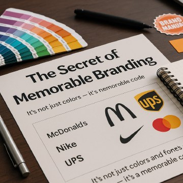
The best brands keep one powerful code stable. Red Bull keeps the silver-blue can and charging bulls. Monster keeps the claw. Rockstar keeps the star. Celsius keeps a cleaner fitness code. Lucozade keeps energy through orange/yellow and its arc. The package can evolve, but the mental shortcut must survive.
This connects directly with Successful Branding Codes and Graphic Design as a Main Sales Power.
The hidden packaging problem in energy drinks is not only standing out. It is standing out without looking unsafe, fake, childish, or legally risky.
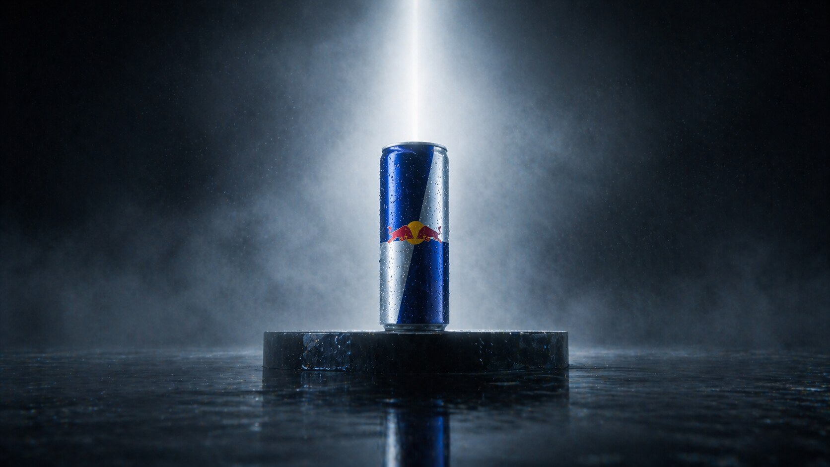
Red Bull is the category architect. Its packaging is interesting because it does not look like the loudest energy drink anymore. Compared with Monster, Bang, or Prime, it is almost disciplined. But that discipline is exactly why it became so strong.
Red Bull’s official company profile says Dietrich Mateschitz worked from 1984 to 1987 on the formula, positioning, packaging, and marketing concept before the Austrian launch on April 1, 1987. He and Thai businessman Chaleo Yoovidhya adapted the Thai functional drink Krating Daeng for Western markets. The designer of the exact can system is not usually credited in public sources; the better-known design authorship is founder-led brand strategy.
The can did several clever things:
The package also helped make Red Bull feel like a category of one. A normal soda can would have made it easier to compare on volume. A slim can made it feel like a tool.
The wrong path is not packaging but claim tension. Red Bull’s famous “gives you wings” line became part of a false-advertising settlement in 2014. The lesson for packaging and branding is clear: the stronger the promise, the more careful the proof has to be.
“Red Bull’s design genius was making less liquid feel like more value.”
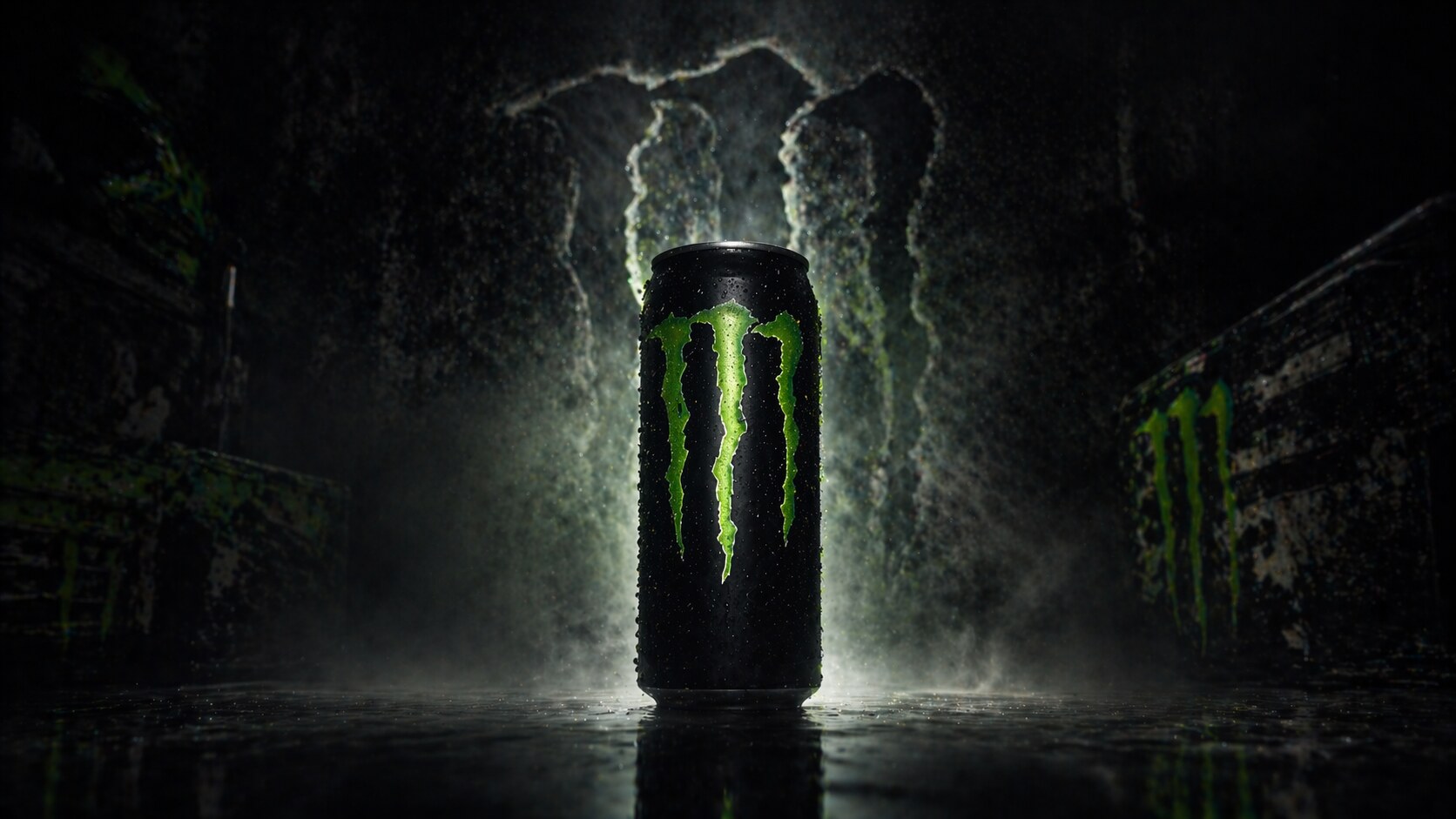
Monster is the most important counter-design to Red Bull. Where Red Bull was compact and premium, Monster went big, black, aggressive, and tribal. The packaging did not try to look medical or polished. It looked like something from a garage, a stage, a motocross event, or a gaming setup.
The public design credit is clearer here. McLean Design created the Monster Energy brand identity and packaging for Hansen’s. In its case study, McLean describes the brief as creating an aggressive brand for a consumer that Red Bull was not fully owning. The result was the neon green clawed “M” on black, with a distressed wordmark and a 16-ounce can.
That claw is one of the strongest energy drink symbols because it works at several scales:
The hidden story is that Monster’s logo became so culturally loaded that conspiracy theories followed it. PolitiFact later debunked claims that the mark had hidden anti-Christian meaning, pointing back to McLean’s stated goal: aggressive impact, not secret code.
Monster’s success path was sharp: take the energy drink from premium functional tool to subculture object.
The wrong path risk is that a brand this aggressive can become visually trapped. If Monster becomes too clean, it loses its bite. If it becomes too extreme, it can feel dated or adolescent. So the brand expands through sub-lines like Ultra, Java, Rehab, and flavor systems while keeping the claw almost sacred.
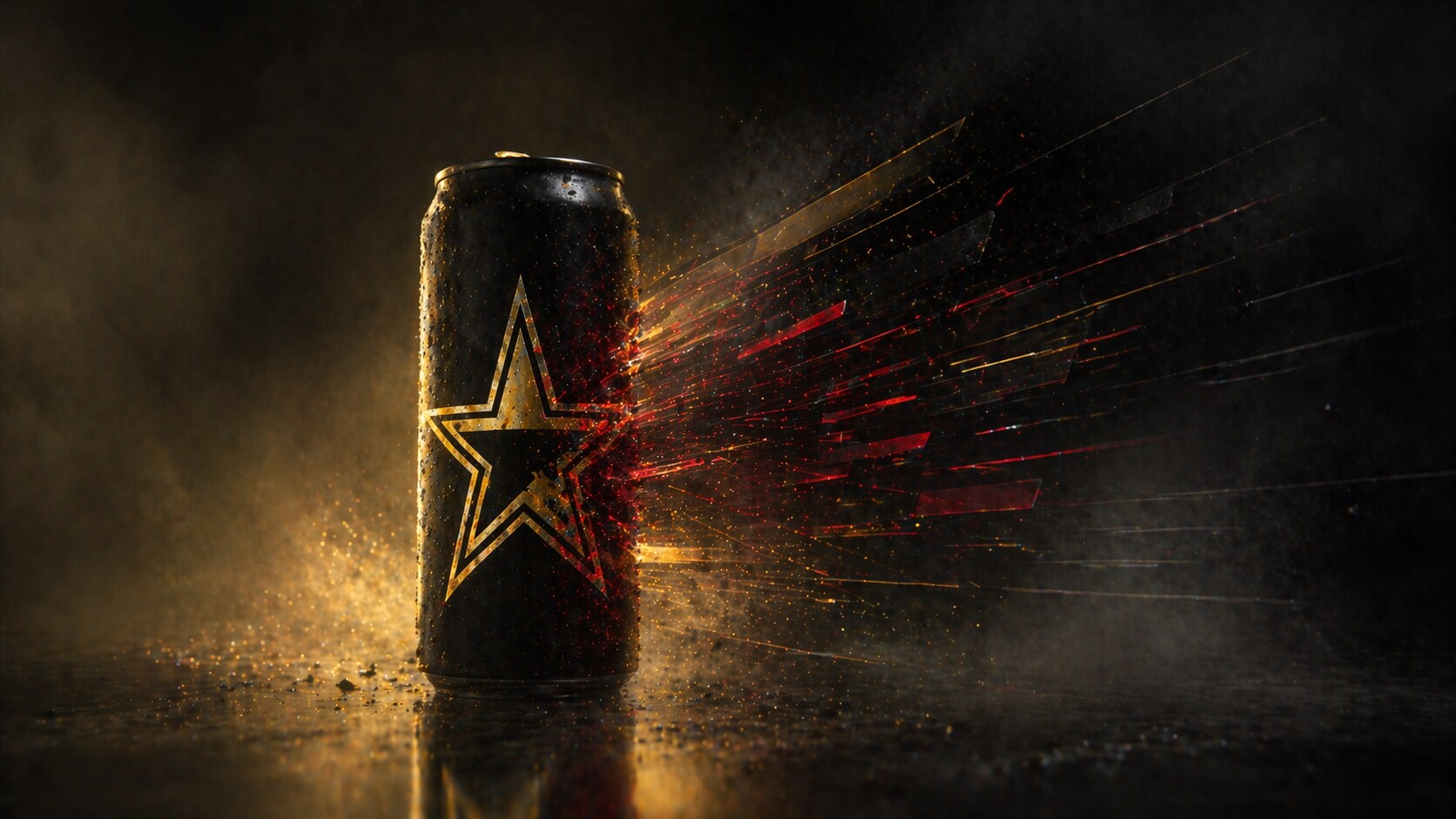
Rockstar entered in 2001 as a direct challenge to Red Bull. Founder Russell Weiner used a simple business and packaging idea: a larger 16-ounce can, a bigger attitude, and a promise that felt more generous than Red Bull’s smaller can.
The early package codes were obvious and effective: star, black, gold, red, loudness, music, and nightlife. The name did much of the work. You did not need to explain “Rockstar” for long. It already carried a fantasy.
But Rockstar also shows what happens when a strong name starts to narrow the brand. Rock music and nightlife were powerful codes, but the energy category became broader: fitness, focus, gaming, zero sugar, wellness, and everyday productivity. The package had to evolve beyond “party fuel”.
PepsiCo acquired Rockstar in 2020 for $3.85 billion. After that, the brand went through major design work. PepsiCo’s 2024 visual identity, designed in-house by PepsiCo Design + Innovation, kept the star but made the system more colorful, accessible, and flavor-forward. The 2024 refresh was part of the “Press Play” platform and tried to move Rockstar from narrow rebellion into broader energy occasions.
What Rockstar teaches:
The blind alley was years of uneven relevance. Rockstar had recognition, but recognition alone is not always growth. PepsiCo’s design work tried to turn the old star into a modern navigation system.
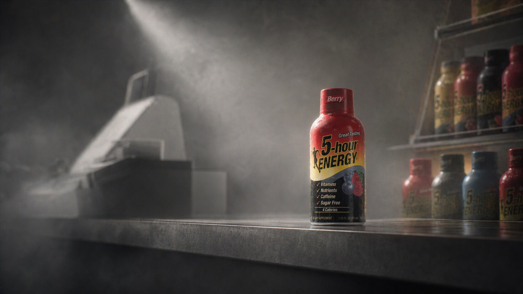
5-hour Energy is one of the strangest packaging successes in the category because it did not win by making a cooler can. It avoided the can fight almost completely.
Founder Manoj Bhargava launched 5-hour Energy in 2004 through Living Essentials. Food Technology Magazine describes it as a category-pioneering two-ounce energy shot. The packaging was small, plastic, direct, and almost pharmaceutical. It did not look like a lifestyle soda. It looked like a small job to be done.
That was the packaging breakthrough.
The tiny bottle changed the sales context:
The design is not beautiful in the classic sense. It is functional retail design. The label is busy, the typography is direct, and the bottle shape is not romantic. But the design understands the moment: tired person, checkout counter, quick decision.
The wrong path is that format innovation invites imitation. Forbes once described Bhargava’s office shelves as full of colorful copycat bottles. The small bottle became a category code, so 5-hour had to defend its mental ownership through distribution, advertising, and repetition.
5-hour Energy proves that iconic packaging does not always mean beautiful packaging. Sometimes it means owning a buying behavior nobody else noticed.
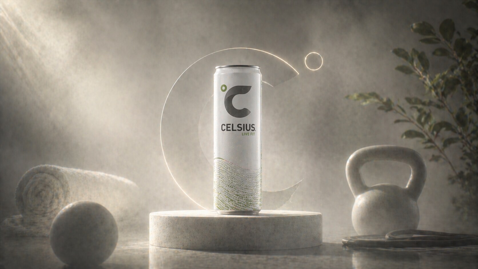
Celsius is the major “better-for-you” energy design story. It did not try to look like Monster. It did not try to look like Red Bull. It moved energy packaging toward wellness, fitness, white space, fruit flavor, slim cans, and routine.
That shift was not immediate. Early Celsius packaging carried more diet and calorie-burning language. Beverage Industry reported in 2016 that Celsius introduced a brand refresh with a degree symbol tied to the name, a bold black logo, the “Live Fit” tagline, and clearer benefit organization on the 12-ounce cans. Publicly credited design work for Celsius also includes Tigre Creative, whose case study lists brand strategy, positioning, identity, packaging, campaigns, and styleguides.
The design success is that Celsius reframed energy as acceptable daily fitness behavior.
The can says:
Celsius also shows the modern challenge: once the clean fitness code works, many brands can imitate it. The future of Celsius packaging is less about inventing “clean energy” and more about keeping the system distinctive while expanding flavors, packs, partnerships, and acquisitions.
The blind alley was early ambiguity. If a can looks too much like a diet supplement, it may struggle to become a mainstream social beverage. The later system became stronger when it sold identity, not only benefits.
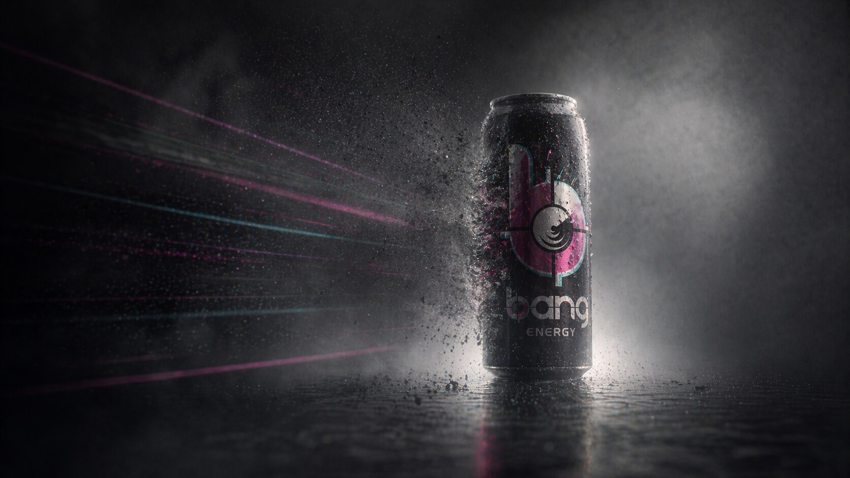
Bang is one of the most useful wrong-path stories in energy drink packaging. It understood attention extremely well. Its cans were bright, loud, flavor-heavy, and built for social visibility. Flavor names like radical candy and dessert-like combinations made the shelf feel like a neon experiment.
Founder Jack Owoc and VPX built Bang around performance language, zero sugar, high caffeine, and bold claims. Visually, it pushed the “performance energy” code into maximalism: circles, gradients, metallic effects, bright typography, and large claims.
For a while, it worked. Bang felt like the drink of the supplement aisle invading the convenience fridge.
But the same design system that created excitement also exposed risk. The “Super Creatine” claim became central to major legal conflict. Reuters reported that Monster won a permanent injunction blocking Bang from marketing drinks as containing “Super Creatine” after a jury verdict awarding Monster $293 million. Monster later completed the acquisition of Bang Energy assets in 2023.
The lesson is sharp:
Bang’s design was not the only issue, but it was the visible carrier of the promise. In energy drinks, that matters. The category is already under scrutiny, so packaging has to balance excitement with credibility.
“In energy drinks, a claim is not just copy. It is part of the package architecture, and it can become a liability.”
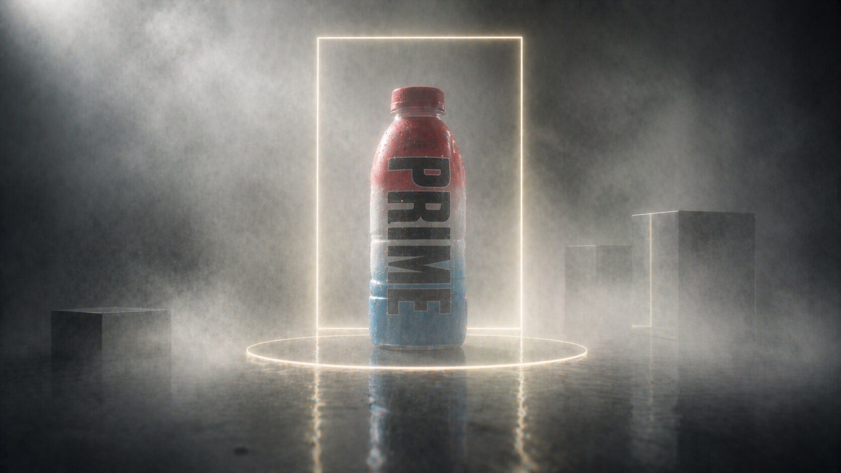
Prime is not the traditional energy drink story. It began as Prime Hydration in 2022, built by Logan Paul and KSI, then expanded into energy products. The packaging design is simple, colorful, and extremely recognizable: big vertical PRIME letters, strong flavor color, clean white space, and a bottle shape that photographs easily.
The designer or agency behind the core packaging is not consistently credited in public sources. The visible authorship is creator-led brand power supported by beverage operators and distribution partners. That is important because Prime shows a new packaging model: the object becomes content.
The bottle and can do several jobs:
Forbes covered the extreme UK resale craze, including KSI pleading with fans not to pay absurd prices. That story says a lot about the packaging. Prime bottles were not only being consumed. They were being hunted, displayed, collected, and resold.
The wrong path is hype decay. Creator packaging can create explosive demand, but it can also burn fast if the product becomes too available, too copied, or too dependent on personality drama. The design has to mature from viral object to durable beverage system.
For the wider sales-design logic behind that, continue with Graphic Design as a Main Sales Power.
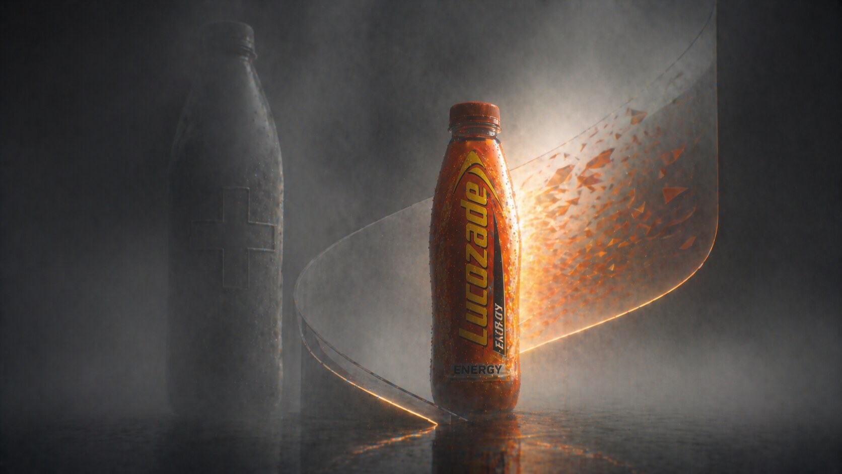
Lucozade is older than the modern energy drink category. It began as a glucose drink associated with recovery and illness, then later shifted toward energy and sport. That makes its packaging story different from Monster or Prime. Lucozade had to escape its own past.
The famous old code was not a can. It was a bottle, orange liquid, and a medicinal recovery association. That is powerful memory, but also a trap. If people associate the drink with being sick, the brand has to redesign its meaning.
Recent design work shows how legacy energy brands evolve. Packaging World reported BrandMe’s 2019 work on Lucozade Energy flavors, with a stronger vertical logo, shard pattern, and clearer flavor impact. In 2024, Lucozade launched a major masterbrand redesign with Pearlfisher London, uniting Lucozade Energy and Sport under a broader “Bring the Energy” platform. The refresh reworked the arc, wordmark, and packaging system to create a more unified shelf presence.
Lucozade teaches a different lesson:
The blind alley is nostalgia without relevance. A brand can be loved and still feel old. Lucozade’s redesigns try to keep the energy of its heritage while making the bottle work in a shelf world full of Celsius, Monster, Prime, and private-label competitors.
Energy drink packaging is moving in several directions at once. That makes the next few years interesting.
On one side, the shelf still rewards impact. Cans need fast recognition. Flavor systems need color. New brands need a visible reason to exist. The black-and-neon language will not disappear because it still works.
On the other side, the category is becoming more regulated, more health-conscious, and more segmented. There is energy for gym people, gamers, drivers, students, office workers, parents, women, Gen Z, low-sugar consumers, and nootropic-curious shoppers. One visual language cannot serve everyone.
The likely packaging directions:
The most successful future packaging will probably not be the loudest. It will be the clearest version of a specific promise.
For the cautionary side of redesign and trend-chasing, continue with Why Companies Sterilize Their Logos and When Being Trendy Backfires.
“The future energy drink can has to do two opposite things: look exciting enough to pick up, and trustworthy enough to drink every week.”
Red Bull shows the power of disciplined category creation. Monster shows the power of a symbol becoming a badge. Rockstar shows how a star has to evolve after acquisition. 5-hour Energy shows that format can beat beauty. Celsius shows the rise of clean fitness energy. Bang shows the danger of over-claiming. Prime shows the power and instability of creator-led packaging. Lucozade shows that heritage can be redesigned without being erased.
That is the real story of energy drink packaging: it is not only graphic design on metal or plastic. It is a promise about who the drink is for, what moment it belongs to, and how much energy people are willing to believe.

News, insights, case studies, and more from the rausr team — straight to your inbox.
Send us your brief, your wildest idea, or just a hello. We’ll season it with curiosity and serve back something fresh, cooked with care.