Packaging Design of the Most Successful Bonbons
Eight iconic bonbon and boxed confectionery brands, their packaging stories, material choices, visual codes and more details from the background.

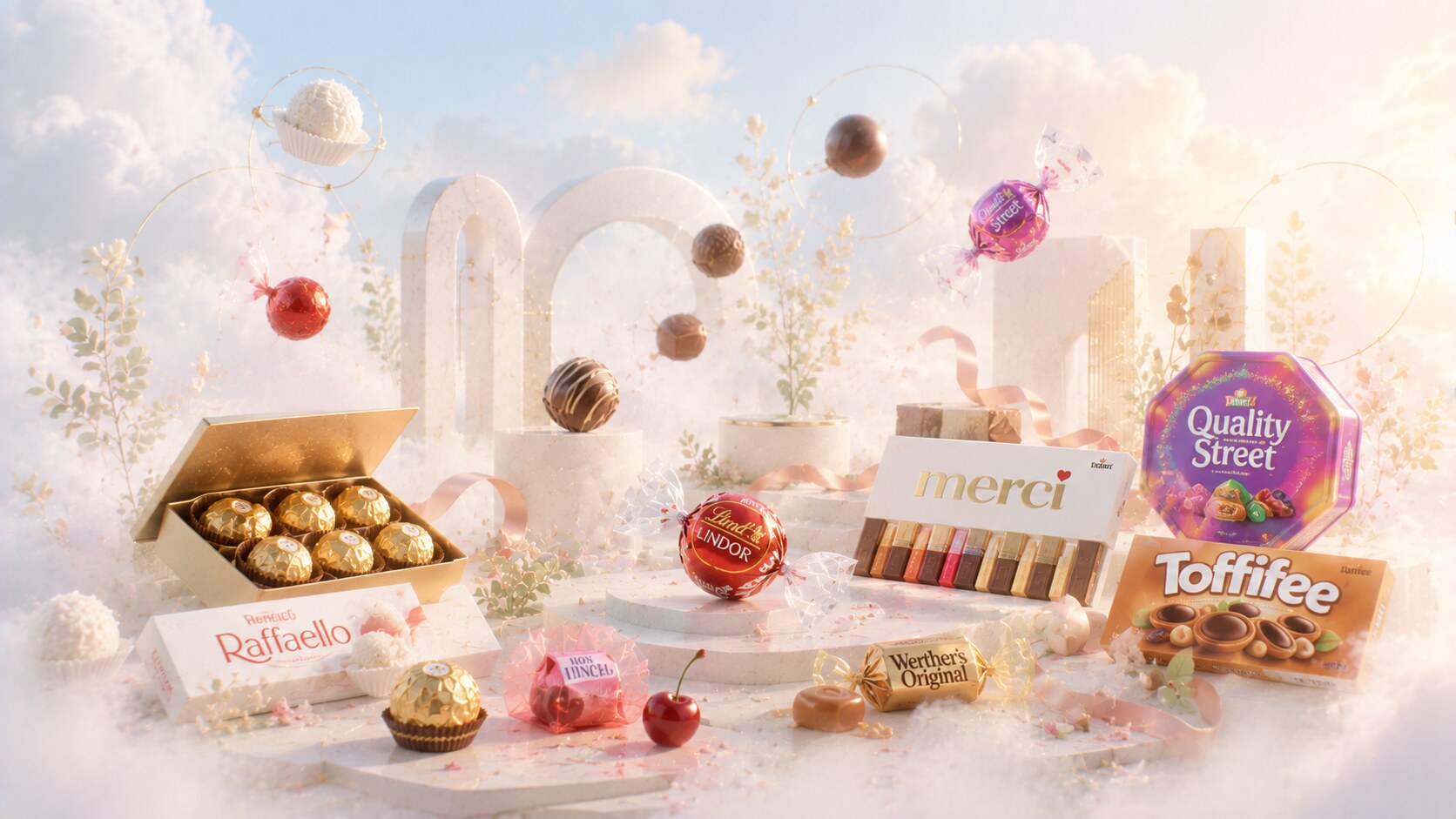
Eight iconic bonbon and boxed confectionery brands, their packaging stories, material choices, visual codes and more details from the background.
Bonbons live in a slightly different packaging world from everyday candy bars.
A bar can win through speed and impulse. A bonbon often wins through gifting, sharing, elegance, memory, and the feeling that opening the pack is already part of the experience.
That makes the category unusually demanding. The package has to protect delicate shapes, separate pieces, manage freshness, communicate flavor assortment, and still look desirable on a shelf crowded with gold, red, ribbon effects, and promises of indulgence.
The strongest packs in this field succeed because they solve both appetite and occasion. They do not only ask, “Does this look tasty?” They also ask, “Does this feel worth bringing home, giving away, or placing on the table?”
This article sits naturally beside Most Successful Chocobars Packaging Design, Packaging of the Most Successful Alcohol Brands, and Package Design Story of Popular Cosmetic Products.
“The best bonbon pack does not only wrap confectionery. It wraps mood, ritual, and permission to pause.”
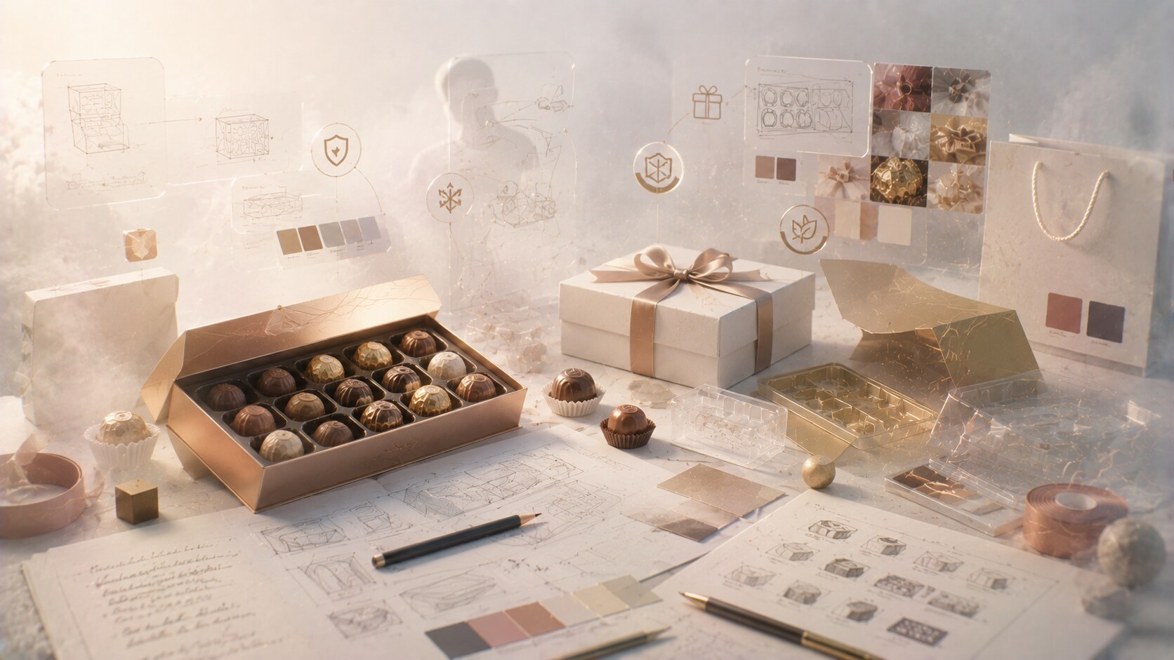
The design challenge here is broader than many young designers expect.
Bonbon packaging usually has to coordinate:
It is also a category where many famous packages were not born from one publicly celebrated agency reveal. Quite often the strongest systems were built through long internal stewardship, packaging engineers, printing suppliers, and brand teams refining the same codes for decades.
That is one hidden truth of confectionery. Some of the world’s most recognizable packs have very famous results and very anonymous authorship.

Ferrero Rocher is one of the clearest examples of packaging doing more cultural work than the product shape alone.
Its system is brilliantly layered:
The visual promise is obvious even before a word is read. It says abundance, formality, and safe luxury. That is why the brand became so strong around Christmas and gifting rituals.
Historically, this is tied more to Ferrero’s internal discipline and the commercial instincts of Michele Ferrero than to one famous outside design studio. The success came from turning repetitive richness into a very stable code.
Because the pack makes the product look expensive, ceremonial, and reassuringly familiar all at once.
The clear box is crucial. Without it, the gold might feel generic. With visibility, the product itself becomes part of the graphic effect.
Gold-premium language can age badly when consumers start reading it as old-fashioned or too formal.
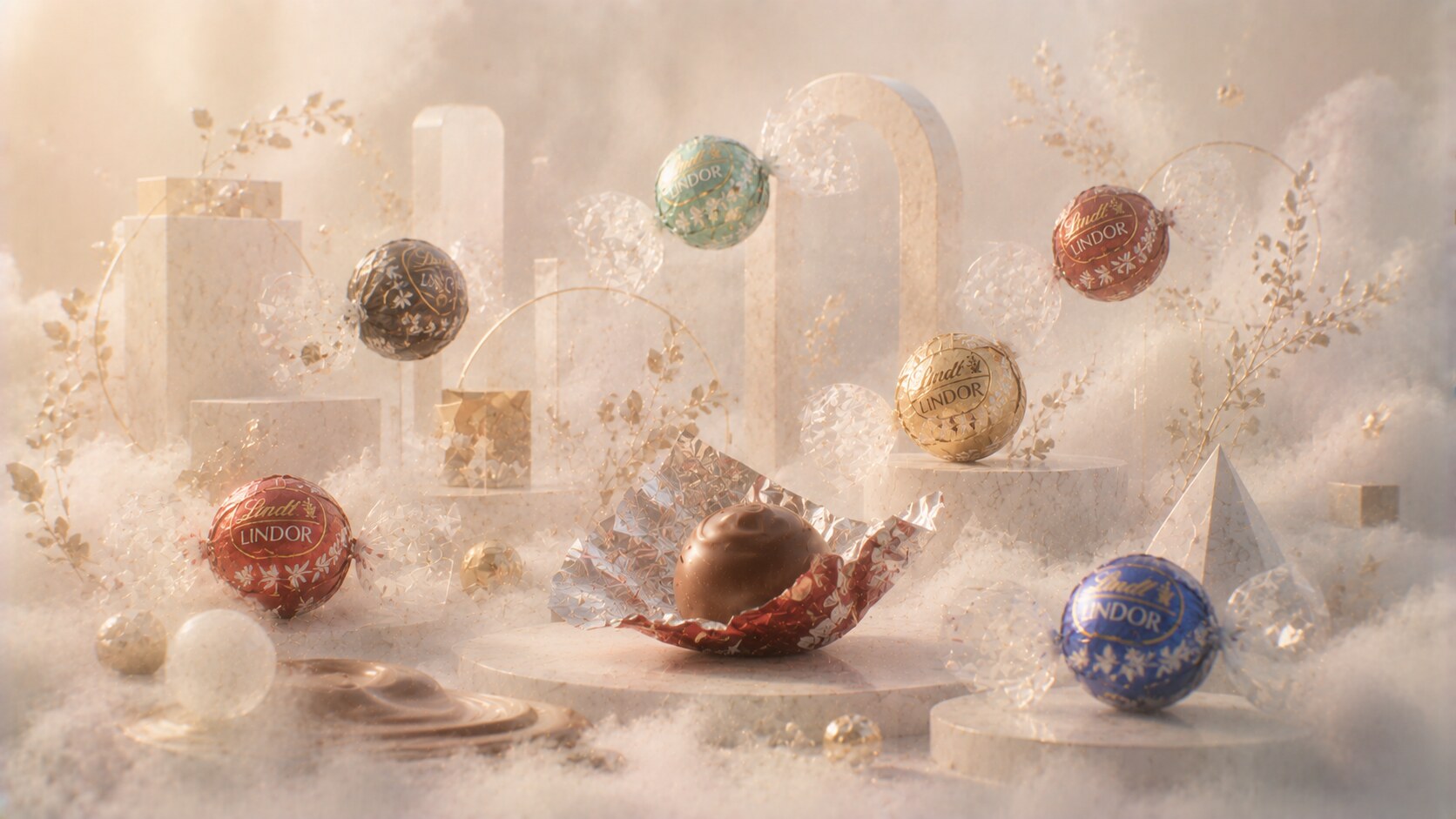
Lindor packaging is much softer than Ferrero Rocher, but equally strategic.
The brand’s key packaging strengths are:
The red milk-chocolate Lindor truffle became especially powerful because it made one flavor-color association almost universal. Later extensions followed the same logic without losing the family look.
This is where the packaging became smarter than it looks. The wrappers feel indulgent, but they are also excellent navigational devices. In a bowl, a box, or a supermarket display, color is doing a huge amount of work.
One useful design lesson from Lindor: when the base product form changes very little, the wrapper color system has to carry much more of the identity load.
Too many flavors can make a once-elegant family start looking crowded or cosmetic rather than chocolaty.
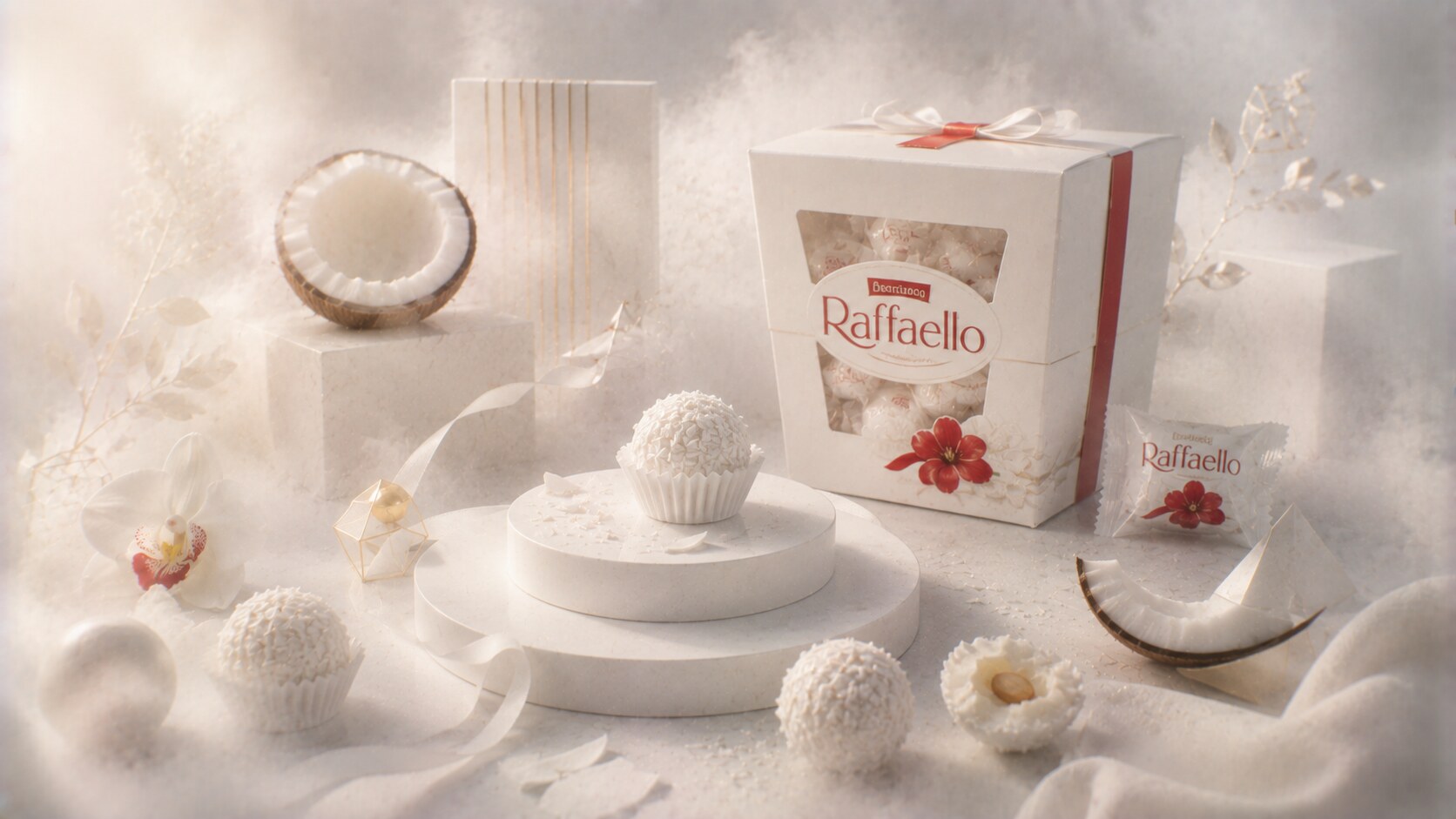
Raffaello succeeded partly because it refused the category default.
Instead of using dark chocolate codes, heavy premium palettes, or loud indulgence cues, it built a cleaner and more bridal-looking identity around:
That made the brand feel airy, giftable, and almost ceremonial in a different way from Ferrero Rocher. It was not luxury through opulence. It was luxury through cleanliness and softness.
This also aligned well with the product itself, which is visually pale and structurally delicate. The packaging does not fight that truth. It amplifies it.
Ferrero even fought legal battles around product appearance in the wider Raffaello story, which shows how seriously confectionery companies treat distinctive visual form.
The same whiteness that makes the brand elegant can also make it less emotionally warm and less impulse-driven than darker, richer-looking competitors.
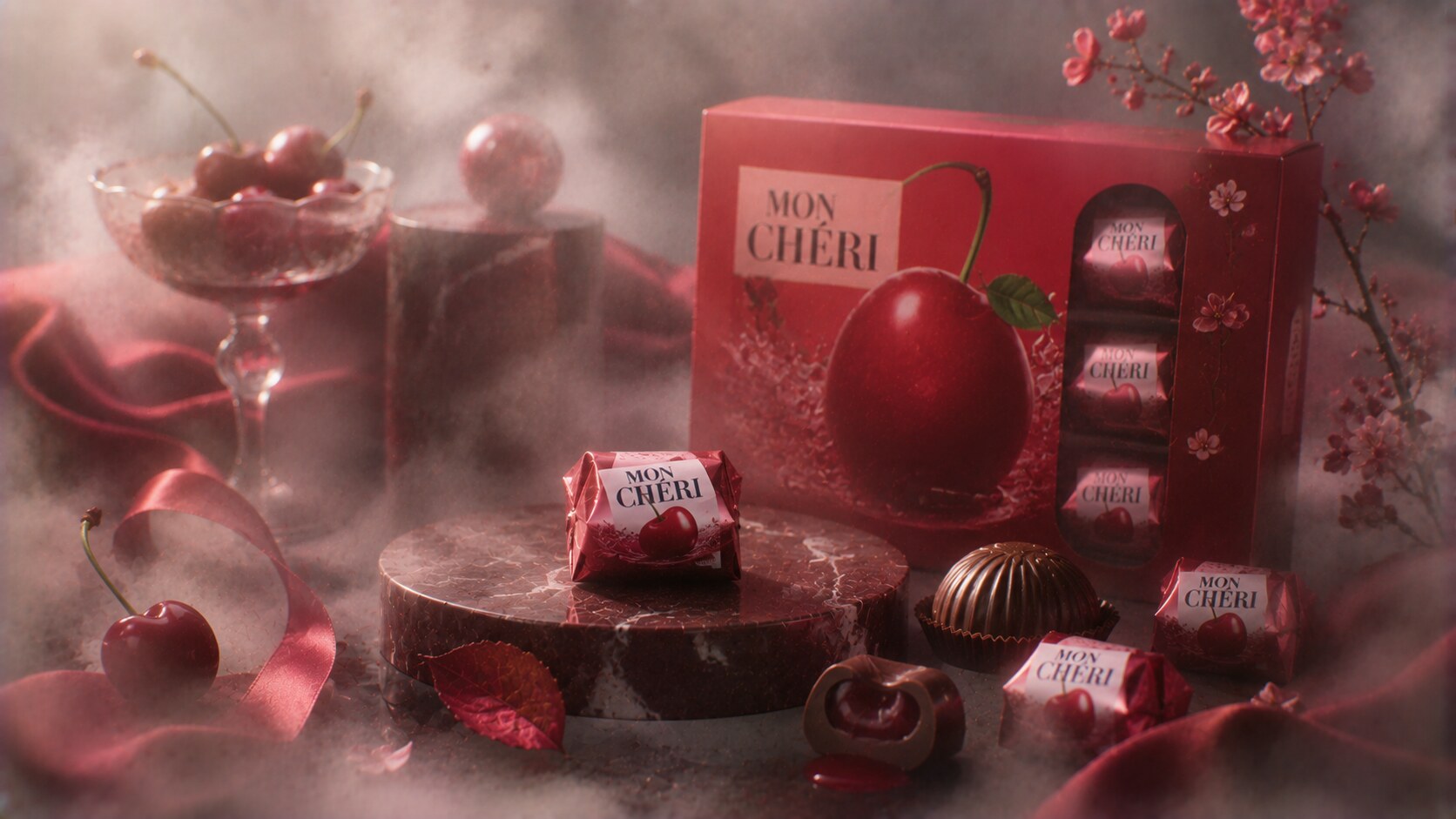
Mon Chéri is interesting because the package is selling a mood as much as a taste.
The design language leans on:
Compared with Raffaello, Mon Chéri is much more theatrical. It pushes romance, sensuality, and a slightly old-world European elegance. That made sense because the product itself is alcohol-linked, more niche, and less universal than milk-chocolate pralines.
Historically, Ferrero used packaging here to position the product almost like an evening confection rather than a casual snack.
The pink-red individual wrapping mattered because it made each piece feel like a small event, not just one unit in a bulk assortment.
Its adult tone can also narrow its audience. In some markets the pack feels iconic, in others slightly dated.
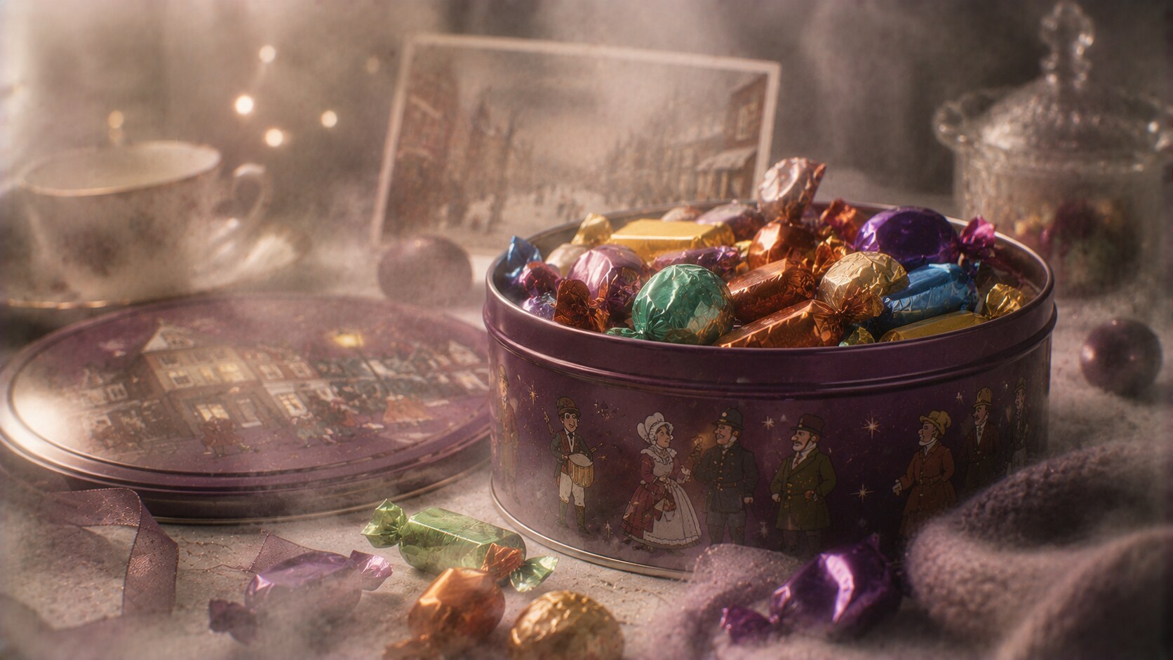
Quality Street is one of the most important packaging stories in British confectionery because the container itself became part of household culture.
The product’s strength came from several layers:
The history here is unusually rich. The brand dates back to 1936, and the original visual world drew on characters associated with J. M. Barrie’s Quality Street. Early advertising and pack illustration were tied to Harold Mackintosh and designer-led work inside Mackintosh’s packaging department, including artwork associated with Harold Oakes.
That makes Quality Street one of the clearer cases where named people really do appear inside the packaging story.
Because it sold assortment and occasion together. The pack promised variety before the sweets were even chosen.
Packaging updates toward paper wrappers and paper tubs are environmentally important, but they also risk changing the tactile nostalgia that helped make the brand special.
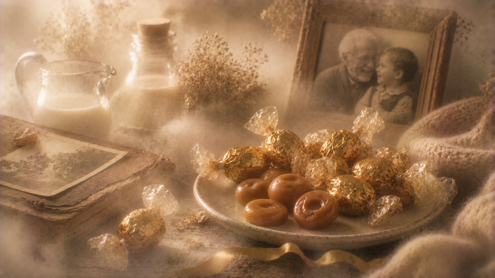
Werther’s Original is one of the best examples of packaging carrying emotional memory.
The basic cues are highly disciplined:
The wrapper does not try to shock. It tries to reassure.
That matched the famous advertising perfectly, especially the grandfather-grandchild emotional framing that helped make the product feel special rather than merely sugary. The package and the ad world worked together as one system.
The deeper strength here is that the pack communicates recipe feeling. Butter, cream, patience, and warmth are all suggested through the color world before anyone reads a line.
Werther’s Original became an internet meme in Japan partly because of dubbed advertising, which is a strange reminder that packaging memory often travels together with voice and story, not only with graphics.
Its nostalgia can become limiting if younger consumers start reading it as a candy for older relatives rather than for themselves.
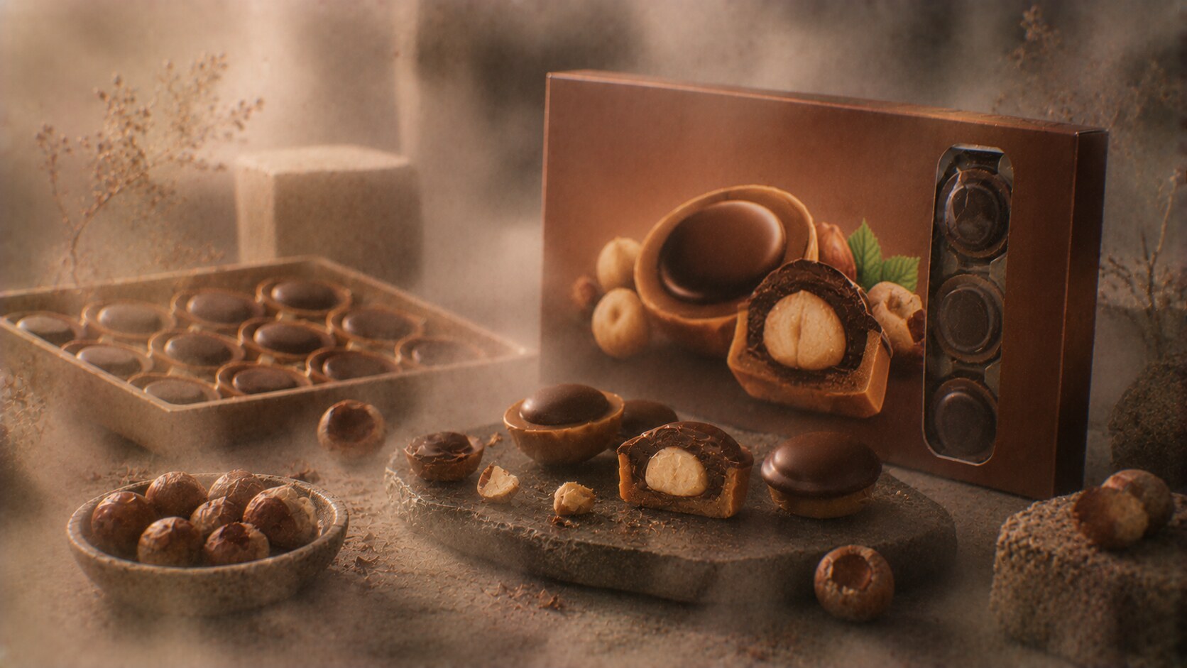
Toffifee is one of the smarter structural packs in mainstream confectionery.
The product is slightly awkward to explain in words: caramel cup, hazelnut, nougat cream, chocolate top.
So the packaging solves the problem visually.
It usually relies on:
This is exactly why it worked. Toffifee never needed to pretend it was elite chocolate. It needed to show that it was layered, fun, and shareable.
The product was developed under the leadership of Klaus Oberwelland, and the package long reflected Storck’s practical mass-premium discipline more than dramatic design-world flourishes.
In the United States the brand became Toffifay with a different spelling and lighter package treatment, which shows how even strong packs may be locally adapted when pronunciation and market habits get in the way.
The box can feel slightly dated when compared with cleaner premium confectionery on today’s shelves.
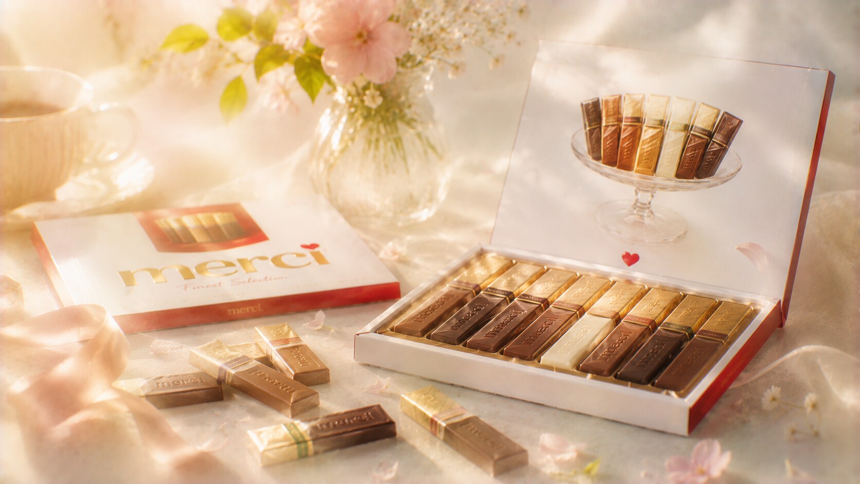
Merci is one of the most conceptually elegant packs in the category because the name already tells the use case.
From the beginning, the packaging was shaped around gifting and polite exchange:
That is a very strong packaging position. The product does not have to invent a consumption occasion from scratch. It already owns one social function: saying thank you.
This is also where the graphic design is stronger than it first appears. The box usually keeps a clean field, visible flavor structure, and a tone that feels orderly rather than festive-chaotic.
Merci was launched with the idea of making gratitude itself into a product occasion, which is one reason the name became such a strong packaging asset across many European markets.
The very clear thank-you positioning can also limit spontaneity. If the box feels too tied to polite gifting, it may be passed over when people want a more playful or self-indulgent chocolate purchase.
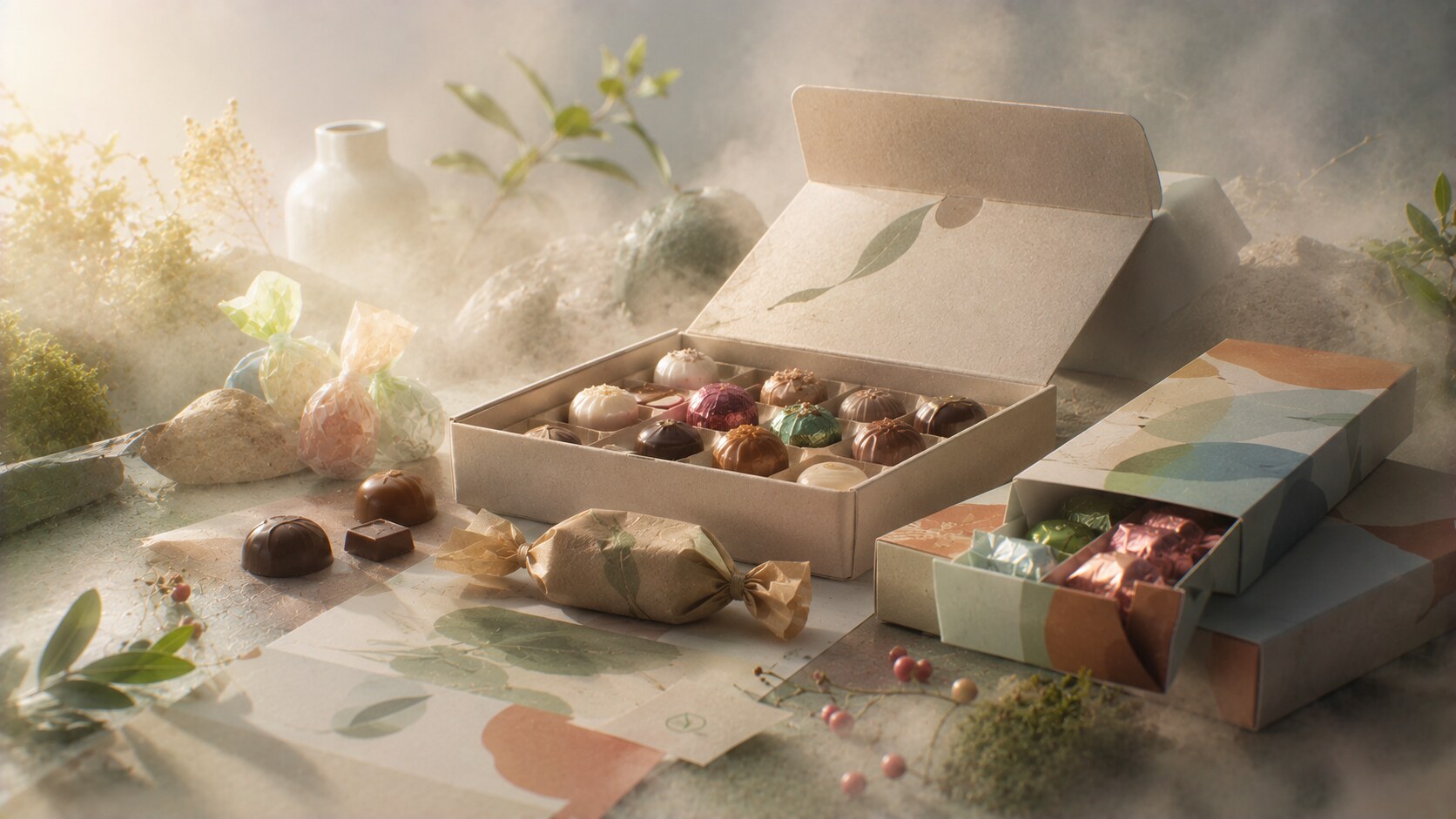
The category is changing under pressure from sustainability, pricing sensitivity, and changing gift habits.
That means future bonbon packaging will likely move toward:
But the strongest brands will still need ritual. Bonbons are not only functional products. They are small social objects.
That is the real design tension now. Packaging has to become more responsible without losing the little sense of occasion that made these products successful in the first place.
One quiet future trend is that brands may need to make secondary packaging work harder. If outer materials become simpler, inner organization, wrapper color, and opening choreography become more important.
The story behind successful bonbon packaging is not only about pretty boxes.
It is about understanding that each brand wins through a different emotional and structural strategy.
| Product | Main strength | Main weakness |
|---|---|---|
| Ferrero Rocher | giftable luxury clarity | can feel over-formal |
| Lindor | excellent flavor color system | line extensions can get crowded |
| Raffaello | unique white-space identity | can feel less warm or indulgent |
| Mon Chéri | strong adult mood | narrower audience |
| Quality Street | occasion and assortment power | sustainability changes may disturb nostalgia |
| Werther’s Original | emotional warmth and trust | can skew older in perception |
| Toffifee | very clear product explanation | box can feel dated |
| Merci | concept and use-case clarity | less spontaneous for impulse purchase |
The table makes the point clearly: bonbon packaging does not win in only one way. Different products dominate through very different emotional codes.
That is why these packs lasted. They were not only recognizable. They were emotionally well-matched to the role they wanted to play.
News, insights, case studies, and more from the rausr team — straight to your inbox.
Send us your brief, your wildest idea, or just a hello. We’ll season it with curiosity and serve back something fresh, cooked with care.