The Packaging Design Story of the Most Iconic Alcohol Brands
From bottle architecture and label typography to the stories, studios, blind paths, and market pressures shaping where alcohol branding goes next.

From bottle architecture and label typography to the stories, studios, blind paths, and market pressures shaping where alcohol branding goes next.
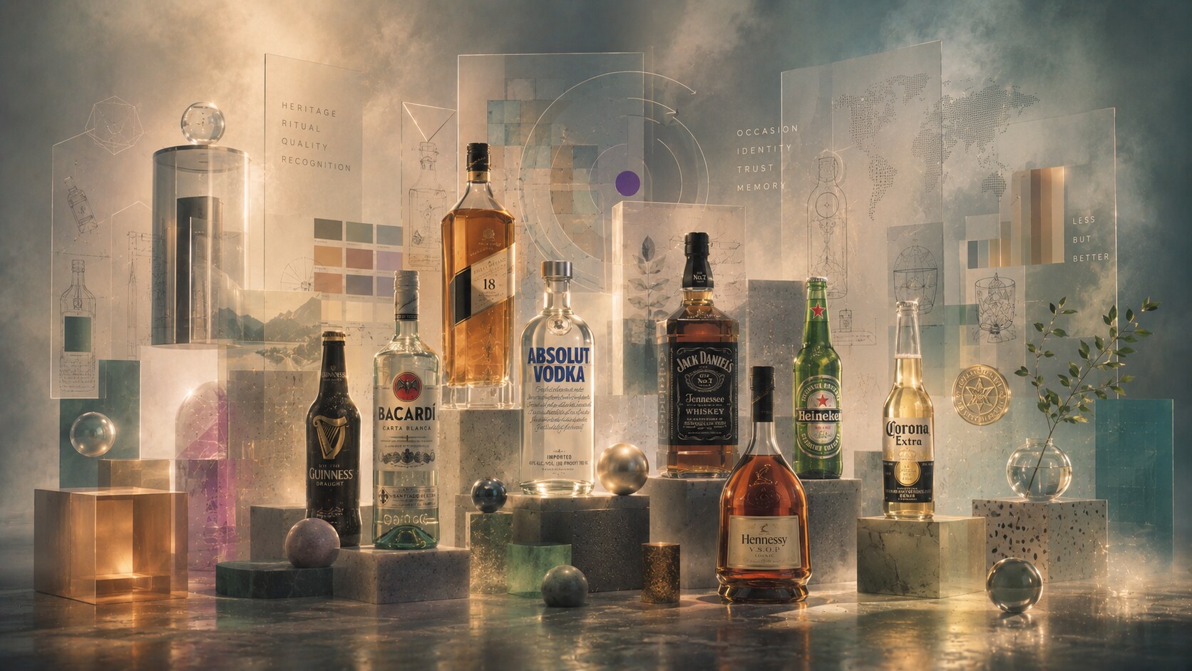
The best alcohol packages do not behave like simple containers.
They do at least four jobs at once:
That is why the strongest alcohol brands are often recognizable before the label is fully read. A square whisky bottle. A transparent vodka bottle with blue lettering. A black-and-white Tennessee label. A green beer bottle with a red star. A clear Mexican bottle that almost dares the sunlight to hit it.
In this category, packaging is never neutral. The shape of the bottle, the width of the shoulder, the typography on the etiquette, the crest, seal, medallion, foil, cap color, and even the amount of empty glass all become part of the story people buy.
If you like this branch of the series, it sits naturally beside Iconic Water and Lemonade Packaging, Packaging Design of Successful Energy Drinks, and The Story of Meal Packaging Design.
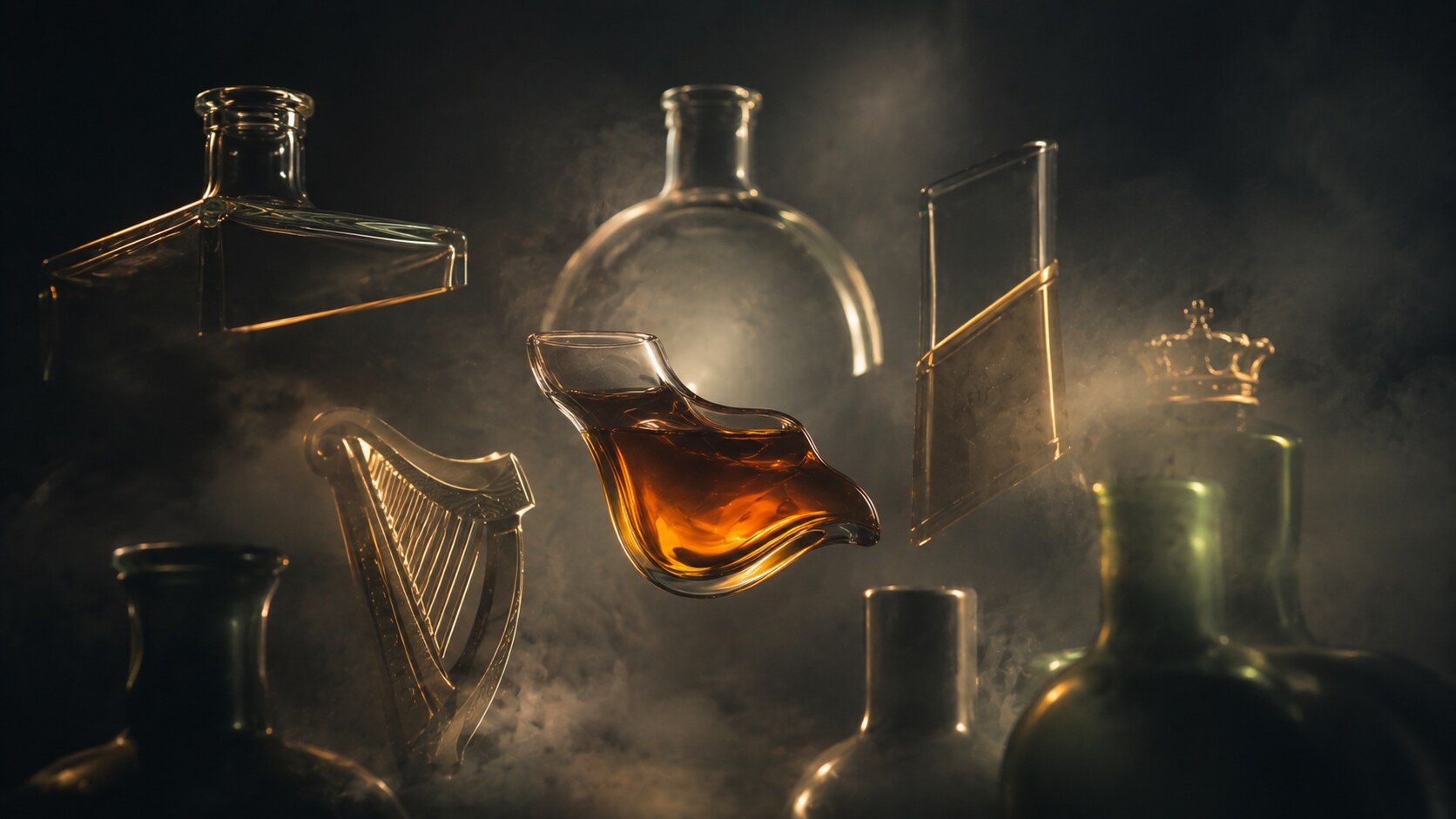
“In alcohol branding, the package is often the first sip.”
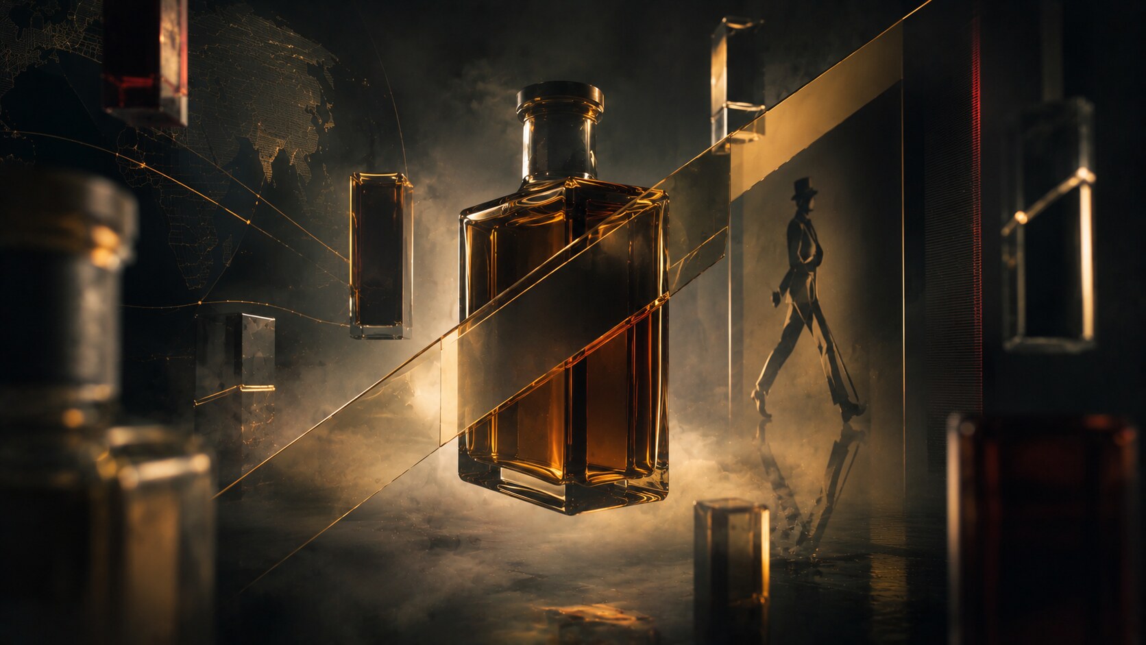
Johnnie Walker is one of the clearest examples of structure becoming identity.
The core visual decisions are still remarkably simple:
The important thing is that these were not random decorative gestures. The square bottle is widely tied to Alexander Walker’s push for more efficient transport and less breakage, while the angled label increased visibility and allowed larger type. In other words, the most iconic parts of the package were born from logistics and legibility, then matured into style.
Materially, the bottle is traditional whisky architecture: rigid glass, paper label, neck seal, and a disciplined shoulder. But the total effect is sharper than many Scotch rivals. It looks export-ready, adult, and mobile.
Graphic design does a lot of work here too. Johnnie Walker’s typography and diagonal label placement make the bottle feel like it is already moving. Very few alcohol labels look that active while remaining conservative.
Because it fused utility and theatre. The package traveled better, read better, and became unmistakable.
The package is so recognizable that many people identify Johnnie Walker first by bottle angle, then only second by the name.
The danger for such a system is over-polishing it. Once a package becomes canonical, every refresh risks smoothing away the tension that made it distinctive.
Absolut is the packaging case study everyone ends up discussing sooner or later.
The bottle’s look is publicly tied to Hans Brindfors, then a young art director at Carlsson & Broman, who helped shape the final direction in the late 1970s. The inspiration came from old Swedish apothecary bottles, which is why Absolut looked so different from conventional vodka packaging when it launched in the United States.
Its logic is almost radical in its restraint:
The typography is the package. That is the secret. Many alcohol brands use labels as supporting material around a central crest or illustration. Absolut made the bottle itself into the billboard, and the naming into the visual event.
Material choice matters too. Clear glass signals purity, but it also exposes the product completely. Absolut turned that transparency into confidence rather than fragility.
Because the bottle was simple enough to stay stable and iconic enough to support decades of reinterpretation.
One reason the bottle became such a cultural object is that its advertising life and package life were unusually inseparable. The package was not just shown in campaigns. It was the campaign.
The long history of limited editions could easily have exhausted the icon, but the base architecture stayed so strong that the bottle survived the experimentation.
Interesting fact: Absolut is one of the few mainstream alcohol brands whose bottle silhouette can carry artist collaborations, social campaigns, and portfolio extensions without losing its core identity.

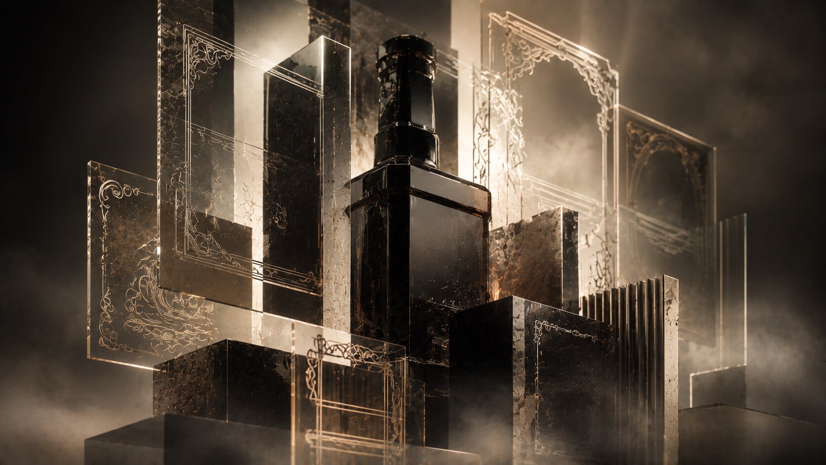
Jack Daniel’s is a masterclass in controlled familiarity.
Its packaging is less about one celebrity designer and more about a long, disciplined internal evolution. Publicly, the brand speaks about its traditional square bottle and widely recognized black-and-white label, and even its 2011 refinement was framed not as a reinvention but as a tightening of a familiar code.
The visual vocabulary is pure category memory:
This is where etiquette graphic design becomes crucial. The bottle shape alone would not make Jack Daniel’s what it is. The label’s typographic texture creates the authority. It feels official, old, and slightly severe, even when buyers know almost nothing about Tennessee whiskey.
Materially, the package is not luxurious in a jeweled sense. It is sturdy and bar-ready. That matters. Jack Daniel’s did not become a global classic by feeling delicate.
Because it turned vernacular American whiskey language into a stable global code.
One of the strongest things about Jack Daniel’s is that the authorship is not overly romanticized. In a strange way, that helps. The package feels like heritage distilled through repetition, not like a single flashy design stunt.
The biggest risk here is clutter. If heritage labels become too ornamental or too crowded with medals, claims, and sub-branding, the authority starts looking theatrical instead of authentic.
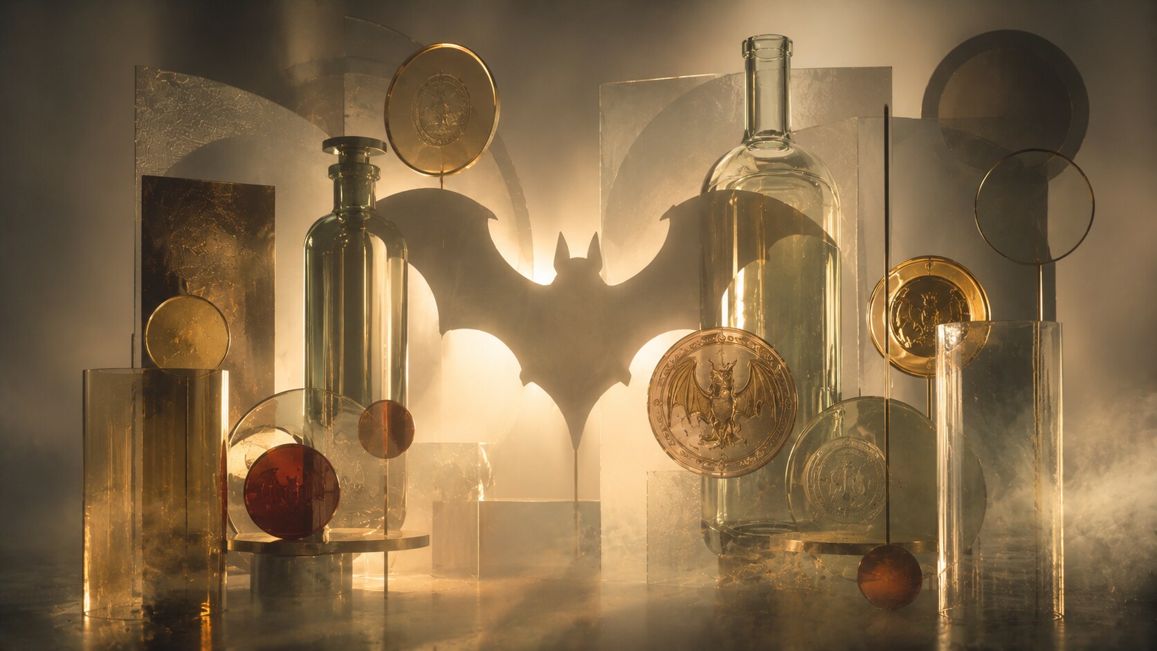
Bacardí’s most famous packaging decision came from a family observation, not a modern branding workshop. According to the company’s own history, Doña Amalia, wife of founder Don Facundo, suggested adopting the bat after noticing fruit bats in the rafters of the first distillery.
That mattered for practical reasons as well as symbolic ones.
At a time when many consumers could not reliably read labels, the bat worked as a direct recognition device. In other words, the mark was not just decorative identity. It was access technology.
The package itself built around that idea:
Bacardí’s graphic design is never as restrained as Absolut’s and never as typographically dense as Jack Daniel’s. It sits in a middle zone: warm, heritage-led, and still easy to call from across a bar.
Because the symbol was memorable before the rest of the label was processed.
The bat carried not only recognition but also a cultural story of luck, family, and protection, which gave the package emotional weight beyond branding.
Brands like Bacardí can lose something when premiumization becomes too faceted, too metallic, or too sculptural. A rum that built itself through broad recognizability should be careful not to design itself away from the rail and into only the gift box.
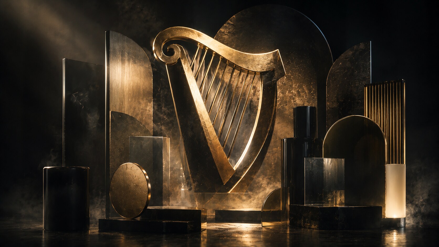
Guinness packaging is proof that one strong emblem can carry a whole world.
The harp first appeared on a Guinness bottle label in 1862, and it remains one of the clearest examples of symbol-led alcohol identity. The package has evolved many times, but the deep truth stays the same: Guinness sells darkness, heritage, craft, and Irishness through a symbol that feels older than most category trends.
The 2016 refresh by Design Bridge is especially interesting because it resisted the flattening instinct that dominated so much brand design in that period. Instead of turning Guinness into a sterile minimalist exercise, the redesign gave the harp more depth and tactility.
Material and color logic stay disciplined:
That combination is powerful because it behaves like a stout should behave: solid, ceremonial, and slightly serious.
Because the package protects atmosphere. Guinness never tried to look as bright, cold, or instantly casual as lagers around it.
The Guinness harp was trademarked before the Irish state adopted its own harp symbol, which is why the state’s version faces the opposite direction.
A brand with this much heritage can become museum-like if it over-romanticizes itself. Guinness’s stronger packaging moments happen when craft feeling is preserved without making the brand feel dusty.
“Great alcohol packaging does not always need more decoration. Sometimes it just needs one symbol strong enough to carry a century.”
Corona is one of the most interesting beer packages because part of its visual success comes from something technically risky.
The clear bottle is the whole point:
Visually, Corona has always understood subtraction. The crown symbol, compact label, white-blue-gold coding, and transparent body allow the bottle to feel casual and transportive. It is almost impossible to separate the package from the ritual of beach, lime, and sunlight.
But that same transparency is also the complication. Beer in clear glass is more exposed to light than beer in darker bottles. Corona’s brand story effectively turned that fragility into occasion branding: very cold serve, fast consumption, outdoor imagery, and the famous lime ritual.
Public brand storytelling does not usually elevate one star designer here, which is revealing. Corona’s package behaves more like a total cultural scene than a design-auteur object.
Because it made the bottle itself feel like vacation.
Many technically “better protected” beer packages are less memorable. Corona won by understanding image value, not by optimizing only for the brewing textbook.
This kind of bottle can become an empty cliché if the visual paradise message is repeated without enough freshness. The stronger the ritual, the more easily it becomes parody when overplayed.

Hennessy’s packaging story is useful because it shows how alcohol packaging can become a hybrid of heritage object, luxury gift, and brand theatre.
Its house language depends on:
The older charentaise bottle tradition still matters here, and Hennessy often uses historical details to make the package feel authentic instead of just decorative. At the same time, the brand has also been open to more contemporary collaborations, including the Marc Newson edition of Hennessy X.O, where the bottle and presentation felt closer to an industrial design object than a standard spirits pack.
This is exactly why Hennessy remains powerful. The package does not only say “premium.” It says “object worth displaying.”
Because cognac buyers often want more than liquid credibility. They want ceremony, gifting power, and visual weight.
Hennessy’s bottle collaborations work best when the house structure remains visible beneath them. The collaborations are strongest as overlays, not replacements.
Luxury spirits always risk drifting into over-designed souvenir territory. If the sculptural drama becomes louder than the house code, prestige can slide into gimmick.
One of the category’s hidden tensions is this: premium spirits must keep looking expensive, but if they become too object-like they can start feeling less drinkable and more like decorative inventory.

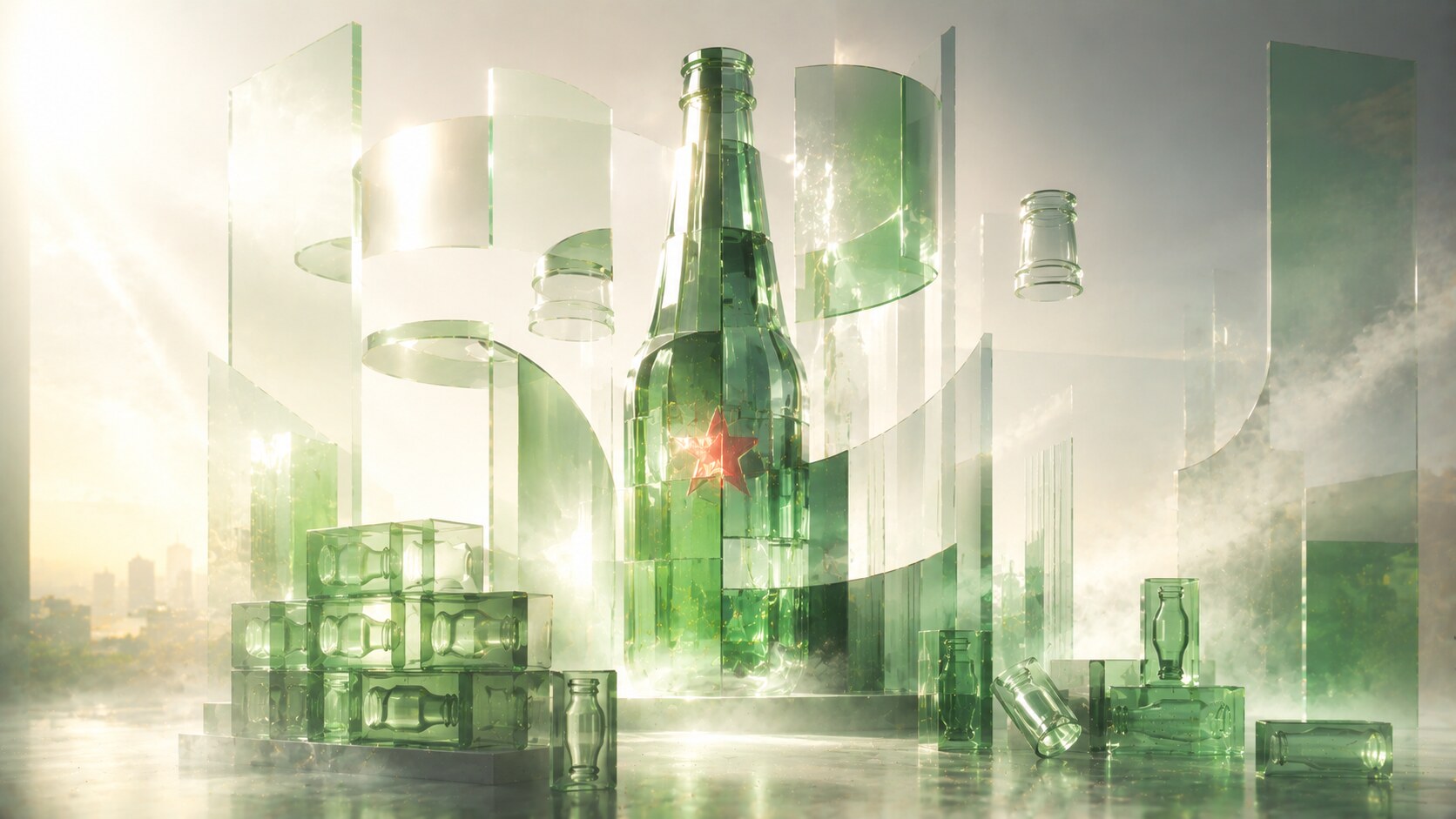
Heineken packaging is a reminder that global familiarity does not happen by accident.
Its basic components are deceptively simple:
Yet the brand has spent years refining that simplicity. The 2010 global roll-out of the Star Bottle made the bottle more sculpted and more cohesive across markets, while long-time design leadership under figures like Mark van Iterson helped treat packaging as a global business tool rather than as a seasonal cosmetic layer.
Heineken’s strength is that the bottle still reads instantly in bars, supermarkets, sponsorship environments, and fridges from different countries. That level of consistency is one of the hardest things in packaging design.
Because it understood that small refinements repeated globally can matter more than dramatic redesigns.
Heineken’s most fascinating blind alley is still the WOBO concept, the “World Bottle” championed by Alfred Heineken, designed so empty bottles could be reused as building bricks. It is one of the smartest and strangest packaging ideas in alcohol history, and it never scaled commercially. The reasons were not only technical. They were also social and symbolic.
That failure is important because it reveals something uncomfortable: a brilliant package concept can still lose if the cultural meaning around it becomes too awkward.
This is where the story becomes current rather than historical.
According to recent IWSR reporting, the beverage alcohol market is under pressure from moderation, health concerns, economic caution, and changing social habits. In some major markets, consumers are drinking less often, becoming more selective, and moving more carefully between premium, no-low, and occasion-based purchases.
That changes packaging strategy immediately.
Alcohol brands now need packages that can do several things at once:
This is why recent alcohol packaging trends are moving in several directions at the same time:
A bottle no longer wins just by looking expensive. It has to look relevant.
“In a moderation era, alcohol packaging has to justify not only the brand, but the occasion itself.”

What these eight stories show is that successful alcohol packaging rarely comes from surface decoration alone.
It usually comes from one or two very clear assets:
Johnnie Walker made transport logic look premium. Absolut made typography become the object. Jack Daniel’s made etiquette feel like authority. Bacardí built memory through a bat. Guinness protected atmosphere through a harp. Corona sold a bottle-shaped mood. Hennessy turned spirits into gift architecture. Heineken proved that consistency can be more powerful than spectacle.
And now all of them are living inside a harder market, where people drink more carefully, compare more critically, and expect more meaning from what they still choose to buy.
That is why alcohol packaging remains such a serious design discipline. It is not only about selling a bottle. It is about giving someone a reason to pick a ritual instead of skipping it.
News, insights, case studies, and more from the rausr team — straight to your inbox.
Send us your brief, your wildest idea, or just a hello. We’ll season it with curiosity and serve back something fresh, cooked with care.