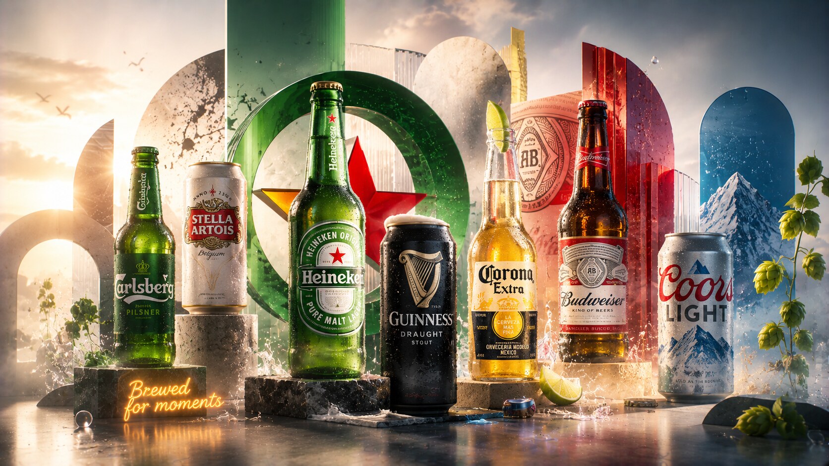
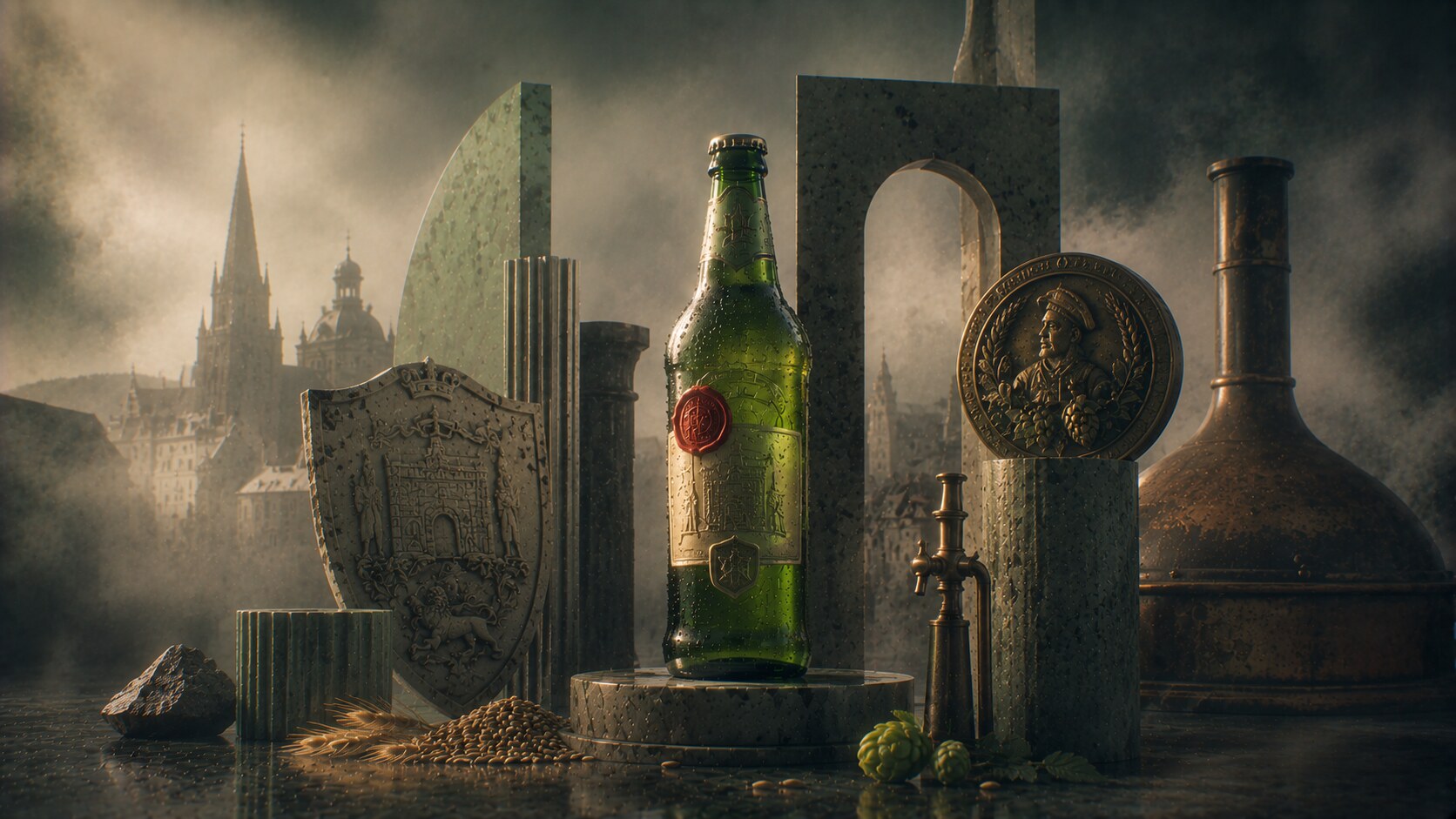
Packaging of the Most Successful Beer Brands
Eight iconic beer packages, from bottles and cans to labels, symbols, materials, and redesign stories, plus why some beer identities became unforgettable.

Eight iconic beer packages, from bottles and cans to labels, symbols, materials, and redesign stories, plus why some beer identities became unforgettable.
Beer lives in a difficult design category.
It has to work:
That is why beer packaging success is usually not about subtle beauty alone. It is about instant recognition, ritual, portability, trust, and the ability to survive repetition without going visually dead.

Some beer packages succeed through shape. Some succeed through color. Some through one emblem. Some through the whole cultural scene built around the bottle or can.
The best ones do all of that at once.
This article sits naturally beside Packaging of the Most Successful Alcohol Brands, Iconic Water and Lemonade Packaging, and Packaging Design of Successful Energy Drinks.
“The strongest beer package is the one people can spot before they decide whether they are thirsty.”
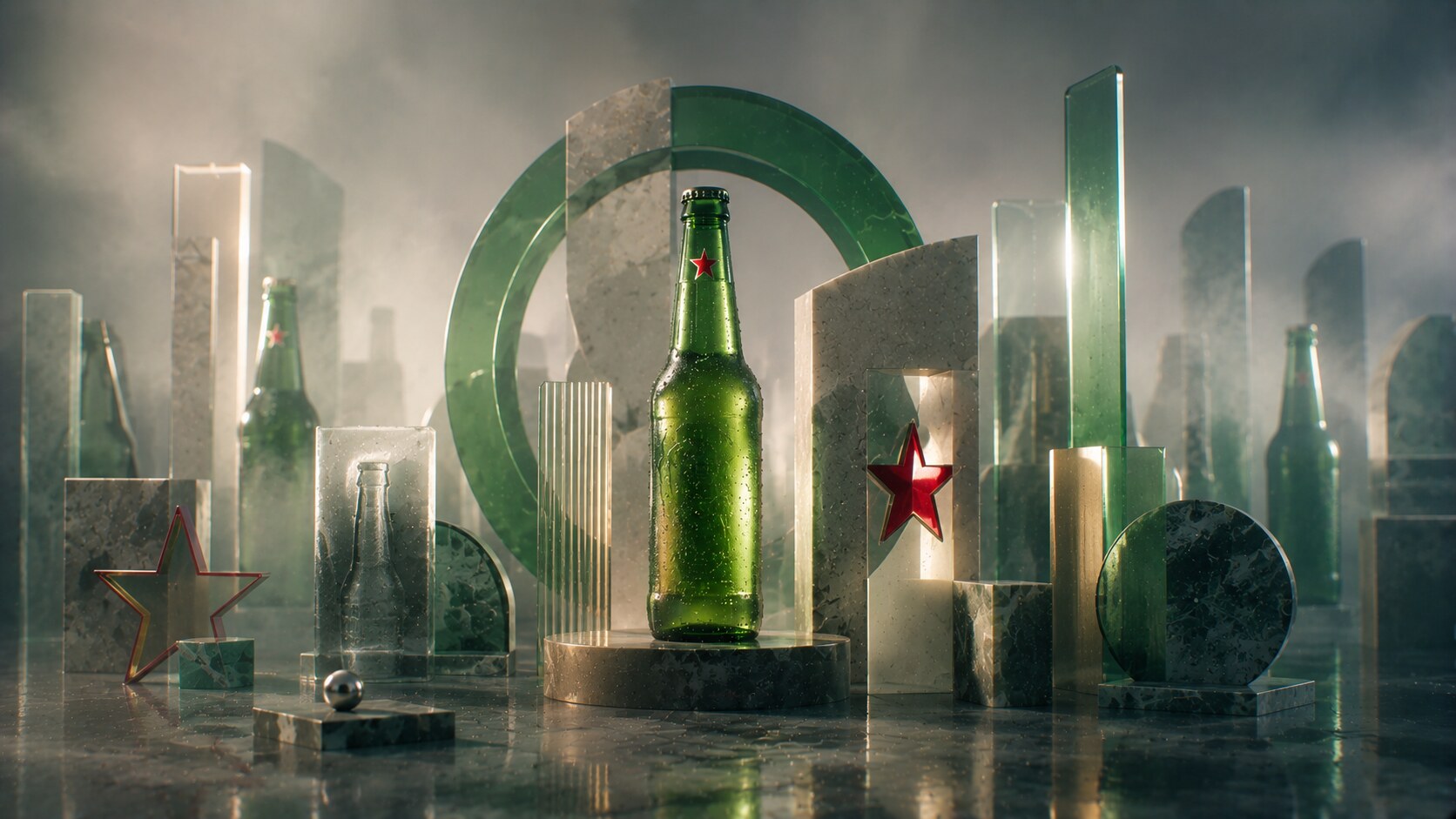
Heineken is one of the clearest examples of disciplined beer packaging evolution.
Its basic code is famous for a reason:
The 2010 global roll-out of the Star Bottle made that system even sharper. The redesign refined the bottle shape and strengthened consistency across markets. Under long-term design leadership from people like Mark van Iterson, Heineken treated packaging as a living strategic asset, not a decorative afterthought.
Why does it work so well? Because every part of the package supports the same message: modern, recognizable, social, and slightly more elevated than ordinary lager clutter.
Because it updated carefully instead of dramatically.
The bottle’s power is not only its label. It is the total choreography of green glass, star symbol, neck coding, and bar visibility.
A globally polished system can sometimes lose local warmth. The more perfectly international a beer looks, the easier it is to flatten regional character around it.
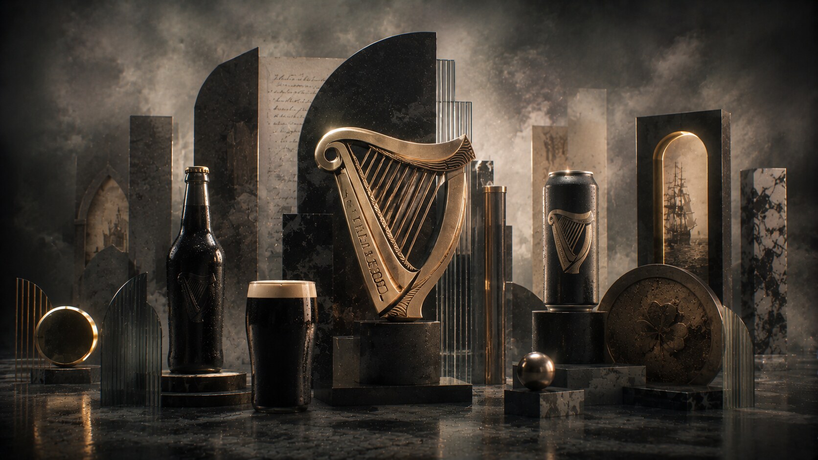
Guinness packaging works because it protects atmosphere.
The harp first appeared on bottle labels in the nineteenth century, and it remains one of the strongest examples of a beer symbol doing heavy cultural work. Guinness does not need to scream from the shelf. It needs to feel solid, old, and unmistakable.
Its package language is extremely disciplined:
The 2016 refresh by Design Bridge is a useful case study because it resisted a cheap flattening trend. Instead of making Guinness look smoother but weaker, the redesign gave the symbol more depth and craft feeling.
Because the package and the product mood still say the same thing.
The Guinness harp became so important historically that it affected how the Irish state handled its own harp symbol orientation.
A heritage beer can become museum-like if it romanticizes itself too much. Guinness works best when its package feels historic but still alive.
One useful beer-packaging lesson from Guinness: a great symbol can carry more long-term value than a complicated label ever will.

Corona is a fascinating packaging success because one of its main decisions was technically risky but culturally brilliant.
The clear bottle is everything:
The label and crown symbol are simple, almost understated. That is exactly why they work. The package does not compete with the transparent bottle; it frames it.
Corona’s package tells a whole scene very quickly: sun, lime, beach, ease, escape.
Because the bottle itself became a lifestyle object.
Many brewers would tell you darker glass protects beer better. Corona won anyway because it understood image value and serving ritual at a much higher level.
The danger is obvious: once paradise branding becomes too repeated, the package can drift into cliché.
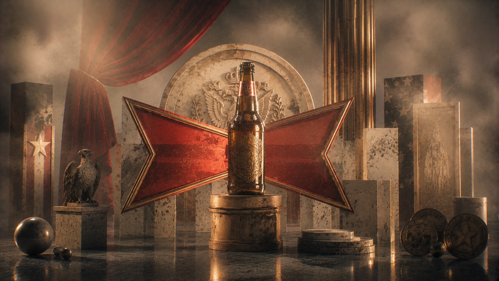
Budweiser packaging is famous not because it is quiet, but because it turns heritage into a dense visual signal.
Its structure is built around:
Budweiser’s label is almost ceremonial. It wants to feel established, national, traditional, and heavy with legacy.
The 2016 redesign by JKR is especially interesting because it looked backward in order to move forward. Instead of inventing a new beer voice, it deepened the historical iconography and removed some of the earlier cluttered energy-drink-era noise that had built up.
Because it understood that heritage only works when it still reads clearly from a distance.
Budweiser’s can and bottle history is much longer and more variable than many people realize. The current “classic” feeling is the result of repeated edits, not one frozen original.
Too much patriotic theatre can become heavy-handed. Budweiser is strongest when the package feels iconic, not overperformed.

Stella Artois shows how much a label can gain by leaning into origin details without losing mass-market legibility.
The 1988 redesign is publicly associated with David Taylor of Taylorbrands. The work drew from the original 1926 label and rebuilt the bottle shape and label system around historic cues:
The result was very smart. Stella’s package feels premium, but not in a luxury-spirits way. It feels like cultured beer, slightly formal, slightly polished, and export-ready.
Because it turned Belgian origin story into a visual code ordinary drinkers could still process quickly.
One reason Stella travelled so well is that its pack looks specific without being locally unreadable. That balance is hard.
A package this polished can also drift into self-seriousness, especially when the drinking culture around the brand becomes more complicated than the elegant label suggests.

Carlsberg’s packaging tends to be more restrained than louder mass lagers, and that is part of its strength.
The pack usually works through:
That restraint matters. Carlsberg rarely tries to shout harder than the whole shelf. Instead, it tries to look settled, assured, and easy to trust.
Materially, its use of green glass and green-led systems helped it stay inside premium European lager language, while the script and crown soften the technical seriousness with some heritage charm.
Because it balanced familiarity and refinement without overcomplicating the label.
Carlsberg’s wider brand history is full of scientific seriousness and brewing innovation, and the packaging benefits from that background even when the label itself stays visually calm.
Restraint can easily become low impact. In cluttered retail, a calm package only works if the core assets are truly memorable.
Pilsner Urquell has one of the hardest packaging jobs in beer: it is not only selling a beer, but the claim of being the original source of a whole global style.
That is why its package leans heavily on:
Its identity is less about a flashy redesign story and more about the long-term weight of origin. The package tells you this beer matters historically before you even know the details of Josef Groll, Plzeň, or 1842.
Because the packaging behaves like an origin certificate, not just a nice export lager.
Pilsner Urquell’s name itself is already packaging strategy. “Original source” is one of the most powerful category-positioning moves in beer history.
Originality can become stiffness. If a heritage beer looks too museum-bound, younger drinkers may admire it without feeling pulled toward it.
One strange truth about beer packaging: some of the world’s most copied beers cannot afford to look generic for even one redesign cycle.

Coors Light is not the most elegant beer package here, but it is one of the most behaviorally smart.
Its system works through:
This is where beer packaging leaves classic heraldry behind and becomes performance design. The package is not mainly saying heritage. It is saying refreshment, coldness, and immediacy.
The Cold Certified mountains that turn blue are one of the clearest examples of a packaging gimmick becoming a true brand asset. It sounds small, but it changed how people interacted with the pack.
Because it turned a common desire into visible proof: cold beer, right now.
Much of Coors Light’s packaging strength comes from not pretending to be deeper than it is. The package is brutally clear about the occasion it belongs to.
Refreshment gimmicks age quickly if the graphic language around them becomes too loud, too synthetic, or too bro-coded. Coors Light has repeatedly had to manage that edge.
If you compare these eight cases carefully, the pattern is very clear.
The strongest beer packages usually own one or two things extremely well:

The weaker paths usually come from trying to say too much at once. Beer packaging gets clumsy very fast when it becomes overloaded with badges, claims, gradients, or fake complexity.
That is why so many recent redesigns in beer have moved toward:
Beer packaging success is not mystery. It is controlled memory.
“Great beer packaging does not only identify the brand. It quietly tells the drinker what kind of night, place, or mood the beer belongs to.”
News, insights, case studies, and more from the rausr team — straight to your inbox.
Send us your brief, your wildest idea, or just a hello. We’ll season it with curiosity and serve back something fresh, cooked with care.