Packaging Story of the Most Successful Snack Brands
How eight famous snack brands built their packaging identities through color, structure, materials, mascots, and shelf logic.

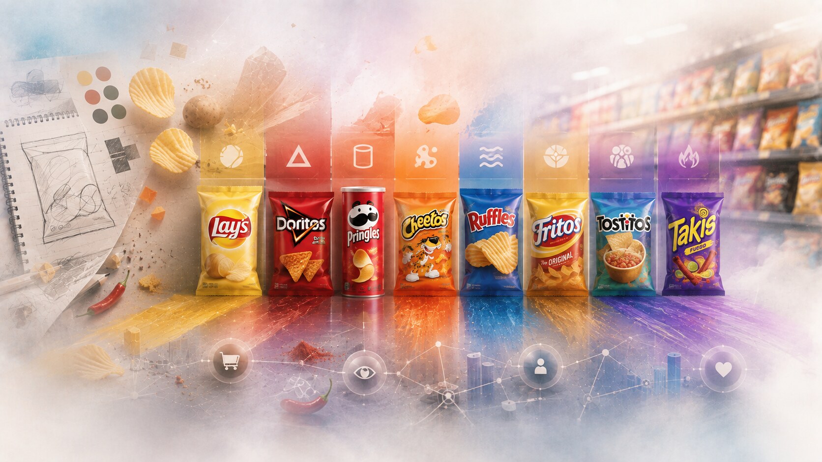
How eight famous snack brands built their packaging identities through color, structure, materials, mascots, and shelf logic.
Snacks live in one of the most competitive packaging environments on earth.
They fight on shelves, in vending machines, at gas stations, in supermarkets, in delivery photos, and now in endless digital thumbnails. That means the package has to do many jobs at once:
That is why the strongest snack packs are rarely accidental. They become successful because color, shape, typography, mascots, product photography, and material decisions start reinforcing the same message over and over.
This article sits naturally beside Most Successful Chocobars Packaging Design, Packaging Design of Successful Energy Drinks, and Iconic Water and Lemonade Packaging.
“The best snack package does not only say what flavor is inside. It says what kind of mood the snack belongs to.”

The snack category looks playful, but the design logic is demanding.
The package has to coordinate:
In many cases the authorship is also less glamorous than outsiders expect. Some famous snack packages come from internal brand teams, some from long-term corporate design groups like PepsiCo Design, and some from combinations of packaging engineers, marketers, and external collaborators whose names never become public.
That is one hidden truth of mass snack branding. The result can be iconic even when the authorship is distributed.
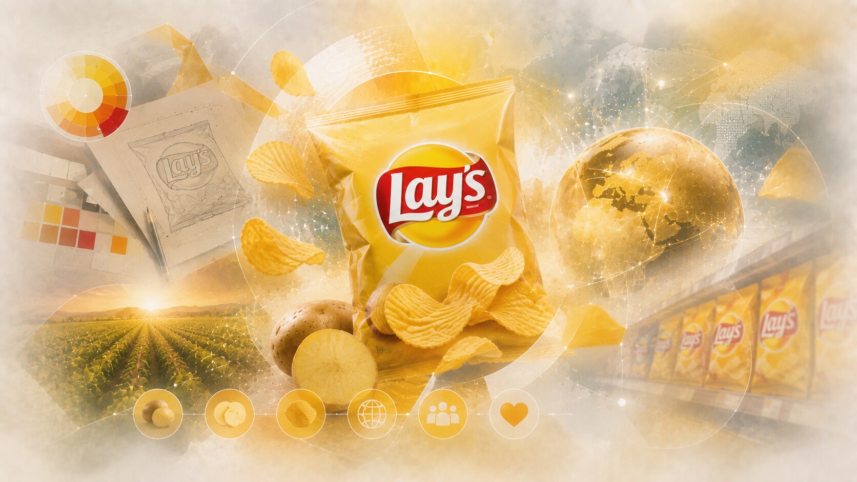
Lay’s is one of the most successful snack packaging systems in the world because it combines extreme recognition with constant small adaptation.
Its strongest historical cues are:
The 2025 redesign story from PepsiCo is especially useful here. The company called it the largest redesign in Lay’s history and made the potato itself more visible in the package story, because many consumers were not strongly connecting the brand back to real potatoes.
That is an important packaging lesson. Sometimes the refresh is not about looking more modern. Sometimes it is about making the most basic product truth more obvious again.
Because the package is emotionally warm, instantly readable, and nearly impossible to miss.
PepsiCo says Lay’s is sold in nearly 200 countries, which helps explain why the graphic system had to become globally simple.
A brand this large risks becoming too extension-heavy, where flavor variation starts weakening the core visual memory.
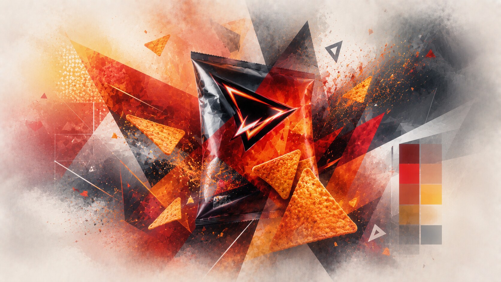
Doritos has one of the clearest attitude-driven package identities in snacks.
The brand first entered the U.S. in 1966, and over time the packaging moved toward stronger geometry, bolder contrast, and more dramatic flavor worlds. That was the right direction because Doritos was never supposed to feel calm.
The strongest packaging signals are:
This is a category-perfect match between product and graphics. A Doritos bag is not trying to look trustworthy in a domestic, pantry-stable way. It is trying to feel energetic and culturally wired.
Because the graphics support the emotional volume of the snack itself.
The original Doritos were unflavored, which makes the later flavor-led identity evolution even more interesting.
When too many limited editions pile up, the line can drift toward visual chaos.
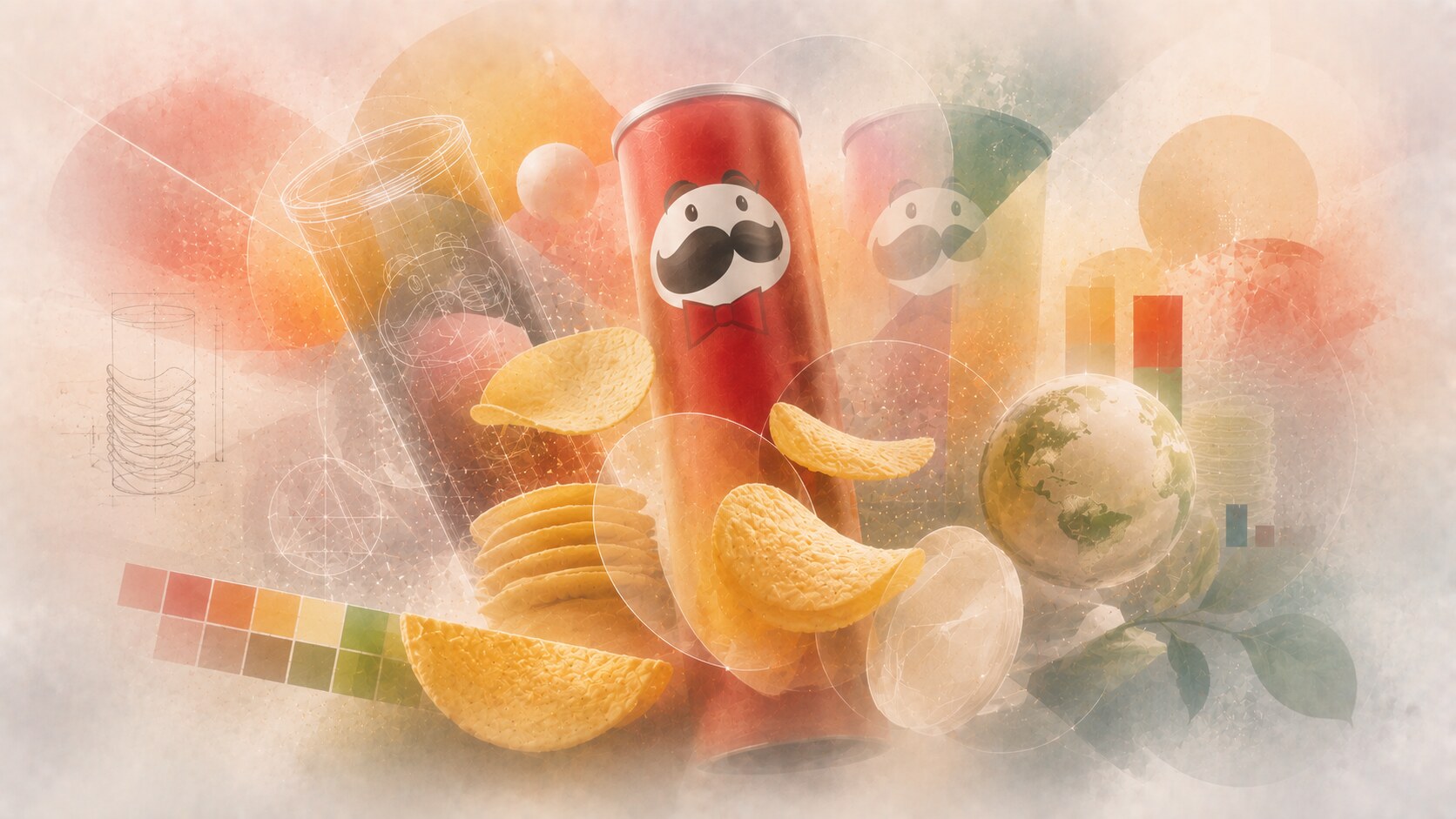
Pringles is one of the clearest cases where structure became brand identity.
The canister solved several practical problems that ordinary chip bags did not solve well:
The FAQ history is also unusually memorable. Fredric Baur helped shape both the chip form and the famous tube, which makes this one of the rare snack stories where packaging invention is publicly tied to named people.
The Mr. P mascot has done the rest for decades. In 2021, the mark was significantly simplified for a more digital era, showing how even a comic mascot must adapt to smaller screens and cleaner branding systems.
Because the canister made the product feel engineered, not fragile.
Baur was so proud of the can that, according to the brand’s own FAQ history, part of his ashes were buried in one.
The tube is iconic, but also material-heavy and environmentally more difficult to defend than a simple bag.
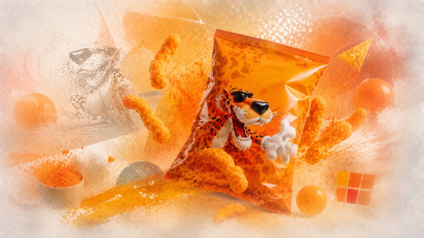
Cheetos packaging is one of the most personality-driven systems in the snack aisle.
The orange palette, the oversized logo energy, and especially Chester Cheetah pushed the brand into a more mischievous territory than ordinary cheese snacks.
PepsiCo Design’s brand page and Cheetos’ own about page both underline that personality. The package is not trying to look clean. It is trying to look fun, indulgent, and a little bit unruly.
This was strategically smart because the snack already leaves behind Cheetle, the orange residue that the company officially names on-pack and in brand communication.
Because the package embraced the snack’s shamelessness instead of trying to tidy it up.
The fact that Cheetle has an official brand name tells you everything about how intentionally Cheetos turned a “mess problem” into a cultural advantage.
The same high-energy style can become visually exhausting if every extension tries to be louder than the last.
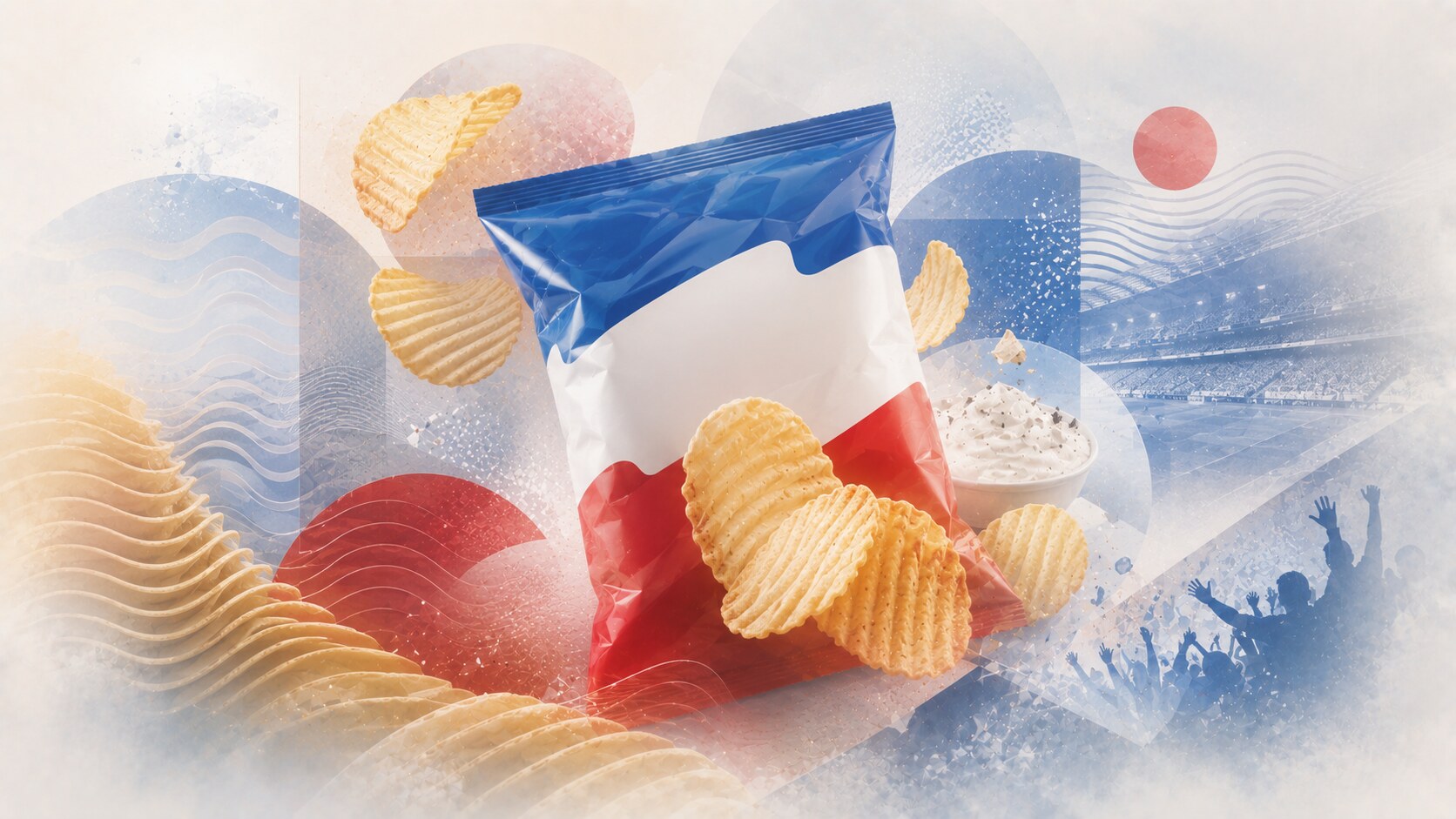
Ruffles is a strong example of a snack package built around one physical feature: the ridge.
That gave the brand a very efficient identity system:
The packaging rarely needs deep explanation. The ridges do the memory work. The brand then adds sports partnerships, high-impact flavors, and bold product imagery on top.
Because the package can visually repeat the product’s most distinctive structural benefit.
Without strong flavor or campaign support, a ridge-led identity can start feeling narrower than more flexible rival systems.
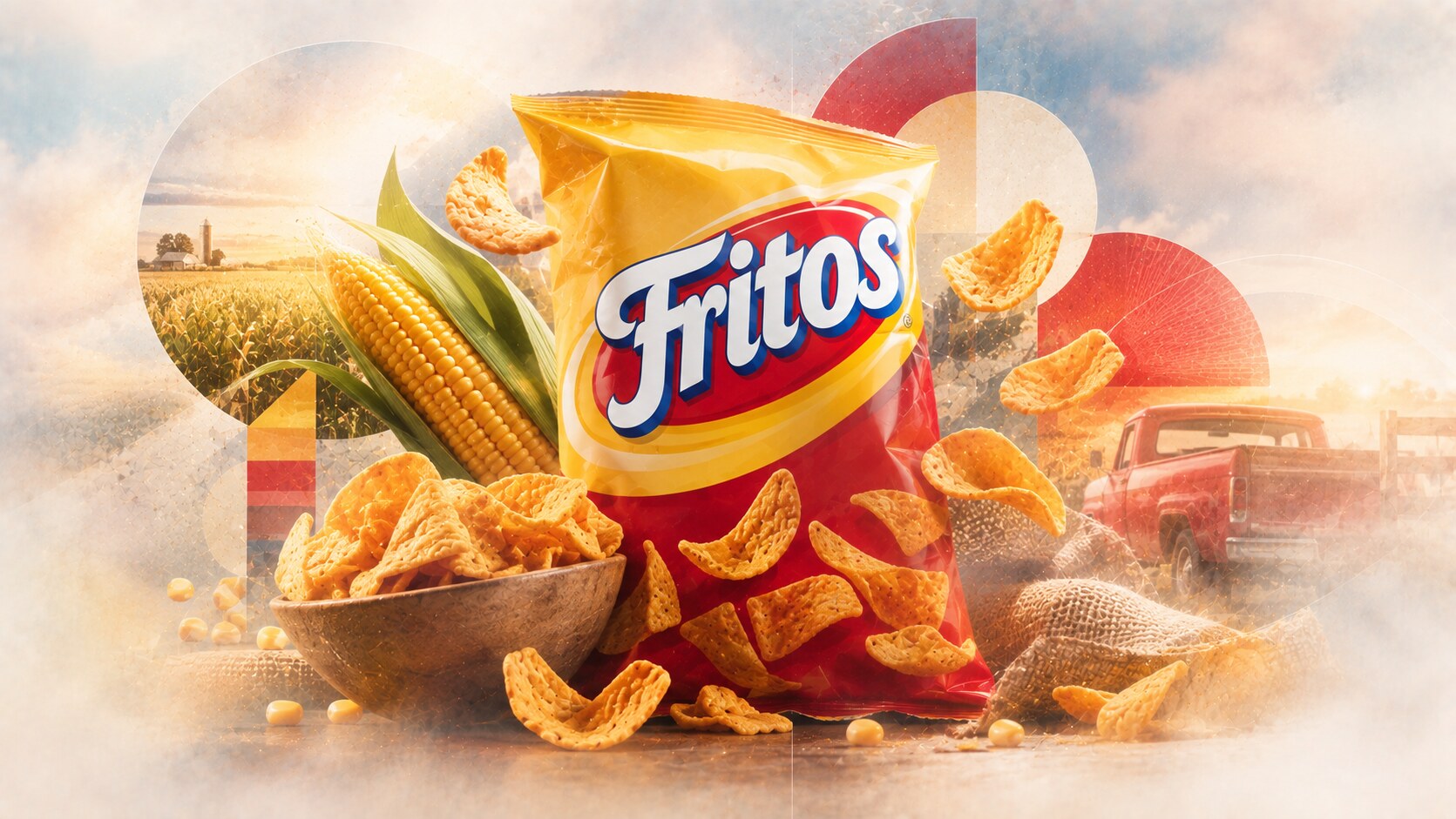
Fritos shows another path to success: a simpler and more grounded brand world.
The official story still leans into tradition, moments, and meals rather than youth-coded energy. That helps explain why the packaging feels more dependable than theatrical.
Its strengths are:
This is a different kind of success. Fritos often wins not by screaming the loudest, but by feeling deeply built into everyday American snack culture.
Because the pack is direct, recognizable, and hard to misunderstand.
A heritage-simple pack can also start looking less exciting in a shelf environment that keeps rewarding novelty.
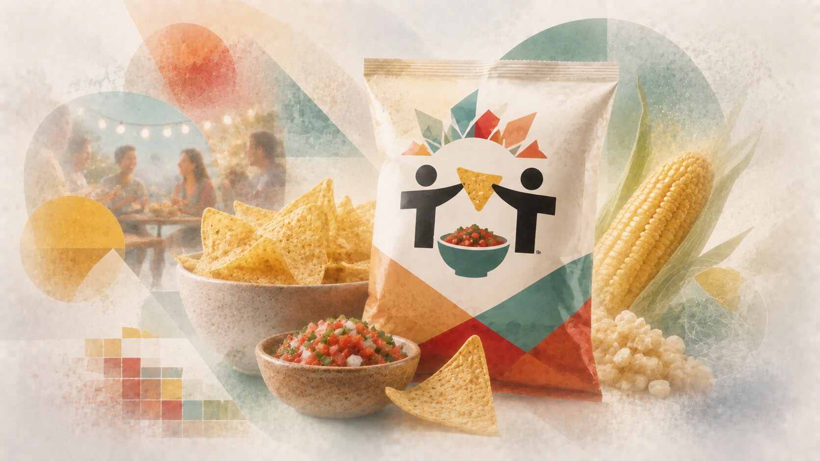
Tostitos has one of the smartest logo ideas in mainstream snack packaging: the two T’s sharing a chip over salsa.
That made the brand meaning instantly social.
Its 2026 refresh is especially relevant because PepsiCo described it as broader than a packaging change. The redesign moved the brand closer to:
The refreshed system also used cream backgrounds for classic lines and stronger color signals for flavor variants, which improved family logic on shelf.
Because the package always implied occasion, not only product.
Tostitos’ official story explicitly says it was not just selling chips, but “the joy of a shared bowl of chips and salsa,” which is unusually clear brand positioning for a mass snack line.
As the brand becomes more food-culture-oriented, it has to be careful not to lose the easy fun that made it popular in the first place.
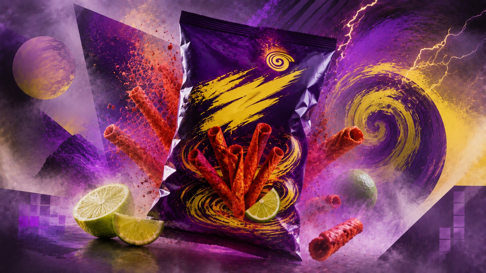
Takis is one of the clearest recent examples of aggressive snack packaging working brilliantly for the right audience.
Barcel’s official messaging is almost comically explicit about intensity, and that honesty is the point. The brand is not trying to appear balanced or calm.
The package sells:
This is why the dark palette, neon accents, and intense product imagery work. The visual world matches the eating promise exactly.
Because the graphics and the product promise are equally extreme.
Such a high-intensity identity can become limiting if the brand ever wants to broaden into calmer occasions or more mainstream perceptions.
| Brand | Core packaging strength | Main weakness |
|---|---|---|
| Lay’s | global readability and warmth | extension overload |
| Doritos | sharp attitude and energy | visual chaos risk |
| Pringles | structural distinctiveness | material complexity |
| Cheetos | personality and mischief | visual exhaustion risk |
| Ruffles | product feature mirrored in identity | narrower system flexibility |
| Fritos | direct heritage clarity | lower excitement on shelf |
| Tostitos | social sharing logic | can over-elevate itself away from fun |
| Takis | unapologetic intensity | limited broadening room |
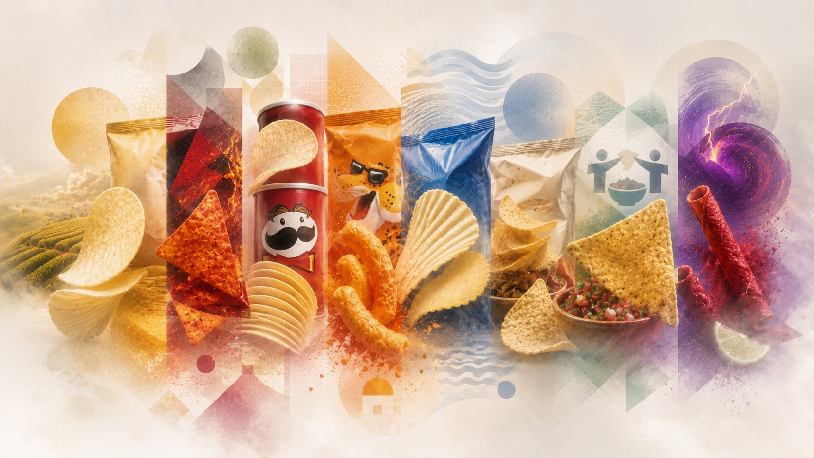
The comparison shows the real lesson clearly. Great snack packaging does not only look attractive. It teaches the shopper how to feel before the bag is even opened.
One future clue is already visible: the strongest snack brands are starting to use packaging not only to sell flavor, but to explain ingredients, transparency, craft, and occasion more openly than before.
Lay’s made warmth easy to see. Doritos made energy easy to see. Pringles made engineering easy to see. Cheetos made mischief easy to see. Ruffles made texture easy to see. Fritos made tradition easy to see. Tostitos made sharing easy to see. Takis made intensity easy to see.
That is why these packages lasted. They were not only colorful bags. They were compressed emotional systems designed to win in seconds.

News, insights, case studies, and more from the rausr team — straight to your inbox.
Send us your brief, your wildest idea, or just a hello. We’ll season it with curiosity and serve back something fresh, cooked with care.