Pantone Color Matching in Print: Why CMYK Alone Is Not Enough
How to keep a brand color consistent across presses, papers, packaging and locations using Pantone references, ICC profiles, proofs and measured tolerances.

How to keep a brand color consistent across presses, papers, packaging and locations using Pantone references, ICC profiles, proofs and measured tolerances.
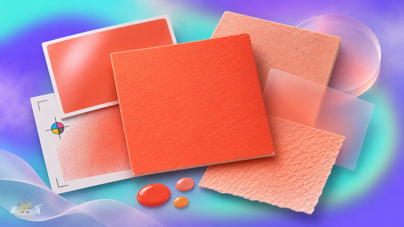
A company approves a warm orange on a coated brochure. The same CMYK numbers go to a second printer for an uncoated bag, a third for a vehicle graphic and a fourth for a folding carton. Four finished oranges come back. None is necessarily the result of a careless printer: the inks, substrates, machines and conversion settings are different.
The answer is not simply to put a Pantone number into the file and hope. A Pantone reference gives people a common color target; controlled printing conditions, material-specific samples and measured approval make that target usable. Sometimes the best route is a separate spot ink. Sometimes calibrated CMYK or an extended-gamut process is good enough. The designer’s job is to decide which difference is acceptable before thousands of items are produced.
The production issue is especially visible in vehicle wraps and packaging families, where one identity must survive materials that behave nothing alike.
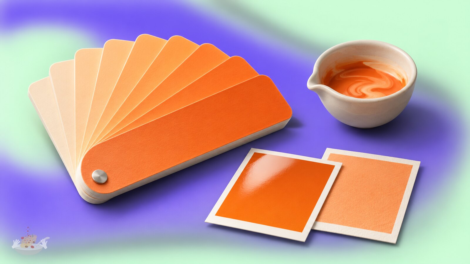
Pantone’s Formula Guide is useful because a designer, client and printer can point to the same physical spot-color reference. A spot ink is mixed for a particular color and printed as its own separation, rather than being built from the four process inks. That can make a distinctive brand color more repeatable and, for some hues, more achievable than CMYK. It also adds production complexity and may require an additional press unit or plate.
The paper underneath still matters. Pantone’s C and U suffixes describe the appearance of a color on coated and uncoated guide stocks. Uncoated paper absorbs more ink, so a swatch with the same number can look quite different. Pantone explicitly warns about this difference. Neither swatch predicts exactly how a recycled board, translucent film or painted sign will look.
This is why the correct question at the start is not “Which Pantone is closest to this RGB value?” It is “Which physical appearance do we want, on which material, under which light?” Select the master reference in person if possible, then ask suppliers to show what they can actually reproduce. A screen chip or a printed office proof is not the master.
The suffix surprise: Pantone’s coated and uncoated versions of a numbered spot color can use the same ink recipe yet be distinct visible colors because the paper changes the result. A C value is not an instruction to make every future material look like the coated fan deck.
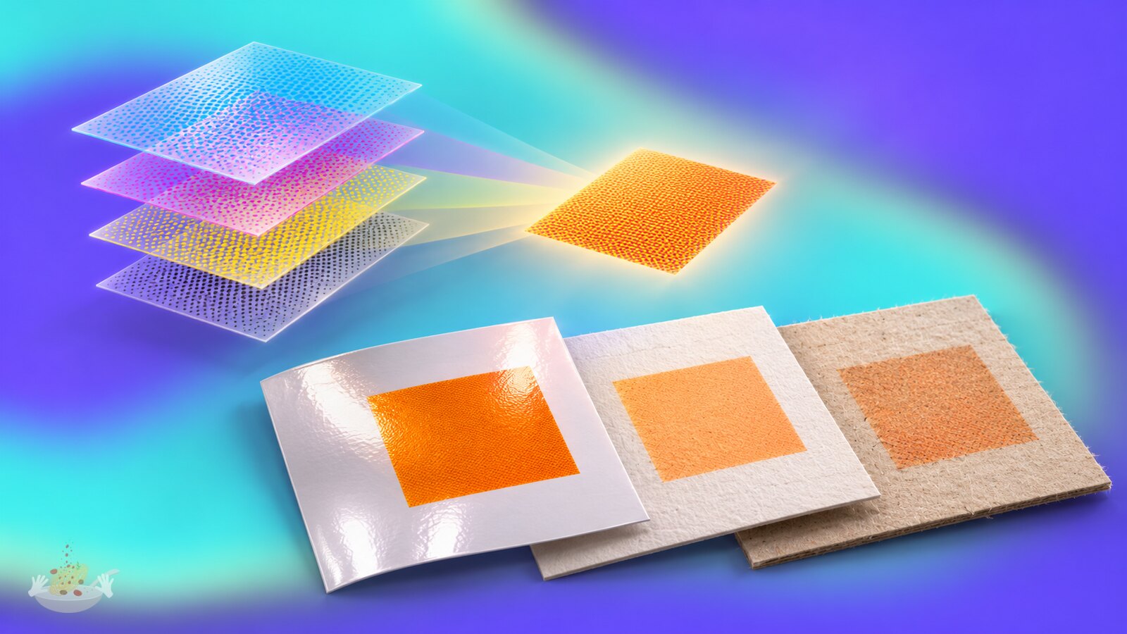
CMYK percentages say how much of each process ink to apply. They are not a complete description of the final color. The same values can shift with ink formulation, paper white, absorbency, tone-value gain, screening, press condition, drying, coating and lamination. A RIP, the software that interprets the file for a printer, can also change how a named color is converted or limited. Even two well-maintained presses can disagree if they are aiming at different printing conditions.
This does not mean CMYK is unreliable by nature. It can be highly predictable when a file, proof and calibrated press share a defined condition. In Europe, ECI’s PSO Coated v3 and PSO Uncoated v3 profiles correspond to different offset-printing conditions and characterization data. The older FOGRA39 condition still appears in production, but it is not interchangeable with FOGRA51 just because both involve coated paper. The International Color Consortium explains how the profile describes the expected printed appearance, not merely a software preference.
For a designer, the practical rule is to ask for the printer’s intended process, stock and output profile before converting artwork to CMYK. If the production route is not yet known, preserve an editable source with well-defined colors rather than baking in one arbitrary conversion and calling it universal.

Imagine a chain that needs one recognizable orange on a coated menu, an uncoated paper sleeve, brown kraft packaging and outdoor vinyl. Demanding the same ink formula on all four would be a weak specification. Brown board may need an opaque white underprint or a deliberately adjusted target; a digital sign printer may simulate the spot color with its own ink set. Some applications may never reach the master hue exactly.
A better brand-color specification has layers. Keep a physical master and a measured digital definition, then approve achievable variants for each important material and process. State whether the priority is a close instrumental match, a visually consistent family on shelf, or recognizability from a distance. Record approved samples and conditions rather than handing suppliers a PDF containing only Pantone XXXX C and one CMYK recipe.
Large packaging programs already work this way. PantoneLIVE’s dependent standards describe colors for particular combinations of substrate, process and ink type, using spectral data. That is not proof that every brand needs a cloud platform. It is evidence that a single abstract swatch is not enough to run many factories and materials consistently.
“The aim is not the same ink everywhere. It is the same recognizable brand color within what each surface can honestly reproduce.”

Production files should say what the printer is supposed to do. If a color will print as a real spot ink, keep it as a consistently named spot swatch and confirm that it remains a separate plate in the exported PDF. If a job will print in CMYK, make a conversion for the agreed output condition. If it uses extended-gamut printing, let the supplier explain its separation workflow instead of silently treating it as ordinary four-color work. A digital press may use a Pantone name only as an input to its simulation, not as a fifth ink.
For a PDF/X handoff, the output intent communicates the intended printing condition. The ICC’s guidance explains the role of that profile in print exchange. Ask the printer which PDF/X variant and profile it accepts; do not assume one export preset suits every supplier. In Adobe InDesign, Separations Preview can reveal an accidental CMYK conversion, an extra spot plate, unwanted overprint or excessive ink coverage before the file leaves the studio.
The handoff should be short but explicit:
The source brand file can contain several approved production recipes. What it should not contain is one unlabelled CMYK swatch reused everywhere because it looked right on a designer’s monitor.

A contract proof is more than a nice sample print. It simulates a defined printing condition and carries a control strip that can be measured. Fogra’s proof certification uses ISO 12647-7 and a MediaWedge to test whether the proof meets its aim. For a critical spot color, ask for a drawdown or production sample on the actual substrate too: a CMYK proof of a spot ink cannot by itself establish how that ink will look on kraft board or under laminate.
The viewing light and measuring setup matter. Brightened papers can look different under light with different ultraviolet content, and the backing beneath a thin sample can change a spectrophotometer reading. A number called Delta E describes a color difference, but teams must agree which formula, instrument condition, substrate, light and tolerance they mean. There is no useful universal “Delta E under 2” promise for every surface. X-Rite’s measurement pitfalls are a reminder that a pass/fail number is only as good as the method behind it.
The unexpected failure is metamerism: two samples may look close under a proofing light and diverge under shop lighting. For a brand that lives on shelf, review representative samples where customers will encounter them as well as under controlled viewing conditions. Record the approved exception if a material cannot match, instead of asking every supplier to hide the difference in its own way.

At global scale, the problem is governance as much as ink. The brand team needs a current master, named material standards, approved suppliers or qualification rules, and a place to record proofs and exceptions. A regional printer needs to know which version is current, who can approve a deviation and whether a new stock requires a new test. After a RIP update, ink change or paper substitution, revalidate the critical colors rather than assuming yesterday’s result still holds.
Even the physical reference can drift. Pantone recommends replacing graphics guides roughly every 12 to 18 months because handling, light and paper aging change their appearance. Two people arguing over old and new fan decks may both believe they are defending the official color. The more serious the brand investment, the less sensible it is to let one battered swatch book become the only source of truth.
The practical finish is a living color standard: master target, approved material versions, file rules, proofing method, tolerance and responsible approver. Pantone is an excellent shared starting point. Reliable color comes from connecting that point to the real press, real material and real viewing conditions every time.
Send us your brief, your wildest idea, or just a hello. We’ll season it with curiosity and serve back something fresh, cooked with care.