PlayStation Branding and Console Design Evolution: From PS1 to PS5
The story of PlayStation branding, logo, controller, console and campaign design from the original PS1 to PS5, including the designers, successes, mistakes and future direction.

The story of PlayStation branding, logo, controller, console and campaign design from the original PS1 to PS5, including the designers, successes, mistakes and future direction.
PlayStation began as a difficult proposal inside Sony, survived a broken partnership with Nintendo, and grew into one of the most recognizable entertainment systems in the world. Its success is often explained through technology and exclusive games, but design did much of the quiet work.
The tilted PS symbol, four controller shapes, startup sounds, blue light, black hardware and cinematic advertising created a complete visual language. Even people who cannot name a console generation often recognize some part of it.
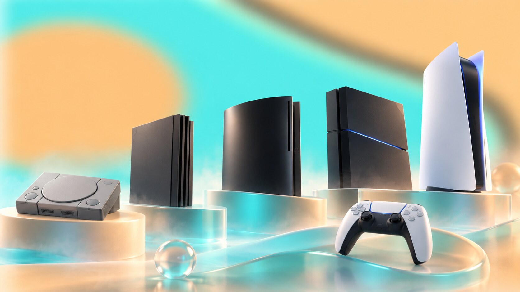
The interesting part is that PlayStation did not keep one fixed aesthetic. The friendly grey PS1, monolithic PS2, glossy PS3, disciplined PS4 and sculptural PS5 look like products from different cultures. What connects them is a smaller set of codes that Sony protected while allowing the hardware to change.
This story continues our series about long-running design systems, including Nintendo Design and Branding Evolution, The Evolution of NVIDIA Branding, and The Evolution of Adobe Design.
“PlayStation’s strongest design decision was not choosing one permanent style. It was choosing a few permanent symbols that could survive many styles.”
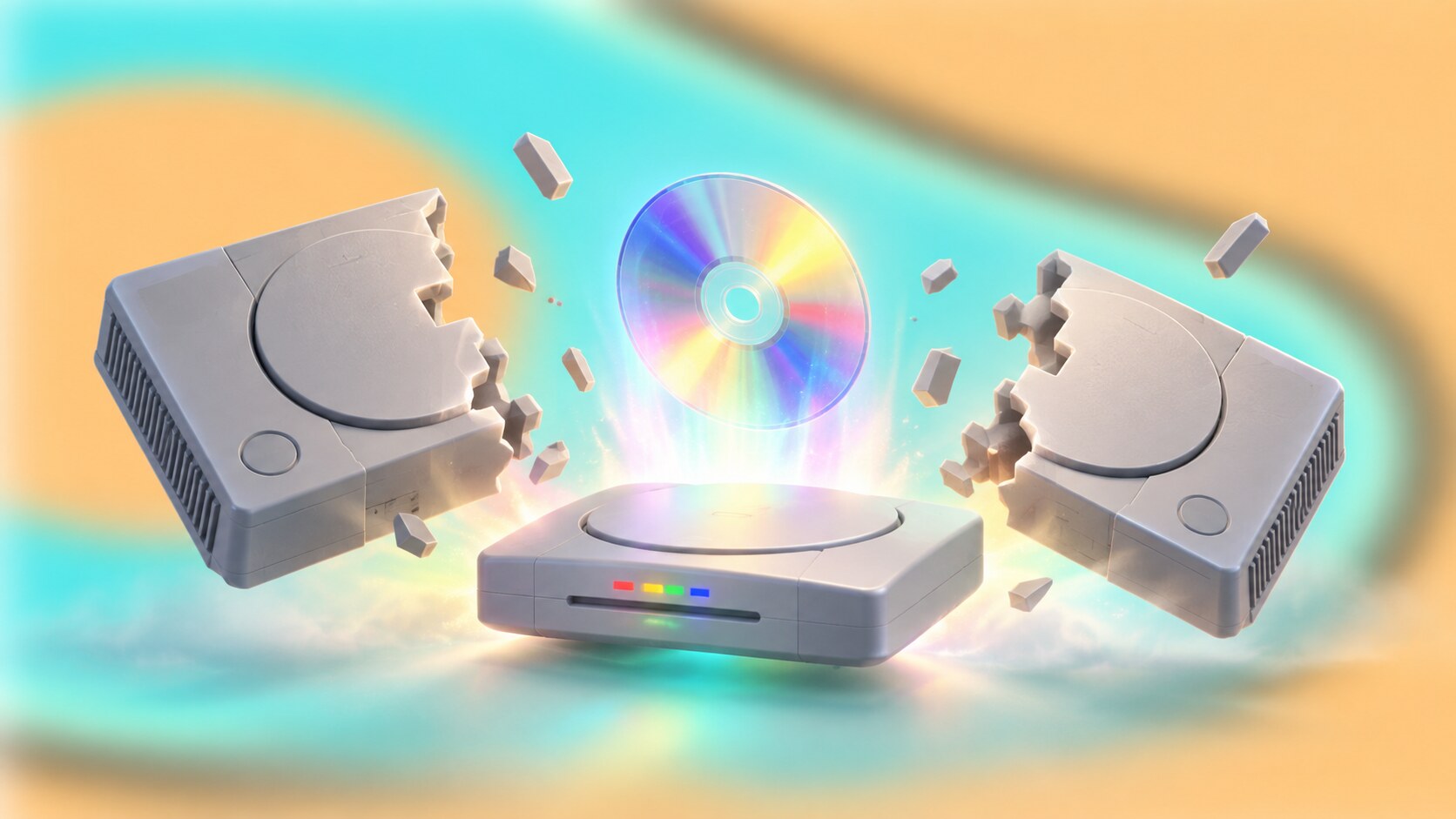
The origin is now part of technology folklore. Sony engineer Ken Kutaragi saw potential in video games before much of Sony’s senior management did. Sony worked with Nintendo on audio technology and later on a CD-ROM system related to the Super Nintendo, but the partnership broke apart.
The famous public version of the story is dramatic: Nintendo announced another CD partner at the 1991 Consumer Electronics Show after Sony had presented its own Nintendo-compatible machine. The full business history is more complicated, but the result is clear. Sony stopped trying to become only a component supplier and began building an independent platform.
Kutaragi argued for a machine designed around real-time 3D graphics and CD storage. Sony Computer Entertainment was established in 1993, combining Sony’s hardware knowledge with the software, music and distribution experience of Sony Music. The original PlayStation launched in Japan in December 1994.
This background shaped the identity. PlayStation could not look like an accessory to Nintendo. It had to feel like a new category: more technical, more grown-up and closer to contemporary music and media culture.

The original PlayStation logo was designed by Manabu Sakamoto. Its upright red P and flattened multicolor S form a compact optical illusion: a two-dimensional mark that appears to occupy three-dimensional space.
That was not decorative cleverness. The first PlayStation’s main promise was polygonal 3D gaming. The logo expressed depth without using a predictable chrome extrusion or a literal screen. According to the designers’ later recollections, many versions were explored before the final mark was chosen.
Teiyu Goto, who led the industrial design of the original console and controller, wanted an identity that still felt entertaining. The red, yellow, green and blue palette gave the technical idea warmth. The colors also worked naturally with the four face buttons, packaging and retail displays.
The logo has survived because it is not tied to one hardware silhouette. Sony later simplified it to a monochrome form, but its geometry remained almost untouched. That continuity became especially valuable when console wordmarks changed repeatedly.
The shadow-like S is not simply placed behind the P. Its colored planes make the symbol behave like a tiny impossible object, an appropriate logo for a machine selling virtual worlds.
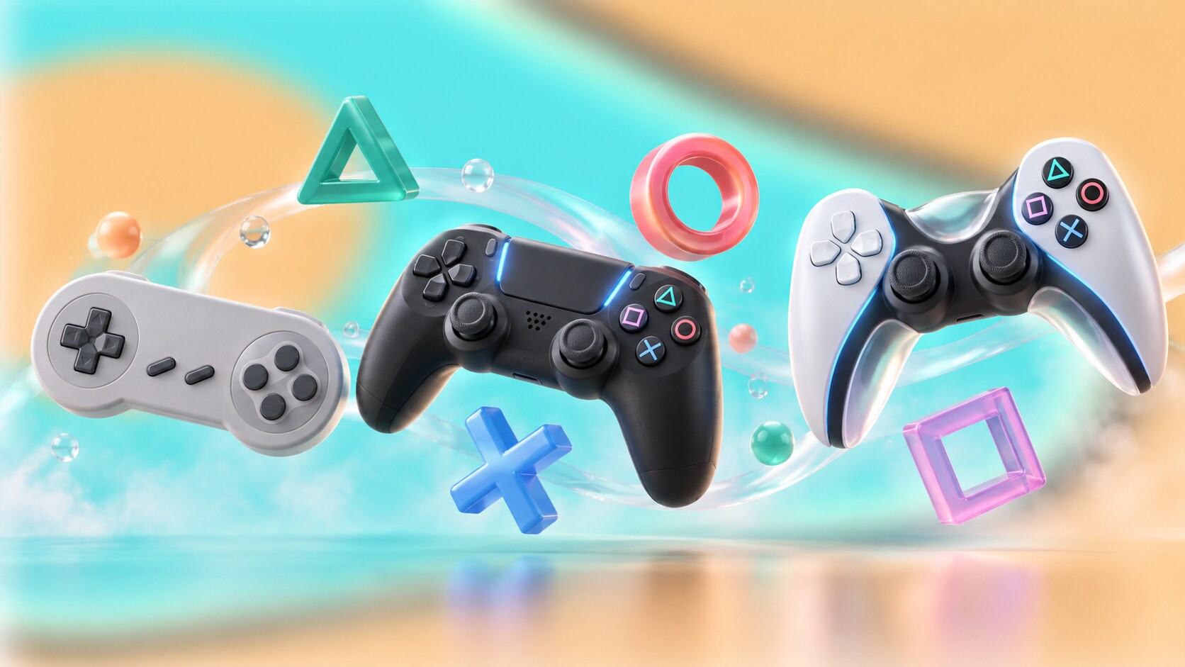
Goto also designed the original PlayStation controller. Instead of copying lettered buttons, he chose triangle, circle, cross and square. He later explained that the triangle suggested viewpoint or direction, the square represented a document or menu, and the circle and cross indicated yes and no in Japanese convention.
Their practical value was immediate. Shapes were easier to distinguish across languages and could become interface instructions, game icons and advertising material. Over time, regional habits complicated the original yes-and-no meaning, but the symbols remained unmistakably PlayStation.
The controller evolved without losing this grammar:
This is a useful branding lesson. A brand asset becomes powerful when it is also useful. The four symbols are not pasted onto the product; players touch them thousands of times. The identity is trained into muscle memory.
The original startup sound worked in a similar way. Takafumi Fujisawa created it in 1994 to feel cinematic and welcoming while also confirming that the machine had started correctly. It turned a technical pause into anticipation.

The first PlayStation was not marketed only as a toy. Sony placed it near youth culture, fashion, electronic music and nightlife. Games such as WipEout were central to this change. Their futuristic racing, soundtrack and graphic work associated with The Designers Republic made gaming feel connected to clubs and independent design magazines.
PlayStation advertising was often surreal rather than explanatory. Campaigns did not always show a console, a price and a smiling family. They sold a parallel identity: the person you became when you played. The famous Double Life commercial treated private gaming lives with cinematic seriousness, while later work kept using tension, transformation and slightly uncomfortable humor.
This strategy succeeded because it made the audience feel seen. Teenagers and young adults did not need to be persuaded that the machine was educational or family-friendly. PlayStation allowed gaming to feel stylish, obsessive and culturally legitimate.
There was also a risk. Provocation can age badly, and some regional advertising crossed from strange into confusing or offensive. A rebellious tone is memorable only when it still connects to the product. When shock becomes the whole message, branding starts talking mainly about itself.
The difference between memorable character and surface-level novelty is also examined in Bold Distinctive Branding vs Beautiful Generic Branding.
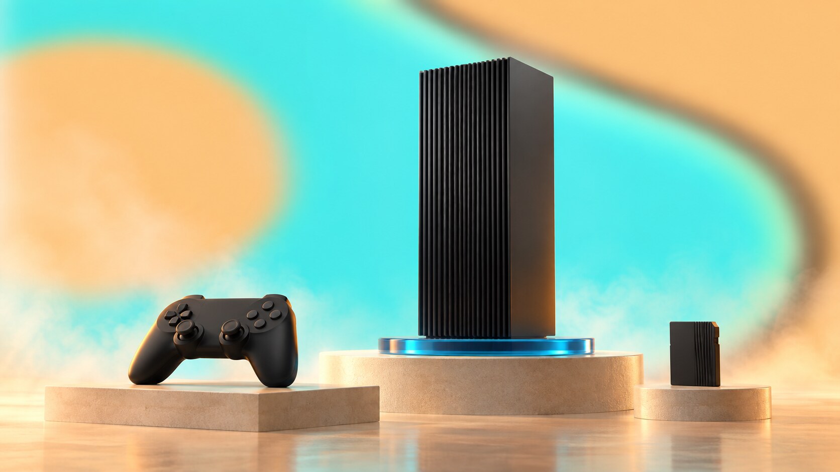
PlayStation 2 replaced the first console’s soft grey friendliness with a black ribbed box. It could sit horizontally or stand vertically on a blue base, looking less like a toy and more like unfamiliar audio-video equipment. The electric blue PS2 wordmark was thin, geometric and almost weightless against the dark hardware.
The design matched the product strategy. PS2 was not only a game machine. It played DVDs, supported the original PlayStation library and entered living rooms at a time when many households were buying their first DVD player. The restrained shell helped it coexist with televisions, receivers and disc players.
Its startup sequence expanded the brand mythology. Floating towers represented data stored on the memory card, so the abstract landscape was not entirely random decoration. A functional system state became atmosphere.
PS2 eventually passed 160 million units according to Sony, making it the best-selling console in the company’s history. The success came from more than styling, but the design made a broad proposition feel coherent:
The product was visually new without asking players to abandon what they already knew. That balance is one of the strongest decisions in the whole PlayStation story.

The original PlayStation 3 was glossy, curved, large and expensive-looking. Its wide PLAYSTATION 3 lettering shared the visual character of Sony’s Spider-Man film typography. Goto later said Kutaragi strongly supported that direction, and the arched console body was developed to suit it.
At E3 in 2005, Sony also showed a curved controller prototype quickly nicknamed the boomerang. It never became the shipping controller. Sony returned to the familiar DualShock-derived shape, initially without vibration in the Sixaxis model and later with it in DualShock 3.
The hardware ambition was real: Blu-ray, the Cell processor, HDMI, hard-drive storage, network services and the PlayStation Store. But Sony’s own later corporate reporting acknowledged that the proprietary architecture made development technically and economically difficult. The premium launch position and complicated messaging made the problem more visible.
The 2009 PS3 Slim was therefore more than a smaller machine. Sony changed the name styling from uppercase PLAYSTATION 3 to PlayStation 3, introduced a simpler PS3 wordmark and visually reconnected the product with the wider family. The revision was lighter, quieter in tone and easier to understand.
“PS3 was not a failure of imagination. It was a warning that engineering ambition, price, typography and product communication must still point in the same direction.”
The difficult period produced a valuable lesson: a premium brand cannot ask customers to decode too many benefits at once. PlayStation recovered when the hierarchy became clearer and developers received a more practical platform.
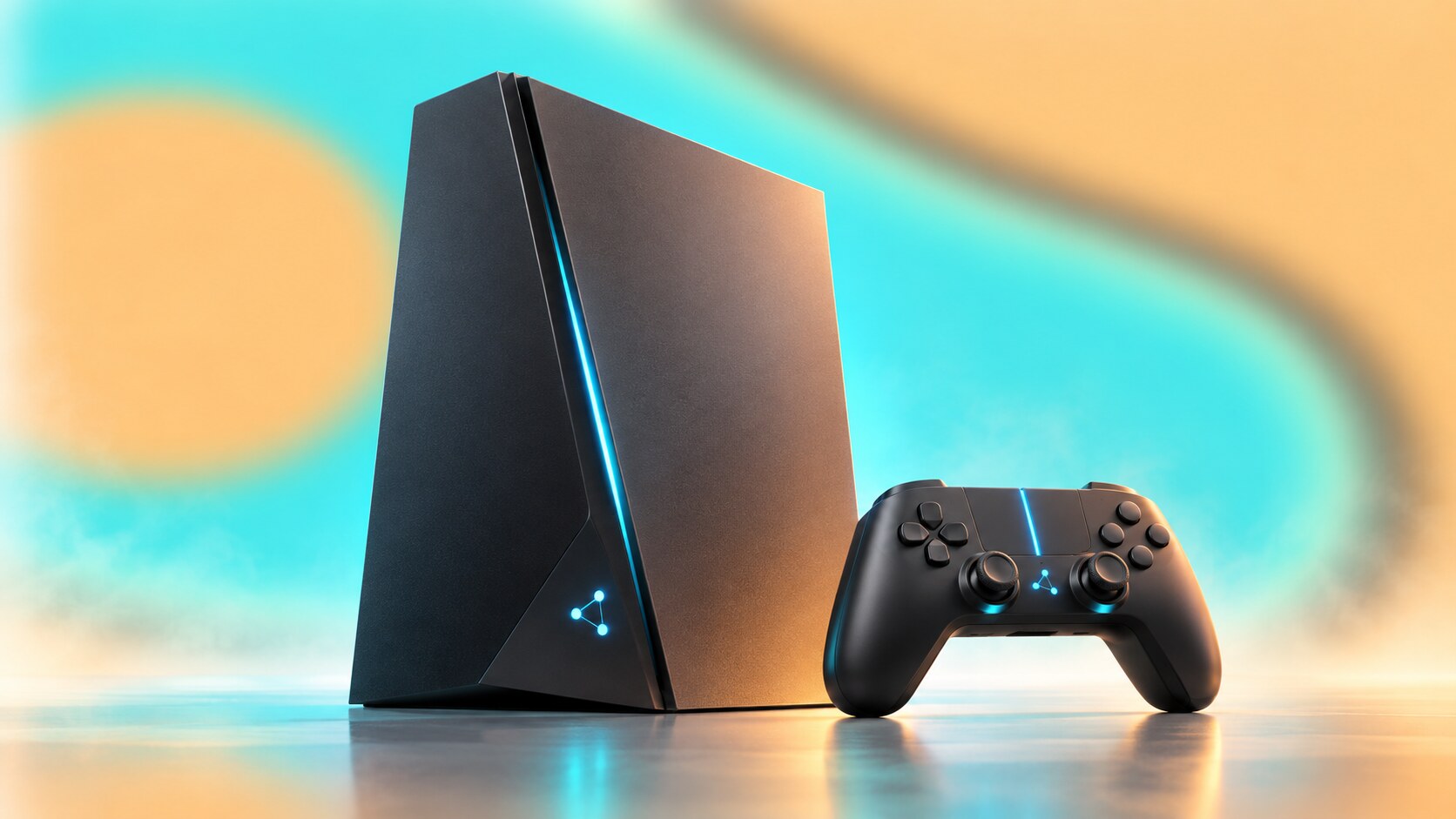
For PlayStation 4, Sony deliberately learned from PS3. Lead system architect Mark Cerny promoted a developer-friendly architecture, while the product strategy emphasized that the machine was built around game creators and players.
Industrial designer Tetsu Sumii described the exterior as a simple object that should look good from every angle in a living room. The slanted black volume, light strip and split matte-gloss surfaces gave it character without making it visually dominant. Console, controller, stand, headset and PS Vita were considered as one family.
The DualShock 4 made several useful changes: more substantial grips, a touchpad, integrated light and a share button. That share button was small hardware carrying a much larger strategic message. PlayStation recognized that playing, recording and broadcasting were becoming connected behaviors.
The global campaign Greatness Awaits, developed by BBH New York, returned to emotional ambition but kept the proposition direct. The PS4 era succeeded because hardware, developer relations, pricing, interface and communication all supported the same idea: playing should be immediate.
What PS4 did particularly well:
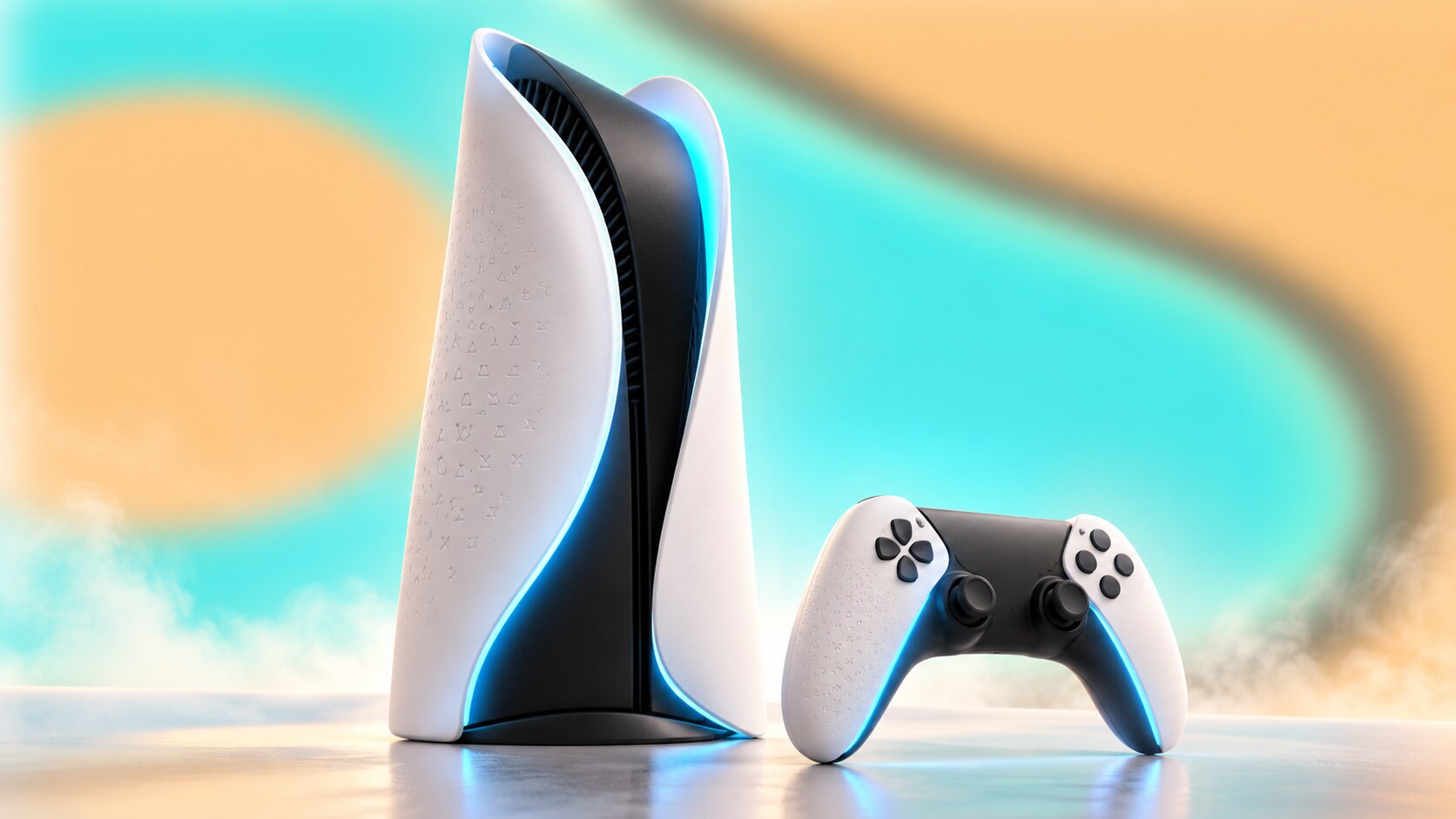
PS5 broke sharply from the black boxes of PS2, PS3 and PS4. The central black technical core is wrapped by two white shells, with blue light appearing between them. The result resembles a portal, a futuristic building or a piece of concept transport design depending on the angle.
Senior art director Yujin Morisawa and Sony Interactive Entertainment’s Design Center developed the product as part of a wider experience covering hardware, user interface, communication and packaging. Sony’s design account describes five connected dimensions rather than a shell designed in isolation.
Some decisions were strongly practical. The large body and curved airflow paths helped manage heat and fan noise. The removable panels made production, service and later customization easier. The white surface separated PS5 from earlier generations in a single glance.
The smallest detail may be the most charming. Tiny triangle, circle, cross and square symbols form texture inside the panels and across parts of the DualSense grip. From a distance they behave like a material finish; close up they reveal the brand alphabet.
Sony kept the established PS logo and closely related numeral construction instead of inventing another master identity. This was deliberate. The radical hardware already created enough novelty, while the familiar mark protected recognition and compatibility.
The weaknesses are also visible. PS5 is difficult to place in some furniture, its family of base stands, detachable drives and revised models can require explanation, and the white surfaces dominate a room more than the quiet PS4 did. Distinction gained some ground at the expense of neutrality.
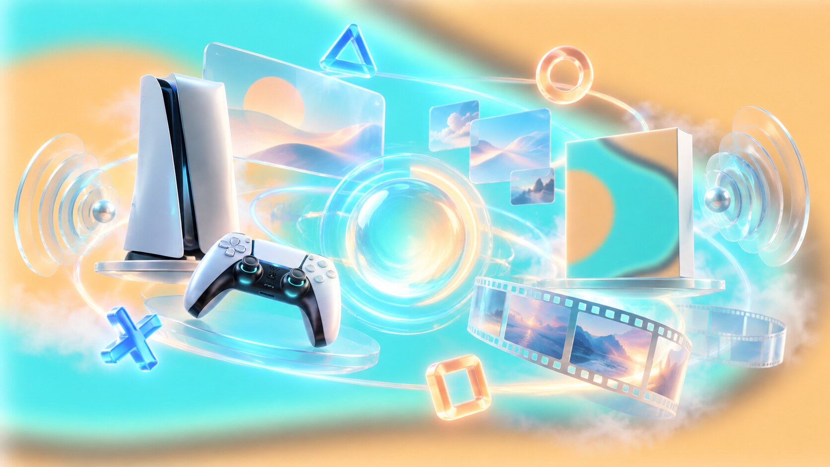
Modern PlayStation design is distributed across many surfaces: the console, controller, packaging, system software, mobile app, PlayStation Store, subscription tiers, game trailers, esports, social media and studio introductions. No customer sees all of them in the same place, but they must still feel related.
The PlayStation Studios animation is a good example. It uses close views of familiar characters before revealing the studio mark. The ident does not depend only on corporate geometry; it borrows emotional equity from the games themselves.
PS5’s campaign platform Play Has No Limits, created with adam&eveDDB, follows the same approach. The advertising is cinematic and surreal, but the recurring portal language relates to the physical console and its promise of entering another world.
Consistency here does not mean making everything identical. It means assigning each brand code a job:
This layered model is more resilient than relying on a fashionable typeface or one campaign line. Individual elements can change while the whole system remains recognizable.

| Era | Strong design decision | Main problem |
|---|---|---|
| PS1 | 3D logo, symbol buttons and adult cultural position | some provocative campaigns overwhelmed the product |
| PS2 | mature black object with DVD and backward compatibility | network identity remained fragmented |
| PS3 | premium materials and ambitious media technology | costly complexity and inconsistent launch communication |
| PS4 | restrained hardware and creator-first clarity | later model naming and service layers became busier |
| PS5 | unmistakable form, DualSense and integrated experience | large footprint and a more complex hardware family |
The recurring success pattern is alignment. PS1’s logo looked three-dimensional because 3D was the product revolution. PS2 looked at home beside media equipment because DVD was part of its value. PS4 looked efficient because clarity and developer accessibility were central. PS5 looks like a portal because immersion is its communication idea.
The wrong paths appeared when one layer told a different story. PS3’s futuristic shell promised effortless premium technology while its cost and development complexity created friction. Some advertisements demanded attention without explaining why the platform mattered. Later product families occasionally made names, accessories and editions harder to compare than necessary.
The lesson is not that simple design always wins. It is that visible complexity needs a reason customers can understand.
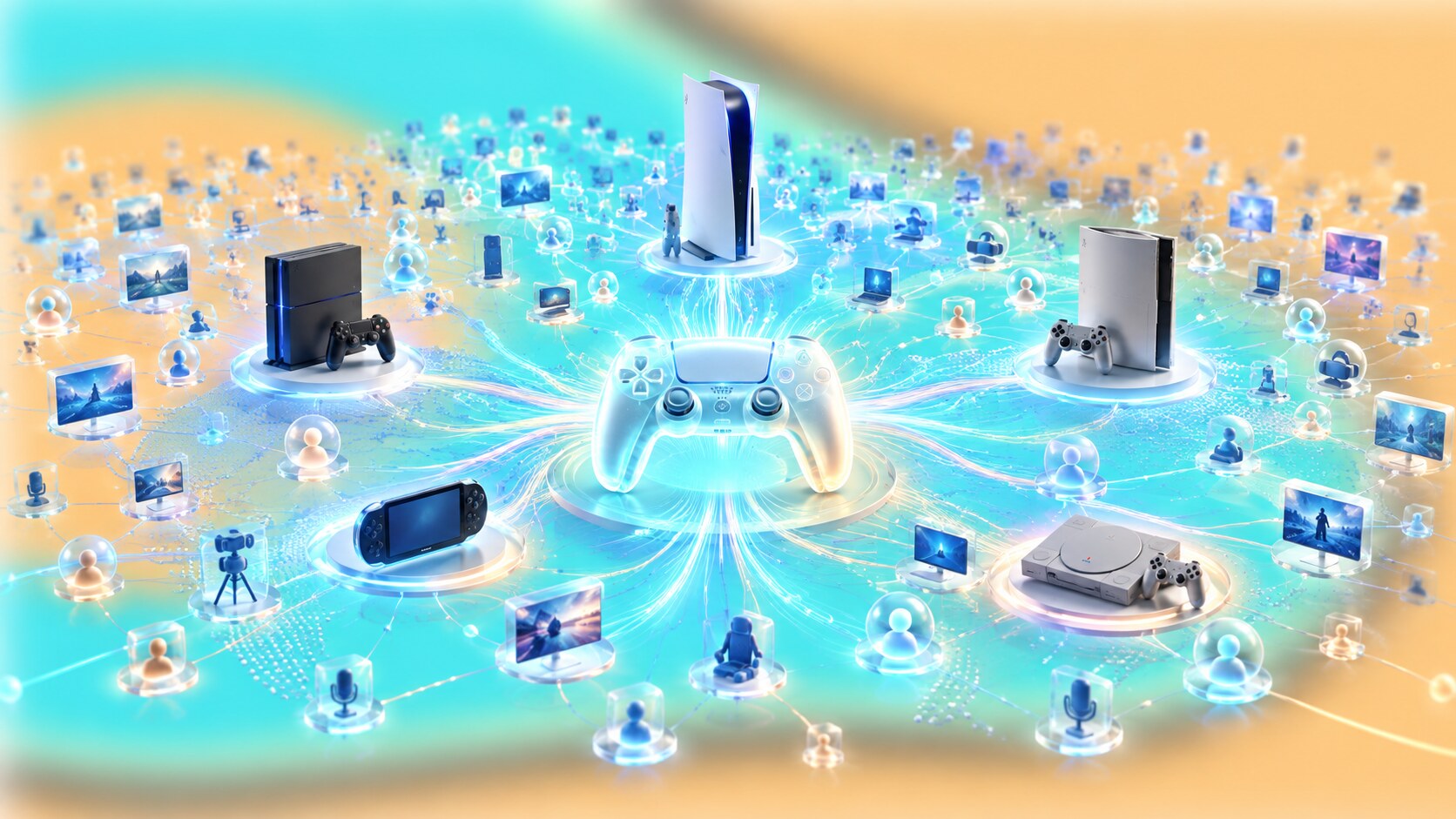
Sony’s published figures show how far the platform has moved beyond selling one box at a time.
These numbers make small design choices expensive. A changed icon, confusing menu label or inaccessible contrast can affect millions of people and thousands of products. At this scale, branding is not only expression. It is navigation, compatibility, documentation and trust.
There is a less visible consequence too. The larger the ecosystem becomes, the harder radical change becomes. Sony can redesign a console exterior every generation, but it must be much more careful with account structures, button conventions, store behavior and library access. The most familiar parts become public infrastructure owned emotionally by players.
The PS symbol may be the famous asset, but PlayStation’s most frequently used identity is probably the controller language. Brand recognition happens every time a player follows an on-screen shape without translating it into a word.

Sony’s confirmed direction is easier to describe than the shape of its next machine. The company is developing machine-learning graphics technology with AMD through Project Amethyst, expanding PlayStation beyond a single screen, investing in network services and using AI tools to support parts of game production. The upgraded PSSR technology introduced in 2026 is one visible result of that research.
From a design perspective, the next challenge is continuity across locations and devices. A person may begin on a television, continue through remote play, use a handheld screen, watch a creator and buy content through a phone. The brand must make those transitions feel like one PlayStation experience rather than a collection of Sony services.
Likely priorities include:
Reports have suggested that a future PlayStation generation could include both a home console and a portable form, sometimes accompanied by supposed codenames, specifications and launch windows. Sony has not confirmed those product names, industrial designs, dates or configurations. They should be treated as speculation, not hidden facts.
What Sony leadership has discussed publicly is a more seamless experience beyond the living room. That can describe remote play, cloud delivery, accessories or future hardware. It does not prove any one leaked design.
The safest prediction is therefore not a particular box. It is that the permanent layer will remain smaller than the changing hardware: the PS mark, the four shapes, the controller relationship and a promise of entering another world.
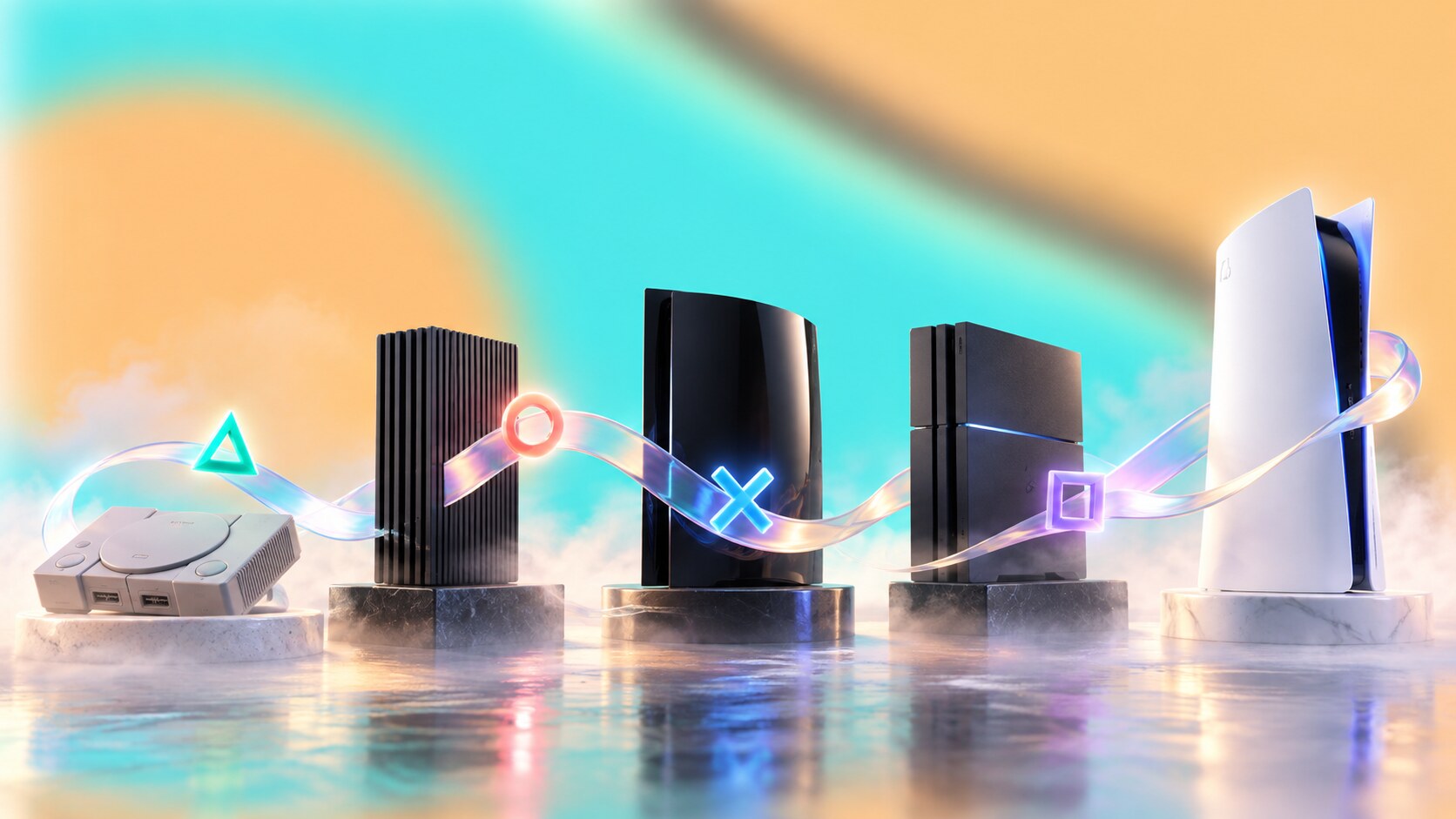
PlayStation started as Sony’s answer to a failed partnership. It became a global brand because technology, industrial design, graphic identity, sound, interface and culture gradually learned to support one another.
Its best decisions were durable rather than fashionable: Sakamoto’s spatial logo, Goto’s controller symbols, Fujisawa’s startup sound, PS2’s mature living-room presence, PS4’s discipline and PS5’s integrated physical and digital language.
Its weaker moments came from misalignment. Expensive complexity, unclear hierarchy or advertising that became louder than the product made the brand harder to read. Sony usually recovered not by erasing PlayStation’s past, but by making its promise clear again.
That may be the central lesson of the whole story. A console generation lasts a few years. A useful symbol, a familiar action and a carefully protected feeling can last for decades.

News, insights, case studies, and more from the rausr team — straight to your inbox.
Send us your brief, your wildest idea, or just a hello. We’ll season it with curiosity and serve back something fresh, cooked with care.