Rebranding a Nation: Ambitious but risky design challenges
What about the challenge of national rebranding — where heritage, emotion, and politics collide with strategy and design. What does it take to change the face of a country?

What about the challenge of national rebranding — where heritage, emotion, and politics collide with strategy and design. What does it take to change the face of a country?
Rebranding a nation is one of the most ambitious — and risky — design challenges possible.
Unlike a product or corporation, a country carries layers of history, emotion, politics, and pride. Colors, shapes, and even typefaces are not just design elements — they’re symbols of identity.
But as global communication, tourism, and digital diplomacy evolve, many nations are rethinking how they visually present themselves to the world.
Can a flag, logo, or national identity be redesigned — without alienating the people it represents?
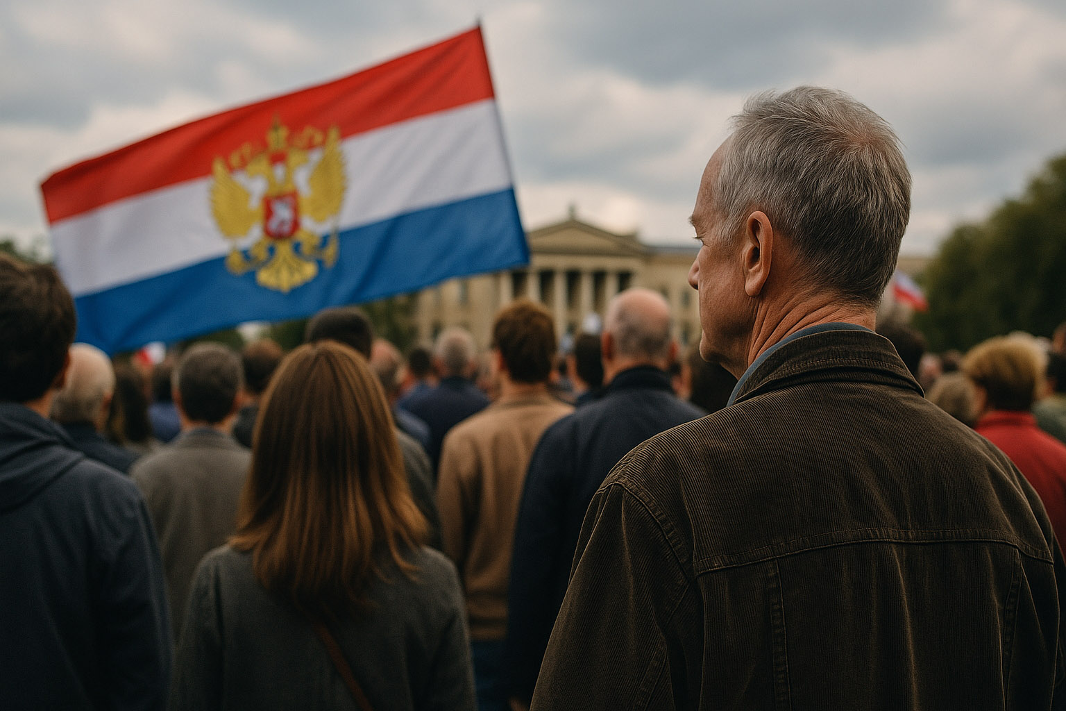
For citizens, national symbols are more than graphic marks — they embody belonging and continuity.
People resist change when it touches what feels “theirs.” A flag, emblem, or coat of arms becomes part of collective memory; altering it can seem like rewriting history.
That’s why national rebranding often meets public backlash.
It’s not only about aesthetics — it’s about trust, identity, and ownership.
People ask: “Why spend millions on design when hospitals need funding?”
So the tension between emotional attachment and strategic modernization defines every such project.
“However, rebranding doesn’t mean erasing tradition — the challenge lies in evolution, not replacement.”
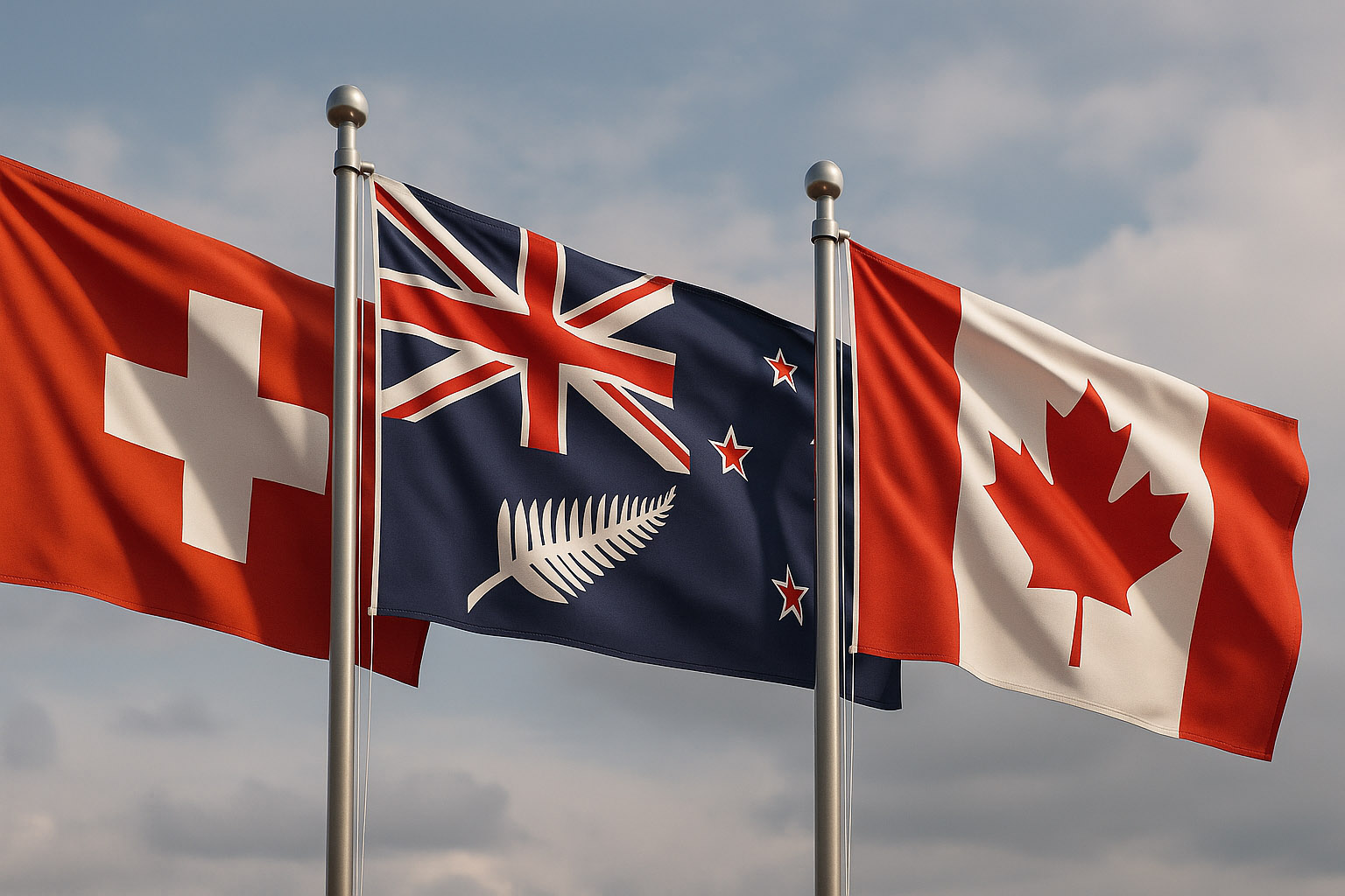
Switzerland’s design system shows that not changing too much can itself be a form of rebranding.
Their global identity — red, white, minimal — is rooted in precision, neutrality, and quality.
Instead of redesigning, the Swiss have systematized their national style, applying grid-based principles across communication, tourism, and exports.
In the 2015 referendum, New Zealand debated changing its flag to better represent Maori culture and move beyond colonial symbols.
The process involved public voting and national debate — although the flag remained unchanged, the initiative opened dialogue about shared identity.
The “Silver Fern” concept remains an unofficial national mark, widely used in sports and branding.
Canada’s 1965 flag redesign was a masterclass in symbolic clarity.
The red maple leaf, designed by George F.G. Stanley and John Matheson, replaced colonial imagery with a modern, instantly recognizable icon.
Despite early resistance, it became a unifying success — proving a bold change can work if it captures emotional truth.
After apartheid, South Africa’s flag redesign (1994) symbolized unity — but subsequent branding efforts lacked cohesion.
Multiple tourism and export identities emerged, diluting visual consistency.
Lesson: symbolic success doesn’t guarantee systemic clarity.
Several U.S. states (e.g., Mississippi, Utah) have struggled with redesigning flags to remove Confederate or religious imagery.
Public resistance was intense — illustrating how heritage and emotion can block progress, even when redesigns seek inclusivity.
After Czechoslovakia’s split, both nations claimed continuity of visual identity.
The Czech Republic kept the old flag — effectively “rebranding by ownership” — leaving Slovakia to develop a new but less internationally recognized symbol.

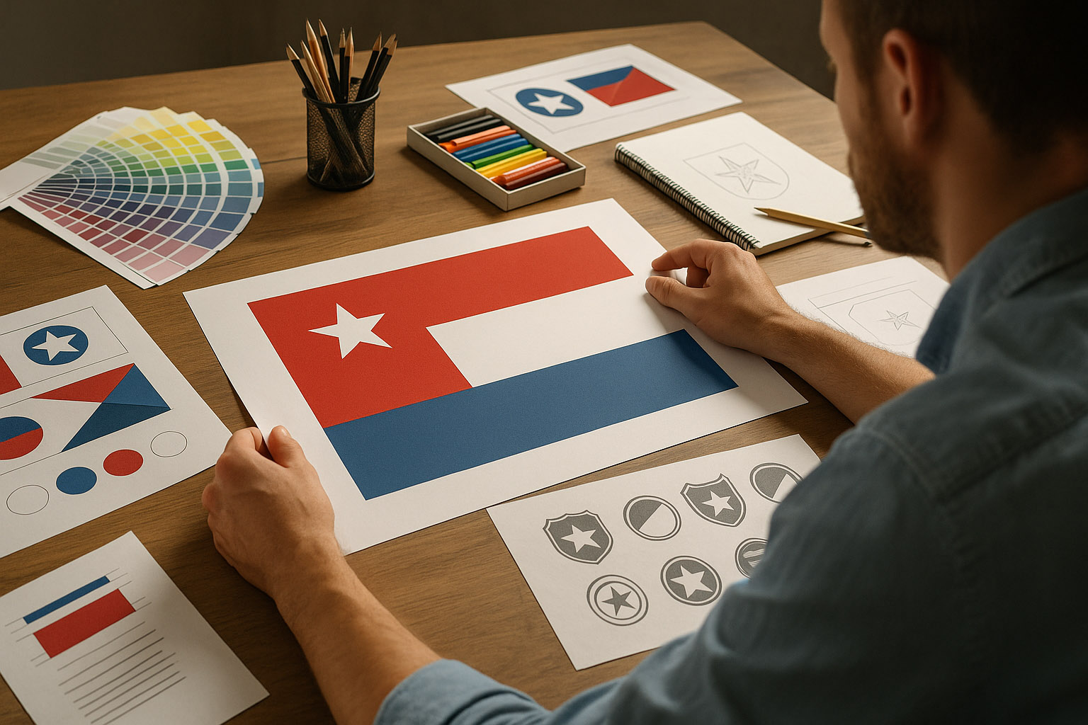
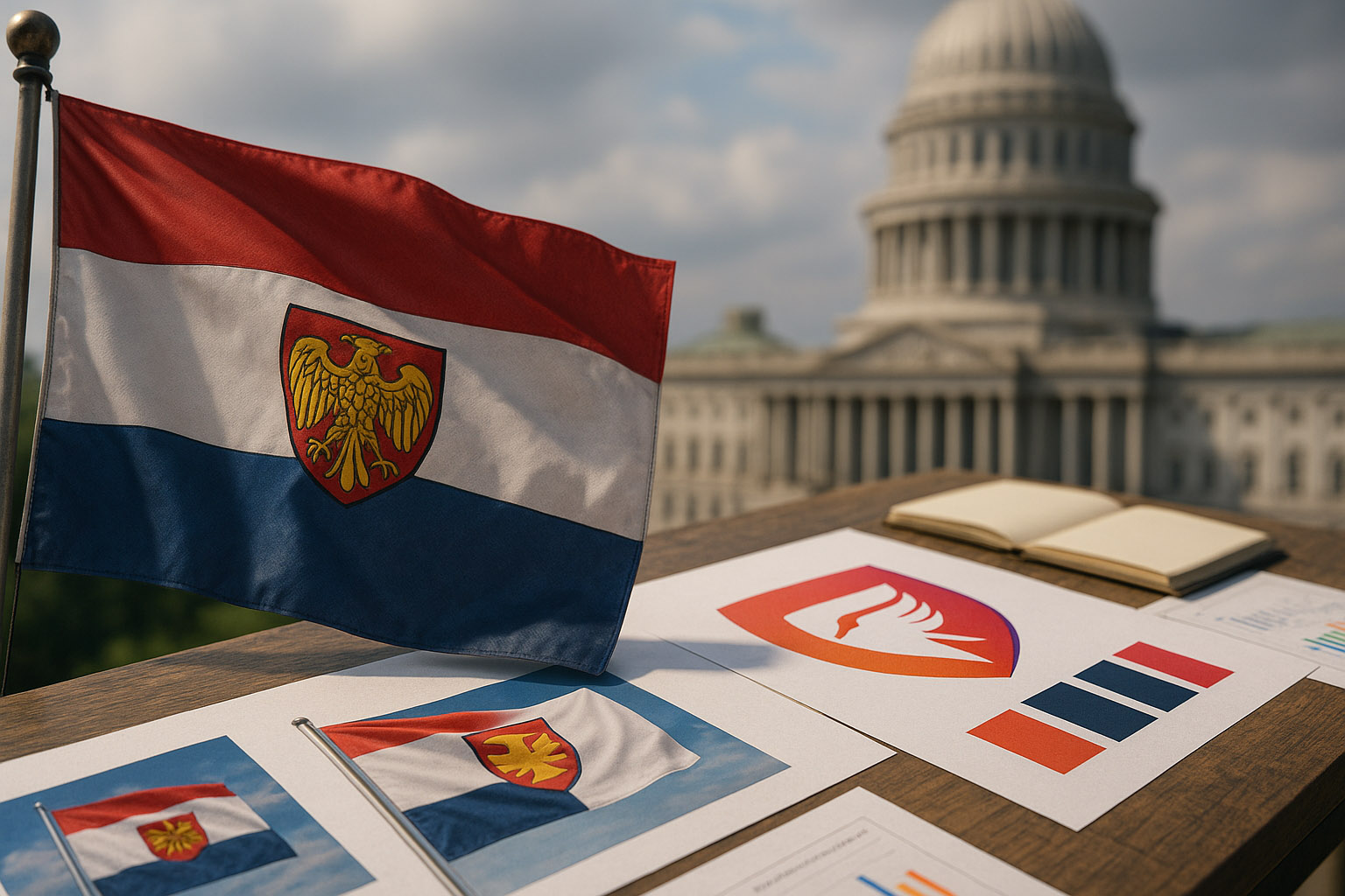
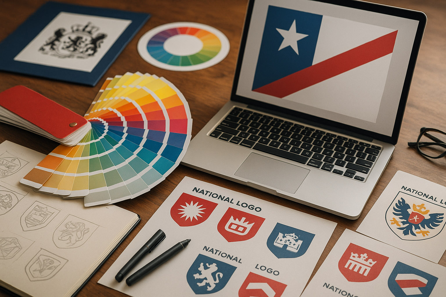
Designing a national identity involves much more than a logo:
| Item | Estimated Cost (EUR) | Description |
|---|---|---|
| Strategic research & workshops | €300,000 – €1 million | Involves sociologists, historians, and designers |
| Public consultations & voting | €1–5 million | Campaigns, outreach, and awareness |
| Design development | €200,000 – €700,000 | Visual system, applications, guidelines |
| Implementation & rollout | €5–50 million | Government signage, documents, uniforms, digital systems |
Example:
New Zealand’s 2015 flag referendum cost over NZ$26 million (€15 million) — and the design wasn’t even adopted.
By contrast, Canada’s flag redesign (1965) cost under €300,000 (adjusted for inflation, still under €3M today) — a long-term visual success at a bargain price.
Technically, yes — visually, within months.
But socially, it takes years of narrative work to make citizens accept a new identity.
The key isn’t speed; it’s inclusion. When people feel part of the process, resistance fades.
Rebranding a nation is less about design and more about collective storytelling.
It asks: Who are we now — and who do we want to be seen as?
From Switzerland’s timeless consistency to Canada’s bold reinvention, each case reveals the same truth — successful national rebranding is never just a visual update.
It’s a mirror held up to a people’s values, memory, and future.
“Sometimes the most radical act of design is simply to listen.”
News, insights, case studies, and more from the rausr team — straight to your inbox.
Send us your brief, your wildest idea, or just a hello. We’ll season it with curiosity and serve back something fresh, cooked with care.