Reddit Design and Branding Evolution: From Old Reddit to a Public Company
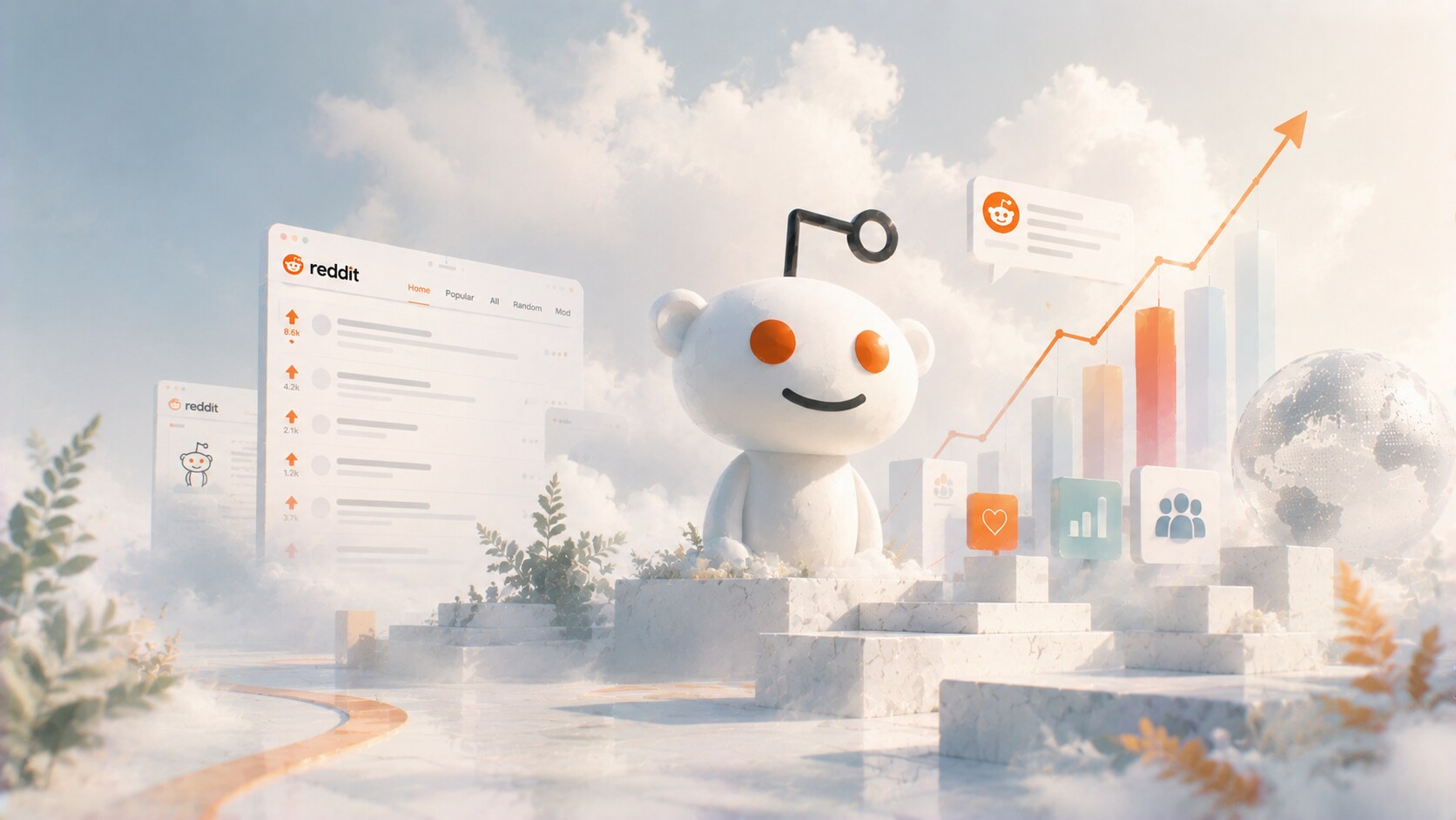
How Reddit’s design and branding evolved from a rough early web forum into a public company with strategic future.

How Reddit’s design and branding evolved from a rough early web forum into a public company with strategic future.
Most major platforms spend years trying to look polished, legible, and advertiser-safe as quickly as possible.
Reddit took a stranger path.
For a long time, its visual identity was almost anti-polish. The site looked dense, improvised, and stubbornly old-web. That was partly a weakness, but it was also part of the myth. Reddit did not feel like a shiny media product. It felt like a living machine built by internet obsessives for other internet obsessives.
That is why Reddit’s design story is worth studying. It is not only about logos and interface updates. It is about how a platform tried to modernize without losing the strange community energy that made it different in the first place.
This article sits naturally beside The Evolution of Yahoo Design, Trend Cycles in Graphic Design, and LEGO Brand Design Evolution.
“Reddit’s biggest design problem was never only how it looked. It was how to make a chaotic culture feel more welcoming without making it feel fake.”
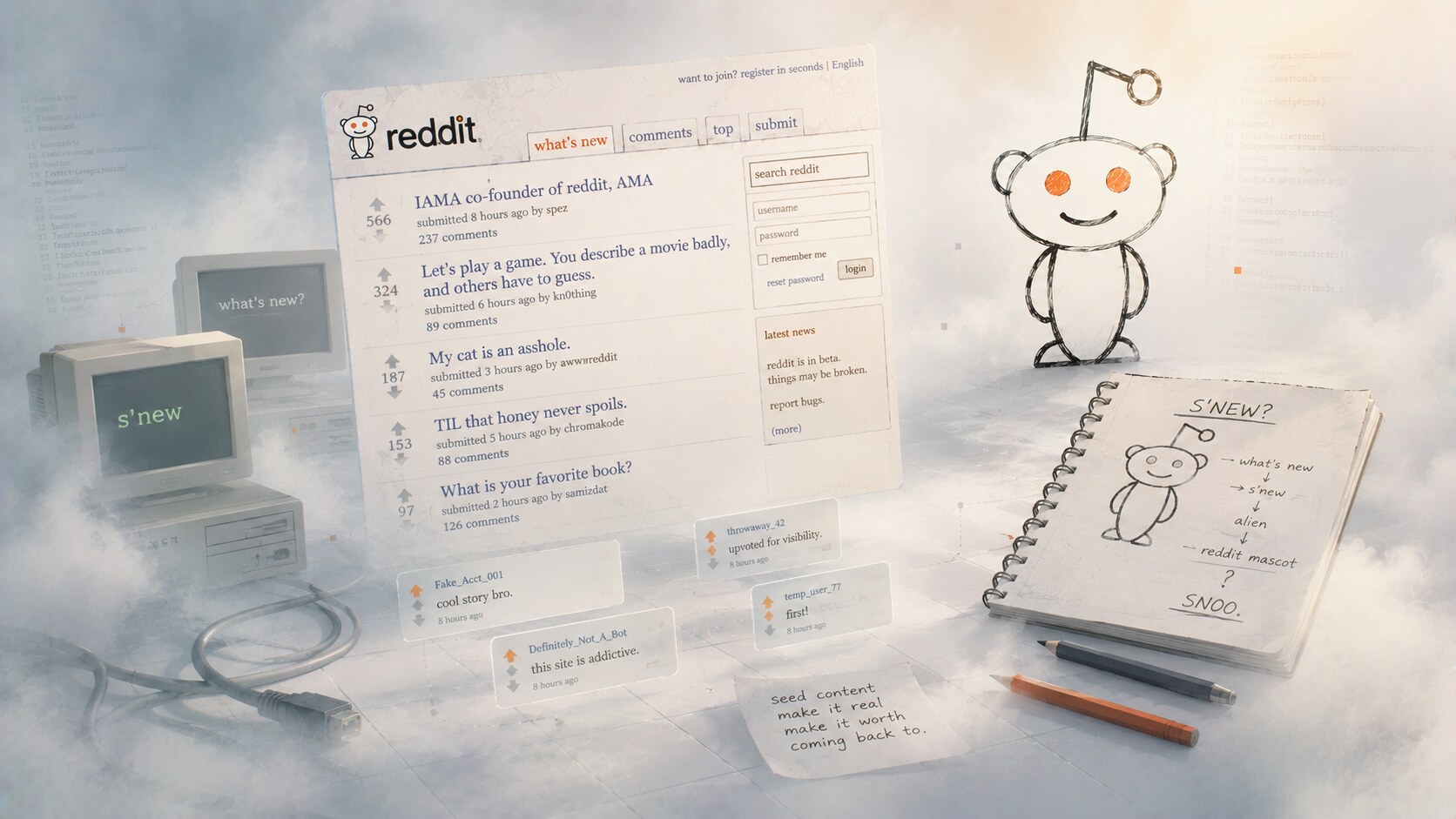
Reddit launched in June 2005, built by Steve Huffman and Alexis Ohanian, later joined by Aaron Swartz. The early site did not try to look luxurious or strongly designed. It looked functional, skeletal, and very much part of the early social web.
That made sense. The original product was really about the behavior model:
Visually, the experience was secondary to the mechanism. But even in that primitive stage, one design choice mattered enormously: the brand had personality.
The name was memorable. The tone was lightweight. And then there was Snoo, the alien mascot sketched by Alexis Ohanian while he was still a student. According to later accounts, the mascot was originally tied to the play on words “what’s new” and an early “S’new” idea before becoming Snoo.
One of the least glamorous but most revealing early stories is that the founders created fake accounts and seeded content themselves so the site would not feel empty. In other words, Reddit’s first design trick was not visual. It was social staging.
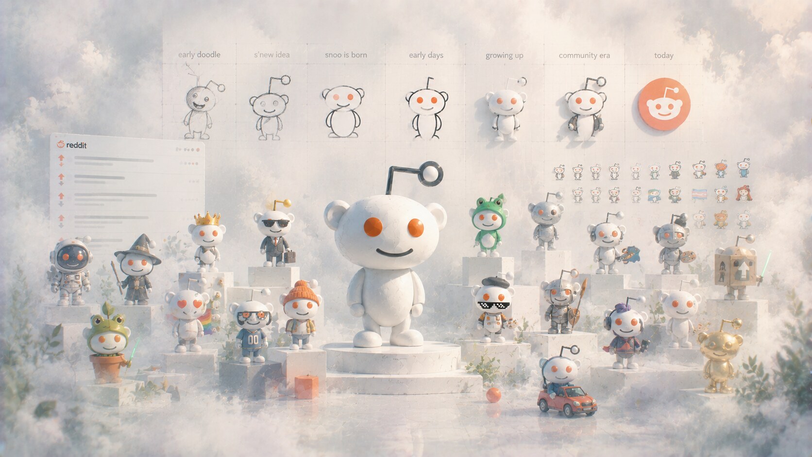
Most big internet brands either avoid mascots or keep them tightly controlled.
Reddit did something more unusual. Snoo became a shared symbol that could be endlessly remixed by communities. That made the mascot far more alive than a typical corporate character.
This worked for several reasons:
That is a deeper branding advantage than it may first seem. Reddit’s brand was never only top-down. It gained power because users were allowed to participate in the visual culture.
One of the more interesting design rules to emerge later was that Snoo should stay visually simple and neutral. That was a way to keep the mascot recognizable even while thousands of communities customized it.
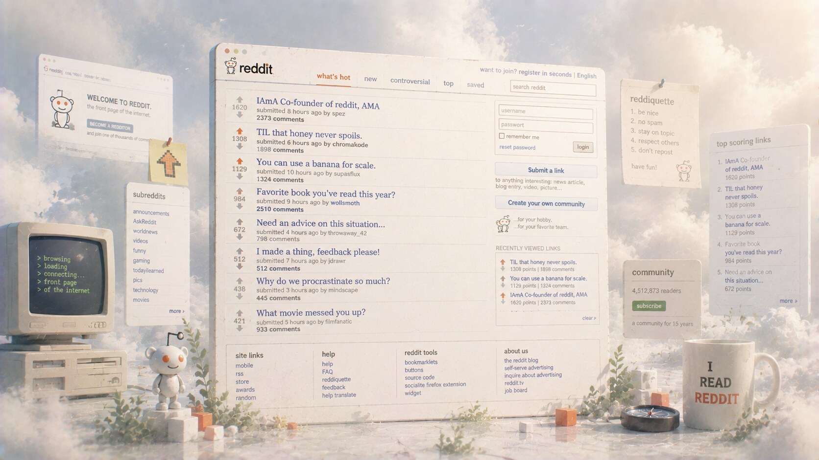
For years, Reddit’s interface looked like a holdover from an older internet. To many new users it felt ugly, intimidating, and too technical. To experienced users it felt fast, honest, and efficient.
That split is central to Reddit’s design story.
Old Reddit had real strengths:
But it also had obvious problems. It was hard for newcomers, inconsistent across communities, and visually closer to a tool than a welcoming mainstream platform.
This is one reason Steve Huffman later described Reddit as looking too much like a “dystopian Craigslist.” That phrase matters because it captured the design problem precisely: the site felt culturally powerful, but not broadly inviting.
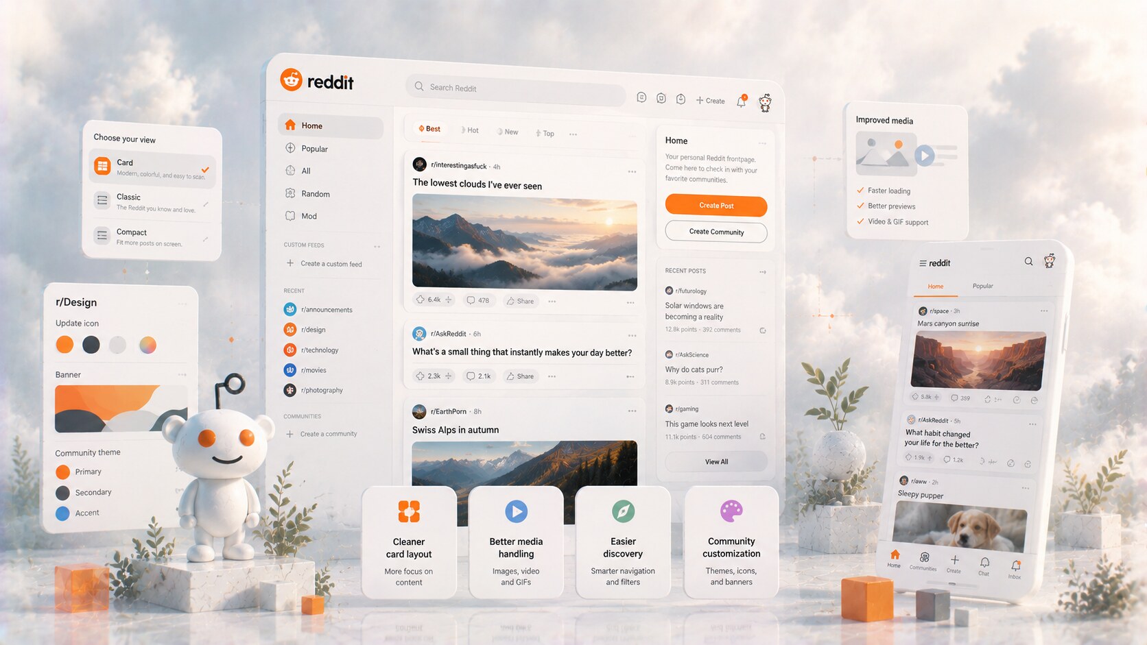
The biggest product-design turning point came in 2018, when Reddit launched its first major redesign in more than a decade.
This phase was driven internally rather than by one famous outside brand studio. Wired’s reporting highlighted Steve Huffman as the executive force behind it, and Tavish MacLellan, Reddit’s creative director for brand at the time, as an important figure in formalizing the visual system.
The redesign introduced:
It also tried to make subreddit customization easier and more legible.
It gave Reddit a better on-ramp for new users and made visual content, comments, and discovery feel less punishing.
Many longtime users still preferred old.reddit.com, and that preference itself became part of the platform’s identity. Few major products carry their legacy interface so publicly for so long.
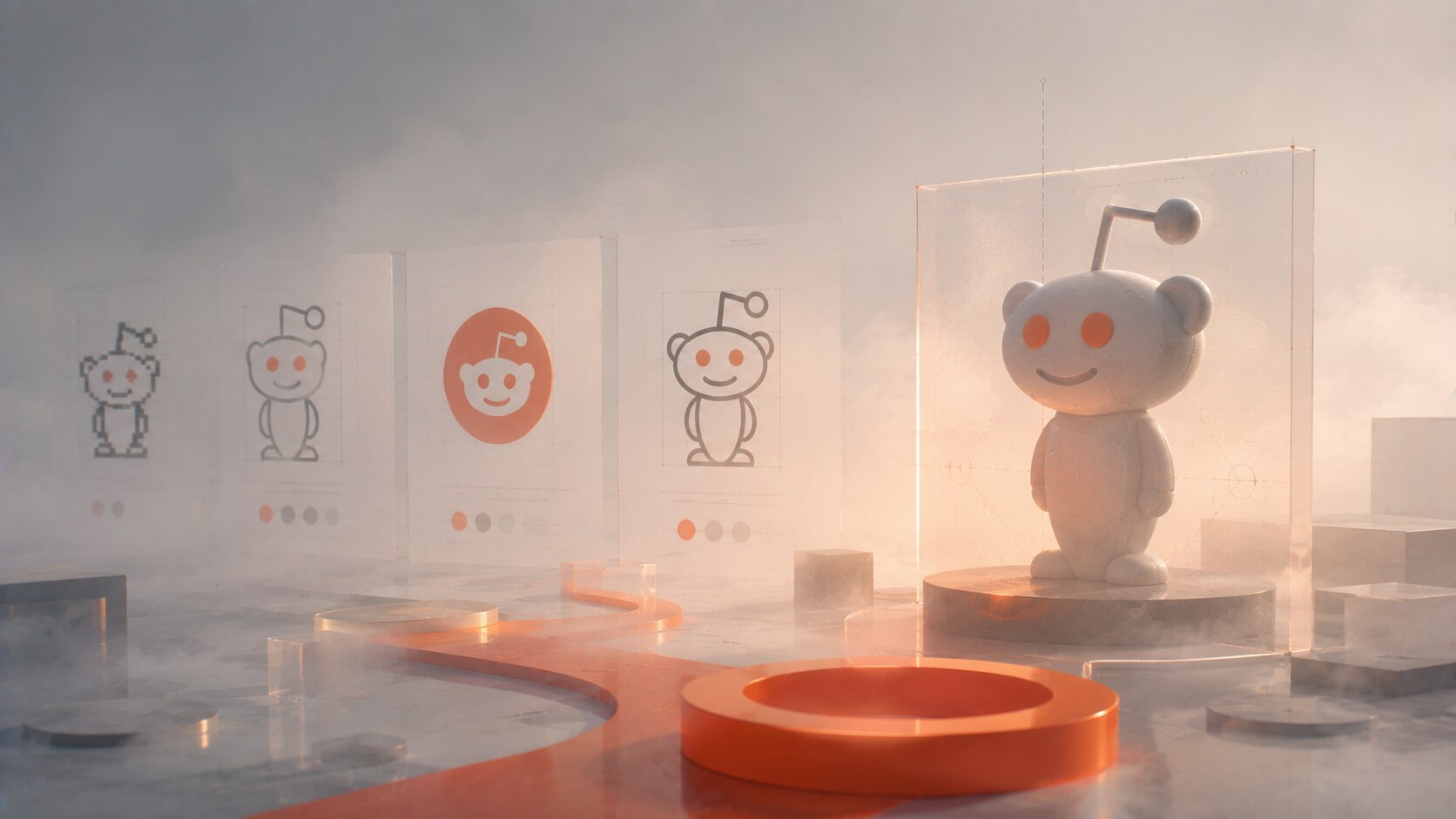
One of the best hidden details from the redesign era comes from Wired’s reporting on Reddit’s brand audit. The old official brand guidelines reportedly included Alexis Ohanian’s personal email and the note: “Have fun with this!”
That is funny, but it also says a lot. Reddit had iconic ingredients, but it lacked a fully mature system.
Over time, the brand became more organized:
This was one of Reddit’s quiet successes. It did not erase community variation, but it made the top-level brand more legible.
By late 2023, design coverage was describing a broader Reddit rebrand: tighter brand colors, sharper typography, an updated Snoo, and a more coherent corporate presentation.
This made strategic sense. Reddit was heading toward its March 21, 2024 IPO, and the company needed to look less like a beloved internet accident and more like a scalable public business.
That shift was successful in some ways:
But there is a permanent tension here. The more professionally branded Reddit becomes, the more carefully it has to preserve the feeling that users still own the culture of the place.
It would be too simple to tell Reddit’s story as a clean improvement arc.
Some of the platform’s most damaging moments were about trust. The 2023 API pricing changes triggered widespread subreddit protests and pushed many users to see Reddit’s modernization as less community-friendly than it claimed to be.
There were also smaller but revealing missteps:
This is important because branding is not only visual. On a platform like Reddit, governance decisions immediately affect how authentic the brand feels.
“Reddit’s strongest identity asset is community ownership. Every time the company weakens that feeling, the visual brand also loses credibility.”
As Reddit grew, the old rough system became harder to defend purely as charm.
| Period | Scale | Design meaning |
|---|---|---|
| 2018 redesign era | about 330 million global users, according to Wired | clearer onboarding became necessary |
| Q4 2025 results | 121.4 million global daily active uniques | informal design was no longer enough |
| Q1 2026 results | 126.8 million daily active uniques | growth pushed Reddit toward a stronger system |
The table is useful because it shows the real reason for so many design changes: scale made looseness expensive.
Several names matter in different phases:
That list matters because Reddit did not become visually important through a single legendary agency moment. Its evolution came more from internal product reality, community culture, and gradual brand discipline.
That is rare. Many large internet companies feel agency-polished from a distance. Reddit still feels authored from the inside.
As of 2026, Reddit’s next design chapter is clearly tied to two things: AI-assisted product features and the defense of human conversation as a brand asset.
Recent reporting points to Reddit Answers, translation tools, stronger search behavior, and a broader product system that is trying to make Reddit easier to use without turning it into generic AI sludge. Steve Huffman has been framing the company’s value around real people talking to other real people, which is a smart brand position in an internet filling up with synthetic content.
That future has promise, but also risk.
Reddit began as a rough but clever social mechanism wrapped in a light brand.
It grew into a giant platform whose mascot became iconic, whose ugly interface became beloved, and whose modernization had to happen in public under the eyes of users who often hate being redesigned.
That is what makes the story so interesting.
The successful part of Reddit’s evolution was not becoming sleek for its own sake. It was learning, slowly, how to build a stronger system around the same strange community engine.
The unresolved question is still the most important one: how polished can Reddit become before it stops feeling like Reddit?
News, insights, case studies, and more from the rausr team — straight to your inbox.
Send us your brief, your wildest idea, or just a hello. We’ll season it with curiosity and serve back something fresh, cooked with care.