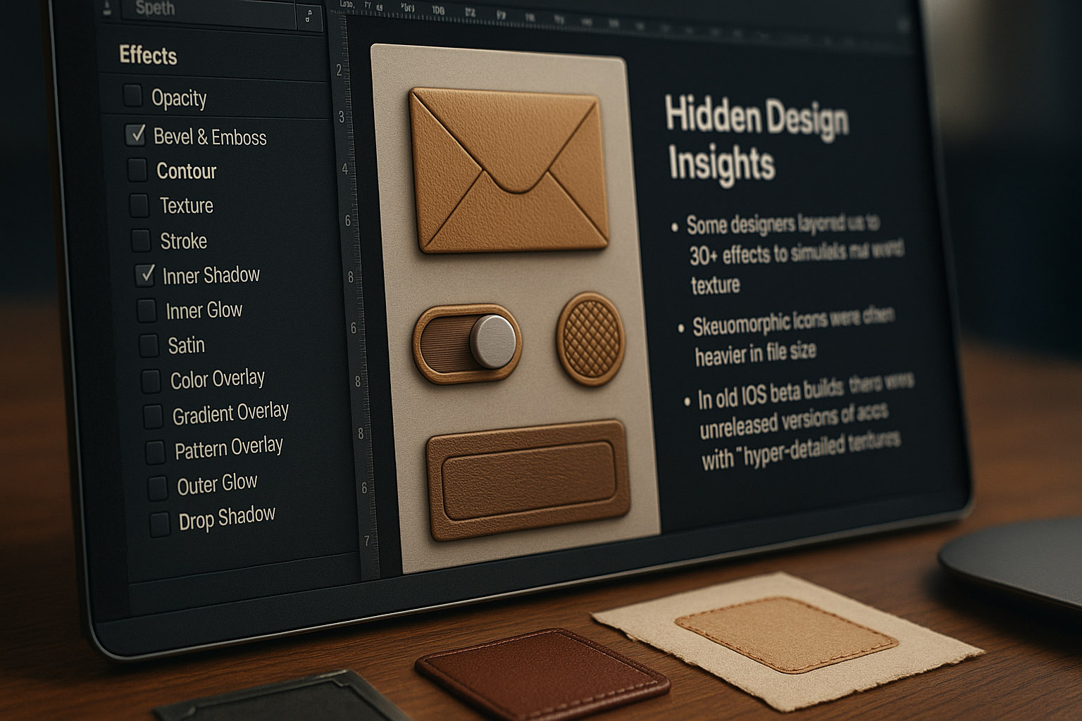
Skeuomorphism: When Interfaces Felt Like Home
A nostalgic look into the textured, cozy era of skeuomorphic design — where buttons looked real, shadows were deep, and your screen resembled a designer’s living room.
A nostalgic look into the textured, cozy era of skeuomorphic design — where buttons looked real, shadows were deep, and your screen resembled a designer’s living room.
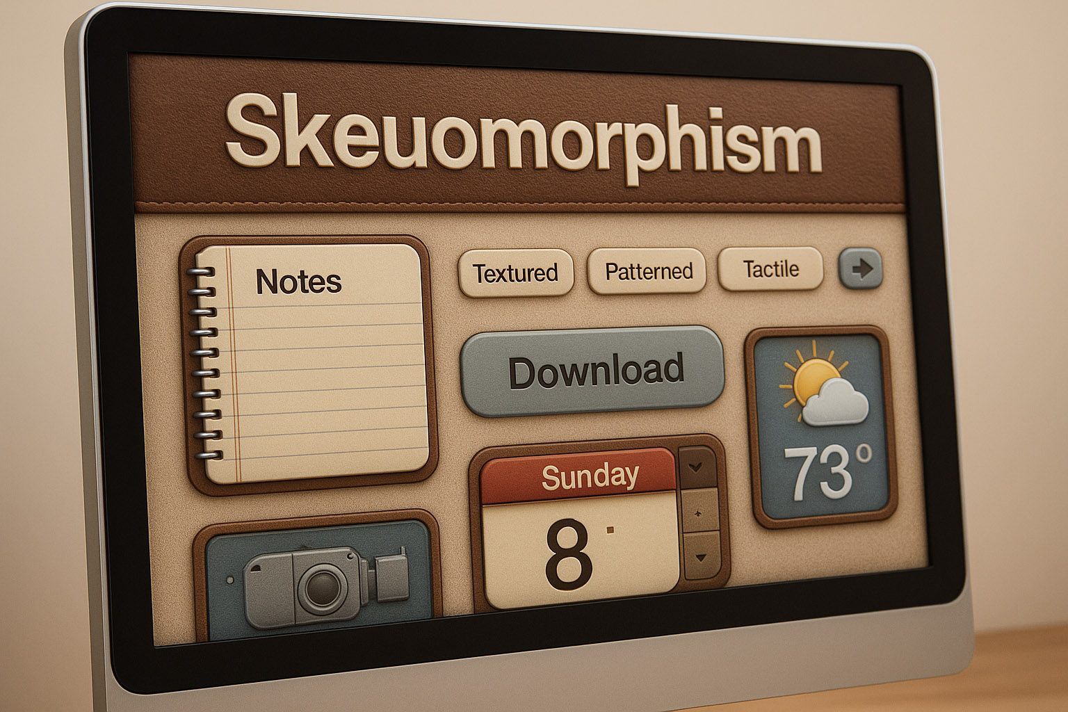
Before digital minimalism took over, there was a time when interfaces welcomed you like a living room — rich in textures, shadows, and familiarity. Digital interfaces didn’t try to hide their metaphors.
“This wasn’t by accident — it was skeuomorphic design. A style that made digital things resemble their real-world counterparts.”
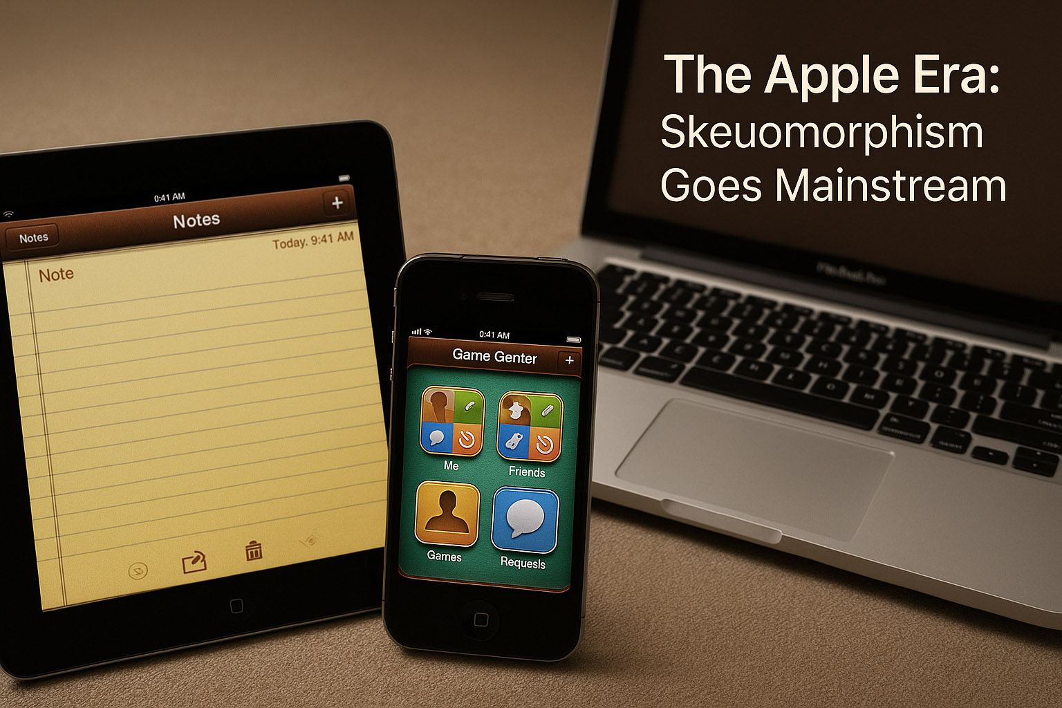
The golden age? Arguably Apple’s era from iOS 1 to iOS 6.
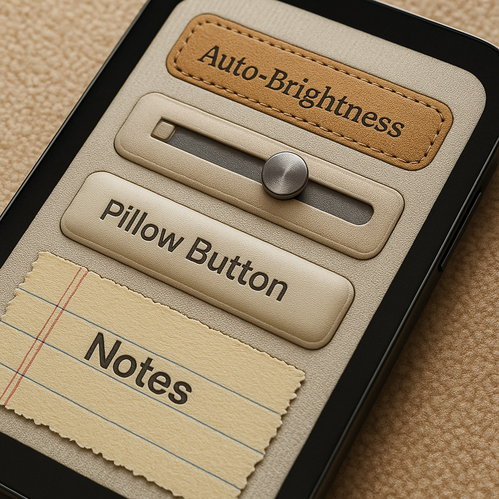
Skeuomorphism helped make technology less intimidating. If you knew how a real-world calendar worked, you knew how iCal worked.
Designers like Scott Forstall championed this approach — believing it made the iPhone more accessible to first-time users.
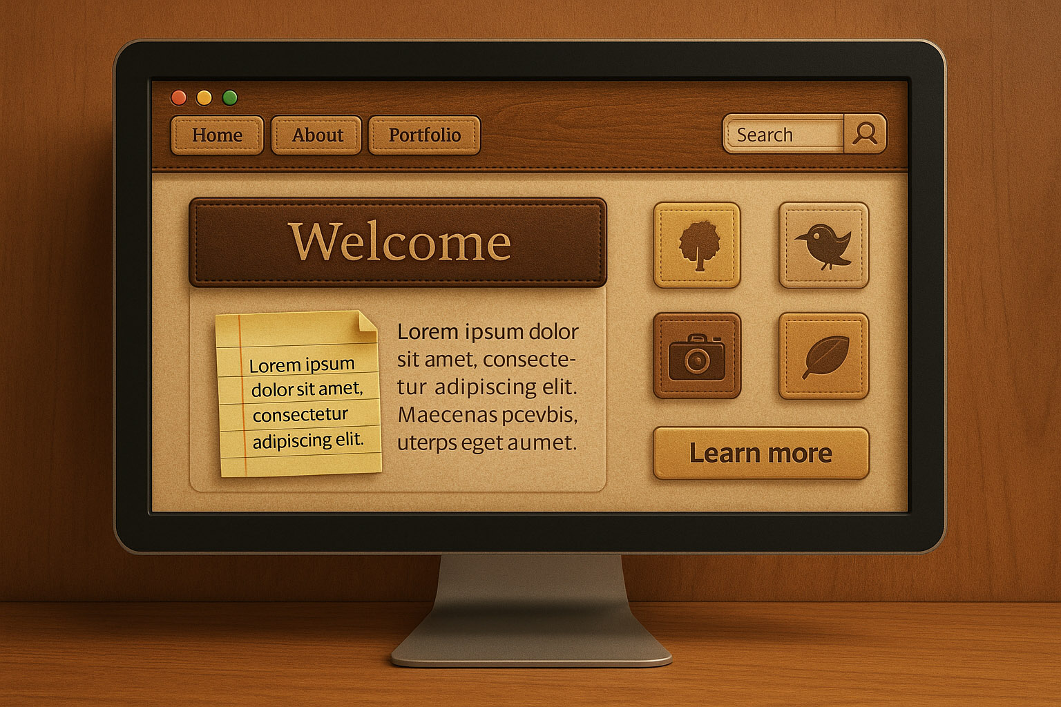
Remember early 2010s web design?
Brands like Evernote, National Geographic, and even early Tumblr themes embraced this rich, tangible design style.
Flash websites loved it too — bringing shadows, noise textures, and 3D-ish interaction.
While Apple popularized skeuomorphism, other platforms embraced it in their own way. Samsung’s early Android skins mimicked leather and chrome. Banking apps in the early 2010s often looked like vaults or ledgers. Even web-based admin dashboards used faux embossing and stitched headers to suggest structure and stability.
Skeuomorphism wasn’t just a trend — it was a global design language for easing users into the digital world.
Flat design hit like a reset button around 2013–2014, led by:
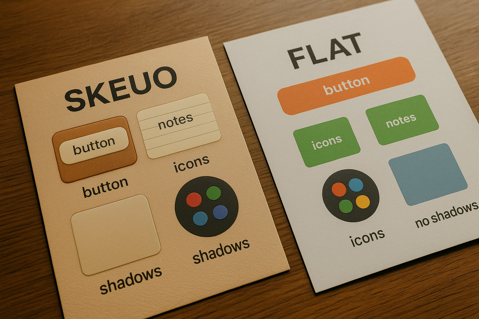
Where skeuomorphism mimicked the physical, flat design favored:
“The shift wasn’t just aesthetic — it was practical.”
Flat designs were faster to load, easier to scale across screen sizes, and more aligned with the rise of responsive and mobile-first web.
While skeuomorphism was eventually phased out, its spirit lives on:
The era taught us how metaphor makes software feel human.
“Not everything needs to be flat and sanitized.
Sometimes, a little drop shadow is all it takes to feel… familiar.”
Today, we see glimpses of skeuomorphism in product mockups, AR/VR environments, and brand identities seeking warmth and nostalgia. Its resurgence in certain digital spaces shows that familiarity and tactility still hold emotional power.
News, insights, case studies, and more from the rausr team — straight to your inbox.
Send us your brief, your wildest idea, or just a hello. We’ll season it with curiosity and serve back something fresh, cooked with care.