How Mobile-Responsive Design and Smart UX Boost Nonprofit Donations
Even small UX changes can drive big results. Better mobile design helped nonprofits increase donations and improve user trust.

Even small UX changes can drive big results. Better mobile design helped nonprofits increase donations and improve user trust.
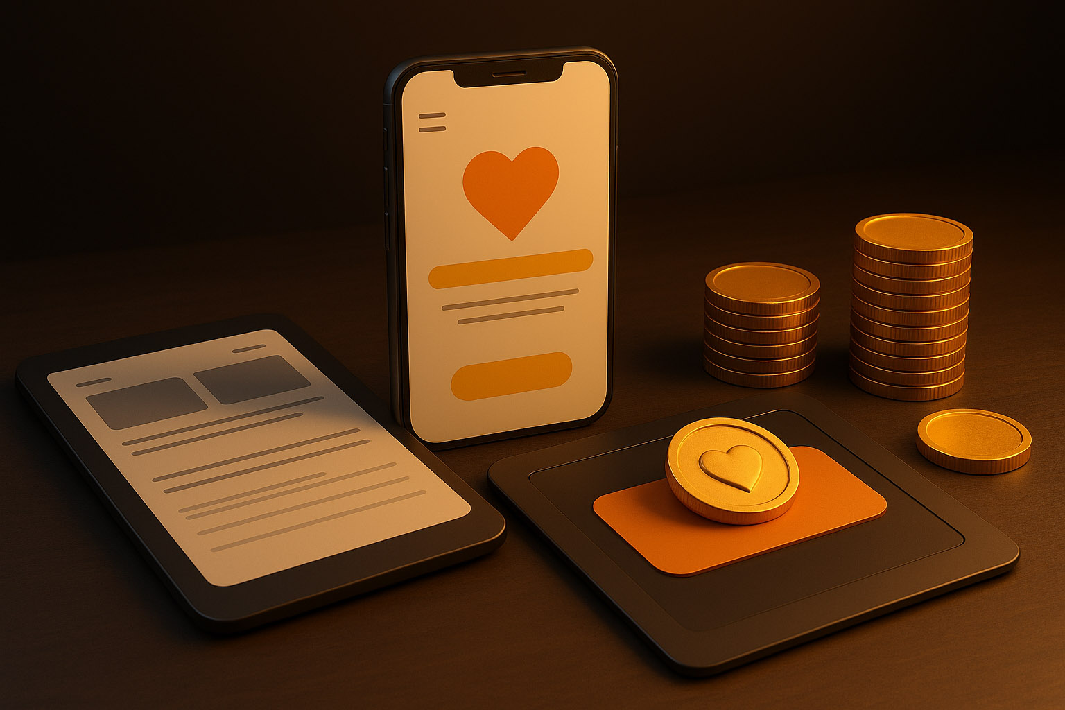
Many nonprofit donation pages are hard to use — especially on mobile devices. Tiny buttons, unclear copy, broken layouts, or slow load times frustrate users.
“When it’s difficult to give, people simply don’t.”
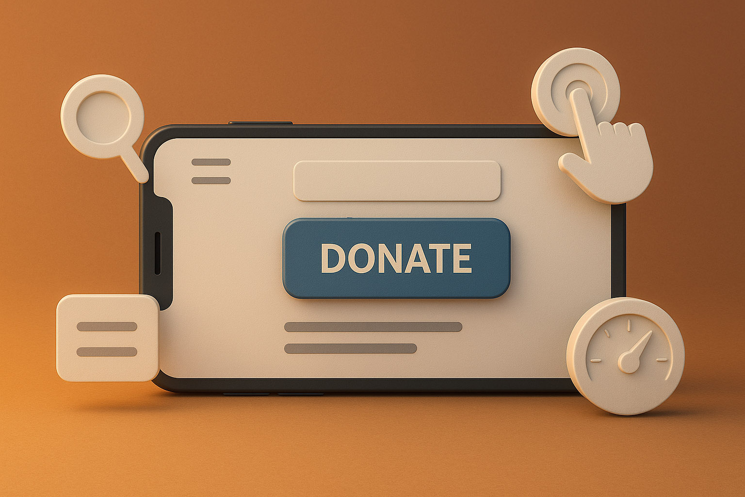
More than 50% of nonprofit web traffic comes from mobile devices, but donation flows are often optimized for desktop. A responsive experience means:
This reduces friction and builds trust — two critical ingredients when asking people for money.
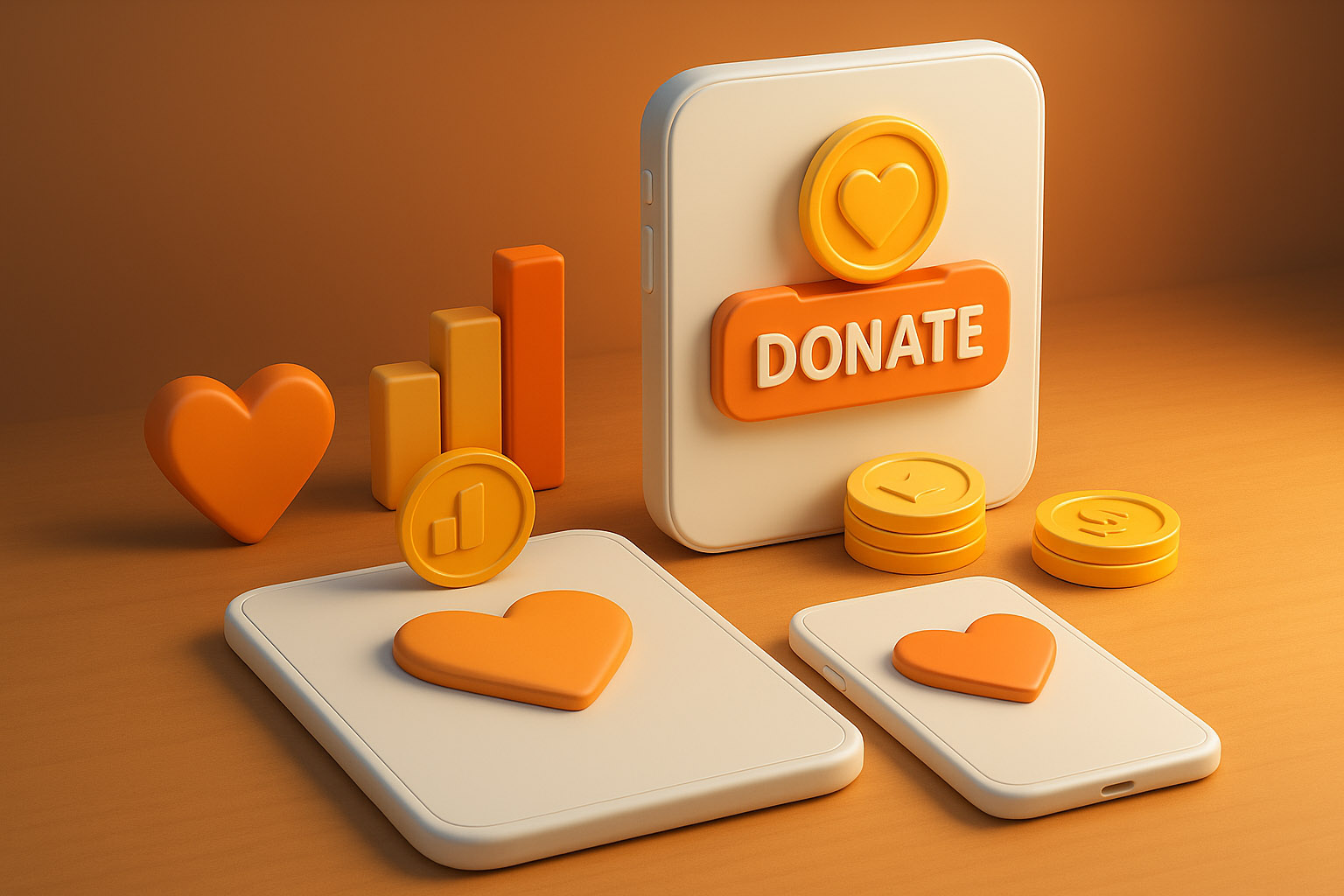
UX isn’t just about how things look — it’s about how they work. These are small tweaks that drive big results:
These adjustments have been shown to increase donation completion rates by 20–60%.
Donors are emotionally driven — but the tech should get out of the way. A smart UX removes doubt and hesitation. When users feel secure, informed, and guided, they are much more likely to complete their donation.
Nonprofits don’t need fancy animations — they need fast, clear, and mobile-first donation experiences.
“With responsive design, trust-building UI patterns, and conversion-smart UX, every click can move closer to impact.”
If you’re interested, DesignRush has featured news on smart UX, offering a more detailed article on this topic.
News, insights, case studies, and more from the rausr team — straight to your inbox.
Send us your brief, your wildest idea, or just a hello. We’ll season it with curiosity and serve back something fresh, cooked with care.