“Stay in a normal status. Don’t chase trends. Stay consistent — and keep drilling the skills that make you fast.”
There’s a quiet truth in design that most feeds won’t tell you: trendiness is not the same thing as quality.
Trends can make work look current for a moment, but they can also push designers into copying the surface of what is popular instead of building a real point of view. That usually leads to reactive work. It looks up to date, but it rarely feels grounded.
This article is not arguing against modern design. It is arguing for stronger priorities: consistency over novelty, craft over decoration, and technical skill over empty atmosphere.
The Trend Trap
Design trends move fast because they are built for attention. One month it is glossy chrome typography, then soft blur, then hyper-minimal layouts, then a flood of identical serif headlines trying to signal taste. The details change, but the pattern stays the same: the work gets noticed because it resembles what people are already noticing.
The real problem is not that trends exist. The problem is how they affect decision-making. Once trend-following becomes your main filter, you stop asking what the message needs and start asking what the market is currently rewarding. Structure becomes secondary. Clarity becomes secondary. Soon the work starts looking like a timestamp rather than a signature.
If your taste is trained by whatever is currently loud, your output becomes dependent on whatever is currently loud.
Consistency Is Not Boring — It’s a Strategy
Great designers often appear consistent because they are working from a stable internal system. Their hierarchy is disciplined. Their spacing feels intentional. Their type choices do not swing wildly from project to project. Even when the final look changes, the thinking underneath it stays reliable.
That kind of consistency does two useful things at the same time. First, it makes your work more recognizable. Second, it makes your process faster. When your fundamentals are stable, you are no longer rebuilding your design worldview every week. You are refining it.
Consistency is often misunderstood as repetition without imagination. In reality, it is what gives your work a center of gravity. It lets you explore without getting lost.
If you want the historical side of this argument, continue with Timeless Designers: The Icons Who Refused to Chase Trends and Does Time or Volume Shape Design Taste?.
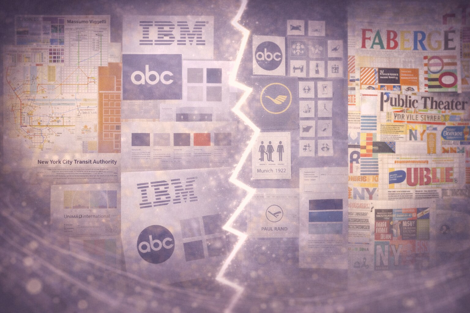
Famous Designers Who Stayed Grounded
You can see this clearly in the careers of several well-known designers. Massimo Vignelli did not spend decades reinventing his visual personality every time culture shifted. He kept returning to grids, restraint, strong typographic hierarchy, and a narrow belief about what graphic design should do. The work changed by project, but the principles stayed stable.
The same is true of Paul Rand. His logos, posters, and identity work could be playful or severe depending on the client, yet the logic underneath remained consistent. He was not chasing whatever surface style the decade was celebrating. He was building clear ideas and giving them memorable form.
Otl Aicher is another strong example. His systems for signage, identity, and public communication feel durable because they were never trying to look fashionable in the first place. They were trying to be precise, legible, and structurally coherent. That usually ages better than any trend-led visual trick.
Even someone like Paula Scher, whose work is more expressive and loud, shows the same deeper pattern. Her typography changes in scale, tone, and context, but it still feels like it comes from one mind. The consistency is not in repeating one exact look. It is in repeating a way of thinking.
Technical Skill Is the Speed Multiplier
Many designers talk about speed as if it were a personality trait. It usually is not. In most cases, speed is just technical fluency. If you know your tools deeply, use styles and systems well, and understand production constraints before you begin, you spend less time fighting the process.
That matters because technical skill protects your attention. Instead of wasting energy on avoidable friction, you can spend it on the decisions that actually shape quality: hierarchy, proportion, typography, and meaning.
This is why the boring drills matter so much. Clean file structure, keyboard fluency, grid practice, reusable styles, naming discipline, export awareness. None of that looks glamorous on social media, but all of it compounds into better and faster work.
Study Print and Older Work
Older work often feels stronger because it was shaped by harder constraints. Limited colors, expensive production, physical reproduction, and typography doing most of the communicative work all forced designers to make sharper decisions. There was less room to hide weak thinking behind effects.
Print is especially useful because it exposes everything. If the hierarchy is wrong, it stays wrong. If the spacing is weak, nothing moves to distract from it. If the layout lacks structure, the piece collapses under its own weight.
That is why studying older work is not nostalgia. It is practical training. You are teaching your eye to notice composition that survives without tricks, typography that carries meaning, and systems that can do more than support a single trendy post.
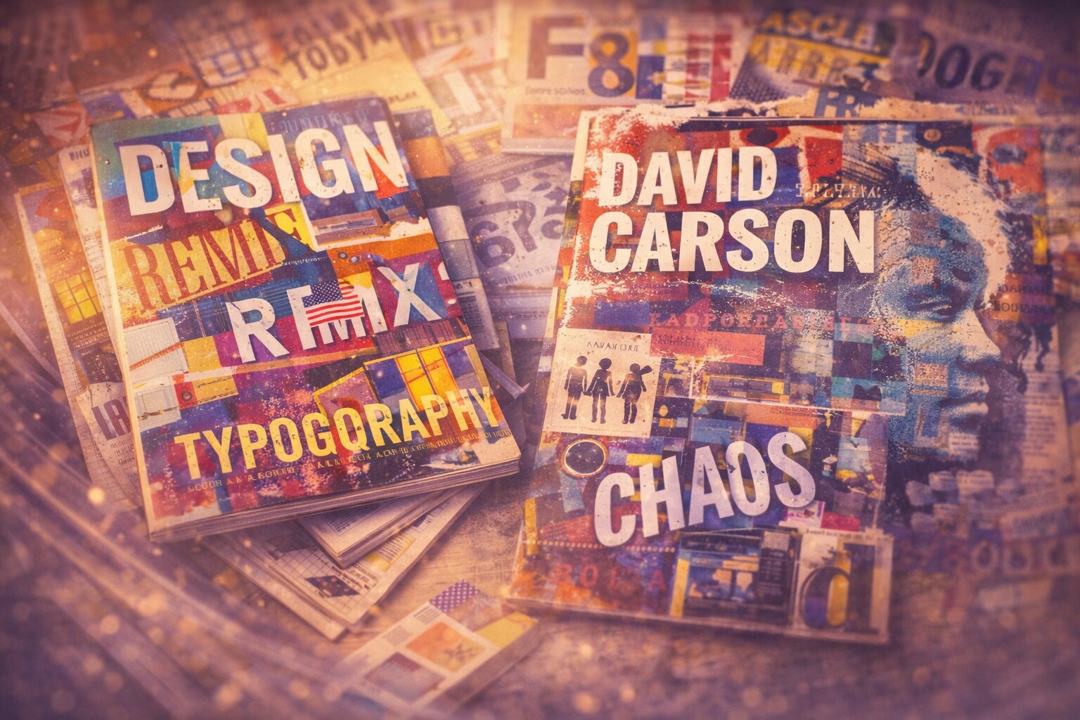
When Style Changes Too Fast
There is a useful counterexample here. Some famous designers became influential precisely because they pushed visual language hard and kept changing it. That can produce exciting work, but it can also create an uneven archive. Some periods stay powerful. Other periods become trapped inside the mood of their moment.
Neville Brody is a good example of this tension. His work was hugely important, especially in the way it expanded what typography could do, but parts of it are now inseparable from a specific late-1980s and early-1990s atmosphere. Historically that work matters. Practically, some of it feels dated much faster than more structurally grounded design.
The same can be said about David Carson. His disruption of clean editorial rules changed design history, and at his best the work still has real force. But the more chaotic and era-specific parts of that language also encouraged a wave of imitation that aged badly. What looked radical in one moment quickly became visual noise in another.
This does not mean experimentation is wrong. It means rapid stylistic change comes with a cost. When the work is built too heavily on the mood of the year, it can lose clarity and longevity once the cultural temperature changes. A designer may still be famous, successful, and influential, but the body of work often becomes less even.
For the branding version of the same problem, read When Being Trendy Backfires: The Hidden Risk of Over-Styled Branding.
A Practical Drill
Rebuild, Don’t Just “Get Inspired”
Inspiration is cheap. Study is work.
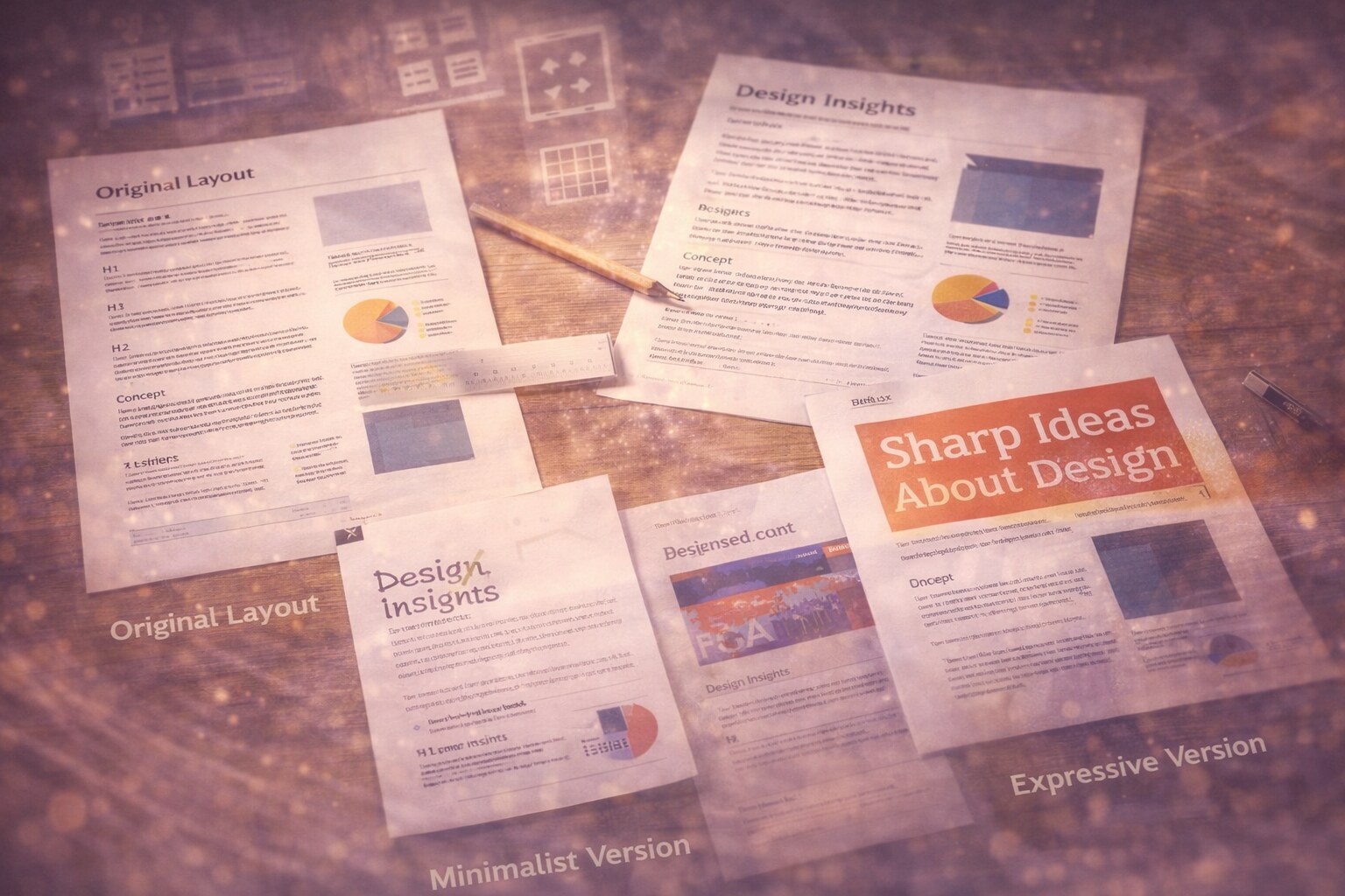
A useful routine is to pick one printed piece you respect, rebuild it from scratch, and focus on matching the hierarchy and spacing before touching any decorative layer. Once you understand the structure, replace the original copy with your own and keep the same framework. Then make two versions from that same grid: one minimal and one more expressive.
That kind of exercise trains the skills that matter most: spacing intuition, typographic hierarchy, system thinking, and creativity inside constraints. It also gives you something better than inspiration. It gives you evidence about how strong design is actually built.
Stay Focused on Your “Unfair Advantage”
Every designer has a lane where they are unusually strong. For one person it is typography and editorial rhythm. For another it is identity systems, layout discipline, or technical polish. That strength usually does not come from constant reinvention. It comes from repetition, depth, and long familiarity with a certain kind of problem.
Trends pull against that. They reward imitation, quick adaptation, and shallow resemblance. Your real advantage usually lives somewhere else. It lives in the part of the craft you are willing to repeat, refine, and sharpen for years.
So the important question is simple: what are you willing to keep practicing long after the trend cycle moves on?
That is where mastery starts.
Conclusion
Trends are real, and sometimes they are useful. But they are temporary by design. If you build your whole way of working around them, your output becomes fragile.
The more durable path is less exciting from the outside and much stronger from the inside. Build a consistent system. Drill technical skill until speed feels natural. Study print and older work for structure rather than nostalgia. Make work that still holds up when you strip the effects away.
“Stay normal. Stay focused. Keep drilling.”