Successful Branding Codes: Target First, Aesthetics Second
Why effective branding codes start with who you target — and how packaging, environments, and social context make your brand feel "right" in the real world.
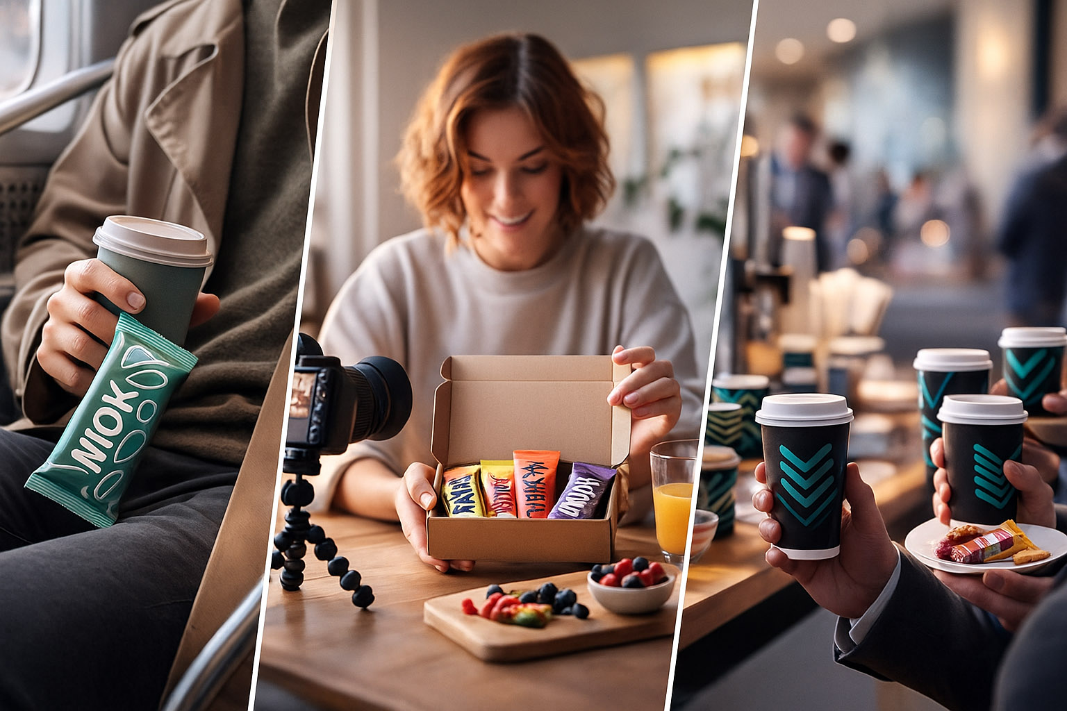
Why effective branding codes start with who you target — and how packaging, environments, and social context make your brand feel "right" in the real world.

Most branding discussions start with how something looks: – “Should we use this color?” – “Is this logo modern enough?” – “Do we need an illustration style?”
The more useful starting question is much simpler:
Because once you know where you want to be seen (on shelves, in feeds, in people’s kitchens, on stage at events), your branding codes stop being abstract design choices and start acting as targeted tools.
This is especially visible in snack bars and packaged foods. Their codes aren’t just about being pretty. They’re built to:
Let’s unpack how this works — and where brands nail it or miss it completely.
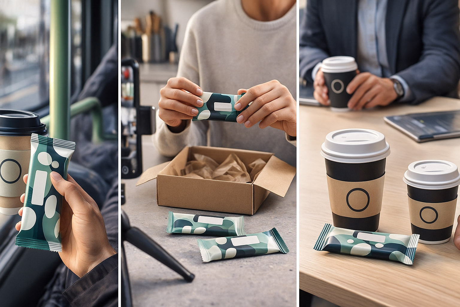
A useful exercise when defining branding codes:
Describe three scenes where your brand will appear.
Write what you want people to feel in each scene.
Only then design visual codes that deliver that feeling repeatedly.
In research interviews, people often can’t explain why a brand feels right. But they can point to:
That’s a sign your codes are aligning with the target context, not just the designer’s taste.
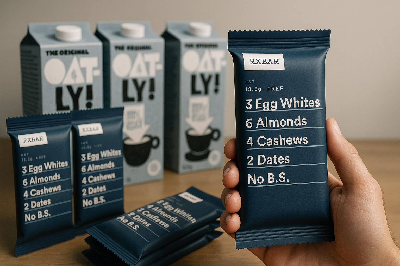
RXBAR’s famous packaging is a masterclass in target-based coding:
Why it works:
Behind the scenes, researchers noticed that people remembered RXBAR not as “the blue bar,” but as “the one with the ingredient list on the front.” That’s a distinctive code built directly from how and where the bar is used.
Oatly rebranded in the early 2010s with packaging that looks like a mix of:
Target world: Urban millennials, coffee shops, Instagram, “alt” lifestyle spaces.
Codes they leaned into:
The interesting (and less discussed) research insight:
In early tests, some participants called the packaging “too loud” or “trying too hard” — but they still remembered it a week later, while forgetting more polished alternatives.
Oatly chose memorability over “being liked” in the first 5 seconds. Their codes were designed to live on baristas’ counters and in social media photos, not in a conservative supermarket dairy aisle.
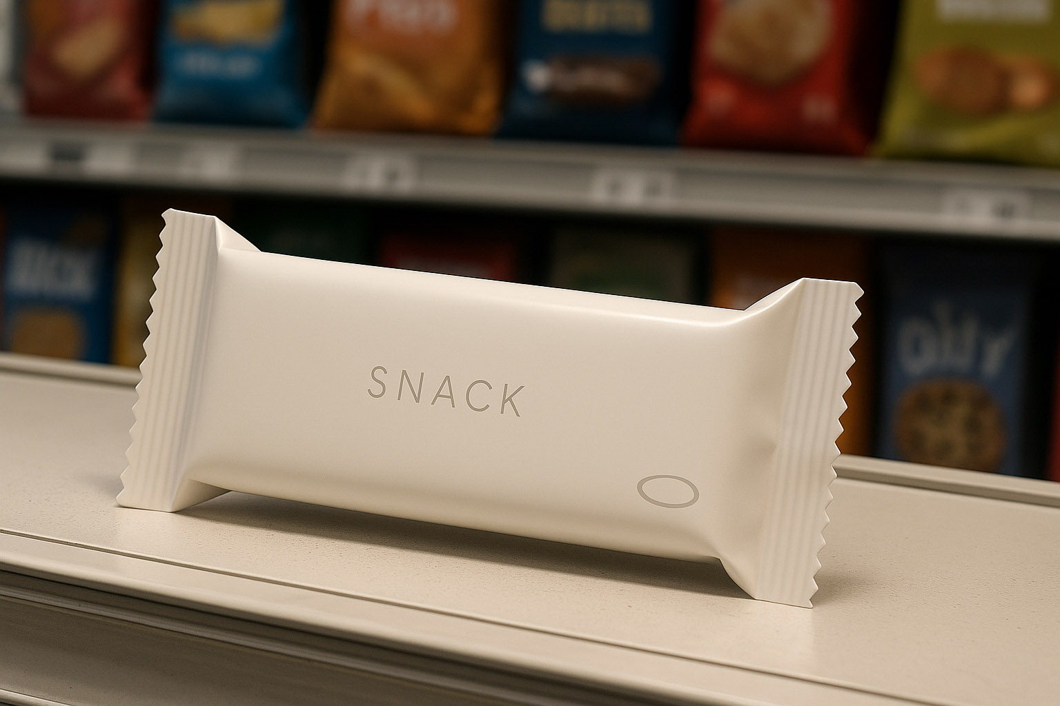
Imagine a founder who wants their snack brand to feel “Apple-level minimal.” So they:
In a design presentation, it looks fantastic. In the real world:
The branding code was aesthetically strong but contextually blind. The target customer didn’t live in a Behance mockup — they lived in:
This is a common failure pattern: the brand belongs to Dribbble, not to the world it’s supposed to sell in.
Tropicana’s infamous 2009 packaging redesign is often told as “people hate change.”
But the more interesting angle is – They removed the ** codes people used to recognize the pack in 1 second.
What changed?
In aisle research, regular buyers literally walked past the new packaging because:
Sales reportedly dropped by ~20% in just a few weeks before PepsiCo reversed the redesign. Not because the new design was ugly — but because the brand codes no longer matched how shoppers searched and grabbed juice.
One under-discussed part of branding codes:
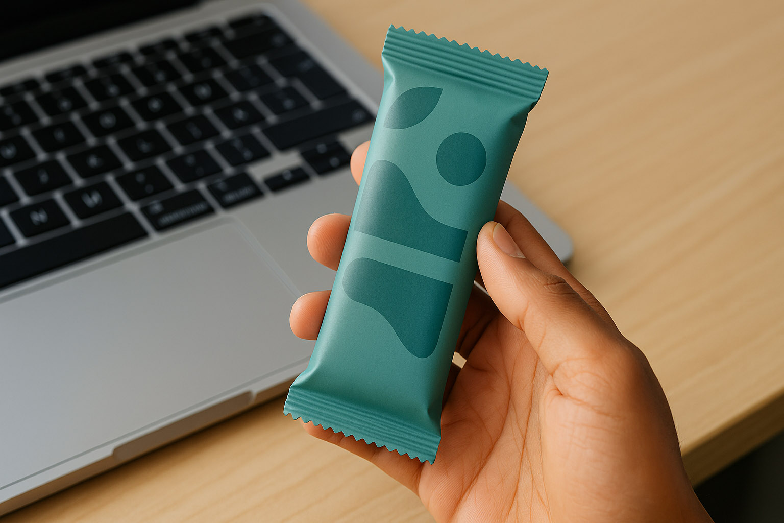
For a snack bar brand, the “target hand” might be:
Some brands reverse-engineer this:
In qualitative research, people often can’t articulate this. But you’ll see it in:
Those repeated patterns are branding codes in the wild.
If you’re working on your own brand, try this practical checklist:
Write three “in the wild” scenarios.
Strong branding isn’t just a beautiful logo or clever typography. It’s the repeated pattern that survives:
When you start with who you target and where your brand appears, your codes become tools instead of decorations. Packaging, digital touchpoints, and environments begin to tell the same story.
Make it easy for your audience to recognize your brand in motion, in their hands, and in the real world — not just inside a polished mockup.
“Design for the shelf, the feed, and the hand. That’s where your branding codes really live.”
News, insights, case studies, and more from the rausr team — straight to your inbox.
Send us your brief, your wildest idea, or just a hello. We’ll season it with curiosity and serve back something fresh, cooked with care.