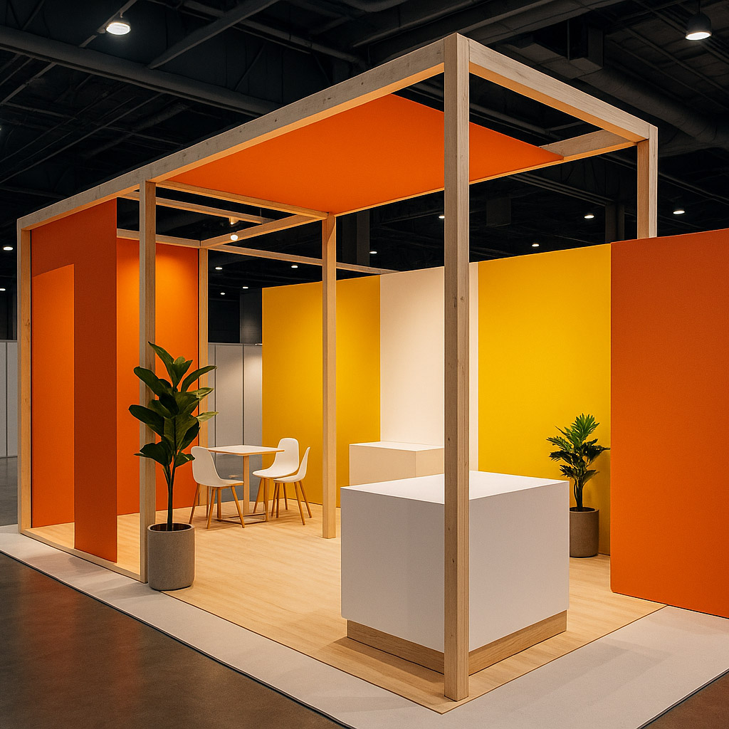
The Best Exhibition Stand Is Not the Most Beautiful One. It Is the One That Stops People.
Why exhibition stands win through clarity, curiosity, and conversation rather than surface beauty alone.


Why exhibition stands win through clarity, curiosity, and conversation rather than surface beauty alone.
At many exhibitions, companies still make the same mistake: they judge the stand the way a designer judges a render.
Was it elegant? Was it premium? Was it photogenic? Did it look expensive enough?
Those things matter, but only after the first and most brutal test has already happened: did anyone stop?
The winner of an exhibition is often not the most beautiful stand. It is the stand that makes the right visitor interrupt their movement, understand enough to care, and feel enough curiosity to begin a conversation.
That is a different design problem.
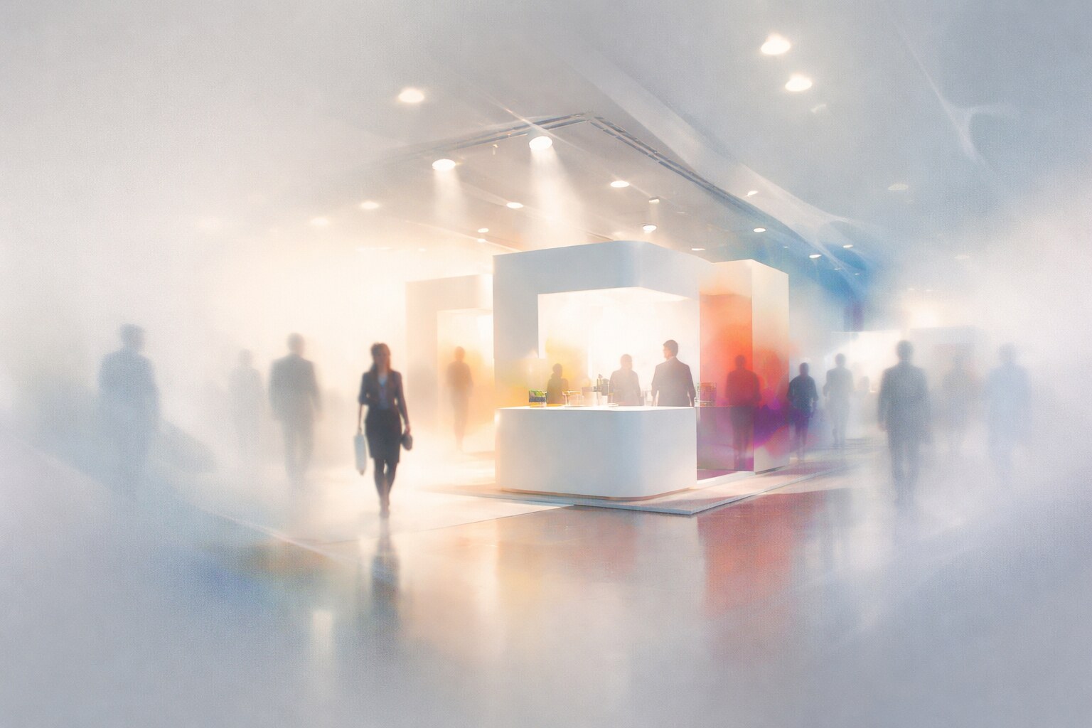
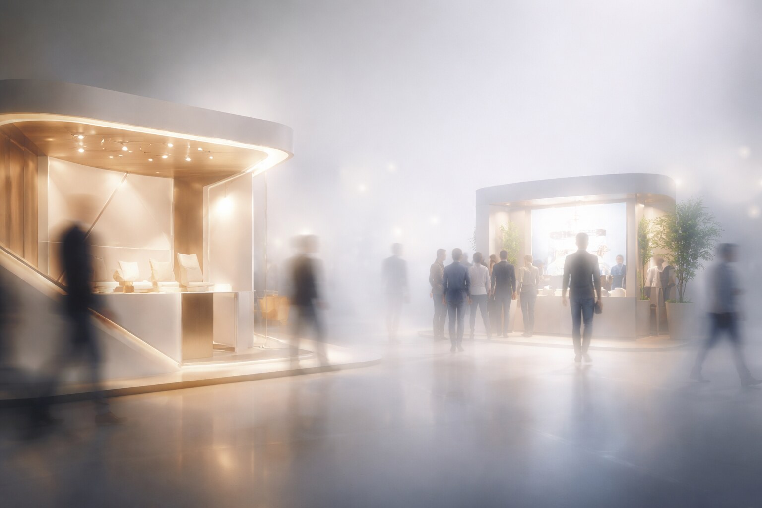
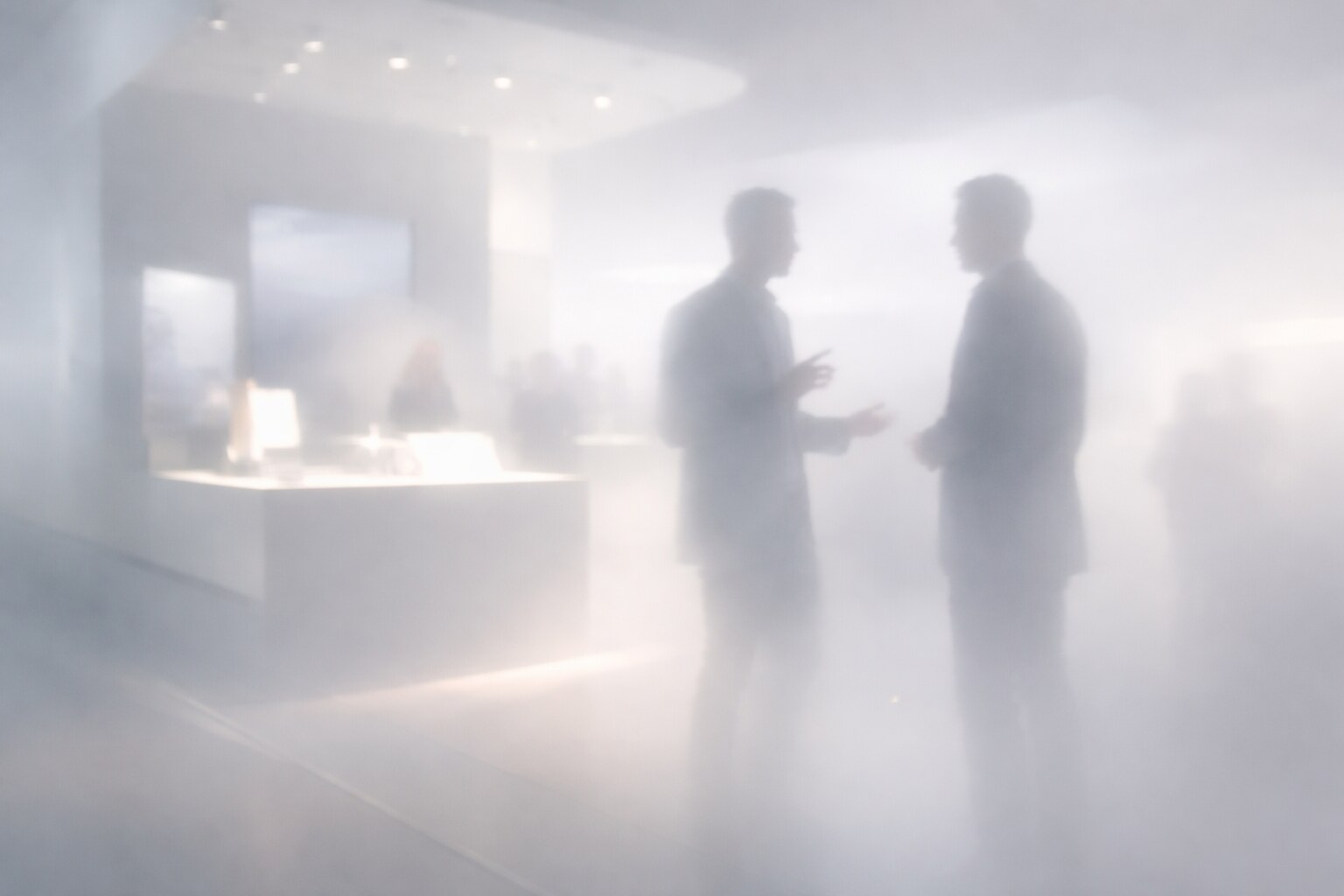
Trade shows and exhibitions are not normal visual environments. They are crowded, noisy, time-compressed, socially pressured places full of competing signals. In that setting, a stand does not win by being admired from a distance. It wins by creating a path from glance to interest, from interest to thought, and from thought to discussion.
If you want the broader event-design background first, continue with Exhibition Stand Design in 2025 and Exhibition & Event Graphic Design in 2026.
“At an exhibition, beauty is not the finish line. Attention is. And attention only matters if it turns into understanding.”
Many stands are visually polished and strategically weak. They look premium, but they do not tell a passing visitor what the company actually does, who it helps, or why anyone should stop.
That failure happens because exhibition design is often treated like scenic branding instead of behavioral design. The company wants to “look strong,” so it commissions a stand that feels sleek, fashionable, and expensive. But visitors do not reward abstract polish by default. They reward relevance.
UFI’s educational material on trade fairs makes this point indirectly but clearly: exhibitions work as part of the marketing mix because they serve defined goals and defined target groups. In trade-show settings, decisions may happen after the event, not at the exact moment of contact. That means the stand’s job is not simply to look good. Its job is to help the right people understand, remember, and engage.
A beautiful stand with vague messaging often loses to a less elegant stand that communicates one sharp promise immediately.
One of the strangest truths of exhibition design is that a stand can be visually admired and commercially invisible at the same time.
Visitors do not enter a hall in a neutral mental state. They are scanning under pressure. They are filtering aggressively. They are deciding, very quickly, whether a stand is worth even three more seconds.
Freeman’s 2024 attendee research is useful here. It found that discovering new products, solutions, and partners was the main attendance driver for most respondents. That means the visitor is not primarily walking around looking for “the prettiest architecture.” They are looking for possible value.
So the stop decision usually comes from a few things working together:
This is why some stands with modest budgets outperform bigger scenic builds. They reduce uncertainty fast enough to deserve attention.
Psychology is not kind to clutter. Hick’s law tells us that decision time rises with the number of alternatives or the amount of uncertainty in a task. On an exhibition floor, that matters a lot. The visitor is not deciding between one stand and nothing. They are deciding between dozens of competing stimuli while walking.
So if a stand throws too many messages, too many claims, too many moving parts, and too many visual hooks at the same time, it does not feel rich. It often feels harder to decode.
That is why the first layer of a good stand should be brutally simple:
Everything else can arrive later.
The first read should not feel like homework. If the visitor needs ten seconds just to understand the category, the stand is already late.
“The most expensive mistake in stand design is not ugliness. It is delayed comprehension.”
Once the stand has passed the clarity test, a second mechanism becomes important: curiosity.
Research on curiosity and memory is useful far beyond classrooms. Studies by Gruber, Gelman, and Ranganath showed that states of curiosity improve learning and memory, even for incidental information encountered during that curious state. That matters for exhibitions because a stand that creates a sharp, solvable question can make the whole interaction more memorable.
The key is not mystery for its own sake. Confusion repels. Curiosity attracts only when the visitor feels there is a real answer nearby.
A stand works well when it says, in effect:
That is very different from empty teaser language. Good curiosity reduces uncertainty in the right direction. Bad curiosity just withholds meaning.

One of the most under-discussed facts in exhibition design is that the booth staff are not separate from the stand. They are part of the experience architecture.
Freeman’s 2025 research found that in-person events build trust at unusually high levels. That alone should push companies to stop thinking about the stand as a static object. The object matters, but the face-to-face interaction is often the actual trust engine.
The staffing research in Industrial Marketing Management adds something even more useful. Using data from 9,215 attendees and 885 exhibitors, the study found a disconnect between whom visitors want to speak to and whom exhibitors often place on the booth. Technical people were often underrepresented, while executive or sales-heavy staffing was often overrepresented.
That is a huge clue.
If the stand successfully attracts an interested visitor but the conversation immediately feels generic, defensive, or too commercial, the design job has been interrupted at the last meter.
So yes, beautiful architecture matters. But the real conversion surface is often a well-positioned staff member who can explain something clearly, answer without jargon, and talk like a human being.
Many stands are over-designed in construction and under-designed in conversation.
The simplest way to think about a strong stand is as a sequence, not a sculpture.
This is why open sightlines, legible hierarchy, and intelligent zoning matter so much. Research in exhibition environments shows that visibility and co-visibility influence how much attention objects receive and what gets remembered afterward. Layout is not neutral. It changes cognitive engagement.
For the more practical build side, continue with How to Start With Exhibition Design and Branding Codes That Stick.
Most weak stands do not fail in mysterious ways. They fail in repetitive ways:
There is also a strange trap here: companies sometimes assume that if the stand looks premium enough, visitors will project value onto the company automatically. Sometimes they do. But just as often they project a different thought: nice build, unclear offer.
Some of the numbers are bigger than many designers expect. UFI’s 2024 industry figures point to 318 million exhibition attendees, 4.7 million exhibiting companies, and an estimated €368 billion in sales generated globally. That scale alone should remind companies that trade-show design is not a side decoration. It is a high-stakes communication environment.
Some of the funny realities are smaller and more human.
And one of the most useful unknown facts is this: trade shows are often less about instant purchase than people think. UFI’s material on trade fairs emphasizes that for many trade-show contexts, the decision may happen after the event. That means memory, trust, and conversation quality are not side issues. They are the core of the job.
For the wider business case for physical events, continue with The Future of Exhibitions: Why Real-World Networking Still Wins.
Sometimes the stand that “wins the hall” in photos is not the one that wins the most useful conversations in real life.
The behavioral logic is fairly consistent:
That is why a strong stand often feels simple without being simplistic. It works with the visitor’s mind instead of against it.
A visitor walking through a crowded aisle does not want to solve a puzzle with twenty parts. They want to know, very quickly, whether this company is relevant to them. Once that threshold is crossed, they are more willing to explore, ask, compare, and remember.
So the best stands usually combine three things at once:
This is also why beauty still matters, but as a support system. Beauty can amplify trust, polish, and desirability. It just cannot substitute for relevance.
The best exhibition stand is not the one that gets the most compliments from designers standing five meters away.
It is the one that makes the right visitor stop, understand enough to care, and step into a conversation that would not have happened otherwise.
That is why the strongest stands are rarely just “beautiful.” They are readable, relevant, curious in the right way, socially easy to enter, and supported by people who can carry the interest forward.
“The real victory of a stand is not that people say “nice booth.” It is that they stop, think, ask, and remember.”

News, insights, case studies, and more from the rausr team — straight to your inbox.
Send us your brief, your wildest idea, or just a hello. We’ll season it with curiosity and serve back something fresh, cooked with care.